I have received several E-mails over the last few weeks that suggest that the economics…
USA and Australian unemployment trends
On Friday, the US Bureau of Labor Statistics (BLS) published their latest labour force data which revealed that the US aggregate unemployment rate had risen to 8.5 per cent, the highest level since March 1982. It is clear that thousands of jobs are being lost (in net terms) in the US as the recession there intensifies and the deterioration is spawning protests. Times are changing for the US. Australian commentators seem to be suggesting that Australia is faring better at present. On the surface that may be right, but when you start digging a little, things do not look as well. This blog takes you through some graphs I have constructed as part of an academic paper I am working on. They are easy to understand and tell an interesting story.
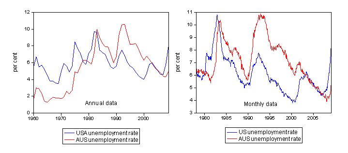
First, here are two graphs which show Australian and US unemployment rates since 1960 (left hand panel) using annual data from the BLS and since February 1978 (right hand panel) using monthly data from the BLS and the ABS.
Several points are noticeable. First, in the 1960s, Australia enjoyed very low (full employment) unemployment rates whereas the US was already struggling with higher rates, in part, due to the less regulated nature of their labour market and the weaker commitment by the US government to maintaining enough jobs to match the labour force.
Second, the cycles in the data are pronounced. The 1982 recession was severe in both cases but the US led Australia at that time and the magnitude of the cycle were comparable. One reason we took longer to go into recession in 1982 was the huge budget deficits that the conservatives were running at the time. While the then treasurer, John Howard (who later, unfortunately became the PM) was vilified for these deficits, in fact, they were mostly the result of the automatic stabilisers propping up demand and stalling the dive into recession. He should have cranked the deficits up further in that period and we might have avoided the worst of it altogether.
The 1991 recession was less of an event for the US, and the poorly implemented macroeconomic policy in Australia (high interest rates, pursuit of fiscal surpluses under the Hawke government – our first truly neo-liberal government) saw us lead the US into this downturn. The policy disaster also meant that we succumbed to the highest unemployment rates that we had seen since the 1930s whereas the US recovered more quickly (they hadn’t started pursuing budget surpluses yet!). While the high point unemployment rate in the US between 1982 and 1991 had fallen, in Australia we went from bad (1982) to worse (1991). It took the next 13 years to get the unemployment rate down in Australia to what the lowest level it had been prior to the 1991 recession (late 1989). We avoided the worst of the short slowdown into the new century but the US felt that more. In December 2000, Australian GDP was negative but as commodity prices started to boom soon after this our growth resumed and unemployment did not take a serious jump upwards.
The US is clearly leading us into current downturn and you can see sharp rises in the unemployment rates in both countries. The pattern is very similar to the 1982 downturn except Australian households are now heavily indebted; are suffering from rising rates of underemployment and have endured the liquidity-killing effects of a decade of fiscal drag (from the federal budget surpluses). These preconditions make the Australian economy much more vulnerable to a serious escalation in unemployment over the next year.
To provide some further insights into what happens during a downturn, I made the following graphs which depict how quickly the unemployment rose in the US and Australia during each of the three major recessions in recent history: 1982, 1991 and 2009.

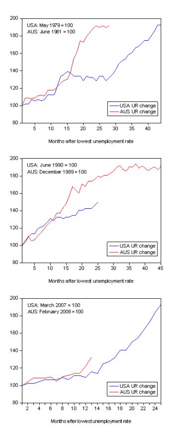
The unemployment rate was indexed at 100 at its lowest rate before the recession in each case (the month is detailed in the charts) and then indexed to that base for each of the months until it peaked. So you get a graphical illustration of the speed at which the recession unfolded (which tells you something about each economy) and the length of time that the labour market deteriorated (expressed only in terms of the unemployment rate). The top panel is 1982, middle 1991 and bottom panel is 2009.
In the 1982 recession, which lasted much longer for the US (the unemployment rate kept rising for 44 months compared to 28 for Australia), in the early stages the pace of deterioration was similar in both Australia and the US. However in the 9th month of downturn, the situation worsened considerably in Australia (with poor policy support from the then conservative government) whereas the US seemed to hold the pattern for some time before a further deterioration after month 28. But the sharpness of the decline in the Australian labour market saw our unemployment rate zoom to just above the US level at the peak of our respective episodes.
The 1991 recession was somewhat different and was worsened in Australia by poor macroeconomic policy (as noted above) as the neo-liberal mantras started to really dominant policy making here. In this recession, both economies started off with similar unemployment rate levels (see the first graph in this blog) and once again the pace of deterioration for the first several months was similar. Around month 12 (one year), the pace of deterioration quickened in Australia and things became very severe after that. There was not the supportive policy response that we are starting to see now from the Australian government at that time. Keating kept talking about a “soft landing” if you will recall. While the deterioration stopped in the US after 25 months, unemployment kept rising for 45 months in Australia – month by month the Federal government vandals failed to respond with adequate policies.
And now to 2008-2009 (bottom panel). The US economy (labour market in this case) began deteriorating in March 2007 and so far has seen 25 months of rising unemployment rates. For the first 14 months the deterioration was moderate but has accelerated since then as the full extent of the global crisis impacts on their real economy. The rate of decline in the early parts of this episode resembles the 1982 experience in the US. Interestingly, Australia’s labour market contraction began in February 2008 and so we are now in the 13th month of decline. For the first 11 months our rate of decline was similar to the US but in the last 2 months you can see our rate of decline is now very sharp and well above the US.
While it is too early yet to make too many predictions, especially as we have some very large fiscal stimulus packages already pumping into the expenditure stream, the behaviour of the Australian labour market is looking familiar. In each of the three recessions shown, the rise in the unemployment rate is moderate and then once the recession really takes a grip on the real economy, the rate of deterioration quickens considerably and unemployment sky rockets. This shift in pace looks to occur at around the 10-12 months mark in the downturn. Just where we are at now. This is why I have been predicting that the unemployment rate will accelerate upwards over the coming months.
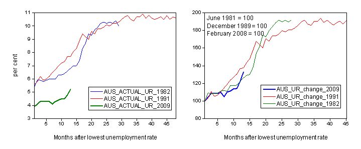
The next graph shows you the level of unemployment at the start of each episode – so the lowest unemployment rate achieved before the relevant downturn began in actual per cent (left-hand panel) and the rate of deterioration (in index numbers as explained previously) in the right-hand panel.

Two points to note. First, while the 1982 and 1991 episodes started broadly from the same unemployment rate (about 5.9 and 5.6 per cent respectively) the lowest unemployment rate we got down to this time was lower. So that is to our advantage. In terms of pace of decline however, the 1991 recession accelerated more quickly earlier than the 1982 recession and persisted for much longer as noted earlier. But have a look at the current episode which is now 13 months old. While initially we were following the decay path of the 1982 recession, in the last 2 months the pace of decline has accelerated and we are now deteriorating more quickly than the very bad 1991 episode at a similar time in the downturn (around 12-13 months). It is too early to tell what this means, however.
Some might be comforted by the fact that our unemployment rate was much lower (4 per cent instead of 5.6 per cent) this time around before the rot set in. That is clearly a difference but we have to consider that the official unemployment rate is a narrow measure of labour underutilisation and other sources of labour wastage have risen over the years (for example) underemployment.
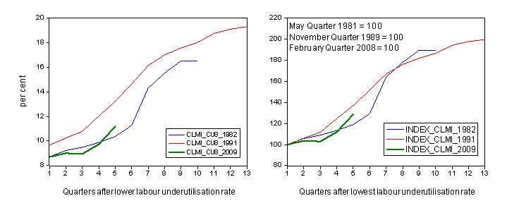
The following graph presents the same level and rate of change analysis for Australia over the three recessions but uses the CofFEE broad measure of labour underutilisation CU8 – which adds hidden unemployment and underemployment to official unemployment. The horizontal axis is also specified in quarters into the downturn rather than months (due to data limitations).

You immediately see the impact of taking a broader perspective. The level of labour underutilisation at the height of the boom (February) was the same as that in 1982 – although then the unemployment rate was higher and underemployment very low. The relatively small difference in level between 1991 and now is due to higher initial unemployment and lower but worsening underemployment that prevailed in 1991. Underemployment really became a significant problem during and since the 1991 recession. So despite the official unemployment rate being lower now than say in 1991, the total level of labour market slack is not that different.
You can also see that in terms of the rate of labour wastage, we are already well above the 1982 rates at a similar period in the downturn. In the 5th quarter of each of the episodes, CU8 was 10.4 per cent (1982); 13.2 per cent (1991) and 11.2 per cent (2009). From the right-hand panel you can see the same pattern as the previous graph – we are now deteriorating faster than the previous recessions at the same point in the downturn. If this rate of decline persists we will quickly catch the levels of labour underutilisation that we saw in 1991-1992 despite starting from a lower official unemployment rate.
When policy makers talk exclusively about the unemployment rate in the context of how to judge the performance of the labour market, you should always translate that “speak” into the broader underutilisation trends. The rule of thumb, which is more or less accurate, is to take the official unemployment rate and double it. That figure will give you a more reliable impression of how bad things are getting. Then you should work out the rates of decline to get things into better perspective of where we are heading. From where I sit, and given that I have been analysing these processes for some time now, the situation does not look very good at all and I think all those economists who have been “talking things up” over the years should now realise that the last 10 years of policy failure have left a legacy that we will regret for years to come.
I have some underemployment data from the US but haven’t finished analysing it in enough detail to present it here. Besides this blog is becoming a book chapter!
Digression: Press coverage of CofFEE EVI and followup data
The major Sunday papers in Australia (Melbourne Age and Sydney Morning Herald) had stories this morning covering the latest Labour Market and Related Payments Monthly Profile data from DEEWR which is now publicly available on a monthly basis. It shows NewStart and Youth Allowance recipients by Centrelink office. The latest data (for February) shows a sharp increase in claims in many areas, particularly the Red Alert suburbs we identified in our Employment Vulnerability Index.
The Melbourne Age had three related stories today about the latest data. The first story entitled Downturn or upturn? It depends on where you live reported that:
The University of Newcastle last month named nearby Kilsyth South and Bayswater North as among the Australian suburbs most vulnerable to job losses.
“Both areas have a lot of low-skill workers working in highly vulnerable industries such as manufacturing, construction and retail trade,” says the university’s Professor Bill Mitchell. “Low-skill workers are the first to go and those industries shed jobs pretty quickly.”
The second story entitled Mortgage belt hit as jobless rate surges reported that:
Professor Bill Mitchell, from the Centre of Full Employment and Equity at Newcastle University, said the unemployment surge appeared to be hitting not only the traditional “old industry” suburbs spreading in a ring to Dandenong, but also newer mortgage-belt suburbs further afield, characterised by high levels of debt, low skills and casual employment.
“The old ring that went out into the west – Footscray, Sunshine, up towards the Ford factory up in Broadmeadows there, and then around to the south-east around Springvale, Dandenong, Noble Park – they have always been disadvantaged,” Dr Mitchell said.
But there was a new set of suburbs “out on the fringes of the urban settlement” that had not previously been considered disadvantaged: “In the north up into Craigieburn, all those new suburbs out the back of Tullamarine and down in the south-east, the suburbs that have grown beyond the industry belt like Pakenham, Cranbourne, which used to be sort of rural suburbs.
“We think those areas are going to bear a significant amount of the brunt as well. They face the likelihood they will be considered the new areas of disadvantage.”
The Sydney Sun Herald ran a truncated version in their on-line edition but covered the briefing I gave them in detail in the print version.
Both articles made a slight error in attributing the data to the Australian Bureau of Statistics. In fact, the data are Centrelink returns from the Department of Education, Employment and Workplace Relations (DEEWR).

I’m still very doubtful that the stimulus plan and in general government interference is the solution. I was looking at the previous recessions and the percentage of unemployment rate on … [LINK DELETED] … and it just seems to me that we might as well accept that it’s a cyclical phenomenon. I don’t know. That’s my 2 cents.
[NOTE: BILL DELETED A LINK HERE TO A SITE WITH LOTS OF ADVERTISING AND UNCLEAR PURPOSE. THERE IS NO INFORMATION ON THE SITE DELETED ABOUT WHO OWNS IT OR ITS AFFILIATION IF ANY … MY COMMENTS POLICY WILL NOT ALLOW SUCH LINKS, SORRY!]
Exactly what degree of unemployment, poverty, homelessness and general economic and social breakdown would you consider to be an “acceptable level” of cyclical phenomenon Jeff?
Yes, the shedding of labour from the private sector is cyclical. No doubt. But, the sovereign government always chooses the level of unemployment at any point in time. After all, if no-one in the private sector wants to purchase the services of someone who wants to work, the national government surely can hire that person and put them to productive work. There is no such thing as a “natural” unemployment rate.
This topic is now (again) one of utmost interest due in part to the housing market having finally turned down the pundits are gazing into their crystal balls and don’t see a US type correction.
However our aussie UR should based on history be even more dire a problem .
I am familar with housing market and industry structure in the outer easeten subs of Melbourne and I think it is even worse than you wrote this in 2009.
Thanks Bil