The Post WW2 period was marked by the mass consumption boom and the rise of…
US labour market is in a deplorable state
Last week, upon the release of the latest – BLS Employment Situation – for September 2012, which showed a drop in the official unemployment rate of 0.3 percentage points, one of the big corporate noters in the US – one Jack Welch tweeted (October 5, 2012 at 10:35 PM) “Unbelievable jobs numbers … these Chicago guys will do anything … can’t debate so change numbers”. It was clear what his meaning was in the build up to the Presidential election in November. He wanted to impugn the integrity of the President (Chicago guy) and more worryingly, the reputation of the workers at the (excellent) Bureau of Labor Statistics. Not only was his comment revealing of his total ignorance of the way these surveys are designed, framed, conducted and then processed but nearly a week later, after being taken to the cleaners by various critics, he later tried to rationalise his ignorance in a Wall Street Journal article (October 11, 2012) – I Was Right About That Strange Jobs Report. The problem is that while his tactics are questionable and his analysis poor – the bottom line is that the US labour market is in a deplorable state.
The WSJ article began by suggesting that people who criticised his arrant ignorance (as per the tweet) were probably trying to make the US like the “Soviet Russia perhaps? Communist China?”, How can it be:
… that in the “United States right now, when a person (like me, for instance) suggests that a certain government datum (like the September unemployment rate of 7.8%) doesn’t make sense.
For the record, he was criticised for saying that the data “doesn’t make sense”. Those of us who monitor these sorts of data releases often are in a state of confusion about some particular numbers and lay off relying on them until revisions are made as the statistician gets more data in.
That is par for the course when using sample survey data especially data that requires estimates of underlying populations in regional spaces in between the censuses.
But that is not what Welch did. He accused the President of manipulating the staff at the BLS in such a way that they would deliberately publish a false, lower unemployment rate in order to improve his election prospects next month.
That is what the fuss was about.
In the WSJ article he tries some statistical analysis to support his claim – which is now – that the numbers are puzzling. The conspiracy angle is muted in this article although you can sense it is still his intention to promote that part of the narrative.
Beseeching his political independence and that of his wife who is apparently named Suzy (too much information Jack), Welch noted that the BLS data is the result of a sample survey.
Let’s get real. The unemployment data reported each month are gathered over a one-week period by census workers, by phone in 70% of the cases, and the rest through home visits. In sum, they try to contact 60,000 households, asking a list of questions and recording the responses.
Some questions allow for unambiguous answers, but others less so. For instance, the range for part-time work falls between one hour and 34 hours a week. So, if an out-of-work accountant tells a census worker, “I got one baby-sitting job this week just to cover my kid’s bus fare, but I haven’t been able to find anything else,” that could be recorded as being employed part-time.
Those who study this data each month know all of that and understand sampling variability. Sampling variability doesn’t mean then numbers are “cooked”. It just means we have to consult the accompanying table of standard errors to see the confidence intervals. Totally transparent.
We can also argue about the internationally accepted labour force framework definitions which come via the ILO labour statistics guidelines that national statistical agencies agree to use for comparability reasons.
For example, the transition from unemployment to employment being 1 hour of paid work in the survey week, certainly biases the unthinking user of the data to believing things are better than they are, if the hours distribution is skewing towards 1 hour per week away from full-time work.
That is why we look deeper to see what is happening with the distribution of hours worked and the rate of underemployment.
Welch thinks he is on a winner when he says:
… the BLS’s own “Handbook of Methods” has a full page explaining the limitations of its data, including how non-sampling errors get made, from “misinterpretation of the questions” to “errors made in the estimations of missing data.”
Bottom line: To suggest that the input to the BLS data-collection system is precise and bias-free is-well, let’s just say, overstated.
We know all of that and the informed user of the data understands monthly variability and ignores it. They examine longer-term trends, which tend to expunge these monthly variations from the data.
Then Welch got down to using the data to see if he could decompose the change in the unemployment rate. But he didn’t actually do that. He noted that “the labor-force participation rate in the U.S. dropped to 63.5%”, which means there were “fewer people in the workforce” and that puts a downward force into unemployment given the other parameters.
True. But he failed to mention that in September the participation rose again to 63.6 per cent adding workers to the labour force. He doesn’t try to calculate what either movement meant for the final unemployment rate outcome.
He then focused on the discrepancy between the payroll data estimate of employment change over August and September of 602,000 workers to the labour force survey estimate for September of 873,000 and concluded that:
These three statistics-the labor-force participation rate, the growth in government workers, and overall job growth, all multidecade records achieved over the past two months-have to raise some eyebrows.
Raising eyebrows does not mean the numbers are cooked.
For those not familiar with the difference between the payrolls data and the labour force survey data here is a brief explanation.
The BLS report from their establishment survey (firms) that:
The unemployment rate decreased to 7.8 percent in September, and total nonfarm payroll employment rose by 114,000 …
However, based on their Household Survey data, the BLS reported that:
Total employment rose by 873,000 in September, following 3 months of little change.
The establishment survey (payrolls) data is subject to substantial revisions. The BLS report that the “change in total nonfarm payroll employment for July was revised from +141,000 to +181,000, and the change for August was revised from +96,000 to +142,000.”
So what are we to make of the latest employment data from the US?
To understand the difference between payroll- and household-based employment surveys you might like to read this excellent BLS publication (May 4, 2012) – Employment from the BLS household and payroll surveys: summary of recent trends.
The BLS say that:
The Bureau of Labor Statistics (BLS) has two monthly surveys that measure employment levels and trends: the Current Population Survey (CPS), also known as the household survey, and the Current Employment Statistics (CES) survey, also known as the payroll or establishment survey.
Employment estimates from both the household and payroll surveys are published in the Employment Situation news release each month. These estimates differ because the surveys have distinct definitions of employment and distinct survey and estimation methods.
The document contains the following Table which catalogues the differences in the two employment surveys.
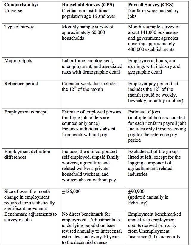
The BLS say that:
Both the payroll and household surveys are needed for a complete picture of the labor market. The payroll survey provides a highly reliable gauge of monthly change in nonfarm payroll employment. The household survey provides a broader picture of employment including agriculture and the self employed.
You should also read the Employment Situation Frequently Asked Questions, which explains a number of things including why the payroll data is revised so much between months.
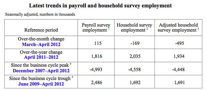
The point is that the two concepts are different. The following Table is taken from the BLS’s April 2012 release. The adjusted series is referred to as a “research series” by the BLS and attempts to bring the two concepts of employment closer together.
They adjust the household survey by “subtracting agriculture and related employment, nonagricultural self employed, unpaid family workers, private household workers, and workers absent without pay from their jobs, and then adding nonagricultural wage and salary multiple jobholders”.
The “household survey has a broader employment definition than the payroll survey” and so the former is always higher than the latter. They move in a similar cyclical pattern though with very similar turning points (troughs and peaks).
To begin, I have been examining the way in which employment growth in the US responds to real GDP growth. We might think of this in terms of employment intensity – the percentage response of employment growth to a one per cent change in real GDP growth.
I used quarterly National Accounts data provided by the US Bureau of Economic Analysis from 1947 and monthly labour force data from the US Bureau of Labor Statistics, which I converted into a quarterly frequency.
The questions I sought to answer for myself were:
1. What is the sensitivity of employment growth over the whole sample?
2. Was that sensitivity different over the peak to recovery periods for the last four recessions?
3. At what rate of real GDP growth does employment growth turn from trough to recovery?
In a further blog (next week maybe depending on my progress), I will put those questions into further context when I introduce a full decomposition framework for analysing the sources of the employment growth in the US at present.
But today we are aiming to be more modest – time prevents everything from happening at once.
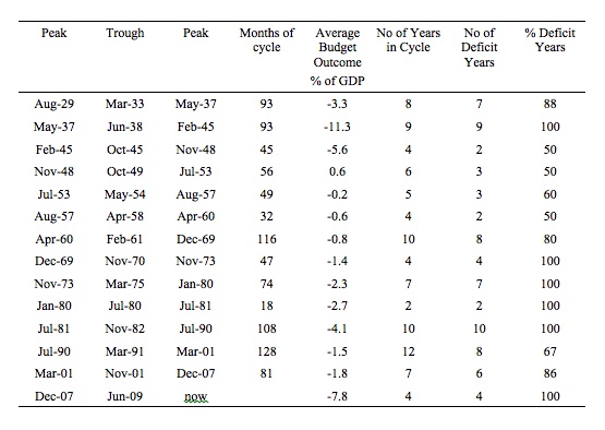
The standard business cycle dating for the US comes from the US National Bureau of Economic Research who provide a table of US Business Cycle Expansions and Contractions.
The following table presents a summary of the NBER recessions since the 1930s.
I selected the last four recessions to keep the analysis tractable in graphical terms – that is, to make it user-friendly out here in blog land. I have detailed econometric models for each of the recessions since the Great Depression and I will reveal that at another time in another format.
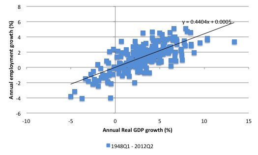
The following graph shows the annual changes in employment (vertical axis) against the annual real GDP growth rates (horizontal axis) from the first-quarter 1948 to the second-quarter 2012. The black line is a linear trend regression, which relates the annual growth in employment to the annual real GDP growth.
The coefficient on the real GDP term for the whole sample is 0.4404, which means in English that for a 1 per cent change in annual real GDP growth, employment growth expands by around 0.44 of a percent.
You can also gain some insight by seeing where the trend line cuts the x-axis – which represents what we might consider to be an employment threshold – the point after which real GDP growth stimulates employment growth.
For the whole sample, the line cuts at around the zero mark, which means that employment growth will be stimulated at very low levels of real GDP growth. So there is an instant employment dividend for stimulus measures that get growth moving again.
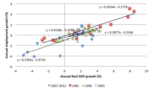
The next graph shows the annual changes in employment (vertical axis) against the annual real GDP growth rates (horizontal axis) for the last four recessions in the US (from the July 1981 episode) – from the peak period through the trough and then out 12 quarters from the peak.
It is clear that the current recession was deeper than the previous three recessions and the recovery somewhat more muted.
The 4 linear trend regression lines are accompanied by the ordinary least squares fit equation. For the 1981 recession, the coefficient on the real GDP term was 0.5034.
For 1991, the coefficient was 0.4538, which suggests that this recovery was accompanied by slightly higher productivity growth because the employment in persons response was lower than in 1982-83.
For 2001, the coefficient was lower again at 0.3877, meaning their were probably stronger productivity growth in this recovery. The employment response in this recovery is quite muted.
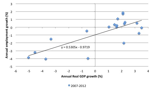
In the current recovery, the coefficient is 0.5305, which tells you that the economy is growing at a lower rate of accompany productivity growth at present. That means, among other things, that the economy eats into its unemployment pool more quickly for a given labour force growth rate.
The current “employment threshold” (the point where the regression line cuts the x-axis) – is no longer at zero but closer to 1.9 per cent (see separate graph for this recession only below). In other words, the real GDP growth rate that spurs an increase in employment growth is now higher. This threshold has shifted outwards since the 1980s recession – which is the topic of another research effort (more later).
It has also been shifting out in the EU and Britain and I will comment more on that when I know more.
But what about the US labour force data?
First, it is true that the labour force participation rate has fallen significantly in the course of the recession and weak recovery. The following graph shows the labour force participation rate (using BLS data) from January 2002 to September 2012. The peak participation rate in the latest period was achieved in January 2007 (66.4 per cent), just before the storm hit.
Later, I will show you what that means for the current unemployment rate.
The labour force is a subset of the working-age population (those above 15 years old) and is the sum of total employment and total unemployment.
The proportion of the working-age population that constitutes the labour force is called the labour force participation rate. So changes in the labour force can impact on the official unemployment rate and so movements in the latter need to be interpreted carefully. A rising unemployment rate may not indicate a recessing economy.
The labour force can expand as a result of general population growth and/or increases in the labour force participation rates.
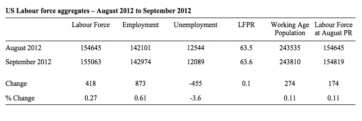
What about the change between August 2012 and September 2012. The following table summarises the changes in the main labour force aggregates.
So the participation rate rose by 0.1 percentage points between August 2012 and September 2012. The labour force grew (418 thousand workers were added) but employment added 873 thousand, which meant that unemployment fell by 455 thousand, and consequently the unemployment rate (which is the percentage of workers in the labour force that are unemployed) fell to 7.8 per cent.
The labour force growth outstripped the underlying growth in the working age population because more of the working age population chose to participate in September.
What was the impact of the participation rate increase in September 2012? Note the final column in the Table above. It calculates what the labour force would have been, given the underlying population growth, had the participation remained at the lower August figure. So it would have only grown by 174 thousand (as a result of underlying growth in the population) instead of 418 thousand.
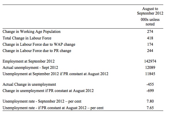
The following Table shows you what that means.
So the increasing participation rate added 244 thousand more workers to the labour force beyond the underlying population growth, which added 174 thousand.
Had the participation rate not increased, the unemployment rate would have fallen to 7.65 per cent rather than 7.8 per cent.
This all rests on employment growing by 873 thousand. How sure can we be of that?
The BLS provide a lot of information about the household data estimates in this document – Household data, reliability of estimates. You will see that for total employment their standard error is around 323 thousand.
That means that:
Approximately 68 percent of the intervals from one standard error below the estimate to one standard error above the estimate would include the true population value … [and] …
Approximately 95 percent of the intervals from 1.96 standard errors below the estimate to 1.96 standard errors above the estimate would include the true population value.
So we can be fairly certain that employment rose by at least 227 thousand in September 2012. Equally, we can be as certain that it rose 873 thousand or even 1.4 million. The standard errors are thus large but we know them and can take them into account when we draw conclusions.
But in my view the real issue is the situation over time – since the January 2007 peak participation rate.
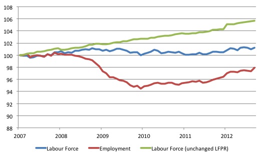
To see what that decline in participation means for the growth of the labour force, consider the following graph, which shows the actual labour force since January 2007 (indexed at 100) up to September 2012 (blue line) and total employment (red line).
The movement in the labour force is a combination of the declining participation rate and the growing working age population. The absolute change in the labour force over that time has been 1919 thousand persons, an increase of 1.25 per cent, which is very modest indeed.
Over the same period, employment has increased by 3054 thousand leading to a rise in unemployment of 4973 thousand.
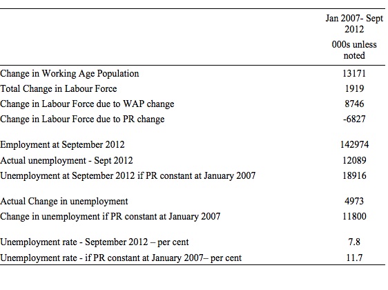
The green line shows what the labour force would have been if the participation rate had not declined since January 2007. The difference is a staggering 6827 thousand workers who have exited the labour force – most of whom would have joined the ranks of the hidden unemployed. If they had have stayed in the labour force, then as I show below, the unemployment rate would be nearer 11.7 per cent rather than 7.8 per cent.
I recomputed the numbers using the same method, which produced the tables above, but this time using the peak participation rate (66.4 per cent) as my benchmark.
And then did the same decomposition.
Summary – deplorable loss of jobs and loss of workers to unemployment and hidden unemployment.
Conclusion
I have run out of time tonight. I will have more to say about these issues in coming blogs.
For now, consider that the US economy is in a parlous state even though it is maintaining growth on the back of existing fiscal deficits. There is an urgent need to push growth faster and in an employment rich direction.
Any thoughts of following the European or UK austerity route should be expunged from the public debate immediately. The opposite is the need.
The problem is that the two major parties, from what I have been seeing in the current election campaign do not understand these issues. And then there is Jack Welch!
That is enough for today!
(c) Copyright 2012 Bill Mitchell. All Rights Reserved.


Welch’s was a smear. But what’s far worse the smear showed he’s stupid. He thought that it’s the unemployment number and not the number of unemployed that may be fatal for the incumbent.
First off: Thanks a lot, I haven’t seen such an in-depth comment and discussion on employment statistics somewhere else (which nonetheless could be my fault).
One methodological remark or question: You write
Which I think is a remarkable finding. One can follow that line of argument easily given the graph and your analysis. However, I wonder whether it is necessary – or more of a proof for that conclusion – if you would estimate a single regression model (instead of four separate ones) and include an interaction term allowing the model itself for estimating coefficients for the different slopes. Wouldn’t it then be possible – within that single model approach – to directly test whether the observed different slopes are – in statistical terms – indeed significantly different from each other which in turn would be a statistical test and eventually proof for your (descriptive) claim that the observed differences have more likely than not indeed a meaning? Well, I know that e.g. in sociology the approach of estimating different regression models for different groups, i.e. applying separate models, then comparing and interpreting the resulting coefficients, is more often than not the standard approach. But – provided there is a large enough sample deriving sufficient statistical power – I always find the single-model-method including suitable interaction terms more convincing in that it provides a measure of probability of the observation being real as opposed to the probability of just being noise. Based on my own experience in the field of social sciences I find it somewhat hard to believe that the differences you observed in the slopes in fig. 2 are statistically really different if tested against the counterfactual hypothesis, i.e. all being statistically “the same”. I for one would love to see that assumption challenged and tested by a single-model-approach…
Prof. Mitchell –
Thanks for the illuminating analysis.
Your view is that “employment growth in the US responds to real GDP growth”. I don’t wish to start a debate on formal cause-&-effect, just to offer an alternative view which may be helpful:
Assume employment drives GDP (ie. to contribute, one must be employed); your %change charts will then be transposed. The slopes are then around 2, suggesting that the employees in question are roughly twice as productive as the average, so the economy may be more sensitive to them than appreciated.
The offset in your 2007-12 chart similarly indicates a threshold GDP growth-rate (~ +2%/y) below which this employment will continue to decline (also credible).
If you can provide some correlation coefficients, we can see how definite these numbers are.