It's Wednesday and I discuss a number of topics today. First, the 'million simulations' that…
US labour market – is this a switch point?
Last week (June 7, 2013), the – US Bureau of Labor Statistics – released their latest – Employment Situation – May 2013 – which showed that in seasonally adjusted terms, total payroll employment increased by 175,000 in May while the Household Labour Force Survey data showed that employment rose by 319 thousand. The essence to be extracted from the data is that total employment in the US is not even keeping up with the underlying population growth. As a result the level of and the labour force shrunk by a further 496,00 persons. The twin evils – falling jobs growth and the unemployment rate edged up a little with participation constant. The question that needs to be asked is whether this is a turning point with slower growth and rising unemployment ahead. Certainly, the conservatives who claim that the budget cuts under the so-called sequestration have done no harm are way off the mark. The major part of those cuts will hit soon and already the employment situation is looking very fragile. The Gross Flows data also tells us that the probability of an employed person becoming unemployed is rising again and the probability of a new entrant getting a job is falling. Those transitions are signally a switch point. The budget deficit is currently large enough to just maintain activity. It should be significantly larger to keep the growth momentum in the right direction. The politics, however, militate against that despite the shaman on the Republican side losing their greatest authority – those Excel spreadsheet geniuses.
For those who are confused about the difference between the payroll (establishment) data and the household survey data you should read this blog – US labour market is in a deplorable state – where I explain the differences in detail.
The US Bureau of Labor Statistics also put out an excellent publication (May 4, 2012) – Employment from the BLS household and payroll surveys: summary of recent trends – which is worth reading.
The BLS say that:
Both the payroll and household surveys are needed for a complete picture of the labor market. The payroll survey provides a highly reliable gauge of monthly change in nonfarm payroll employment. The household survey provides a broader picture of employment including agriculture and the self employed.
You should also read the Employment Situation Frequently Asked Questions, which explains a number of things including why the payroll data is revised so much between months.
The point is that the two concepts are different.
The “household survey has a broader employment definition than the payroll survey” and so the former is always higher than the latter. They move in a similar cyclical pattern though with very similar turning points (troughs and peaks).
Focusing on the Household Labour Force Survey data, the seasonally adjusted labour force rose by 420 thousand in May 2013, while employment rose by 319 thousand with the labour force participation rate constant at 63.4.
Unemployment rose by 101 thousand and the unemployment rate edged up from 7.51 per cent to 7.56 per cent.
Employment growth has to absorb the increase in the labour force to ensure unemployment doesn’t rise. The task that economies typically face in a recovery from a deep recession is that the labour force growth, itself accelerates (due to the hidden or discouraged workers re-entering the labour force) and there is a huge residual pool of unemployed as to be absorbed.
Usually, employment growth is insufficient in the early stages of the recovery to absorb the unemployment quickly and so we observe the distinct cyclical asymmetry in the behaviour of unemployment over the economic cycle. It quickly rises but only falls slowly again.
In the case of the US labour market, the labour force pressure that typically slows the reduction in unemployment has not been visible in the recovery
not visible. In fact, as we will see below, the labour force participation rate continues to stagnate at below its pre-crisis peak, which takes pressure of the employment growth. But, of-course, that is not a good sign.
While employment growth fell by 0.14 per cent, the labour force declined by 0.32 per cent, which means that unemployment fell by 290 thousand even though employment also declined.
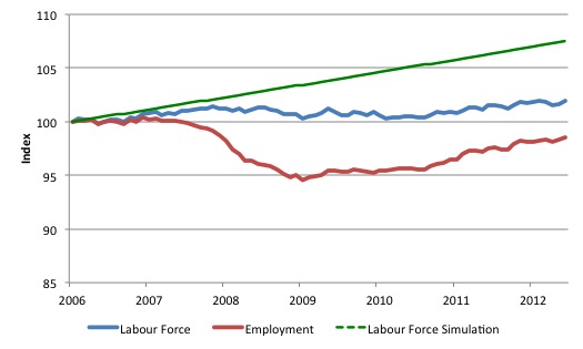
The following graph gives you an idea of what has been going on in the US since December 2006 (the low-point unemployment rate month of the last cycle). All series shown are indexed to 100 at December 2006. The graph shows the evolution of the labour force (blue), total employment (red) and what the labour force would have been (in index numbers) if it had have grown at its average rate over the period December 2001 to December 2006 (0.094 per cent per month).
The difference between the blue and red line is the growth in unemployment since December 2006, while the difference between the blue and green lines is the growth in hidden unemployment (as a result of falling participation).
In terms of actual numbers, the gap between the green and blue lines is equivalent to 8.5 million workers as at May 2013.
So you get an idea of how massive this recession has been for the US labour market. The sluggish labour force growth (1.9 per cent over the period since December 2006) is only slightly higher than the 1.4 per cent employment contraction. If the labaour force had have maintained its average growth as noted above then it would have grown by 7.5 per cent over the period covered by the graph.
The unemployment devastation would have been massive if not for the sluggish labour force growth. I will come back to the falling participation rate later.
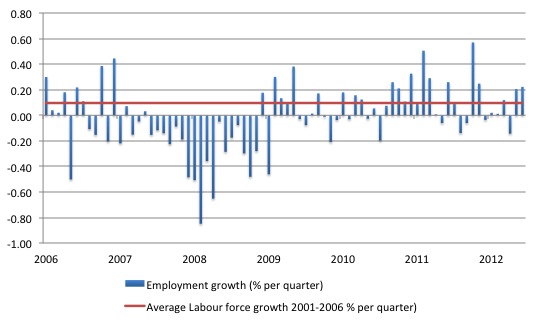
The following graph shows the monthly employment growth since the low-point unemployment rate month (December 2006). The red line is the average labour force growth over the period December 2001 to December 2006 (0.094 per cent per month). The unemployment rate rises if the employment growth is below the labour force growth rate.
What is apparent is that a strong positive and reinforcing trend in employment growth has not yet been established in the US labour market since the recovery began back in 2009. The labour market has definitely not set a sail for sustained recovery yet and remains in a very fragile state.
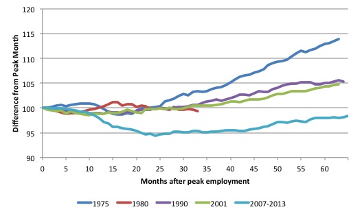
As a matter of history, the following graph shows employment indexes for the US (from US Bureau of Labor Statistics data) for the five NBER recessions since the mid-1970s.
They are indexed at the NBER peak (which doesn’t have to coincide with the employment peak). We trace them out to 64 months or so, except for the first-part of the 1980 downturn which lasted a short period.
It was followed by a second major downturn 12 months later in July 1982 which then endured. The current downturn has lasted 65 months and employment is still below the starting point of 100 (currently the index stands at 98.4).
Falling participation
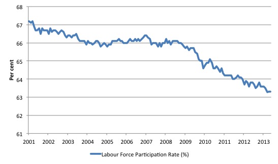
What really is striking about the last few years in the US is the falling participation rate. The following graph shows the labour force participation rate (the proportion of those above 16 years of age that are in the labour force – that is, employed or officially unemployed) since January 2001.
Clearly, there has been a trend decline in the labour force underpinning the sharp cyclical acceleration from late 2007.
Examining participation rates provides us with information about what is happening on the margin of civilian working age population and the labour force. If, for example, the participation rises, unemployment can rise even though employment growth is strong. That is a virtuous sign because it means that the economic situation is improving and discouraged workers are coming back into the labour force as the jobs market looks more hopeful.
We juxtapose that situation with one where the participation rate is falling – which suggests discouraged workers are giving up on job search because of the dearth of vacancies available and even though unemployment might actually fall, the signs are bleak. All that sort of economy is doing is trading official unemployment for hidden unemployment. The weakness just leaves the labour force.
The fall in participation since December 2006 has been stark – from 66.4 per cent to 63.3 per cent in March 2013. What does that mean in numbers?
You can compute how much larger the labour force would be if the participation rate now was at its recent (December 2006) peak by working out the current working age population and multiplying it by the peak labour participation rate.
The difference between the actual labour force now and the “potential” labour force represents the number of workers that have given up looking for work as a result of the lack of job opportunities available, upon the assumption that there have been no sharp rise in retirements.
This difference is approximately what we might call the rise in hidden unemployment and in the case of the US is equal to 7,623 thousand workers.
If we added them back into the labour force and considered them to be unemployed (which is not an unreasonable assumption given that the difference between the two categories – unemployment and hidden unemployment is due to whether the person had actively searched for work in the previous month) – then the unemployment rate would rise to 11.9 per cent rather than the current official unemployment rate of 7.6 per cent.
So there is a huge degree of slack not counted among the official unemployed in the US and tells us that the unemployment rate is likely to be a very misleading indicator of how the US economy is faring.
In other words, a lot of the continuing slack is being hidden in the not in the labour force category. If employment growth speeds up then we can expect to see unemployment rise as the participation rate rises due to improving opportunities for employment. That is not happening yet as the participation rate is continuing to fall.
Long-term unemployment
The BLS report that the average duration of unemployment is now 36.9 weeks and continues to rise. In December 2006 it was 16.1 weeks.
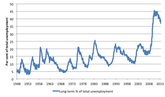
The upshot is that the US labour market has for the first time a serious long-term unemployment problem. The following graph shows the evolution of this proportion (those unemployed for 27 weeks or more as a percentage of the total unemployed) since January 1948. The previous recessions are indicated by the spikes up to around 25 per cent.
The most recent recession is an outlier in terms of severity with the proportion peaking at 45.6 per cent in June 2010. In May 2013, the proportion was 37 per cent.
Many mainstream economists consider the problem in the US to be structural and conclude that the long-term unemployed are largely “unemployable”. This perspective goes back to the start of the neo-liberal onslaught.
The rising long-term unemployment has allowed the neo-liberal assertions that were highly influential in the design of the 1994 OECD Job Study to resurface – this time (and for the first-time) in the context of the US debate. The long-term unemployment rates have always been higher in Europe and Australia.
The Jobs Study was the bible for governments everywhere, which were intent on abandoning their commitment to full employment and, instead, concentrate labour market policy on supply-side initiatives. This was the so-called activism agenda – the pursuit of “employability” rather than ensuring there were enough jobs available. It was claimed that persistent unemployment was due to poor attitudes and lack of training.
The principle claim was that long term unemployment possessed strong irreversibility properties. Irreversibility is sometimes referred to as hysteresis and suggests that the long term unemployed constitute a bottleneck to economic growth which can only be ameliorated through supply-side (rather than demand-side) policy initiatives.
The OECD considered that only by “market-based” developments – privatising public employment services, harsh welfare-to-work changes, tightened activity tests, reductions in the real value of income support for the unemployed etc – that this alleged irreversibility would be alleviated.
The problem is that the facts never supported the ideologically-obsessed narrative that the neo-liberals pushed, which were used to justify the dismantling of the public sector and the privatisation of labour market programs. Unemployment did not fall until there was strong enough growth in aggregate demand.
The reason? Please read my blog – What causes mass unemployment? – for more discussion on this point.
In earlier work that I have done studying the rise in long term unemployment I found no evidence that there had been any major structural shifts in the relationship between long-term unemployment and total unemployment in most nations.
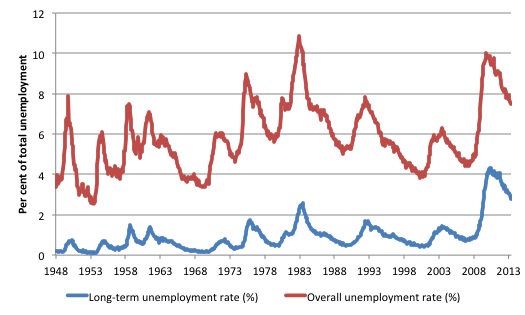
The sharp rises in long-term unemployment occur as a consequence recessions. In the next graph you can see this very clearly. The long-term unemployment rate (LTUR) rises with a slight lag with the official unemployment rate (UR). The lag is because it takes 27 weeks in the US classification system before a person who becomes unemployed today is counted as being long-term unemployed.
So during a prolonged downturn, the flows into short-term unemployment feed longer duration spells of unemployment which then cascades over into long-term unemployment. All the dynamics of the LTUR are demand-driven. I have never been able to construct them as steady structural shifts driven by behavioural supply side changes.
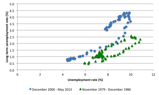
The next graph compares the relationship between the official unemployment rate (horizontal axis) and the long term unemployment rate (vertical axis) for two cycles coinciding with the 1982 recession (green markers – low-point unemployment rate – November 1979 was 5.9 per cent) and the current downturn (blue markers – low-point unemployment rate – December 2006 was 4.4 per cent). The data for the 1982 recession shows that the economy started with a higher unemployment rate which rose sharply and drove a rise in the long-term unemployment rate.
In the recovery phase, the long-term unemployment rate dropped (in a lagged pattern) with the improvements in the official unemployment rate.
The current recession started from a better position but has endured for longer even though the unemployment rate only rose to 10 per cent rather than 10.8 per cent in November 1982. It is the persistent of the slackness that accounts for the continuing rise in the LTUR.
But if you compare the actual slope of each of the recoveries (one the LTUR peaks and starts to fall again) they are almost identical. So just as the LTUR fell to low levels as the 1982 recovery strengthened, I would expect the same to happen in the current period. However, the longer the recovery is stalled the worse the consequences are for those who remain long-term unemployed.
We can add a bit more graphical insight to this discussion given the excellent data provided by the BLS.
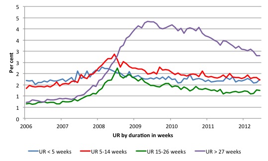
You can see that more clearly in the following graph which shows the same time series from December 2006 (the low-point unemployment rate month of the last cycle) to May 2013 of the unemployment rate (%) by duration segments in weeks. The marked feature of this recession compared to earlier downturns (not shown) is the extent of the rise in those unemployed for longer than 27 weeks as a proportion of the labour force.
That is a guide to the entrenched nature of the event and the fact that employment growth in the recovery has been insufficient to eat in to the pool of unemployed that built up in 2008-09.
The sequence of movement through the duration categories is very evident as the recession deepened and the employment response was weak. The US government should have intervened earlier and with more significant employment-orientated stimulus packages to prevent that duration wave occurring.
Once you see long-term rising like that the losses mount and the labour market recovery becomes more difficult because not only have the people been dislocated from paid employment for a long time but their skills and capacities start to atrophy, which then introduces an additional problem.
Gross Flows Analysis
To fully understand the way gross flows are assembled and the transition probabilities calculated you might like to read these blogs – What can the gross flows tell us? and More calls for job creation – but then. For earlier US analysis see this blog – Jobs are needed in the US but that would require leadership
The data is available from these extremely cludgy – Data Retrieval App – from the BLS. Please bring back the capacity to access the large historical text-file dump for the entire gross flows data – please!!!
Transition probabilities are calculated from Gross labour flows data which is available from the Data Retrieval App – provided (against better judgement) by the US Bureau of Labor Statistics. By way of refreshing your understanding, gross flows analysis allows us to trace flows of workers between different labour market states (employment; unemployment; and non-participation) between months. So we can see the size of the flows in and out of the labour force more easily and into the respective labour force states (employment and unemployment).
The various inflows and outflows between the labour force categories are expressed in terms of numbers of persons which can then be converted into so-called transition probabilities – the probabilities that transitions (changes of state) occur. We can then answer questions like: What is the probability that a person who is unemployed now will enter employment next period?
So if a transition probability for the shift between employment to unemployment is 0.05, we say that a worker who is currently employed has a 5 per cent chance of becoming unemployed in the next month. If this probability fell to 0.01 then we would say that the labour market is improving (only a 1 per cent chance of making this transition).
The following table shows the schematic way in which gross flows data is arranged each month – sometimes called a Gross Flows Matrix. For example, the element EE tells you how many people who were in employment in the previous month remain in employment in the current month. Similarly the element EU tells you how many people who were in employment in the previous month are now unemployed in the current month. And so on. This allows you to trace all inflows and outflows from a given state during the month in question.
The transition probabilities are computed by dividing the flow element in the matrix by the initial state. For example, if you want the probability of a worker remaining unemployed between the two months you would divide the flow (U to U) by the initial stock of unemployment. If you wanted to compute the probability that a worker would make the transition from employment to unemployment you would divide the flow (EU) by the initial stock of employment. And so on.
So for the 3 Labour Force states we can compute 9 transition probabilities reflecting the inflows and outflows from each of the combinations.
Analysing movements in these probabilities over time provides a different insight into how the labour market is performing by way of flows of workers.
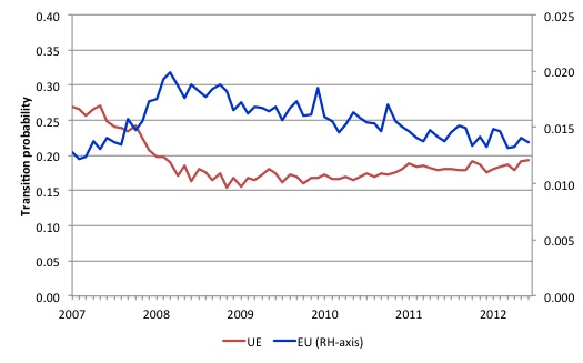
The next graph shows the transitions for EU and UE from December 2007 (when the crisis hit the US labour market) up to May 2013.
The probability of an American (in general) losing their job if employed (blue line) rose throughout 2008 (peaking at 2 per cent in February 2009), slowly evened out and is now slowly falling (1.2 per cent in May 2013).
In December 2009, the chance of an unemployed American worker gaining employment was 27 per cent. This probability fell to a low of 15.4 per cent in October 2009, and scudded along at around 17 per cent through much of 2010-2011. It peaked again in September 2012 at 19.2 per cent, but as the impacts of the fiscal retreat started to impact, it fell to 17.6 per cent.
It has risen again in recent months and is now around 19.3.
This is not a rapid recovery and there is no definite pattern of growth visible as yet. The US labour market appears to be stuck in a vicious cycle of flat private spending and confidence and an unwillingness of the US government to stimulate sufficiently to fill the gap and create work.
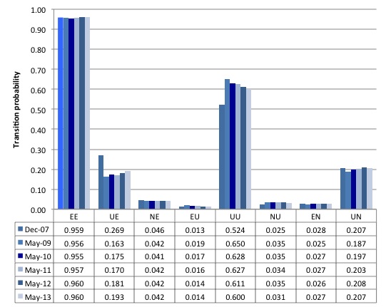
The second graph compares the US transition probabilities for various months during the crisis up until May 2013 (see the accompanying Table for values). I have also jigged the vertical and horizontal scales to allow the changes in the columns to be seen more clearly. That is one of the reasons I also provided the raw data.
Several points by way of interpretation can be made.
First, the data shows that the EE probability is now stable – that is, the likelihood an employment person will remain employed in the next month (not necessarily with the same employer though) – is about what is was at the start of the crisis. That is a good sign.
Second, the EU probability (employment to unemployment) has fallen since the early days of the crisis but is now steady at 14 per cent.
Further, the EN probability has risen marginally indicating that employed workers are now increasingly likely to flow out of the labour force once they lose their jobs – that is, they become hidden unemployed.
Third, the likelihood of a new entrant getting a job (NE) is fairly flat after some initial improvement in 2010. But it still remains that new entrants are more likely to become employment (NE) than enter the labour force unemployed (NU).
Fourth, the probability of an unemployed worker remaining unemployed (UU) continues to improve, although the likelihood that such a worker will leave the labour force (UN) is higher than the likelihood of them getting a job (UE) and the former probability has risen over the last 2 years, which is not a good sign (and is consistent with the continued deterioration in the participation rate).
Overall, the Gross Flows data suggests the slight improvement in the US labour market during 2012 is now tapering. There is a lot of statis in the data, which can be interpreted as the economy is approaching a switch point.
Growth is not strong enough to budge the inertia and there are signals that it is slowing and a reversal of the gains made to date might be coming.
Conclusion
While the political impasses in the US Congress have been comical and the conservatives are doing their best to impose austerity on the nation, the fact that the austerity is only partial to date (and the Democrats are certainly not “expansionists”).
This has kept a budget deficit large enough to support growth and allow some confidence to be regained in the private sector.
The results is that there is a very weak recovery going on that is barely filtering into the labour market.
The problem is that the bulk of the sequestration cuts will start impacting over the next 12 months at a time when the recovery is fragile and the economy appears to be on a knife edge.
The labour market data published last week by the BLS certainly indicates that a switch-point might have been reached. The improvement is slowing and many indicators have become stuck.
The labour force data for May 2013 and the on-going disaster the other side of the Atlantic should be sending a strong signal to all US politicians that fiscal austerity is the last thing the economy needs at present
In that sense, they might read a Bloomberg editorial (June 6, 2013) – Austerity Principles, or How to Save an Economy in Crisis.
The analysis has problems but it is absolutely correct when it concludes:
Studies, including some completed in recent weeks, show no correlation between debt today and growth tomorrow. And there certainly is no special number at which debt becomes crippling, such as the 90 percent debt-to-GDP ratio that some attribute to Reinhart and Rogoff …
Fiscal expansion works …
Fiscal contraction can backfire … the idea of expansionary fiscal contraction is a contradiction. No place illustrates this better than the euro area, where austerity budgets have been imposed on debt-laden countries. The result is that the euro zone is mired in recession for the sixth consecutive quarter …
Currencies matter. One important factor is whether a country controls its currency …
Sounds almost like they are proponents of Modern Monetary Theory (MMT)!
That is enough for today!
(c) Copyright 2013 Bill Mitchell. All Rights Reserved.

Any idea how much of an effect the baby boomers reaching retirement age is having on the participation rate?
Bloomberg goes MMT ….
Nice to see them finally accepting reality.
@markg: That’s an interesting question, and I don’t think the direction is clear. Although retirements of Baby Boomers would reduce the participation rate, many of the companies will replace BB with new employees, so there would be a swap of an unemployed person for a retiree. Also, the retirees will drive demand in the economy, from their tourism, from their visits to grandchildren, from their medical care, from their assisted living care, and from their bequeaths to survivors (who subsequently spend some of the gift).
I think the factor to consider is if their spending as a retiree is more labor-creating than their spending as a worker. While retirees may spend less in retirement than they would have spent as a worker, they may spend on goods and services that require more labor to produce, compared to the goods and services they bought as a worker.
Take care, Joel
Middle aged working families lever up. As they raise children they need bigger cars, bigger houses, bigger food budgets, huge education expenses, etc. Retirees delever, downsize houses, downsize cars, stop spending on education.