Regular readers will know I have been assessing the evolving data concerning the longer-run impacts…
Latest Australian vacancy data – its all down to deficient demand
The continuing obsession among policy makers combines fiscal austerity and deregulation (particularly of labour markets) as the hope for prosperity. I know these are just catch cries that aim to obfuscate the underlying intent which is to redistribute real income away from workers. But even that conspiracy theory has certain problems when you realise that business doesn’t necessarily do very well in general when economies are locked in a recessive mire. The structural reform argument goes that growth can be engendered by deregulating the labour market to remove inefficiencies that create bottlenecks for growth even when fiscal austerity is slashing aggregate demand and killing growth. The 1994 OECD Jobs Study the provides the framework for this policy approach. The only problem is that it failed even before the crisis emerged. But with policymakers intent on slashing aggregate demand, which they know will kill growth, they have to offer something that they can pretend will generate growth. The structural reform agenda has zero credibility in the same way that fiscal austerity has zero credibility. The latest vacancy data from Australia continues to provide an evidential basis for rejecting both conservative agendas.
The Australian Bureau of Statistics released the latest Job Vacancy data last week (June 27, 2013) for the May-quarter 2013. The highlights (seasonally adjusted) are:
- Over the year to the May-quarter 2013, job vacancies have fallen by 33.2 thousand or 19.3 per cent.
- Over the last quarter, job vacancies have fallen by 6.1 thousand or 3.3 per cent.
- Vacancies in the private sector fell by 29 thousand or 18.5 per cent, while vacancies in the Public sector fell by 4.3 thousand a decline of 28 per cent over the last 12 months.
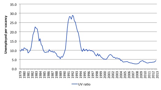
- The unemployment-vacancy ratio (a measure of the strength of the labour market) was 3.6 in May 2011 and has risen to 4.5 in the May-quarter 2013, a sign of a deteriorating labour market overall. This is still a long way from the astronomic value of 28.2 in the third-quarter 1991, at the height of that recession.
The Sydney Morning Herald report (June 28, 2013) – Tough competition for fewer job vacancies% – emphasised the rising unemployment to vacancy ratio, which is a measure economists such as yours truly use to assess the strength of labour demand in the economy.
The SMH article says:
New figures show there are now five unemployed people for every vacant job in Australia, as two economic forces work in opposition: the number of job vacancies has fallen in the past year, while the number of unemployed has increased by 50,000.
In the absence of information to the contrary, a rising ratio suggests things are getting tougher, especially if vacancies are falling while unemployment is rising. However, those who preach the view that structural impediments are the main problem suggest that a rising ratio can arise because of a shift in the underlying relationship between unemployment and vacancies.
I last wrote about this topic in the blog – Serial liars who stand for nothing that is worth supporting.
Other related blogs include – Labour market deregulation will not reduce unemployment and The OECD is at it again and Extending unemployment benefits … an omen and Nobel prize – hardly noble.
The Unemployment-Vacancies ratio in Australia looks like this – for the period May 1979 to May 2013. You can see the impacts of the two major recessions in this period (1982 and 1991).
So it is true that a ratio now of 4.95 – that is, around 4.5 unemployed persons per unfilled job – is low relative to the peak of May 1992 when the ratio was 29, it remains the case that there are many more people unemployed competing for scarce jobs than there were before the crisis started to impact.
Further, underemployment is now much higher than in 1982 (when it was largely non-existent) and 1991 (when it started to rise to current levels) and so the unemployed now have to compete for jobs with new entrants, other unemployed and the near 900 thousand unederemployed (7.5 per cent of the labour force).
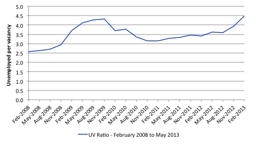
The next graph zooms in on the most recent period – February 2008 (which was the low-point unemployment rate in the last cycle) to May 2013 (the latest data).
The UV ratio is now higher than it was at the peak of the downturn in 2009, before the fiscal stimulus started to support the economic recovery.
With no structural changes obvious in this period, it is hard to argue that the rising ratio is the result of anything other than a declining aggregate demand situation – that is, a lack of job creation.
Economists have long used the unemployment-vacancy (UV) relationship, the so-called Beveridge curve, which plots the unemployment rate on the horizontal axis and the vacancy rate on the vertical axis to investigate these sorts of questions.
The Beveridge curve is named after the British economist William Beveridge who was influential in defining the full employment agenda in the Post World War 2 period in the UK (and, arguably in most advanced nations). He is the guy that the British Labour politicians are falling over each other to channel to try to convince the British people that their soft austerity is right out of the Beveridge handbook. Like all snake-oil salespersons, this lot are just second-rate neo-liberals – that is, they haven’t the gumption to pursue the free market agenda to its logical end but just play around the edges.
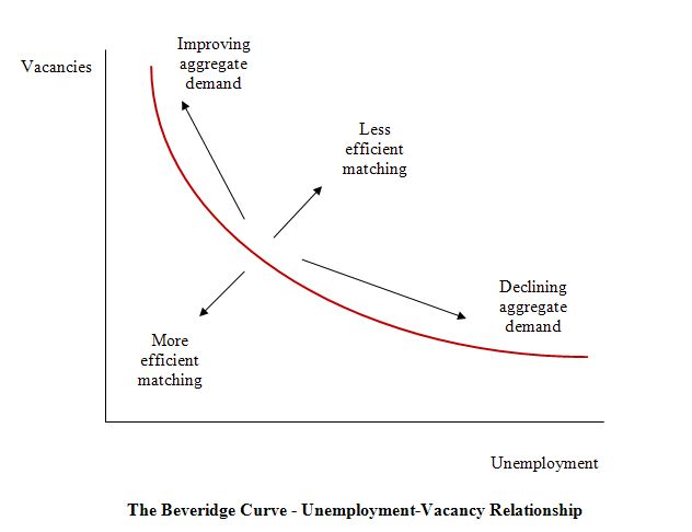
The following diagram is the usual depiction of the UV relationship with vacancies on the vertical axis and unemployment on the horizontal axis. The red line is a UV curve at some point in time.
The logic is that movements along the curve are cyclical events and shifts in the curve are alleged to be structural events. So a movement “down along the red curve” to the south-east suggests a decline in the number of jobs available due to an aggregate demand failure, while a movement “up along the red curve” indicates improved aggregate demand and lower unemployment. If unemployment rises in an economy where there are movements along the UV curve it is referred to as “Keynesian” or “cyclical” unemployment – that is, arising from a deficiency in aggregate demand.
However, the notion that there is a neat decomposition between shifts in and movements along the curve is highly contested and has not been reliably established in the empirical or theoretical literature.
One of my earliest papers, which came from my PhD work was published in 1987 – ‘The NAIRU, Structural Imbalance and the Macroequilibrium Unemployment Rate’, Australian Economic Papers, 26(48), pages 101-118 – showed that structural imbalances (supply constraints) can be the result of cyclical variations and can be resolved, in part, by attenuating the amplitude of the downturns using fiscal policy.
In other words, there is no decomposition as the mainstream would like us believe.
This is reinforced by work I did a decade ago where it is clearly shown that where the UV curve shifts, almost always the shifts were associated with major recessions which generated structural-like changes in the labour market. In other words, the shifts are driven by cyclical downturns (aggregate demand failures) rather than any changes in autonomous supply side behaviour (like worker attitudes changing, or welfare policy introducing distortions to incentives, etc). More about which later.
As a digression, I am in the process of creating an on-line repository of all my written academic work in referred journal (more than a hundred articles) since my first publication back in 1982
The mainstream search literature (for which Nobel Prizes have been awarded) claims that “shifts in the curve” (out or in) indicated non-cyclical (structural) factors were causing the rising falling unemployment. The prize winners claimed this meant that if the UV curve was shifting out then the labour market was becoming less efficient in matching labour supply and labour demand and vice versa for shifts inwards.
The factors that allegedly “cause” increasing inefficiency are the usual neo-liberal targets – the provision of income assistance to the unemployed (dole); other welfare payments, trade unions, minimum wages, changing preferences of the workers (poor attitudes to work, laziness, preference for leisure, etc).
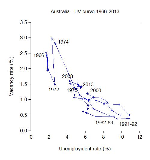
The following graph plots the Beveridge (UV) curve for Australia from 1966 to 2013. The vacancy rate (vacancies as a percent of the labour force) is shown on the vertical axis and the unemployment rate is shown on the horizontal axis. The 2013 observations is the average of the first 6 months of this year.
In the period from 1966 to the mid-1970s, the UV curve was very steep indicating that the economy was at full employment (2 per cent unemployment) and there were always more vacancies unfilled than workers to fill them.
This was a very dynamic period because the firms had to structure their jobs to be attractive in order to entice the scarce supply of workers to take them. The firms also invested heavily in capital equipment to reduce labour inputs and this accelerate productivity (and real wages) growth.
The outward shifts in the UV curve are clearly evident. These outward shifts were common around this time and later (early 1990s) in many nations.
The architects of the OECD Jobs Study – LSE economists Layard, Nickell and Jackman – [Reference: Layard, R., Nickell, S. and Jackman, R. (1991) Unemployment, Macroeconomic Performance and the Labour Market, Oxford University Press: Oxford] were instrumental in misleading the public (and policy makers) about these shifts.
They argued (Pages 4, 38) that these shifts are due to a failure of the unemployed to seek work as effectively as before. They explained the outward shift in the European Beveridge curve by:
… a fall in the search effectiveness … among the unemployed.
They later claimed that (Page 268) that the UV shift were due to “the rise in long-term unemployment, which reduces search effectiveness …”
What does this mean?
LNJ (Page 38) offered the following explanation:
Either the workers have become more choosey in taking jobs, or firms become more choosey in filling vacancies (owing for example to discrimination against the long-term unemployed or to employment protection legislation.
They suggested that the first reason dominates.
There was always what economists call an “observational equivalence problem” in attempting to test for this. This sort of problem arises when movements in the data are consistent with competing theoretical explanations.
In this case, job search time will lengthen when there are large cyclical downturns and the probability of gaining a job decreases.
But with high UV ratios (at the time), it becomes a fallacy of composition to conclude that if all individuals reduced their reservation wage to the minimum (to maximise supply-side search effectiveness) that unemployment would significantly fall (given the small estimated real balance effects in most studies).
Further, unless growth in labour requirements is symmetrical and labour force growth steady on both sides of the business cycle, the pool of unemployed can rise and remain persistently high.
While it is impossible to directly test changes in the motivation of individuals independent of the hypothesis that the shifts are collateral damage of severe recessions the dates when the UV curve shift should give you a good idea of what is going on.
The Australian Beveridge curve shown above exhibited a substantial outward shift during the 1974-75 recession (the first OPEC oil shock). Later instability is apparent in 1982-83 and then 1991-92. These were times of massive recession – refer also back to the first UV graph for further information.
It is no surprise that these shifts or periods of instability occurred during major demand-side recessions. That is, they are driven by cyclical downturns (macroeconomic events) rather than any autonomous supply-side shifts.
At these times, there was no major shift in any policies which the neo-liberals have identified as “structural impediments” to search-effectiveness. The Australian experience is replicated in every nation I have examined closely. The notion that the shifts in the UV curve are due to some policy-induced structural deterioration in search effectiveness beggars belief.
To advance the view that the workers suddenly choose this sharp rise in unemployment and then to design policies which hack into unemployment benefits and other protections to stop reduce the “incentives” for the unemployed to remain that way also beggars belief.
However, undaunted by some empirical evidence, the work of LNJ provided much of the “academic” justification for the OECD Jobs Study agenda, which was released in 1994.
The Jobs Study, exploited the misinformation about the shifts in the UV curve and set out the blueprint for labour market deregulation which has dominated the last 15 or so years. Governments around the world started to implement the OECD agenda – the so-called labour market activism – with more or less vigour.
The OECD constantly pressured governments to abandon the hard-won labour protections which provide job security and fair pay and working conditions for citizens.
Their solution? Cut benefits, toughen activity tests, eliminate trade union influence, abandon minimum wages and reduce any subsidies that prolong the search propensity by workers.
The result? Even before the crisis, unemployment remained well above the full employment levels in most nations; real GDP growth was muted relative to the past; real wages growth has been suppressed relative to productivity growth – leading to a massive redistribution of real income to profits; private gross capital formation has been lower than in the past.
Most economies failed to provide enough employment relative to the preferences of the labour force and persistent demand-deficient unemployment was accompanied by rising underemployment in many countries.
Assessment: the deregulation agenda was a failure.
Even the OECD had to make concessions in this regard.
In the period leading up to the crisis, there was a lot of work aimed at establishing the empirical veracity of the orthodox view that unemployment rose when real wages and workplace protections increased. This has been a particularly European and English obsession. There has been a bevy of research material coming out of the OECD itself, the European Central Bank and various national agencies, in addition to academic studies.
The overwhelming conclusion to be drawn from this literature is that there is no conclusion. These various econometric studies, bias their analyses in favour of finding validity in the orthodox line of reasoning. However, even then, they provide no consensus view as Baker et al (2004) show convincingly.
Just prior to the crisis, partly in response to the reality that active labour market policies have not solved unemployment and have instead created problems of poverty and urban inequality, some notable shifts in perspectives are evident among those who had wholly supported (and motivated) the orthodox approach which was exemplified in the 1994 OECD Jobs Study.
In the face of the mounting criticism and empirical argument, the OECD began to back away from its hard-line Jobs Study position. In the 2004 Employment Outlook, OECD (2004: 81, 165) admitted that “the evidence of the role played by employment protection legislation on aggregate employment and unemployment remains mixed” and that the evidence supporting their Jobs Study view that high real wages cause unemployment “is somewhat fragile.”
Then in 2006, the OECD Employment Outlook entitled Boosting Jobs and Incomes, which claimed to be a comprehensive econometric analysis of employment outcomes across 20 OECD countries between 1983 and 2003 went further. The study sample for the econometric modelling included those who adopted the Jobs Study as a policy template and those who resisted labour market deregulation. The Report revealed a significant shift in the OECD position. OECD (2006) finds that:
- There is no significant correlation between unemployment and employment protection legislation;
- The level of the minimum wage has no significant direct impact on unemployment; and
- Highly centralised wage bargaining significantly reduces unemployment.
The only robust finding that the OECD (2006) demonstrated was that employment protections do not impact on the level of unemployment but merely redistribute it towards the most disadvantaged – including the youth who have not yet developed skills and have little work experience.
That point is obvious. In a job-rationed economy, supply-side characteristics will always serve to only shuffle the unemployment queue. The problem is a shortage of jobs. Unemployment dances very closely to labour demand not labour supply.
Unemployment dancing to labour demand
You will increasingly hear in the coming months policy makers and business lobbyists calling for more structural reform in the labour market. The extreme versions will claim that growth is being constrained by the labour market – thus diverting attention from the fact that firms only employ if they can sell the production that is created.
This diversionary tactic denies that unemployment is a demand phenomena – arising due to a deficiency in demand.
Instead the notion is that unemployment is a result of supply-side constraints that have to be eliminated through deregulation.
The reality is that unemployment is typically a demand phenomenon – that is, it reflects a systemic failure to create enough jobs as a result of deficient aggregate demand.
The Australian Government’s position is standard supply-side, which has been exposed over several decades to be a false depiction of how unemployment occurs.
It is difficult to mount a search-based explanation for mass unemployment when there are not enough jobs being generated relative to labour supply.
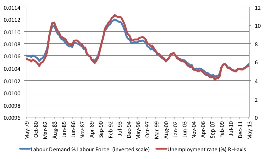
In the following graph, we show the unemployment rate is plotted on the right-hand scale against the sum of employment and vacancies (as a percentage of the labour force) as a measure of labour demand on the left-hand scale (inverted). The correspondence between the two series is striking and the variation in the unemployment rate is closely associated with the evolution of demand.
If unemployment rates were the result of supply-changes (such as preferences for work, or welfare benefits etc) then this close correspondence would not occur. The fact is that unemployment is the driven by insufficient demand for labour, which, in turn, is driven by aggregate demand deficiencies.
The following graph shows the unemployment rate on the left hand scale plotted against the sum of employment and vacancies (as a percentage of the labour force) as a measure of labour demand on the right hand scale (inverted) from the first-quarter 1978 to the third-quarter 2011 (that is, the data incorporates the latest vacancy information released today).
The correspondence between the two series is striking and a major part of the variation in the unemployment rate is clearly is associated with the evolution of demand.
You can see that labour demand is no falling again – after the effects of the fiscal stimulus through 2010-11 have started to wane upon its withdrawal.
The late Franco Modigliani presented similar graphs for France, Germany, and the United Kingdom, which shows that as job availability declines the unemployment rate rises, with the concomitant outcomes that the search process lengthens as does the average duration of unemployment. Modigliani (2000: 5) concluded:
Everywhere unemployment has risen because of a large shrinkage in the number of positions needed to satisfy existing demand.
Reference: Modigliani, Franco (2000) ‘Europe’s Economic Problems’, Carpe Oeconomiam Papers in Economics, 3rd Monetary and Finance Lecture, Freiburg, April 6.
Where data is available, you could draw similar graphs for most nations.
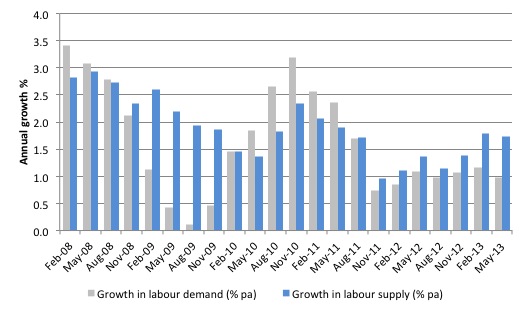
The next graph shows the growth in labour demand and labour supply (measured as above) from February 2008 to May 2013 (the current cycle). The impact of the fiscal stimulus in 2010 and into 2011 is clear as is the withdrawal of the same and the slowdown in investment in mining in more recent quarters.
Phase diagrams
To examine the demand versus supply issue further, we can examine some phase diagrams.
I first started using phase analysis in this 2001 paper – Exploring labour market shocks in Australia, Japan and the USA, which has since been published but you can get the free working paper version at the link provided. You will find reference in that paper to other relevant material if you are interested.
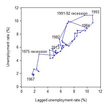
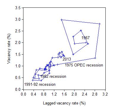
The following two phase diagrams show the current values of the respective time series plotted on the y-axis against the lagged value of the same series on the x-axis. The annual data is from 1966 to 2013 (so the graphs are for 1967 to 2012 given the lagged values).
These scatter plots are helpful in four distinct ways:
First, the charts provide information on whether cycles are present in the data.
Second, the presence of “attractor points” can be determined. The points might loosely be construed as the middle of each of the traced-out ellipses.
Third, the magnitude of the cycles can be inferred by the size of the cyclical ellipses around the attractor points.
Fourth, the persistence (strength) of the attractor point can be determined by examining the extent to which it disciplines the cyclical observations following a shock. Weak attractors will not dominate a shock and the relationship will shift until a new attractor point exerts itself.
The first graph shows the phase diagram for the Australian unemployment rate while the second graph shows the phase diagram for the vacancy rate.
Australia shifted its attractor in the 1974-76 period and the two subsequent recessions have oscillated around this higher point with varying cyclical magnitude. The explanation for Australia’s persistently high unemployment rate revolves around the factors that generated the shift.
It is also clear that the economy takes several years to recover from a large negative shock even if the attractor remains constant. Japan, also shifted its attractor in the period following the first oil shock. The extent of the shift compared to Australia was small. There was also a relatively speedier resolution to the 1980s downturn compared to Australia.
The next graph shows phase diagram for the vacancy rate. Once again, the 1974-75 disturbances in the unemployment rate attractor in Australia also promoted a shift in the vacancy rate attractor, although in this case the movement was downwards.
The supply-side analysis interprets the unemployment shift (and outward movements in the UV curve above) as indicative of a decline in labour market efficiency. The cure – structural adjustment aka labour market deregulation.
But using the same logic, we would interpret the inward shift in the vacancy relationship as a sign of increasing efficiency in the process that matches labour supply and labour demand (less unfilled vacancies are present at any time).
Clearly, both states cannot hold. The unemployment behaviour cannot be indicating a deteriorating structural efficiency while the vacancy relationship is depicting the opposite.
A consistent interpretation for both movements can be found in the view that the Australian economy has been demand constrained as a result of a regime shift in government policy in the mid-1970s. That is, the increasing dominance of neo-liberal and fiscal austerity. The same findings can be found for other nations with the same explanation.
The rapid rise in unemployment in 1974 was so large that subsequent (lower) growth with on-going labour force and productivity growth could not reverse the stockpile of unemployed.
Whatever endogenous supply effects that may have occurred in skill atrophy and work attitudes were not causal but reactive.
The phase diagram analysis suggests that to restore full employment, the economy needs a major positive shock of a sufficient magnitude to shift the current attractor point downwards.
It is almost definite from the earlier analysis and related empirical work reported in my 2008 book with Joan Muysken – Full Employment abandoned – that this shock has to be aggregate and focused on the demand side.
That is, large-scale job creation is required.
This is, of-course, consistent with our assessment that a Job Guarantee would not only be the most efficient inflation anchor available but would also be sufficient to shift the attractor down to levels consistent with full employment.
Conclusion
The latest vacancy data from the ABS is consistent with the view that the Australian labour market is deteriorating as a result of a slowdown in aggregate demand translating into a decline in labour demand.
The same analytical framework could be applied to most advanced nations right now with similar conclusions.
The data is damaging for those who consider the mass unemployment to be a problem that can only be addressed via structural reform – cutting job protection, wages etc.
That sort of agenda will clearly further undermine the living standards and job security of workers already damaged by persistently high labour underutilisation (unemployment, underemployment and hidden unemployment).
The deregulation attempts will reinforce the damage that fiscal austerity is doing in the countries with high unemployment.
The problem for the structural reform lobby is that like the arguments used to justify fiscal austerity, there is no credible evidence available to support claims that labour market deregulation increases employment, real wages, and productivity.
While there have been a number of research articles published in self-serving mainstream journals, supposedly proving that unemployment support reduces employment by undermining the incentives of the jobless to search for work, the reality is that the evidence is deeply flawed and inconsequential.
The literature is replete with such datasets, spurious techniques and other niceties that the mainstream researchers use to cheat on their findings or mislead the reader as to what is actually being demonstrated.
The most sustainable argument that can be maintained is that unemployment is the result of a failure of aggregate demand to generate enough economic activity and employment growth.
That is enough for today!
You are correct that more is being said about “structural adjustment.” I have noticed that in more articles that I have been reading recently, even those denigrating austerity, that the writers talk about structural adjustment. Of course they don’t define the term but it seems evident that it is code for cutting the welfare state.
By the way, I live in North Carolina which has recently elected a Republican governor. The other day he signed into law a bill cutting unemployment benefits and has made it clear that he intends on cutting Medicaid. I don’t understand how people can be happy with that but it seems to be the direction of things. The governor seems to be getting his marching orders directly from ALEX.
@GLH
You are of course referring to ALEC, the American Legislative Exchange Council. For the unknowing, ALEC is a huge state-level lobbying group that until the Madison rotunda occupation had flown largely under the radar. No more. ALEC has been exposed as the author of hard right-wing cookie-cutter legislation on almost every subject that a state legislature might consider, and their effectiveness is so obscene that ALEC-written bill have actually been introduced with references to ALEC’s sponsorship and “insert here” tags still intact. ALEC is financed by a Who’s Who of major corporations, the national Chamber of Commerce (a horror in itself), and various insane billionaires, the Koch’s included, and meetings are attended by just about every jerk-water GOP state officeholder who ever dreamed he was important. Fortunately, exposure of the completely toxic nature of ALEC has led several dozen major corporations to drop membership, but ALEC is still quite active, and still has hundreds of fully-written sample bills in its files waiting for any lobbyist to find the next corruptible politician walling to sell his or her voters up the river for some quick cash.
Have you ever looked at ALEC, Bill. Probably well over half the socially and economically toxic bills in state legislatures in the US were first written by ALEC. It’s a lodestone of why nothing here works anymore.
On the subject of unemployment and the way its duration impacts on the chances of being re-employed, please see an article on the American experience in The Atlantic, “I Can’t Stop Looking at These Terrifying Long-Term Unemployment Charts” in which hysteresis effects are discussed in relation to long-term unemployment. The article discusses a paper issued by Federal Reserve Bank of Boston economists who show that current unemployment is not structural, but they do point to discrimination against the long-term unemployed.
Here is an extract from the article:
Here are links to The Atlantic article and the Boston Fed’s paper:
http://www.theatlantic.com/business/archive/2012/12/i-cant-stop-looking-at-these-terrifying-long-term-unemployment-charts/266118/
http://www.bostonfed.org/economic/ppb/2012/ppb123.pdf
Yes,and we have a new Treasurer who is also committed to the search for the Holy Grail – ie – a surplus budget.
It looks like we have a Treasury bureaucracy which is well and truly embedded in the neoliberal ideology.
An election in the next 2 months or so will no doubt see either Tweedle Dum or Tweedle Dee in the wreckers chairs.None of this crowd have the wisdom let alone the cojones to challenge fashionable ideas.
It also looks like Kevin’s 3 years in the political wilderness didn’t result in much insightful thinking.
@ Brian Lilley
I was until May an undergraduate in Economics at Northeastern and had the pleasure of knowing both Rand Ghayad and Professor Dickens.
Their research into Beveridge curves is exceptional. I am so glad someone has noticed…