It's Wednesday, and as usual I scout around various issues that I have been thinking…
European Commission is once again bereft of credibility
The European Commission released its – European Economic Forecast – Autumn 2014 – which is its bi-annual statement of economic outlook. In his editorial to the outlook, Director General Marco Buti admits that “euro area is still projected to have spare capacity in 2016”, which means the Commission is overseeing economic policy choices that will deliberately impose a recessionary bias for the next two years (at least) and deliberately force millions of Europeans to endure joblessness, savings erosion and the march towards poverty and despair for the next two years. Its a statement of monumental policy failure and the Director General Marco Buti should resign immediately just after he sacks his policy advisers.
Table 1 (reproduced below) in the document presents an overview to the 2014 Autumn forecasts from the Commission. Given it has been unwilling to change its policy direction away from its current bias towards austerity it follows that the Commission accepts these outcomes as being a reflection of a reasonable policy position.
It is also likely that these forecasts will be optimistic, that is, err on the side of too much growth and too greater a reduction in unemployment. For example, in its previous (Spring) forecasts, the Commission had indicated that the Eurozone would grow by 1.7 per cent in 2014. Now, after reflecting on the stark reality that the policy makers have created, it has downgraded that forecast (made only 6 months ago) to 1.1 per cent. Even that revised forecast is optimistic.
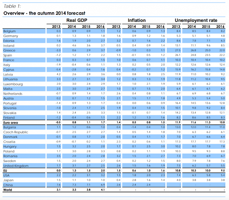
The EC expects Eurozone:
1. Real GDP growth to remain around 1.7 per cent per year in 2016 with Germany at 1.8 per cent and France at 1.5 per cent. Italy is expected to remain in recession this year (-0.4 per cent growth) and barely raise its head above the zero line next year.
2. Inflation to be 1.5 per cent in 2016, which is still below the ECB’s inflation targetting minimum of 2 per cent.
3. Significantly, unemployment to fall only 0.8 percentage points between 2014 and 2016 and still remain at 10.8 per cent by the end of 2016.
4. Unemployment to remain at 22 per cent in Greece by the end of 2016, 22.2 per cent in Spain, 10.2 per cent in France (down by only 0.2 points), 12.4 per cent in Italy, and to actually rise in Malta.
5. Unemployment in the US to fall from 6.3 per cent in 2014 to 5.4 per cent by end of 2016 and in Japan to remain steady at 3.8 per cent.
In terms of the coming showdown between France and the European Commission with respect to the French capacity to bring its fiscal position within the Stability and Growth Pact (SGP) fiscal rules, the EC expects France’s fiscal deficit to increase from 4.4 per cent in 2014 to 4.7 per cent in 2016 (as a percent of GDP).
So far Italy has signalled to the EC that it is a surrender monkey with the announcements in the recent weeks that it will impose even harsher austerity on an economy that has been in recession for the last three years. Whether France also walks the plank – or should I say submit entirely to the mindless Commission dictates regarding its fiscal position.
Time will tell. They would be mad to obey the Commission on that score given that the forecasts for employment growth and unemployment are dire over the next two years.
In the country specific forecasts, the Commission claims that the Greek economy will be growing by 3.7 per cent in 2016 and 2.9 per cent next year (2015) as a result of a “surge” in exports driven by a lower euro and:
… gains in competitiveness and quality of the business environment.
The forecasts are not to be believed. An investment and private consumption boom fuelled by an export boom. We have heard that before. The IMF could have written the narrative to support the forecasts. It has their print all over them.
Inflation is expected to be hovering around 1.1 per cent in 2016 – in other words, very low by historical or any other standards and well below the ECB preferred rate.
You can get all the data used in the forecasts from the – Annual macro-economic database (AMECO) – supplied by the European Commission.
To give you an idea of how nonsensical the modelling is consider the following graph, which shows the real Output Gap for Greece (Percentage of potential gross domestic product at constant 2010 market prices) and the unemployment rate from 2000 out to the forecast horizon of 2016.
The big swing in activity is clearly evident with a massive output gap being matched by the sharp rise in the unemployment rate.
But what else do you notice?
The average real output gap over the period from 2000 to 2008 for Greece was 1.39 per cent, which means that the European Commission was claiming that the Greek economy was operating at levels of activity in excess of its potential on average for those 8 years.
The average unemployment rate for the same period was 9.7 per cent, which also means that the Commission had it in its mind that such an unemployment rate was consistent with the economy being beyond full employment.
That assessment is problematic enough. It is hard to fathom any economic model that thinks having 9.7 per cent of the active population in a state of joblessness on average for 8 years constitutes an overheating economy. But we can leave that piece of the absurdity aside, although it is linked to the next point, because it relates to the same nonsensical macroeconomic modelling.
Now study the graph again.
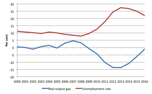
When the crisis began, Greece’s unemployment rate was 7.8 per cent (2008) and the estimated output gap was 3.3 per cent (meaning the economy was exceeding its potential by 3.3 per cent).
The estimated output gap for 2016 it to be -1 per cent, indicating a slight degree of slack. Last time, the output gap was in this territory, was in 2002 (-1.2 per cent) and in 2005 it was -0.23 per cent. The unemployment rate in 2002 was 10.3 per cent and in 2005, 10 per cent.
Conceptually draw some vertical lines at each point on the graph where the output gap is about the estimated 2016 magnitude (-1 per cent). Trace the line out to where it would cut the red unemployment rate line. You will get an unemployment rate around 10 per cent, give or take.
The point is that the European Commission macroeconomic models tend to suggest when there is a little bit of output slack in the past, the unemployment rate would be around 10 to 10.5 per cent.
The unemployment estimate for 2016 is 22 per cent and that is associated with an economy that the Commission claims will have just a little bit of slack (-1 per cent output gap).
Go figure that nonsense.
Why is an unemployment of 22 per cent considered to be close to full employment whereas before the crisis a rate of 10 per cent was considered to be representative of a near fully employed economy?
There is no explanation supplied in the European Commission’s documentation. All this stuff is just made up and supported by very dodgy macroeconomic models designed to give the results that the forecasters desire.
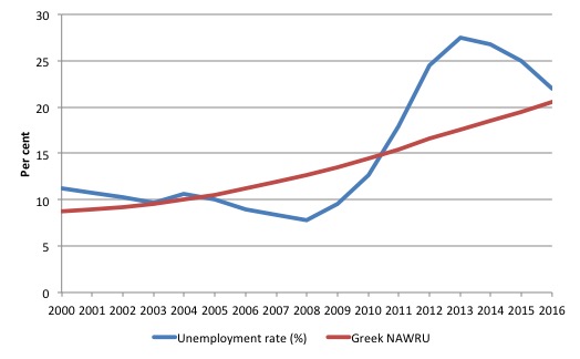
The next graph consolidates what I have been saying above. It shows the estimated NAWRU (Non-accelerating wage rate of unemployment), which is the estimated unemployment rate where there are no inflationary pressures emerging from the labour market.
Mainstream economists believe this rate to be equivalent to full employment. I have added the actual unemployment rate for Greece from 2000 to 2016 (so the 2014-16 observations are estimates/forecasts).
The NAWRU and its close cousin the NAIRU (which just replaces wage inflation for generalised inflation) is a central plank used by neo-liberal economists to attack on the use of discretionary fiscal policy by governments.
They claim, erroneously, that full employment occurs when the unemployment rate was at the level where inflation (wage or price) is stable.
NAWRU/NAIRU theorists invent a number of spurious reasons (all empirically unsound) to justify steadily ratcheting the estimate of this (unobservable) inflation-stable unemployment rate upwards.
The NAIRU has been severely discredited as an operational concept but it still exerts a very powerful influence on the policy debate.
Further, governments have become captive to the idea that if they try to get the unemployment rate below the “estimated” NAIRU using expansionary policy then they would just cause inflation.
The NAWRU/NAIRU is widely used to define full capacity utilisation and is intrinsically associated with output gaps, given the way it is calculated.
If the economy is running an unemployment equal to the estimated NAWRU/NAIRU then the mainstream concluded that the economy is at full capacity.
Of-course, they keep changing their estimates of the NAWRU/NAIRU which were in turn accompanied by huge standard errors in their forecasts. These error bands in the estimates of their calculated NAIRUs have varied at times between 3 and 13 per cent in some studies, which of course, makes the concept useless for policy purposes.
The following blogs are background if you are lost:
- The dreaded NAIRU is still about!
- NAIRU mantra prevents good macroeconomic policy
- Structural deficits – the great con job!
- Structural deficits and automatic stabilisers
The NAWRU/NAIRU relationship with the estimates of the Output Gap is also highly contentious.
As I note in this blog – Structural deficits and automatic stabilisers – the problem is that the estimates of output gaps are extremely sensitive to the methodology employed.
They rely on an estimate of potential GDP, which is non-observable. It is clear that the typical methods used to estimate potential GDP reflect ideological conceptions of the macroeconomy, which are problematic when confronted with the empirical reality.
For example, on Page 3 of the CBO document – Measuring the Effects of the Business Cycle on the Federal Budget – we read:
… different estimates of potential GDP will produce different estimates of the size of the cyclically adjusted deficit or surplus …
CBO define Potential GDP as “the level of output that corresponds to a high level of resource … labor and capital … use.
So how do they estimate potential GDP? They explain their methodology in this document.
CBO say that they:
They start with “a Solow growth model, with a neoclassical production function at its core, and estimates trends in the components of GDP using a variant of a tried-and-tested relationship known as Okun’s law. According to that relationship, actual output exceeds its potential level when the rate of unemployment is below the “natural” rate of unemployment) Conversely, when the unemployment rate exceeds its natural rate, output falls short of potential. In models based on Okun’s law, the difference between the natural and actual rates of unemployment is the pivotal indicator of what phase of a business cycle the economy is in.
The resulting estimate of Potential GDP is “an estimate of the level of GDP attainable when the economy is operating at a high rate of resource use” and that if “actual output rises above its potential level, then constraints on capacity begin to bind and inflationary pressures build” (and vice versa).
So despite saying that their estimate of Potential GDP is “the level of output that corresponds to a high level of resource … labor and capital … use” what you really need to understand is that it is the level of GDP where the unemployment rate equals some estimated NAIRU.
Intrinsic to the computation is an estimate of the so-called “natural rate of unemployment” or the Non Accelerating Inflation Rate of Unemployment or the NAWRU (if we are thinking in steady-state wage terms).
Given the history of estimates of the NAWRU/NAIRU, the “steady-state” unemployment across different nations has varied dramatically from time to time – with sudden rises projected for no apparent reason other than the actual unemployment has just risen. These estimates would hardly be considered “”high rate of resource use”. Similarly, underemployment is not factored into these estimates
The concept of a potential GDP in the CBO parlance is thus not to be taken as a fully employed economy. Rather they use the standard dodge employed by mainstream economists where the the concept of full employment is not constructed as the number of jobs (and working hours) which satisfy the preferences of the available labour force but rather in terms of the unobservable NAWRU/NAIRU.
The problem is that policy makers then constrain their economies to achieve this (assumed) cyclically invariant benchmark. Yet, despite its centrality to policy, the NAWRU/NAIRU evades accurate estimation and the case for its uniqueness and cyclical invariance is weak. Given these vagaries, its use as a policy tool is highly contentious.
Now in the previous graph you can see that the NAWRU estimates provided by the Commission have been rising steadily since about 2005. Why?
Structural factors – inefficiencies etc – government regulations, minimum wages, trade union interference, income support, lazy workers, tax wedges and the rest of it.
Okay, but in the Autumn 2014 Forecasts we read that investment will gain:
… momentum and the economy begins to reap the benefits of ongoing structural reforms … [and] … exports pick up with the recovery and benefit from reforms … A relatively strong fall in unemployment to 25.0% in 2015 and 22.0% in 2016 can be expected thanks to the pick-up in investment, the continuation of employment programmes, and ongoing structural reforms bearing fruit … [and there will be] … falling unit labour costs and the implementation of product market reforms, notably to remove distortions and increase competition in the retail, health and energy sectors … [and there has been] …. major income tax reform and expenditure consolidation … [and there has been] … fiscal-structural reforms under Greece’s programme …
Question: with all that structural reform, why is the NAWRU still increasing? No discussion is provided.
Why is it just a straight line continually rising? No Answer! The real answer is that their macroeconomic models are written to generate this sort of result without particular reference to reality.
They can hardly admit that the output gaps are going to persist at huge percentage amounts and still claim things are heading in the right direction. So the way out of it is to reduce the output gap by inflating the NAWRU. Object achieved.
No plausible reason is advanced for the rise. There doesn’t really have to be because the normal folk cannot grasp all this and neo-liberal Groupthink stops any of these questions being asked.
How many journalists have enquired into this absurdity in the last week? None that I have found. Groupthink and confirmation bias rules!
The OECD also tried this nonsense on recently in the case of Spain. Please read my blog – The confidence tricksters in the economics profession – for more discussion on this point.
They claimed that the Spanish full employment unemployment rate had risen to 23 per cent in September 2013 after having estimated it to be 8 per cent in 2010.
Conclusion
I have run out of time today – been travelling a lot.
But the audacity of the European Commission really knows no bounds. It hides all their neo-liberal biases with the sophistry of model estimates and numbers and fancy jargon – but the bottom line is that their estimates are relatively meaningless.
And if they have a grain of truth – the only reasonable conclusion is that the policy environment is a total failure and all nations should leave the euro and reestablish their policy sovereignty without the mindless European Commission oversight.
Then the unemployment rate in Brussels will rise but everywhere else it is likely to fall substantially.
That is enough for today!
(c) Copyright 2014 Bill Mitchell. All Rights Reserved.
Bill says “It is hard to fathom any economic model that thinks having 9.7 per cent of the active population in a state of joblessness on average for 8 years constitutes an overheating economy. But we can leave that piece of the absurdity aside..”.
9.7% unemployed can easily equate to the “inflation barrier” as Bill calls it (i.e. the level of unemployment at which inflation gets problematic) given an inefficient enough labour market. In contrast, unemployment dropped to literally zero on two occasions in Switzerland in the 1960s. In contrast again, unemployment has been very high in Spain for decades: long before it joined the EU.
I’d like to see some decent analysis of exactly WHY unemployment was so high for so long in Spain.
And before someone points out that the above 9.7% could be dealt with via JG, yes I’m well aware of that. My point is that ABSENT JG, overheating could occur at 9.7% given a seriously inefficient labour market.
@Ralph Musgrave
By ‘inefficient labour market’, do you generally mean to say ‘workers that won’t work for a sandwich and a glass of tap water’ or lower wages.
@Bill
This blog and your writing is good fun. I love the humour. The serious point is that you’re dead right. I remember back in 2009, these guys coming up with la la land forecasts of Greece returning to growth by 2011 and debt/GDP falling by 2013. Some of this stuff is just basically off the wall.
Even the bank stress tests have mostly been PR exercises. I don’t even think the people that wrote these reports write this stuff without cracking open a few brewskies beside their computer.
If they actually think people who’s job is to make money by betting on real life do anything more than wipe their asses with these reports than I feel sorry for them.
This latest la la land stuff is equally amusing. 9.7% for 8 years is overheating?! Ha Ha. Such is the lengths one will go to deny the reality that expansionary fiscal policy is needed.
But you know, spending money on ‘those people’ never appealed to our beloved aristocrats. Why should it now?
I fail to see the physical economic point of economic growth.
Ireland has more “growth” this year as more cars chase scarce money but how does that increase my purchasing power ??
I should think it extracts from it.
Any growth in the eurozone is catastrophic for the mean person but good for a person or entity who holds a stock of euro debt.
Bills economics is divorced from human scale affairs.
Who cares what they produce ?
It cannot be effectively consumed under present debt money conditions.
We can clearly see “free trade” inside a scarce money ecosystem is anything but.
It is a demonic wealth concentration device that makes Autarky look like a enlightened option !!!
Who would have thought ?
Franco & Dev were right all along.
You cannot engage in free trade with these devils.
They will destroy you…………….all that needs to be known is in the UKs Pink Book.
We are witnessing the movement of a gigantic money vortice.
Its objectives is clearly political in nature.
The report makes use of DSGE models for forecasting? This is a big report for a luddite like myself to follow but i dont trust the predictions at all.
PAGE 33
[quote] Starting in 2015, the lagged impact of recent policy actions should begin to feed through to domestic demand. This includes the impact of monetary policy measures in the EU (e.g. the decisions mentioned in Section 3), the banking
sector’s follow-up to the comprehensive assessment, and the beneficial effect of structural reforms (20) undertaken in the recent past.[/quote]
[quote] By contrast, Eggertsson, Ferrero and Raffo argue that structural reforms do not improve output during crisis, but may even entail near-term contractionary effects – a result that can be associated with the absence of physical capital in their DSGE model [/quote]
So am i right in thinking they’re using a method of modelling where the internal mechanics of said model do not work by mathematical proof of contradiction (before you start inputting imperfect real world data). Then go on to use it as an excuse to cover for the magnificent failure of QE?
How is it that economics missed the revolution in other fields like computer science, chaos/complexity theory, convergence and modern probability theory?