Today (April 18, 2024), the Australian Bureau of Statistics released the latest - Labour Force,…
Australian labour market – weakness continues
Today’s release of the – Labour Force data – for February 2015 by the Australian Bureau of Statistics shows that the Australian labour market remains weak. While employment growth was modest the unemployment rate only fell by 0.1 percentage points as a result of a declining participation rate. Employment growth remains well below the underlying population growth with the result being an upward bias in the unemployment rate. The falling participation rate reflects a rising hidden unemployment rate as workers have given up looking for work. The broad ABS labour underutilisation rate – the sum of unemployment and underemployment – will now be heading towards 16 per cent (it is published in next month’s release). While the Australian Treasurer might deny that the teenage labour market is in crisis, the data tells a different story.The teenage labour market is in a parlous state and requires an urgent policy problem that the Federal government refuses to recognise or deal with. They are so obsessed with cutting fiscal deficits and shoring up the position of the Prime Minister and Treasurer that they cannot see the future damage they are causing as a result of the appalling state of the youth labour market and the weak labour market in general.
The summary ABS Labour Force (seasonally adjusted) estimates for February 2015 are:
- Employment increased by 15,600 (0.1 per cent) with full-time employment increasing 10,300 and part-time employment rising by 5,300. Basically a reversal of last month’s decline overall.
- Unemployment decreased 15,800 to 777,300 but it would have been less if the participation rate had not fallen.
- The official unemployment rate decreased by 0.1 points to 6.3 per cent.
- The participation rate fell by 0.1 points at 64.6 per cent. It is still well below its November 2010 peak (recent) of 65.9 per cent.
- Aggregate monthly hours worked increased by 13 million hours (0.8 per cent).
- The quarterly ABS broad labour underutilisation estimates (the sum of unemployment and underemployment) were updated this month. Underemployment remained constant at 8.6 per cent and total labour underutilisation rate was 14.9 per cent (down 0.1 points). There were 1,060.9 thousand persons underemployed and a total of 1.838.2 thousand workers either unemployed or underemployed. The next quarterly release is in the May 2015 publication.
I did a segment on the Labour Market today for the national ABC current affairs program – PM. You can listen on-line if interested (from 18:00 EAST).
Last night, the Treasurer appeared on the ABC TV program – Lateline.
His performance was woeful and it is now an embarrassment having someone like him as our Federal Treasurer. He should seek employment with the European Commission as an adviser to the Eurogroup. He is of that quality.
Bearing on the labour market, he was asked about youth unemployment. Here is the interchange:
Interviewer: Could I just put a couple of figures to you? These come from the Foundation for Young Australians. They say having so many young Australians out of work costs the economy half a billion lost hours of work this year – that’s $13.6 billion lost in GDP. Has the Treasury done this sort of modelling for you?
Treasurer: Well, it’s obviously a major issue, but, you know, when you talk about crisis, I’d say a crisis is 50 per cent youth unemployment like Spain, or, you know, something much larger than what it is. Having said that, I’m not downplaying it. But the question that I keep asking myself is: how are we going to make sure that younger Australians have the same opportunities that you and I have and you and I have better opportunities than our parents had before us? That’s been the focus. Now there’s some fantastic statistical data in the Intergenerational Report that makes comparisons with other countries, it makes assumptions about longevity, which is really important, but it also encourages us to think about how we can delay the ageing process. That means longevity is one thing and age expectancy is one thing – that’s terrific. But the other thing we need to think about is how active we are during the course of our lives.
Interviewer: But that’s a message for them when they get old. I mean, if you’re 18 years old, you haven’t got a job now, you’ve got very few prospects of getting one – what’s the message today? And I suppose going back to my question about is this a crisis?, I mean, why don’t you have some sort of national youth summit and try and bring all the forces together of politics, business and so on to try and deal with this because otherwise we’ll end up with a lost generation?
Treasurer: Well I think you’re overplaying it. I think you’re going too far in that regards. I don’t see it as a crisis.
At that point he should have announced his retirement from the position of Treasurer. Have a look at the data below and draw your own conclusions about teenagers.
Employment growth weak
In the last month, total employment increased by 15,600 (0.1 per cent) with full-time employment increasing by 10,300 and part-time employment rising by 5,300. Over the last 12 months employment has grown by only 1.5 per cent well which is still below the underlying population growth rate.
Over the last 24 months or so we have seen the labour market data switching back and forth regularly between negative employment growth and positive growth spikes.
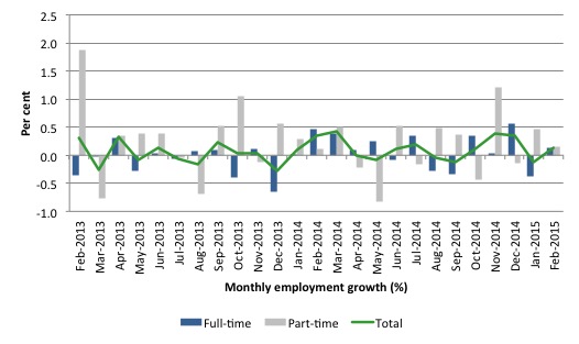
The following graph shows the month by month growth in full-time (blue columns), part-time (grey columns) and total employment (green line) for the 24 months to February 2015 using seasonally adjusted data. It gives you a good impression of just how flat employment growth has been notwithstanding the huge spike in part-time employment in the August survey, which the revised data shows was substantially offset by the fall in full-time employment.
While full-time and part-time employment growth are fluctuating around the zero line, total employment growth is still well below the growth that was boosted by the fiscal-stimulus in the middle of 2010.
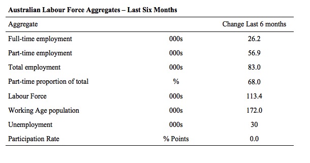
The following table provides an accounting summary of the labour market performance over the last six months. The monthly data is highly variable so this Table provides a longer view which allows for a better assessment of the trends. WAP is working age population (above 15 year olds).
The conclusion – overall there have been only 83 thousand jobs (net) added in Australia over the last six months. This is a very weak employment growth outcome overall.
Full-time employment has risen by 26.2 thousand jobs (net) while part-time work has risen by 56.9 thousand jobs. Thus, 68 per cent of the total employment created (net) over the last 6 months has been part-time.
The Working Age Population has risen by 172 thousand in the same period while the labour force has risen by 113.4 thousand. The participation rate has remained unchanged.
The result is that employment growth has not been able to keep pace with the underlying population growth and unemployment has risen by 30 thousand.
A very poor outcome.
To put the recent data in perspective, the following graph shows the movement in the labour force and total employment since the low-point unemployment rate month in the last cycle (February 2008) to February 2015. The two series are indexed to 100 at that month. The green line (right-axis) is the gap (plotted against the right-axis) between the two aggregates and measures the change in the unemployment rate since the low-point of the last cycle (when it stood at 4 per cent).
You can see that the labour force index has largely levelled off yet the divergence between it and employment growth has risen sharply (in spurts) over the last several months.
The Gap series gives you a good impression of the asymmetry in unemployment rate responses even when the economy experiences a mild downturn (such as the case in Australia). The unemployment rate jumps quickly but declines slowly.
It also highlights the fact that the recovery has not strong enough to bring the unemployment rate back down to its pre-crisis low. You can see clearly that the unemployment rate fell in late 2009 and then has hovered at the same level for some months before rising again over the last several months.
Since the current government was elected in September 2013, the situation has deteriorated significantly.
The Gap shows that the labour market is now in much worse shape than it was at the peak of the financial crisis in 2009. After the government prematurely terminated the fiscal stimulus the situation has progressively deteriorated.
In February 2015, the Gap of 2.7 percentage points and remains well above the levels that appeared in May and June 2009 when the Australian economy was enduring the impact of the crisis. All the gains made since then have thus disappeared due to poorly crafted fiscal policy not responding appropriately to non-government spending changes.
Today’s results continue to reflect an upward trend in the unemployment rate (given the drop in participation).

Full-time and Part-time employment trends
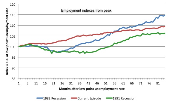
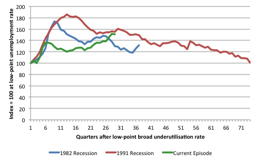
The following graph shows employment indexes for the last 3 recessions and allows us to see how the trajectory of total employment after each peak prior to the three major recessions in recent history: 1982, 1991 and 2009 (the latter to capture the current episode).
The peak is defined as the month of the low-point unemployment rate in the relevant cycle and total employment was indexed at 100 in each case and then indexed to that base for each of the months as the recession unfolded.
I have plotted the 3 episodes for 84 months after the low-point unemployment rate was reached in each cycle – the length of the current episode.
The initial employment decline was similar for the 1982 and 1991 recessions but the 1991 recovery was delayed by many month and the return to growth much slower than the 1982 recession.
The current episode is distinguished by the lack of a major slump in total employment, which reflects the success of the large fiscal stimulus in 2008 and 2009.
However, the recovery spawned by the stimulus clearly dissipated once the fiscal position was reversed and the economy is now producing very subdued employment outcomes.
Moreover, since February 2008, employment has grown by a miserly 9.5 per cent, which is a glacial pace.
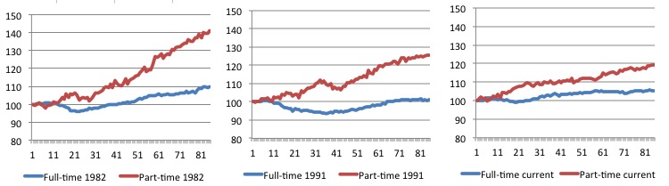
The next 3-panel graph decomposes the previous graph into full-time and part-time employment. The vertical scales are common to allow a comparison between the three episodes.
First, after the peak is reached, part-time employment continues to increase as firms convert full-time jobs into fractional jobs.
Second, recoveries are dominated by growth in part-time employment as firms are reluctant to commit to more permanent arrangements with workers while there is uncertainty of the future course in aggregate demand.
Third, the current recovery is clearly mediocre by comparison, with both very subdued growth in full-time and part-time work.
Teenage labour market – continues to deteriorate
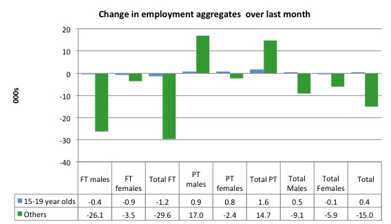
Teenagers gained 400 jobs overall (net) in February 2015 – losing 1.2 thousand full-time jobs and gaining 1.6 thousand part-time jobs net.
The following graph shows the distribution of net employment creation in the last month by full-time/part-time status and age/gender category (15-19 year olds and the rest)
If you take a longer view you see how poor the situation remains.
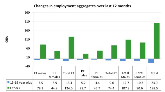
Over the last 12 months, teenagers have lost 23 thousand jobs overall while the rest of the labour force have gained 198.5 thousand net jobs. Remember that the overall result represents a fairly poor annual growth in employment.
The teenage segment of the labour market is being particularly dragged down by the sluggish employment growth, which is hardly surprising given that the least experienced and/or most disadvantaged (those with disabilities etc) are rationed to the back of the queue by the employers.
The following graph shows the change in aggregates over the last 12 months.
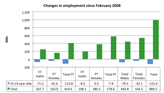
To further emphasise the plight of our teenagers, I compiled the following graph that extends the time period from the February 2008, which was the month when the unemployment rate was at its low point in the last cycle, to the present month (February 2015). So it includes the period of downturn and then the so-called “recovery” period. Note the change in vertical scale compared to the previous two graphs.
Since February 2008, there have been only 989.2 thousand (net) jobs added to the Australian economy but teenagers have lost a staggering 121.6 thousand over the same period. It is even more stark when you consider that 113.8 thousand full-time teenager jobs have been lost in net terms.
Even in the traditionally, concentrated teenage segment – part-time employment, teenagers have gone backwards losing 7.8 thousand jobs (net) even though 578.6 thousand part-time jobs have been added overall.
Overall, the total employment increase is modest. Further, around 58.5 per cent of the total (net) jobs added since February 2008 have been part-time, which raises questions about the quality of work that is being generated overall.
To put the teenage employment situation in a scale context the following graph shows the Employment-Population ratios for males, females and total 15-19 year olds since February 2008 (the month which coincided with the low-point unemployment rate of the last cycle).
You can interpret this graph as depicting the loss of employment relative to the underlying population of each cohort. We would expect (at least) that this ratio should be constant if not rising somewhat (depending on school participation rates).
The facts are that the absolute loss of jobs reported above is depicting a disastrous situation for our teenagers. Males, in particular, have lost out severely as a result of the economy being deliberately stifled by austerity policy positions.
The male ratio has fallen by 11.9 percentage points since February 2008, the female by 7.2 percentage points and the overall teenage employment-population ratio has fallen by 9.6 percentage points. That is a staggering decline in the employment market for Australian teenagers.

Overall, the performance of the teenage labour market continues to be deeply disturbing. It doesn’t rate much priority in the policy debate, which is surprising given that this is our future workforce in an ageing population. Future productivity growth will determine whether the ageing population enjoys a higher standard of living than now or goes backwards.
The best the Government appears to be capable of is to dream up plans which deny income support to this group and impose impossible activity tests on them.
The longer-run consequences of this teenage “lock out” will be very damaging.
I continue to recommend that the Australian government immediately announce a major public sector job creation program aimed at employing all the unemployed 15-19 year olds, who are not in full-time education or a credible apprenticeship program.
The Government should abandon their ideological obsession with supply-side punishment regimes and realise that the unemployed cannot search for jobs that are not there.
It is clear that the Australian labour market continues to fail our 15-19 year olds. At a time when we keep emphasising the future challenges facing the nation in terms of an ageing population and rising dependency ratios the economy still fails to provide enough work (and on-the-job experience) for our teenagers who are our future workforce.
Unemployment – decreased 15,800
The unemployment rate decreased by 0.1 points to 6.3 per cent in February 2015. Official unemployment decreased 15,800 but that the unemployment rate would not have decreased had not the participation rate also declined (see below).
Overall, the labour market still has significant excess capacity available in most areas and what growth there is is not making any major inroads into the idle pools of labour.
The following graph updates my 3-recessions graph which depicts how quickly the unemployment rose in Australia during each of the three major recessions in recent history: 1982, 1991 and 2009 (the latter to capture the 2008-2010 episode). The unemployment rate was indexed at 100 at its lowest rate before the recession in each case (January 1981; January 1989; May 2008, respectively) and then indexed to that base for each of the months as the recession unfolded.
I have plotted the 3 episodes for 84 months after the low-point unemployment rate was reached in each cycle. The current episode is now in its 84th month (0 being February 2008). For 1991, the peak unemployment which was achieved some 38 months after the downturn began and the resulting recovery was painfully slow. While the 1982 recession was severe the economy and the labour market was recovering by the 26th month. The pace of recovery for the 1982 once it began was faster than the recovery in the current period.
It is significant that the current situation while significantly less severe than the previous recessions is dragging on which is a reflection of the lack of private spending growth and declining public spending growth.
Moreover, the current episode is also different to the last two major recessions in the sense that the recovery is over and the economy is deteriorating again.
In relative terms, the current episode is now worse than the other two recessions (in terms of deviation from low-point unemployment rate).
The graph provides a graphical depiction of the speed at which the recession unfolded (which tells you something about each episode) and the length of time that the labour market deteriorated (expressed in terms of the unemployment rate).
Clearly this type of graph will lose relevance because the 1982 episode will start feeding into the 1992 period. It just goes to show how long these episodes of high unemployment are – in all three cases the unemployment rate was still well above where it started some 7 years earlier.
From the start of the downturn to the 84-month point (to February 2015), the official unemployment rate has risen from a base index value of 100 to a value 157.3. After falling steadily as the fiscal stimulus pushed growth along (it reached 122.5 after 35 months – in January 2010), it has been slowly trending up for some months now. Unlike the other episodes, the current trend, at this stage of the cycle, is upwards and accelerating.
It is now above the peak that was reached just before the introduction of the fiscal stimulus. In other words, the gains that emerged in the recovery as a result of the fiscal stimulus in 2009-10 have now been lost.
At 84 months, 1982 index stood at 137.5 (and falling) while the 1991 index was at 148.5 (and steady). It is clear that at an equivalent point in the “recovery cycle” the current period is more sluggish than our recent two major downturns and trending upwards while the trend in the earlier episodes was moderately downwards.

Note that these are index numbers and only tell us about the speed of decay rather than levels of unemployment. Clearly the 6.3 per cent at this stage of the downturn is lower that the unemployment rate was in the previous recessions at a comparable point in the cycle although we have to consider the broader measures of labour underutilisation (which include underemployment) before we draw any clear conclusions.
The notable aspect of the current situation is that the recovery is very slow.
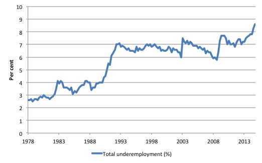
Broad labour underutilisation – 14.9 per cent
The ABS published its quarterly broad labour underutilisation measures for the February quarter in this months’ data release.
In the February-quarter, total underemployment remained at 8.6 per cent in the February-quarter and the ABS broad labour underutilisation rate (the sum of unemployment and underemployment) fell from 15.0 per cent to 14.9 per cent (as a result of the fall in the unemployment rate this month).
| There are now 1,060.9 thousand persons underemployed. Overall, there are 1.838.2 thousand workers either unemployed or underemployed. |
The following graph plots the history of underemployment in Australia since February 1978.
If hidden unemployment is added to the broad ABS figure the best-case (conservative) scenario would see a underutilisation rate well above 17.5 per cent at present. Please read my blog – Australian labour underutilisation rate is at least 13.4 per cent – for more discussion on this point.
The following graph shows the same type of indexes as the previous graph except it uses the ABS broad labour underutilisation rate (unemployment plus underemployment). It also is in terms of quarters rather than months.
We also show the full evolution of the the 1982 and 1991 episodes from the low-point (= 100) through the peak and back to the next low-point. In the case of the 1982 recession the index had risen to a peak of 172.8 in May 1983 (a broad underutilisation rate of 14.4 per cent) and then fell back to 9.8 per cent by November 1989 (index value 117.4).
At that point, the cycle turned down again signalling the beginning of the 1991 recession. That cycle reached a peak of 185 (or 18.1 per cent in November 1992) and it took until February 2008 for it to reach the low-point of 9.9 percent (an index value of 100.9). That point marked the beginning of the next cycle.
That should tell you how severe the 1991 recession was and how asymmetric the labour market response is on either side of the cycle. From its start in November 1989 it took 74 quarters (18.5 years) to return to more or less that level.
In terms of the three recession comparison, at the same period in the ‘recovery’ (using quarterly data), the broad labour underutilisation rate (unemployment plus underemployment) had an index value of 131.3 in the 1982 recession (absolute value of 10.8 per cent); an index value of 156.1 in the 1991 recession (absolute value of 15.2 per cent); and an index value of 150.5 in the current period (absolute value of 14.9 per cent).
So while the level of unemployment is much lower now than in the 1982 recession (at a comparable stage), underemployment is now much higher and so the total labour underutilisation rates is higher. Further, the 1982 recovery in broad underutilisation terms was more robust than the current stagnating situation.
Commentators who think of the 1982 recession as severe, rarely see it in these terms. Joblessness is probably worse than underemployment but both mean that labour is wasted and income earning opportunities are being foregone. For a worker with extensive nominal commitments, the loss of income when hours are rationed may be no less severe than the loss of hours involved in unemployment, if the threshold of solvency is breached.
The next update will be for the May-quarter 2015 Labour Force data release published in early June 2015.
Aggregate participation rate – falls by 0.1 points
The February 2015 participation rate fell by 0.1 points to 64.6 per cent. It remains substantially down on the most recent peak in November 2010 of 65.9 per cent when the labour market was still recovering courtesy of the fiscal stimulus.
While the official unemployment rate fell by 0.1 points this month, that was all due to the decline in the participation rate.
The labour force is a subset of the working-age population (those above 15 years old). The proportion of the working-age population that constitutes the labour force is called the labour force participation rate. Thus changes in the labour force can impact on the official unemployment rate, and, as a result, movements in the latter need to be interpreted carefully. A rising unemployment rate may not indicate a recessing economy.
The labour force can expand as a result of general population growth and/or increases in the labour force participation rates.
What would have the unemployment rate been had the participation rate not fallen by 0.1 points?
The following Table shows the breakdown in the changes to the main aggregates (Labour Force, Employment and Unemployment) and the impact of the fall in the participation rate.
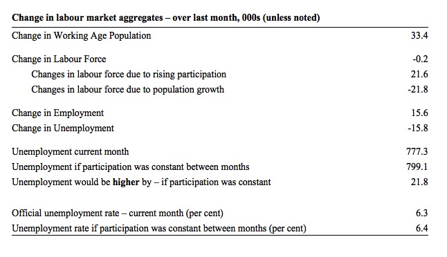
In February 2105, the increase in employment of 15.6 thousand (net) jobs was accompanied by a labour force decline of 200. As a result, unemployment fell by 15.8 thousand.
The rising labour force in February 2105 was the outcome of two separate factors:
- The underlying population growth added 21.6thousand persons to the labour force. The population growth impact on the labour force aggregate is relatively steady from month to month; and
- The fall in the participation rate meant that there were 15.8 thousand workers exiting the labour force (relative to what would have occurred had the participation rate remained unchanged).
- The net result was a slight decline in the labour force (0.2 thousand)
So while employment growth was below the underlying population growth, the falling participation reduced the impact on unemployment and meant that there were 21.8 thousand less workers looking for jobs.
If the participation rate had not have fallen, total unemployment, at the current employment level, would have been 799.1 thousand rather than the official count of 777.3 thousand as recorded by the ABS – a difference of 21.8 thousand workers (the ‘participation effect’).
Thus, without the fall in the participation rate, the unemployment rate would have been 6.4 per cent (rounded) rather than its current value of 6.3 per cent.
The conclusion is that hidden unemployment rose slightly in February 2105 while official unemployment rate fell slightly.
There is considerable monthly fluctuation in the participation rate but the current rate of 64.6 per cent is a long way below its most recent peak in November 2010 of 65.9 per cent.
What would the unemployment rate be if the participation rate was at that recent November 2010 peak level (65.9 per cent)?
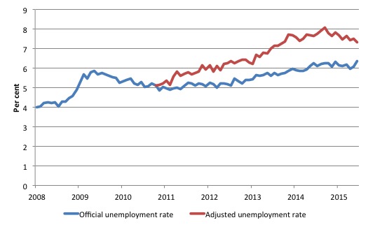
The following graph tells us what would have happened if the participation rate had been constant over the period November 2010 to February 2015. The blue line is the official unemployment since its most recent low-point of 4 per cent in March 2008.
The red line starts at November 2010 (the peak participation month). It is computed by adding the workers that left the labour force as employment growth faltered (and the participation rate fell) back into the labour force and assuming they would have been unemployed. At present, this cohort is likely to comprise a component of the hidden unemployed (or discouraged workers).
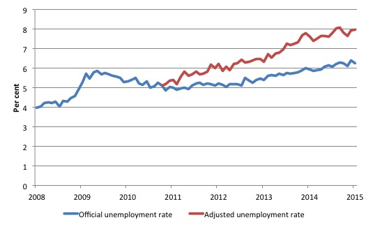
Total official unemployment in February 2015 was estimated to be 777.3 thousand. However, if participation had not have fallen since November 2010, there would be 1006.9 thousand workers unemployed given growth in population and employment since November 2010.
| The unemployment rate would now be 8.0 per cent if the participation had not fallen below its November 2010 peak of 65.9 per cent. |
The difference between the two numbers mostly reflects, in part, the change in hidden unemployment (discouraged workers) since November 2010. These workers would take a job immediately if offered one but have given up looking because there are not enough jobs and as a consequence the ABS classifies them as being Not in the Labour Force.
There has been some change in the age composition of the labour force (older workers with low participation rates becoming a higher proportion) but this only accounts for about a 1/3 of the shift. The rest is undoubtedly hidden unemployment.
Note, the gap between the blue and red lines doesn’t sum to total hidden unemployment unless November 2010 was a full employment peak, which it clearly was not. The interpretation of the gap is that it shows the extra hidden unemployed since that time.
Aggregate participation rate – rises by an unbelievable 0.3 points
The July 2015 participation rate rose by 0.3 points to 64.6 per cent. Even so, it remains substantially down on the most recent peak in November 2010 of 65.9 per cent when the labour market was still recovering courtesy of the fiscal stimulus.
As noted in the introduction, this size swing in the monthly estimates is not believable and I expect there to be substantial downward revisions in the coming months as the population benchmarks are revised downward to reflect the slower than assumed growth.
The rise in the official unemployment rate by 0.3 points this month was mostly due to this huge jump in the participation rate.
The labour force is a subset of the working-age population (those above 15 years old). The proportion of the working-age population that constitutes the labour force is called the labour force participation rate. Thus changes in the labour force can impact on the official unemployment rate, and, as a result, movements in the latter need to be interpreted carefully. A rising unemployment rate may not indicate a recessing economy.
The labour force can expand as a result of general population growth and/or increases in the labour force participation rates.
What would have the unemployment rate been had the participation rate not risen by 0.3 points?
The following Table shows the breakdown in the changes to the main aggregates (Labour Force, Employment and Unemployment) and the impact of the rise in the participation rate.
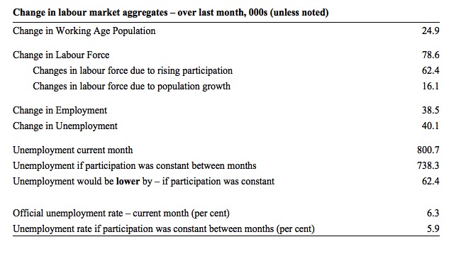
In July 2015, the increase in employment of 38.5 thousand (net) jobs was accompanied by a labour force rise of 78.6 thousand. As a result, unemployment increased by 40.1 thousand.
The rising labour force in July 2105 was the outcome of two separate factors:
- The underlying population growth added 16.1 thousand persons to the labour force. The population growth impact on the labour force aggregate is relatively steady from month to month but has slowed in recent months; and
- The rise in the participation rate meant that there were 62.4 thousand workers entering the labour force (relative to what would have occurred had the participation rate remained unchanged).
- The net result was a sharp rise in the labour force (78.6 thousand)
So even though employment growth was stronger than the underlying population growth, the sharp rise in the participation meant that unemployment rose rather than fell.
If the participation rate had not have risen, total unemployment, at the current employment level, would have been 738.3 thousand rather than the official count of 800.7 thousand as recorded by the ABS – a difference of 62.4 thousand workers (the ‘participation effect’).
Thus, without the rise in the participation rate, the unemployment rate would have been 5.9 per cent (rounded) rather than its current value of 6.3 per cent.
The conclusion is that hidden unemployment fell in July 2105 while official unemployment rate rose by 0.3 points.
There is considerable monthly fluctuation in the participation rate but the current rate of 64.6 per cent is a long way below its most recent peak in November 2010 of 65.9 per cent.
What would the unemployment rate be if the participation rate was at that recent November 2010 peak level (65.9 per cent)?
The following graph tells us what would have happened if the participation rate had been constant over the period November 2010 to July 2015. The blue line is the official unemployment since its most recent low-point of 4 per cent in February 2008.
The red line starts at November 2010 (the peak participation month). It is computed by adding the workers that left the labour force as employment growth faltered (and the participation rate fell) back into the labour force and assuming they would have been unemployed. At present, this cohort is likely to comprise a component of the hidden unemployed (or discouraged workers).
Total official unemployment in July 2015 was estimated to be 800.1 thousand. However, if participation had not have fallen since November 2010, there would be 930.7 thousand workers unemployed given growth in population and employment since November 2010.
| The unemployment rate would now be 7.3 per cent if the participation had not fallen below its November 2010 peak of 65.9 per cent. |
The difference between the two numbers mostly reflects, in part, the change in hidden unemployment (discouraged workers) since November 2010. These workers would take a job immediately if offered one but have given up looking because there are not enough jobs and as a consequence the ABS classifies them as being Not in the Labour Force.
There has been some change in the age composition of the labour force (older workers with low participation rates becoming a higher proportion) but this only accounts for about a 1/3 of the shift. The rest is undoubtedly hidden unemployment.
Note, the gap between the blue and red lines doesn’t sum to total hidden unemployment unless November 2010 was a full employment peak, which it clearly was not. The interpretation of the gap is that it shows the extra hidden unemployed since that time.
Hours worked – rose modestly in February 2015 but down over last year
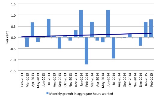
Aggregate monthly hours worked increased by 13 million hours (0.8 per cent) in February 2015 in seasonally adjusted terms.
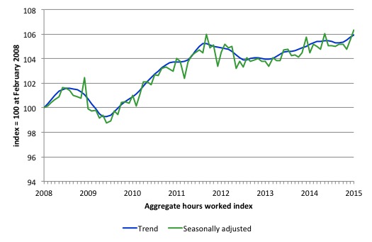
The following graph shows the trend and seasonally adjusted aggregate hours worked indexed to 100 at the peak in February 2008 (which was the low-point unemployment rate in the previous cycle).
The next graph shows the monthly growth (in per cent) over the last 24 months. The dark linear line is a simple regression trend of the monthly change – which depicts a slight upward trend. You can see the pattern of the change in working hours is also portrayed in the employment graph – zig-zagging across the zero growth line.
The reality is that working hours in the Australian labour market over the last two years have exhibited hardly any net growth and over the last twelve months total working hours are up by just 1.8 per cent.
Conclusion
In general, we always have to be careful interpreting month to month movements given the way the Labour Force Survey is constructed and implemented.
But today’s data shows that the labour market remains weak. There was some modest growth in employment but only offsetting what was lost last month.
The zig-zag dance around the zero growth line continues.
Employment growth remains well below the underlying population growth and unemployment only fell this month because the participation rate also fell.
The participation rate remains well below its November 2010 peak. The unemployment rate would now be 8 per cent rather than 6.3 per cent if the participation rate was at that recent peak value. The difference is mostly accounted for by workers giving up looking for work in the weak labour market.
At the last release, the ABS Broad Labour Underutilisation rate – the sum of official unemployment and underemployment – was estimated to be 14.9 per cent with underemployment steady at 8 per cent. That is a massive wastage rate and defies those who claim the economy is close to full employment.
The teenage labour market also remains in a parlous state. This is an emergency which is being ignored by the Federal Government. The Treasurer in recent days denied that there was a crisis in this segment of the labour market.
The neglect of our teenagers will have a very long memory indeed and the negative consequences will be stronger given the ageing population.
The data continues to tell us that the policy settings are all wrong. A fiscal stimulus is urgently needed.
That is enough for today!
(c) Copyright 2015 William Mitchell. All Rights Reserved.
The present federal government is the most regressive and foolish since WW2.
After the 2014 budget I wrote to several people in the ALP and the Greens advocating denying supply so as to force the lying,underhanded government to a double dissolution. No,won’t do that. Not only did they not have the courage but I got the impression then and since that they support what this government is doing at least in principle.
So,in the election next year we will be faced with the same old same old Dee/Dum syndrome. Pity the youth and anybody else in the way of this idiocy.
Time for a political party to be grounded in the new economic paradigm. Our two major parties have been deadlocked since Labor abandoned its traditional union mission in the 80s to go neoliberal (thanks Piping Shrike) which left the Tories with nothing substantial to oppose, only posturing or doubling down on the crazy in order to differentiate the “brand”. Neither have any really substantial reason to exist anymore beyond protecting a power base. At least the Greens identify the major economic challenge of climate, even if they can’t think macro. I’ve felt for a while we’re living through the strange death of Liberal Australia, but it’s only time will really tell which party gets torn in half by emerging economic/political paradigms like the Asquith-Lloyd George Liberals were.
“The neglect of our teenagers will have a very long memory indeed and the negative consequences will be stronger given the ageing population.”
I doubt that the Generation Beiber would have a clue what is going on. They would only know what the media tell them and as such would probably either blame themselves or the budget black hole / debt that labour left us with.
The kids that do understand will have no power in the future to turn things around. Their vote will count no more than ours does now.
The two major parties simply don’t care about anything other than pleasing their Oligarch puppet masters.
Because my pleasing them they get the power of the media at their disposal to influence how the mainstream votes.
I wish I shared your optimism that these kids will ever be able to remove these pigs from power.
What an indictment of the neo-liberal ideology! I am a new comer to this site and to MMT and am both elated about the possibility of real change and depressed about the difficulty of challenging the accepted orthodoxy which holds there is no alternative to “budget repair” and that national government debt must be reduced or the sky will fall in.
Well the sky IS falling in- most obviously on our youth and their future. I am trying to spread the word as Bill exhorts us to, when an opportunity arises with friends. But so deep seated is the “we must live within our means” mantra that they (so far) do not get it. I have difficulty explaining it and part of the problem is that my own grasp of MMT is not deep enough to be able to explain it convincingly.
I cannot put into words what u think of Joe Hockey in print sadly.
The main is completely incompetent and has a sense of entitlement that blows my mind. The fact he spent 6 years berating Wayne Swan and then once in power literally had no idea what to do simply amazed me. What did be do for 6 years!? Did he read a single economics book? I honestly think he didn’t and just believed he’d wing-it with his debating skills.
I think we need to seriously rethink how people like Hockey can have control over a $1.6 trillion dollar economy with absolutely no qualifications. We need to hire our smartest people like Bill Mitchell to do jobs such as these.
Thank you for saying it frankly Bill when you said Hockey should have resigned his position. Words can’t describe how much I despise the man.
@podargus I also wrote requesting blocking supply and was told it was not in the interests of democracy. The left needs to understand an eye for an eye for things to be equal. They did it to Whitlam, they most certainly deserve it in return now to bring the universe back into equilibrium.
Jason – I am certainly no fan of Hokey but he is only part of the problem,a bit like the figurehead on a ship of old. Not only does he have his party behind him but there are large sections of the Treasury as well. And that doesn’t take into account the economic commentariat and the host of the stupid and ignorant who can’t see the insanity in neoliberal economics.
I’m not into the eye for an eye,a tooth for a tooth business. That way the whole world would be blind and toothless. However I am into taking effective action when circumstances require it.