Yesterday (April 24, 2024), the Australian Bureau of Statistics (ABS) released the latest - Consumer…
Inflation benign in Australia with plenty of scope for fiscal expansion
A few weeks ago (April 8, 2015), I wrote a blog – Monetary policy is largely ineffective – which detailed why fiscal policy is a superior set of spending and taxation tools through which a national government can influence variations in activity in the real economy. In today’s blog I will consider two recent bits of evidence that reinforce that viewpoint. Today’s inflation data issued by the Australian Bureau of Statistics clearly indicates that there is plenty of scope for further interest rate cuts within the logic of the central bank’s inflation targetting strategy. But monetary policy is trapped in Australia at present between the need to expand the economy (for which it is largely ineffective) and the worry that further interest rates cuts will push housing prices up further. Second, economic activity is faltering and unemployment has risen because the Government refuses to take discretionary action to increase the fiscal deficit to support higher spending levels. They are firmly caught up in the neo-liberal obsession about the need for surpluses and where they are likely to make concessions is in tax cuts for high income earners – based on the so-called trickle down hypothesis. Some recent research from the US, however, demonstrates fairly categorically that tax changes at the top end of the income distribution have negligible effects on economic activity. This is in contradistinction to changes in disposable income at the bottom end. They are very powerful in terms of stimulating or undermining employment and output.
The Australian Bureau of Statistics released the Consumer Price Index, Australia – data for the March-quarter 2015 today.
The March-quarter inflation rate was 0.2 per cent which translated into an annual inflation rate of 1.3 per cent.
The annual rate in the December-quarter was 1.7 per cent. The trend is very much down. The Reserve Bank of Australia’s preferred core inflation measures – the Weighted Median and Trimmed Mean – are now at the bottom end of their inflation targetting range (2 to 3 per cent) and are trending down. Various measures of inflationary expectations are also flat or falling, including the longer-term, market-based forecasts.
The RBA Governor gave a speech yesterday (April 21, 2014) – The World Economy and Australia – to the American Australian Association luncheon, hosted by Goldman Sachs in New York, where he described the dilemma facing the RBA in its monetary policy settings.
He said, that on the one hand:
… output is below conventional estimates of ‘potential’, aggregate demand still seems on the soft side as resources investment falls sharply, and unemployment is elevated … So interest rates should be quite accommodative …
But, on the other hand:
What complicates the situation is that these are not the only pertinent facts. A good deal of the effect of easier monetary policy comes via the housing sector – through higher prices, which increase perceived wealth and encourage higher construction, through higher spending on durables associated with new dwellings, and so on. These are not the only channels but, according to research, together they account for quite a bit of the direct effects of easier monetary policy. And they do appear to be working, thus far. Housing starts will reach high levels this year and wealth effects do appear to be helping consumption, which is rising faster than income.
But household leverage starts from a high level, having risen a great deal in the 1990s and early 2000s. The extent to which further increases in leverage should be encouraged is not easily answered, but nor can it be conveniently side-stepped …
Then there are dwelling prices, which, at a national level, have already risen considerably from their previous lows, at a time when income growth has been slowing. Popular commentary is, in my opinion, too focused on Sydney prices and pays too little attention to the more disparate trends among the other 80 per cent of Australia. That said, it is hard to escape the conclusion that Sydney prices – up by a third since 2012 – look rather exuberant. Credit conditions are only one of several factors at work here. But credit conditions are very easy. So while the conduct of monetary policy can’t allow these financial considerations to dominate the ‘real economy’ ones completely, nor can it simply ignore them. A balance has to be found.
The theoretical nature of the dilemma is outlined in the blog I cited in the Introduction. The RBA has one main policy tool – the discretion to set the short-term interest rates. It cannot use that tool to stimulate real spending and keep a lid on housing prices. Another policy tool is needed – fiscal policy.
But fiscal policy is in the hands of those who can only think in terms of surpluses good, deficits bad.
What is apparent from today’s inflation figures and last week’s labour market data (see blog – Australian labour market – holding steady in a weak state – is that there is plenty of room for further fiscal stimulus.
I will come back to that a bit later once I have summarised today’s inflation data.
The summary results for the March-quarter 2015 are as follows:
- The All Groups CPI rose by 0.2 per cent compared with a rise of 0.2 per cent in the December-quarter 2014.
- The All Groups CPI rose by 1.3 per cent over the 12 months to the December 2014, compared to the annualised rise of 1.7 per cent over the 12 months to December-quarter 2014.
- The Trimmed mean series rose by 0.6 per cent in the March-quarter 2015 and by 2.3 per cent over the previous year (down from 2.2 per cent for the 12 months to September 2014).
- The Weighted median series rose by 0.6 per cent in the March-quarter 2015 and by 2.4 per cent over the previous year (down from 2.4 per cent for the 12 months to September 2014).
- The significant price rises this quarter were for domestic holiday travel and accommodation (+3.5 per cent), tertiary education (+5.7 per cent) and medical and hospital services (+2.2 per cent).
- The most significant offsetting price falls this quarter were for automotive fuel (-12.2 per cent) and fruit (-8.0 per cent).
Trends in inflation
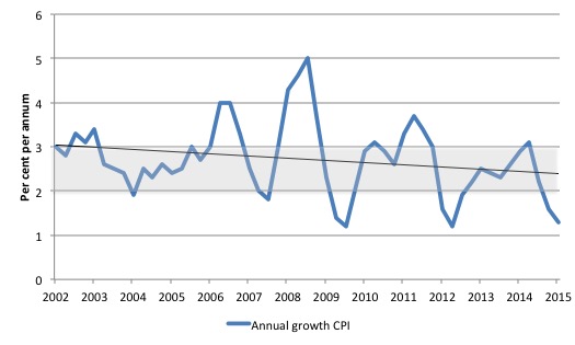
The headline inflation rate increased by 0.2 per cent in the March-quarter 2015 translating into an annualised increase of 1.3 per cent for the year, which a significant reduction on the December-quarter 2014 result of 1.7 per cent.
The following graph shows the annual headline inflation rate since the first-quarter 2002. The black line is a simple regression trend line depicting the general tendency. The shaded area is the RBA’s so-called targetting range (but read below for an interpretation).
Implications for monetary policy
What does it mean for monetary policy? The RBA will well understand that the fuel price declines are outliers in the overall trend which is for a moderation of inflation.
The Consumer Price Index (CPI) is designed to reflect a broad basket of goods and services (the ‘regimen’) which are representative of the cost of living. You can learn more about the CPI regimen HERE.
Please read my blog – Australian inflation trending down – lower oil prices and subdued economy – for a detailed discussion about the use of the headline rate of inflation and other analytical inflation measures.
Is a headline rate of CPI increase of 0.2 per cent for the March-quarter 2015 significant for monetary policy decisions? To examine its lasting significance we have to dig deeper and sort out underlying structural inflation pressures and ephemeral price factors.
The RBA’s formal inflation targeting rule aims to keep annual inflation rate (measured by the consumer price index) between 2 and 3 per cent over the medium term. Their so-called ‘forward-looking’ agenda is not clear – what time period etc – so it is difficult to be precise in relating the ABS data to the RBA thinking.
What we do know is that they do not rely on the ‘headline’ inflation rate. Instead, they use two measures of underlying inflation which attempt to net out the most volatile price movements. How much of today’s estimates are driven by volatility?
To understand the difference between the headline rate and other non-volatile measures of inflation, you might like to read the March 2010 RBA Bulletin which contains an interesting article – Measures of Underlying Inflation. That article explains the different inflation measures the RBA considers and the logic behind them.
The concept of underlying inflation is an attempt to separate the trend (“the persistent component of inflation) from the short-term fluctuations in prices. The main source of short-term ‘noise’ comes from “fluctuations in commodity markets and agricultural conditions, policy changes, or seasonal or infrequent price resetting”.
The RBA uses several different measures of underlying inflation which are generally categorised as ‘exclusion-based measures’ and ‘trimmed-mean measures’.
So, you can exclude “a particular set of volatile items – namely fruit, vegetables and automotive fuel” to get a better picture of the “persistent inflation pressures in the economy”. The main weaknesses with this method is that there can be “large temporary movements in components of the CPI that are not excluded” and volatile components can still be trending up (as in energy prices) or down.
The alternative trimmed-mean measures are popular among central bankers.
The authors say:
The trimmed-mean rate of inflation is defined as the average rate of inflation after “trimming” away a certain percentage of the distribution of price changes at both ends of that distribution. These measures are calculated by ordering the seasonally adjusted price changes for all CPI components in any period from lowest to highest, trimming away those that lie at the two outer edges of the distribution of price changes for that period, and then calculating an average inflation rate from the remaining set of price changes.
So you get some measure of central tendency not by exclusion but by giving lower weighting to volatile elements. Two trimmed measures are used by the RBA: (a) “the 15 per cent trimmed mean (which trims away the 15 per cent of items with both the smallest and largest price changes)”; and (b) “the weighted median (which is the price change at the 50th percentile by weight of the distribution of price changes)”.
Please read my blog – Australian inflation trending down – lower oil prices and subdued economy – for a more detailed discussion.
So what has been happening with these different measures?
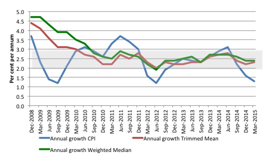
The following graph shows the three main inflation series published by the ABS over the last 24 quarters – the annual percentage change in the all items CPI (blue line); the annual changes in the weighted median (green line) and the trimmed mean (red line). The RBAs inflation targetting band is 2 to 3 per cent (shaded area).
The data is seasonally-adjusted.
The CPI measure of inflation (at 1.3 per cent down from 1.6 per cent in the December-quarter 2014) is now well below the target band, while the RBAs preferred measures – the Trimmed Mean (2.3 per cent up from 2.2 per cent) and the Weighted Median (2.4 per cent and steady) – are now approaching the lower bound of the RBAs targetting range of 2 to 3 per cent.
How to we assess these results?
First, there is clearly a downward trend in all of the measures. The “core” measures used by the RBA have been benign for many quarters even with a relatively large fiscal deficit and record low interest rates. They are now trending down.
Second, it is clear that the RBA-preferred measures are now at the bottom of the inflation-targeting band.
The RBA will also be mindful that real GDP growth is well below trend and the labour market is weak.
In terms of their legislative obligations to maintain full employment and price stability, one would think the RBA would have to cut interest rates in the coming month given the failing economy and the benign inflation environment.
But the sectoral property market imbalances are suggesting that the RBA doesn’t want rates to be the cause of even more credit-driven property speculation.
Conclusion: Monetary policy is the wrong tool to be relying on.
What is driving inflation in Australia?
The following bar chart compares the contributions to the quarterly change in the CPI for the March-quarter 2015 (red bars) compared to the December-quarter 2014 (blue bars).
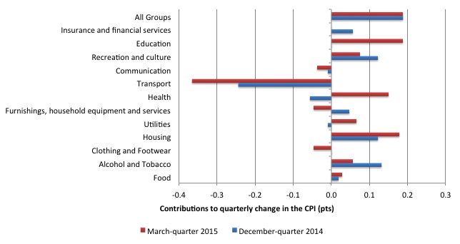
The ABS say that:
The most significant price rises this quarter were for domestic holiday travel and accommodation (+3.5%), tertiary education (+5.7%) and medical and hospital services (+2.2%).
The most significant offsetting price falls this quarter were for automotive fuel (-12.2%) and fruit (-8.0%).
The next bar chart provides shows the contributions in points to the annual inflation rate by the various components.
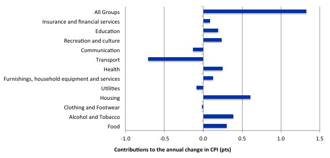
In the twelve months to March 2015, the major drivers of inflation were food, health, housing, and alcohol and tobacco prices. The tobacco and health price rises largely reflect government policy.
Inflation and Expected Inflation
The fear of inflation, in part, drives this misplaced faith in monetary policy over fiscal policy.
If we went back to 2009 and examined all of the commentary from the so-called experts we would find an overwhelming emphasis on the so-called inflation risk arising from the fiscal stimulus. The predictions of rising inflation and interest rates dominated the policy discussions.
The fact is that there was no basis for those predictions in 2009 and five years later inflation is benign or falling other than where some cartel controls the supply-price.
Right around the world, these sort of predictions came to nought because they were made by people who didn’t really understand how the macroeconomy works.
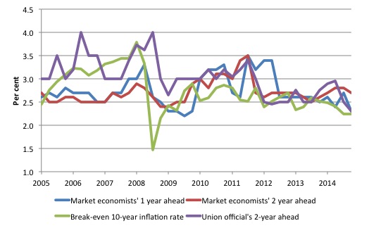
The following graph shows four measures of expected inflation expectations produced by the RBA – Inflation Expectations – G3 – from the June-quarter 2005 to the March-quarter 2015.
The four measures are:
1. Market economists’ inflation expectations – 1-year ahead.
2. Market economists’ inflation expectations – 2-year ahead – so what they think inflation will be in 2 years time.
3. Break-even 10-year inflation rate – The average annual inflation rate implied by the difference between 10-year nominal bond yield and 10-year inflation indexed bond yield. This is a measure of the market sentiment to inflation risk.
4. Union officials’ inflation expectations – 2-year ahead.
Notwithstanding the systematic errors in the forecasts, the price expectations (as measured by these series) are trending down in Australia, which will influence a host of other nominal aggregates such as wage demands and price margins.
The market economists’ two-year ahead is well above the Break-even 10-year inflation rate while the Union officials seem to have a more realistic outlook.
The expectations are still lagging behind the actual inflation rate, which means that forecasters progressively catch up to their previous forecast errors rather than instantaneously adjust, which is what a rational expectations theory would suggest. Another blow to the mainstream economics conception of human behaviour!
Recent evidence regarding fiscal policy
I wrote a blog last December – Trickle down economics – the evidence is damning – where I examined recent evidence on the validity of the so-called ‘trickle down hypothesis’ that dominates neo-liberal thinking.
I concluded that:
The implication is that the major claims relating to ‘trickle-down’ theories, which underpinned the rise of neo-liberalism and the policy shift in favour of privatisations, labour market deregulation, entrenched unemployment, cuts to public funding of health, education and public infrastructure (transport etc) have been shown to be unsupported by the evidence. They are just mindless ideology without an evidence base. The evidence suggests the swing to these policies has undermined economic growth and dented the prospects of millions of people around the world.
Yesterday, I read the a recent publication from the National Bureau of Economic Research in the US (pubilshed in March 2015) – Tax Cuts For Whom? Heterogeneous Effects of Income Tax Changes on Growth and Employment – written by Owen M. Zidar, who is an academic at the University of Chicago.
The link will take you to a working paper version which is very close to the final version put out by the NBER, for which they charge fees to access.
This study “investigates how tax changes for different income groups affect aggregate economic activity”.
It demonstrates why distributional factors are important in understanding fiscal policy outcomes and the macroeconomic performance of a nation, in general.
It also demonstrates how distributional considerations should influence the design of fiscal interventions.
Without detailing the complete methodology deployed by the author, the paper uses examines tax changes by income group (high and low) at the US state level.
He then examines:
… how the composition of these tax changes affects subsequent economic activity …
He points out that tax policy has impacted on high and low income earners differentially in different preiods since the 1980s:
In the early 1980s and 2000s, the largest tax cuts as a share of income went to top income taxpayers. In the early 1990s, top income earners faced tax increases while taxpayers with low to moderate incomes received tax cuts.
That provides an excellent basis for determining whether tax cuts/hikes to high income groups have differential impacts relative to tax cuts/hike to the low income groups.
It also bears on the validity of the trickle down hypothesis. We would expect that if neo-liberal conceptions of tax impacts were accurate, a tax change to a high income earner should have a substantially greater impact on economic activity than a similar tax change for a low income earner.
The paper finds exactly the opposite:
… tax cuts that go to high income taxpayers generate less growth than similarly-sized tax cuts for low and moderate income taxpayers
Read that again!
The results are further summarised as follows:
1. The state by state analysis focused on employment growth.
2. “there is a small to negligible relationship between tax changes for the top 10% and em- ployment growth over a 2 year period”.
3. There is “a stronger relationship between employment growth and tax changes for the bottom 90%, particularly after 1950”.
4. “the positive relationship between tax cuts and employment growth is largely driven by tax cuts for lower-income groups”.
5. “the effects of tax cuts for the top 10% on employment growth is small”.
6. “The effects are larger in states with high unemployment rates, cyclical non-traded industries (e.g. construction), and seem to come from increased durable consumption.”
7. “a one percent of GDP increase in taxes in a given state reduces employment growth over a two year period in that state by 2.6 percent when the tax increase is paid for by taxpayers in the bottom 90% and by 0.2 percent when the tax increase is paid for by taxpayers in the top 10% on average”.
8. “A one percent of state GDP tax change for the bottom 90% reduces the level of state employment by 5.1 percent cumulatively over a two year period”. But the effect for a similar change for the top 10 per cent is around zero!
The impacts are symmetrical whether they be for tax increases or decreases.
What do these results mean?
Those Ayn Rand ‘movers and shakers’ don’t seem to behave in the way that she and her followers (most of the neo-liberal fraternity) thought.
It seems that good old disposable income growth concentrated at the lower ends of the income distribution drives economic performance and increasing or decreasing tax burdens at the top end of the distribution makes very little difference to economic activity.
This also illustrates another feature of fiscal policy that differentiates it from monetary policy.
The government can use fiscal policy to achieve both equity and stimulus purposes.
Many progressives have a distinct distaste for high income earners, until, of course they enter that group themselves and then the situation often changes.
But that quip aside, equity demands that all people have an opportunity to access the real resources of the society more or less equally.
High incomes provide greater opportunity and can get to the point where equity is impossible to achieve given the available real resources.
But what to do when an economy is failing and unemployment is rising. That requires fiscal stimulus.
This research confirms what we have known for a long time based on earlier research. The government can reduce the disposable income of high income earners (higher taxes) and simultaneously expand the disposable income of low income earners and get a large boost in total spending, national income and employment.
The point is that reducing unemployment with a fiscal expansion can also simultaneously achieve equity goals.
It also means that the fiscal expansion could have relatively small impacts on the fiscal balance if it is accomplished with redistributive spending capacity strategies (outline above).
But it is unlikely that when an economy is in recession that full employment can be re-established without increasing the fiscal deficit.
Storms in NSW
I noted Neil Wilson’s comment that the low barometric pressure that NSW has experienced during the recent storms was just “a bit of a cloudy day with a few showers here” where he lives in the UK.
I lived in the UK for a while doing postgraduate studies and, even in the worst of the winter, didn’t quite see anything like we have endured over the last few days on the East Coast of NSW.
To check my memory, I did a little research of historical weather data in the UK. The British Meteorology Office (MET) provides fantastic – UK climate – Historic station data – and with time series data beckoning I did some digging.
I chose the – Bradford station data – as a sample (it is in the region that Neil lives) and I know the area. It gets pretty bleak up there in the Winter months.
The data starts in January 1908. Over the last 107 years, the maximum monthly rainful has been 261.4mm in February 2007.
To put that in perspective, for the month of April 2015, there was 77.1mm of rain recorded at the Maitland (NSW, near Newcastle) rain monitoring station in the first 20 days. Then the storm struck and between 9am on Tuesday (April 21) and 4am Wednesday (April 22), the same local rain station near Newcastle recorded 308mm.
I also consulted the – weather extremes data – provided by the British MET.
No British location has ever recorded more than 279mm of rainfall in a 24-hour period (that being on July 18, 1955 in Martinstown, Dorset).
In terms of wind gusts, the highest ever recorded in Britain was on February 13, 1989 at Fraserburgh, Aberdeenshire – speed 123 knots (or 228 km/h). For England, the highest was 103 knots (189 km/h), at Gwennap Head, Cornwall on December 15, 1979.
Yesterday, the wind speed in the local area was “averaging 90 to 100 km/h and peak gusts of up to 125 km/h”.
Conclusion: not quite a cloudy day with a few showers!
That is enough for today!
(c) Copyright 2015 William Mitchell. All Rights Reserved.
It’s the different effect of the absolute pressure in different parts of the world that’s amazing. (And clearly very scary).
1008 is an extreme storm in NSW and yet here it is only a cloudy day with a few showers. We have to get down to 980 before things get really blowy.
Generally in the UK it has to be below 1000 before anybody puts a coat on.
Please don’t think I was making light of the NSW storm because I’m a grizzled UK northerner used to every season in a single day. I most certainly wasn’t. I was just surprised that what I would almost call ‘high pressure’ was causing such danger to life and property.
It amazing what you learn reading this blog.
Dear Neil Wilson (at 2015/04/22 at 18:22)
I wasn’t worried that you were making light. I was interested in the differences and sought data (as usual). It revealed very interesting variations.
Several more deaths today are now reported from cars being washed off roads by the rain deluge into flooded pastures. Its been a massive storm.
best wishes
bill
Truly awful.
The worst storm I remember in the UK was the Great Storm of 1987. The central pressure there got down to 953mb. And although people died and a lot of damage was done it was nowhere near as bad as what you’re reporting.
Interesting how the same settings in the weather lead to totally different effects in the local area based upon specific local conditions.
Much like economics…
Dear Bill
This has nothing to do with Australia, but the Conservative Canadian government brought down a budget yesterday. They take great pride in saying that it is a BALANCED budget. There is going to be a federal election in Canada this year, and the Conservatives will tirelessly hammer on the fact that they succeeded in balancing the budget, which in their eyes makes them excellent economic policymakers. Opposition parties are only going to say that the budget isn’t really balanced.
Regards. James
Bill, how do you easily explain MMT to others? Are there any good resources?
Further to the Canadian budget and proposed balanced budget legislation, here is my letter in the Vancouver Sun:
Allow deficits to curb unemployment
Re: Balanced budget laws don’t have to work perfectly to be useful, Column, April 9
The issue is not whether balanced budget legislation is a good idea, but whether targeting a balanced budget at the national level makes sense. The federal budget is a tool to manage the economy, and good management requires counter-cyclical fiscal policy to keep the economy on an even keel.
When inflation threatens, the government must tax more and spend less. And when the economy is depressed, the opposite – more spending and less taxation – is called for. The budget balance will fluctuate up and down as required. If funding is needed, the government owns a central bank which can always provide it.
Even the Conservative government brags about how thousands of jobs were saved as a result of billions of dollars of stimulus after the financial crisis of 2008. A $200-billion extraordinary financing framework was created to bail out big banks and large corporations. And the Conservatives admit in their proposed legislation that government money must be made available in urgent circumstances such as war.
But Canada has 1.3 million unemployed. Why is that not considered urgent? We know that long-term unemployment leads to increased rates of family breakdown, increased crime rates, increased alcohol and substance abuse, increased suicide rates, increased incidence of mental and physical problems, and lost opportunities for skill development and work experience among the young.
Too many pundits, politicians and academics are prepared to sacrifice the welfare of the jobless by counselling the straitjacket of balanced budgets.
Read more: http://www.vancouversun.com/news/Tuesday+April+Treaty+issues+deep/10988722/story.html#ixzz3Xuz50Rkb
I am definitely an economics layman but it seems to me that maintaining a “pool of unemployed” is part of Conservative Govt policy to keep a lid on wages growth.
Secondly it allows them to maintain a constant economic emergency, keeping the uninformed public scared & compliant.