Today (April 18, 2024), the Australian Bureau of Statistics released the latest - Labour Force,…
Australian labour market – flat and not looking very prospective
Today’s release of the – Labour Force data – for August 2015 by the Australian Bureau of Statistics shows that the Australian labour market stalled this month with fairly weak employment growth, a falling participation rate, and flat hours worked. Unemployment decreased as did the unemployment rate but it that was all due to the decline in the participation rate – that is, unemployment was replaced by hidden unemployment as a result of the weak employment growth. The teenage labour market went backwards in August and their situation remains parlous. In a sense, this is the calm before the storm as private investment is forecast to decline rather sharply in the coming year and the government is intent on cutting its net spending. Either outcome will see the labour market retreat rather quickly.
The summary ABS Labour Force (seasonally adjusted) estimates for August 2015 are:
- Employment increased 17,400 (0.15 per cent) with full-time employment increasing by 11,500 and part-time employment rising by 5,900.
- Unemployment decreased by 14,400 to 781,100.
- The official unemployment rate decreased by 0.1 points to 6.2 per cent but this was due to the decline in participation.
- The participation rate decreased by 0.1 points 65 per cent. It is still well below its November 2010 peak (recent) of 65.9 per cent.
- Aggregate monthly hours worked decreased by 0.6 million hours (0.04 per cent).
- The quarterly ABS broad labour underutilisation estimates (the sum of unemployment and underemployment) were updated in this month. Underemployment was at 8.4 per cent and total labour underutilisation rate was at 14.3 per cent. There were 1,051.2 thousand persons underemployed and a total of 1.839.3 thousand workers either unemployed or underemployed. The next quarterly release is in the November 2015 publication.
Employment growth barely positive
In the last month, total employment increased by a miserable 17,700 (0.15 per cent) with full-time employment increasing by 11,500 and part-time employment rising by 5,900.
Over the last 12 months employment has grown by 2 per cent which is still below the labour force growth rate.
Over the last 24 months or so we have seen the labour market data switching back and forth regularly between negative employment growth and positive growth spikes.
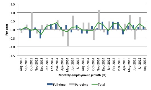
The following graph shows the month by month growth in full-time (blue columns), part-time (grey columns) and total employment (green line) for the 24 months to August 2015 using seasonally adjusted data. It gives you a good impression of just how flat employment growth has been notwithstanding the huge spike in part-time employment in the November 2014 survey.
While full-time and part-time employment growth are fluctuating around the zero line, total employment growth is still well below the growth that was boosted by the fiscal-stimulus in the middle of 2010.
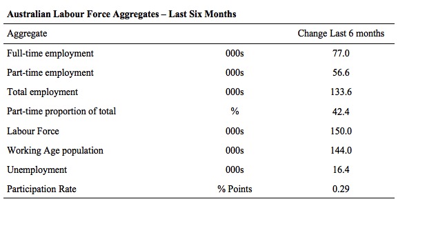
The following table provides an accounting summary of the labour market performance over the last six months. The monthly data is highly variable so this Table provides a longer view which allows for a better assessment of the trends. WAP is working age population (above 15 year olds).
The conclusion – overall there have been 133.6 thousand jobs (net) added in Australia over the last six months while the labour force has increased by 150 thousand. Employment growth has thus not kept pace with the supply of labour.
Full-time employment has risen by 77 thousand jobs (net) while part-time work has risen by 56.6 thousand jobs. Thus, 42.4 per cent of the total employment created (net) over the last 6 months has been part-time.
The participation rate has risen by 0.29 points.
The inadequate employment growth has thus seen unemployment rise by 16.4 thousand.
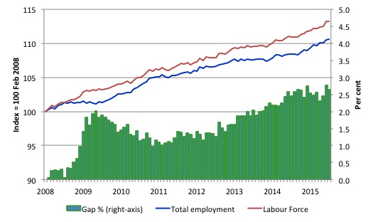
To put the recent data in perspective, the following graph shows the movement in the labour force and total employment since the low-point unemployment rate month in the last cycle (February 2008) to August 2015. The two series are indexed to 100 at that month.
The green bars (right-axis) represent the gap (plotted against the right-axis) between the two aggregates and measures the change in the unemployment rate since the low-point of the last cycle (when it stood at 4 per cent).
You can see that the labour force and employment indexes are following a similar growth path and so the rise in unemployment has levelled off for the time being.
The Gap series gives you a good impression of the asymmetry in unemployment rate responses even when the economy experiences a mild downturn (such as the case in Australia). The unemployment rate jumps quickly but declines slowly.
It also highlights the fact that the recovery has not strong enough to bring the unemployment rate back down to its pre-crisis low. You can see clearly that the unemployment rate fell in late 2009 and then has hovered at the same level for some months before rising again over the last several months.
The Gap shows that the labour market is now in much worse shape than it was at the peak of the financial crisis in 2009. After the government prematurely terminated the fiscal stimulus the situation has progressively deteriorated.
In August 2015, the Gap of 2.6 percentage points and remains well above the levels that appeared in June and June 2009 when the Australian economy was enduring the impact of the crisis. All the gains made since then have thus disappeared due to poorly crafted fiscal policy not responding appropriately to non-government spending changes.
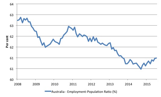
Given the variation in the labour force estimates, it is sometimes useful to examine the Employment-to-Population ratio (%) because the underlying population estimates (denominator) are less cyclical and subject to variation than the labour force estimates. This is an alternative measure of the robustness of activity to the unemployment rate, which is sensitive to those labour force swings.
The following graph shows the Employment-to-Population ratio, since February 2008 (the low-point unemployment rate of the last cycle).
It dived with the onset of the GFC, recovered under the boost provided by the fiscal stimulus packages but then went backwards again as the last Federal government imposed fiscal austerity in a hare-brained attempt at achieving a fiscal surplus.
The ratio has been steadily rising since October 2014 and suggests that the labour market may have bottomed out and will improve slowly as long as there are no major policy contractions or cuts in private capital formation.
The on-going fiscal deficit is still supporting some growth in the economy as the spending associated with the mining boom disappears.
The series was flat in the last month.
Full-time and Part-time employment trends
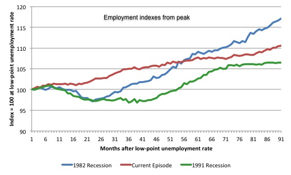
The following graph shows employment indexes for the last 3 recessions and allows us to see how the trajectory of total employment after each peak prior to the three major recessions in recent history: 1982, 1991 and 2009 (the latter to capture the current episode).
The peak is defined as the month of the low-point unemployment rate in the relevant cycle and total employment was indexed at 100 in each case and then indexed to that base for each of the months as the recession unfolded.
I have plotted the 3 episodes for 89 months after the low-point unemployment rate was reached in each cycle – the length of the current cycle.
The initial employment decline was similar for the 1982 and 1991 recessions but the 1991 recovery was delayed by many months and the return to growth much slower than the 1982 recession.
The current episode is distinguished by the lack of a major slump in total employment, which reflects the success of the large fiscal stimulus in 2008 and 2009.
However, the recovery spawned by the stimulus clearly dissipated once the fiscal position was reversed and the economy is now producing very subdued employment outcomes.
Moreover, since February 2008, employment has grown by a miserly 10.6 per cent, which is a glacial pace.
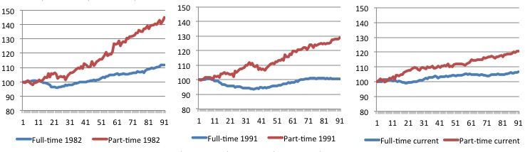
The next 3-panel graph decomposes the previous graph into full-time and part-time employment. The vertical scales are common to allow a comparison between the three episodes.
First, after the peak is reached, part-time employment continues to increase as firms convert full-time jobs into fractional jobs.
Second, recoveries are dominated by growth in part-time employment as firms are reluctant to commit to more permanent arrangements with workers while there is uncertainty of the future course in aggregate demand.
Third, the current recovery is clearly mediocre by comparison, with both very subdued growth in full-time and part-time work.
Teenage labour market – goes backwards
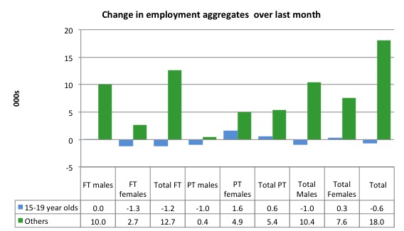
Teenagers lost 1.2 thousand (net) full-time jobs overall but gained 600 part-time jobs (net) in August 2015. The net outcome was a loss of 600 jobs overall.
The following graph shows the distribution of net employment creation in the last month by full-time/part-time status and age/gender category (15-19 year olds and the rest)
If you take a longer view you see how poor the situation remains.
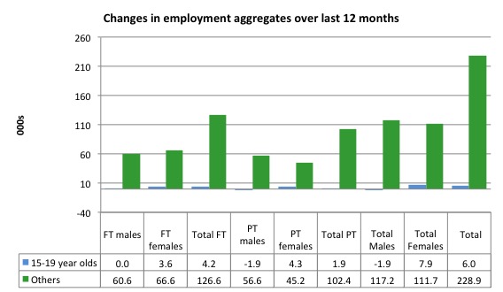
Over the last 12 months, teenagers have gained only 6 thousand jobs overall while the rest of the labour force have gained 228.9 thousand net jobs. Remember that the overall result represents a fairly poor annual growth in employment.
The teenage segment of the labour market is being particularly dragged down by the sluggish employment growth, which is hardly surprising given that the least experienced and/or most disadvantaged (those with disabilities etc) are rationed to the back of the queue by the employers.
The following graph shows the change in aggregates over the last 12 months.
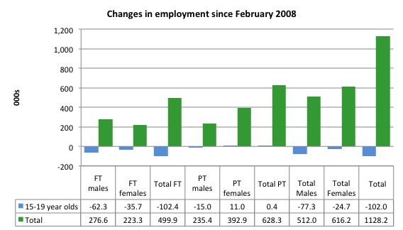
To further emphasise the plight of our teenagers, I compiled the following graph that extends the time period from the February 2008, which was the month when the unemployment rate was at its low point in the last cycle, to the present month (August 2015). So it includes the period of downturn and then the so-called “recovery” period. Note the change in vertical scale compared to the previous two graphs.
Since February 2008, there have been only 1,228.2 thousand (net) jobs added to the Australian economy but teenagers have lost a staggering 102 thousand over the same period. It is even more stark when you consider that 102.4 thousand full-time teenager jobs have been lost in net terms.
Even in the traditionally, concentrated teenage segment – part-time employment, teenagers have gained only 400 jobs (net) even though 628.3 thousand part-time jobs have been added overall.
Overall, the total employment increase is modest. Further, around 55 per cent of the total (net) jobs added since February 2008 have been part-time, which raises questions about the quality of work that is being generated overall.
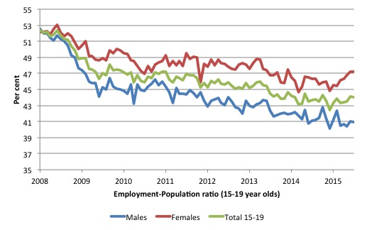
To put the teenage employment situation in a scale context the following graph shows the Employment-Population ratios for males, females and total 15-19 year olds since February 2008 (the month which coincided with the low-point unemployment rate of the last cycle).
You can interpret this graph as depicting the loss of employment relative to the underlying population of each cohort. We would expect (at least) that this ratio should be constant if not rising somewhat (depending on school participation rates).
The facts are that the absolute loss of jobs reported above is depicting a disastrous situation for our teenagers. Males, in particular, have lost out severely as a result of the economy being deliberately stifled by austerity policy positions.
In the last month, with the employment situation improving, there has been some reversal in the downward trends in these ratios.
The male ratio has fallen by 12.1 percentage points since February 2008, the female by 4.9 percentage points and the overall teenage employment-population ratio has fallen by 8.3 percentage points. That is a staggering decline in the employment market for Australian teenagers.
Overall, the performance of the teenage labour market continues to be deeply disturbing. It doesn’t rate much priority in the policy debate, which is surprising given that this is our future workforce in an ageing population. Future productivity growth will determine whether the ageing population enjoys a higher standard of living than now or goes backwards.
The best the Government appears to be capable of is to dream up plans which deny income support to this group and impose impossible activity tests on them.
The longer-run consequences of this teenage “lock out” will be very damaging.
I continue to recommend that the Australian government immediately announce a major public sector job creation program aimed at employing all the unemployed 15-19 year olds, who are not in full-time education or a credible apprenticeship program.
The Government should abandon their ideological obsession with supply-side punishment regimes and realise that the unemployed cannot search for jobs that are not there.
It is clear that the Australian labour market continues to fail our 15-19 year olds. At a time when we keep emphasising the future challenges facing the nation in terms of an ageing population and rising dependency ratios the economy still fails to provide enough work (and on-the-job experience) for our teenagers who are our future workforce.
Unemployment – decreased 14,400 thousand
The unemployment rate decreased by 0.1 points to 6.3 per cent in August 2015 on the back of a drop in the participation rate (see separate analysis below).
Overall, the labour market still has significant excess capacity available in most areas and what growth there is is not making any major inroads into the idle pools of labour.
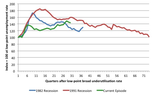
The following graph updates my 3-recessions graph which depicts how quickly the unemployment rose in Australia during each of the three major recessions in recent history: 1982, 1991 and 2009 (the latter to capture the 2008-2010 episode). The unemployment rate was indexed at 100 at its lowest rate before the recession in each case (February 1981; February 1989; June 2008, respectively) and then indexed to that base for each of the months as the recession unfolded.
I have plotted the 3 episodes for 90 months after the low-point unemployment rate was reached in each cycle. This is the duration of the current cycle. For 1991, the peak unemployment which was achieved some 38 months after the downturn began and the resulting recovery was painfully slow. While the 1982 recession was severe the economy and the labour market was recovering by the 26th month. The pace of recovery for the 1982 once it began was faster than the recovery in the current period.
It is significant that the current situation while significantly less severe than the previous recessions is dragging on which is a reflection of the lack of private spending growth and declining public spending growth.
Moreover, the current episode is also different to the last two major recessions in the sense that the recovery is over and the economy is deteriorating again.
In relative terms, the current episode is now worse than the other two recessions (in terms of deviation from low-point unemployment rate).
The graph provides a graphical depiction of the speed at which the recession unfolded (which tells you something about each episode) and the length of time that the labour market deteriorated (expressed in terms of the unemployment rate).
Clearly this type of graph will lose relevance because the 1982 episode will start feeding into the 1992 period. It just goes to show how long these episodes of high unemployment are – in all three cases the unemployment rate was still well above where it started some 7 years earlier.
From the start of the current downturn to August 2015, the official unemployment rate has risen from a base index value of 100 to a value 156.1.
After falling steadily as the fiscal stimulus pushed growth along (it reached 122.5 after 35 months – in February 2010), it has been slowly trending up for some months now. Unlike the other episodes, the current trend, at this stage of the cycle, is mildly upwards.
It is now above the peak that was reached just before the introduction of the fiscal stimulus. In other words, the gains that emerged in the recovery as a result of the fiscal stimulus in 2009-10 have now been lost.
It is clear that at an equivalent point in the “recovery cycle” the current period is more sluggish than our recent two major downturns and trending upwards while the trend in the earlier episodes was moderately downwards.
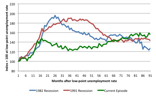
Note that these are index numbers and only tell us about the speed of decay rather than levels of unemployment. Clearly the 6.2 per cent at this stage of the downturn is lower that the unemployment rate was in the previous recessions at a comparable point in the cycle although we have to consider the broader measures of labour underutilisation (which include underemployment) before we draw any clear conclusions.
The notable aspect of the current situation is that the recovery is very slow.
Broad labour underutilisation – upwards of 14.4 per cent
The ABS published its quarterly broad labour underutilisation measures for the August-quarter in this month’s data release.
In the August_quarter, total underemployment remained at 8.4 per cent and the ABS broad labour underutilisation rate (the sum of unemployment and underemployment) was 14.3 per cent.
| There were 1,051.2 thousand persons underemployed and a total of 1.839.3 thousand workers either unemployed or underemployed. |
The following graph plots the history of underemployment in Australia since February 1978 to the August_quarter 2015.
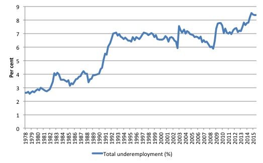
If hidden unemployment is added to the broad ABS figure the best-case (conservative) scenario would see a underutilisation rate well above 16 per cent at present. Please read my blog – Australian labour underutilisation rate is at least 13.4 per cent – for more discussion on this point.
The following graph shows the same type of indexes as the previous graph except it uses the ABS broad labour underutilisation rate (unemployment plus underemployment). It also is in terms of quarters rather than months.
We also show the full evolution of the the 1982 and 1991 episodes from the low-point (= 100) through the peak and back to the next low-point.
In the case of the 1982 recession the index had risen to a peak of 172.8 in May 1983 (a broad underutilisation rate of 14.5 per cent) and then fell back to 9.8 per cent by November 1989 (index value 117.5).
At that point, the cycle turned down again signalling the beginning of the 1991 recession. That cycle reached a peak of 185.4 (or 18.2 per cent in November 1992) and it took until February 2008 for it to reach the low-point of 10 percent (an index value of 101.4). That point marked the beginning of the next cycle.
That should tell you how severe the 1991 recession was and how asymmetric the labour market response is on either side of the cycle. From its start in November 1989 it took 74 quarters (18.5 years) to return to more or less that level.
In terms of the three recession comparison, at the same period in the ‘recovery’ (using quarterly data), the broad labour underutilisation rate (unemployment plus underemployment) had an index value of 128.7 in the 1982 recession (absolute value of 10.8 per cent); an index value of 159.7 in the 1991 recession (absolute value of 15.7 per cent); and an index value of 143.9 in the current period (absolute value of 14.4 per cent).
So while the level of unemployment is much lower now than in the 1982 recession (at a comparable stage), underemployment is now much higher and so the total labour underutilisation rates is higher. Further, the 1982 recovery in broad underutilisation terms was more robust than the current stagnating situation.
The current situation is akin to the devastating 1991 recession, although underemployment is higher and unemployment lower.
Commentators who think of the 1982 recession as severe, rarely see it in these terms. Joblessness is probably worse than underemployment but both mean that labour is wasted and income earning opportunities are being foregone. For a worker with extensive nominal commitments, the loss of income when hours are rationed may be no less severe than the loss of hours involved in unemployment, if the threshold of solvency is breached.
The next update will be for the August-quarter 2015 Labour Force data release published in early September 2015.
Aggregate participation rate – falls by 0.1 points
The August 2015 participation rate fell by 0.1 points to 65 per cent. Even so, it remains substantially down on the most recent peak in November 2010 of 65.9 per cent when the labour market was still recovering courtesy of the fiscal stimulus.
The fall in the official unemployment rate by 0.1 points this month was almost all due to the decline in the participation rate.
The labour force is a subset of the working-age population (those above 15 years old). The proportion of the working-age population that constitutes the labour force is called the labour force participation rate. Thus changes in the labour force can impact on the official unemployment rate, and, as a result, movements in the latter need to be interpreted carefully. A rising unemployment rate may not indicate a recessing economy.
The labour force can expand as a result of general population growth and/or increases in the labour force participation rates.
What would have the unemployment rate been had the participation rate not fallen by 0.1 points?
The following Table shows the breakdown in the changes to the main aggregates (Labour Force, Employment and Unemployment) and the impact of the rise in the participation rate.
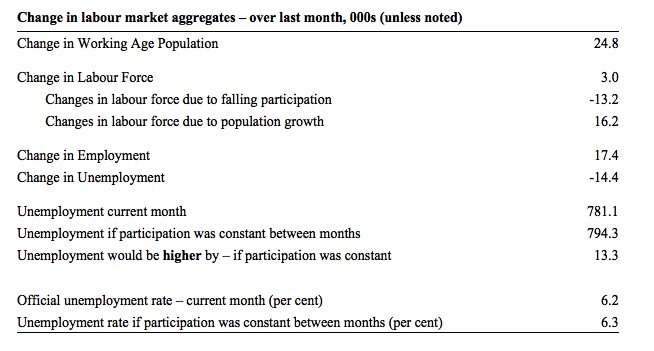
In August 2015, the increase in employment of 17.4 thousand (net) jobs was accompanied by a labour force rise of only 3 thousand. As a result, unemployment decreased by 14.4 thousand.
The rising labour force in August 2105 was the outcome of two separate factors:
- The underlying population growth added 16.2 thousand persons to the labour force. The population growth impact on the labour force aggregate is relatively steady from month to month but has slowed in recent months; and
- The fall in the participation rate meant that there were 13.2 thousand workers dropping out of the labour force (relative to what would have occurred had the participation rate remained unchanged).
- The net result was the small rise in the labour force of 3 thousand.
So even though employment growth was barely stronger than the underlying population growth, the fall in the participation meant that unemployment fell by 14.4 thousand.
If the participation rate had not have fallen, total unemployment, at the current employment level, would have been 794.3 thousand rather than the official count of 781.1 thousand as recorded by the ABS – a difference of 13.2 thousand workers (the ‘participation effect’).
Thus, without the fall in the participation rate, the unemployment rate would have been 6.3 per cent (rounded) rather than its current value of 6.2 per cent. That is, it would have remained unchanged.
The conclusion is that hidden unemployment rose slightly in August 2105 while official unemployment rate fell by 0.1 points.
There is considerable monthly fluctuation in the participation rate but the current rate of 65 per cent is a long way below its most recent peak in November 2010 of 65.9 per cent.
What would the unemployment rate be if the participation rate was at that last November 2010 peak level (65.9 per cent)?
The following graph tells us what would have happened if the participation rate had been constant over the period November 2010 to August 2015. The blue line is the official unemployment since its most recent low-point of 4 per cent in February 2008.
The red line starts at November 2010 (the peak participation month). It is computed by adding the workers that left the labour force as employment growth faltered (and the participation rate fell) back into the labour force and assuming they would have been unemployed. At present, this cohort is likely to comprise a component of the hidden unemployed (or discouraged workers).
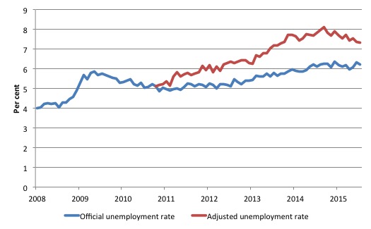
Total official unemployment in August 2015 was estimated to be 781.1 thousand. However, if participation had not have fallen since November 2010, there would be 931.6 thousand workers unemployed given growth in population and employment since November 2010.
| The unemployment rate would now be 7.3 per cent if the participation had not fallen below its November 2010 peak of 65.9 per cent. |
The difference between the two numbers mostly reflects, in part, the change in hidden unemployment (discouraged workers) since November 2010. These workers would take a job immediately if offered one but have given up looking because there are not enough jobs and as a consequence the ABS classifies them as being Not in the Labour Force.
There has been some change in the age composition of the labour force (older workers with low participation rates becoming a higher proportion) but this only accounts for about a 1/3 of the shift. The rest is undoubtedly hidden unemployment.
Note, the gap between the blue and red lines doesn’t sum to total hidden unemployment unless November 2010 was a full employment peak, which it clearly was not. The interpretation of the gap is that it shows the extra hidden unemployed since that time.
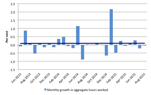
Hours worked – fell in August 2015
Aggregate monthly hours worked decreased by 0.6 million hours (-0.04 per cent) in August 2015 in seasonally adjusted terms.
The flat hours growth combined with the slightly faster employment growth has arisen because the full-time workers are now experiencing shorter working weeks. We will know more about that in due course.
The following graph shows the trend and seasonally adjusted aggregate hours worked indexed to 100 at the peak in February 2008 (which was the low-point unemployment rate in the previous cycle).
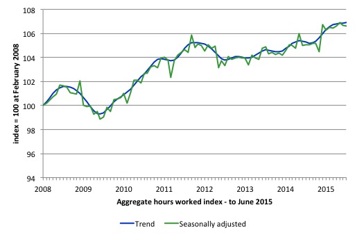
The next graph shows the monthly growth (in per cent) over the last 24 months. The dark linear line is a simple regression trend of the monthly change – which depicts the near flat trend. You can see the pattern of the change in working hours is also portrayed in the employment graph – zig-zagging across the zero growth line.
The reality is that working hours in the Australian labour market over the last two years have exhibited hardly any net growth and over the last twelve months total working hours are up by just 1.5 per cent.
That is, not a significant rise.
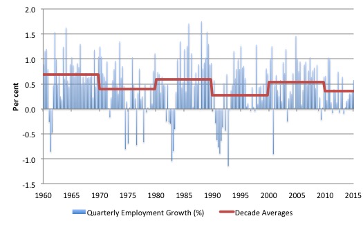
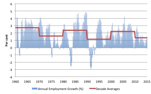
Historical reminder
It is sometimes useful to look at a longer time series to put the current period into some perspective. The following two graphs show quarterly (first graph) and annual employment growth (second graph) since the first-quarter 1960 to the June-quarter 2015.
The horizontal lines represent the respective decade average growth rates as a summary guide to the shifting performance.
Two points can be made irrespective of whether we use quarterly or annual growth rates.
1. Recession is damaging and should be avoided.
2. The growth rates in the 1960s were much stronger (close to 4 per cent per annum) than than the current period. Indeed, since the neo-liberal era began – variously from the 1980s – the growth rates have dropped on average and now struggle in good times to be above 1 per cent per annum.
The 1960s also supported much stronger real GDP growth rates and higher productivity growth. Fiscal deficits were the norm. In the 1970s, the federal government started to obsess about the deficits and the attempts at achieving surplus had the predictable effect. Slower growth, declining productivity growth and lower average employment growth.
The neo-liberal period has not been successful in this regard.
Quarterly employment growth
Annual employment growth
Conclusion
In general, we always have to be careful interpreting month to month movements given the way the Labour Force Survey is constructed and implemented.
Last month’s variations were a clear warning of the volatility in the monthly estimates. The ABS has now recalibrated its population benchmarks to reflect the slower than previously anticipated growth, which is now reflected in the time series reported.
This month, employment barely grew (just faster than the underlying population growth) and unemployment only fell because the participation rate fell a bit (workers leaving the labour force).
What we can make of the data is that the economy is not contracting at present but is with employment just keeping pace with the population growth, the pool of unemployment labour will remain at the elevated levels.
Whether unemployment has peaked is unclear at this stage. If the private investment plans (projected rather significant cuts) for the forthcoming year are realised then peak unemployment will be higher than it is at present.
The participation rate fell in August 2015 and remains well below its November 2010 peak, which means that employment growth has not been strong enough to induce people back into the labour force for an extended period of time.
The upward trend in the Employment-to-Population ratio stalled this month.
The glaring failure is that the teenage labour market remains in a parlous state. This segment of the labour force is not enjoying any of the growth in the labour market.
This is an emergency which is being ignored by the Federal Government. The neglect of our teenagers will have a very long memory indeed and the negative consequences will be stronger given the ageing population.
That is enough for today!
(c) Copyright 2015 William Mitchell. All Rights Reserved.
No politician in Australia cares about teenage unemployment because if they did they would either do something about it or hand in their resignation.
“133.6 thousand jobs (net) added in Australia over the last 6months while the labour force has increased by 150 thousand”.
I’m no economic genius but that those figures tell me one thing – there are too many bloody people for the available work.
One of the principal reasons for that state of affairs is an insane immigration policy,including the “new” found Syrian refugee source. Tell me now,just how long ago did the Assad son begin to radically increase the slaughter of his people?
One of the other principal reasons is insane trade agreements,especially the latest with China. It should be obvious by now that the Chinese in their insatiable greed accompanied by arrogance, will bring their own nationals in to replace Australian workers on property which they have been allowed to purchase contrary to the long term interests of Australian citizens.
I know from long experience just how stupid the leadership in Australia is.
I am still plumbing the depths of the stupidity of Australia’s so called citizens when they return a blind eye to this ripoff.
There will always be too many people for available work, Podargus, unless a job guarantee is in place.