For years, those who want selective access to government spending benefits (like the military-industrial complex…
UK household spending falling yet corporate profitability at record levels
Last week (December 8, 2015), the British Office of National Statistics released its updated – Family Spending, 2015 edition – which provides a detailed breakdown of household spending for 2014. What is interesting about the release from my perspective, in addition to seeing how household spending changes in composition over time, is what it says about distributional forces in the UK and the way in which households are losing out to corporate interests under the policy directions of neo-liberal British Labour and Conservative governments. In real terms, household spending overall is a lower in 2014 than what it was at the turn-of-the-century. British households are also saving less as a percent of their disposable income than they were 10 years ago. The weight share in national income has fallen dramatically over that time. Yet, real GDP growth (that is, real national income) has risen by around 27 per cent since the turn-of-the-century. It doesn’t take a genius to work out where that real income that it the workers have lost has gone. There are several components to this story and this blog looks at some of them.
Household spending patterns 2000-01 to 2014
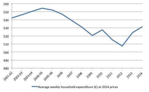
In 2001/02, British households on average spent £542.50 per week in inflation-adjusted terms (that is, in real terms).
In 2014, British households on average spent £531.30 per week in real terms. That is a real decline of 2.1 per cent over the 13 year period.
Average weekly expenditure per person in 2001/02 was £228.30.50 per week in real terms, whereas by 2014 this it dropped 2.8 per cent two £221.80 per week.
The following graph shows average weekly household expenditure (£) in real terms between 2001/02 and 2014. The declining expenditure preceded the onset of the GFC.
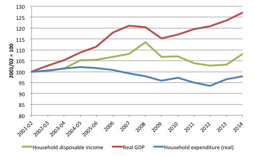
To put this in perspective I constructed the following graph, which shows the growth of real GDP (that is, economy wide income generated per year) and Household disposable income in real terms (2014 prices), and average weekly household expenditure (also at 2014 prices).
In this case, I indexed the three series to 100 as at 2001/02 to show you the evolution of total GDP income household disposable income and household average weekly expenditure.
It’s rather stark I think to see real GDP growing by 27.1 per cent over this period, real household disposable income growing by just 8 per cent, and real average weekly household expenditure falling by 2.1 per cent.
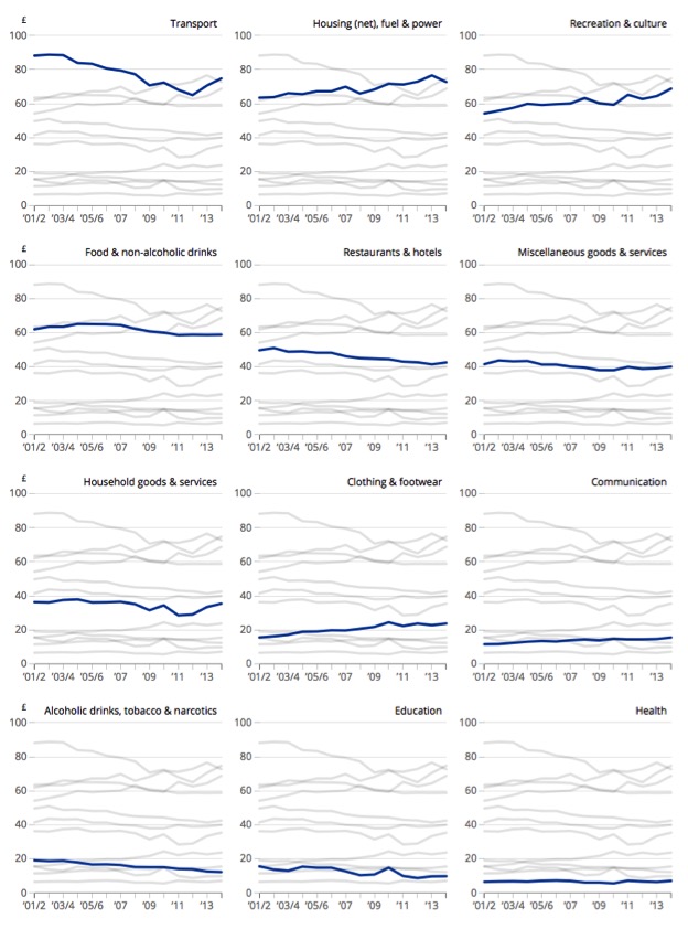
The following graph is taken from the ONS report (December 8, 2015) – Households spend the most on transport – and shows the evolution of the broad spending categories in the survey from 2001/02 to 2014.
You can see that British households are spending more on Housing, Recreation and culture, less on Addictive substances and Education (as trends).
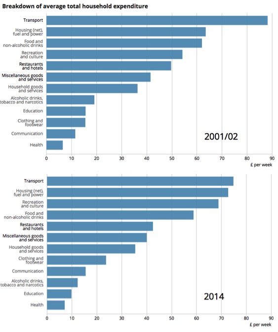
To summarise that information, I put together this graph which allows a comparison of the breakdown of average total household expenditure in 2001/02 and 2014.
Relative to 2001/02, British households are spending much more on Housing, fuel and power, less on Food and non-alcoholic drinks, more on Recreation and culture, less on Restaurants and hotels and substantially less on Education.
Other related evidence, suggests that British households so squeezed in real income terms are consuming larger proportions of their weekly spending on essentials.
Corporate profitability sky-rockets in the UK
On December 1, 2015, the British ONS released the latest data on – Profitability of UK Companies, Quarter 2 (April to June) 2015 – which provides one part of the picture as to what is going on.
The following graph shows the annual rates of return of private non-financial corporations in Britain (net), which is calculated as the Gross operating surplus less capital consumption at current replacement cost.
It is clear that the GFC did very little to dampen rates of return, which have celebrated quickly in the last four years.
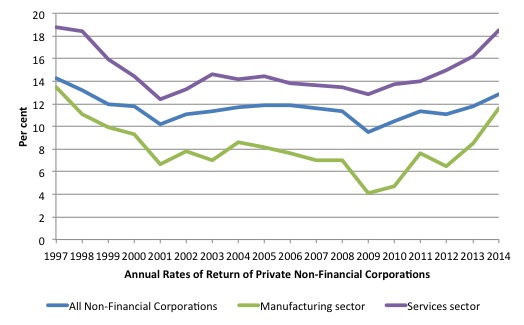
In its publication, the ONS say:
Manufacturing Companies
The estimated net rate of return for manufacturing companies in Quarter 2 2015 was 6.7%. This was 0.9 percentage points lower than Quarter 1 2015.
… the estimates of net rate of return for the manufacturing sector can be volatile. Variation from one quarter to the next usually reflects the fortunes of a number of the larger companies and is not necessarily an indicator of improving or worsening economic performance across the sector as a whole.
Service companies
The estimated net rate of return for service companies in Quarter 2 2015 was 21.3%. This was the highest estimated rate since the series began, surpassing the previous highest revised estimate of 20.8% for Quarter 1 2015.
Rates of return in excess of 20 per cent at a time when household incomes are barely growing in real terms and household spending on average is declining in real terms indicates serious imbalances in the distribution of national income.
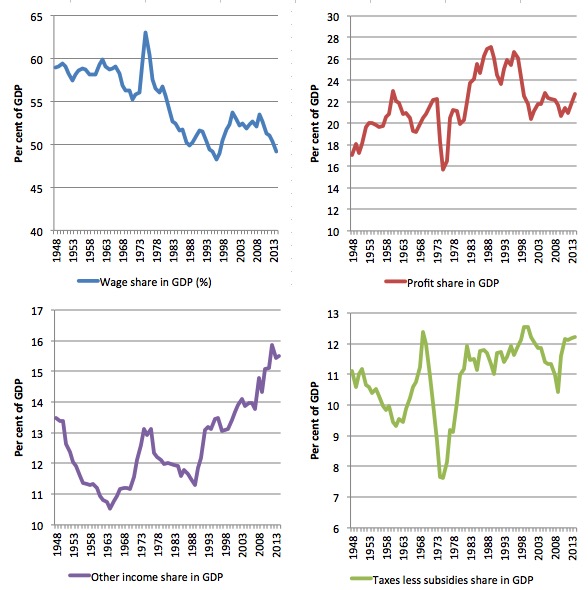
The wage share in national income has fallen dramatically since the mid 1970s
This is part of a longer term trend that has been characteristic of the neo-liberal period since the early Thatcher days.
The following graph shows the shares of each category of income in GDP at market prices from 1948 to 2014. The data are available from the Quarterly and annual data for GDP estimates at chained volume measures and current prices published by the ONS.
They also provide an historical archive which provides data from 1948 to 1996.
GDP income is distributed between Compensation of employees, Gross operating surplus of corporations, Taxes on products less subsidies (government share) and Other income (which includes “mixed income and the operating surplus of the non-corporate sector”).
The latter category includes the self-employment and small business income shares. We clearly expect that to rise somewhat in recent years given the rapid rise in self-employment.
The wage share in 2014 was 49.2 per cent of GDP whereas through the 1950s up to mid-1980s it averaged 58 per cent.After the Thatcher years the wage share was steadily eroded.
The share taken out by government has not increased significantly over this period (11 per cent in 1948 to 12 per cent in 2014).
Clearly, some of the decline in the wage share has been due to the increase in the other income share particularly since the late 1990s, although that in this has only been of the order of two percentage points.
The profit share has risen over time, with oscillations, and since the GFC has risen by around two percentage points. It is clear that the fundamental transformation is in fact a shares began during the Thatcher years with an upward trend in the profit share in a downward trend in the wage share.
The only way in which these developments can occur is if productivity growth outstrips the growth in real wages. I have explained that relationship many times before and if you’re unsure just do a search to find the explanation.
What it means is that workers are more productive than they were but are not sharing in that increase productivity and the surpluses being generated are being appropriated by the profit share.
There is an interesting paper – How to Boost the Wage Share – published by the British TUC Touchstone Pamphlets (No 13) in 2013.
They find that “skill-biased technological change and globalisation has played some role” in the decline of the wage share and the corresponding increase in the profit share, but the most significant determinants have been “the reduction in trade union and collective bargaining coverage in the workplace” and “the increased role of financial activity and the rising prominence of financial institutions in national economies”.
The increasing profit share is mostly explained by the “increased profitability of the financial sector”. The study also notes that “while profits have risen, investment and research and development spending as a share of GDP have both fallen since the early 1980s”.
So where has all the national income that has been re-distributed to profits gone? The answer they give, which is also consistent with other studies in other nations (that have experienced similar national income redistribution) is that “increase profits have been used to fund fastly increased remuneration packages for directors, financiers and executives in finance and parts of the corporate sector, and a surge in mergers and acquisitions and private equity activity”.
The authors believe that a rebalancing of national income shares in favour of wages with “a lower dispersion of earnings and a reduced dependence on low pay” are necessary conditions for stronger and more stable economic growth and prosperity.
They argue that this rebalancing should form the basis of a “new social contract with labour, underpinned by a new set of governing rules between the state, the workforce and business”.
We can only agree with that.
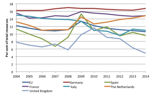
The household saving ratio in the UK has fallen dramatically
The following graph shows the saving ratio out of income (percent) for household and the NPISH (non-profit institutions serving households) four selected EU nations including the United Kingdom from 2004 to 2014.
The behaviour of the United Kingdom stands out in contrast to that of the other nations although clearly Germany, France and the Netherlands form a separate group from Italy and Spain in terms of the non-English speaking nations in the sample.
The squeeze on household income in Britain has meant that consumption growth has in part been driven by a rundown in the saving ratio.
More workers in the UK are now being paid the National Minimum Wage (NMW) or close to it
The following graph shows the proportion of adult hours were that are paid close to the adult National Minimum Wage between 1999 and 2015.
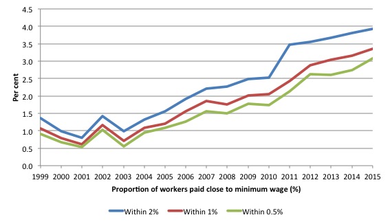
The ONS say that a higher proportion of workers are now earning close to the National Minimum Wage (NMW), which was introduced in 1999:
Examining the distribution of earnings in this manner exposes several characteristics of the UK’s recent experience which are masked by changes in the median and mean measures. The growing concentration of pay at the bottom of the UK’s earnings distribution is particularly marked. While in 1997, the modal rate of hourly pay was between £3.74 and £4.14 and covered 6.0% of all jobs, in 2015, the modal rate of hourly pay was between £6.46 and £6.86, and covered 8.0% of all jobs.
Changes at the bottom of the UK’s earnings distribution appear to be closely related to changes in the NMW … between 1999 and 2003, the NMW affected a relatively small fraction of total adult hours worked. 1.4% of total hours worked were within 2% of the NMW in 1999 – between £3.53 and £3.67 per hour … falling slightly to 1.0% of total hours in 2003. However, this fraction has increased steadily over the last decade. In 2015, 3.9% of total hours and just over 5.0% of adult jobs … were worked within 2.0% of the NMW (Source)
Conclusion
All of these trends are clearly related and part of the overall picture that is characteristic of modern neo-liberal Britain.
The trends are more or less repeated in many advanced nations these days. Taken together, they form part of our understanding of how the world economy is became unbalanced before the crisis and why the crisis finally hit.
They also provide clear policy targets for governments seeking to reform (that is, rebalance their economies). There must be a concerted effort to ensure that productivity growth translates into real wages growth.
There must be less reliance on household debt to fund consumption growth.
It makes no sense for an economy to experience real GDP growth of 27 per cent over a 14 year period, while real average household weekly expenditure falls by 2.1 per cent and corporate profitability to surge to record levels.
The vested interests that have delivered these outcomes have to be tackled head on by progressive politicians.
My role, small though it is, is to provide analysis to support public education and ensure that these politicians are, in turn, supported at the political level.
That is enough for today!
(c) Copyright 2015 William Mitchell. All Rights Reserved.
The key point on the NMW change is that tax credits were introduced in 2003 – just as the percentage of low wage jobs started to take off.
It’s a heck of a correlation that suggests tax credits are indeed private sector wage subsidies. Public funded output has been appropriated by the private sector.
Alternatively, the capitalists and their legions of ethically challenged followers would argue that “THE MARKET” has spoken and there is no problem.
Prof. Mitchell’s headline “Corporate profitability sky-rockets in the UK” is invalid.
His graph of “annual rates of return of private non-financial corporations” is misleading because it is truncated at Q4 2014.
In particular, there was a short-lived spike in manufacturing profits at the end of 2014. This is evident in the ONS’s graphs, but Prof. Mitchell’s graph gives a completely different impression because it omits the latest data for Q1 and Q2 2015.
In fairness to Prof Mitchell, immediately below his graph he reproduces the ONS’s comments on the volatility of manufacturing profits. Even so he retains his misleading headline and graph.
The rate of return of UK service companies dipped to only 10% in 2001 and 12% in 2009, but has since has recovered to 21%, which is slightly above the 1997 rate.
Arguably this is good news since it suggests potential for increases in employment and wages in service industries, especially in SE England. However, it is misleading to describe this recovery as “sky-rockets”.
The data for manufacturing companies remains volatile and bleak, with a 2015 rate of return on capital of only about 7% (Q2 2015), barely half that in 1997. No “sky-rockets” here, alas.
Dear Kingsley Lewis (at 2015/12/14 at 14:44)
In your continual zeal to find fault you clearly haven’t appreciated the context of the blog that you are criticising.
First, I deliberately used the annual profitability series provided by the British ONS to ensure that it aligned with the annual household average weekly spending data published in the HES. That is, correct professional practice which you don’t appear to be familiar with.
Second, I think the use of the term sky-rocket is reasonable given that the describe the service sector profitability as the “highest recorded quarterly estimate since the series began in 1997”.
best wishes
bill
Bill,
Even HMG recognises tax credits are a major expense due to poor wages hence the abortive attempt to reduce them. Meanwhile auto entitlement of pensions from end of Oct 2015 plus increased NI contributions in April (introduced by the last government so do not count as Tory action!) Will exacerbate the problem.
Finally changes to future pension provision (less HMG cost) and replacement of benefits by Universal Credit (thanks A Ian Duncan Smith) will complete the impoverishment.
Richard Wolff has a good graph which shows the flatlining of wages since about 1975 and the upward slope of production. The gap has been filled by bank credit, so the banks are RENTING OUT the money to the population-paying for your wages! It’s ”bankers’ heaven”.
In the UK there are NO politicians trying to educate the public about this -we might as well be in the late 18th Century when Edmund Burke referred to commerce as a natural order ordained by God.
the most significant rise seems to be other income.Income on asset price inflation?
I think to compare GDP growth relative to household earnings and expenditure it would
be helpful to include GDP per capita.
It is worth keeping in mind that growing inequality in incomes masks an even greater falling
share for the majority of workers.I wonder how the share of the fiftieth centiles income has
fallen over the decades.
Is it possible to do a similar post about Australia? Are we as bad as the UK? Maybe not, but I suspect we are approaching it.
Bill,
The introductory paragraph contains – ‘Yet, real GDP growth (that is, real national income) has risen by 23 per cent since the turn-of-the-century.’
Several paragraphs later – ‘It’s rather stark I think to see real GDP growing by 27.1 per cent over this period’.
My eyes (& brain) tend to glaze over when confronted by statistics, but why the apparent discrepancy?
A final word to say that I really enjoy & appreciate your ‘blog’ – consumed daily.
Those ONS figures on Housing and Power seem too low :http://www.theguardian.com/money/2015/jul/16/tenants-in-england-spend-half-their-pay-on-rent
80 quid won’t cover a bedsit in Grimsby these days,let alone power etc too.
What effect if any does population growth have on these figures.