The IMF and the World Bank are in Washington this week for their 6 monthly…
There was no reason for the US to raise interest rates
Last week (December 16, 2015), the US Federal Reserve Bank raised its policy interest rate by 25 basis points (1/4 percentage point) for the first time since 2005. In its – Opening Statement – the Federal Reserve chairperson said that the decision reflected the Bank’s judgement that there had been “further improvement toward our objective of maximum employment” and that it “was recently confident that inflation would move back to its 2 per cent objective over the medium term”. They did, however, acknowledge that “some cyclical weakness likely remains” and referred to the significant drop in labour force participation, the rise in underemployment, and the almost non-existent wages growth. Taken together, it was a strange decision to take given that the labour market is still a long way from where it was pre-crisis (unemployment has been replaced by underemployment and non-participation) and that the price level inflation is well below their two per cent target (even taking into account the extraordinary drop in energy prices).
The last time the Federal Funds Target Rate was increased was in June 2006 when it was raised from 5 to 5.25 per cent. In September 2007, the Bank dropped the Rate to 4.75 per cent and then after nine successive cuts it was down to 1 per cent by November 2008.
The Federal Reserve Bank also released its – Economic Projections of Federal Reserve Board members – last week to accompany the decision, which show the “individual assessments of projected appropriate monetary policy” of the Federal Open Market Committee (FOMC).
This document provides a clue to where the FOMC members consider monetary policy is heading (that is, where the federal funds rate is going over the next three years).
The document provides forecasts of real GDP growth, the unemployment rate, the price deflator for personal consumption expenditure (PCE) and the core PCE measure, which excludes price movements in food and energy (so-called volatile components of price inflation).
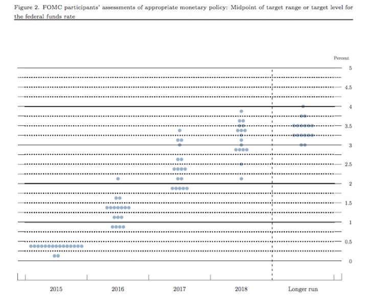
It also produces the following graph (Figure 2 in the document) which plots the “FOMC participants’ assessments of appropriate monetary policy: Midpoint of target range or target level for the federal funds rate” for the next several years.
Each of the ‘dots’ is a estimate of the federal funds rate of each individual member of the FOMC. It’s quite clear that the Committee anticipates a steady rise in the federal funds rate over the next three years although the range expected varies from a rate of just over 2 per cent in 2018 to close to 4 per cent.
The Federal Reserve Bank explains its ambit with respect to interest-rate setting in this document – FOMC Longer-Run Goals and Monetary Policy Strategy – which was updated on January 27, 2015.
It notes its “statutory mandate from the Congress” is to promote “maximum employment, stable prices, and moderate long-term interest rates”.
It says that:
The Committee reaffirms its judgment that inflation at the rate of 2 percent, as measured by the annual change in the price index for personal consumption expenditures, is most consistent over the longer run with the Federal Reserve’s statutory mandate.
It also talks about keeping “longer-term inflation expectations firmly anchored”, which is jargon for stable expected inflation.
It however does not “specify a fixed goal for employment” because it claims that “assessments of the maximum level of unemployment … are necessarily uncertain and subject to revision”.
Of course, this so-called uncertainty gives the Bank the latitude to avoid defining full employment, so that they can allege there is been sufficient improvement even if labour underutilisation rates remain elevated.
In their opening statement, cited above, they say that the “unemployment rate, at 5 percent in November … is close to the median of the FOMC participants’ estimates of its longer-run normal level”. Yet, they acknowledge that participation is well down on pre-crisis levels and there are significant numbers of “people who are working part time but would rather work full time”.
When I reflect on the broad array of data that one considers when assessing the state of an economy, the FOMC’s decision seems premature.
Capacity utilisation rates are well-down and falling again
The Federal Reserve Bank publishes a monthly data series – Industrial Production and Capacity Utilization – which provides an indication of how much of the non-labour productive capacity is being utilised.
They define “Capacity utilization for Total Industry (TCU)” as:
… the percentage of resources used by corporations and factories to produce goods in manufacturing, mining, and electric and gas utilities for all facilities located in the United States (excluding those in U.S. territories). We can also think of capacity utilization as how much capacity is being used from the total available capacity to produce demanded finished products …
the capacity index tries to conceptualize the idea of sustainable maximum output, which is defined as the highest level of output a plant can sustain within the confines of its resources … The capacity utilization rate can also implicitly describe how efficiently the factors of production (inputs in the production process) are being used … It sheds light on how much more firms can produce without additional costs. Additionally, this rate gives manufacturers some idea as to how much consumer demand they will be able to meet in the future.
Clearly, when capacity utilisation rates are high, the inflation risk from demand side pressures (that is, spending pressures) increases.
Firms, typically, keep some spare capacity in reserve as a normal strategy so that they can meet unexpected spikes in demand without losing market share. So what might be considered a normal full capacity load will be less than 100 per cent.
The following graph charts the evolution of this data series from January 1967 to November 2015. You can clearly see the cyclical swings associated with recessions.
It is interesting to note that each subsequent recovery since the 1990s has levelled off below the previous level, which is consistent with the observation that the neo-liberal era has been associated with stifled growth rates and elevated levels of excess capacity.
But even in the current recovery, capacity utilisation rates are still below 80 per cent and over the last few months have been heading south again, indicating that firms have increased idle equipment and machinery and plenty of non-inflationary capacity available to meet increased spending growth.
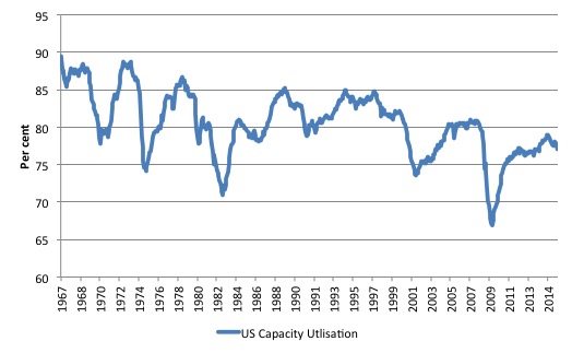
It is hard to marry this information against the recent Federal Reserve Board decision to increase interest rates.
I know that the Bank believes that the current interest rate environment, even after the rate hike, remains “accommodative” (which is jargon for stimulatory). But with real GDP growth moderate and capacity utilisation rates falling again, the nation hardly needs monetary policy to be less accommodative than it was.
Note also that I don’t believe the shift in interest rates will be particularly harmful at this stage.
The US jobs deficit
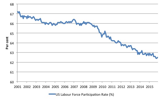
What really is striking about the last few years in the US is the falling participation rate. The labour force participation rate is the proportion of the working age population that is either employed or unemployed.
In November 2015, the participation rate was a further 0.4 percentage points below the level a year ago, reflecting an on-going deterioration since the early 2000s.
The following graph shows the decline in the US labour force participation since January 2001.
The fall in participation since December 2006 has been stark – from 66.4 per cent to 62.5 per cent in November 2015, a decline of 3.9 percentage points.
In terms of the current working age population that amounts to some 10 million workers who have exited the labour force since December 2006. Remember that the official unemployment is only 7.9 million workers.
When times are bad, many workers opt to stop searching for work while there are not enough jobs to go around. As a result, national statistics offices classify these workers as not being in the labour force (they fail the activity test), which has the effect of attenuating the rise in official estimates of unemployment and unemployment rates.
These discouraged workers are considered to be in hidden unemployment and like the officially unemployed workers are available to work immediately and would take a job if one was offered.
But the participation rates are also influenced by compositional shifts (changing shares) of the different demographic age groups in the working age population. In most nations, the population is shifting towards older workers who have lower participation rates.
Thus some of the decline in the total participation rate could simply being an averaging issue – more workers are the average who have a lower participation rate.
I analysed this declining trend in this blog – Decomposing the decline in the US participation rate for ageing.
I updated that analysis to November 2015 and computed that the decline in the participation rate due to the shift in the age composition of the working age population towards older workers with lower participation rates accounted for about 55 per cent of the actual decline.
So if there had been no ageing effect the current participation rate would be 64.3 per cent rather than the actual rate in November 2015 of 62.5 per cent.
So the 1.8 percentage point decline in the participation rate (net of ageing effect) amounts to 4,613 thousand workers who have left the labour force as a result of the cyclical sensitivity of the labour force.
It is hard to claim that these withdrawals reflect structural changes (for example, a change in preference with respect to retirement age, a sudden increase in the desire to engage in full-time education).
Thus, even if we take out the estimated demographic effect (the trend), we are still left with a massive cyclical response.
What does that mean for the underlying unemployment?
The labour force changes as the underlying working age population grows and with changes in the participation rate.
If we adjust for the ageing component of the declining participation rate and calculate what the labour force would have been given the underlying growth in the working age population if participation rates had not declined since December 2006 then we can estimate the change in hidden unemployment since that time due to the sluggish state of the US labour market.
The current unemployment rate is 5 per cent. Taking out the demographic effect of the falling participation rate, gives an adjusted unemployment rate of 7.8 per cent (if the participation rate had not declined due to cyclical factors since December 2006).
That puts an entirely different spin on the recovery to date.
To hold the unemployment rate constant with the participation rate at its peak, employment has to expand at a rate equal to the net new entrants into the labour force.
That is, has to keep pace with the underlying growth in the working age population adjusted for participation rate changes.
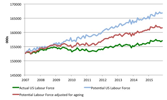
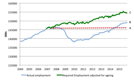
The following graph shows the actual labour force since January 2007 (green line), which reflects the declining labour force participation rate and contrasts it with what the labour force would have been if the participation rate had have remained at its January 2007 peak of 66.4 per cent (blue line).
The blue line is thus driven by the underlying changes in the working age population.
However, as discussed above, demographic changes have been a driving force in the declining participation rate. I modelled those changes using fixed-weight analysis and adjusted the potential labour force accordingly.
The red line shows what the labour force would have been if the participation rate had not been negatively affected by the cyclical downturn. So it nets out the ageing effect of the declining participation rate.
The difference between the green (actual) and red (potential net of ageing) lines gives an idea of the cyclical damage that has occurred on the labour supply side of the US labour market.
The gap between the lines is an estimate of the additional hidden unemployment that has occurred.
In January 2007 (at the peak participation rate which had carried over from December 2006), the US unemployment rate was 4.6 per cent, which was slightly higher than the 4.4 per cent low point recorded a month earlier in December 2006. It didn’t start to increase quickly until early 2008 and then the jump was sudden.
We can have a separate debate about whether 4.4 per cent constitutes full employment in the US. My bet is that if the government offered an unconditional Job Guarantee at an acceptable minimum wage there would be a sudden reduction in the national unemployment rate which would take it to well below 4.4 per cent without any significant inflationary impacts (via aggregate demand effects).
So I doubt 4.4 per cent is the true irreducible minimum unemployment rate that can be sustained in the US. The members of the FOMC should be required to justify why they believe the long-term “normal unemployment rate” is 5 per cent.
But for the purposes of this analysis, we will use the 4.4 per cent low achieved last in April 2007 (when the broadest measure of labour underutilisation (U6 was 8.2 per cent in comparison with 9.9 per cent in November 2015) as a benchmark so as not to get sidetracked into definitions of full employment. In that sense, my estimates should be considered the best-case scenario given that I actually think the cyclical losses are much worse than I provide here.
For those mystified by this statement – it just means that I think the economy was not at full employment in December 2006 and thus was already enduring some cyclical unemployment at that time.
Using the estimated potential labour force (controlling for declining participation), we can compute a ‘necessary’ employment series which is defined as the level of employment that would ensure on 4.4 per cent of the simulated labour force remained unemployed.
This time series tells us by how much employment has to grow each month (in thousands) to match the underlying growth in the working age population with participation rates constant at their January 2007 peak.
I computed the ‘necessary’ employment series for the unadjusted potential labour force and the age-adjusted potential labour force, corresponding to the blue and red lines in the previous graph, respectively.
The following graph compares the ‘necessary’ employment series adjusted for ageing (green line) with the actual US employment (blue line) up to November 2015. The former series starts at January 2007. The actual employment data is graphed from January 2003 to show perspective.
This allows us to calculate how far below the 4.4 per cent unemployment rate (constant participation rate) the US employment level is.
There are two effects:
- The actual loss of jobs between the employment peak in January 2008 and the trough was in January 2010 was 8,260 thousand jobs. However, total employment is now above the January 2008 peak by 2,847 thousand jobs. This gain in jobs is measured by the AB gap in the graph which shows the gap in employment relative to the January 2008 peak (the dotted red line is an extrapolation of the peak employment level). You can see that it wasn’t until July 2014 that the US labour market reached the previous peak employment again.
- The loss of the jobs that would have been generated had the demand-side of the labour market kept pace with the underlying population growth – that is, with the participation rate at its peak and the unemployment rate constant at 4.4 per cent. That loss amounts to 8,256 thousand jobs. This is the segment BC measured as at November 2015.
- The net effect or overall jobs gap as at November is 5,409 thousand jobs.
Thus, to repeat, the total jobs that would need to be created to unwind the cyclical damage caused by the crisis is thus 5,409 thousand (approximately 5.4 million). This is the sum of the segments AB + BC.
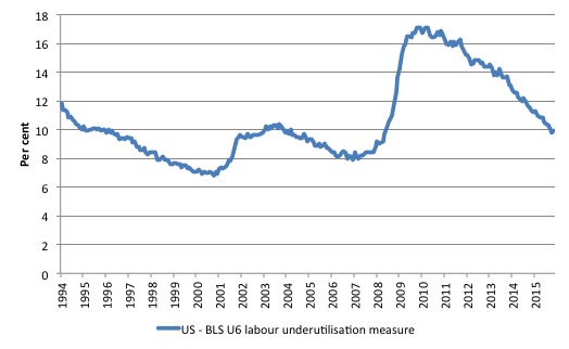
To put that into further perspective, the following graph shows the BLS measure U6, which is defined as:
Total unemployed, plus all marginally attached workers plus total employed part time for economic reasons, as a percent of all civilian labor force plus all marginally attached workers.
It is thus the broadest measure of labour underutilisation that the BLS publish.
In December 2006, before the affects of the slowdown started to impact upon the labour market, the measure was estimated to be 7.9 per cent. It now stands at 9.9 per cent (November 2015).
It remains well above previous troughs, which suggests (along with the other signals presented above) that the labour market is still a long way from being considered ‘recovered’.
While the unemployment rate has dropped to 5 per cent, underemployment and hidden unemployment have risen.
Which only leaves us to talk about the inflation rate!
What do we know about the US inflation rate?
The US Federal Reserve FOMC uses two measures of inflation to guide its assessment of how they are performing relative to their inflation target of 2 per cent:
1. The price index for Personal Consumption Expenditures (PCE) taken from the National Accounts, published by the Bureau of Economic Analysis.
2. The so-called “core” PCE price index, which the BEA defines “as personal consumption expenditures (PCE) prices excluding food and energy prices”.
The BEA tell us in their FAQ – What is the Core PCE price index?:
The core PCE price index measures the prices paid by consumers for goods and services without the volatility caused by movements in food and energy prices to reveal underlying inflation trends.
The following three graphs tell the story. The first graph shows the annual inflation in energy prices (component of personal consumption expenditure) from the March-quarter 1962 the third-quarter 2015.
Energy prices have dropped by about 17 per cent in the last 12 months in the US, which has had a dramatic impact upon the overall PCE price index.
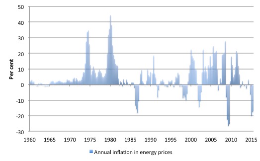
The next graph shows the annual inflation rate for PCE and core PCE over the same period. The huge spikes in the mid-1970s and late 1970s early 1980s were driven by the OPEC oil price hikes (refer to the previous graph).
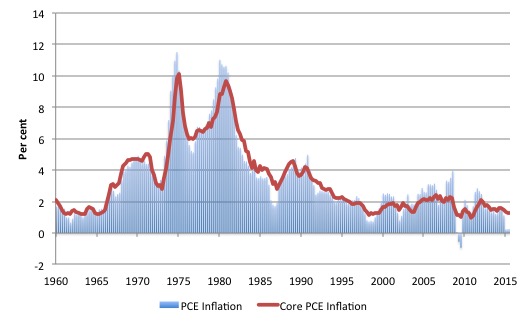
To provide more recent perspective the following graph is just a snapshot of the previous graph starting in the March-quarter 2005. PCE inflation is currently at 0.3 per cent per annum, while Core PCE inflation is at 1.3 per cent.
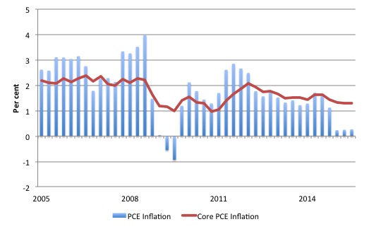
By any assessment, the inflation rate is well below the US Federal Reserve’s target. It is also hard to understand the expectations for PCE inflation by the members of the FOMC as outlined in the document cited above. Given the movements in the US dollar (upwards) and the continued decline in energy prices it is hard to see the Core PCE inflation rate rising.
Rather, the expectation should be that it will further moderate.
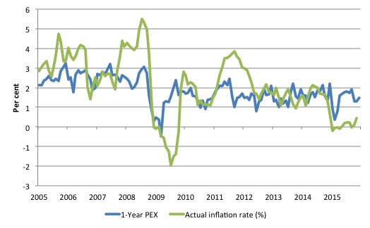
The current expected price inflation for the next 12 months derived from the Cleveland Federal Reserve’s – Inflation Expectations – series is currently 1.4 per cent, well below the core PCE.
The following graph shows the evolution of the actual consumer price index and the one-year ahead inflation expectations series from March 2005 to December 2015.
It doesn’t appear as though a 2 per cent level is acting as an attractive for the price expectations series. In fact, if the actual inflation rate, however measured (via the BLS CPI survey or via the PCE measures from the National Accounts), remains at their current low levels, then the expected inflation rate will drop further.
Conclusion
Given all this, it’s hard to comprehend, in economic terms, why the US Federal Reserve Bank raised interest rates last week.
I suspect it is being pressured by financial markets in one way or another. Please read my blog – Why banks are pushing the US central bank to increase interest rates – for more discussion on this point.
That is enough for today!
(c) Copyright 2015 William Mitchell. All Rights Reserved.
As I’ve been saying for a long time, the only reason to raise interest rates is because we haven’t raised them for a long time, and by golly, that just can’t be right. We have raised interest rates just to say we did. Just one more example that the orthodoxy gas lost all capacity to think and conduct real macroanalysis.
There is another possible reason – a psychological one. If many people think the economy is improving (taken to be a reality, otherwise why would interest rates be increasing) then they will invest their money in riskier assets, which will boost business confidence. In other words, this is a strategy equivalent to talking the economy up.
There are 3 main reasons why they hiked IR:
1) In the era of voodoo neoclassical-monetarists economics, the job of CB’s is to manage ‘expectations’. The confidence fairy has to be feed… she has been starving too long.
2) Rentiers are starving of yield. After the many efforts to prop up mini-bubbles after the crash, in form of localized real estate bubbles, fracking oil, tech unicorn-IPO-PE complex, etc. the finance sector cannot take it anymore and need corporate welfare injections by the state in the form of safe interest income from the govt. (which they can arbitrage and leverage later on for multiplied benefit).
A second derivative is that part of the population, is aligned with this desire by the elites as they need income from their savings, and as the households have relatively sanitized their balance sheets on aggregate they would benefit from this, except corporations are now worse of and the level of aggregate debt is worse, and the economy (national and international) is very weak.
3) Institutional protection. When the problems start again (probably after presidential elections) they can claim they tried to do something AND they will be able to lower IR again, hence protecting their own misguided economic religion and prestige.
The effect of aging workers may be tricky to estimate. Older retired workers are returning to the labor force or delaying retirement due to a variety of reasons; adult dependents especially indebted recent graduates, live with their parents as parents savings dwindle and investment fails to generate adequate returns, debts rise etc..
Declining real estate values and home equity based lines of credit extended to retiree’s will eventually affect the future prospects of the younger ones as their modest prospects for any inheritances evaporate.
The younger more optimistic employed people who have become homeowners often with a parental cosigner are dealing with astronomical debts and declining income prospects; a very precarious life for all.
Yellen, perhaps thinking she was channeling Yoda, promised this rate hike by the end of this year, many moons ago, to see if jedi mind tricks alone could propel the economy; that failed, so the immediate negative consequences for markets, not just for the 1% but also for pensioners, of not raising them have been weighed against the less visible, slower to unfold negative consequences that will occur as a result, and so slow painful death of the middle class continues.
Lord help us all!
The FED did what it did out of macro-economic orthodoxy/stupidity and/or the self interest of the TBTF banks and other financial institutions like itself in keeping everything in such a muddled but quasi-tolerable mess that the general populace won’t rise up en mass and kick their asses or bash their heads in. It’s up to us to recognize this super slow-motion train wreck strategy by standing up on our own hind legs and demanding that policies be implemented that terminatedly end their dominance, that correct the specific and most basic problems of the economy and that will consequently free both the individual and enable the system to be free flowing.
I guess these buffoons want to believe they can return to the glory days when the cash rate was closer to its so called “natural rate” of corporate welfare. They’ve been depressed for so long they’ve become delusional and have caved to the rentiers… Because “screw logic and reasoning, evidence holds no credence here. Give the (financial) media and the people (the 1%) what they want. We’ll just make up some polly waffle justification and they’ll buy it”.
They’ve probably figured the media have repeatedly bashed the “raise rates” rhetoric into the public mind for so long now that this (absurd and ignorant) policy decision has become an inevitable necessity. People who know nothing of how the system works now have foolish expectations of rate rises which defy logic – on the basis of it being “normal”, despite the current policy environment of high unemployment and low/no inflation being anything but; for this they will have their expectations finally meet to their own detriment.
It is ridiculous the public now has this bizarre concept in their heads that policy should not be made to deal with the situation at hand, but must follow arbitrary rules, trends, numbers and ratios.