Today (April 18, 2024), the Australian Bureau of Statistics released the latest - Labour Force,…
Australian labour market – still weak with a moderate upturn
In the previous two months, there was virtually zero employment growth and labour force participation declined. The latest labour force data released today by the Australian Bureau of Statistics – Labour Force data – for March 2016 show that those ominous signs are still hovering above the labour market. Total employment growth was modest at best – 26,100 (net) jobs created but full-time employment fell by 18,800. There was also a decline in hours worked which is now trending downwards. The growth in part-time work suggests that overall the quality of work in Australia declined in March 2016. So overall a poor outcome. Unemployment fell this month but this is largely because the weak employment growth is interacting with even weaker labour force growth. But still, a decline in unemployment, not induced by a fall in the participation rate is a welcome outcome. The teenage labour market remains in a poor state even though the 15-19 year olds enjoyed part-time employment growth. Overall, with private investment forecast to decline further over the next 12 months, the Australian labour market is looking very weak and the Federal government should be introducing a rather sizeable fiscal stimulus in its upcoming fiscal statement. This should include large-scale public sector job creation which would ensure teenagers regained the jobs that have been lost due to the fiscal drag over the last several years. However, the Federal government appears incapable of addressing this dire issue. It is embroiled in mythical discussions about running out of money and not being able to defend the economy if there is another crisis. All make believe, while the real world does head towards another major rift.
The summary ABS Labour Force (seasonally adjusted) estimates for March 2016 are:
- Employment increased 26,100 (0.2 per cent) with full-time employment decreasing by 18,800 and part-time employment increasing by 34,900.
- Unemployment decreased by 7,300 to 723,100.
- The official unemployment rate decreased by 0.1 percentage points to 5.7 per cent.
- The participation rate was unchanged at 64.9 per cent. This is well below its November 2010 peak (recent) of 65.8 per cent.
- Aggregate monthly hours worked decreased 17.5 million hours (-1.1 per cent).
- The quarterly ABS broad labour underutilisation estimates (the sum of unemployment and underemployment) for the February quarter were updated last month. Underemployment was at 8.4 per cent and total labour underutilisation rate was at 14.2 per cent. There were 1,051.2 thousand persons underemployed and a total of 1.839.3 thousand workers either unemployed or underemployed. The next quarterly release will be in the June 2016 publication.
Employment growth – non-existent
Total (net) employment in March 2016 is estimated to have increased by 26,100 jobs. Full-time employment decreased 8,800, while part-time employment increased by 34,900.
This follows the total (net) employment change in February 2016 of 300 jobs. Prior to that there were two second consecutive month of negative growth.
The ABS said that:
Trend employment growth in Australia eased … In March 2016, the annual trend employment growth rate was 2.2 per cent, down from 2.6 per cent in December 2015 . That’s an increase of around 250,000 persons employed, compared with 300,000 persons.
So things are deteriorating.
The zig-zag pattern that we have observed over the last 24 months or so – where the employment estimates have been switching back and forth regularly between negative employment growth and positive growth with the occasional spikes – continues.
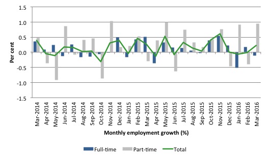
The following graph shows the month by month growth in full-time (blue columns), part-time (grey columns) and total employment (green line) for the 24 months to March 2016 using seasonally adjusted data.
It gives you a good impression of just how flat employment growth has been over the last 2 years.
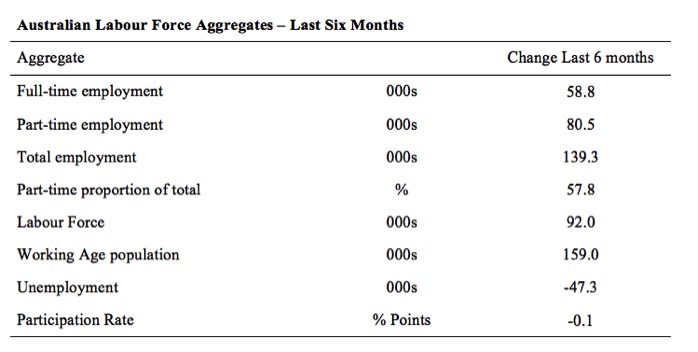
The following table provides an accounting summary of the labour market performance over the last six months. The monthly data is highly variable so this Table provides a longer view which allows for a better assessment of the trends. WAP is working age population (above 15 year olds).
The conclusion – overall there have been 139.3 thousand jobs (net) added in Australia over the last six months while the labour force has increased by only 92 thousand. Employment growth has thus outstripped the increase in the supply of labour with the result that unemployment has fallen by 47.3 thousand.
This should not be taken as an indication of strong employment growth. Rather, the weak participation has meant the labour force growth rate has slowed significantly.
Full-time employment has risen by 58.8 thousand jobs (net) while part-time work has risen by 80.5 thousand jobs. Thus, 57.8 per cent of the total employment created (net) over the last 6 months has been part-time.
The participation rate has fallen by 0.1 points and remains at depressed levels.
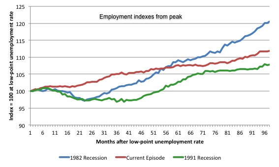
The following graph shows employment indexes for the last 3 recessions and allows us to see how the trajectory of total employment after each peak prior to the three major recessions in recent history: 1982, 1991 and 2009 (the latter to capture the current episode).
The peak is defined as the month of the low-point unemployment rate in the relevant cycle and total employment was indexed at 100 in each case and then indexed to that base for each of the months as the recession unfolded.
I have plotted the 3 episodes for 97 months after the low-point unemployment rate was reached in each cycle – the length of the current cycle.
The initial employment decline was similar for the 1982 and 1991 recessions but the 1991 recovery was delayed by many months and the return to growth much slower than the 1982 recession.
The current episode is distinguished by the lack of a major slump in total employment, which reflects the success of the large fiscal stimulus in 2008 and 2009.
However, the recovery spawned by the stimulus clearly dissipated once the fiscal position was reversed and the economy fell back into producing very subdued employment outcomes.
While the employment growth was stronger in October and November 2015 we now know that the estimates were distorted by the rotational issues in the sample used by the ABS as well as other issues relating to survey reliability over that period.
Moreover, since February 2008, employment has grown by a miserly 11.9 per cent, which is a very slow pace in historical terms for such a long period.
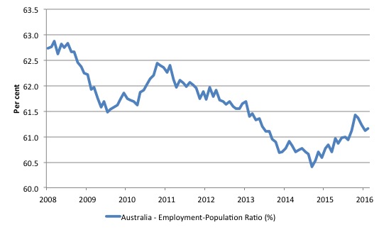
Given the variation in the labour force estimates, it is sometimes useful to examine the Employment-to-Population ratio (%) because the underlying population estimates (denominator) are less cyclical and subject to variation than the labour force estimates. This is an alternative measure of the robustness of activity to the unemployment rate, which is sensitive to those labour force swings.
The following graph shows the Employment-to-Population ratio, since February 2008 (the low-point unemployment rate of the last cycle).
It dived with the onset of the GFC, recovered under the boost provided by the fiscal stimulus packages but then went backwards again as the last Federal government imposed fiscal austerity in a hare-brained attempt at achieving a fiscal surplus.
The ratio began rising in October 2014 which suggested to some that the labour market had bottomed out and would improve slowly as long as there are no major policy contractions or cuts in private capital formation.
However, the peak in November is now gone (partly distorted by the sample survey issues) and the ratio is once again in retreat.
The on-going fiscal deficit is still supporting growth in the economy as the spending associated with the mining boom disappears.
The series increased by 0.1 points in March but remains 1.7 points below the April 2008 peak of 62.9 per cent.
Teenage labour market – slight improvement this month
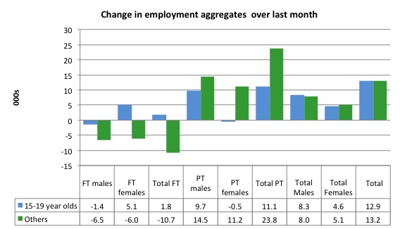
The teenage labour market showed some modest improvement in March 2016 with full-time employment rising by 1.8 thousand and part-time employment rising by just 11.1 thousan (net) jobs.
Total employment thus rose by 12.9 thousand (net).
The following graph shows the distribution of net employment creation in the last month by full-time/part-time status and age/gender category (15-19 year olds and the rest)
If you take a longer view you see how poor the situation remains.
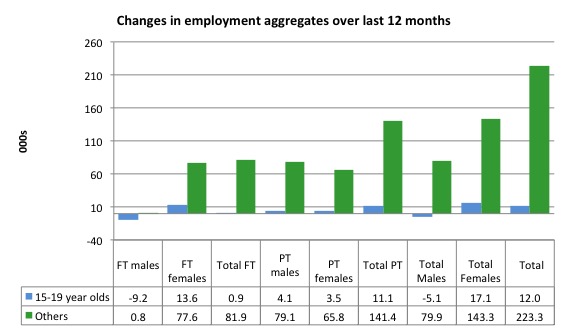
Over the last 12 months, teenagers have gained only 12 thousand (net) jobs overall while the rest of the labour force have gained 223.3 thousand net jobs. Remember that the overall result represents a fairly poor annual growth in employment.
The teenage segment of the labour market is being particularly dragged down by the sluggish employment growth, which is hardly surprising given that the least experienced and/or most disadvantaged (those with disabilities etc) are rationed to the back of the queue by the employers.
The following graph shows the change in aggregates over the last 12 months. It is as if the teenagers have not had a stake in the labour market either way (blue bars barely visible).
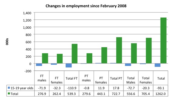
To further emphasise the plight of our teenagers, I compiled the following graph that extends the time period from the February 2008, which was the month when the unemployment rate was at its low point in the last cycle, to the present month (March 2016). So it includes the period of downturn and then the so-called “recovery” period. Note the change in vertical scale compared to the previous two graphs.
Since February 2008, there have been only 1,262 thousand (net) jobs added to the Australian economy but teenagers have lost a staggering 93.1 thousand over the same period. It is even more stark when you consider that 110.9 thousand full-time teenager jobs have been lost in net terms.
Even in the traditionally, concentrated teenage segment – part-time employment, teenagers have gained only 17.8 thousand jobs (net) even though 556.6 thousand part-time jobs have been added overall.
Overall, the total employment increase is modest. Further, around 57 per cent of the total (net) jobs added since February 2008 have been part-time, which raises questions about the quality of work that is being generated overall.
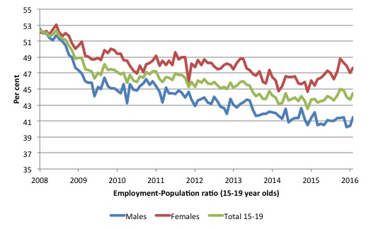
To put the teenage employment situation in a scale context the following graph shows the Employment-Population ratios for males, females and total 15-19 year olds since February 2008 (the month which coincided with the low-point unemployment rate of the last cycle).
You can interpret this graph as depicting the loss of employment relative to the underlying population of each cohort. We would expect (at least) that this ratio should be constant if not rising somewhat (depending on school participation rates).
The facts are that the absolute loss of jobs reported above is depicting a disastrous situation for our teenagers. Males, in particular, have lost out severely as a result of the economy being deliberately stifled by austerity policy positions.
In the last month, with the employment situation improving, there has been some reversal in the downward trends in these ratios.
The male ratio has fallen by 11.1 percentage points since February 2008, the female ratio has fallen by 4.5 percentage points and the overall teenage employment-population ratio has fallen by 7.9 percentage points. That is a substantial decline in the employment market for Australian teenagers.
The other staggering statistic relating to the teenage labour market is the decline in the participation rate since the beginning of 2008 when it peaked in January at 61.4 per cent. In March 2016, the participation rate was just 53.6 per cent.
That is an additional 115.1 thousand teenagers who have dropped out of the labour force as a result of the weak conditions since the crisis.
If we added them back into the labour force the teenage unemployment rate would be 27.6 per cent rather than the official estimate for March 2016 of 17.1 per cent. Some may have decided to return to full-time education and abandoned their plans to work. But the data suggests the official unemployment rate is significantly understating the actual situation that teenagers face in the Australian labour market.
Overall, the performance of the teenage labour market remains poor. It doesn’t rate much priority in the policy debate, which is surprising given that this is our future workforce in an ageing population. Future productivity growth will determine whether the ageing population enjoys a higher standard of living than now or goes backwards.
I continue to recommend that the Australian government immediately announce a major public sector job creation program aimed at employing all the unemployed 15-19 year olds, who are not in full-time education or a credible apprenticeship program.
Unemployment decreased by 7,300 to 723,100
The official unemployment rate fell by 0.1 percentage points to 5.7 per cent in March 2016.
Overall, the labour market still has significant excess capacity available in most areas and what growth there is is not making any major inroads into the idle pools of labour.
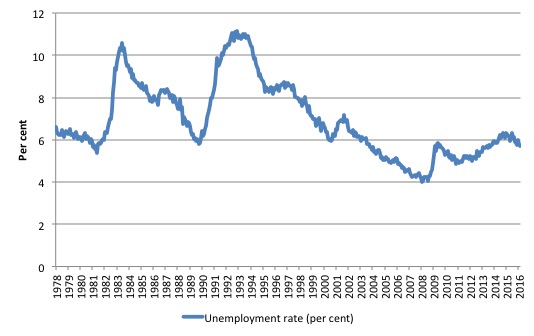
The following graph shows the national unemployment rate from February 1978 to March 2016. The longer time-series helps frame some perspective to what is happening at present.
After falling steadily as the fiscal stimulus pushed growth along, the unemployment rate slowly trended up for some months.
It is now above the peak that was reached just before the introduction of the fiscal stimulus. In other words, the gains that emerged in the recovery as a result of the fiscal stimulus in 2009-10 have now been lost.
Broad labour underutilisation – upwards of 14.2 per cent
The ABS published its quarterly broad labour underutilisation measures for the February-quarter in this month’s data release.
In the February-quarter, total underemployment was 8.4 per cent and the ABS broad labour underutilisation rate (the sum of unemployment and underemployment) was 14.2 per cent.
There were 1,058.9 thousand persons underemployed and a total of 1,791.5 thousand workers either unemployed or underemployed.
The following graph plots the history of underemployment in Australia since February 1978 to the February-quarter 2015.
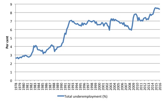
If hidden unemployment is added to the broad ABS figure the best-case (conservative) scenario would see a underutilisation rate well above 16 per cent at present. Please read my blog – Australian labour underutilisation rate is at least 13.4 per cent – for more discussion on this point.
The next update will be for the May-quarter 2016 and will be published published in the June 2016 Labour Force release.
Aggregate participation rate – unchanged at depressed levels
The March 2016 participation rate was unchanged at 64.9 per cent. It remains substantially down on the most recent peak in November 2010 of 65.8 per cent when the labour market was still recovering courtesy of the fiscal stimulus.
What would the unemployment rate be if the participation rate was at that last November 2010 peak level (65.8 per cent)?
The following graph tells us what would have happened if the participation rate had been constant over the period November 2010 to March 2016. The blue line is the official unemployment since its most recent low-point of 4 per cent in February 2008.
The red line starts at November 2010 (the peak participation month). It is computed by adding the workers that left the labour force as employment growth faltered (and the participation rate fell) back into the labour force and assuming they would have been unemployed. At present, this cohort is likely to comprise a component of the hidden unemployed (or discouraged workers).
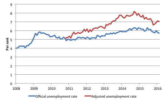
Total official unemployment in March 2016 was estimated to be 723.1 thousand. However, if participation had not have fallen relative to November 2010, there would be 902.3 thousand workers unemployed given growth in population and employment since November 2010.
The unemployment rate would now be 7 per cent if the participation had not fallen below its November 2010 peak of 65.8 per cent. The official unemployment in March 2016 was 5.7 per cent.
The difference between the two numbers mostly reflects, the change in hidden unemployment (discouraged workers) since November 2010. These workers would take a job immediately if offered one but have given up looking because there are not enough jobs and as a consequence the ABS classifies them as being Not in the Labour Force.
There has been some change in the age composition of the labour force (older workers with low participation rates becoming a higher proportion) but this only accounts for about a 1/3 of the shift. The rest is undoubtedly accounted for by the rise in hidden unemployment.
Note, the gap between the blue and red lines doesn’t sum to total hidden unemployment unless November 2010 was a full employment peak, which it clearly was not. The interpretation of the gap is that it shows the extra hidden unemployed since that time.
This gap shrinks as participation rises relative to the November 2010 peak.
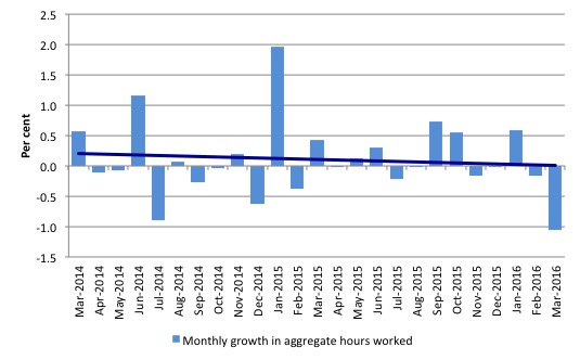
Hours worked – fell in March 2016
Aggregate monthly hours fell by 17.5 million hours (-1.1 per cent) in March 2016 in seasonally adjusted terms.
The following graph shows the monthly growth (in per cent) over the last 24 months. The dark linear line is a simple regression trend of the monthly change – which depicts a decreasing trend.
The labour market has weakened over the last two years.
You can see the pattern of the change in working hours is also portrayed in the employment graph – zig-zagging across the zero growth line.
Conclusion
I always repeat my monthly warning – we always have to be careful interpreting month to month movements given the way the Labour Force Survey is constructed and implemented.
Today’s figures show that while employment growth was positive this month the pattern of growth continues to zig-zag across the zero growth line.
While 26,100 (net) jobs were created in Australia in March 2016 – full-time employment declined sharply as did hours worked. The growth in part-time work suggests that overall the quality of work in Australia declined in March 2016.
The conclusion remains that the overall demand side of the labour market is rather weak.
Unemployment fell this month but this is largely because the weak employment growth is interacting with even weaker labour force growth. But still, a decline in unemployment, not induced by a fall in the participation rate is a welcome outcome.
The teenage labour market remains in a poor state even though the 15-19 year olds enjoyed part-time employment growth.
I consider this situation to warrant immediate attention by the Federal Government. The neglect of our teenagers will have a very long memory indeed and the negative consequences will be stronger given the ageing population.
The Federal government appears incapable of addressing this dire issue. They are embroiled in mythical discussions about running out of money and not being able to defend the economy if there is another crisis.
All make believe, while the real world does head towards another major rift.
That is enough for today!
(c) Copyright 2016 William Mitchell. All Rights Reserved.
Bill is there any chance that the govt has input into fudging these figures ?
Ps Can something be done about this Credit Rating rubbish ? Its all over the news here how we must accpet austerity.
Mark my understanding is the ratings agencies are just private companies with a vested interest in giving themselves a value. For government debt it’s nonsense but the media just go with it because so many mainstream” orthodox” economists believe that nonsense too. Only “heterodox” economists particularly MMT realise that governments with their own currency never have to default in their own currency although they can do by political choice. All the economists in media would be mainstream so not even realise they’re wrong. I’ve argued with an economist from a well known Australian Union and couldn’t convince him. His argument is the concept of fiat money is fragile and if you lift the veil of the reality the masses won’t be able to handle it. Sad but true.