The IMF and the World Bank are in Washington this week for their 6 monthly…
US central bank decision to raise interest rates doesn’t make much sense
On December 14, 2016, the US Federal Reserve Bank pushed up its policy target interest rate from 0.5 per cent to 0.75 per cent. In its – Press Release – it said that the “labor market has continued to strengthen and that economic activity has been expanding at a moderate pace since mid-year”. It acknowledged that “business investment has remained soft”. But it believes that even though it has increased the rate by 25 basis points, there is still room for “some further strengthening in labor market conditions and a return to 2 percent inflation”. The logic is very confused in my view. First, the US labour market is weak (in inflation pressure terms) notwithstanding the reduced official unemployment rate. Real wages growth has been effectively zero and the broad measure of labour underutilisation (U6) remains at 9.3 per cent (as at November). Second, the emphasis on central bank policy shifts is based on a view that elements of total spending are sensitive to interest rate changes and by increasing rates, price pressures will attenuated. The only problem with that logic is that all the elements of spending in the US (private investment, household durable goods) are hardly setting the world on fire. Private investment, in particular, is in poor shape. So by the US Federal Reserve bank’s own logic (which I do not share) it should be expecting on-going further poor investment growth, which will further undermine potential productive capacity. Not a sound strategy at all.
The US Federal Reserve reaffirmed that “its statutory mandate” is:
… to foster maximum employment and price stability.
So, importantly there is a real (maximum employment) and nominal (price stability) dimension to its charter, rather than just an inflation target which is a “2 percent longer-run objective”.
It is here that things get tricky.
Since the emergence and dominance of the Monetarist (morphing into broad neo-liberalism), which is simple policy terms can be summarised as an emphasis on inflation targets that are to be met by adjusting monetary policy (in modern terms, adjusting interest rates) and a eschewal of fiscal policy as a counter-stabilising policy tool, the usual distinction (considered trade-off) between real and nominal objectives has been largely abandoned.
So prior to this period, the dominant view, that really took hold in the 1950s, was that there was a trade-off (both short- and long-run) between inflation (nominal) and unemployment (real). So when unemployment was low due to strong growth, inflation might be expected to be higher because the labour market generated stronger wage demands and goods markets were buoyant.
This was the Phillips Curve era – named after the New Zealand economist Bill Phillips – who released the most popular (but not the first) expression of this relationship.
The earlier view that dominated the profession (in the Classical era – prior to the Great Depression) was referred to as the – Classical dichotomy – asserted that the real side of the economy (output and employment) are completely separable from the nominal (money) side.
So there is no trade-off. The Quantity Theory of Money (QTM) held that prices were determined by the stock of money while the level of output was determined by the full employment labour market outcome that was always guaranteed because the real wage would adjust to productivity through competition.
The link between full employment and output was via the current level of technology that determined productivity. So demand for output didn’t matter – everything produced would always be sold because price adjustments would see to it.
So nominal spending growth will only influence prices because the economy is always assumed to be at full employment. The other way of expressing this is via the so-called ‘neutrality’ rule – that money is neutral with respect to real variables and only drives the the price level.
The policy prescription is simple – government attempts to increase aggregate demand will be inflationary and will not reduce unemployment. The less extreme versions of the theory say that short-run growth can be influenced by macroeconomic policy changes (because they claim there are sticky prices) but once prices adjust, neutrality sets in and renders policy futile.
The US Federal Reserve Open Market Committee, which sets rates, has been significantly influenced by this sort of reasoning.
It continually referring to its desire to achieve a 2 per cent inflation target (although not formally constituted) and believes that shifts in the cash rate (market rate on overnight funds) will influence all borrowing costs in the US, which, in turn, will influence spending growth.
This logic then constructs spending growth as the driver of inflation, notwithstanding their talk about ‘cost’ pressures arising from energy prices.
How does this play out against their joint objective – maximum employment and price stability?
It is here that the ideological tricks enter.
The neutrality hypothesis asserts that attaining price stability in some way generates full employment. Less extreme versions of the hypothesis allow for some short-run cyclical developments as a result of monetary policy adjustments (that is, interest rate increases might slow growth).
But there is no long-run concern, whatever the short-run concessions are made, because by achieving price stability, maximum employment ultimately is achieved.
A former senior official at Australia’ Reserve Bank (RBA), Malcolm Edey wrote in a 1999 public education article (now no longer available on-line) – Monetary Policy in Australia – that:
Ultimately the growth performance of the economy is determined by the economy’s innate productive capacity, and it cannot be permanently stimulated by an expansionary monetary policy stance. Any attempt to do so simply results in rising inflation. The Bank’s policy target recognises this point. It allows policy to take a role in stabilising the business cycle but, beyond the length of a cycle, the aim is to limit inflation to the target of 2-3 per cent. In this way, policy can provide a favourable climate for growth in productive capacity, but it does not seek to engineer growth in the longer run by artificially stimulating demand.
This is the classic Non-Accelerating Inflation Rate of Unemployment (NAIRU) narrative that epitomises the Monetarist doctrine.
Politically, the central bank cannot admit it is using unemployment to achieve price stability (by suppressing wage demands etc). That would be dynamite.
So they have to come up with this nonsensical idea that even if they drive unemployment up in the short-run (and many neo-liberals do not even concede that), in the long-run, the economy will settle at maximum (or full) employment as long as the central bank maintains policy discipline in pursuing its inflation target.
A massive sleight of hand.
When unemployment (or other broader measures of labour underutilisation) do not settle at acceptably low levels, the narrative then introduces spurious ‘structural’ factors which have pushed the full employment unemployment rate (NAIRU) up.
Its a win-win argument – it can never be proved wrong on those terms.
Please read my blog – Inflation targeting spells bad fiscal policy – for more discussion on this point.
That blog provides a detailed critique of this nonsense and I won’t repeat it further.
The US Federal Reserve FOMC released the – Summary of Economic Projections – to accompany its decision and gives us an idea of where the participants think the US economy is heading.
This document provides a clue to where the FOMC members consider monetary policy is heading (that is, where the federal funds rate is going over the next three years).
The document provides forecasts of real GDP growth, the unemployment rate, the price deflator for personal consumption expenditure (PCE) and the core PCE measure, which excludes price movements in food and energy (so-called volatile components of price inflation).
The FOMC converged on a belief that inflation would reach the 2 per cent level by 2017 and remain stable after that.
They indicated that a Federal Funds Rate (the policy interest rate) required to achieve that steady inflation rate would be between 2.5 per cent to 3.8 per cent, with a median projection of 3 per cent.
A majority of participants believed that interest rates would have to be above 1.375 per cent by the end of 2017 and above 2.125 per cent by the end of 2018, which gives some idea of the pattern of increase they expect to manage.
Unemployment would converge, they believed on 4.8 per cent (varying between 4.5 per cent and 5 per cent) with a median real GDP growth rate of 1.8 per cent.
The Federal Reserve Bank explains its ambit with respect to interest-rate setting in this document – FOMC Longer-Run Goals and Monetary Policy Strategy – which was updated on January 26, 2016.
It reinforces that its “statutory mandate from the Congress” is to promote “maximum employment, stable prices, and moderate long-term interest rates”.
It says that:
The Committee reaffirms its judgment that inflation at the rate of 2 percent, as measured by the annual change in the price index for personal consumption expenditures, is most consistent over the longer run with the Federal Reserve’s statutory mandate.
It also talks about keeping “longer-term inflation expectations firmly anchored”, which is jargon for stable expected inflation.
It however does not “specify a fixed goal for employment” because it claims that “assessments of the maximum level of unemployment … are necessarily uncertain and subject to revision”.
Of course, this so-called uncertainty gives the Bank the latitude to avoid defining full employment, so that they can allege there is been sufficient improvement even if labour underutilisation rates remain elevated.
Importantly, and consistent with the discussion earlier about money ‘neutrality’, the US Federal Reserve claims that:
The maximum level of employment is largely determined by nonmonetary factors that affect the structure and dynamics of the labor market.
Which means that it is resonating the view that in a monetary economy, employment (real aggregate) is unrelated to monetary events (such as nominal spending growth). This dodge allows Monetarist-leaning policy makers to effectively jettison responsibility for maintaining full employment and implicate ‘structural’ problems if employment growth lags.
Of course, this allows fiscal authorities to also starve the macroeconomy of expenditure (with fiscal deficits that are too low) while then using ‘micro’ policies of deregulation, attacks on trade unions, attacks on welfare recipients to ‘repair’ the ‘structural’ problems.
A two-pronged attack on the well-being of all citizens to advance the welfare of the top-end-of-town.
In their opening statement, cited above, the:
Federal Open Market Committee … indicates that the labor market has continued to strengthen and that economic activity has been expanding at a moderate pace since mid-year. Job gains have been solid in recent months and the unemployment rate has declined.
The FOMC claim that it “considers a wide range of indicators in making these assessments”.
When I reflect on the broad array of data that one considers when assessing the state of an economy, the FOMC’s decision seems premature and lacking in firm logic.
The state of the real economy – capacity utilisation rates are well-down and falling again
The Federal Reserve Bank publishes a monthly data series – Industrial Production and Capacity Utilization – G.17 – which provides an indication of how much of the non-labour productive capacity is being utilised.
They define “Capacity utilization for Total Industry (TCU)” as:
… the percentage of resources used by corporations and factories to produce goods in manufacturing, mining, and electric and gas utilities for all facilities located in the United States (excluding those in U.S. territories). We can also think of capacity utilization as how much capacity is being used from the total available capacity to produce demanded finished products …
the capacity index tries to conceptualize the idea of sustainable maximum output, which is defined as the highest level of output a plant can sustain within the confines of its resources … The capacity utilization rate can also implicitly describe how efficiently the factors of production (inputs in the production process) are being used … It sheds light on how much more firms can produce without additional costs. Additionally, this rate gives manufacturers some idea as to how much consumer demand they will be able to meet in the future.
Clearly, when capacity utilisation rates are high, the inflation risk from demand side pressures (that is, spending pressures) increases.
Firms, typically, keep some spare capacity in reserve as a normal strategy so that they can meet unexpected spikes in demand without losing market share. So what might be considered a normal full capacity load will be less than 100 per cent.
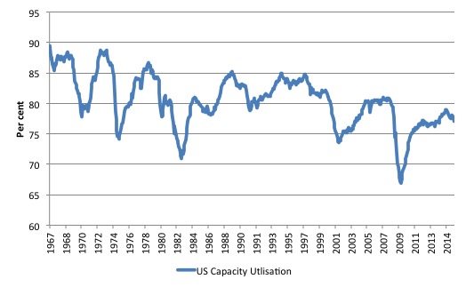
In fact, the average rate of capacity utilisation since this data series was first published in January 1967 has been 80.3 per cent, although the mean rates were much higher in the 1960s and 1970s, before the Monetarist (neo-liberal) era started suppressing growth rates.
The following graph charts the evolution of this data series from January 1967 to November 2016. You can clearly see the cyclical swings associated with recessions.
It is interesting to note that each subsequent recovery since the 1990s has levelled off below the previous level, which is consistent with the observation that the neo-liberal era has been associated with stifled growth rates and elevated levels of excess capacity.
But even in the current recovery, capacity utilisation rates are still below 80 per cent and over the last few months have been heading south again, indicating that firms have increased idle equipment and machinery and plenty of non-inflationary capacity available to meet increased spending growth.
In November 2016, the capacity utilisation rate was 75 per cent and around the level that America endured during the worst of the 2001 recession.
This is one of the reasons (which I show below) why private investment remains weak. There is ample productive capacity in situ to handle the current levels of spending and output without any need to expand productive capacity in an uncertain environment.
It is hard to marry this information against the Federal Reserve Board’s decision to increase interest rates.
I know that the Bank believes that the current interest rate environment, even after the rate hike, remains “accommodative” (which is jargon for stimulatory). But with real GDP growth moderate and capacity utilisation rates falling again, the nation hardly needs monetary policy to be less accommodative than it was.
The state of the real economy – the US jobs deficit
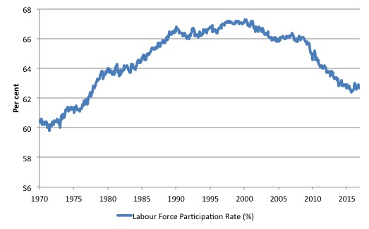
What really is striking about the last few years in the US is the falling participation rate. The labour force participation rate is the proportion of the working age population that is either employed or unemployed.
In November 2015, the participation rate was a further 0.4 percentage points below the level a year ago, reflecting an on-going deterioration since the early 2000s.
The following graph shows the decline in the US labour force participation since January 2001.
The fall in participation since December 2006 has been stark – from 66.4 per cent to 62.6 per cent in November 2016, a decline of 3.8 percentage points.
The participation rate declined further in November 2016.
When times are bad, many workers opt to stop searching for work while there are not enough jobs to go around. As a result, national statistics offices classify these workers as not being in the labour force (they fail the activity test), which has the effect of attenuating the rise in official estimates of unemployment and unemployment rates.
These discouraged workers are considered to be in hidden unemployment and like the officially unemployed workers are available to work immediately and would take a job if one was offered.
But the participation rates are also influenced by compositional shifts (changing shares) of the different demographic age groups in the working age population. In most nations, the population is shifting towards older workers who have lower participation rates.
Thus some of the decline in the total participation rate could simply being an averaging issue – more workers are the average who have a lower participation rate.
I analysed this declining trend in this blog – Decomposing the decline in the US participation rate for ageing.
My last estimate of this effect (as at November 2015) suggest that the decline in the participation rate due to the shift in the age composition of the working age population towards older workers with lower participation rates accounted for about 55 per cent of the actual decline.
So if there had been no ageing effect the current participation rate would be 64.4 per cent rather than the actual rate in November 2016 of 62.7 per cent.
So the 1.7 percentage point decline in the participation rate (net of ageing effect) amounts to 4,241 thousand workers who have left the labour force as a result of the cyclical sensitivity of the labour force.
It is hard to claim that these withdrawals reflect structural changes (for example, a change in preference with respect to retirement age, a sudden increase in the desire to engage in full-time education).
Thus, even if we take out the estimated demographic effect (the trend), we are still left with a massive cyclical response.
What does that mean for the underlying unemployment?
The labour force changes as the underlying working age population grows and with changes in the participation rate.
If we adjust for the ageing component of the declining participation rate and calculate what the labour force would have been given the underlying growth in the working age population if participation rates had not declined since December 2006 then we can estimate the change in hidden unemployment since that time due to the sluggish state of the US labour market.
The current unemployment rate is 4.6 per cent. Taking out the demographic effect of the falling participation rate, gives an adjusted unemployment rate of 7 per cent (if the participation rate had not declined due to cyclical factors since December 2006).
That puts an entirely different spin on the recovery to date.
To hold the unemployment rate constant with the participation rate at its peak, employment has to expand at a rate equal to the net new entrants into the labour force.
That is, has to keep pace with the underlying growth in the working age population adjusted for participation rate changes.
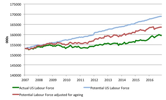
The following graph shows the actual labour force since January 2007 (green line), which reflects the declining labour force participation rate and contrasts it with what the labour force would have been if the participation rate had have remained at its January 2007 peak of 66.4 per cent (blue line).
The blue line is thus driven by the underlying changes in the working age population.
However, as discussed above, demographic changes have been a driving force in the declining participation rate. I modelled those changes using fixed-weight analysis and adjusted the potential labour force accordingly.
The red line shows what the labour force would have been if the participation rate had not been negatively affected by the cyclical downturn. So it nets out the ageing effect of the declining participation rate.
The difference between the green (actual) and red (potential net of ageing) lines gives an idea of the cyclical damage that has occurred on the labour supply side of the US labour market.
The gap between the lines is an estimate of the additional hidden unemployment that has occurred.
In January 2007 (at the peak participation rate which had carried over from December 2006), the US unemployment rate was 4.6 per cent, which was slightly higher than the 4.4 per cent low point recorded a month earlier in December 2006. It didn’t start to increase quickly until early 2008 and then the jump was sudden.
We can have a separate debate about whether 4.4 per cent constitutes full employment in the US. My bet is that if the government offered an unconditional Job Guarantee at an acceptable minimum wage there would be a sudden reduction in the national unemployment rate which would take it to well below 4.4 per cent without any significant inflationary impacts (via aggregate demand effects).
So I doubt 4.4 per cent is the true irreducible minimum unemployment rate that can be sustained in the US. The members of the FOMC should be required to justify why they believe the long-term “normal unemployment rate” is 5 per cent.
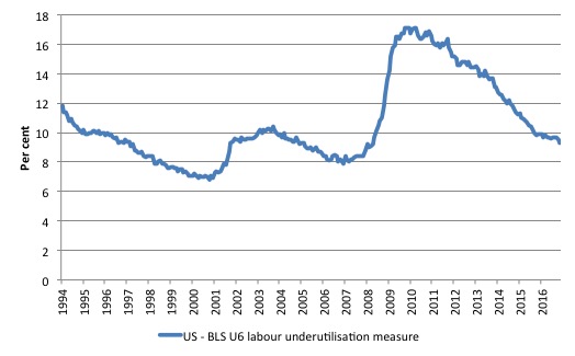
But for the purposes of this analysis, we will use the 4.4 per cent low achieved last in April 2007 (when the broadest measure of labour underutilisation (U6 was 8.2 per cent in comparison with 9.3 per cent in November 2016) as a benchmark so as not to get sidetracked into definitions of full employment. In that sense, my estimates should be considered the best-case scenario given that I actually think the cyclical losses are much worse than I provide here.
For those mystified by this statement – it just means that I think the economy was not at full employment in December 2006 and thus was already enduring some cyclical unemployment at that time.
Using the estimated potential labour force (controlling for declining participation), we can compute a ‘necessary’ employment series which is defined as the level of employment that would ensure on 4.4 per cent of the simulated labour force remained unemployed.
This time series tells us by how much employment has to grow each month (in thousands) to match the underlying growth in the working age population with participation rates constant at their January 2007 peak.
I computed the ‘necessary’ employment series for the unadjusted potential labour force and the age-adjusted potential labour force, corresponding to the blue and red lines in the previous graph, respectively.
The following graph compares the ‘necessary’ employment series adjusted for ageing (green line) with the actual US employment (blue line) up to November 2016. The former series starts at January 2007. The actual employment data is graphed from January 2003 to show perspective.
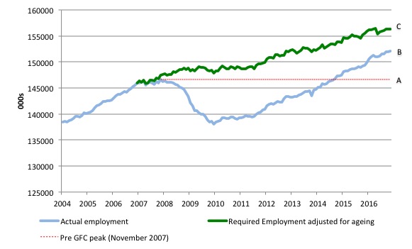
This allows us to calculate how far below the 4.4 per cent unemployment rate (constant participation rate) the US employment level is.
There are two effects:
- The actual loss of jobs between the employment peak in November 2007 and the trough was in January 2010 was 8,582 thousand jobs. However, total employment is now above the January 2008 peak by 5,490 thousand jobs. This gain in jobs is measured by the AB gap in the graph which shows the gap in employment relative to the November 2007 peak (the dotted red line is an extrapolation of the peak employment level). You can see that it wasn’t until July 2014 that the US labour market reached the previous peak employment again.
- The shortfall of jobs (the overall jobs gap) is the actual employment relative to the jobs that would have been generated had the demand-side of the labour market kept pace with the underlying population growth (Required Employment Adjusted for Ageing) – that is, with the participation rate at its peak and the unemployment rate constant at 4.4 per cent. This shortfall (BC) loss amounts to 4,518 thousand jobs. This is the segment BC measured as at November 2016.
To put that into further perspective, the following graph shows the BLS measure U6, which is defined as:
Total unemployed, plus all marginally attached workers plus total employed part time for economic reasons, as a percent of all civilian labor force plus all marginally attached workers.
It is thus the broadest measure of labour underutilisation that the BLS publish.
In December 2006, before the affects of the slowdown started to impact upon the labour market, the measure was estimated to be 7.9 per cent. It now stands at 9.3 per cent (November 2016) and has only marginally declined in the last 12 months.
It remains well above previous troughs, which suggests (along with the other signals presented above) that the labour market is still a long way from being considered ‘recovered’.
While the unemployment rate has dropped to 4.6 per cent, underemployment and hidden unemployment have risen.
Interest-rate sensitive components of total spending in the US
I should note at the outset that I do not subscribe to the logic that interest rate movements have a strong impact on total spending.
I have made this point regularly that interest rate changes are a blunt instrument and the overall impacts on total spending are ambiguous – given that there are complex distributional effects involved (for example, creditors gain, debtors lose).
But the Federal Reserve narrative is that inflation threats emerge when the economy is approaching full capacity and to attenuate those threats spending growth has to be moderated.
Interest rate increases are meant to accomplish this end by increasing the costs of borrowing and choking off credit growth.
The two major components of total spending that will be impacted by this effect are private investment (capital formation) and consumer spending on durables (white goods, cars etc), which both rely on credit access.
It is here that the illogical nature of the decision becomes clear.
I did some analysis of the detailed expenditure data available from the US Bureau of Economic Analysis.
Total investment (public and private) is only 4.6 per cent above the real GDP peak-quarter in December 2007.
The following aggregates are relevant as at the September-quarter 2016 in relation to that 2007 peak-quarter:
1. Real GDP 11.5 per cent above.
2. Personal consumption expenditure is 14.7 per cent above.
3. Household durable goods 38.8 per cent above and broken down we get: Motor vehicles and parts 12.6 per cent above (27.5 per cent of total durable spending); Furnishings and durable household equipment 34.9 per cent above (23.6 per cent of total durable spending); Recreational goods and vehicles 90.4 per cent above (37 per cent of total durable spending); and Other durable goods 25 per cent above (13.6 per cent of total durable spending).
4. Gross private domestic investment is 7.4 per cent above only.
5. Public gross domestic investment is 11.9 per cent below, with Federal 5.2 per cent below peak (comprising 44.8 per cent of total public investment) and State/Local government 16.7 per cent below (comprising 55.2 per cent of total public investment).
In terms of contributions to real GDP growth of these expenditure components, the following data relates to the September-quarter 2016:
1. Real GDP grew by 0.78 per cent in the September-quarter 2016.
2. Private and public investment added very little to growth in net terms (0.04 points).
3. Personal consumption added 0.47 points (more than half the growth), with the sub-component Durable goods adding 0.26 points of that.
4. Net exports added 0.23 points.
So using the US Federal Reserve logic it will expect private investment (capital formation) to decline even further and probably turn into a negative contributor to growth in 2017.
Only durable goods expenditure, which might or might not be sensitive to interest rate variations is growing strongly. But then if government austerity is the norm (government spending overall added only 0.01 points to real GDP growth in the September-quarter 2016) and private capital formation weak, attacking consumer durable expenditure will likely push the US economy towards zero or very low growth.
The inflation data (as we will see) doesn’t warrant any policy response remotely like that.
The inflation situation …
What do we know about the US inflation rate?
The US Federal Reserve FOMC uses two measures of inflation to guide its assessment of how they are performing relative to their inflation target of 2 per cent:
1. The price index for Personal Consumption Expenditures (PCE) taken from the National Accounts, published by the Bureau of Economic Analysis (Table 2.3.4).
2. The so-called “core” PCE price index, which the BEA defines “as personal consumption expenditures (PCE) prices excluding food and energy prices”.
The BEA tell us in their FAQ – What is the Core PCE price index?:
The core PCE price index measures the prices paid by consumers for goods and services without the volatility caused by movements in food and energy prices to reveal underlying inflation trends.
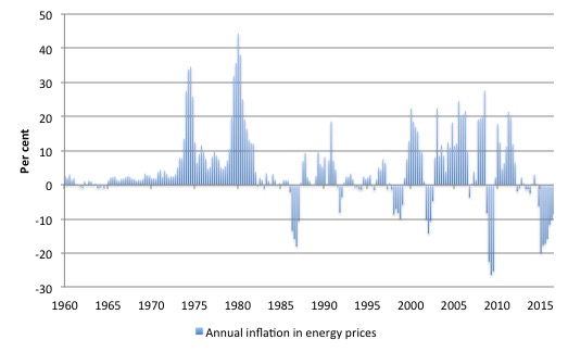
The following three graphs tell the story. The first graph shows the annual inflation in energy prices (component of personal consumption expenditure) from the March-quarter 1960 the third-quarter 2016.
Energy prices peaked in the December-quarter 2012 and have since then dropped by 26.7 per cent. The annual rate of energy price inflation has been negative for the last eight consecutive quarters, although the rate of decline has moderated.
While they rose by 3.7 per cent in the June-quarter 2016, the rate of increase was only 0.5 per cent in the September-quarter 2016.
The decline in energy prices has clearly had a dramatic impact upon the overall PCE price index.
The US Federal Reserve Press Release said that it expected “the transitory effects of past declines in energy … prices” to “dissipate”.
Perhaps.
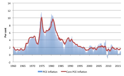
The next graph shows the annual inflation rate for PCE and core PCE over the same period. The huge spikes in the mid-1970s and late 1970s early 1980s were driven by the OPEC oil price hikes (refer to the previous graph).
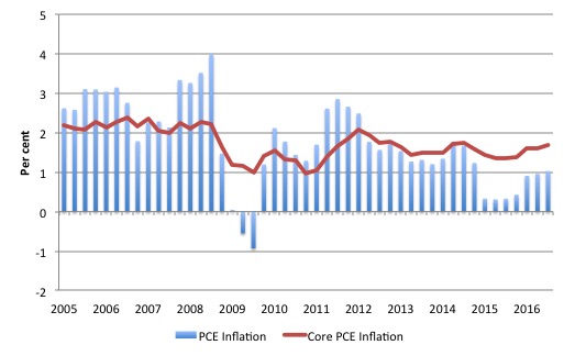
To provide more recent perspective the following graph is just a snapshot of the previous graph starting in the March-quarter 2005.
PCE inflation is currently at 1 per cent per annum, while Core PCE inflation is at 1.7 per cent. Both have been relatively stable throughout 2016.
By any assessment, the inflation rate is still well below the US Federal Reserve’s target although the gap is less than it was in 2015.
The US Federal Reserve’s Press Statement (link above) said that:
Market-based measures of inflation compensation have moved up considerably but still are low; most survey-based measures of longer-term inflation expectations are little changed, on balance, in recent months.
The current expected price inflation for the next 12 months derived from the Cleveland Federal Reserve’s – Inflation Expectations – series is currently 2.29 per cent (December 2016) and has risen steadily over the current year.
The ten-year ahead expected inflation is still only 1.93 per cent and has not shown any sharp acceleration over the last year (it was 1.85 per cent in January 2016).
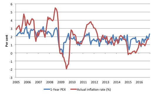
The following graph shows the evolution of the actual consumer price index and the one-year ahead inflation expectations series from March 2005 to December 2015.
It is clear that the US Federal Reserve
Conclusion
Given all this, it’s hard to comprehend, in economic terms, why the US Federal Reserve Bank raised interest rates last week.
It is responding to pressure from financial markets in one way or another rather than using any comprehensible economic logic.
Please read my blog – Why banks are pushing the US central bank to increase interest rates – for more discussion on this point.
Having said that though, I should add that I doubt the decision will have much effect on total economic activity. Key expenditure components remain weak and are unlikely to respond to interest rate changes at all.
Capacity utilisation rates are well below historical norms, which tells me that the incentive to invest in new productive capital is probably low at present.
That view is reinforced by the fact that private investment has remained weak since the GFC even though interest rates have been at very low levels. Clearly, other factors than cost of borrowing have been at play and will remain so.
But then with negative factors still present (uncertainty, spare capacity) it doesn’t help to make borrowing more expensive.
That is enough for today!
(c) Copyright 2015 William Mitchell. All Rights Reserved.
I suspect they are anticipating Trump in some way.
Hello,
What a fantastic analysis of the situation.
One (on the surface believable) myth I read long ago is that the 2-3 percent inflation target was so that the government could finance itself with 30-year (2.5% average yield) bond issues, more or less for free. By the time a 30-year bond rolls over the amount nets to zero in real terms. (72/2.5=28.8 years)
But as we know the government bond financing rhetoric is a voluntary construct for corporate welfare because a sovereign government that is the monopoly issuer of its currency is not financially constrained.
Wise words on what is going on in India and now Venezuela is a suggested blog topic.
Thank you very much.
Alan
That is a lot of information and a lot of analysis and a lot of work. Thank you for sharing it Professor.
Dr. Bill,
Thanks so much and totally agree with your analysis and conclusion that there is little rationale for, and little to be expected from, central bank policy that is responsive to capital market demands and a modicum of constant political badgering, both for a ‘more normal’ policy stance.
So, given this just confirms the impotency of CB monetary policy, we are left hungering for a fiscal policy stance that might result in what all this analysis indicates is needed, positive aggregate demand growth .
But having watched Dr. Kelton’s postulation at the Levy Institute’s Minsky Conference this Spring that there will be no Fiscal-side contribution coming in the US because both sides of the aisle abhor any increase in public ‘debt’ to fund public ‘good’, the question remains “why not?” to proceed with what Dr. Lerner described, accurately at the time, as ‘printing the money’, which could come under the vastly misunderstood rubric of “helicopter money”, in order to achieve a balancing of the US national budget without the need for more public ‘debt’?
At Minsky, Dr. Fullwiler opined that Lerner’s “printing money” was the same as public debt-issuance at ‘near-zero’ rates. But debt securities are marketable at changing prices and rates over the long-term (perenially), and besides, neither side is accepting of them, even to support infrastructure investments.
(Neither am I, really)
Simply put, is it high time to advance debt-free issuance, in the same monetary-fiscal framework proposed by Friedman, back when he was a student of Simons and Fisher? Also, as recently proposed by more modern luminaries including Martin Wolf and Adair Turner’s Overt Money Financing of Deficits?
Or, what else is there?
Respectfully.
Nice article professor. I read you regularly, and often link to your essays from my facebook page. It is discouraging that I refer to an Austrailian economist for the best analysis. If there’s someone doing it this well in the United States I have not found them. I do read Warren Mosler regularly, but more for the investment conversation than anything else. I am an alderman in Manchester NH., and at last night’s meeting another alderman complained about the size of the national debt. This is the knee jerk statement someone makes when they want to buff up their ‘conservative’ bona fides regarding taxes. I responded that the the federal government has no need whatsoever for debt in order to fund its operations. I got silence in response. The lack of knowledge up here is stupefying. Thanks for helping to shine some light in this darkness. IF we don’t get a clue soon, we’re toast.