This week, Australia learned that old geopolitical relationships and so-called 'free trade' treaties mean little…
US labour market improves and interest rates will rise as a consequence
On March 10, 2017, the US Bureau of Labor Statistics (BLS) released their latest labour market data – Employment Situation Summary – February 2017 – which showed that total non-farm employment from the payroll survey rose by 235,000, which built on the 227,000 net change in January 2016. The unemployment rate fell to 4.7 per cent. The Labour Force also grew strongly as participation rose by 0.1 points. The signs are more positive than a few months ago, even if broader indicators (the U6 measure supplied by the BLS ) suggest caution. Overall, there is a large jobs deficit remaining and previous analysis has shown that the jobs that have been created in the recovery are biased towards low pay. One suspects though that the Federal Reserve Bank will take the chance offered by a stronger monthly result (February) to increase interest rates a notch when it meets this week.
Overview
For those who are confused about the difference between the payroll (establishment) data and the household survey data you should read this blog – US labour market is in a deplorable state – where I explain the differences in detail.
See also the – Employment Situation FAQ – provided by the BLS, itself.
The BLS say that:
The establishment survey employment series has a smaller margin of error on the measurement of month-to-month change than the household survey because of its much larger sample size. … However, the household survey has a more expansive scope than the establishment survey because it includes self-employed workers whose businesses are unincorporated, unpaid family workers, agricultural workers, and private household workers …
Focusing on the Household Labour Force Survey data, the seasonally adjusted labour force rose by by 340 thousand in February 2017 and the participation rate rose by 0.1 points.
The participation rate has risen from 62.6 per cent in November 2016 to 63 per cent in February 2017, which is usually a sign that employment opportunities are becoming easier to access.
Total employment rose by 447 thousand in net terms, and as a consequence, official unemployment fell by 107 thousand.
The unemployment rate eased from 4.78 per cent to 4.7 per cent.
While it is too early to say whether the stronger growth so far this year is reversing the slowdown experienced in the second-half of 2016, the signs are there.
Many commentators are calling this upturn a Trump effect, given they hypothesise that the prospect of corporate tax cuts and further deregulation is creating a new wave of confidence and the job creation has followed.
But caution is always required in interpreting monthly data.
Remember, that the US economy has been undermining standard wage employment since 2005 (see – All net jobs in US since 2005 have been non-standard) and has demonstrated a bias towards low-wage job creation (see Bias toward low-wage job creation in the US continues).
So more precarious jobs if those trends are continuing is hardly progress.
Further, the February participation rate was still only 63 per cent and still far below the peak in December 2006 (66.4).
Adjusting for the ageing effect (see US labour market – some improvement but still soft for an explanation of this effect), the rise in those who have given up looking for work (discouraged) since December 2006 is around 3.5 million.
If we added them back into the labour force and considered them to be unemployed (which is not an unreasonable assumption given that the difference between being classified as officially unemployed against not in the labour force is solely due to whether the person had actively searched for work in the previous month) – we would find that around 3,698 thousand workers have exited the labour force due to lack of employment opportunities, which would make the current US unemployment rate around 6.7 per cent rather than the official estimate of 4.7 per cent.
That provides a quite different perspective in the way we assess the US recovery.
The US labour market is still a long way from where it was at the end of 2007.
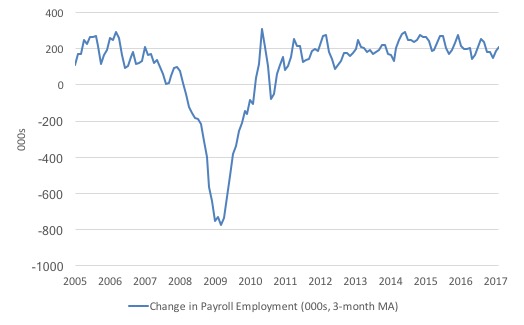
Payroll employment trends
The first graph shows the monthly change in payroll employment (in thousands, expressed as a 3-month moving average to take out the monthly noise).
The monthly changes were stronger in 2015, and then dipped in the first-half of 2016. By the end of 2016, job creation was stronger but then it tailed off again, somewhat.
In the last two months (January and February 2017), there has been a strengthening of net payroll employment change.
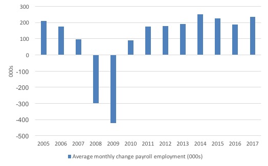
The next graph shows the same data in a different way – in this case the graph shows the average net monthly change in payroll employment (actual) for the calendar years from 2005 to 2017. Clearly, the average for 2017 is for January and February only.
The data suggests that the downward trend that began in 2014 might be reversing in early 2017.
The average net change in 2014 was 250 thousand, in 2015 was 226 thousand, in 2016, 187 thousand. Already in the first two months of 2017, the average net change is 237 thousand.
One has to be careful though.
Weather conditions in the US have been kind to construction, which increased by 58,000 in February 2017. The BLS noted that “Construction has added 177,000 jobs over the past 6 months.”
Manufacturing employment also rose by 28,000 in net terms and has added 57,000 jobs in the last 3 months. Gains were made in private education (up 29,000) and health care (up 27,000).
Of note, is the BLS observation that “Employment in professional and business services continued to trend up in February (+37,000). The industry has added 597,000 jobs over the year.”
However, retail trade employment fell by 26,000 in February 2017, which bucks the trend in the other sectors.
Several sectors (wholesale trade, transportation and warehousing, information, financial activities, leisure and hospitality, and
government) showed “little or no change” in February 2017.
Labour Force Survey – employment growth picking up
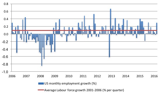
In January 2017, employment fell by 0.02 per cent, while the labour force rose by 0.05 per cent. This deterioration was more than reversed in February 2017, with employment growth rising by 0.29 per cent compared to the 0.21 per cent rise in the labour force.
The following graph shows the monthly employment growth since the low-point unemployment rate month (December 2006). The red line is the average labour force growth over the period December 2001 to December 2006 (0.0910 per cent per month).
What is apparent is that a strong positive and reinforcing trend in employment growth has not yet been established in the US labour market since the recovery began back in 2009. There are still many months where employment growth, while positive, remains relatively weak when compared to the average labour force growth prior to the crisis.
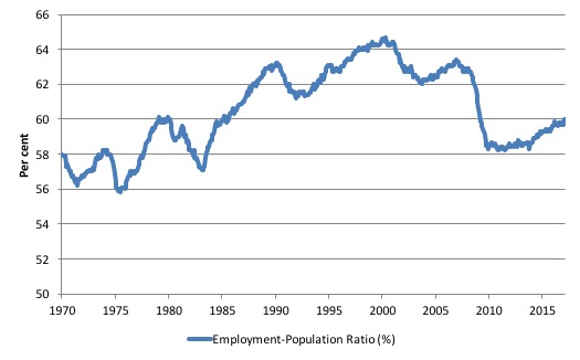
A good measure of the strength of the labour market is the Employment-Population ratio given that the movements are relatively unambiguous because the denominator population is not particularly sensitive to the cycle (unlike the labour force).
The following graph shows the US Employment-Population from January 1970 to February 2017. While the ratio fluctuates a little, the February 2017 outcome (60 per cent) was up by 0.3 points on December.
But it remains well down on pre-GFC levels (peak 63.4 per cent in December 2006), which is a further indication of how weak the recovery has been so far.
Federal Reserve Bank Labor Market Conditions Index (LMCI)
The Federal Reserve Bank of America has been publishing a new indicator – Labor Market Conditions Index (LMCI) – which is derived from a statistical analysis of 19 individual labour market measures since October 2014.
It is now being watched by those who want to be the first to predict a rise in US official interest rates. Suffice to say that the short-run (monthly) changes in the LMCI are “assumed to summarize overall labor market conditions”.
A rising value (positive change) is a sign of an improving labour market, whereas a declining value (negative change) indicates the opposite.
You can get the full dataset HERE.
I discussed the derivation and interpretation of the LMCI in this blog – US labour market weakening.
In January 2017, the LMCI rose by 1.3 index points, and continues the relative weak trend downwards since 2015.
The following graph shows the FRB LMCI for the period January 2007 to January 2017. At the time of writing, the February data had not yet been released.
We note that while unemployment is now lower than last year and the rate of hiring has stabilised after declining earlier in the year. The way these factors combine in the index leads to an overall assessment that the labour market has been in decline.
The fall away over the last nine months has been quite significant notwithstanding the July 2016 upturn.

The US jobs deficit
As noted in the Overview, the current participation rate (63 per cent) is a long way below the most recent peak in December 2006 of 66.4 per cent.
When times are bad, many workers opt to stop searching for work while there are not enough jobs to go around. As a result, national statistics offices classify these workers as not being in the labour force (they fail the activity test), which has the effect of attenuating the rise in official estimates of unemployment and unemployment rates.
These discouraged workers are considered to be in hidden unemployment and like the officially unemployed workers are available to work immediately and would take a job if one was offered.
But the participation rates are also influenced by compositional shifts (changing shares) of the different demographic age groups in the working age population. In most nations, the population is shifting towards older workers who have lower participation rates.
Thus some of the decline in the total participation rate could simply being an averaging issue – more workers are the average who have a lower participation rate.
I analysed this declining trend in this blog – Decomposing the decline in the US participation rate for ageing.
I updated that analysis to December 2015 and computed that the decline in the participation rate due to the shift in the age composition of the working age population towards older workers with lower participation rates accounted for about 58 per cent of the actual decline.
Thus, even if we take out the estimated demographic effect (the trend), we are still left with a massive cyclical response.
What does that mean for the underlying unemployment?
The labour force changes as the underlying working age population grows and with changes in the participation rate.
If we adjust for the ageing component of the declining participation rate and calculate what the labour force would have been given the underlying growth in the working age population if participation rates had not declined since December 2006 then we can estimate the change in hidden unemployment since that time due to the sluggish state of the US labour market.
Adjusting for the demographic effect would give an estimate of the participation rate in February 2017 of 64.5 if there had been no cyclical effects (1.5 percentage points up from the current 63 per cent).
So the 1.5 percentage point decline in the participation rate due to the downturn (net of ageing effect) amounts to 3,477 thousand workers who have left the labour force as a result of the cyclical sensitivity of the labour force.
It is hard to claim that these withdrawals reflect structural changes (for example, a change in preference with respect to retirement age, a sudden increase in the desire to engage in full-time education).
In January 2007 (at the peak participation rate which had carried over from December 2006), the US unemployment rate was 4.6 per cent (which was slightly higher than the 4.4 per cent low point recorded a month earlier in December 2006. It didn’t start to increase quickly until early 2008 and then the jump was sudden.
We can have a separate debate about whether 4.4 per cent constitutes full employment in the US. My bet is that if the government offered an unconditional Job Guarantee at an acceptable minimum wage there would be a sudden reduction in the national unemployment rate which would take it to well below 4.4 per cent without any significant inflationary impacts (via aggregate demand effects).
So I doubt 4.4 per cent is the true irreducible minimum unemployment rate that can be sustained in the US.
But we will use it as a benchmark so as not to get sidetracked into definitions of full employment. In that sense, my estimates should be considered the best-case scenario given that I actually think the cyclical losses are much worse than I provide here.
For those mystified by this statement – it just means that I think the economy was not at full employment in December 2006 and thus was already enduring some cyclical unemployment at that time.
Using the estimated potential labour force (controlling for declining participation), we can compute a ‘necessary’ employment series which is defined as the level of employment that would ensure on 4.4 per cent of the simulated labour force remained unemployed.
This time series tells us by how much employment has to grow each month (in thousands) to match the underlying growth in the working age population with participation rates constant at their January 2007 peak – that is, to maintain the 4.4 per cent unemployment rate benchmark.
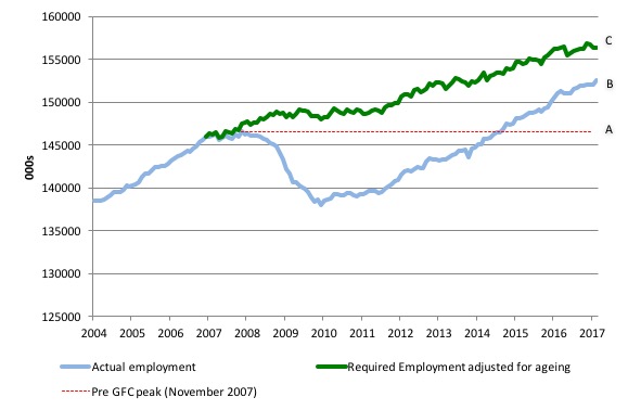
I computed the ‘necessary’ employment series based on the age-adjusted potential labour force (dark green line in the following graph).
The light blue line is the actual employment as measured by the BLS and the dotted red line is the level of employment that prevailed in November 2007 (the peak before the crisis).
This allows us to calculate how far below the 4.4 per cent unemployment rate (constant participation rate) the US employment level currently is.
There are two effects:
- The actual loss of jobs between the employment peak in November 2007 and the trough (January 2010) was 8,582 thousand jobs. However, total employment is now above the January 2008 peak by 5,933 thousand jobs. This gain in jobs is measured by the AB gap in the graph which shows the gap in employment relative to the November 2007 peak (the dotted red line is an extrapolation of the peak employment level). You can see that it wasn’t until July 2014 that the US labour market reached the November 2007 peak employment level again.
- The shortfall of jobs (the overall jobs gap) is the actual employment relative to the jobs that would have been generated had the demand-side of the labour market kept pace with the underlying population growth (Required Employment Adjusted for Ageing) – that is, with the participation rate at its December 2006 peak and the unemployment rate constant at 4.4 per cent. This shortfall (BC) loss amounts to 3,886 thousand jobs. This is the segment BC measured as at February 2017.
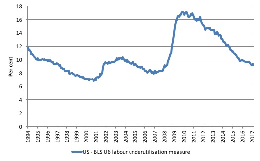
To put that into further perspective, the following graph shows the BLS measure U6, which is defined as:
Total unemployed, plus all marginally attached workers plus total employed part time for economic reasons, as a percent of all civilian labor force plus all marginally attached workers.
It is thus the broadest measure of labour underutilisation that the BLS publish.
In December 2006, before the affects of the slowdown started to impact upon the labour market, the measure was estimated to be 7.9 per cent. It now stands at 9.2 per cent (February 2017) which means it hasn’t improved since December 2016.
It remains well above previous troughs, which suggests (along with the other signals presented above) that the labour market is still a long way from being considered ‘recovered’.
It means that while unemployment has declined modestly over the last year, underemployment and hidden unemployment have risen.
And the relevance for Federal Reserve Interest Rate decisions?
The stronger than expected employment growth in the US this month almost assures that the Federal Reserve Bank will increase interest rates in the US when the FOMC meets on Tuesday and Wednesday (March 14-15).
In their February 2017 – Monetary Policy rePort – (released February 14, 2017), the Federal Reserve Bank opened their analysis by noting that the US labour market had improved in the last several months.
The Report also said that the labour market:
… is close to full employment.
Other indicators are also consistent with a healthy labor market.
One can dispute that claim but it is their claim and they set the interest rate.
So I am guessing that the stronger February employment result will open the FOMC gate for another interest rate push upwards this coming week.
Conclusion
The evidence is fairly consistent across a range of measures – the mass unemployment in the US was the result of a systemic failure in that economy to produce enough jobs, which emerged as aggregate spending collapsed in early 2008.
Since then, as the economy has slowly starting growing again, the demand-side of the labour market has improved steadily and the unemployment rate has fallen.
The pace of improvement slowed in 2016 but in February 2017, there was a significant uptick in employment growth. Some have called this the Trump effect – as firms are anticipating tax cuts and further deregulation.
Whether the uptick is a sign of on-going improvement remains to be seen.
The broader indicators suggest things haven’t improved much yet. We will have to wait and see.
I refer there to the slack indicated by the broader BLS measures of labour underutilisation and the jobs gap. Further, the jobs that are being created are biased towards low pay.
Related analysis shows that the impacts of the Great Recession will be long-lasting.
I issue orders
While the topic of fake news is in vogue, here is a hot update.
This photo was taken outside the Il‑Bank Ċentrali ta’ Malta aka as the Central Bank of Malta last Friday afternoon (March 10, 2017), just before I went inside and instructed the Governor to introduce processes to exit the Eurozone and withdraw from the Eurosystem by Monday (March 13, 2017) and have the new Lira ready for use.
Everyone agreed that this would be in the best interests of this island nation. I expect by the time this blog is posted, the processes of exit will be well advanced.
I wish them well in their struggles to take back their democratic processes from the right-wing, corporatist elites that run the European Commission and oversee the Eurozone.

That is enough for today!
(c) Copyright 2017 William Mitchell. All Rights Reserved.
Hmmn. I am glad the people in the pictured building listened to your instructions. I guess we will see if anyone follows them. It would be good if they did. Are the authorities in Malta more sensible than elsewhere?
I cannot post your link in my facebook page. I have no trouble posting other items. Odd
The Chris Herbert Show
Chris Herbert
Malta looks beautiful from the architecture of the building. I’m curious how the news of euro withdrawal will be received.
Apparently, the Prime Minister of Malta said this about UK leaving the EU (according to the Daily Express which is low grade toilet paper):
He has warned Britain “cannot have its cake and eat it”, describing Mrs May’s plans for the UK divorce from the Brussels club as “unacceptable”.
That cake he is talking about is not being carved up terribly equitably:
“As part of a progressive study, the European Foundation for the Improvement of Living and Working Conditions (Eurofound) analyzed wages across the EU.
The report, titled Recent Developments in the Distribution of Wages in Europe, scrutinized data from 2004 to 2011 – the period before and after the onset of the Great Recession.
It found that the UK has the highest Gini coefficient of any EU member state – higher than that of the US. The coefficient is a widely used measure of income distribution within a nation, and is often used to calculate inequality. ” (RT report).
I now have the lira you have ordered!!! LOL and I think I will use old euros to purchase the building you are standing in front of!