Today (April 18, 2024), the Australian Bureau of Statistics released the latest - Labour Force,…
More evidence that the US labour market is not at full employment
Regular readers will recall a few of my blogs where I have demonstrated that the US economy is still nowhere near to what one might call full employment, even though that concept is highly contested and can span a range of outcomes depending on the ideological disposition one takes. I have also done some research decomposing the marked decline in the US participation rate since around 2000 into age-related effects and what I call the discouraged worker effects (workers giving up looking for jobs because of the slow employment growth). This week (March 20, 2017), research published by the Federal Reserve Bank of San Francisco bears on this topic –
How Tight Is the U.S. Labor Market? – and they essentially concur with my previous assessments. There work is interesting because it reaches the same conclusion from a variety of methods, which is always a good sign because it means the result is not method-specific. However, there are those who for their own ideological reasons want to argue that the US economy is already at full employment. If they were correct, it would mean the quality of that ‘full employment’ had shifted markedly – lower – as a consequence of the GFC and its aftermath and that the associated underutilisation levels had risen.
Past relevant blogs for background include:
1. Decomposing the decline in the US participation rate for ageing.
2. US labour market deteriorating – the losses from GFC will be long-lived.
3. The US labour market is nowhere near full employment.
The Federal Reserve Bank of San Francisco study was published in their March edition of the Bank’s Economic Letters series.
The researchers conclude that:
1. “After applying a new method to adjust for demographic changes in the labor force, the current unemployment rate is still 0.3 to 0.4 percentage point higher than at past labor market peaks.”
2. “This indicates that the labor market may not be quite as tight as the headline unemployment rate suggests.”
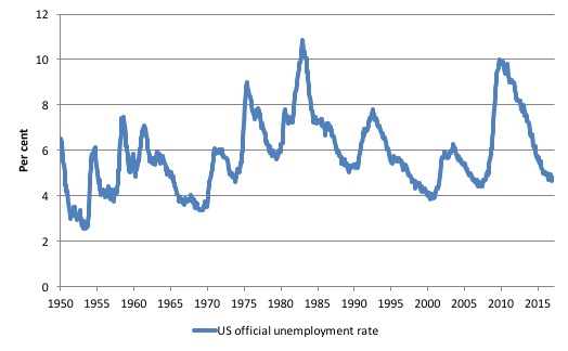
The motivation is that the latest BLS data for February produced an unemployment rate of 4.7 per cent, which is “considerably lower than the historical average of 5.8% since 1948 and has fallen below its levels during the labor market peaks of 1979 and 1989”.
The authors note that “(t)he expectation that the rate will fall even further raises the possibility that the labor market will exceed the Federal Reserve’s goal of maximum employment and could push up wages and prices substantially.”
The following graph shows the official US unemployment rate since January 1950 up until February 2017.
The point of the research (and my previous blogs above) is that thinking in terms of historical constants – such as comparing peaks or troughs and such – is fraught, if underlying structures have changed.
The FRBSF paper notes:
Using such comparisons of the level of unemployment over time to assess the amount of labor market slack can be problematic, however, because slow changes in the demographic composition of the workforce affect the aggregate unemployment rate. In particular, as the size and employment trends among different groups of workers change, comparisons across business cycles become increasingly difficult.
Basic LF arithmetic
The Labour Force Survey typically asks the respondents:
1. Did you work for at least one hour in the past week? Yes: counted as Employed. Then the respondent will be interrogated about whether they have enough hours of work and more.
2. If the answer was No, then the person is asked: (a) Are you willing to work?; and (b) Are you actively seeking work?
If the answers are: Yes, Yes, then the person is counted among the officially Unemployed.
If the answers are: Yes, No, then the person is counted as being Not in the Labour Force (NLF), that is, inactive.
The aggregates are E + U = the Labour Force (LF).
LF + NLF = Working Age Population (WAP).
The Labour Force Participation Rate (LFPR) = LF/WAP
The Unemployment rate (UR) = U/LF.
The Employment-Population ratio (EPOP) = Employment/WAP.
Interpreting declining participation rates
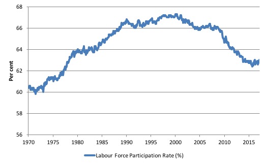
The following graph shows the aggregate participation rate from January 1948 to June 2014. The US aggregate participation rate peaked at 67.3 per cent in April 2000 (seasonally adjusted). Thereafter it has declined on trend with some reversions in between.
In February 2017, it stood at 63 per cent, a considerable fall since 2000.
It is clear that the US participation rate has been declining which typically signals a slackening employment growth. If workers, facing little chance of gaining a job, stop actively searching for work, then the national statistics offices will classify these workers as not being in the labour force.
The labour force is the sum of all those above a threshold age level (usually 15 years) who are either in employment or unemployment and actively seeking work for which they are available.
So you see the issue, if an unemployed person becomes frustrated with their failure to gain employment – usually because there are not enough jobs to go around – and stop looking until things improve, the statistician will not classify them as being officially unemployment.
They are considered active and outside the labour force despite the fact that they would accept a job offer and be available for an immediate start.
In other words, conceptually they are wasted labour in the same way an unemployed person is wasted.
But by classifying them as being outside the labour force, this has the effect of attenuating the official estimates of unemployment and unemployment rates.
Economists consider these excluded ‘unemployed’ workers to be discouraged workers and conceptually enduring hidden unemployment.
That is clear enough.
But the participation rates published by the statistician are averages of a variety of behaviour across the age spectrum.
It is clear that the decline in the aggregate participation rate began before the GFC hit the US.
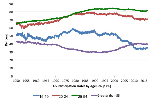
The next graph breaks the aggregate down into age groups. The prime age (25-54) and 20-24 groups have seen a tapering of their participation rates sine the late 1980s.
There have been sharp declines in the participation rates for teenagers (16-19) since the late 1980s and a steady rise in participation rates for the over 55s.
An average aggregate is influenced by the shifting weights of its component parts (in this case, the age-weights in the working age population.
So movements in the participation rate is also influenced by compositional shifts (changing shares) of the different demographic age groups in the working age population.
In most nations, the population is shifting towards older workers who have lower participation rates even if these older worker participation rates are rising.
Thus some of the decline in the total participation rate could simply being an averaging issue – more workers are the average who have a lower participation rate.
The question is how much of the falling US LFPR is due to the cyclical slowdown and how much of it is due to the ageing of the population?
My conclusion was that approximately 2.7 percentage points (up to June 2014) of the fall in participation since April 2000 was due to the shift in the age composition of the working age population.
That left about 40 per cent of the decline the result of other factors, which I concluded were of a cyclical origin (the discouraged worker effect).
How do changing labour force weights affect the unemployment rate estimate?
The FRBSF researchers investigate a similar question.
They note that:
The overall unemployment rate is an average of the unemployment rates for different demographic groups that have been weighted to reflect each group’s share of the labor force. A declining labor force share for a group with a high unemployment rate – for instance, young workers, whose share of the total workforce is falling due to the aging of the population-will tend to reduce the overall unemployment rate over time.
The compare two techniques:
1. Shift-share – where “the actual overall unemployment rate with an alternative rate calculated holding the labor force shares of the different demographic groups fixed at their value in a baseline or reference year”.
In other words, one creates a counterfactual and asks what would have happened if everything else was as it is now except the age-weights in the labour force were unchanged since some base period?
2. Dynamic factor analysis – a statistical technique that constructs an “an alternative scenario in which the aggregate unemployment rate is not driven by trends in worker flows specific to certain demographic groups only. Instead our method accounts for aggregate labor market forces, that is, movements in the flows that are common across all demographic groups.”
I won’t go into detail here but the approach statistically analyses “flows between employment, unemployment, and nonparticipation by each of the 11 demographic groups” and permits a separation of “all demographic influences from aggregate labor market trends.”
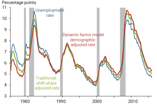
The results of their study are summarised in the following graph.
The blue line is the actual BLS unemployment rate. The green line is the shift-share simulation – which the authors say would give an unemployment rate of 5 per cent as at February 2017, “the same level as in the 1979 and 1989 labor market peaks (green line) and only one-tenth higher than the 2006 peak-which appears to confirm the initial impression of a tight labor market.”
The red line is the decomposition from the second method and the authors conclude that “Our demographic-adjusted unemployment rate (red line, Figure 1) stands at 5.2% as of February 2017, compared with the BLS published rate of 4.7%”.
The problem with the green line (shift-share decomposition) is that it “does not correct for the effects of labor market changes related to demographics”.
Which are?
1. Assume young people increasingly opt to stay at school and thus their labour force weight falls as their labour force participation rate declines.
The shift-share approach adjusts for this because it asks what the situation would be had they not done that.
2. But, the opting out of the labour force not only reduces the weight of the young people in the labour force but also reduces their official unemployment rate, which the shift-share approach ignores.
It comes down to those troublesome ‘stocks’ and ‘flows’ which confound students of economics continually.
There are two effects operating.
1. The falling youth LFPR reduces the size of their specific Labour Force, given the LF = LFRP*WAP.
2. But their return to school and withdrawal from the labour force also means they are not unemployed anymore.
The unemployment rate for any specific cohort is equal to their total unemployment divided by their labour force size.
The shift-share technique only adjusts for the labour force size effect and does not account for the decline in the numerator (their unemployment).
The FRBSF paper writes:
… a “stock” that measures a supply at a point in time, such as the unemployment rate, and a “flow,” such as the movement of workers between the labor force states of employed, unemployed, and out of the labor force or nonparticipation. Using a simple analogy, young workers’ unemployment rate-a stock-can be seen as the amount of water in a bathtub. If you turn on the tap and pull the plug, the level of water in the tub changes with the flow of water into and out of the bathtub. If the rate of water flowing into the tub slows by turning the faucet down, while the draining rate remains the same, the water level will go down. Similarly, if a higher fraction of high school graduates go to college instead of looking for a job, this would reduce the flow of young workers entering the pool of unemployment and thus lower the young workers’ unemployment rate.
Their overall conclusion is thus that:
… the demographic-adjusted unemployment rate is still 0.3 to 0.4 percentage point higher than it was at past labor market peaks”.
As a closing remark, I updated the my Job Openings and Labor Turnover data this week, after the BLS released new data.
This data allows us to assess the viability of different theoretical views of the labour market.
One of the claims made by mainstream economists (and it is in their textbooks) is that rising unemployment is the result of workers quitting their jobs to enjoy leisure.
That is, a downturn in employment (and a rise in unemployment) arises – allegedly – because workers develop a renewed preference for more leisure and less work and the supply of labour at each real wage level thus moves inwards (that is, workers are now less willing to supply the same hours of labour as before at the going real wage).
So they quit their jobs and head to the beach and relax.
And at the empirical level this theory predicts that quits will fall as employment falls.
The simplest fact then, which would give support to this notion of supply-side shifts, is whether the quit rate is, indeed, counter-cyclical – as the theory predicts. That is, does the quit rate rise when the unemployment rate rises or not. Simple enough.
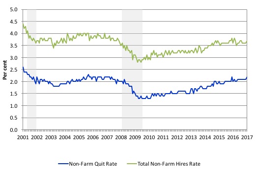
The following graph (for the period January 2001 to January 2017) shows in a compelling way that the quit rate (non-farm quits as a percent of total non-farm employment) behaves in a cyclical fashion as we would expect – that is, it rises when times are good and falls when times are bad.
The grey bars are the NBER recession (peak-to-trough) periods in this sample.
It is clear that when the unemployment rate rises, the quit rate falls. Exactly the opposite to that predicted by the supply-side story which means that their claim that causality runs from unemployment benefits to higher quits to higher unemployment is pure and unadulterated nonsense.
Many studies have demonstrated the phenomenon depicted in the graph.
Workers become very cautious when unemployment starts to rise and postpone any desired or planned job changes and opt for the security of their present job.
When there are more jobs being created and the hiring rate rises, workers then take more risks and the quit rate tends to rise.
The quit rate is now at 2.2 per cent (January 2017) but has not yet reached the levels found before the crisis.
The other series plotted is the hiring rate (green line). It is clear that it is also well below the pre-crisis level.
Another way of thinking about these series relates to the question explored by the FRBSF researchers.
If the US economy had fully recovered, then what explains the fact that these dynamic measures are still at lower levels?
Were the pre-crisis levels indicating excess full employment? Unlikely.
Conclusion
The FRBSF study shows that the US economy is still operating with labour market slack compared to the pre-crisis period.
That alone suggests the US labour market is not at full employment.
But then we can debate whether it was at full employment pre-crisis, which is another question again.
That is enough for today!
(c) Copyright 2017 William Mitchell. All Rights Reserved.
“And at the empirical level this theory predicts that quits will fall as employment falls.”
That should be ‘quits will rise as employment falls’.
Bill….this string is very relevant to today’s blog [a response to my comments a few days ago], and would appreciate if could be included as a response, here…THX, Jim Green
Andrew Wakeling says:
Thursday, March 23, 2017 at 14:53
“In this regard, the sensible strategy for a government is always to target full employment and allow the fiscal balance to be whatever it takes to achieve that goal. The government can always achieve a given employment target because it can run a buffer stock of jobs (the Job Guarantee) which would ensure that anyone who wants a job but cannot find one elsewhere can work for pay in the public sector.”
But how do you set the wages for these ‘buffer stock’ jobs, particularly given you are prepared to ‘allow the fiscal balance to be whatever it takes’? What is to constrain the government as employer paying overly high wages if all it cares is to achieve full employment?
Hi Andrew….it has always been a puzzlement to me why consensus has it that we can only achieve Full Employment by driving up massive deficits [and some support this]-but most often it is cited to sabotage what 87% of Americans support, that “anybody wanting to work should be able to find a job”-in short, it gets a lot of lip service from our politicians, and goes no where……but my puzzlement is why do we go down this path when we have Pro-Market “deficit-neutral” solutions to get to the same place? For instance, HR 1000-Further, is: THE NEIGHBOR-TO-NEIGHBOR JOB CREATION ACT [hereafter NTN, Amazon]-a federally mandated Social Insurance, a condition of employment, to provide a fund to hire/train our unemployed. Jobs beget jobs, and for a modest 4% of salary policy cost we can create more revered “private-sector” jobs in 6 months-than HR 2847 [The HIRE ACT]-in 6 years! My emphasis that this path is “Pro-Market” is to change the dialogue-we need to recognize that unemployment adversely impacts the bottom line-but we are so lost in manipulating the “human index” in our economic system [that is why it needs to be removed]-the loss of income to the market from unemployment [albeit common sense]-never gets discussed…also, I am saying this is controlled by a “law”, but in the absence of finding one, coined from [D]iminshed income to the market resulting from [UE]unemployment]-the D/UE LAW-[and I’m not delusional that anything new/different is hokie…..]-but the over-arching point is that if we can get the oligarchy on board re our jobless-it will make the work for Bill, and the rest of us who support Full Employment-a whole lot easier. Regarding your final point re how we provide “high wages”-a decent wage for Buffer Stock employees-without driving up the deficit [I think that is your point]-as noted I support “deficit-neutral” solutions-but I think these things are settled the way they are always settled-through give-and-take until a decent wage is settled upon. -I am a little concerned by those who believe they should start as a CEO-but I think their numbers are statistically irrelevant…..
Best regards, Jim Green
Another rather strange attack on MMT – from somebody who allegedly worked at the Bank of Spain for 30 years. At least we now know why they signed up to the Euro if this is the advice on offer