Today (April 18, 2024), the Australian Bureau of Statistics released the latest - Labour Force,…
Australian labour market – stronger performance this month (but suspicions remain)
The latest labour force data released today by the Australian Bureau of Statistics – Labour Force data – for March 2017 shows a rather substantial jump in full-time employment (74,500 thousand) and a rising participation rate (up 0.2 points). That is usually a virtuous duet even though unemployment rose by 4 thousand and the unemployment rate was steady at 5.9 per cent. I say virtuous because it means that more jobs are being created and more people are coming back into the labour market to access the better environment. The curious thing though is tha total monthly hours of work barely rose, which leads one to suspect that the employment strength is a sampling issue and we will see next month whether the underlying behaviour over the last several months reasserts itself or whether March 2017 marks a shift to better times. Put me in the sceptical camp at this stage. Broad labour underutilisation remains high at 14.7 per cent with unemployment and underemployment summming to 1,890.3 thousand persons. The teenage labour market also showed some improvement but remains in a poor state. Overall, we will have to see.
The summary ABS Labour Force (seasonally adjusted) estimates for March 2017 are:
- Employment increased by 60,900 (0.9 per cent) with full-time employment increasing by 74,500 and part-time employment decreasing by 13,600.
- Unemployment increased 4,000 to 753,100.
- The official unemployment rate remained steady at 5.9 per cent.
- The participation rate rose by 0.2 points to 64.8 per cent. Its behaviour has been quite erratic over the last 6 months. It remains well below its December 2010 peak (recent) of 65.8 per cent.
- Aggregate monthly hours worked increased 3.2 million hours (0.19 per cent).
- The undadjusted monthly data tells us that underemployment fell from from 8.8 per cent of the labour force in February 2017 to 8.,5 per cent in March 2017. The total labour underutilisation rate (unemployment plus underemployment) was 14.7 per cent. There were 1,089.2 thousand persons underemployed and a total of 1,890.3 thousand workers either unemployed or underemployed.
Employment growth – stronger than recent months
Employment increased by 60,900 (0.9 per cent) with full-time employment increasing by 74,500 and part-time employment decreasing by 13,600.
This is a substantial increase in relative terms – given the recent history.
In seasonally-adjusted terms, 67.8 per cent of the net jobs created in Australia in the last 12 months have been part-time.
The zig-zag pattern that we have observed over the last 36 months or so – where the employment estimates have been switching back and forth regularly between negative employment growth and positive growth with the occasional spikes – continues.
The positive spike in March is, however, somewhat larger than similar spikes in the last 8 or 9 months. It is possible we will see a revision in the data next month given this unusually strong result.
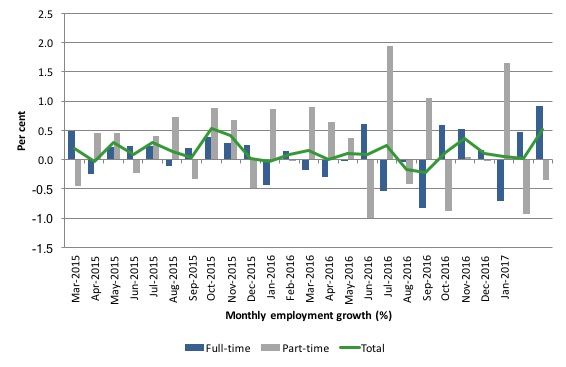
The following graph shows the month by month growth in full-time (blue columns), part-time (grey columns) and total employment (green line) for the 24 months to March 2017 using seasonally adjusted data.
It gives you a good impression of just how flat employment growth has been over the last 2 years. You can also see the dominance of part-time employment growth over the same period, especially in the last year or so.
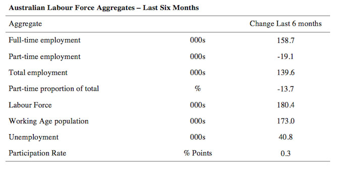
The following table provides an accounting summary of the labour market performance over the last six months. The monthly data is highly variable so this Table provides a longer view which allows for a better assessment of the trends. WAP is working age population (above 15 year olds).
Full-time employment has risen risen by 158.7 thousand jobs (net) over the last 6 months, while part-time work has fallen by 19.1 thousand jobs.
The conclusion – overall there have only been 139.6 thousand jobs (net) added in Australia over the last six months while the labour force has increased by 180.4 thousand. Employment growth has thus failed to keep pace with underlying population growth and the rising participation rate (up 0.3 points). The result has been that unemployment has risen by 40.8 thousand.
Overall – a rather modest labour market.
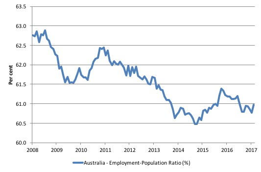
Given the variation in the labour force estimates, it is sometimes useful to examine the Employment-to-Population ratio (%) because the underlying population estimates (denominator) are less cyclical and subject to variation than the labour force estimates. This is an alternative measure of the robustness of activity to the unemployment rate, which is sensitive to those labour force swings.
The following graph shows the Employment-to-Population ratio, since February 2008 (the low-point unemployment rate of the last cycle).
It dived with the onset of the GFC, recovered under the boost provided by the fiscal stimulus packages but then went backwards again as the last Federal government imposed fiscal austerity in a hare-brained attempt at achieving a fiscal surplus.
The ratio began rising in December 2014 which suggested to some that the labour market had bottomed out and would improve slowly as long as there are no major policy contractions or cuts in private capital formation.
However, the peak in December is now gone and the ratio is once again in retreat.
The on-going fiscal deficit is still supporting some growth in the economy as the spending associated with the mining boom disappears. But the deficit is clearly too small given the behaviour of the real aggregates.
The series rose by 0.1 points in March 2017 to 61 per cent and remains a staggering 2 percentage points below the April 2008 peak of 62.9 per cent.
Teenage labour market – some improvement March 2017
The teenage labour market saw full-time employment rise by 11.7 thousand jobs and part-time employment fall by 9.2 thousand (net) jobs in March 2017.
Total employment thus rose by 2.5 thousand (net). A slight improvement in the parlous state of this segment.
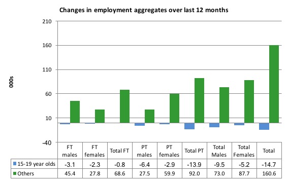
The following graph shows the distribution of net employment creation in the last month by full-time/part-time status and age/gender category (15-19 year olds and the rest)
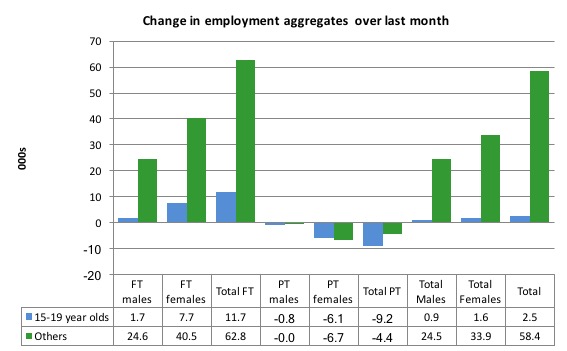
Over the last 12 months, teenagers have lost 14.7 thousand (net) jobs overall while the rest of the labour force have gained 160.6 thousand net jobs. Remember that the overall result represents a fairly poor annual growth in employment.
Full-time employment for teenagers over the last 12 months has fallen by 0.8 thousand and they have lost 13.9 thousand part-time employment jobs.
The teenage segment of the labour market is being particularly dragged down by the sluggish employment growth, which is hardly surprising given that the least experienced and/or most disadvantaged (those with disabilities etc) are rationed to the back of the queue by the employers.
The following graph shows the change in aggregates over the last 12 months. It is as if the teenagers have not had a stake in the labour market either way (blue bars barely visible).
In terms of the current cycle, which began after the last low-point unemployment rate month (February 2008), the following results are relevant:
1. Since February 2008, there have been only 1,412 thousand (net) jobs added to the Australian economy but teenagers have lost a staggering 104.9 thousand over the same period.
2. Since February 2008, teenagers have lost 113 thousand full-time jobs (net).
3. Even in the traditionally, concentrated teenage segment – part-time employment, teenagers have gained only 8.1 thousand jobs (net) even though 814.5 thousand part-time jobs have been added overall.
4. Overall, the total employment increase is modest. Further, around 58 per cent of the total (net) jobs added since February 2008 have been part-time, which raises questions about the quality of work that is being generated overall.
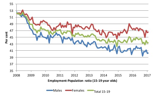
To put the teenage employment situation in a scale context the following graph shows the Employment-Population ratios for males, females and total 15-19 year olds since February 2008.
You can interpret this graph as depicting the loss of employment relative to the underlying population of each cohort. We would expect (at least) that this ratio should be constant if not rising somewhat (depending on school participation rates).
The facts are that the absolute loss of jobs reported above is depicting a disastrous situation for our teenagers. Males, in particular, have lost out severely as a result of the economy being deliberately stifled by austerity policy positions.
In the latter months of 2015, with the part-time employment situation improving, there was some reversal in the downward trends in these ratios.
However, that short improvement has now disappeared and the ratios are once again trending downwards.
The male ratio has fallen by 12.3 percentage points since February 2008, the female ratio has fallen by 5.5 percentage points and the overall teenage employment-population ratio has fallen by 8.9 percentage points. That is a substantial decline in the employment market for Australian teenagers.
The other staggering statistic relating to the teenage labour market is the decline in the participation rate since the beginning of 2008 when it peaked in January at 61.4 per cent. In March 2017, the participation rate was just 52.9 per cent.
That is an additional 122.4 thousand teenagers who have dropped out of the labour force as a result of the weak conditions since the crisis.
If we added them back into the labour force the teenage unemployment rate would be 29.5 per cent rather than the official estimate for March 2017 of 18.1 per cent.
Some may have decided to return to full-time education and abandoned their plans to work. But the data suggests the official unemployment rate is significantly understating the actual situation that teenagers face in the Australian labour market.
Overall, the performance of the teenage labour market remains extremely poor. It doesn’t rate much priority in the policy debate, which is surprising given that this is our future workforce in an ageing population. Future productivity growth will determine whether the ageing population enjoys a higher standard of living than now or goes backwards.
I continue to recommend that the Australian government immediately announce a major public sector job creation program aimed at employing all the unemployed 15-19 year olds, who are not in full-time education or a credible apprenticeship program.
Unemployment increased 4,000 to 753,100
The official unemployment rate remained steady at 5.9 per cent in March 2017 despite the relatively strong employment growth because the participation rate also rose by 0.2 points, which meant that there was slightly greater gains in the labour force than employment.
Overall, the labour market still has significant excess capacity available in most areas and what growth there is is not making any major inroads into the idle pools of labour.
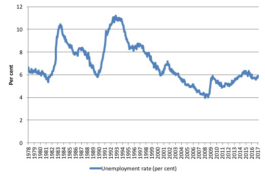
The following graph shows the national unemployment rate from February 1978 to March 2017. The longer time-series helps frame some perspective to what is happening at present.
After falling steadily as the fiscal stimulus pushed growth along, the unemployment rate slowly trended up for some months.
It is now above the peak that was reached just before the introduction of the fiscal stimulus. In other words, the gains that emerged in the recovery as a result of the fiscal stimulus in 2009-10 have now been lost.
Broad labour underutilisation – at 14.7 per cent
The ABS publishes monthly and quarterly labour underutilisation data. The quarterly data was updated last month (for the February-quarter 2017).
Using the monthly data (for March 2017) we see that:
1. Underemployment was estimated to be 8.5 per cent of the labour force down from 8.8 per cent in February 2017.
2. The total labour underutilisation rate (unemployment plus underemployment) was 14.7 per cent.
3. There were 1,089.2 thousand persons underemployed and a total of 1,890.3 thousand workers either unemployed or underemployed.
The following graph plots the history of quarterly (seasonally-adjusted) underemployment in Australia since February 1978 to the February-quarter 2017.
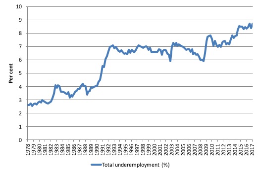
The next graph shows the evolution of the broad underutilisation rate over the same period. You can see the three cyclical peaks corresponding to the 1982, 1991 recessions and the more recent downturn.
Unemployment was a higher proportion of the two earlier peaks but underemployment now dominates the current cycle (just).
The other difference between now and the two earlier cycles is that the recovery triggered by the fiscal stimulus in 2008-09 did not persist and as soon as the ‘fiscal surplus’ fetish kicked in in 2012, things went backwards very quickly.
The two earlier peaks were sharp but steadily declined. The last peak fell away on the back of the stimulus but turned again when the stimulus was withdrawn.
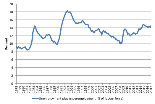
If hidden unemployment (given the depressed participation rate) is added to the broad ABS figure the best-case (conservative) scenario would see a underutilisation rate well above 16 per cent at present. Please read my blog – Australian labour underutilisation rate is at least 13.4 per cent – for more discussion on this point.
The next update will be for the May-quarter 2017 and will be published published in the June 2017 Labour Force release. In between those releases, the monthly estimates guide our thinking.
Aggregate participation rate – rises by 0.2 points 64.8 per cent
The participation rate rose by 0.2 points to 64.8 per cent, which is a good sign.
There is considerable monthly fluctuation in the participation rate but it remains substantially down on the most recent peak in November 2010 of 65.8 per cent when the labour market was still recovering courtesy of the fiscal stimulus.
The rising participation rate this month meant that the unemployment rose by 4 thousand even though total employment increased by 60,900 thousand.
The rising participation rate added an extra 43.1 thousand persons to the labour force (over the 21.8 thousand that were added as a result of underlying population growth).
The labour force thus grew by 64.9 thousand in March 2017.
If the participation rate had not increased the unemployment rate would have fallen to 5.6 per cent instead of remaining steady at 5.9 per cent.
Given the monthly volatility in the data, it is better to look at longer term trends. In this vein, what would the unemployment rate be if the participation rate was at the last November 2010 peak level value?
The following graph tells us what would have happened if the participation rate had been constant over the period November 2010 to March 2017. The blue line is the official unemployment rate since its most recent low-point of 4 per cent in February 2008.
The red line starts at November 2010 (the peak participation month). It is computed by adding the workers that left the labour force as employment growth faltered (and the participation rate fell) back into the labour force and assuming they would have been unemployed. At present, this cohort is likely to comprise a component of the hidden unemployed (or discouraged workers).
In recent months the gap between the lines has diverged which signals a deteriorating situation.
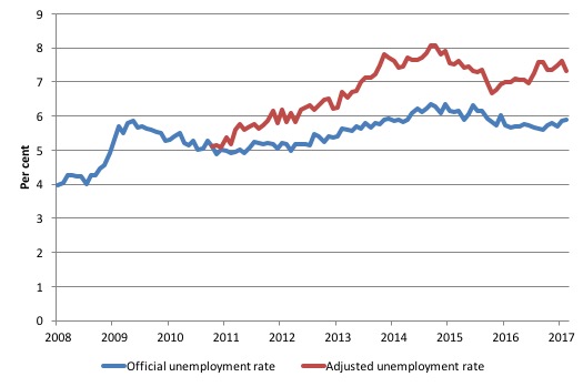
Total official unemployment in March 2017 was estimated to be 753.1 thousand. However, if participation had not have fallen relative to November 2010, there would be 951.9 thousand workers unemployed given growth in population and employment since November 2010.
The unemployment rate would now be 7.3 per cent if the participation had not fallen below its November 2010 peak of 65.8 per cent. The official unemployment in March 2017 was 5.9 per cent.
The difference between the two numbers mostly reflects, the change in hidden unemployment (discouraged workers) since November 2010. These workers would take a job immediately if offered one but have given up looking because there are not enough jobs and as a consequence the ABS classifies them as being Not in the Labour Force.
There has been some change in the age composition of the labour force (older workers with low participation rates becoming a higher proportion) but this only accounts for less than 1/3 of the shift. The rest is undoubtedly accounted for by the rise in hidden unemployment.
Note, the gap between the blue and red lines doesn’t sum to total hidden unemployment unless November 2010 was a full employment peak, which it clearly was not. The interpretation of the gap is that it shows the extra hidden unemployed since that time.
This gap shrinks as participation rises relative to the November 2010 peak.
Hours worked – rose modestly per cent in March 2017
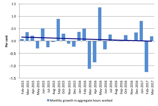
Seasonally-adjusted aggregate monthly hours worked increased 3.2 million hours (0.19 per cent) in March 2017 despite the substantial increase in full-time work.
The following graph shows the monthly growth (in per cent) over the last 24 months. The dark linear line is a simple regression trend of the monthly change – which depicts a distinct negative trend.
You can see the pattern of the change in working hours is also portrayed in the employment graph – zig-zagging across the zero growth line.
Conclusion
I repeat my standard monthly warning – we always have to be careful interpreting month to month movements given the way the Labour Force Survey is constructed and implemented.
Today’s figures show that the Australian labour market has improved in March 2017, although we have been led down this path before in recent years.
Total employment rose fairly strongly, relative to its recent history – by 60,900 but it was the strength of full-time employment (up 74,500) that is welcome.
The curious fact is that despite the strong full-time employment performance, total monthly hours barely moved.
But the analysis shows that employment growth over the last few years has been zig-zagging around the zero growth line on a more or less monthly basis with some positive spikes such as we saw in March 2017.
So it is too early to form a view that this month marks a turning point in a positive direction.
Over the last 12 months, Australia has gained 67.8 thousand full-time jobs (in net terms) and gained 78.1 thousand part-time jobs.
Overall, employment has grown by only 145.9 thousand jobs (net) – a fairly modest annual figure.
While this month’s surge in full-time work represents a break in the dominance of part-time work, we need more months like this before we can reject the obvious conclusion that Australia has become a nation of part-time employment growth with all the attendant negative consequences – poor income growth, precarious work, lack of skill development etc.
Underemployment remains high at 8.5 per cent and taken together (unemployment and underemployment) there were 14.7 per cent of the labour force counted as broadly underutilised (1,890.3 thousand).
The teenage labour market remains in a poor state even though this cohort shared in the full-time employment growth in March 2017.
Overall, the state of the Australian labour market is tenuous verging on weak.
It is clear that the current restrictive fiscal policy position adopted by the Federal government is not sufficient to redress the inadequate non-government spending growth.
It is also clear the cutbacks the Government is planning in the May Fiscal Statement are unwarranted.
That is enough for today!
(c) Copyright 2017 William Mitchell. All Rights Reserved.
The only other surges in full-time employment over the last couple of years that came anywhere the size of this one turned out to be sampling issues as I recall. Last I looked earlier today, the markets were not showing much sign of believing that the economy has been booming over the last month or so.