For years, those who want selective access to government spending benefits (like the military-industrial complex…
Britain’s labour market showing no Brexit anxiety yet
I have been keeping my eye on movements in the British data to see if there is any discernable effects yet of the June 2016 Brexit outcome. The latest investment data certainly doesn’t suggest anything is going on yet. The British Office of National Statistics (ONS) reported (May 25, 2017) – that total investment spending in real terms grew by 1.2 per cent in the March-quarter 2017 and over the 12 months by 2.2 per cent. Business investment was strong. This is investment in long-term productive infrastructure. It might be argued that this spending was already decided upon some time ago so the Brexit vote may not yet have impacted. We will see about that. The latest labour market data is also positive and that is what I have been looking at for a part of today.
Basic Labour force summary data
The last quarterly data for the British labour market tells us that the unemployment rate fell to 4.6 per cent (from 4.7 per cent in the December-quarter).
The Participation rate rose from 63.4 to 63.6 per cent and just about at the pre-GFC level of 63.7 per cent.
Employment growth remains positive although serious questions remain about the quality of the employment being generated.
The following graph shows the quarterly employment growth since the March-quarter 2002 to the March-quarter 2017.
The growth rate has increased significantly since mid-2016.
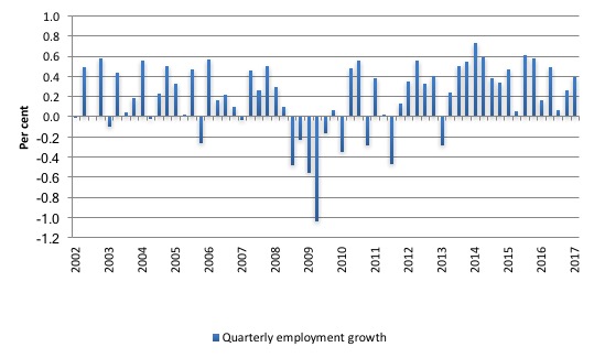
So there has been improvement based on those figures.
Gross Flows and Transition Probabilities
Instead of just looking at the raw employment and unemployment data, I find it useful to examine the gross flows data – which shows the flows between labour force categories.
The latest ONS statement – Labour market flows: May 2017 – came out on May 17, 2017.
I updated my dataset for the UK today (which takes us to the March-quarter 2017) and computed updated Transition Probabilities, which are derived from the Gross Flows labour market data.
To fully understand the way gross flows are assembled and the transition probabilities calculated you might like to read these blogs – What can the gross flows tell us? and More calls for job creation – but then. For earlier US analysis see this blog – Jobs are needed in the US but that would require leadership
Gross flows analysis allows us to trace flows of workers between different labour market states (employment; unemployment; and non-participation) between months. So we can see the size of the flows in and out of the labour force more easily and into the respective labour force states (employment and unemployment).
Each period there are a large number of workers that flow between the labour market states – employment (E), unemployment (U) and not in the labour force (N). The stock measure of each state indicates the level at some point in time, while the flows measure the transitions between the states over two periods (for example, between two months).
The net changes each month – between the stock measures – are small relative to the absolute flows into and out of the labour market states.
National statisticians measure these flows in their labour force surveys. In Britain, we get this data on a quarterly basis.
The various stocks and flows are denoted as follows (single letters denote stocks, dual letters are flows between the stocks):
- E = employment stock, with subscript t = now, t+1 the next period.
- U = unemployment stock.
- N = not in the labour force stock.
- EE = flow from employment to employment (that is, the number of people who were employed last period who remain employment this period)
- UU = flow of unemployment to unemployment (that is, the number of people who were unemployed last period who remain unemployed this period)
- NN = flow of those not in the labour force last period who remain in that state this period
- EU = flow from employment to unemployment
- EN = flow from employment to not in the labour force
- UE = flow from unemployment to employment
- UN = flow from unemployment to not in the labour force
- NE = flow from not in the labour force to employment
- NU = flow from not in the labour force to unemployment
The following Matrix Table provides a schematic description of the flows that can occur between the three labour force framework states.
Labour Market Flows Matrix

The various inflows and outflows between the labour force categories are expressed in terms of numbers of persons which can then be converted into so-called transition probabilities – the probabilities that transitions (changes of state) occur.
We can then answer questions like: What is the probability that a person who is unemployed now will enter employment next period?
So if a transition probability for the shift between employment to unemployment is 0.05, we say that a worker who is currently employed has a 5 per cent chance of becoming unemployed in the next month. If this probability fell to 0.01 then we would say that the labour market is improving (only a 1 per cent chance of making this transition).
From the table above – sometimes called a Gross Flows Matrix – the element EE tells you how many people who were in employment in the previous month remain in employment in the current month.
Similarly the element EU tells you how many people who were in employment in the previous month are now unemployed in the current month. And so on. This allows you to trace all inflows and outflows from a given state during the month in question.
The transition probabilities are computed by dividing the flow element in the matrix by the initial state. For example, if you want the probability of a worker remaining unemployed between the two months you would divide the flow (UU) by the initial stock of unemployment. If you wanted to compute the probability that a worker would make the transition from employment to unemployment you would divide the flow (EU) by the initial stock of employment. And so on.
So the 3 Labour Force states in the Matrix Table above allow us to compute 9 transition probabilities reflecting the inflows and outflows from each of the combinations.
Analysing movements in these probabilities over time provides a different insight into how the labour market is performing by way of flows of workers.
So how has Britain been doing?
Transitions from Employment
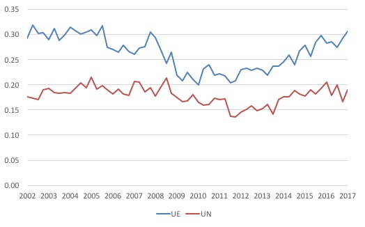
The first graph shows the transition probabilities between employment and unemployment from December 2007 to April 2017.
The probabilities crossed twice (but note the different axis) over this period – early on in the GFC when employment was collapsing and unemployment was rising quickly (September 2008) and, more recently, in the September-quarter 2013 as the labour market improved.
Since then there has been a steady fall in the chance of an employed worker losing their job, while the chance of an unemployed worker gaining employment has continued to rise.
The former transition probability (EU) is now well below the pre-GFC level, whereas the UE probability has just reached the pre-GFC level.
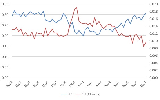
The next graph compares the UE and the UN (probability that an unemployed worker will exit the labour force) from the March-quarter 2002 to the March-quarter 2017.
When workers are confronted with a lack of employment opportunities they typically exit the labour force (give up looking for work) and enter what we call hidden unemployment.
So we would expect the UN probability to have risen during the crisis, which it did in, say, the US and Australia.
But for Britain, that didn’t occur – in fact, the opposite happened – and it is only in recovery that the UN probability has started to rise back to pre-GFC levels. There is a research project in seeking answers to that puzzle.
I have already commented on the UE transition probability. The only additional fact that is evident is that an unemployed workers in Britain is more likely to transit into employment than exit the labour force although that difference became compressed during the crisis.
The widening gap between UE and UN is a further sign that the British labour market continues to improve (in aggregate terms).
What about the transitions out of employment? Is an employed worker more likely to transit into unemployment (EU) or to exit the labour force (EN)?
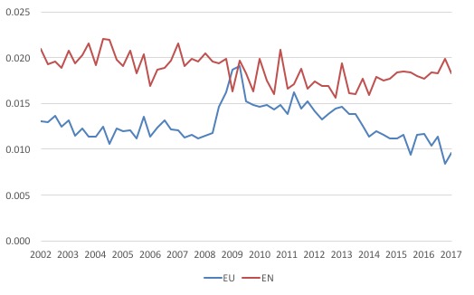
The next graph compares these two transition probabilities.
We see that during the crisis the probability that an employed worker would become unemployed rose sharply and was in the worst period of the crisis above the EN probability.
The EN probability really describes retirement-type transitions and these have been quite stable over the cycle because it reflects underlying demographics, which move slowly.
The EU transition is much more cyclical as one would expect.
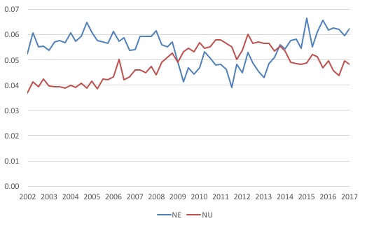
Finally, what about new entrants into the British labour force? Are they more likely to enter employment (NE) or, initially, transition into unemployment (NU)?
The next graph tells us the answer.
During the crisis, it is clear that the chances of a new entrant becoming employed fell sharply and was lower than the NU probability.
This particularly would have impacted on school-leavers.
It took some four and a half years (March-quarter 2009 to December-quarter 2013) for that situation to reverse. Since then, new entrants are much more likley to enter employment (NE) than unemployment (NU).
Conclusion
The evidence is fairly consistent across a range of measures that, in aggregate terms, the British labour continues to improve.
Certainly, with three full quarters of labour market data since the Brexit vote, there are no signs that British firms are going into reverse.
In general, it looks like the unemployed have improved chances of gaining a job as have new entrants. These transition probabilities continue to improve.
Employment growth is strong and has accelerated since mid-2016.
I know economists who predicted a recession by the end of 2016 have now massaged their anti-Brexit message with the “clock is ticking” claim.
To which I can only say – let’s wait and see.
Politics in the Pub
Tonight, I am talking at the Newcastle Politics in the Pub which will be held at the Stag and Hunter Hotel, Maitland Road, Mayfield.
The event starts at 18:30 and will go to about 20:00.
The topic is the recent Australian government fiscal statement brought down earlier this month.
I commented on it in this blog – Australian government in contractionary bias when stimulus is needed.
If you are close by, come along.
That is enough for today!
(c) Copyright 2017 William Mitchell. All Rights Reserved.
“There is a research project in seeking answers to that puzzle.”
Isn’t there just.
I’ve noticed that the UK participation rate has remained about about 63% for absolutely ages. You have to scale down to fractions of a percentage point to see any movement whatsoever. That appears very different from any other country.
The detachment from the labour force just didn’t happen in the UK – at least not in the same way. The level of ‘discouraged’ people (sequence LFL8 at ONS) is tiny – it peaked at 90,000 and drops down below 30,000. This is in an economy where 3,671,000 people are wanting work and don’t have it. So about 1% of the total report as inactive-discouraged. Even as a fraction of ‘inactive – wants a job’ it’s only 1.7% of the total.
Neil Wilson
Tuesday, May 30, 2017 at 16:52
Agreed, and it doesn’t feel like the picture Bill paints here on the ground. There are also huge regional differences – Tyneside, Cornwall, almost the whole of Wales where traditional manufacturing and mining industries have simply disappeared. The hi-tech jobs are all in the south-east and particularly “silicon valley” – the Thames between London and Newbury.
I am lucky to be retired and have a lifestyle that is good enough for what I want out of life, if not what I was used to, but even here in the South I know plenty of people desperate for work. I seriously doubt the ONS figures.
To be fair, there is a general sense of optimism. There are spanking new buildings going up everywhere. A splendid cinema complex with several restaurants just opened in Bournemouth. But I think that’s all come out of QE with more money being pumped into assets. Maybe it is just taking a long time to trickle down?
As a father of two young adults 25 and 21 living in the south of England I do think
their is work out there for them at the moment which is not the case in many other
countries .There is a big BUT they still cannot afford rent let alone consider saving to buy
a house.
Generational economic decline can only accelerate as the bank of mum and dad ,
grandma and grandad runs dry.What help will most millennials be able to give to
their children?