Today (April 18, 2024), the Australian Bureau of Statistics released the latest - Labour Force,…
US labour market – poor results – not close to full employment
On June 6, 2017, the US Bureau of Labor Statistics (BLS) released their latest labour market data – Employment Situation Summary – May 2017 – which showed that total non-farm employment from the payroll survey rose by just 138,000 in May. While the payroll data confirms an on-going deterioration in job creation, an examination of the Labour Force Survey data presents an even worse picture. The official unemployment rate fell from 4.4 per cent to 4.3 per cent, the lowest rate since May 2001. But the fall in unemployment of some 195 thousand persons was not a sign of strength. Total employment fell by 233 thousand but was a smaller decline than experienced by the labour force (down 429 thousand) on the back of a fall in the participation rate (0.2 percentage points). In other words, hidden unemployment rose while official unemployment fell as workers gave up looking for work in the face of declining employment growth. The estimate of employment change from the Labour Force Survey was also positive (156 thousand net jobs added). There is still a large jobs deficit remaining and other indicators suggest the labour market is still below where it was prior to the crisis. Which makes the claims by a number of analysts that the US jobs market is so strong that inflation is about to accelerate on the back of wages growth (which at present is largely non-existent). In other words, there are many assessments that the unemployment rate has reached the so-called NAIRU (Non-Accelerating Inflation Rate of Unemployment) below which accelerating inflation becomes inevitable. I doubt that assessment.
Overview
For those who are confused about the difference between the payroll (establishment) data and the household survey data you should read this blog – US labour market is in a deplorable state – where I explain the differences in detail.
See also the – Employment Situation FAQ – provided by the BLS, itself.
The BLS say that:
The establishment survey employment series has a smaller margin of error on the measurement of month-to-month change than the household survey because of its much larger sample size. … However, the household survey has a more expansive scope than the establishment survey because it includes self-employed workers whose businesses are unincorporated, unpaid family workers, agricultural workers, and private household workers …
Focusing on the Household Labour Force Survey data, the seasonally adjusted labour force contracted by 429 thousand in May 2017 as the participation rate fell by 0.2 points to 62.7 per cent.
The decline in the participation rate is a reversal on the positive increases earlier in the year and has been declining because of the weakening employment growth.
Total employment fell by 233 thousand in net terms, and as a consequence, official unemployment fell by 195 thousand.
As a result the official unemployment rate eased from 4.4 per cent to 4.3 per cent.
While declining unemployment in times of growth is desirable, a decline in unemployment brought on by negative employment growth and a declining participation rate is not a desirable outcome.
Hidden unemployment has clearly replaced official unemployment.
Further, the May 2017 participation rate of 62.7 per cent is still far below the peak in December 2006 (66.4).
Adjusting for the ageing effect (see US labour market – some improvement but still soft for an explanation of this effect), the rise in those who have given up looking for work (discouraged) since December 2006 is around 4.2 million.
If we added them back into the labour force and considered them to be unemployed (which is not an unreasonable assumption given that the difference between being classified as officially unemployed against not in the labour force is solely due to whether the person had actively searched for work in the previous month) – we would find that the current US unemployment rate would be around 6.7 per cent rather than the official estimate of 4.5 per cent.
That provides a quite different perspective in the way we assess the US recovery.
Note also previous discussions – All net jobs in US since 2005 have been non-standard and the fact that there has been a bias towards low-wage job creation in the recovery.
Conclusion: the US labour market is still a long way from where it was at the end of 2007.
Payroll employment trends
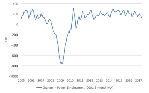
The first graph shows the monthly change in payroll employment (in thousands, expressed as a 3-month moving average to take out the monthly noise).
The monthly changes were stronger in 2014 and 2015, and then dipped in the first-half of 2016. By the end of 2016, job creation was stronger but then it tailed off again, somewhat.
In the first two months of 2017 (January and February), there was a strengthening of the net payroll employment change, but since then it has all been downhill.
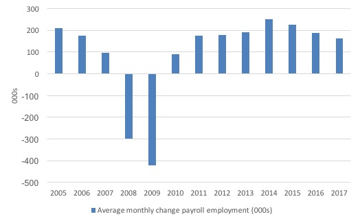
The next graph shows the same data in a different way – in this case the graph shows the average net monthly change in payroll employment (actual) for the calendar years from 2005 to 2017. Clearly, the average for 2017 is for January to May only.
The slowdown that began in 2014 is continuing.
The average change so far in 2017 (162 thousand) down from the 187 thousand average throughout 2016.
The average net change in 2014 was 250 thousand, in 2015 it was 226 thousand.
Labour Force Survey – employment growth negative
In May 2017, employment decline by 0.15 per cent (233 thousand) while the labour force decline by 0.27 per cent (429 thousand) as the participation rate fell by 0.2 percentage points.
As a result, even though employment growth was negative, the unemployment level fell by 195 thousand.
So the worst trends came together – falling employment and falling participation, which means that official unemployment has been replaced by a rise in hidden unemployment as the demand-side of the labour market fails to keep pace with the underlying population growth.
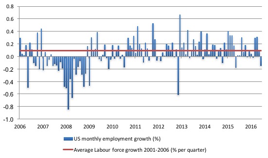
The next graph shows the monthly employment growth since the low-point unemployment rate month (December 2006). The red line is the average labour force growth over the period December 2001 to December 2006 (0.0910 per cent per month).
What is apparent is that no coherent positive and reinforcing trend in employment growth has been established in the US labour market since the recovery began back in 2009. There are still many months where employment growth, while positive, remains relatively weak when compared to the average labour force growth prior to the crisis or is negative.
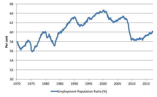
A good measure of the strength of the labour market is the Employment-Population ratio given that the movements are relatively unambiguous because the denominator population is not particularly sensitive to the cycle (unlike the labour force).
The following graph shows the US Employment-Population from January 1970 to May 2017. While the ratio fluctuates a little, the May 2017 outcome (60 per cent) was 0.2 points below the April result.
But it remains well down on pre-GFC levels (peak 63.4 per cent in December 2006), which is a further indication of how weak the recovery has been so far.
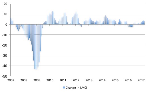
Federal Reserve Bank Labor Market Conditions Index (LMCI)
The Federal Reserve Bank of America has been publishing a new indicator – Labor Market Conditions Index (LMCI) – which is derived from a statistical analysis of 19 individual labour market measures since October 2014.
It is now being watched by those who want to be the first to predict a rise in US official interest rates. Suffice to say that the short-run (monthly) changes in the LMCI are “assumed to summarize overall labor market conditions”.
A rising value (positive change) is a sign of an improving labour market, whereas a declining value (negative change) indicates the opposite.
You can get the full dataset HERE.
I discussed the derivation and interpretation of the LMCI in this blog – US labour market weakening.
At the time of writing, the latest data available does not include the May 2017 observation. I will update when the dataset is updated by the central bank.
In April 2017, the LMCI rose by 3.6 index points which is indicative of some strength in the US labour market although the index remains well below the levels experienced earlier in the recovery.
The following graph shows the FRB LMCI for the period January 2007 to April 2017.
We note that while unemployment is now lower than last year and the rate of hiring has stabilised after declining earlier in the year. The way these factors combine in the index leads to an overall assessment that the labour market has been in decline.
The US jobs deficit
As noted in the Overview, the current participation rate fell by 0.2 points and at 62.7 per cent is a long way below the most recent peak in December 2006 of 66.4 per cent.
When times are bad, many workers opt to stop searching for work while there are not enough jobs to go around. As a result, national statistics offices classify these workers as not being in the labour force (they fail the activity test), which has the effect of attenuating the rise in official estimates of unemployment and unemployment rates.
These discouraged workers are considered to be in hidden unemployment and like the officially unemployed workers are available to work immediately and would take a job if one was offered.
But the participation rates are also influenced by compositional shifts (changing shares) of the different demographic age groups in the working age population. In most nations, the population is shifting towards older workers who have lower participation rates.
Thus some of the decline in the total participation rate could simply being an averaging issue – more workers are the average who have a lower participation rate.
I analysed this declining trend in this blog – Decomposing the decline in the US participation rate for ageing.
I updated that analysis to December 2015 and computed that the decline in the participation rate due to the shift in the age composition of the working age population towards older workers with lower participation rates accounted for about 58 per cent of the actual decline.
Thus, even if we take out the estimated demographic effect (the trend), we are still left with a massive cyclical response.
What does that mean for the underlying unemployment?
The labour force changes as the underlying working age population grows and with changes in the participation rate.
If we adjust for the ageing component of the declining participation rate and calculate what the labour force would have been given the underlying growth in the working age population if participation rates had not declined since December 2006 then we can estimate the change in hidden unemployment since that time due to the sluggish state of the US labour market.
Adjusting for the demographic effect would give an estimate of the participation rate in May 2017 of 64.4 if there had been no cyclical effects (1.7 percentage points up from the current 62.7 per cent).
So the 1.7 percentage point decline in the participation rate due to the downturn (net of ageing effect) amounts to 3,972 thousand workers who have left the labour force as a result of the cyclical sensitivity of the labour force.
It is hard to claim that these withdrawals reflect structural changes (for example, a change in preference with respect to retirement age, a sudden increase in the desire to engage in full-time education).
We can have a separate debate about whether 4.4 per cent constitutes full employment in the US.
My bet is that if the government offered an unconditional Job Guarantee at an acceptable minimum wage there would be a sudden reduction in the national unemployment rate which would take it to well below 4.4 per cent without any significant inflationary impacts (via aggregate demand effects).
So I doubt 4.4 per cent is the true irreducible minimum unemployment rate that can be sustained in the US. In May 2017, the unemployment rate fell to 4.3 per cent and there is plenty of scope for further reductions.
But we will use 4.4 per cent as a benchmark so as not to get sidetracked into definitions of full employment. In that sense, my estimates should be considered the best-case scenario given that I actually think the cyclical losses are much worse than I provide here.
4.4 per cent just compares the present with where the US was in March 2007 (after adjusting for the demographic shifts since then).
Using the estimated potential labour force (controlling for declining participation), we can compute a ‘necessary’ employment series which is defined as the level of employment that would ensure on 4.4 per cent of the simulated labour force remained unemployed.
This time series tells us by how much employment has to grow each month (in thousands) to match the underlying growth in the working age population with participation rates constant at their January 2007 peak – that is, to maintain the 4.4 per cent unemployment rate benchmark.
I computed the ‘necessary’ employment series based on the age-adjusted potential labour force (dark green line in the following graph).
The light blue line is the actual employment as measured by the BLS and the dotted red line is the level of employment that prevailed in November 2007 (the peak before the crisis).
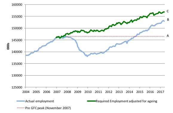
This allows us to calculate how far below the 4.4 per cent unemployment rate (constant participation rate) the US employment level currently is.
There are two effects:
- The actual loss of jobs between the employment peak in November 2007 and the trough (January 2010) was 8,582 thousand jobs. However, total employment is now above the January 2008 peak by 6,328 thousand jobs. This gain in jobs is measured by the AB gap in the graph which shows the gap in employment relative to the November 2007 peak (the dotted red line is an extrapolation of the peak employment level). You can see that it wasn’t until July 2014 that the US labour market reached the November 2007 peak employment level again.
- The shortfall of jobs (the overall jobs gap) is the actual employment relative to the jobs that would have been generated had the demand-side of the labour market kept pace with the underlying population growth (Required Employment Adjusted for Ageing) – that is, with the participation rate at its December 2006 peak and the unemployment rate constant at 4.4 per cent. This shortfall (BC) loss amounts to 3,972 thousand jobs. This is the segment BC measured as at May 2017.
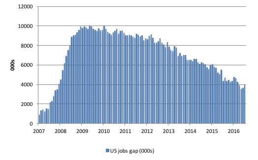
The next graph shows the difference between the blue and green lines in the above graph. The US Jobs Gap is thus the departure of current employment from the level of employment that would have generated a 4.4 per cent unemployment rate, given current population trends.
While the jobs gap is declining, it is still substantial and actually rose in May 2017.
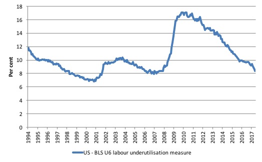
To put that into further perspective, the following graph shows the BLS measure U6, which is defined as:
Total unemployed, plus all marginally attached workers plus total employed part time for economic reasons, as a percent of all civilian labor force plus all marginally attached workers.
It is thus the broadest measure of labour underutilisation that the BLS publish.
In December 2006, before the affects of the slowdown started to impact upon the labour market, the measure was estimated to be 7.9 per cent. It now stands at 8.4 per cent (May 2017) which means it has fallen by 0.8 points since the end of 2016.
The U-6 measure remains well above previous troughs, which suggests (along with the other signals presented above) that the labour market is still some way from being considered ‘recovered’.
Inflation and unemployment
My feature on the US labour market this month focuses on the debate as to whether the US unemployment rate can go lower without introducing a dangerous inflationary spiral.
This relates to my on-going discussion about whether the US economy is close to full employment or not. Up until this point, I have concluded that it is nowhere near full employment.
Given the previous discussion, I was most surprised to read some of the analysis from the investment banks and the like ‘talking up’ the May labour force data.
For example, in its weekly report on the US, London-based firms Capital Economics wrote “Fed’s dilemma getting worse” and concluded that the US labour market data was “not too discouraging” because:
After all, the unemployment rate declined to 4.3% in May, its lowest level since 2001. With survey evidence suggesting it will fall below 4% in the next few months, and wage growth likely to pick up before long, we expect the Federal Reserve to raise rates steadily over the next year and a half.
I wonder whether they looked at the same data as the rest of us and understood what it was telling us.
But their assessment was not an outlier.
For example, the New York Times article (June 2, 2017) – U.S. Unemployment at 16-Year Low, but Economy’s Weak Spots Remain – also focused on the ‘low’ unemployment rate.
Apparently:
Since 2012, this has been a tremendous period of steady, solid job growth – historic in many ways – that has slowly absorbed most if not all of the underemployed and unemployed people last year …
I wonder how the 5.2 million underemployed, and 1.5 million who are marginally attached and the 355 thousand who the BLS classifies as discouraged, feel about that, not withstanding the 6.9 million unemployed.
The full employment spin seems to ignore reality as investment bankers hanker for rising interest rates to bolster their profitability.
NAIRU talk is back in town as the unemployment rate declines.
The following graph shows the evolution of the US unemployment rate since 1950 up to May 2017.
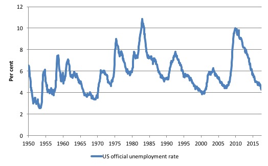
I have discussed the relevance of the Non-Accelerating Inflation Rate of Unemployment (NAIRU) concept before:
1. No coherent evidence of a rising US NAIRU.
2. Why we have to learn about the NAIRU (and reject it).
3. NAIRU mantra prevents good macroeconomic policy.
4. The dreaded NAIRU is still about!.
The next graph shows the so-called Phillips curve for the US, with the unemployment rate on the horizontal axis and the annual inflation rate on the horizontal axis.
The complexity of the graph is that there are, in fact, four separate Phillips curves shown – one for each of the periods denoted. The dotted lines are simple linear regressions for each of the four periods.
The point is that the relationship between the two variables has not been stable over time. It shifted out in the 1970s after the massive oil price hikes then shifted in again in the more recent period.
The shift outward in the mid-1970s was associated with recession – in other words, is was cyclical rather than structural in origin. The cyclical behaviour of the unemployment rate is asymmetric – rising quickly, falling slowly – which means that a deep recession causes unemployment persistence.
That is why the curve loops around itself at some higher level before slowly moving back over time towards the yellow relationships.
The dotted lines suggest that the relationship has flattened out meaning that larger changes in the unemployment rate are accompanied by smaller changes in inflation.
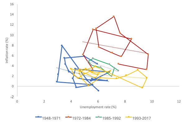
The shifting Phillips curve upset the policy consensus in the 1960s that governments could target a particular (low) unemployment rate – consistent with full employment – as long as they were prepared to accept the associated inflation rate.
With the shift in the relationship, policy entered an uncertain phase.
The NAIRU began life in the 1960s as the so-called natural rate hypothesis (NRH) as a response to this uncertainty.
The NRH asserted that there is only one unemployment rate consistent with stable inflation. In the NRH, there is no discretionary role for aggregate demand management and only microeconomic changes (structural policies) can reduce the natural rate of unemployment.
If government tried to drive the unemployment rate down to low levels (below this so-called Natural Rate) then all that would happen is that the inflation rate would accelerate.
Accordingly, the policy debate became increasingly concentrated on deregulation, privatisation, and reductions in the provisions of the Welfare State with tight monetary and fiscal regimes instituted.
In the mid-1970s, the NRH morphed a little but the idea of a cyclically-invariant steady-state unemployment rate persisted in the form of the NAIRU concept.
The NAIRU was constructed as meaning that when unemployment is above it then inflation should decelerate and vice-versa.
While various theoretical structures have been used to justify the NAIRU as a viable concept, the conclusion from each is simple: there is only one cyclically-invariant unemployment rate associated with stable price inflation.
The NAIRU concept has dominated macroeconomic policy making in most OECD countries since the late 1970s and the “fight-inflation-first” strategies have exacted a harsh toll in the form of persistently high unemployment and broader labour underutilisation.
Under the sway of the NAIRU, policy makers around the World abandoned the pursuit of full employment as initially conceived.
Of-course they couldn’t admit that so they started redefining what full employment meant.
So if you read this literature you will quickly realise that the neo-liberals define full employment as being the NAIRU which is divorced from any notion that there has to be enough jobs available to meet the desires of the available labour force.
So in one small change in taxonomy governments have been able to turn their failure to provide enough jobs into a success – well we are at full employment now because we are at the NAIRU. So it is a pernicious concept indeed.
Under the NAIRU approach, policy makers use unemployment as a tool to suppress price pressures and the OECD experience in the 1990s and beyond shows that this strategy has been successful with persistently high unemployment being the result.
How useful is the NAIRU as a guide to policy? While the topic is vast, in this blog I will just have a brief look at the NAIRU.
In my 2008 book with Joan Muysken Full Employment Abandoned we analyse this topic in depth.
So if you are looking for references or authorities for the statements I make here the book would be a good place to start.
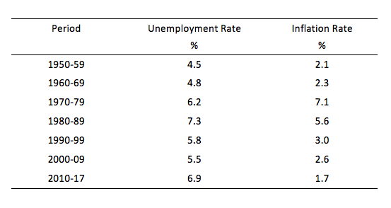
The first graph and accompanying data table demonstrates the disparate behaviour of the inflation rate and the unemployment rate from January 1950 until April 2017 (BLS data).
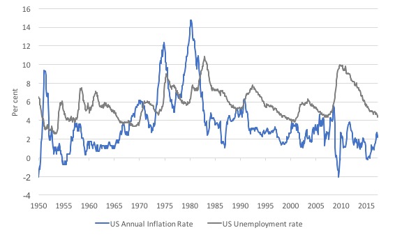
The inflation rate has gone through three notable phases in the period shown: low inflation up until about 1973, then a period of high inflation (peaking to 14.8 per cent in March 1980) mostly instigated by the supply side oil shocks in 1973 and 1979.
The high inflation period was not contained until the mid-1980s. With recessions occurring regularly after that inflation has been generally low and has returned to it pre-oil shock values.
This pattern is very similar in many other advanced nations.
The unemployment rate shows a different pattern. Prior to the oil price hikes it was generally in the 4 to 5 per cent range but began rising sharply as authorities tightened spending to combat the inflation arising from the oil supply shock.
After that the unemployment hovered at higher levels as various administrations maintained tight fiscal conditions. The elevated levels were interrupted by recessions which caused asymmetric spikes in the unemployment rate.
This behaviour can be characterised as a series of mean shifts accompanied by a very high degree of persistence.
From the graph, it is difficult to construe an unemployment rate over the period where you would witness accelerating inflation if the actual unemployment rate were lower or decelerating inflation if the unemployment rate was higher. There is thus little support for the NAIRU proposition.
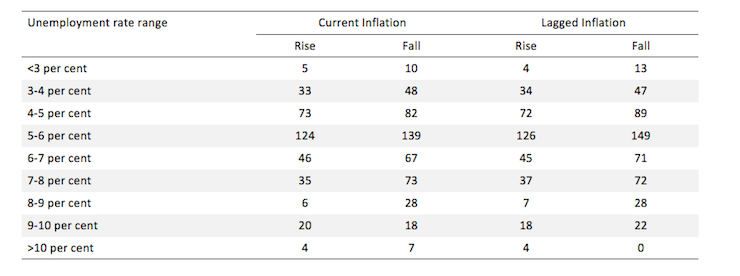
The next table reinforces that conclusion.
It compares the frequency of accelerating inflation with decelerating inflation for given ranges of the unemployment rate. If there were a well-defined and stable NAIRU we would expect to find some unemployment rate range where all the changes in inflation were negative and below that range most of the changes in inflation positive.
The results clearly do not support the existence of such a rate.
What we can conclude is that we are unlikely to get any definitive information from the unemployment data about the likely movements in the inflation rate.
I have also done more advanced regression studies of this data in the past, which fail to find any evidence of a stable NAIRU specification. The evidence is that the relationship between unemployment and inflation is subjected to continual shocks from both the demand and supply side.
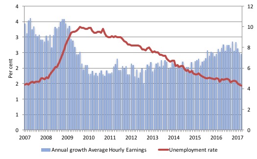
This graph is instructive. It shows the annual growth in average hourly earnings in the US from March 2007 to May 2017 (blue columns) and the official unemployment rate (red line).
When the unemployment rate was at the current levels before the crisis the (say below 5 per cent), the average wages growth was 3.3 per cent.
Now, annual wages growth is 2.5 per cent and that rate has been falling as the unemployment rate falls.
In other words, there are no signs of a wages breakout at present and plenty of signs that the labour market has not returned to the same degree of tightness that existed before the crisis unfolded.
I found this article – Is Low Unemployment Inflationary? – very interesting when it first came out in 1997. It appeared in the Economic Review (82(1)) published by the Federal Reserve Bank of Atlanta.
The author, Roberto Chang, concluded that:
In practice, the concept of a nonaccelerating inflation rate of unemployment is not useful for policy purposes. First, the NAIRU moves around. Second, uncertainty about where the NAIRU is at any point of time is considerable. Third, even if we knew where the NAIRU were, it would be sub optimal to predict inflation solely on the basis of the comparison of unemployment against the NAIRU. A policy of raising the fed funds rate when unemployment falls below the NAIRU may be ineffective…even if the NAIRU were constant, its location were known and all shocks to the economy were to come from the demand side. Implementing such policy would likely induce changes in the expectations and behavior of the private sector an important additional reason to be skeptical about using the NAIRU for policy.
Conclusion
The May labour market data release confirms the trend established earlier in the 2017 that US employment conditions are weakening.
Despite the fact that the official unemployment rate fell to 4.3 per cent, which is the lowest level since May 2001, and just below the 4.4 per cent recorded pre-GFC in March 2007, it is hard to see this as a sign of strength.
Rather, the contraction in employment was just smaller than the contraction it the labour force (as the participation rate dropped 0.2 points), which is why the unemployment rate fell.
There are times when falling unemployment signals weakness. May 2017 was one of those times.
There is still a significant jobs shortfall relative to the pre-GFC position, which along with the elevated levels of the broader labour underutilisation measures (U-6) brings into question the claims that the US labour market is at full employment.
This assessment is reinforced by the fact that the participation rate is still well below where it was even after we adjust for the ageing effects (retirements).
The wage and inflation data also do not suggest that 4.3 per cent is the irreducible minimum unemployment rate before inflation starts to accelerate.
Which rock are these bastards hiding under at present?
Where is Tony Blair and Peter Mandelson today? Planning a new party to revive New Labour?
The Blairites that are still in Parliament thanks to Jeremy Corbyn should thank their lucky stars they are not among the jobless after last week’s national election.
A lot of people thought Jeremy Corbyn would lead the Labour party into an election wipeout, including these MPs pic.twitter.com/xy4T0HrKge
— Channel 4 News (@Channel4News) June 9, 2017
That is enough for today!
(c) Copyright 2017 William Mitchell. All Rights Reserved.
Wow at the video Bill. I thought politics was toxic here down under but boy with so many people undermining you within your own party he truly is a strong man. It’s bizarre they can’t see it but they’re all so infested in neoliberal logic that big things Luke free education or good healthcare funding are possible. I don’t think politicians would think we could go to the mooon in this day and age it’s getting that serious.
‘I thought politics was toxic here down under’
Jason- the situation in the UK at present is a bit like after 40 years of constipation, freer bowel movements are now just about feeling possible. Corbyn’s strength seems to be that everything about him is counter-cultural and he’s not power obsessed or even vindictive towards those on the video that trashed him. Not only that, he defied the ‘bog-paper’ press in the UK by ignoring the bastards and they hated him even more for that!
Corbyn isn’t a great intellectual, he just didn’t give a sh*t what people thought and that resonated with the young. It’s the first small dent in the neo-liberal armour but the neo-liberal machine will fight back. A shame that Labour haven’t got the language to challenge the childish and condescending ‘magic money tree ‘ meme that the desperate Tories used. But with the Tories and the Gutter Press’ status as ‘truth-tellers’ knocked back the Overton Window might be opening just a little bit to let some air in.
Some of these MPs are morons. For instance, Angela Eagle. When she ran for the leadership, her central argument was that she was the best leader because she was the best leader. No substance at all. Which is true of most of these bastards. It is true that Corbyn’s performance up until the election was less than stellar. But boy did he improve. And the Labour manifesto was miles ahead of anything the Tories could come up with. And he engaged in substantively arguing his case, while all the Maybot did was utter platitudes.
Larry, I don’t know whether you noticed (the media didn’t as far as I know) but in her speech outside No. 10 on the Friday morning, May bizarrely ‘used’ (pinched) a Corbyn meme and used it as if it were hers! It was strangely unnerving as no -one noticed it, it was a phrase (‘no-one and no community left behind’) that Corbyn had been using for some time; here’s the extract:
‘The government I lead will put fairness and opportunity at the heart of everything we do so that we will fulfil the promise of Brexit together, and over the next five years build a country in which no one and no community is left behind, a country in which prosperity and opportunity are shared across this United Kingdom.’
She uses this phrase: ‘build a country in which no one and no community is left behind’
This is EXACTLY the wording Corbyn has been using over the last two years: see: http://www.youtube.com/watch?v=Gic-gazmZr8
This is incredible, she has literally half-inched the phrase without any acknowledgement-why isn’t the MSM pointing this out! Good grief-incredible.
Two cents from this side of the pond re the OECD, our market-driven economies, including the U.S.-and agree with Bill that the U.S. labor market is in a “deplorable state”:
“Unemployment results in a loss of income to the market”-is a factual statement-and a mathematical model, a law as it were, re its effect–which would result in an index, such as NAIRU, regarding its impact on the health, or ill, in the economy-is non-existent. The larger point being that Job Creation would be seen in a different light-i.e., the Buffer Stock Employment Model, and like “public-sector” employment, would be seen in a more favorable light in Job Creation policies, if such an index was prevalent to factor in. The bottom line is that unemployment is a NO ONE WINS: The jobless lose, civility loses [Ferguson, etc.], and the market loses, to wit [proposed]:
THE LAW OF DIMINISHED INCOME TO THE MARKET FROM UNEMPLOYMENT [hereafter D/UE LAW]
3% is the zero-sum threshold above which unemployment triggers diminished labor training and skills, under-utilizing capital resources, reducing the rate of productivity advance, increasing unit labor costs, reducing the general supply of goods and services–and the loss in income to the Market is compounded exponentially with each percentage point of increase in unemployment, above 3%.
Short Definition:
3% is the zero-sum threshold above which unemployment triggers substantial undermining of the Market–and the loss in income to the Market is compounded exponentially with each percentage point of increase in unemployment, above 3%.
Ref: THE NEIGHBOR-TO-NEIGHBOR JOB CREATION ACT
Jim Green, Democrat candidate for Congress, District 21, TX, 2000
Bill,
I wonder whether the greater use of AI and robotics could be starting to have an impact on the labour markets.
https://irs.princeton.edu/sites/irs/files/event/uploads/robots_and_jobs_march_3.17.2017_final.pdf
I would be interested to hear your views on the subject.
Simon, I did notice that. And I also noticed how she has pinched other Labour ideas. She really is something else, isn’t she. Why the MSM isn’t pointing this out may be due to them being lazy? Or incompetent? I honestly don’t know.
I’ve been watching BBC news footage post U.K. Election and boy are they trying to backtrack about Corbyn with what I can only assume is extreme car to lot seem left wing in interviews. Reminds me of the abc in Australia being forced to try and obviously swing right wing for the Tory pressure of not appearing too left. It’s quite strange to watch. They’re scared to act like the voters actually did it while they tried to destroy him prior to the election. I’m glad voters are fighting back.