Today (April 18, 2024), the Australian Bureau of Statistics released the latest - Labour Force,…
Australian labour force data – improvement but no positive trend yet emerging
The latest labour force data released today by the Australian Bureau of Statistics – Labour Force data – for May 2017 shows that employment rose by 42,000 on the back of a strong rebound in full-time employment (up 52,100), given last month’s contraction in full-time work. Unemployment fell by 18,600, which allowed the official unemployment rate to fall to 5.5 per cent. There was a slight uptick in the participation rate as job opportunities improved. Underemployment remained steady at 8.6 per cent and broad labour underutilisation remains high at 14 per cent with unemployment and underemployment summing to 1,837.4 thousand persons. The teenage labour market also deteriorated in May contrary to the overall improvement. It remains in a poor state.
The summary ABS Labour Force (seasonally adjusted) estimates for May 2017 are:
- Employment increased by 42,000 (0.3 per cent) – full-time employment increased 52,100 while part-time employment decreased 10,100.
- Unemployment decreased 18,600 to 711,900.
- The official unemployment rate decreased by 0.2 pts to 5.5 per cent.
- The participation rate increased by less than 0.1 points to 64.9 per cent. Its behaviour has been quite erratic over the last 6 months. It remains well below its December 2010 peak (recent) of 65.8 per cent.
- Aggregate monthly hours worked increased 31.1 million hours (1.87 per cent).
- The quarterly broad labour underutilisation data came out this month for the May-quarter 2017. The total labour underutilisation rate (unemployment plus underemployment) was 14.4 per cent (1,849 thousand workers). Underemployment was 8.8 per cent and there were 1,129 thousand persons underemployed.
Employment growth – positive with stronger full-time employment growth this month
Employment increased by 42,000 (0.9 per cent) – full-time employment increased 52,100 while part-time employment decreased 10,100.
The zig-zag pattern that we have observed over the last 36 months or so – where the employment estimates have been switching back and forth regularly between negative employment growth and positive growth with the occasional spikes – continues.
There is no positive trend in the employment data that I can see.
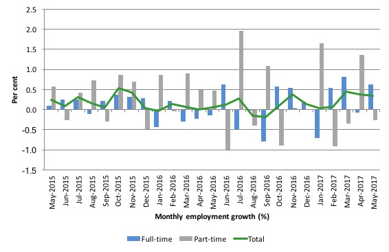
The following graph shows the month by month growth in full-time (blue columns), part-time (grey columns) and total employment (green line) for the 24 months to May 2017 using seasonally adjusted data.
It gives you a good impression of just how flat employment growth has been over the last 2 years. You can also see the dominance of part-time employment growth over the same period, especially in the last year or so.
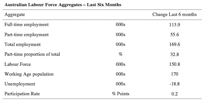
The following table provides an accounting summary of the labour market performance over the last six months. The monthly data is highly variable so this Table provides a longer view which allows for a better assessment of the trends.
Full-time employment has risen risen by 113.9 thousand jobs (net) over the last 6 months, while part-time employment has risen by 55.6 thousand jobs.
The conclusion – overall there have been 169.6 thousand jobs (net) added in Australia over the last six months while the labour force has increased by 150.8 thousand. The result has been that unemployment has fallen by 18.8 thousand.
Overall – an improving labour market performance.
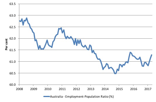
Given the variation in the labour force estimates, it is sometimes useful to examine the Employment-to-Population ratio (%) because the underlying population estimates (denominator) are less cyclical and subject to variation than the labour force estimates. This is an alternative measure of the robustness of activity to the unemployment rate, which is sensitive to those labour force swings.
The following graph shows the Employment-to-Population ratio, since February 2008 (the low-point unemployment rate of the last cycle).
It dived with the onset of the GFC, recovered under the boost provided by the fiscal stimulus packages but then went backwards again as the last Federal government imposed fiscal austerity in a hare-brained attempt at achieving a fiscal surplus.
The ratio began rising in December 2014 which suggested to some that the labour market had bottomed out and would improve slowly as long as there are no major policy contractions or cuts in private capital formation.
The series turned again as overall economic activity weakened. Over the last few months it has improved again.
The series rose by 0.2 points in May 2017 to 61.3 per cent and remains a 1.6 percentage points below the April 2008 peak of 62.9 per cent.
Teenage labour market – deteriorates sharply in May 2017
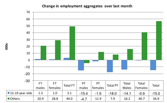
The teenage labour market saw total employment fall by 15 thousand (net) in May 2017.
Full-time employment rose by 3.1 thousand jobs and part-time employment fell by 18 thousand (net) jobs.
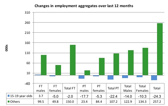
The following graph shows the distribution of net employment creation in the last month by full-time/part-time status and age/gender category (15-19 year olds and the rest)
Over the last 12 months, teenagers have lost 24.3 thousand (net) jobs overall while the rest of the labour force have gained 257.2 thousand net jobs. Remember that the overall result represents a fairly poor annual growth in employment.
Full-time employment for teenagers over the last 12 months has fallen by 2 thousand while part-time employment employment has fallen by 22.4 thousand.
The following graph shows the change in aggregates over the last 12 months.
In terms of the current cycle, which began after the last low-point unemployment rate month (February 2008), the following results are relevant:
1. Since February 2008, there have been only 1,505.1 thousand (net) jobs added to the Australian economy but teenagers have lost a staggering 108.4 thousand over the same period.
2. Since February 2008, teenagers have lost 118.3 thousand full-time jobs (net).
3. Even in the traditionally, concentrated teenage segment – part-time employment, teenagers have gained only 9.8 thousand jobs (net) even though 858.7 thousand part-time jobs have been added overall.
4. Overall, the total employment increase is modest. Further, around 57 per cent of the total (net) jobs added since February 2008 have been part-time, which raises questions about the quality of work that is being generated overall.
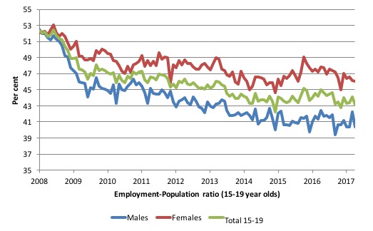
To put the teenage employment situation in a scale context (relative to their size in the population) the following graph shows the Employment-Population ratios for males, females and total 15-19 year olds since February 2008.
You can interpret this graph as depicting the loss of employment relative to the underlying population of each cohort. We would expect (at least) that this ratio should be constant if not rising somewhat (depending on school participation rates).
The facts are that the absolute loss of jobs reported above is depicting a disastrous situation for our teenagers. Males, in particular, have lost out severely as a result of the economy being deliberately stifled by austerity policy positions.
In the latter months of 2015, with the part-time employment situation improving, there was some reversal in the downward trends in these ratios.
However, that short improvement has now disappeared and the ratios are once again trending downwards.
The male ratio has fallen by 12.2 percentage points since February 2008, the female ratio has fallen by 6 percentage points and the overall teenage employment-population ratio has fallen by 9.1 percentage points.
That is a substantial decline in the employment market for Australian teenagers.
The other staggering statistic relating to the teenage labour market is the decline in the participation rate since the beginning of 2008 when it peaked in January at 61.4 per cent. In May 2017, the participation rate was just 53 per cent (down 0.5 points from April 2017).
That amounts to an additional 127 thousand teenagers who have dropped out of the labour force as a result of the weak conditions since the crisis.
If we added them back into the labour force the teenage unemployment rate would be 29.8 per cent rather than the official estimate for May 2017 of 18.5 per cent.
Some may have decided to return to full-time education and abandoned their plans to work. But the data suggests the official unemployment rate is significantly understating the actual situation that teenagers face in the Australian labour market.
Overall, the performance of the teenage labour market remains extremely poor. It doesn’t rate much priority in the policy debate, which is surprising given that this is our future workforce in an ageing population. Future productivity growth will determine whether the ageing population enjoys a higher standard of living than now or goes backwards.
I continue to recommend that the Australian government immediately announce a major public sector job creation program aimed at employing all the unemployed 15-19 year olds, who are not in full-time education or a credible apprenticeship program.
Unemployment 18,600 to 711,900
The official unemployment rate decreased by 0.2 pts to 5.5 per cent in May 2017, which is a welcome reduction, especially as the participation rate also edged up marginally.
However, the labour market still has significant excess capacity available.
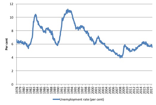
The following graph shows the national unemployment rate from February 1978 to May 2017. The longer time-series helps frame some perspective to what is happening at present.
After falling steadily as the fiscal stimulus pushed growth along, the unemployment rate slowly trended up for some months.
It is now still 0.6 points above the level it fell to as a result of the fiscal stimulus.
Broad labour underutilisation – at 14 per cent
The ABS publishes monthly and quarterly labour underutilisation data. The quarterly data was updated this month (for the May-quarter 2017):
1. Underemployment was estimated to be 8.8 per cent of the labour force (slightly down on the February-quarter).
2. The total labour underutilisation rate (unemployment plus underemployment) was 14.4 per cent.
3. There were 1,129 thousand persons underemployed and a total of 1,849 thousand workers either unemployed or underemployed.
The following graph plots the history of quarterly (seasonally-adjusted) underemployment in Australia since February 1978 to the May-quarter 2017.
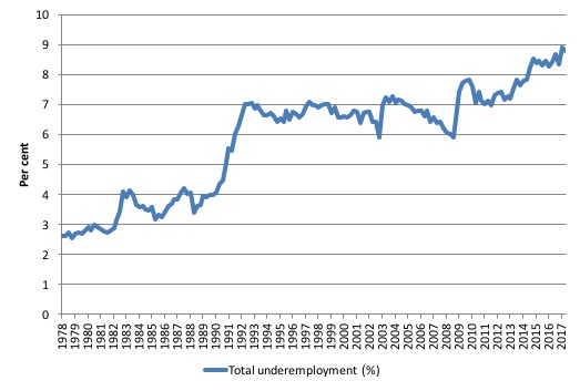
The next graph shows the evolution of the broad underutilisation rate over the same period. You can see the three cyclical peaks corresponding to the 1982, 1991 recessions and the more recent downturn.
Unemployment was a higher proportion of the two earlier peaks but underemployment now dominates the current cycle (just).
The other difference between now and the two earlier cycles is that the recovery triggered by the fiscal stimulus in 2008-09 did not persist and as soon as the ‘fiscal surplus’ fetish kicked in in 2012, things went backwards very quickly.
The two earlier peaks were sharp but steadily declined. The last peak fell away on the back of the stimulus but turned again when the stimulus was withdrawn.
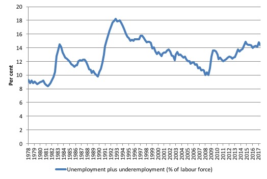
If hidden unemployment (given the depressed participation rate) is added to the broad ABS figure the best-case (conservative) scenario would see a underutilisation rate well above 16 per cent at present. Please read my blog – Australian labour underutilisation rate is at least 13.4 per cent – for more discussion on this point.
The next update will be for the May-quarter 2017 and will be published published in the June 2017 Labour Force release. In between those releases, the monthly estimates guide our thinking.
Aggregate participation rate – rises by less than 0.1 points to 64.9 per cent
While the participation rate edged up marginally in May 2017, it remains substantially down on the most recent peak in November 2010 of 65.8 per cent when the labour market was still recovering courtesy of the fiscal stimulus.
What would the unemployment rate be if the participation rate was at the last November 2010 peak level value?
The following graph tells us what would have happened if the participation rate had been constant over the period November 2010 to May 2017. The blue line is the official unemployment rate since its most recent low-point of 4 per cent in February 2008.
The red line starts at November 2010 (the peak participation month). It is computed by adding the workers that left the labour force as employment growth faltered (and the participation rate fell) back into the labour force and assuming they would have been unemployed. At present, this cohort is likely to comprise a component of the hidden unemployed (or discouraged workers).
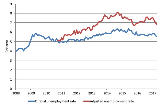
1. Total official unemployment in May 2017 was estimated to be 711.9 thousand.
2. Unemployment would be 892.6 thousand if participation rate was at its November 2010 peak.
3. The unemployment rate would now be 6.8 per cent rather than the official May 2017 estimate of 5.5 per cent.
The difference between the two numbers mostly reflects, the change in hidden unemployment (discouraged workers) since November 2010. These workers would take a job immediately if offered one but have given up looking because there are not enough jobs and as a consequence the ABS classifies them as being Not in the Labour Force.
There has been some change in the age composition of the labour force (older workers with low participation rates becoming a higher proportion) but this only accounts for less than 1/3 of the shift. The rest is undoubtedly accounted for by the rise in hidden unemployment.
Note, the gap between the blue and red lines doesn’t sum to total hidden unemployment unless November 2010 was a full employment peak, which it clearly was not. The interpretation of the gap is that it shows the extra hidden unemployed since that time.
This gap shrinks as participation rises relative to the November 2010 peak.
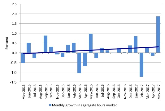
Hours worked – increased by 31.1 million hours (1.87 per cent) in May 2017
The data this month estimates that a massive increase in hours worked occurred in May 2017 – the result is clearly an outlier. When we last saw a spike like that (January 2015) the following months reverted back to the pattern shown in the graph below.
The following graph shows the monthly growth (in per cent) over the last 24 months. The dark linear line is a simple regression trend of the monthly change – which depicts an upward trend – driven entirely by the most recent positive outlier.
You can see the pattern of the change in working hours is also portrayed in the employment graph – zig-zagging across the zero growth line.
Conclusion
My standard monthly warning: we always have to be careful interpreting month to month movements given the way the Labour Force Survey is constructed and implemented.
The surge in monthly hours worked is somewhat suspect. Stay tuned for some revision.
But, given that warning, today’s figures show that the Australian labour market improved in May 2017, with a strong full-time employment result overall.
The surge in total monthly hours was notable.
Underemployment, however, remained unchanged.
The teenage labour market deteriorated sharply in May 2017 and remains in a poor state.
Overall, the state of the Australian labour market remains uncertain. These positive spikes do not repeat and the employment growth pattern of zig-zagging across the zero line, which has been apparent for a few years now seems to reimpose itself.
That is enough for today!
(c) Copyright 2017 William Mitchell. All Rights Reserved.
What if Henry George was correct, and that wages and *earned* profits rise and fall together, inversely with economic rent? Because economists give so little credence to economic rent/unearned income–even though it’s some 30% of the economy–it appears that businesses are doing well whilst wages are lagging. But this isn’t the case: it’s the rent-seeking industries, the drones, such as banking and real estate which are ripping us all off mercilessly as they drown in *our* economic rent which gives the false impression that business, generally, is winning out as against wages. It’s not. It’s banking/money-maker’s and other rent-seeking which is the mechanism doing us in: Michael Hudson’s FIRE sector (finance, insurance and real estate) and all the attendant grey gifts have BECOME the economy! I support heterodox economists, Bill, but why does George’s rent-seeking equation (P – R = W + I) continue to remain invisible in explaining why banking/money, income taxes and land prices have crippled world economies?
I have no confidence that the unemployment numbers will significantly improve given current federal policies.
Hi Bill,
Comment in The Guardian to day where a UBI was being discussed:
“UBI will replace welfare, old age pension, employment insurance, disability benefits, old age supplements, etc. If you’re working and make more than the UBI, you won’t see it until you lose your job, quit your job, or retire. If you’re working and make less, it will top you up. If you’re getting it and supplement it with a minor job earning up to a certain amount, you keep half of the supplementary earnings while still getting UBI.
This is not a payment or a program. It’s a right. With globalization, robotics and the increasing concentration of wealth in fewer and fewer hands, it makes all the sense in the world”.
Do you still have major problems with the above as outlined? Its not strictly a UBI as only those not working would get it. The level of this UBI is not specified and that may be one of the issues with it.
@Barri
My take on a UBI – the non-specific nature of the benefit is its biggest weakness, especially under the current economic belief of balanced budgets.
Firstly, what level will the UBI be set at to replace all these benefits without hugely increasing the welfare bill (not actually a problem, but a perceived problem when spending must match taxation) and would this level actually be high enough to reduce poverty? Most of the benefits mentioned are only paid to specific targets, so under a UBI this spend is going to be spread out to more people, meaning the amount each person gets will have to be lower unless they massively increase taxation on the working population, which will be unpopular! I know some have said the reduced spend from no means testing and fewer administrative staff would increase the amount available for a UBI, but by how much? Not enough, in my opinion.
Secondly, how much would someone need to be earning before they no longer get a “top-up” from a UBI? Either this level will be very low to reduce the overall cost of the policy, which would likely result in more low paid individuals earning below poverty levels of income, or taxes on the earnings of those above the earnings threshold is going to be much higher. Again, this would be unpopular!
“UBI will replace welfare, old age pension, employment insurance, disability benefits, old age supplements, etc.”
The implication here is the privatization of all those services.
If we wanted to dismantle the welfare state this is, probably, the best strategy we could follow.
Currently is politically difficult to cut too much in public services, but if they were private, we could squeeze profits very easily from the citizens.
It would be also easy to keep UBI payments below inflation because, of course, we have not enough money and, maybe, even lower the quantity a little in every crisis.
Well then why work if it is going to be taken of you ?
Why work if you dont make the UBI amount ?
Imagine someone on 3k a week handing in their dollars and being happy about it ? LOL
“Its not strictly a UBI as only those not working would get it.”
When is a UBI, not a UBI? When the ‘U’ bit is missing. U stands for ‘Universal’.
What you are describing is just unemployment benefit and tax credits, which we already have. In the UK we have Universal Credit (there’s that U word again) which does precisely that … for £2.09 per hour.
The living wage is near £10 per hour.
There’s also no mention of how the clawback works. Either it is an income taper or an increase in taxation – both of which trigger psychological loss aversion in recipients. It is better to never get anything than to be given something and have it taken away.
The Job Guarantee, by contrast, gives £10 per hour to anybody who hasn’t got a job *and* takes that labour away from the private sector and sets them to work for the public good.
That means that rather than having people stood out in the cold working in hand car washes for private profit, they get to do a more meaningful public job and the car wash becomes a machine. Machines drive productivity. We don’t want subsidised labour available to private concerns so that labour is expensive to them and instead they have to do a bit of actual capitalism – invest capital in innovation and automation.
There is no need for taxation withdrawal. If you leave the job guarantee and get another job you see no change in the wage you receive. It is entirely seamless from your experience. But the public spending is automatically withdrawn.
But it is important to remember that for those exempted by reason of age or infirmity still get an income. You’re either signed off by a doctor, or you are over a certain age. If you are, then you get a pension from the state.
Social security is the key, and the Job Guarantee should be seen as an extension to social care. It ensures you have something to do with your day that is of genuine use to others.
Hi Neil,
The comment in the Guardian was not my view but attracted a large number of positive responses. It seemed superficially attractive but I queried the level of the so called UBI and argued for a Job Guarantee for those who want to work and a decent income, the minimum wage and benefits, for all those either unable to work due to incapacity or age.
As usual, any discussion of a UBI generates a lot if discussion but most do not understand the economic implications or the surrender to neoliberal ideology a UBI represents.
How much of our labour force underutilisation is down to immigration, particularly temporary immigrants – guest workers and people on 457 Visas? Please note I am NOT talking about refugees. Australia’s immigration level is something like twice the OECD average and so is our resultant population growth.
On the one hand, I’m told Australia would be in recession if not for immigration, that they are all that is keeping the economy afloat and GDP growing, but on the other hand Naked Capitalism and the odd article elsewhere tells me this is smoke and mirrors as the growth is in housing demand and retail, while depressing wages as immigrants will (and do) work for less, increasing under and unemployment for the resident population. Meanwhile, infrastructure isn’t being maintained or increased to cater for the increased population, and per capita income is going backwards..
I get from an MMT viewpoint this is largely immaterial: employment is a false scarcity and we can and should spend what is needed to buy up available resources until and unless it becomes counterproductive by creating inflation, but I’m trying to get my head around the politics. I also wonder about the country’s limited physical resources- most of it’s desert, water’s limited and severe weather events are increasing.
If you google “immigration Australia” for the most part all you will get is variations on immigration is good for GDP and any questioning of immigration is purely racist from the liberal pseudo left, or immigration is conflated with Muslims and refugees to attack them by the right. Neither is helpful.
For my part, I think the neoliberalists ARE using high immigration levels to drive up house prices and retail profits while driving wages and working conditions down. If I’m right, we need to halt immigration immediately while ever we are forced to live under this stupid neoliberalist paradigm – the same paradigm that won’t halt immigration for precisely the reasons it should.
I’d welcome other people’s thoughts on this, including how you go about discussing it without being attacked as a racist by the liberal left, or applauded for being one by the right. I’m so frustrated hearing
” Yes! They didn’t deserve $100,000 each after burning the place down, the ingrates!” if I say I want immigration halted.