Today (April 18, 2024), the Australian Bureau of Statistics released the latest - Labour Force,…
Australian labour market – stumbling along with no definitive trend
The latest labour force data released today by the Australian Bureau of Statistics – Labour Force data – for July 2017 shows that total employment rose only modestly (27,900) while full-time employment contracted. Part-time employment rose by 48,200 reversing the decline from last month. As a result of a rise in the participation rate (0.1 points), unemployment rose by 1,100, and the official unemployment rate decreased by less than 0.1 pts to 5.6 per cent. Underemployment rose to 14 per cent as monthly hours of work declined with the fall in full-time employment. The broad labour underutilisation remains high at 14 per cent with unemployment and underemployment summing to 1,812.6 thousand persons. The teenage labour market showed a slight improvement but remains in a poor state. Overall, my assessment of the Australian labour market is that it remains in an uncertain state. There is no definitive trend yet.
The summary ABS Labour Force (seasonally adjusted) estimates for July 2017 are:
- Employment increased by 27,900 (0.2 per cent) – full-time employment decreased 20,300 while part-time employment increased 48,200.
- Unemployment increased 1,100 to 730,600.
- The official unemployment rate decreased by less than 0.1 pts to 5.6 per cent.
- The participation rate increased by 0.1 points to 65.1 per cent. It remains well below its December 2010 peak (recent) of 65.8 per cent.
- Aggregate monthly hours worked decreased 14.4 million hours (0.8 per cent).
- Using the seasonally-unadjusted monthly data, the total labour underutilisation rate (unemployment plus underemployment) was 14 per cent (1,812.6 thousand workers). Underemployment was 8.5 per cent and there were 1,101.3 thousand persons underemployed.
Employment growth – modestly positive but full-time employment down
Employment increased by 27,900 (0.1 per cent) – full-time employment decreased 20,300 while part-time employment increased 48,200.
We are seening a full-time employment increase one month then fall back the next with corresponding opposite behaviour in part-time employment.
While the ABS considers there is an upwards trend in full-time employment but I consider that only a statistical artefact rather than any reality.
We have observed a zig-zag pattern in total employment growth over the last 36 months or so – where the employment estimates have been switching back and forth regularly between negative employment growth and positive growth with the occasional spikes.
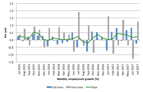
The following graph shows the month by month growth in full-time (blue columns), part-time (grey columns) and total employment (green line) for the 24 months to July 2017 using seasonally adjusted data.
It gives you a good impression of just how flat employment growth has been over the last 2 years. The positive note is that there has been four stronger full-time employment outcomes in the last five months.
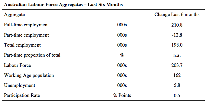
The following table provides an accounting summary of the labour market performance over the last six months. The monthly data is highly variable so this Table provides a longer view which allows for a better assessment of the trends.
Full-time employment has risen risen by 201.8 thousand jobs (net) over the last 6 months, while part-time employment has fallen by 12.8 thousand jobs.
The conclusion – overall there have been 198 thousand jobs (net) added in Australia over the last six months while the labour force has increased by 203.7 thousand. The result has been that unemployment has risen by 5.8 thousand.
Overall – an improving labour market performance, especially given the growth of the labour force as a result of two successive increases in the participation rate.
Although the fall in full-time employment suggests the quality of work may have fallen a little in July.
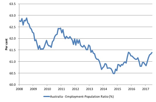
Given the variation in the labour force estimates, it is sometimes useful to examine the Employment-to-Population ratio (%) because the underlying population estimates (denominator) are less cyclical and subject to variation than the labour force estimates. This is an alternative measure of the robustness of activity to the unemployment rate, which is sensitive to those labour force swings.
The following graph shows the Employment-to-Population ratio, since February 2008 (the low-point unemployment rate of the last cycle).
It dived with the onset of the GFC, recovered under the boost provided by the fiscal stimulus packages but then went backwards again as the last Federal government imposed fiscal austerity in a hare-brained attempt at achieving a fiscal surplus.
The ratio began rising in December 2014 which suggested to some that the labour market had bottomed out and would improve slowly as long as there are no major policy contractions or cuts in private capital formation.
The series turned again as overall economic activity weakened. Over the last few months it has improved again.
The series rose by 0.1 points in July 2017 to 61.4 per cent and remains a 1.5 percentage points below the April 2008 peak of 62.9 per cent.
Teenage labour market – slight improvement in July 2017
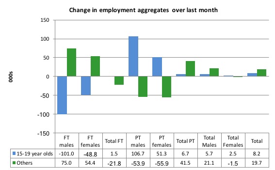
Full-time teenage employment rose by 1.5 thousand jobs in July, while part-time employment rose by 6.7 thousand.
As a result, total employment rose by 8.2 thousand (net) in July 2017, which represents a slight improvement on last month’s poor result.
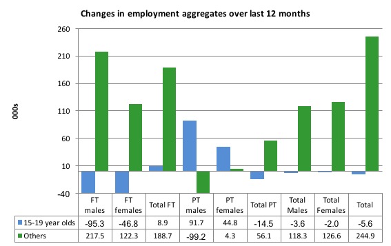
The following graph shows the distribution of net employment creation in the last month by full-time/part-time status and age/gender category (15-19 year olds and the rest)
Over the last 12 months, teenagers have lost 5.6 thousand (net) jobs overall while the rest of the labour force have gained 244.9 thousand net jobs. Remember that the overall result represents a fairly modest annual growth in employment.
Full-time employment for teenagers over the last 12 months has risen by 8.9 thousand while part-time employment employment has fallen by 14.5 thousand.
The following graph shows the change in aggregates over the last 12 months.
In terms of the current cycle, which began after the last low-point unemployment rate month (February 2008), the following results are relevant:
1. Since February 2008, there have been only 1,553.8 thousand (net) jobs added to the Australian economy but teenagers have lost a staggering 101.2 thousand over the same period.
2. Since February 2008, teenagers have lost 117.5 thousand full-time jobs (net).
3. Even in the traditionally, concentrated teenage segment – part-time employment, teenagers have gained only 16.4 thousand jobs (net) even though 852.6 thousand part-time jobs have been added overall.
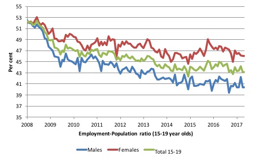
To put the teenage employment situation in a scale context (relative to their size in the population) the following graph shows the Employment-Population ratios for males, females and total 15-19 year olds since February 2008.
You can interpret this graph as depicting the loss of employment relative to the underlying population of each cohort. We would expect (at least) that this ratio should be constant if not rising somewhat (depending on school participation rates).
The facts are that the absolute loss of jobs reported above is depicting a disastrous situation for our teenagers. Males, in particular, have lost out severely as a result of the economy being deliberately stifled by austerity policy positions.
In the latter months of 2015, with the part-time employment situation improving, there was some reversal in the downward trends in these ratios.
However, inrecent months the ratios have fallen again, with a slight pickup in July.
The male ratio has fallen by 11.5 percentage points since February 2008, the female ratio has fallen by 5.8 percentage points and the overall teenage employment-population ratio has fallen by 8.7 percentage points.
That is a substantial decline in the employment market for Australian teenagers.
The other staggering statistic relating to the teenage labour market is the decline in the participation rate since the beginning of 2008 when it peaked in January at 61.4 per cent. In July 2017, the participation rate rose 0.2 points to 53 per cent.
That amounts to an additional 126.8 thousand teenagers who have dropped out of the labour force as a result of the weak conditions since the crisis.
If we added them back into the labour force the teenage unemployment rate would be 29 per cent rather than the official estimate for July 2017 of 17.7 per cent.
Some may have decided to return to full-time education and abandoned their plans to work. But the data suggests the official unemployment rate is significantly understating the actual situation that teenagers face in the Australian labour market.
Overall, the performance of the teenage labour market remains extremely poor. It doesn’t rate much priority in the policy debate, which is surprising given that this is our future workforce in an ageing population. Future productivity growth will determine whether the ageing population enjoys a higher standard of living than now or goes backwards.
I continue to recommend that the Australian government immediately announce a major public sector job creation program aimed at employing all the unemployed 15-19 year olds, who are not in full-time education or a credible apprenticeship program.
Unemployment increased 1,100 to 730,600
The official unemployment rate decreased by less than 0.1 pts to 5.6 per cent in July 2017. In June it was 5.654 per cent and in July it was 5.65 per cent.
The labour market still has significant excess capacity available.
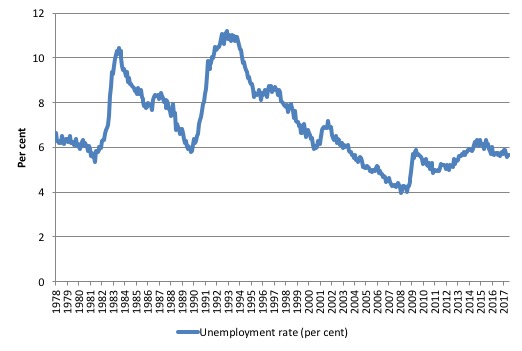
The following graph shows the national unemployment rate from February 1978 to July 2017. The longer time-series helps frame some perspective to what is happening at present.
After falling steadily as the fiscal stimulus pushed growth along, the unemployment rate slowly trended up for some months.
It is now still 0.6 points above the level it fell to as a result of the fiscal stimulus and 1.7 points above the level reached before the GFC began.
Broad labour underutilisation – at 14 per cent
The ABS publishes monthly and quarterly labour underutilisation data. The quarterly data was updated last month (for the May-quarter 2017) and so we use the monthly data (which is seasonally unadjusted) to see what is going on in between the quarterly updates:
1. Underemployment was estimated to be 8.5 per cent of the labour force – up 0.1 points on the June 2017 result.
2. The total labour underutilisation rate (unemployment plus underemployment) was 14 per cent.
3. There were 1,101.3 thousand persons underemployed and a total of 1,812.6 thousand workers either unemployed or underemployed.
The following graph plots the history of quarterly (seasonally-adjusted) underemployment in Australia since February 1978 to the May-quarter 2017.
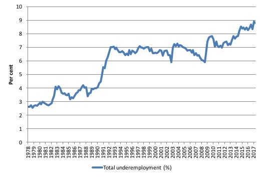
The next graph shows the evolution of the broad underutilisation rate over the same period. You can see the three cyclical peaks corresponding to the 1982, 1991 recessions and the more recent downturn.
Unemployment was a higher proportion of the two earlier peaks but underemployment now dominates the current cycle (just).
The other difference between now and the two earlier cycles is that the recovery triggered by the fiscal stimulus in 2008-09 did not persist and as soon as the ‘fiscal surplus’ fetish kicked in in 2012, things went backwards very quickly.
The two earlier peaks were sharp but steadily declined. The last peak fell away on the back of the stimulus but turned again when the stimulus was withdrawn.
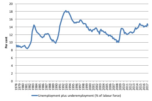
If hidden unemployment (given the depressed participation rate) is added to the broad ABS figure the best-case (conservative) scenario would see a underutilisation rate well above 15 per cent at present. Please read my blog – Australian labour underutilisation rate is at least 13.4 per cent – for more discussion on this point.
Aggregate participation rate – rises by 0.1 points to 65.1 per cent
While the participation rate edged up marginally in July 2017, it remains substantially down on the most recent peak in November 2010 of 65.8 per cent when the labour market was still recovering courtesy of the fiscal stimulus.
What would the unemployment rate be if the participation rate was at the last November 2010 peak level value?
The following graph tells us what would have happened if the participation rate had been constant over the period November 2010 to July 2017. The blue line is the official unemployment rate since its most recent low-point of 4 per cent in February 2008.
The red line starts at November 2010 (the peak participation month). It is computed by adding the workers that left the labour force as employment growth faltered (and the participation rate fell) back into the labour force and assuming they would have been unemployed. At present, this cohort is likely to comprise a component of the hidden unemployed (or discouraged workers).
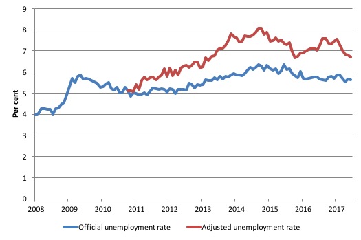
1. Total official unemployment in July 2017 was estimated to be 730.6 thousand.
2. Unemployment would be 875 thousand if participation rate was at its November 2010 peak.
3. The unemployment rate would now be 6.7 per cent rather than the official July 2017 estimate of 5.6 per cent.
The difference between the two numbers mostly reflects, the change in hidden unemployment (discouraged workers) since November 2010. These workers would take a job immediately if offered one but have given up looking because there are not enough jobs and as a consequence the ABS classifies them as being Not in the Labour Force.
There has been some change in the age composition of the labour force (older workers with low participation rates becoming a higher proportion) but this only accounts for less than 1/3 of the shift. The rest is undoubtedly accounted for by the rise in hidden unemployment.
Note, the gap between the blue and red lines doesn’t sum to total hidden unemployment unless November 2010 was a full employment peak, which it clearly was not. The interpretation of the gap is that it shows the extra hidden unemployed since that time.
This gap shrinks as participation rises relative to the November 2010 peak.
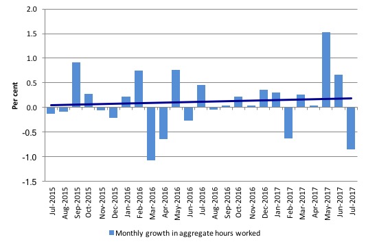
Hours worked – fell by 14.4 million hours (0.84 per cent) in July 2017
Last month’s increase in hours worked did not repeat itself in July 2017. The July outcome was basically a reversal on the June result and helps explain why underemployment rose.
The following graph shows the monthly growth (in per cent) over the last 24 months. The dark linear line is a simple regression trend of the monthly change – which depicts an upward trend – driven entirely by the outlier in May 2017.
You can see the pattern of the change in working hours is also portrayed in the employment graph – zig-zagging across the zero growth line.
Conclusion
My standard monthly warning: we always have to be careful interpreting month to month movements given the way the Labour Force Survey is constructed and implemented.
Today’s figures show that the Australian labour market improved again in July 2017, if we consider positive overall employment growth to be the benchmark.
The net result was fairly modest, however and was accompanied by a fall in full-time work.
Unemployment rose because the labour force grew faster (as participation rose) than employment. That is a situation where virtuous outcomes are likely.
But the quality of work fell given the rise in underemployment (due to the fall in monthly hours worked).
There was a slight improvement in the teenage labour market in July 2017, but it remains in a poor state.
Overall, the state of the Australian labour market remains uncertain.
Crowdfunding Request – Economics for a progressive agenda
The request has achieved 56 per cent of target with just 10 days left.
I received a request to promote this Crowdfunding effort. I note that I will receive a portion of the funds raised in the form of reimbursement of some travel expenses. I have waived my usual speaking fees and some other expenses to help this group out.
The Crowdfunding Site is for an – Economics for a progressive agenda.
As the site notes:
Professor Bill Mitchell, a leading proponent of Modern Monetary Theory, has agreed to be our speaker at a fringe meeting to be held during Labour Conference Week in Brighton in September 2017.
The meeting is being organised independently by a small group of Labour members whose goal is to start a conversation about reframing our understanding of economics to match a progressive political agenda. Our funds are limited and so we are seeking to raise money to cover the travel and other costs associated with the event. Your donations and support would be really appreciated.
For those interested in joining us the meeting will be held on Monday 25th September between 2 and 5pm and the venue is The Brighthelm Centre, North Road, Brighton, BN1 1YD. All are welcome and you don’t have to be a member of the Labour party to attend.
It will be great to see as many people in Brighton as possible.
Please give generously to ensure the organisers are not out of pocket.
That is enough for today!
(c) Copyright 2017 William Mitchell. All Rights Reserved.
Around the political blogs, an air of smugness is just beginning to creep in on the right. Wage restraint appears to be creating employment – quite the opposite of what MMT would tell us.
I tend to think it has a fair bit to do with the collapsing household savings ratio feeding through into consumption spending – business reports that conditions and confidence have now returned to pre-GFC levels and job advertisments have begun rising while at the same time, consumer confidence remains in the toilet. Many commentors are puzzling over this remarkable divergence for which there doesn’t really seem to be a precedent in such data series.
Workers can’t spend what they aren’t earning without recourse to credit – and credit growth isn’t exactly booming. It remains far below pre-GFC levels. Government is of an austerity mindset so they aren’t exactly helping either. But consumers are still somehow finding enough money in their wallets to spend to give business a boost.
An interesting one to watch.