Today (April 18, 2024), the Australian Bureau of Statistics released the latest - Labour Force,…
Gross Flows analysis of Australian labour market – some improvement – August 2017
Today, I am writing from the Brighton, UK and today the first event of the British part of our Reclaim the State tour is to be held. See below for details. Last week, I attended the first International Modern Monetary Theory (MMT) conference, which although there have been many MMT-focused workshops or conferences in the past, was truly a gathering of the clan. The large number who attended (over 200 I believe) shows we are making progress. There is a snowball rolling and it will inevitably get bigger. The only danger of these focused events is that the ‘group’ can easily get trapped into thinking that the views expressed are the norm, which is the first step towards Groupthink. They are clearly not the norm and further work is required, but the fact that we can hold such a large conference focused exclusively on MMT is a significant step forward. I will write more about the MMT conference another day. Today, I want to focus on some statistics analysis – I had time on the plane journey across the Atlantic (Kansas City to London) to delve into the latest Gross Flows data from the Australian Bureau of Statistics. Gross flows analysis provides a different way of viewing the labour force data and often reveals some interesting trends that are hidden in the net analysis of labour market data.
Introduction
In recent months, there has been a lot of talk about how strong the Australian labour market is becoming. Sure enough, employment growth has picked up a bit and in August there was a good full-time employment result.
Unemployment and underemployment remain at elevated levels but are not increasing at any alarming rate.
Wages growth is flat but steady.
So how strong is the labour market? Well we can make assessments about that using what is called Gross Flows analysis and I updated my flows dataset before I left to do just that.
Is it getting harder to get a job?
One way of viewing the labour market is in terms of the gross flows that occur each month between the different labour market states.
Just focusing on net results (the usual way of analysing labour force data releases) – such as how much employment changed by obscures the fact that there is continuous flow going on with workers moving between full-time and part-time jobs, unemployment and not in the labour force (that is, non-participation).
The strength of these flows and their direction vary over the business cycle and the flow dynamics gives us a pretty good view of how things stand.
The only problem is that the data is difficult to deal with, and as a result, the analysis is time consuming.
There is a lot of detailed knowledge you need to have to get into the business of analysing this type of data. If you are interested in reading more go to the Australian Bureau of Statistics resource page – Understanding Movements in Employment – as a starting point.
There are a lot of traps involved. Note these are particular samples drawn out of the labour force survey sample (matched pairs).
The ABS offer the following tips:
In the Labour Force Survey, one-eighth of the dwellings sampled in the previous month are replaced, in the current month, by a new set of dwellings from the same geographic area. The seven-eighth overlap between the dwellings selected in consecutive months maintains continuity within the population survey sample and enables more reliable measurement of change in the labour force characteristics of the population than would be possible if a new sample was introduced each month.
The matching of respondents who report in consecutive months enables analysis of the transition of individuals between the different labour force status classifications, referred to as the matched sample. The transition counts between the different labour force status classifications from one point in time to the next are commonly referred to as gross flows.
And then they offer this warning which tells you that one cannot reconcile the levels that are provided in the LFS data (employment etc) with the totals that appear in the gross flows matrix:
The figures presented in gross flows are presented in original terms only and do not align with published labour force estimates. The gross flows figures are derived from the matched sample between consecutive months, which after taking account of the sample rotation and varying non-response in each month is approximately 80 per cent of the sample.
The major problems in using this data, then, are: (a) sample bias present in any survey data; (b) misclassification errors (likely to be small in ABS labour force data); and (c) rotation group bias (significant issue in ABS labour force data).
You can also read the Abowd, J.M. and Zellner, A. (1985) ‘Estimating Gross Labor-Force Flows’, Journal of Business and Economic Statistics, 3 (3), 254-283 – for further details of these issues.
Gross flows analysis allows us to trace flows of workers between different labour market states (employment; unemployment; and non-participation) between months. So we can see the size of the flows in and out of the labour force more easily and into the respective labour force states (employment and unemployment).
Each period there are a large number of workers that flow between the labour market states – employment (E), unemployment (U) and not in the labour force (N). The stock measure of each state indicates the level at some point in time, while the flows measure the transitions between the states over two periods (for example, between two months).
The net changes each month – between the stock measures – are small relative to the absolute flows into and out of the labour market states.
National statisticians measure these flows in their monthly labour force surveys. The various stocks and flows are denoted as follows (single letters denote stocks, dual letters are flows between the stocks):
- E = employment stock, with subscript t = now, t+1 the next period.
- U = unemployment stock.
- N = not in the labour force stock.
- EE = flow from employment to employment (that is, the number of people who were employed last period who remain employment this period)
- UU = flow of unemployment to unemployment (that is, the number of people who were unemployed last period who remain unemployed this period)
- NN = flow of those not in the labour force last period who remain in that state this period
- EU = flow from employment to unemployment
- EN = flow from employment to not in the labour force
- UE = flow from unemployment to employment
- UN = flow from unemployment to not in the labour force
- NE = flow from not in the labour force to employment
- NU = flow from not in the labour force to unemployment
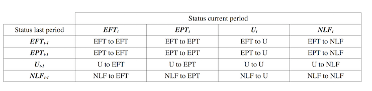
The following Matrix Table provides a schematic description of the flows that can occur between the three labour force framework states.
Labour Market Flows Matrix

The various inflows and outflows between the labour force categories are expressed in terms of numbers of persons which can then be converted into so-called transition probabilities – the probabilities that transitions (changes of state) occur.
We can then answer questions like: What is the probability that a person who is unemployed now will enter employment next period?
So if a transition probability for the shift between employment to unemployment is 0.05, we say that a worker who is currently employed has a 5 per cent chance of becoming unemployed in the next month. If this probability fell to 0.01 then we would say that the labour market is improving (only a 1 per cent chance of making this transition).
From the table above – sometimes called a Gross Flows Matrix – the element EE tells you how many people who were in employment in the previous month remain in employment in the current month.
Similarly the element EU tells you how many people who were in employment in the previous month are now unemployed in the current month. And so on. This allows you to trace all inflows and outflows from a given state during the month in question.
The transition probabilities are computed by dividing the flow element in the matrix by the initial state. For example, if you want the probability of a worker remaining unemployed between the two months you would divide the flow (UU) by the initial stock of unemployment. If you wanted to compute the probability that a worker would make the transition from employment to unemployment you would divide the flow (EU) by the initial stock of employment. And so on.
So the 3 Labour Force states in the Matrix Table above allow us to compute 9 transition probabilities reflecting the inflows and outflows from each of the combinations.
Analysing movements in these probabilities over time provides a different insight into how the labour market is performing by way of flows of workers.
The 9-element labour market flows matrix is the general result. However, the data presented by the Australian Bureau of Statistics (ABS) is quite exceptional in international terms because it splits the employment category into full-time and part-time, adding an extra 7 elements, which are shown in the next table.
The following table shows the schematic way in which gross flows data is arranged by the ABS each month.
Here EFT refers to full-time employment, EPT to part-time employment, U to unemployment and NLF to Not in the Labour Force. The subscripts t and t-1 refer to the current month and the previous month, respectively.
The term matrix might sound technical to those not trained in statistics and algebra, but in this context, think about it as just being a spreadsheet, which almost everyone has a working knowledge of these days.
Each element in the matrix (cell in the spreadsheet) tells you the volume (in 000s for Australian labour force data) of the flows between the different labour force states noted.
So the element EFT to EFT tells you how many people who were in full-time employment in the previous month (t-1) remain in full-time employment in the current month (t).
Similarly the element EFT to U tells you how many people who were in full-time employment in the previous month (t-1) are now unemployed in the current month (t). And so on. This allows you to trace all inflows and outflows from a given state during the month in question.
For example, new entrants to the labour force come from the NLF (Not in the Labour Force) and can transit into EFT, EPT or U. The respect numbers in the relevant cells tell us where these entrants go each month.
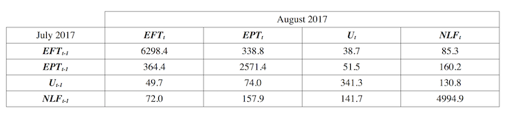
This is what the latest July 2017 gross flows matrix looks like for Australia.
So, 49.7 thousand persons who were unemployed in July 2017 found full-time employment in August 2017, whereas 38.7 thousand persons flowed in the opposite direction.
To see how many people dropped out of the labour force in August, we would subtract the sum of the elements (NLF to EFT, NLF to EPT, NLF to U) which are flows from NLF into one of the three labour force categories and then subtract the sum the elements (EFT to NLF, EPT to NLF, U to NLF), which are the flows from the three labour force categories into NLF.
The result is that 4.7 thousand persons dropped out of the labour force in the last month.
130.8 thousand previously unemployed persons exited the labour force while 141.7 thousand came into the labour force to become unemployed.
338.8 thousand full-time workers transitted into part-time employment over the month whereas 364.4 part-time workers were able to secure full-time work.
According to the official labour force data, total full-time employment rose by 40,100 thousand in August. But that net figure masks the scale of the flows into and out of full-time employment.
Total outflows from full-time employment were 338.8 thousand EFT to EPT, 38.7 thousand EFT to U, 85.3 thousand EFT to NLF.
Total inflows were 364.4 thousand EPT to EFT, 49.7 thousand U to EFT, and 72 thousand NLF to EFT.
The other point to note is that there is clear “state dependence” (which means that flows within same states are the largest).
So EFT to EFT, EPT to EPT, U to U and NLF to NLF (between months) are the largest flow categories. Large numbers of people move between jobs but stay employed in one way or another, and so on.
You can conduct your own analysis as you see fit but the overall impression is clear – the flows between states are substantial even though there is state dependence.
Gross flows matrix, July to August 2017 (matched sample)
The results
I updated the latest data and computed the transition probabilities.
The first graph shows you what is happening to the transition probabilities over the current cycle. February 2008 was the low-point unemployment rate month in the last cycle.
March 2009 was probably the nadir in the downturn and August 2017 is the current month data.
The graph shows that the over the course of the downturn then ‘recovery’, there is now:
1. A higher transition probability from EFT to EPT, EFT to U, EPT to EFT, EPT to U, and NLF to U (although the Not in the Labour Force category is fairly stable between February 2008 and August 2017).
2. A lower transition probability from EFT to N, EPT to N, U to EFT, U to EPT, and U to N. So there is a lower probability of a person dropping out of the labour force now compared to February 2008.
3. Part-time workers have a much higher probability of becoming unemployed than full-time workers.
![]()
A comparison between the start of 2017 (January) and August 2017 is presented in the next graph.
The main shifts since January have been in the increased probability of a part-time and/or unemployed worker gaining full-time work.
There has also been an increased probability for the unemployed to gain part-time work.
The underlying rise in the participation rate this year (so far) is also reflected in the reduced probabilities of those in the labour force exiting.
![]()
So a tentative conclusion suggests the labour market has indeed improved over the course of this year but is still not as strong as it was in February 2008, when the GFC began to impact.
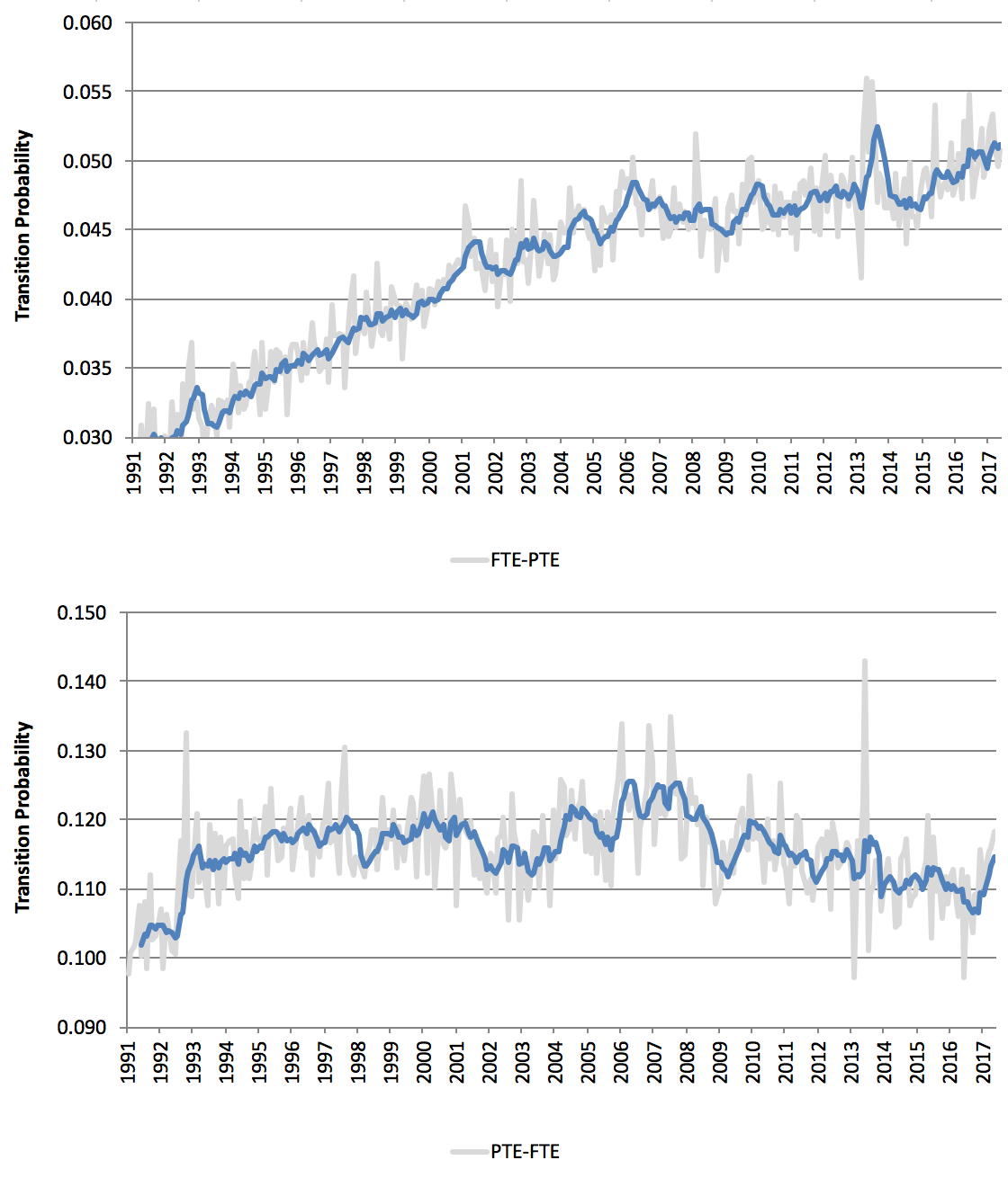
Transitions between full-time and part-time employment
In recent months, there has been a stronger full-time employment result, which was in contradistinction to earlier trends indicating that Australia was becoming a part-time employment nation.
The next graph shows the intra-employment transition probabilities (EFT to EPT – upper panel; and EPT to EFT – lower panel) from April 1991 to August 2017. The blue lines in each panel are 6-month moving averages to give a better idea of trend. The light gray series are the seasonally-adjusted original data, which moves around a lot.
You can see that over the last 36 odd years the chances of a full-time worker becoming part-time employed has steadily risen and accelerated following the 1991 recession.
The EFT-EPT transition probability rose sharply during the downturn following February 2008 indicating a lack of job creation and firms adopting caution as the economy slowed.
The EPT-EFT has fallen in trend terms since the GFC, indicating that it is much harder for a part-time worker to get full-time work.
In the last six months, that downward trend has been reversed but it is still too early to tell whether this improvement will endure.
Transitions between full-time and part-time employment
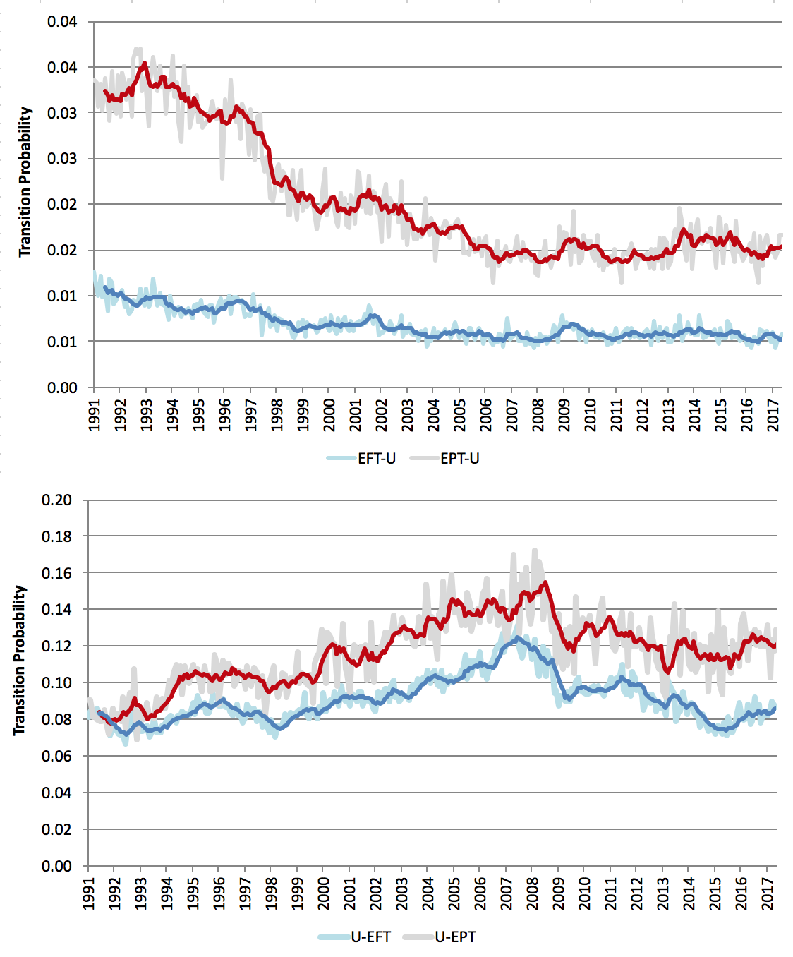
Finally, the next graph shows the transition probabilities between employment and unemployment (EFT to UN and EPT to UN – upper panel; and U to EFT and U to EPT – lower panel) from April 1991 to August 2017.
The bolder lines in each panel are 6-month moving averages to give a better idea of trend. The lighter series are the seasonally-adjusted original data, which moves around a lot.
You can see that over the last 36 odd years, most of the movements out of employment into unemployment come from the part-time work category, even though that probability has declined with economic growth.
Similarly, there is a much higher probability of an unemployed worker gaining part-time work compared to full-time work.
In the last six months, the probability that a full-time worker will become unemployed has been stable. A similar result exists for part-time workers.
The probability of flows the other way (U to EFT and U to EPT) have risen marginally, although that improvement is more marked in the U to EPT flow.
Conclusion
While the data is quite tricky to work with, the message appears to be that the Australian labour market has improved a bit over the last 6 months.
But that improvement is off a pretty poor base and total labour underutilisation still remains around 14 per cent.
Reclaiming the State Lecture Tour – September-October, 2017
For up to date details of my upcoming book promotion and lecture tour in Late September and early October through Europe go to – The Reclaim the State Project Home Page.
Today’s event is in Brighton, UK.
It is a so-called ‘Fringe event’ attached to the Annual British Labour Party Conference.
The event will be held at The Brighthelm Centre, North Road, Brighton, BN1 1YD.
Time: The event will run from 14:00 to 17:00.
See RSVP Page.
I hope to see a lot of you there. I will be talking about Modern Monetary Theory (MMT) (of course), the demise of the British Left, and Brexit. Should be fun.
Brilliant insights. Thanks.
Good luck today Bill. Sorry I can’t make it.
I see Toynbee has had some kind of Damascene moment in today’s Guardian. It’s all about worrying with a general air of over exuberance about the place. Ala Kinnock. Knock some sense into them.
Wouldn’t this govt deficit spending be helping the employment figures ?
Another factor that will play into this – I’m sure Bill is aware of – is that as of July this year, the age at which the aged pension can be claimed was raised and will continue to steadily be raised over the next six years. This will keep those who would formerly have retired in the labour force for longer, increasing the participation rate of that age bracket and adding to the figures overall.
The conservatives policy is still to ultimately raise the retirement age to 70. I’m trying to imagine a 70 year old bricklayer still dragging bricks and concrete around. I guess they think that several million people who have been manual labourers all their lives will just re-train or start their own small businesses in their twilight years.