Today (April 18, 2024), the Australian Bureau of Statistics released the latest - Labour Force,…
US labour market – hit by two hurricanes but improvement suggested
On September 1, 2017, the US Bureau of Labor Statistics (BLS) released their latest labour market data – Employment Situation Summary – September 2017 – which showed that total non-farm employment from the payroll survey fell by 33,000 in September, which reflected the impact of the two hurricanes that have ravaged southern US states in the survey period. The Labour Force Survey data showed that employment rose by 906 thousand in September and the labour force rose by 575 thousand. Thus, the BLS estimated that unemployment fell by 331 thousand and the official unemployment rate fell by 0.2 points to 4.22 per cent. There is still a large jobs deficit remaining and other indicators suggest the labour market is still below where it was prior to the crisis. Further, the bias towards low-pay and below-average pay jobs continues and the fortunes of university graduates has declined relative to other cohorts in the labour force.
BLS Hurricane Note
The BLS prefaced the latest labour market data with a statement about Hurricanes Irma and Harvey.
It said that:
A sharp employment decline in food services and drinking places and below-trend growth in some other industries likely reflected the impact of Hurricanes Irma and Harvey …
… the net effect of these hurricanes was to reduce the estimate of total nonfarm payroll employment for September. There was no discernible effect on the national unemployment rate …
No changes were made to either the establishment or household survey estimation procedures for the September figures. For both surveys, collection rates generally were within normal ranges, both nationally and in the affected states.
Overview – Total employment rose in September
For those who are confused about the difference between the payroll (establishment) data and the household survey data you should read this blog – US labour market is in a deplorable state – where I explain the differences in detail.
See also the – Employment Situation FAQ – provided by the BLS, itself.
The BLS say that:
The establishment survey employment series has a smaller margin of error on the measurement of month-to-month change than the household survey because of its much larger sample size. … However, the household survey has a more expansive scope than the establishment survey because it includes self-employed workers whose businesses are unincorporated, unpaid family workers, agricultural workers, and private household workers …
Focusing on the Household Labour Force Survey data, the seasonally adjusted labour force rose by 575 thousand in September 2017 and the participation rate rose by 0.2 points to 63.1 per cent.
Total employment rose by a staggering 900 thousand in net terms (standby for revisions next month!).
Taken together, these shifts in September meant that official unemployment fell by 331 thousand.
The official unemployment rate fell by 0.2 points to 4.22 per cent.
Notwithstanding these improvements, the September 2017 participation rate of 63.1 per cent is still far below the peak in December 2006 (66.4 per cent).
Adjusting for the ageing effect (see US labour market – some improvement but still soft for an explanation of this effect), the rise in those who have given up looking for work for one reason or another since December 2006 is around 3.285 million.
If we added them back into the labour force and considered them to be unemployed (which is not an unreasonable assumption given that the difference between being classified as officially unemployed against not in the labour force is solely due to whether the person had actively searched for work in the previous month) – we would find that the current US unemployment rate would be around 6.1 per cent rather than the official estimate of 4.2 per cent.
That provides a quite different perspective in the way we assess the US recovery.
Note also previous discussions – All net jobs in US since 2005 have been non-standard and the fact that there has been a bias towards low-wage job creation in the recovery.
Conclusion: the US labour market is still a long way from where it was at the end of 2007.
Payroll employment trends
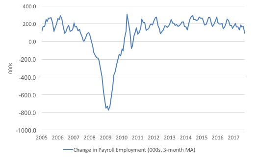
The first graph shows the monthly change in payroll employment (in thousands, expressed as a 3-month moving average to take out the monthly noise).
The monthly changes were stronger in 2014 and 2015, and then dipped in the first-half of 2016. By the end of 2016, job creation was stronger but then it tailed off again, somewhat.
In the first two months of 2017 (January and February), there was a strengthening of the net payroll employment change, followed by a lull in March and May, and then a strengthening.
September was definitely weaker but note the hurricane warning.
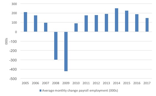
The next graph shows the same data in a different way – in this case the graph shows the average net monthly change in payroll employment (actual) for the calendar years from 2005 to 2017. Clearly, the average for 2017 is for January to August only.
The slowdown that began in 2015 is continuing.
The average change so far in 2017 (148 thousand) is down from the 187 thousand average throughout 2016.
The average net change in 2014 was 250 thousand, in 2015 it was 226 thousand.
Labour Force Survey – employment growth rose this month
In September 2017, employment fell by 0.59 per cent (906 thousand) while the labour force rose by 0.36 per cent (575 thousand) and the participation rate rose by 0.2 points.
So employment growth outstripped the labour force growth despite the sharp rise in participation and so there was a sharp fall in unemployment and the unemployment rate.
We should note that the monthly data has been all over the place lately so it is a little hard to be definitive.
I expect there to be revisions in the employment outcome when the data comes out next month.
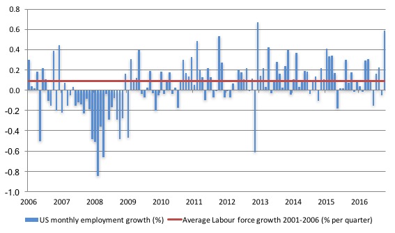
The next graph shows the monthly employment growth since the low-point unemployment rate month (December 2006). The red line is the average labour force growth over the period December 2001 to December 2006 (0.09 per cent per month).
What is apparent is that no coherent positive and reinforcing trend in employment growth has been established in the US labour market since the recovery began back in 2009. There are still many months where employment growth, while positive, remains relatively weak when compared to the average labour force growth prior to the crisis or is negative.
The sharp positive spike in September is clearly an outlier – hence my suspicion that revisions are coming.
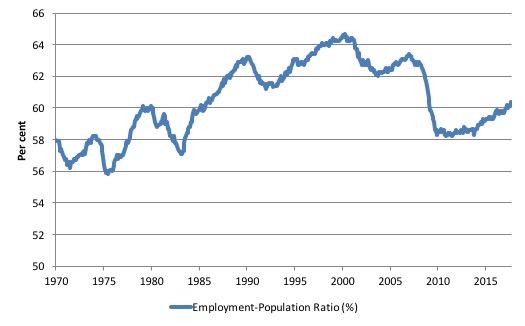
A good measure of the strength of the labour market is the Employment-Population ratio given that the movements are relatively unambiguous because the denominator population is not particularly sensitive to the cycle (unlike the labour force).
The following graph shows the US Employment-Population from January 1970 to September 2017. While the ratio fluctuates a little, the September 2017 outcome (60.4 per cent) was 0.3 points up from the previous month.
Despite this sharp rise, the ratio remains well down on pre-GFC levels (peak 63.4 per cent in December 2006), which is a further indication of how weak the recovery has been so far.
The US jobs deficit
As noted in the Overview, the current participation rate of 63.1 per cent is a long way below the most recent peak in December 2006 of 66.4 per cent.
When times are bad, many workers opt to stop searching for work while there are not enough jobs to go around. As a result, national statistics offices classify these workers as not being in the labour force (they fail the activity test), which has the effect of attenuating the rise in official estimates of unemployment and unemployment rates.
These discouraged workers are considered to be in hidden unemployment and like the officially unemployed workers are available to work immediately and would take a job if one was offered.
But the participation rates are also influenced by compositional shifts (changing shares) of the different demographic age groups in the working age population. In most nations, the population is shifting towards older workers who have lower participation rates.
Thus some of the decline in the total participation rate could simply being an averaging issue – more workers who have a lower participation rate as a proportion of the total workforce.
I analysed this declining trend in this blog – Decomposing the decline in the US participation rate for ageing.
I updated that analysis to December 2015 and computed that the decline in the participation rate due to the shift in the age composition of the working age population towards older workers with lower participation rates accounted for about 58 per cent of the actual decline.
Thus, even if we take out the estimated demographic effect (the trend), we are still left with a significant cyclical response.
What does that mean for the underlying unemployment?
The labour force changes as the underlying working age population grows and with changes in the participation rate.
If we adjust for the ageing component of the declining participation rate and calculate what the labour force would have been given the underlying growth in the working age population if participation rates had not declined since December 2006 then we can estimate the change in hidden unemployment since that time due to the sluggish state of the US labour market.
Adjusting for the demographic effect would give an estimate of the participation rate in September 2017 of 64.5 if there had been no cyclical effects (1.5 percentage points up from the current 63.1 per cent).
It is hard to claim that these withdrawals reflect structural changes (for example, a change in preference with respect to retirement age, a sudden increase in the desire to engage in full-time education).
To compute these job gaps we have to set a ‘full employment’ benchmark. In the past, I have set it at 4.4 per cent, which is where the US labour market was in March 2007 prior to the crisis.
I doubted that 4.4 per cent was the true irreducible minimum unemployment rate that could be sustained in the US. For example, if the government offered an unconditional Job Guarantee at an acceptable minimum wage there would be a sudden reduction in the national unemployment rate which would take it to well below 4.4 per cent without any significant inflationary impacts (via aggregate demand effects).
Further, the September unemployment rate has now fallen to 4.22 per cent.
Given that, I will use 4.2 as the full-employment benchmark so as not to get sidetracked into definitions of full employment. In that sense, my estimates should be considered the best-case scenario given that I actually think the cyclical losses are much worse than I provide here.
Using the estimated potential labour force (controlling for declining participation), we can compute a ‘necessary’ employment series which is defined as the level of employment that would ensure on 4.2 per cent of the simulated labour force remained unemployed.
This time series tells us by how much employment has to grow each month (in thousands) to match the underlying growth in the working age population with participation rates constant at their January 2007 peak – that is, to maintain the 4.2 per cent unemployment rate benchmark.
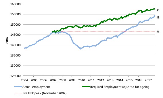
I computed the ‘necessary’ employment series based on the age-adjusted potential labour force (dark green line in the following graph).
The light blue line is the actual employment as measured by the BLS and the dotted red line is the level of employment that prevailed in November 2007 (the peak before the crisis).
This allows us to calculate how far below the age-adjusted 4.2 per cent unemployment rate (constant participation rate) the US employment level currently is.
There are two effects:
- The actual loss of jobs between the employment peak in November 2007 and the trough (January 2010) was 8,582 thousand jobs. However, total employment is now above the January 2008 peak by 7,750 thousand jobs. This gain in jobs is measured by the AB gap in the graph which shows the gap in employment relative to the November 2007 peak (the dotted red line is an extrapolation of the peak employment level). You can see that it wasn’t until August 2014 that the US labour market reached the November 2007 peak employment level again.
- The shortfall of jobs (the overall jobs gap) is the actual employment relative to the jobs that would have been generated had the demand-side of the labour market kept pace with the underlying population growth (Required Employment Adjusted for Ageing) – that is, with the participation rate at its December 2006 peak and the unemployment rate constant at 4.2 per cent. This shortfall (BC) loss amounts to 3,213 thousand jobs. This is the segment BC measured as at September 2017.
The US Jobs Gap is thus the departure of current employment from the level of employment that would have generated a 4.4 per cent unemployment rate, given current population trends.
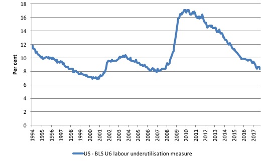
To put that into further perspective, the following graph shows the BLS measure U6, which is defined as:
Total unemployed, plus all marginally attached workers plus total employed part time for economic reasons, as a percent of all civilian labor force plus all marginally attached workers.
It is thus the broadest measure of labour underutilisation that the BLS publish.
In December 2006, before the affects of the slowdown started to impact upon the labour market, the measure was estimated to be 7.9 per cent. It now stands at 8.3 per cent (September 2017) – a decline of 1 percentage points since the beginning of the year.
The U-6 measure remains above previous troughs, which suggests (along with the other signals presented above) that the labour market is still some way from being considered ‘recovered’.
Scarring effects of the recession
There was an interesting New York Times article (October 5, 2017) = Why Some Scars From the Recession May Never Vanish – which questions the ‘all is good’ narrative that has been accompanying the recent BLS data releases on the US labour market.
It considers the impact of the recession on employment rates by education, splitting the labour force into two cohorts – college graduates and “less educated workers” (presumably non-college graduates).
Here is the graph the article provided:
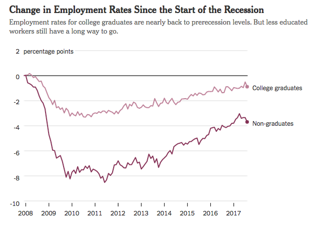
It draws the following conclusion:
Employment rates for college graduates are nearly back to prerecession levels. But less educated workers still have a long way to go.
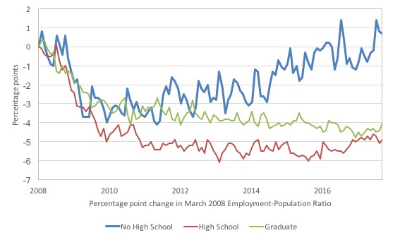
I explored that a little further because my own research has found that there has been a bias towards low-pay jobs in the recovery.
I examined movements in the Employment-Population Ratio for three US labour force cohorts (over 25 years):
1. Less than a High School Diploma.
2. High School Graduates, No College.
3. Bachelor’s degree and higher.
I set the January 2008 observation for the Employment-Population ratio to zero and then computed percentage points deviations from that observation.
By September 2017, the Employment-Population ratio for Graduates was still 4 points below its January 2008 value; for the High School Graduates/No College cohort 4.9 per cent below, yet for the Less than a High School Diploma cohort, their ratio was 0.7 points above.
Further, since 2011, the least educated workers have been enjoying a steady trend increase in the Employment-Population ratio, while the more educated cohorts have stalled, with the relative position of university graduates declining steadily.
Conclusion
The September labour market data release for the US is difficult to interpret because of the large spike in employment and the effects of the hurricanes on payroll employment.
However, having said that, the decline in unemployment and the rise in participation are good signs.
Caution always has to be exercised given the volatility of the monthly data.
The broader measure of labour underutilisation (U-6) remains above the pre-GFC levels but has fallen significantly over the last 12 months, which is also a good sign.
I still do not think the US labour market is near to full employment. This assessment is reinforced by the fact that the participation rate is still well below where it was even after we adjust for the ageing effects (retirements).
Reclaim the State book offer
Go to www.reclaimthestate.org – for discount codes.
That is enough for today!
(c) Copyright 2017 William Mitchell. All Rights Reserved.
Dear Bill,
I am perplexed by the last graph. I tried to dig out more information but all I could find was the raw data on the BLS site and a graph generated by FRED (LNS12327662)
The official unemployment rate among graduates is low (2.3%) but there was a massive drop of participation rate from 79% in mid-1990s to 76-77% in mid-2000-s and to 72% now. These drops occurred during recessions.
There are about 55.6 million people over 25 years old with graduate status. 7% is about 3.9 million
What happened to these people and who are they? Are they mostly spouses of employed people? How does immigration (especially H1-B program) affect these numbers?