It's Wednesday and I discuss a number of topics today. First, the 'million simulations' that…
US growth performance hides very disturbing regional trends
Last Friday (October 27, 2017), the US Bureau of Economic Analysis published their latest national accounts data – Gross Domestic Product: Third Quarter 2017 (Advance Estimate), which tells us that annual real GDP growth rate was 3 per cent in the September-quarter 2017, slightly down on the 3.1 per cent recorded in the June-quarter. As this is only the “Advance estimate” (based on incomplete data) there is every likelihood that the figure will be revised when the “second estimate” is published on November 29, 2017. The US result was driven, in part, by a continued (but slowing) contribution from personal consumption expenditure which coincided with record levels of household indebtedness. How long consumption expenditure can be kept growing as the debt levels rise is a relevant question. At some point, the whole show will come to a stop as it did in 2008 and that will impact negatively on private investment expenditure as well, which has just started to show signs of recovery. Governments haven’t learned that relying on personal consumption expenditure for economic growth in an environment of flat wages growth means that household debt will rise quickly and reach unsustainable levels. How harsh the correction will be is as yet unclear. But when it comes, the US government will need to increase its discretionary fiscal deficit to stimulate confidence among business firms and get growth back on track.
US economy – what is going on at the aggregate level?
The US Bureau of Economic Analysis said that:
Real gross domestic product (GDP) increased at an annual rate of 3.0 percent in the third quarter of 2017 … In the second quarter, real GDP increased 3.1 percent.
So a slight slowdown but quite a result given that the nation has endured two massive hurricanes in the same quarter, which US Bureau of Labor Statistics had estimated was behind the 33,000 drop in payroll employment in September 2017.
Please read my blog – US labour market – hit by two hurricanes but improvement suggested – for more discussion on this point.
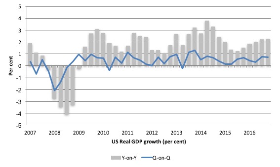
The September-quarter growth was 0.74 per cent (0.76 per cent in the June-quarter).
The last two quarters have represented a sharp rise in growth compared to 2016 and the first half of 2017.
The following sequence of graphs captures the story.
The first graph shows the annual real GDP growth rate (year-to-year) from the peak of the last cycle (December-quarter 2007) to the March-quarter 2017 (gray bars) and the quarterly growth rate (blue line). The data is available – HERE.
The year-to-year growth calculation smooths out the considerable volatility in the quarterly data to help us see the trend.
The next graph shows the evolution of the Private Investment to GDP ratio from the December-quarter 2007 (real GDP peak prior to GFC downturn) to the September-quarter 2017.
The decline in the investment ratio as a result of the crisis was substantial and endured for 2 years. As a result the potential productive capacity of the US contracted somewhat. There are various estimates available but the overall message is that potential GDP fell considerably as a result of the lack of productive investment in the period following the crisis.
The retreat in the Investment ratio after the June-quarter 2015, appears to have been arrested and it has stabilised at around 17.2 per cent, still down from pre-GFC levels.
Private investment has not a driving force in the recent growth (see next section).

In this blog – Common elements linking US and UK economic slowdowns – I discuss estimates of potential GDP in the US and the shortcomings of traditional methods used by institutions such as the Congressional Budget Office.
So if you are interested please go back and review that discussion.
The latest CBO estimates, made available through – St Louis Federal Reserve Bank, show why we should be sceptical.
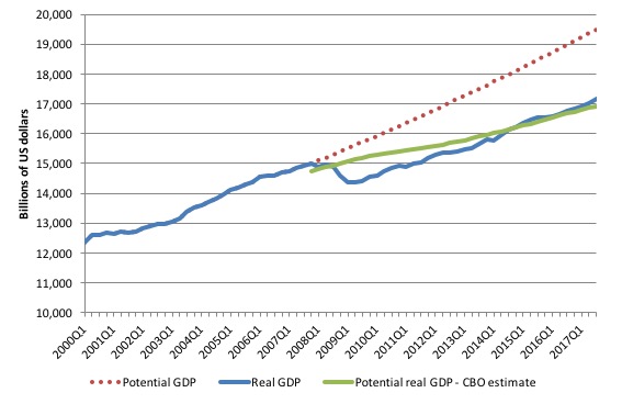
To get some idea of what has happened to potential real GDP growth in the US, the next graph shows the actual real GDP for the US (in $US billions) and two estimates of the potential GDP. There are many ways of estimating potential GDP given it is unobservable.
While I could have adopted a much more sophisticated technique to produce the red dotted series (potential GDP) in the graph, I decided to do some simple extrapolation instead to provide a base case.
The question is when to start the projection and at what rate. I chose to extrapolate from the most recent real GDP peak (December-quarter 2007). This is a fairly standard sort of exercise.
The projected rate of growth was the average quarterly growth rate between 2001Q4 and 2007Q4, which was a period (as you can see in the graph) where real GDP grew steadily (at 0.68 per cent per quarter) with no major shocks.
If the global financial crisis had not have occurred it would be reasonable to assume that the economy would have grown along the red dotted line (or thereabouts) for some period.
The gap between actual and potential GDP in the fourth-quarter 2015 is around $US2,340 billion or around 12 per cent. That gap had been rising steadily since late 2014 but has now stabilised and started falling as a result of the last three quarters of stronger growth and the stabilisation of the Investment ratio.
The green line is the estimate of potential output provided by the US Congressional Budget Office and made available through – St Louis Federal Reserve Bank.
In relation to the CBO estimate, the US economy is estimated to be producing in the September-quarter 2017 at 1.4 per cent over its potential.
If you believed the CBO estimate, you would see that the output gap closed in the September-quarter 2014 and the US economy has been producing above its potential (and increasingly so) since then.
But the US inflation rate was 1.8 per cent in the third-quarter 2014 and is now around 1.7 per cent. Wages growth remains flat. Broader measures of labour underutilisation indicate there is still considerable slack.
Which suggests that the CBO estimates are inaccurate – probably by several percentage points.
Wht we know (and I explain this in more detail in the blog mentioned above), the CBO base their estimate of Potential GDP on their estimate of the NAIRU – the estimated (unobservable) Non-accelerating Inflation Rate of Unemployment.
This is a conceptual unemployment rate that is consistent with a stable rate of inflation.
The literature demonstrates that the history of NAIRU estimation is far from precise. Studies have provided estimates of this so-called ‘full employment’ unemployment rate as high as 8 per cent or as low as 3 per cent all at the same time, given how imprecise the methodology is.
The former estimate would hardly be considered “high rate of resource use”. Similarly, underemployment is not factored into these estimates.
The problem is that the actual unemployment rate is falling at present and NAIRU estimates are chasing it downwards. So with no precision at all, we can dismiss the CBO conception.
The continued slack in the labour market (bias towards low-pay and high underemployment) would lead to the conclusion that the output gap is likely to be closer to 12.4 per cent (extrapolated estimate) than the CBO estimate.
Contributions to growth
The accompanying BEA Press Release said that:
The increase in real GDP in the third quarter reflected positive contributions from personal consumption expenditures (PCE), private inventory investment, nonresidential fixed investment, exports, and federal government spending. These increases were partly offset by negative contributions from residential fixed investment and state and local government spending. Imports, which are a subtraction in the calculation of GDP, decreased …
The deceleration in real GDP growth in the third quarter primarily reflected decelerations in PCE, in nonresidential fixed investment, and in exports that were partly offset by an acceleration in private inventory investment and a downturn in imports.
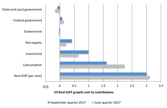
The next graph compares the September-quarter 2017 (blue bars) contributions to real GDP growth at the level of the broad spending aggregates with the March-quarter 2016 (gray bars), where the overall annualised real GDP growth was 3 per cent compared to 3.1 per cent.
While household consumption expenditure continues to be a positive contributor, that contribution has dropped substantially in the September-quarter 2017 – from 2.24 percentage points in the last quarter to 1.62 points this quarter.
American household debt remains high (see below) and real wages growth is flat. Uncertainty is increasing. So how that impacts will remain to be seen.
However, private investment spending has increased its contribution from 0.6 percentage points to 0.98 points in the September-quarter 2017, which is a positive outcome.
The Government sector undermined growth in the September-quarter 2017 by -0.02 points overall – a continued, small negative contribution.
The Federal government, however, continued to support growth (although at a lower rate) – 0.08 points compared to 0.13 points in the June-quarter.
The other contributor to growth was Net exports (0.41 points up from 0.21 points in the June-quarter 2017).
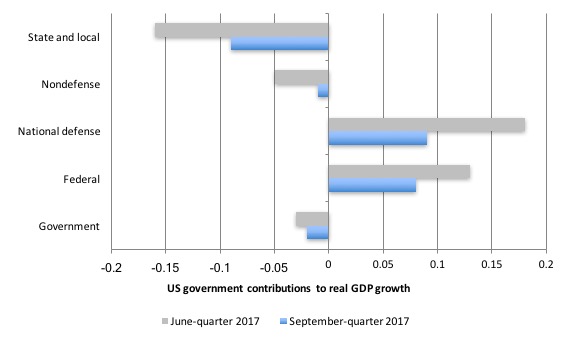
The next graph decomposes the government sector and shows the substantial reversal in growth contribution from the State and Local government sectors.
Further, the federal sphere has reduced non-defense spending and its overall positive contribution to growth is largely due to defense outlays – a worrying sign.
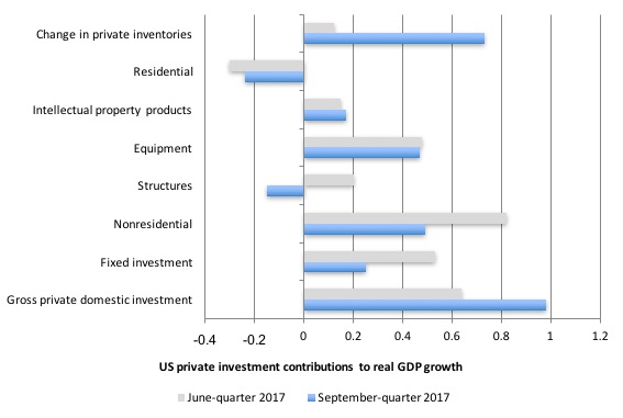
The next graph shows the contributions to real GDP growth of the various components of investment.
The inventory cycle dominated other positive investment contributions.
The investment in housing continues to drain growth.
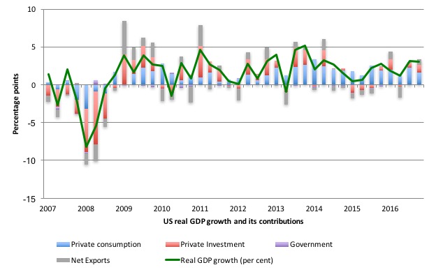
The next graph shows the contributions the different expenditure components have made to real GDP growth since the peak in the December-quarter 2007.
The thing to concentrate on is what was going on in 2016 where only household consumption was holding growth up. With incomes flat and prices rising, that growth was being fuelled by increased indebtedness.
The last two quarters have seen more balanced contributions to growth from investment and the external sector.
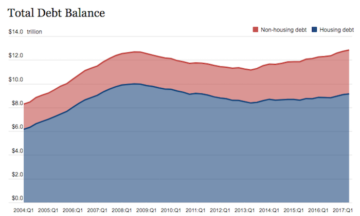
The Federal Reserve Bank of New York publication – Household Debt and Credit Report – was last updated for the second-quarter (August 2017) – (PDF Download).
It shows:
Aggregate household debt balances rose to a new peak in the second quarter of 2017. As of June 30, 2017, total household indebtedness was $12.84 trillion, a $114 billion (0.9%) increase from the first quarter of 2017. This increase put overall household debt $164 billion above its peak in the third quarter of 2008, and 15.1 percent above its trough in the second quarter of 2013.
I plan to do a separate blog on this topic including the rising and dangerous levels of auto loan debt.
The question that remains unanswered is whether US households will be able to maintain consumption spending growth given the rising household debt levels.
Is the significant slowdown in consumption spending growth a sign that a peak debt level is approaching?
The following graph is taken from the FRBNY publication. Clearly the gap between mortgage and non-mortgage debt is rising as total household indebtedness rises.
This looks to be an unsustainable situation and will require either significant non-government spending boosts in investment or net exports or government spending increases to offset the likely slowdown in household consumption spending.
The 2017 Distressed Communities Index
The aggregate data presented in the National Accounts, however, can be quite misleading for reasons that are well documented. A nation can be growing fast on the back of building weapons while forcing citizens to endure inferior health, education and other services that advance well-being.
The treatment of gender-biased home work is also inconsistent as is the exclusion of environmental damage.
There are also distributional concerns that aggregate data cannot pick up.
This issue is brought into relief with the publication by the non-profit US organisation Economic Innovation Group (EIG)’s – The 2017 Distressed Communities Index (October , 2017).
The full report is available HERE.
EIG say that:
The Distressed Communities Index (DCI) is a tool for measuring the vitality of U.S. communities. This 2017 report examines place-based disparities in the American economic experience and assesses the relationship between them and a host of other important factors, such as health outcomes, public assistance spending, demographics, and educational attainment.
So it tells us about the way in which total growth is distributed into qualitative outcomes at regional levels – where people live and work.
In regional studies, we talk about the social settlement (where people live) and the economic settlement (where jobs are). Regional development strategies aim to bring these ‘settlements’ together.
The current dominance of neoliberal, ‘market solutions’ subjugates the social settlement to the economic settlement – by forcing hollowed out regions (old industries etc) to lose population, particularly the more mobile youth and educated people.
This process has the inevitable consequence of turning declining regions (towns etc) into geriatric centres as businesses leave and the ancillary support services start declining due to scale issues.
The rhetoric of the neoliberals which claim these market forces will bring people to where the jobs are is erroneous. Countless studies have now shown that these ‘market-based’ migrations are not as powerful as the believers would make out.
The EIG Report concludes that:
… the link between individual fates and those of their communities is tightening as Americans are now less geographically mobile than at any point in modern history.
In other words, a severe polarisation is occurring in the US, which is replicated around the globe, demonstrating further the failure of the neoliberal narrative.
The EIG Report says that:
America’s elite zip codes are home to a spectacular degree of growth and prosperity – hubs of innovation and progress seemingly immune to the concerns over automation, globalization, or lack of upward mobility that pervade national headlines. However, outside of those top communities, economic well-being is often tenuous at best. And, at worst, millions of Americans are stuck in places where what little economic stability exists is quickly eroding beneath their feet.
The EIG study divided US communities (zip codes) into five tiers and characterised them using “seven complementary metrics”.
The following table (taken from the Report) summarises the results of the exercise:
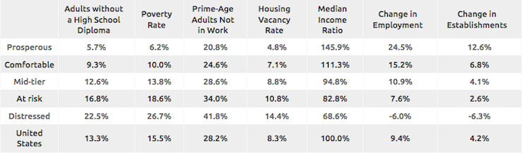
The research finds that:
1. “The 2017 DCI finds that 52.3 million Americans live in economically distressed communities-the one-fifth of zip codes that score worst on the DCI. That represents one in six Americans, or 17 percent of the U.S. population.”
2. “By comparison, 84.8 million Americans live in prosperous communities-the one-fifth of zip codes that score best on the DCI. These top-performing zip codes contain 27 percent of the country’s population, a far greater share than any other tier.”
3. “The average state has 15.2 percent of its population in a distressed community, but more than half of the Americans living in distressed communities reside in the South (compared to only 37.5 percent of the total population).”
4. “Prosperity is far more evenly distributed across the country, with 26.5 percent of the population of the average state living in a prosperous zip code.”
5. “Far from achieving even anemic growth from 2011 to 2015, distressed communities instead experienced what amounts to
a deep ongoing recession, with a 6.0 percent average decline in employment and a 6.3 percent average drop in business establishments.”
6. “Job growth in the average distressed zip code was negative from 2011 to 2015, trailing the average prosperous zip code by more than 30 points.”
7. “Distressed zip codes were the only group in which the number of both jobs and business establishments declined during the national recovery.”
8. “Distressed zip codes contain 35 percent of the country’s brown eld sites.”
9. “58 percent of adults in distressed zip codes have no education beyond high school.”
The Report also documents poorer health outcomes (higher mortality rates, lower life expectancy, higher incidence of mental and substance abuse disorders, poor women’s health outcomes, bad outcomes for those with disabilities) in distressed communities.
There are also gender and ethnic differences as expected (Blacks and Native Americans minorities dominate distressed communities).
“Blacks and Native Americans are three times more likely to live in a distressed community than a prosperous one.”
And political divisions are noted – “Democrats represent six of the 10 most distressed congressional districts” but that “Democrats and Republicans both represent large portions of America’s distressed population.”
The problem is that when such inequalities persist (what EIG termed “geographically exclusive growth”), the nation increasingly limits its “economic potential as a whole”, with the consequence of creating an increasingly “fractured … society”.
It is back to the old argument – that a society fracturing and breaking down starts to impose costs on those who have the benefit of wealth and are participating in the growth process.
Everyone is now jumping on the ‘inequality is bad for growth’ bandwagon now (even the IMF) because the results of the neoliberal experiment are maturing and revealing themselves to be unsustainable.
Conclusion
The September-quarter 2017 real GDP growth estimate showed a levelling out of growth at around 3 per cent per annum.
This builds on the strong growth in the June-quarter 2017.
While household consumption growth continues, it has clearly slowed, which might be signalling that the record levels of household indebtedness are starting to impinge.
A bright spot was the growth in private capital formation and net exports.
The negative contribution from the government sector continues.
In general, I conclude that the federal government’s deficit is now too low to support stronger growth and a rise in household saving, which will be necessary as the private debt levels rise further. Also, labour underutilisation rates (U6) remain elevated (and excessive).
And once again, reflect on the EIG Distressed Communities Report.
The EIG’s final conclusion is:
It is fair to wonder whether a recovery that excludes tens of millions of Americans and thousands of communities deserves to be called a recovery at all.
Which should always be borne in mind when considering the aggregate National Accounts data.
That is enough for today!
(c) Copyright 2017 William Mitchell. All Rights Reserved.
Thank you for a lucid analysis of the US economy, which I now understand with the help of MMT. It’s rather uncanny to see how the analysis can be applied directly to New Zealand.
Don’t worry, Trump is about to increase the federal deficit. Let’s wait and see if it increases growth.