It's Wednesday and I discuss a number of topics today. First, the 'million simulations' that…
Updating the impact of ageing labour force on US participation rates
Yesterday, I discussed the latest US labour market data, including the 0.4 percentage point drop in the participation rate, which is a large decline for a month. Whether that is subject to revision or not remains to be seen. The monthly data fluctuates quite a bit due to sampling errors and uncertainties regarding population benchmarks. It is clear that during the recession, many workers opted to stop searching for work because there was a dearth of jobs available. As a result, national statistics offices considered these workers to have stopped ‘participating’ and classified them as being ‘not in the labour force’, which had had the effect of attenuating the official estimates of unemployment and unemployment rates. These discouraged workers are considered to be in hidden unemployment. But the participation rates are also influenced by compositional shifts (changing shares) of the different demographic age groups in the working age population. In most nations, the population is shifting towards older workers who have lower participation rates. Thus some of the decline in the total participation rate could simply be an averaging issue. This blog updates my previous estimates for the US. The aggregate participation rate has been in decline since the beginning of this century and the compositional shifts account for around 73 per cent of the decline over that time.
I considered this issue in these blogs (among others):
1. Decomposing the decline in the US participation rate for ageing (July 22, 2014).
2. Democrats in glass houses – you know the rest! (February 22, 2016).
Basic LF arithmetic
The Labour Force Survey typically asks the respondents:
1. Did you work for at least one hour in the past week? Yes: counted as Employed. Then the respondent will be interrogated about whether they have enough hours of work and more.
2. If the answer was No, then the person is asked: (a) Are you willing to work?; and (b) Are you actively seeking work?
If the answers are: Yes, Yes, then the person is counted among the officially Unemployed.
If the answers are: Yes, No, then the person is counted as being Not in the Labour Force (NLF), that is, inactive.
The aggregates are E + U = the Labour Force (LF).
LF + NLF = Working Age Population (WAP).
The Labour Force Participation Rate (LFPR) = LF/WAP
The Unemployment rate (UR) = U/LF.
The Employment-Population ratio (EPOP) = Employment/WAP.
Interpreting declining participation rates
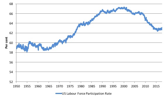
The following graph shows the aggregate participation rate from January 1950 to October 2017. The US aggregate participation rate peaked at 67.3 per cent in April 2000 (seasonally adjusted). Thereafter it has declined on trend with some reversions in between.
In October 2017, it stood at 62.7 per cent, a considerable fall since 2000.
A declining participation rate typically signals a slackening employment growth. If workers, facing little chance of gaining a job, stop actively searching for work, then the national statistics offices will classify these workers as not being in the labour force.
The labour force is the sum of all those above a threshold age level (usually 15 years) who are either in employment or unemployment and actively seeking work for which they are available.
So you see the issue, if an unemployed person becomes frustrated with their failure to gain employment – usually because there are not enough jobs to go around – and stop looking until things improve, the statistician will not classify them as being officially unemployment.
They are considered active and outside the labour force despite the fact that they would accept a job offer and be available for an immediate start.
In other words, conceptually they are wasted labour in the same way an unemployed person is wasted.
But by classifying them as being outside the labour force, this has the effect of attenuating the official estimates of unemployment and unemployment rates.
Economists consider these excluded ‘unemployed’ workers to be discouraged workers and conceptually enduring hidden unemployment.
These workers will typically reenter the labour force when jobs growth becomes stronger and so the participation rate rises again.
These swings in the participation rate are of a cyclical nature – they ebb and flow with the state of the economic cycle (how strong production and employment growth are).
That is clear enough.
But there are also trends that are separate from these cyclical swings in the participation rate.
The participation rates published by the statistician are averages of a variety of behaviour across the age spectrum, which I explain in more detail below.
It is clear that the decline in the aggregate participation rate began before the GFC hit the US.
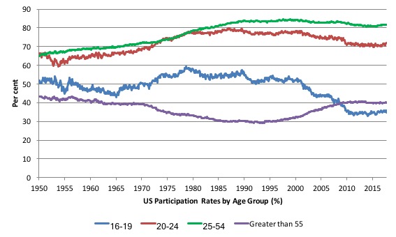
The next graph breaks the aggregate down into age groups. The prime age (25-54) and 20-24 groups have seen a tapering of their participation rates since the late 1980s.
There have been sharp declines in the participation rates for teenagers (16-19) since the late 1980s and a steady rise in participation rates for the over 55s.
The aggregate participation rate is a weighted-average of the participation rates of the different demographic groups. It is thus influenced by the shifting weights of its component parts (in this case, the age-weights) in the working age population.
These shifts in demographic shares of the working age population tend to be slow moving (trends) rather then cyclical.
But they certainly mean that movements in the aggregate participation rate is influenced by the compositional shifts (changing shares) of the different demographic age groups in the working age population.
In most nations, the population is shifting towards older workers who have lower participation rates even if these older worker participation rates are rising.
Thus, some of the decline in the total participation rate could simply being an averaging issue – more workers in the working age population who on average who have a lower participation rate.
That is, the participation rate could change without any underlying change in the behaviour of the different demographic groups.
The question of interest is: How much of the falling US labour force participation is due to the cyclical factors (slower economic activity, particularly associated with the GFC) and how much of it is due to the ageing of the population?
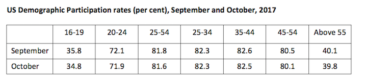
In yesterday’s blog – US labour market – uncertainty remains paramount with data volatility – presented this table, which shows the US participation rates for September and October 2017 for the different age groups within the Working Age Population in the US.
The major shift has been at the two ends of the age distribution: the teenage participation rate fell by 1 percentage point, while those above 45 years also saw significant declines.
So the decline in the overall participation rate is not a straightforward case of the ageing population or young people returning to school.
The gender split is also interesting.
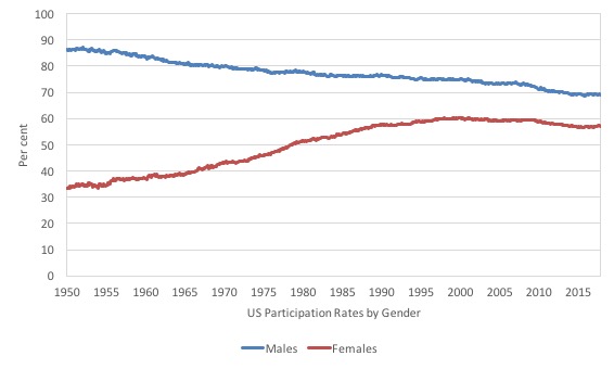
The following graph shows the US participation rates for males and females from January 1950 to October 2017. The massive shift in womens’ behaviour coupled with the long-term decline in male participation rates is evident.
Here are some other facts to help us understand what is going on between September and October:
1. The 0.4 percentage points decline in the aggregate participation was driven by nearly equal declines in the male and female rates.
2. For the 16-19 age cohort: overall -1.0 points; males -0.7 points; females -1.4 points.
3. For the 20-24 age cohort: overall -0.2 points; males -0.7 points; females +0.2 points.
4. For the 25-54 age cohort: overall -0.2 points; males -0.1 points; females -0.3 points.
5. For the Over 55s age cohort: overall -0.3 points; males -0.4 points; females -0.3 points.
The following graph shows the 15-24 NEET proportions for the US and the OECD average.
The OECD write that Youth not in employment, education or training (NEET) (Source):
… presents the share of young people who are not in employment, education or training (NEET), as a percentage of the total number of young people in the corresponding age group, by gender. Young people in education include those attending part-time or full-time education, but exclude those in non-formal education and in educational activities of very short duration. Employment is defined according to the OECD/ILO Guidelines and covers all those who have been in paid work for at least one hour in the reference week of the survey or were temporarily absent from such work. Therefore NEET youth can be either unemployed or inactive and not involved in education or training. Young people who are neither in employment nor in education or training are at risk of becoming socially excluded – individuals with income below the poverty-line and lacking the skills to improve their economic situation.
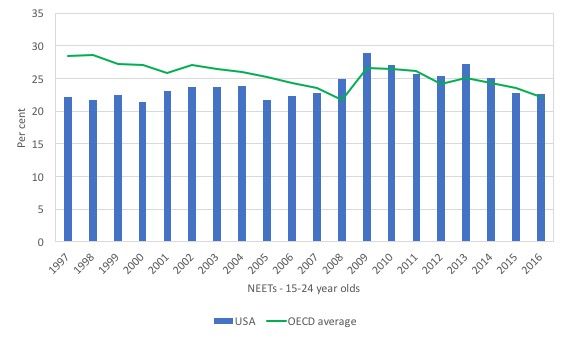
Two points to note:
1. The proportion of NEETs in the US and the OECD is alarmingly high. This is the future productivity we are considering and under neoliberalism, the austerity, which has created a lack of job opportunities for young people and failing education and training systems, is seriously undermining future prosperity.
That cost is hidden at present and being borne by the youth via income loss and other pathologies associated with dislocation. However, in decades to come, we will all rue this period of errant waste of potential.
2. While the US NEET proportion rose during the GFC, it has now fallen back to where it was pre-GFC. Still high but largely stabilised.
So this doesn’t account for the declining youth participation.
The ethnic breakdown is also instructive.
The following graph shows the participation rates for Whites (total, males and females) in the left panel and for Blacks (total, males and females) and Hispanics (total) in the right panel from January 1975 to October 2017. The vertical scales in both panels is the same to allow easy comparisons.
The data for Whites goes back further (from January 1954) and at the start of the sample the total participation rate was 58.1 per cent, with White males 86.1 per cent and White females 32.7 per cent.
So the decline in White males began much earlier than 1975 and the rise in White females began in the 1960s. Certainly the differences in participation behaviour between genders for Whites was much greater than for Blacks.
White participation declined sharply after the GFC whereas Black and Hispanic participation was less sensitive.
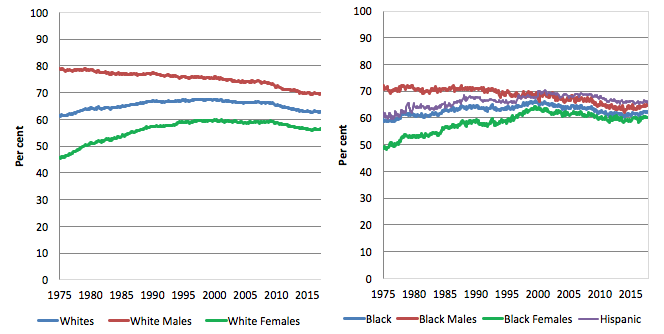
In the most recent month, White participation fell by 0.4 points (Males -0.2, Females -0.5); Black participation fell by 0.4 points (Males -0.8, Females +0.1); and Hispanics fell by 0.9 points.
Documenting the changing US Labour Force demographics
We have seen that there has been considerable change in the underlying demographics of the US labour market which have driven the changes in the aggregate participation rate.
To formalise how that might impact on the overall participation rate we need to take a few more conceptual steps.
The total participation rate (LFPR) is weighted average of the underlying participation rates of the demographic groups that make up the total Working Age Population (WAP).
We will stick to using: three broad groups – young workers 16-24 years old; prime-age workers 25-54 years old; and older workers 55 years and over. Note the US collect data for 16-19 years olds rather than 15-19, the latter being the age span favoured by most national statistical agencies.
The behaviour of the individual age cohorts within the prime-age category (25-34, 35-44, 45-54) is very similar and researchers often reduce the complexity of the problem by aggregating them together with little loss of information.
For those who like formulas we can write the total participation rate as (a weighted average):
LFPR(t) = (w16-24 x LFPR16-24) + (w25-54 x LFPR25-54) + (wGT55 x LFPRGT55)
In English this just says that the total LFPR at time t is equal to the weighted sum of the participation rates of the three demographic groups, where the weights are given by the share of each demographic group in the overall WAP.
The weights are calculated, for example as: w16-24 = Total Population of 16-24 year olds divided by Total WAP. And so on for the other two groups.
The following holds: w16-24 + w25-54 + wGT55 = 1
The weights proportionately segment the total WAP into the three age groups respective shares.
As we noted above, like any average, the total is influenced by the LFPR behaviour of the three groups and the weights each group has in the WAP.
For example, we could encounter a situation where the LFPRs for the three groups are unchanged but the total WAP becomes comprised of more of the GT55 group and less of the 16-24 groups and if LFPRGT55 < LFPR16-24, then the total LFPR will fall just because there are proportionately more people in the WAP who have lower participation rates.
So the decline would be a statistical artifact (and averaging phenomena) rather than signalling any behavioural changes among the individuals in the cohorts.
As we saw in the graph of the participation rate above, the peak participation rate in the US was recorded in April 2000. There has been considerable shifts in the labour force weights of the three groups since April 2000.
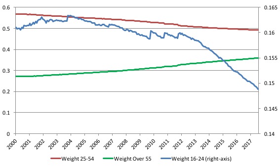
The next graph shows the changing weights of the three groups in the total Working Age Population (WAP) for the US from April 2000 (the peak participation rate month) to October 2017.
We note that Prime-age demographic (25-54 year olds) steadily declines as a share of the total WAP over the period shown. At that time, the share of older workers (GT55) in the total WAP started to rise steadily as the Prime-age persons moved into that category.
The US Youth participation rates (16-24), shown on the right-hand axis has declined over the same period. The absolute decline in weights are:
- 16-24: -1.22 percentage points
- 25-54: -7.57 percentage points
- Over 55: 8.79 percentage points
Since the GFC (from January 2008) the absolute decline in weights has been:
- 16-24: -1.2 percentage points
- 25-54: -4.7 percentage points
- Over 55: 5.9 percentage points
So almost all the decline in the youth weight has come since the GFC whereas the trends for the other cohorts were already well established prior to the GFC.
As an aside, this information allows you to see how scaling on a vertical axis can provide a very misleading impression. The youth decline is very small relative to the changes in the weights of the other two age groups.
The decline in the Prime-age weight has been less than the rise in the Older workers share because the Prime-age category is experiencing flows at both thresholds – the youth flow in and the older Prime-age workers flow out.
Decomposing Trend and Cycle components of participation rate change
Now we are in a position to answer our question: How much of that falling LFPR is due to the cyclical slowdown and how much of it is due to the ageing of the population?
To answer this question we have to establish a benchmark period in history and then analyse the shifts in relation to that benchmark.
Once that benchmark period is established, we can use the following formula to decompose the changes in the participation rate into cyclical (effects of recession and boom) and trend components (ageing etc).
The total LFPR peaked in April 2000 at 67.3 per cent. By October 2017, the participation rate had fallen to 62.7 per cent – a dramatic fall.
The difference between now and April 2000, given the current Working Age Population, is that some 11.8 million workers are no longer in the workforce. These workers would have been in the Labour Force if the participation rate had not fallen from its April 2000 peak.
The question is what happened to these workers? How many retired due to age and how many abandoned search due to recession?
In a recession, older workers typically reduce their participation rates because they are among the first to lose their jobs. They become discouraged workers, some retire prematurely, others take up disability support pensions (doctors take sympathy on them and give then an easy ride through the system), and others, still, start small business with payout cheques.
The GFC recession and its aftermath saw something quite different. Older workers have increased their participation rates.
So there is now a higher proportion of older workers seeking work. However, there are also more of these workers in the Working Age Population, which will reduce the weighted average total.
In a previous blog, I estimated the two effects – ageing and cycle – from April 2000 to June 2014 – see Decomposing the decline in the US participation rate for ageing.
However, we can use the same approach to estimate the impact of the shifting demographic composition of the Working Age Population on the Total LFPR from any point in time.
The last cycle basically ended in January 2008. We would thus expect shifts in the participation rate due to recession to accelerate from that point.
So the question I answer here is how much of the decline in participation since January 2008 is due to ageing effects as opposed from cyclical effects (recession)?
January 2008 is our benchmark and we can calculate the weighted average in the following way.
Instead of using the current weights to calculate the actual participation rate:
Actual LFPR(t) = (w16-24 x LFPR16-24) + (w25-54 x LFPR25-54) + (wGT55 x LFPRGT55)
We would use so-called fixed weights, where the relevant weights (proportions in the population) are fixed at their January 2008 values.
In other words, we are then considering the LFPR behaviour for each group weighted by the share of the WAP as at January 2008. That is, we are abstracting from the shifting weights.
The formula would be (in this case):
Fixed-weight LFPR(t) = (w16-24_January_2008 x LFPR16-24) + (w25-54_January_2008 x LFPR25-54) + (wGT55_January_2008 x LFPRGT55)
where the term (for example) w16-24_January_2008 is the share of 16-24 years olds in the WAP as at January 2008 and so on.
Then the difference between the two calculations – Actual LFPR(t) and Fixed-weight LFPR(t) – tells us the change in the participation rate that is due to changes in the age distribution of the Working Age Population since January 2008.
We can then isolate what the participation rate would be without any changes in the age distribution and thus see the impact of the cyclical changes.
Here are some numbers:
1. The actual participation rate in January 2008 was 66.2 per cent. In October 2017 it had fallen to 62.7 per cent.
2. The following weights applied in January 2008: 16-24 16.1 per cent of WAP; 25-54 53.9 per cent; and over 55s 30.3 per cent.
3. By October 2017, these weights were: 16-24 14.9 per cent of WAP; 25-54 49.1 per cent; and over 55s 35.9 per cent. So, quite a shift.
The following graph plots the two times series – the Actual LFPR(t) (using current weights) and Fixed-weight LFPR(t) (using January 2008 weights and thus denoting what the LFPR would be had the weights not changed).
The green line is just the participation rate at January 2008. The differences between the three lines provides the decomposition between ageing factors (shifting weights in the working age population) and other factors (which we presume to be cyclical given what has happened in this period).
The differences between the three lines are interpreted as follows:
1. A to C – is simply the total change in the actual participation rate since January 2008.
2. A to B – is the difference between the actual participation rate at January 2008 and what the participation rate would have been had there been no changes in the demographic weights – it is thus the cyclical effect.
2. B to C – is the difference between the actual participation rate and what the participation rate would have been had there been no changes in the demographic weights – it is thus the ageing effect.
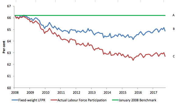
What does this mean?
1. The difference A to C is equal to 3.5 percentage points – which, given the Working Age Population in October 2017, represents an absolute loss of 8,955 thousand workers from the labour force due to the participation rate decline since January 2008.
2. If the population weights had not changed (that is, were still at the January 2008 benchmark) then the October 2017 participation rate would be 64.9 per cent rather than the actual rate of 62.7 per cent. This is the distance B to C and is thus 2.2 percentage points. This means that some 5,532 workers have left the labour force due to ageing (shifting weights).
3. That means that 1.3 percentage points drop in the participation rate is due to the cycle – some 3,324 thousand workers leaving the labour force due to a lack of employment opportunities.
These workers could be reasonably classified as additions to ‘hidden unemployed’, which suggests that they would return to the employed workforce if there was sufficient employment growth forthcoming. They would almost certainly work if a Job Guarantee was introduced.
4. The ageing effect thus accounts for 61.8 per cent of the decline in the participation rate, and the other (cyclical) effect accounts for 38.2 per cent of the decline in the participation rate since January 2008.
5. If we add the cyclical effect back into the labour force, and call these workers unemployed, then the adjusted ‘unemployment rate’ would be 6.1 per cent in October 2017 compared to the actual rate reported by the BLS of 4.1 per cent.
Which is quite a difference!
By way of summary and comparison, here is a table that captures the shifts using the April 2000 and January 2008 benchmarks.
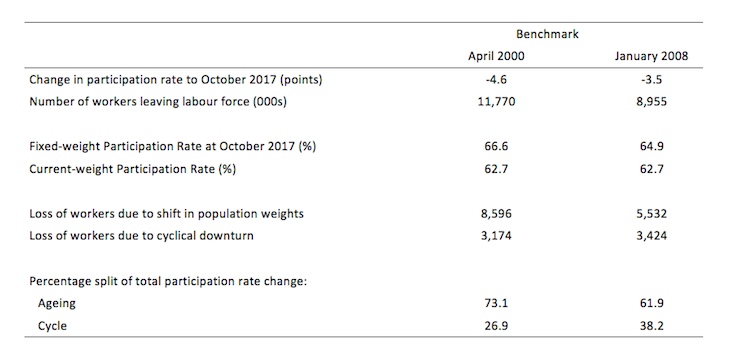
As expected, the cyclical effect is much stronger if we use the January 2008 benchmark. The on-going downward trend in participation rates was continuing but the cycle was more prominent in that period than previously.
Overall, since April 2000, 73 per cent of the decline in participation rates is due to ageing effects – more people in the older age groups that traditionally have lower participation rates (even though the average rate for the older cohort has increased).
Conclusion
The ageing of the US population is on-going and is also associated with a rising dependency ratio – less people working relative to the people not-working and dependent on the production of those in work.
This will require a boost in productivity of those in work or else material standards of living will fall or external trade deficits will have to rise.
The policy settings should reflect that – higher investment in the education and training of American youth, guaranteed jobs for those who are unable to find them to allow them to gain work experience and income security, and better public infrastructure across the board to encourage crowding-in of private investment.
At present, not much of that is going on.
That is enough for today!
(c) Copyright 2017 William Mitchell. All Rights Reserved.
You know… I can get opinion based on economic ‘theory’ on many different econ sites. Rarely, an analysis like you have provided in the last two posts though. Except for here.
I just want to thank you for that. And for treating your readers (and me) like adults who might want to look at the stats, and understand how you interpret them, in order to evaluate things themselves to see if they agree with your conclusions.
This is a tangential question but I hope someone can help me out here.
The other day, someone thought they could checkmate me on the impossibility of full employment by the irrefutable historic fact that in Australia:
the ratio of equivalent full-time positions to population has not and does not change
the ratio of equivalent full-time positions to adult workers has changed (more workers because women entered the workforce in the 1970s, therefore less jobs to go around)
therefore this explains rising unemployment rate, not the fact that we went from a full employment policy to a NAIRU policy
I smell a rat but not sure how to refute this argument. I suspect it assumes a zero-sum game where more labor participation does not result in more work opportunities. The “women entered the workforce” argument seems to be the reverse of the “robots are taking our jobs” argument
Any takers?
Anne: The MMT argument would be, that as long as there are real resources such as unemployed/underemployed workers and material available, there is potential for more jobs. The theory that gives us NAIRU, fails to recognize that.
The fact that capital may not see the opportunity for further investment is immaterial; jobs can always be created by the national money issuing branch of government, through direct funding. This holds true up to the point were with full participation the unemployment rate is so low that it becomes likely that the unemployment rate just reflects the numbers of people moving from one job to another, historically taken to be around 2%.
Any government that claims to have achieved near full employment at higher levels of unemployment isn’t telling the truth.
Thanks JC
So that argument overlooks the fact that underutilised resources, means more jobs are possible. In rel to women just means household labor might be underutilised or unvalued.
Anne: Yes! The twin goals of maintaining full employment and price stability, significantly broadens the definition of an economically viable job paid at a living wage.