Today (April 18, 2024), the Australian Bureau of Statistics released the latest - Labour Force,…
Australian labour market – steady to finish a relatively good year
The latest labour force data released today by the Australian Bureau of Statistics – Labour Force data – for December 2017 shows that the Australian labour market was relatively steady in December 2017, with both relatively strong employment growth and a rising participation rate. Unemployment rose due to the sharp rise in the participation rate following on the stronger employment growth. The teenage labour market however did not enjoy the benefits of this growth and went backwards. Further, underemployment rose sharply as did the broad labour underutilisation rate signifying that the Australian labour market still is a fair distance away form full employment. Overall, my assessment remains – the labour market has improved over 2017 but still fluctuates between good and bad from month to month and has a lot of slack remaining. We are not yet in a position to say that there is a sustained growth path ahead.
The summary ABS Labour Force (seasonally adjusted) estimates for December 2017 are:
- Employment increased 34,700 (0.3 per cent) – Full-time employment increased 15,100 and part-time employment increased 19,500.
- Unemployment increased 20,500 to 730,600.
- The official unemployment rate increased 0.1 points to 5.5 per cent.
- The participation rate increased by 0.2 points to 65.7 per cent. It is now approaching its previous peak (December 2010) of 65.8 per cent.
- Aggregate monthly hours worked decreased 4.2 million hours (0.2 per cent).
- The monthly (unadjusted) estimates show that underemployment rose sharply by 0.4 points to 8.9 per cent in December 2017. The total labour underutilisation rate (unemployment plus underemployment) rose by 0.7 points to 14.3 per cent. Both underemployment and unemployment rose in December 2017. There were 1,186.4 thousand persons underemployed and a total of 1,903.1 thousand workers either unemployed or underemployed.
Employment growth – positive but weaker
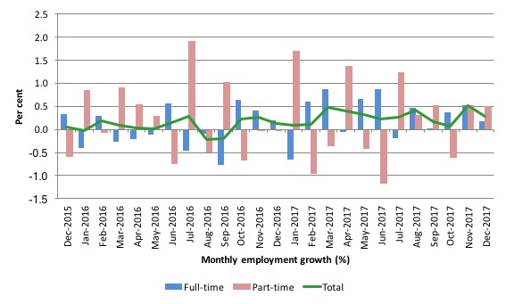
Employment growth in November was weaker in December but still positive with a net job increase of 34,700 (0.3 per cent). Full-time employment increased 15,100 and part-time employment increased 19,500.
We observed a zig-zag pattern in total employment growth up until the end of 2016 switching around the zero growth line. The oscillating pattern has continued into 2017 but the level has risen above the zero line.
The following graph shows the month by month growth in full-time (blue columns), part-time (grey columns) and total employment (green line) for the 24 months to December 2017 using seasonally adjusted data.
It gives you a good impression of just how flat employment growth had been leading into 2017 and the increasingly better performance in 2017.
Overall: today’s result is steady.
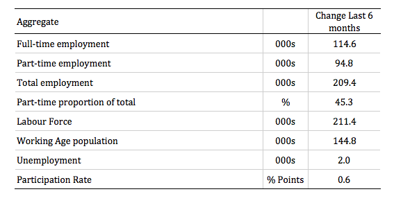
The following table provides an accounting summary of the labour market performance over the last six months. The monthly data is highly variable so this Table provides a longer view which allows for a better assessment of the trends.
Full-time employment has risen risen by 114.6 thousand jobs (net) over the last 6 months, while part-time employment has risen by 94.8 thousand jobs. This reverses the 2016 and early 2017 bias which saw employment growth dominated by part-time job creation.
The situation over the last six months has been more balanced, but part-time employment is still disproportionately represented in the total employment change.
Overall there have been 209.4 thousand jobs (net) added in Australia over the last six months while the labour force has increased by 211 thousand. The result has been that unemployment has risen by 2 thousand.
In other words, while employment growth has lifted in the second-half of 2017, with participation rising, the labour force growth has outstripped the growth in net jobs. This is a common phenomenon as a recovery consolidates.
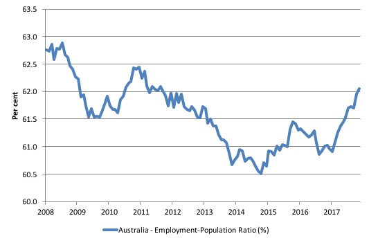
Given the variation in the labour force estimates, it is sometimes useful to examine the Employment-to-Population ratio (%) because the underlying population estimates (denominator) are less cyclical and subject to variation than the labour force estimates. This is an alternative measure of the robustness of activity to the unemployment rate, which is sensitive to those labour force swings.
The following graph shows the Employment-to-Population ratio, since February 2008 (the low-point unemployment rate of the last cycle).
It dived with the onset of the GFC, recovered under the boost provided by the fiscal stimulus packages but then went backwards again as the last Federal government imposed fiscal austerity in a hare-brained attempt at achieving a fiscal surplus.
The ratio began rising in December 2014 which suggested to some that the labour market had bottomed out and would improve slowly as long as there are no major policy contractions or cuts in private capital formation.
The series turned again as overall economic activity weakened.
However, since January 2017 when the ratio was 61 per cent, the situation has improved quite significantly and the ratio rose by 0.2 points to 61.9 after being stationary between August and October.
It rose by 0.1 points in December 2017
The series remains a 0.8 percentage points below the April 2008 peak of 62.9 per cent.
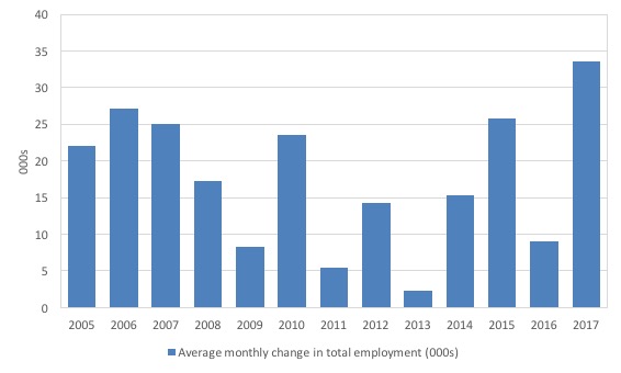
To put the current monthly performance into perspective, the following graph shows the average monthly employment change for the calendar years from 2005 to 2017.
It is clear that after some lean years, 2017 was a much stronger year if total employment is the indicator.
Teenage labour market – 15-19 year olds fail to share employment growth
The steady overall employment growth in December was accompanied by a decline in teenage employment growth.
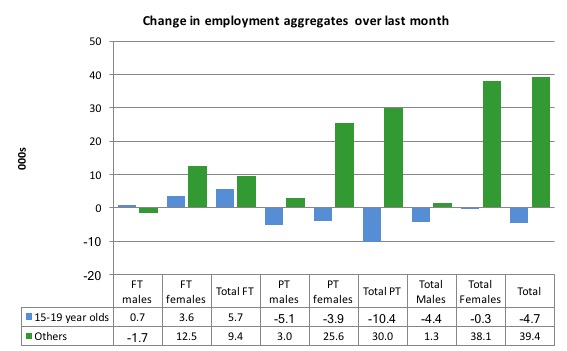
Full-time teenage employment rose by 5.7 thousand in December 2017 (reversing the similar decline in November), while part-time employment fell by 10.4 thousand (reversing the similar rise in November).
As a result, total employment fell by 4.7 thousand (net) in December 2017.
The following graph shows the distribution of net employment creation in the last month by full-time/part-time status and age/gender category (15-19 year olds and the rest)
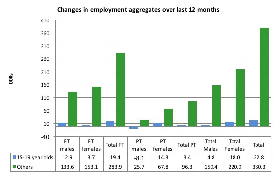
Over the last 12 months, however, teenagers have gained 22.8 thousand (net) jobs overall while the rest of the labour force have gained 380.3 thousand net jobs.
Teenagers are around 6.1 per cent of the total labour force and their share in employment growth over the last 12 months has been 5.6 per cent (that is, disproportionately low).
The following graph shows the change in aggregates over the last 12 months.
In terms of the current cycle, which began after the last low-point unemployment rate month (February 2008), the following results are relevant:
1. Since February 2008, there have been only 1,793.2 thousand (net) jobs added to the Australian economy but teenagers have lost a staggering 101.7 thousand over the same period.
2. Since February 2008, teenagers have lost 114.9 thousand full-time jobs (net).
3. Even in the traditionally, concentrated teenage segment – part-time employment, teenagers have gained only 13.2 thousand jobs (net) even though 915.3 thousand part-time jobs have been added overall. That is, the teenage share has been 1.4 per cent while its share of the labour force is 6.1 per cent.
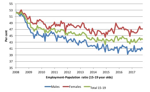
To put the teenage employment situation in a scale context (relative to their size in the population) the following graph shows the Employment-Population ratios for males, females and total 15-19 year olds since February 2008.
You can interpret this graph as depicting the loss of employment relative to the underlying population of each cohort. We would expect (at least) that this ratio should be constant if not rising somewhat (depending on school participation rates).
The facts are that the absolute loss of jobs reported above is depicting a very difficult situation for our teenagers. Males, in particular, have lost out severely as a result of the economy being deliberately stifled by austerity policy positions.
In the latter months of 2015, with the part-time employment situation improving, there was some reversal in the downward trends in these ratios.
The December 2017 result showed that the male ratio fell by 0.6 points to 40.7 per cent, the female ratio remained unchanged on 47.1 and the overall ratio fell by 0.3 points to 43.8 per cent.
The male ratio has fallen by 11.8 percentage points since February 2008, the female ratio has fallen by 5.1 percentage points and the overall teenage employment-population ratio has fallen by 8.5 percentage points.
The other staggering statistic relating to the teenage labour market is the decline in the participation rate since the beginning of 2008 when it peaked in January at 61.4 per cent.
In December 2017, the participation rate fell 1 percentage point to 53.6 per cent.
But the difference between the 2008 level, amounts to an additional 117.1 thousand teenagers who have dropped out of the labour force as a result of the weak conditions since the crisis.
If we added them back into the labour force the teenage unemployment rate would be 28.7 per cent rather than the official estimate for December 2017 of 18.2 per cent.
Some may have decided to return to full-time education and abandoned their plans to work. But the data suggests the official unemployment rate is significantly understating the actual situation that teenagers face in the Australian labour market.
Overall, the performance of the teenage labour market remains fairly poor. It doesn’t rate much priority in the policy debate, which is surprising given that this is our future workforce in an ageing population. Future productivity growth will determine whether the ageing population enjoys a higher standard of living than now or goes backwards.
I continue to recommend that the Australian government immediately announce a major public sector job creation program aimed at employing all the unemployed 15-19 year olds, who are not in full-time education or a credible apprenticeship program.
Unemployment rose by 20,500 to 730,6000
The official unemployment rate rose by 0.1 points to 5.5 per cent in December 2017, because the continuing rise in the participation rate outstripped the employment growth.
The combination of rising unemployment and rising employment is usually a sign of an improving economy and continues to be so until the participation rate has stabilised at a new cyclical high.
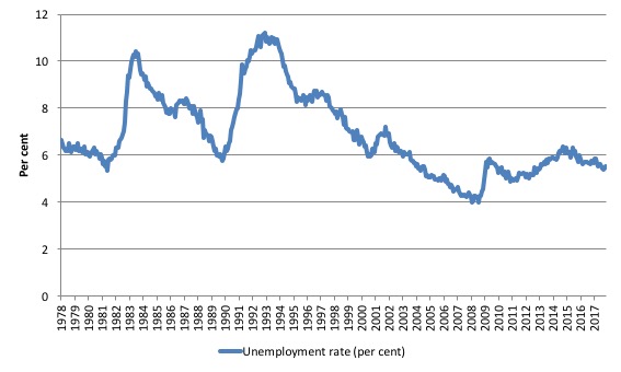
The following graph shows the national unemployment rate from February 1978 to December 2017. The longer time-series helps frame some perspective to what is happening at present.
After falling steadily as the fiscal stimulus pushed growth along, the unemployment rate slowly trended up for some months.
It is now still 0.6 points above the level it fell to as a result of the fiscal stimulus and 1.5 points above the level reached before the GFC began.
Conclusion: there is still considerable slack in the labour market that should be absorbed with fiscal stimulus.
Broad labour underutilisation – at 14.3 per cent
The ABS publishes monthly and quarterly labour underutilisation data. The quarterly data for the November-quarter 2017 was published last month.
So we use the monthly (unadjusted series) this month, which tells us:
1. Underemployment was estimated to be 8.9 per cent of the labour force (up 0.4 points).
2. The total labour underutilisation rate (unemployment plus underemployment) was 14.3 per cent (up 0.7 points).
3. There were 1,186.4 thousand persons underemployed and a total of 1,903.1 thousand workers either unemployed or underemployed.
So even with steady employment growth, the Australian labour market has nearly 2 million workers available for work who cannot find sufficient hours.
In terms of the quarterly data, the following graph plots the seasonally-adjusted underemployment rate in Australia since February 1978 to the November-quarter 2017.
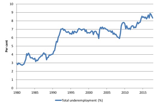
The next graph shows the evolution of the broad underutilisation rate over the same period. You can see the three cyclical peaks corresponding to the 1982, 1991 recessions and the more recent downturn.
Unemployment was a higher proportion of the two earlier peaks but underemployment now dominates the current cycle (just).
The other difference between now and the two earlier cycles is that the recovery triggered by the fiscal stimulus in 2008-09 did not persist and as soon as the ‘fiscal surplus’ fetish kicked in in 2012, things went backwards very quickly.
The two earlier peaks were sharp but steadily declined. The last peak fell away on the back of the stimulus but turned again when the stimulus was withdrawn.
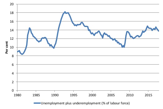
If hidden unemployment (given the depressed participation rate) is added to the broad ABS figure the best-case (conservative) scenario would see a underutilisation rate well above 15 per cent at present. Please read my blog – Australian labour underutilisation rate is at least 13.4 per cent – for more discussion on this point.
The next quarterly update will be for the February-quarter 2018 and will be published published in the March 2018 Labour Force release. In between those releases, the monthly estimates will guide our thinking.
Aggregate participation rate – rose 0.2 points to 65.7 per cent
There is considerable monthly fluctuation in the participation rate but the current rate of 65.7 per cent is now approaching its most recent peak in November 2010 of 65.8 per cent.
What would the unemployment rate be if the participation rate was at the last November 2010 peak level value?
The following graph tells us what would have happened if the participation rate had been constant over the period November 2010 to December 2017. The blue line is the official unemployment rate since its most recent low-point of 4 per cent in February 2008.
The red line starts at November 2010 (the peak participation month). It is computed by adding the workers that left the labour force as employment growth faltered (and the participation rate fell) back into the labour force and assuming they would have been unemployed. At present, this cohort is likely to comprise a component of the hidden unemployed (or discouraged workers).
With the rise in participation in recent months, the red line has fallen and is now approaching the actual unemployment rate.
That means that the cylical fall in the participation rate since November 2010 has been reversed.
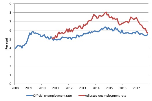
1. Total official unemployment in December 2017 was estimated to be 730.6 thousand.
2. Unemployment would be 750 thousand if participation rate was at its November 2010 peak.
3. The unemployment rate would now be 5.7 per cent rather than the official December 2017 estimate of 5.7 per cent.
The difference between the two numbers mostly reflects, the change in hidden unemployment (discouraged workers) since November 2010. These workers would take a job immediately if offered one but have given up looking because there are not enough jobs and as a consequence the ABS classifies them as being Not in the Labour Force.
There has been some change in the age composition of the labour force (older workers with low participation rates becoming a higher proportion) but this only accounts for less than 1/3 of the shift. The rest is undoubtedly accounted for by the rise in hidden unemployment.
Note, the gap between the blue and red lines doesn’t sum to total hidden unemployment unless November 2010 was a full employment peak, which it clearly was not. The interpretation of the gap is that it shows the extra hidden unemployed since that time.
This gap shrinks as participation rises relative to the November 2010 peak.
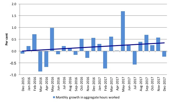
Hours worked – fell by 4.2 million hours (0.2 per cent))
Hours worked fell by 4.2 million hours (0.2 per cent) in December 2017.
Over the previous four months, monthly hours growth has been consistently positive reflecting the recent bias to full-time employment growth.
The following graph shows the monthly growth (in per cent) over the last 24 months. The dark linear line is a simple regression trend of the monthly change – which depicts an modest upward trend – driven mostly by the outlier in May 2017.
You can see the pattern of the change in working hours is also portrayed in the employment graph – zig-zagging across the zero growth line although less so in 2017.
Conclusion
My standard monthly warning: we always have to be careful interpreting month to month movements given the way the Labour Force Survey is constructed and implemented.
Today’s figures show that the Australian labour market was relatively steady in December 2017, with both relatively strong employment growth and a rising participation rate.
Unemployment rose due to the sharp rise in the participation rate following on the stronger employment growth.
The teenage labour market however did not enjoy the benefits of this growth and went backwards.
Further, underemployment rose sharply as did the broad labour underutilisation rate signifying that the Australian labour market still is a fair distance away form full employment.
Overall, my assessment remains – the labour market has improved over 2017 but still fluctuates between good and bad from month to month and has a lot of slack remaining.
We are not yet in a position to say that there is a sustained growth path ahead.
That is enough for today!
(c) Copyright 2018 William Mitchell. All Rights Reserved.
This Post Has 0 Comments