Today (April 18, 2024), the Australian Bureau of Statistics released the latest - Labour Force,…
Australian labour market – weakens further in March 2018
The Australian Bureau of Statistics released the latest – Labour Force, Australia, March 2018 – today which showed that the Australian labour market has weakened further in the first three months of 2018 and is decidely weaker when compared to 2017. Employment growth was virtually zero (4,900 net increase) in March 2018 and participation fell, suppressing the otherwise inevitable rise in unemployment, which would have accompanied the weak employment growth. Unemployment fell slightly but only because the participation rate fell. Had the participation rate been constant across the months, the unemployment rate would have been 5.7 per cent rather than the official rate for March 2017 of 5.5 per cent. Further, underemployment rose marginally as did the broad labour underutilisation rate, which stands at 14.3 per cent (nearly 1.9 million workers are either without work or do not have sufficient hours of work. The teenage labour market was slightly improved. Overall, my assessment is that the Australian labour market has weakened again in March and remains a considerable distance from full employment. There is a lot of slack remaining and defies the foolish calls in recent days from those demanding reductions in the fiscal deficit.
The summary ABS Labour Force (seasonally adjusted) estimates for March 2018 are:
- Employment increased 4,900 (0.04 per cent) – Full-time employment decreased 19,900 and part-time employment increased 24,800.
- Unemployment decreased 2,400 to 730,200.
- The official unemployment rate was steady at 5.5 per cent.
- The participation rate decreased by 0.1 points to 65.5 per cent, which is still below its previous peak (December 2010) of 65.8 per cent.
- Aggregate monthly hours worked increased 4.5 million hours (0.26 per cent).
- The estimates for the March 2018 show that underemployment rose by 11.3 thousand and was estimated to be 8.4 per cent of the labour force (up 0.1 points from February 2018). The total labour underutilisation rate (unemployment plus underemployment) was stable at 14.3 per cent. There were 1,136.6 thousand persons underemployed and a total of 1,891.9 thousand workers either unemployed or underemployed.
Employment growth – positive but the weakness continues
Employment growth weakened further again in March with a net job increase of just 4,900 (0.04 per cent).
Full-time employment decreased 19,900 and part-time employment increased 24,800. So this took the edge of the so-called full-time jobs boom that the politicians were boasting about last month.
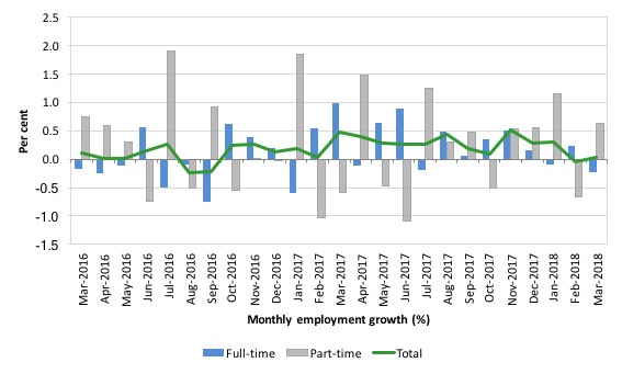
We observed a zig-zag pattern in total employment growth up until the end of 2016 switching around the zero growth line. The oscillating pattern has continued into 2017 but the level has risen above the zero line.
The following graph shows the month by month growth in full-time (blue columns), part-time (grey columns) and total employment (green line) for the 24 months to March 2018 using seasonally adjusted data.
It gives you a good impression of just how flat employment growth had been leading into 2017.
And the trend is decidedly down in the first months of 2018.
Overall: today’s result signals a sustained weaker labour market.
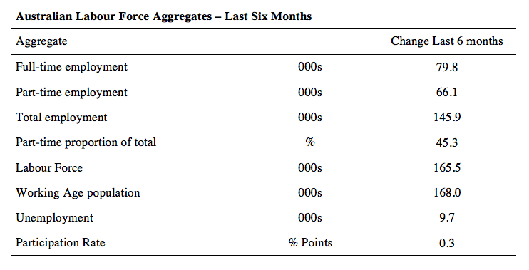
The following table provides an accounting summary of the labour market performance over the last six months. The monthly data is highly variable so this Table provides a longer view which allows for a better assessment of the trends.
Overall there have been only 145.9 thousand jobs (net) added in Australia over the last six months while the labour force has increased by 165.5 thousand. The result has been that unemployment has risen by 9.7 thousand.
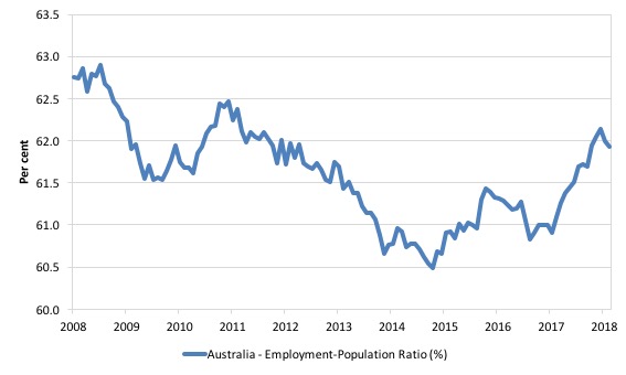
Given the variation in the labour force estimates, it is sometimes useful to examine the Employment-to-Population ratio (%) because the underlying population estimates (denominator) are less cyclical and subject to variation than the labour force estimates. This is an alternative measure of the robustness of activity to the unemployment rate, which is sensitive to those labour force swings.
The following graph shows the Employment-to-Population ratio, since February 2008 (the low-point unemployment rate of the last cycle).
It dived with the onset of the GFC, recovered under the boost provided by the fiscal stimulus packages but then went backwards again as the last Federal government imposed fiscal austerity in a hare-brained attempt at achieving a fiscal surplus.
The ratio began rising in December 2014 which suggested to some that the labour market had bottomed out and would improve slowly as long as there are no major policy contractions or cuts in private capital formation.
The series turned again as overall economic activity weakened.
But the ratio fell 0.1 points in March 2018 back to 61.9 remains well below pre-GFC peak in April 2008 of 62.9 per cent.
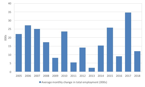
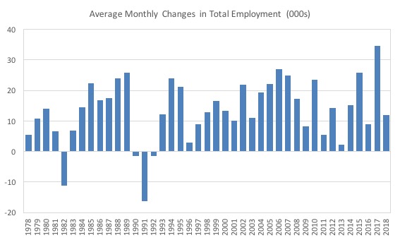
To put the current monthly performance into perspective, the following graph shows the average monthly employment change for the calendar years from 2005 to 2018 (the 2018 result is up to March only).
It is clear that after some lean years, 2017 was a much stronger year if total employment is the indicator.
It is also clear that the labour market has weakened considerably in the first three months of 2018.
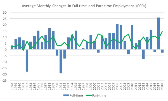
To provide a longer perspective, the following graphs shows the average monthly changes in Total employment (upper panel), and Full-time and Part-time employment (lower panel) in thousands since 1978 (when the current dataset began).
The 2018 average is for January and February only so is not definitive.
The interesting result is that during recessions or slow-downs, it is full-time employment that takes the bulk of the adjustment. Even when full-time employment growth is negative, part-time employment continues to grow.
Teenage labour market – 15-19 year olds slight increase in employment growth
Total teenage employment rose by 1.5 thousand jobs in March.
Full-time teenage employment rose by 1.3 thousand, while part-time employment fell by 0.2 thousand.
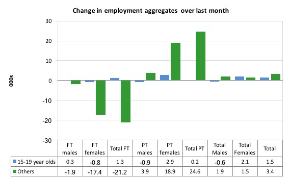
The following graph shows the distribution of net employment creation in the last month by full-time/part-time status and age/gender category (15-19 year olds and the rest)
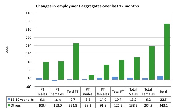
Over the last 12 months, however, teenagers have gained 22.5 thousand (net) jobs overall while the rest of the labour force have gained 343.1 thousand net jobs.
Teenagers are around 6.1 per cent of the total labour force and their share in employment growth over the last 12 months has been proportional, meaning their relative position has not changed.
The following graph shows the change in aggregates over the last 12 months.
In terms of the current cycle, which began after the last low-point unemployment rate month (February 2008), the following results are relevant:
1. Since February 2008, there have been only 1,836.6 thousand (net) jobs added to the Australian economy but teenagers have lost a staggering 87.5 thousand over the same period.
2. Since February 2008, teenagers have lost 113.6 thousand full-time jobs (net).
3. Even in the traditionally, concentrated teenage segment – part-time employment, teenagers have gained only 26.1 thousand jobs (net) even though 963.5 thousand part-time jobs have been added overall. That is, the teenage share has been 2.7 per cent while its share of the labour force is 6.1 per cent.
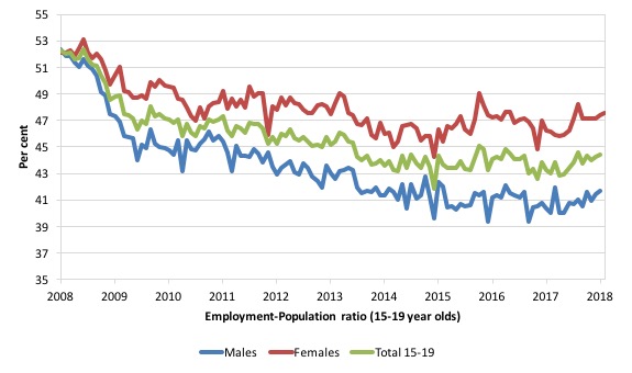
To put the teenage employment situation in a scale context (relative to their size in the population) the following graph shows the Employment-Population ratios for males, females and total 15-19 year olds since February 2008.
You can interpret this graph as depicting the loss of employment relative to the underlying population of each cohort. We would expect (at least) that this ratio should be constant if not rising somewhat (depending on school participation rates).
The facts are that the absolute loss of jobs reported above is depicting a very difficult situation for our teenagers. Males, in particular, have lost out severely as a result of the economy being deliberately stifled by austerity policy positions.
In the latter months of 2015, with the part-time employment situation improving, there was some reversal in the downward trends in these ratios.
The male ratio has fallen by 10.8 percentage points since February 2008, the female ratio has fallen by 4.6 percentage points and the overall teenage employment-population ratio has fallen by 7.8 percentage points.
The other staggering statistic relating to the teenage labour market is the decline in the participation rate since the beginning of 2008 when it peaked in February at 61.4 per cent.
In March 2018, the participation rate was 54.4 per cent (down 0.6 percentage points).
The difference between the 2008 level, amounts to an additional 95.8 thousand teenagers who have dropped out of the labour force as a result of the weak conditions since the crisis.
If we added them back into the labour force the teenage unemployment rate would be 26.8 per cent rather than the official estimate for March 2018 of 18.2 per cent.
Some may have decided to return to full-time education and abandoned their plans to work. But the data suggests the official unemployment rate is significantly understating the actual situation that teenagers face in the Australian labour market.
Overall, the performance of the teenage labour market remains fairly poor. It doesn’t rate much priority in the policy debate, which is surprising given that this is our future workforce in an ageing population. Future productivity growth will determine whether the ageing population enjoys a higher standard of living than now or goes backwards.
I continue to recommend that the Australian government immediately announce a major public sector job creation program aimed at employing all the unemployed 15-19 year olds, who are not in full-time education or a credible apprenticeship program.
Unemployment decreased 2,400 to 730,200
The official unemployment rate was steady at 5.5 per cent in March 2018 on the back of the subdued employment growth. Only a falling participation rate helped to keep the rate from rising (see below).
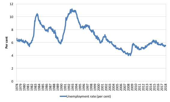
The following graph shows the national unemployment rate from February 1978 to March 2018. The longer time-series helps frame some perspective to what is happening at present.
After falling steadily as the fiscal stimulus pushed growth along, the unemployment rate slowly trended up for some months.
It is now still 0.6 points above the level it fell to as a result of the fiscal stimulus and 1.5 points above the level reached before the GFC began.
Conclusion: there is still considerable slack in the labour market that should be absorbed with fiscal stimulus.
Broad labour underutilisation rose to 14.3 per cent
The ABS publishes monthly and quarterly labour underutilisation data. The quarterly data for the February-quarter 2017 was published last month.
So for this month, we use the monthly data.
The results are:
1. Underemployment rose by 11.3 thousand and was estimated to be 8.4 per cent of the labour force (up 0.1 points from February 2018).
2. The total labour underutilisation rate (unemployment plus underemployment) was stable at 14.3 per cent.
3. There were 1,136.6 thousand persons underemployed and a total of 1,891.9 thousand workers either unemployed or underemployed.
So even with steady employment growth, the Australian labour market has nearly 1.9 million workers available for work who cannot find sufficient hours.
In terms of the quarterly data, the following graph plots the seasonally-adjusted underemployment rate in Australia since February 1978 to the February-quarter 2018 (blue line) and the broad underutilisation rate over the same period (green line).
The difference between the two lines is the unemployment rate.
You can see the three cyclical peaks corresponding to the 1982, 1991 recessions and the more recent downturn.
The other difference between now and the two earlier cycles is that the recovery triggered by the fiscal stimulus in 2008-09 did not persist and as soon as the ‘fiscal surplus’ fetish kicked in in 2012, things went backwards very quickly.
The two earlier peaks were sharp but steadily declined. The last peak fell away on the back of the stimulus but turned again when the stimulus was withdrawn.

If hidden unemployment (given the depressed participation rate) is added to the broad ABS figure the best-case (conservative) scenario would see a underutilisation rate well above 17 per cent at present. Please read my blog – Australian labour underutilisation rate is at least 13.4 per cent – for more discussion on this point.
The next quarterly update will be for the May-quarter 2018 and will be published published in the June 2018 Labour Force release. In between those releases, the monthly estimates will guide our thinking.
Aggregate participation rate – fell 0.1 points to 65.5 per cent
Unemployment fell by 2,400 this month but if the participation rate had not fallen, total unemployment and the unemployment rate would have risen.
By how much?
The labour force is a subset of the working-age population (those above 15 years old). The proportion of the working-age population that constitutes the labour force is called the labour force participation rate. Thus changes in the labour force can impact on the official unemployment rate, and, as a result, movements in the latter need to be interpreted carefully. A rising unemployment rate may not indicate a recessing economy.
The labour force can expand as a result of general population growth and/or increases in the labour force participation rates.
What would have the unemployment rate been had the participation rate not fallen by 0.1 points in March 2018?
The following Table shows the breakdown in the changes to the main aggregates (Labour Force, Employment and Unemployment) and the impact of the rise in the participation rate.
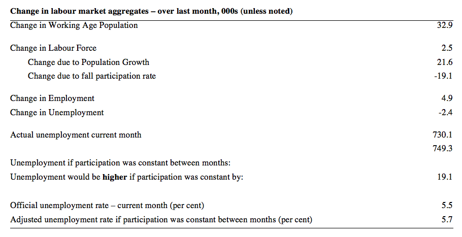
The change in the labour force in March 2018 was the outcome of two separate factors:
- The underlying population growth added 21.6 thousand persons to the labour force. The population growth impact on the labour force aggregate is relatively steady from month to month but has slowed in recent months; and
- The fall in the participation rate meant that there were 19.1 thousand workers dropping out of the labour force (relative to what would have occurred had the participation rate remained unchanged).
- The net result was the rise in the labour force of 2.5 thousand (rounded).
If the participation rate had not have fallen, total unemployment, at the current employment level, would have been 749.3 thousand rather than the official count of 730.1 thousand as recorded by the ABS – a difference of 19.1 thousand workers (the ‘participation effect’).
Thus, without the fall in the participation rate in January 2018, the unemployment rate would have been 5.7 per cent (rounded) rather than its current value of 5.5 per cent.
The conclusion is that hidden unemployment rose slightly in March 2018 along with underemployment – a sign of a weakening situation.
There is considerable monthly fluctuation in the participation rate but the current rate of 65.5 per cent is still below its most recent peak in November 2010 of 65.8 per cent.
What would the unemployment rate be if the participation rate was at the last November 2010 peak level value?
The following graph tells us what would have happened if the participation rate had been constant over the period November 2010 to January 2018. The blue line is the official unemployment rate since its most recent low-point of 4 per cent in February 2008.
The red line starts at November 2010 (the peak participation month). It is computed by adding the workers that left the labour force as employment growth faltered (and the participation rate fell) back into the labour force and assuming they would have been unemployed. At present, this cohort is likely to comprise a component of the hidden unemployed (or discouraged workers).
With the rise in participation in recent months, the red line has fallen but is still above the actuall unemployment rate.
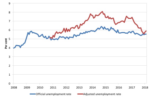
1. Total official unemployment in January 2018 was estimated to be 730.2 thousand.
2. Unemployment would be 781 thousand if participation rate was at its November 2010 peak.
3. The unemployment rate would now be 5.9 per cent rather than the official March 2018 estimate of 5.5 per cent.
The difference between the two numbers mostly reflects, the change in hidden unemployment (discouraged workers) since November 2010. These workers would take a job immediately if offered one but have given up looking because there are not enough jobs and as a consequence the ABS classifies them as being Not in the Labour Force.
There has been some change in the age composition of the labour force (older workers with low participation rates becoming a higher proportion) but this only accounts for less than 1/3 of the shift. The rest is undoubtedly accounted for by the rise in hidden unemployment.
Note, the gap between the blue and red lines doesn’t sum to total hidden unemployment unless November 2010 was a full employment peak, which it clearly was not. The interpretation of the gap is that it shows the extra hidden unemployed since that time.
This gap shrinks as participation rises relative to the November 2010 peak.
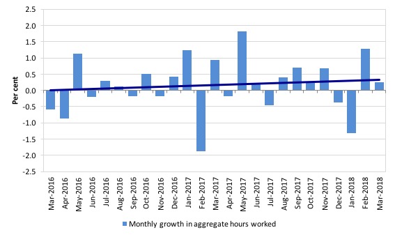
Hours worked – increased modestly by 4.5 million hours (0.26 per cent).
The weakening in the labour market showed up in the working hours series as the graph below shows.
The following graph shows the monthly growth (in per cent) over the last 24 months. The dark linear line is a simple regression trend of the monthly change – which depicts an modest upward trend – distorted somewhat by the outlier in May 2017 (the trend would have been more sharply downward without that positive spike).
You can see the pattern of the change in working hours is also portrayed in the employment graph – zig-zagging across the zero growth line although less so in 2017.
Conclusion
My standard monthly warning: we always have to be careful interpreting month to month movements given the way the Labour Force Survey is constructed and implemented.
Today’s figures show that the Australian labour market has weakened further in the first three months of 2018 and is decidely weaker when compared to 2017.
Employment growth was virtually zero (4,900 net increase) in March 2018 and participation fell, suppressing the otherwise inevitable rise in unemployment, which would have accompanied the weak employment growth.
The teenage labour market was slightly improved.
Further, underemployment rose marginally as did the broad labour underutilisation rate.
Taken together, my overall assessment is:
1. The labour market has weakened again in March.
2. It remains a considerable distance from full employment.
That is enough for today!
(c) Copyright 2018 William Mitchell. All Rights Reserved.
From where I’m observing, Western Australia, the economy is fairing more poorly than the rest of Australia. Unemployment has risen from 6.1% to 6.9% and with 10% of the population WA attributed for ~25% of personal insolvencies. Our economy is certainly in reverse. We have had an uninspiring solution from the Chamber of Commerce and Industry WA to extend our retail hours. However, if people don’t have a decent income and are insolvent then how will this work?
I can’t see it either Lisa.
Extending retail hours might work to generate more revenue if shop windows and walls are groaning under the weight of all the customers trying to get inside and spend money but are locked out because of closing hours but if the problem is a lack of demand then that won’t help.
I’m pretty sure the WA Chamber of Commerce understands that reality, seems to me that they just figure that the situation is creating an opportunity to get some legislation they’ve long wanted pushed through.