Today (April 18, 2024), the Australian Bureau of Statistics released the latest - Labour Force,…
US labour market tepid – there is plenty of scope fiscal expansion
On May 4, 2018, the US Bureau of Labor Statistics (BLS) released their latest labour market data – Employment Situation Summary – April 2018 – which showed that total non-farm employment from the payroll survey rose by just 164,000 in April, which was an improvement on the very modest rise in March. The Labour Force Survey data, however, showed that employment only rose by 3 thousand) in April 2018 but was accompanied by a substantial fall in the labour force (236 thousand) which meant that total unemployment fell by 239 thousand. The unemployment rate fell to 3.93 per cent (from 4.07) but this does not signal a stronger labour market. There is still a large jobs deficit remaining. Finally, there is no evidence of a wages breakout going on. Taken together, the US labour market is showing no definite trend up or down at present and it is still some distance from being at full employment.
Overview – Total employment rose by just 3 thousand in April 2018
For those who are confused about the difference between the payroll (establishment) data and the household survey data you should read this blog – US labour market is in a deplorable state – where I explain the differences in detail.
See also the – Employment Situation FAQ – provided by the BLS, itself.
The BLS say that:
The establishment survey employment series has a smaller margin of error on the measurement of month-to-month change than the household survey because of its much larger sample size. … However, the household survey has a more expansive scope than the establishment survey because it includes self-employed workers whose businesses are unincorporated, unpaid family workers, agricultural workers, and private household workers …
Focusing on the Household Labour Force Survey data, the seasonally adjusted labour force fell by 236 thousand in April 2018 with the participation rate falling 0.1 points to 62.8 per cent.
Total employment rose by a 3 thousand in net terms, which means that official unemployment fell by 239 thousand.
The official unemployment rate fell to 3.93 per cent.
However, in assessing the overall state of the labour market, we have to bear in mind that the April 2018 participation rate is still far below the peak in December 2006 (66.4 per cent).
Adjusting for the ageing effect (see below), the rise in those who have given up looking for work for one reason or another since December 2006 is around 3.9 million workers.
If we added them back into the labour force and considered them to be unemployed (which is not an unreasonable assumption given that the difference between being classified as officially unemployed against not in the labour force is solely due to whether the person had actively searched for work in the previous month) – we would find that the current US unemployment rate would be around 6.2 per cent rather than the official estimate of 3.93 per cent.
That provides a quite different perspective in the way we assess the US recovery. It challenges the view that the US economy is close to full employment.
Sure enough the unemployment is back down to pre-crisis levels but there are around 3.9 million workers missing from the labour force and their absence is not due to ageing effects (demographic changes).
Conclusion: on that basis, the US labour market is still a long way from where it was at the end of 2007, even though the U-6 Broad indicator has now returned to its pre-GFC level (see below).
But as we see later, wages growth for the vast majority of workers is also flat, which provides further evidence of on-going slack.
Payroll employment trends
The BLS noted this month that:
The change in total nonfarm payroll employment for February was revised down from +326,000 to +324,000, and the change for March was revised up from +103,000 to +135,000. With these revisions, employment gains in February and March combined were 30,000 more than previously reported.
This arises when the statistician gets extra information.
What it means is that labour market did not slow down as much as the original March data suggested.
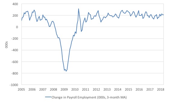
The first graph shows the monthly change in payroll employment (in thousands, expressed as a 3-month moving average to take out the monthly noise).
The monthly changes were stronger in 2014 and 2015, and then dipped in the first-half of 2016. By the end of 2016, job creation was stronger but then it tailed off again, somewhat.
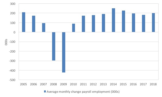
The next graph shows the same data in a different way – in this case the graph shows the average net monthly change in payroll employment (actual) for the calendar years from 2005 to 2017.
The slowdown that began in 2015 is continuing (although the February 2018 outlier has pushed the current average for 2018 up above the 2017 average).
The average change in 2017 was 171 thousand, which is down from the 187 thousand average throughout 2016.
The average net change in 2014 was 250 thousand, in 2015 it was 226 thousand.
The 2018 average is obviously just for the first three months (200 thousand) – but so far 2018 looks a bit stronger than 2017.
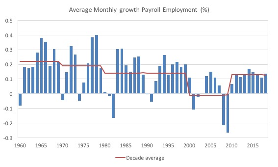
To put the current recovery into historical perspective the following graph shows the average annual growth in payroll employment since 1960 (blue columns) with the decade averages shown by the red line.
It reinforces the view that while payroll employment growth has been steady since the crisis ended, it is still well down on previous decades of growth.
Labour Force Survey – employment growth virtually flat this month
In April 2018, employment as measured by the household survey was flat (rising 3 thousand net) while the labour force fell by 0.15 per cent (236 thousand) and the participation rate fell 0.1 points to 62.8 per cent.
As a result, total unemployment fell by 239 thousand.
But taken together this is a weaker labour market – but, given that the monthly data has fluctuated considerably lately so it is hard to be definitive.
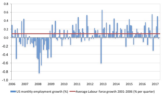
The next graph shows the monthly employment growth since the low-point unemployment rate month (December 2006). The red line is the average labour force growth over the period December 2001 to December 2006 (0.09 per cent per month).
The last two months have been very disappointing using this measure of employment.
What is apparent is that there is still no coherent positive and reinforcing trend in employment growth in the US labour market since the recovery began back in 2009. There are still many months where employment growth, while positive, remains relatively weak when compared to the average labour force growth prior to the crisis or is negative.
The sharp positive spike in September 2017 is clearly an outlier as is (to a certain extent) the negative spike in October 2017.
But when we consider the payroll data and the poor labour force survey result, the general conclusion is that things are fairly subdued.
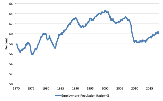
A good measure of the strength of the labour market is the Employment-Population ratio given that the movements are relatively unambiguous because the denominator population is not particularly sensitive to the cycle (unlike the labour force).
The following graph shows the US Employment-Population from January 1970 to April 2018. While the ratio fluctuates a little, the April 2018 outcome was down by 0.1 per cent to 60.3 per cent.
Over the longer period though, we see that the ratio remains well down on pre-GFC levels (peak 63.4 per cent in December 2006), which is a further indication of how weak the recovery has been so far and the distance that the US labour market is from being at full capacity (assuming that the December 2006 level was closer to that state).
Unemployment trends
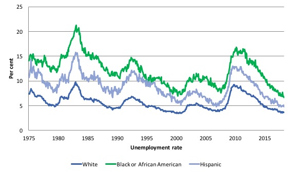
The trends in unemployment by ethnicity are interesting in the US.
Two questions arise:
1. Is the Black and African American unemployment rate higher than it was before the GFC, given that the White unemployment rate is now around its lower levels?
2. Has the relationship between the Black and African American unemployment rate and the White unemployment rate deteriorated since the GFC?
The answer to both questions is No!.
The first graph shows the history of BLS unemployment rates for Black and African Americans, Hispanics and Whites.
You can see that they all cycle together as economic activity cycles. You can also see that the Black and African American unemployment rate is currently at 6.6 per cent, which is well below the pre-GFC minimum achieved of 7.6 per cent (August 2007).
Note: this data moves around a lot on a monthly basis.
The rate rose from 6.8 per cent in December 2017 to 7.7 in January 2018 only to drop back to 6.9 per cent in March and then fall further to 6.6 per cent in April 2018.
The White unemployment rate was steady in April 2018 at 3.6 per cent.
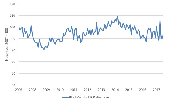
The second graph shows the Black and African American unemployment rate to White unemployment rate (ratio) from October 2007 (index = 100), when the White unemployment rate was at its previous lowest level.
This graph allows us to see whether the relative position of the two cohorts has changed since the crisis.
The data shows that, in fact, Black and African Americans are slightly worse off in relative terms (to Whites) now (April 2018) than they were a decade ago.
The ratio index stands at 88.4 points, meaning that that the Black and African American to White unemployment rate ratio has fallen by 11.6 percentage points since November 2007, which is a relative improvement for Black and African Americans.
That means that the labour force growth is including the more disadvantaged workers.
There is no wages breakout for workers
The latest data continues to support my assessment that despite the commentariat claiming a wages breakout is nigh, the evidence for that claim is non-existent.
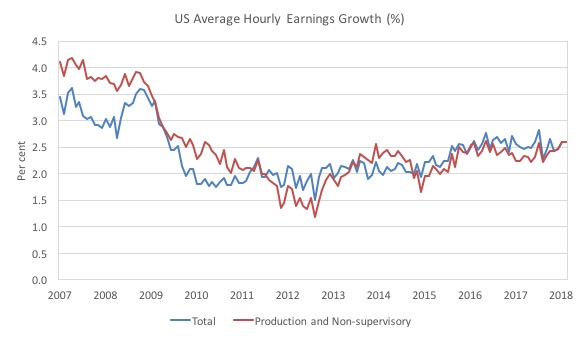
Production and Non-supervisory workers have barely seen movement in their hourly wage outcomes over the last several years (note the BLS revised the January growth figure down in the latest release).
The first graph shows the annual movement in average hourly earnings in total and for Production and Non-supervisory workers. The BLS time series for the latter category began in April 2006.
Total nominal average hourly earnings rose by 2.5 per cent in the 12 months to April 2018.
This is down on the 2.7 per cent in the 12 months to December 2017.
Production and nonsupervisory employees were 82.3 per cent of private US non-farm employment. The growth in average hourly earnings for this dominant cohort has been relatively stable since December 2017.
The graph shows that for these workers – the predominant majority in the US labour market – wages growth has been largely flat since 2013 with a dip in 2015.
The annual rate of growth has been sitting on around 2.3 to 2.4 per cent since 2009 (with monthly fluctuations around that attractor).
The conclusion is that for the vast majority of workers there is no acceleration in wages in the US.
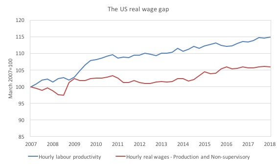
The next graph shows the movements in hourly labour productivity for Production and nonsupervisory employees and their real wages – indexed to 100 in the April-quarter 2007. The data is quarterly so it includes updated productivity estimates.
As I have explained before, if productivity outstrips real wages growth, then these workers are losing wage share and shifting the difference to profits (or other workers – the top-end of the distribution)
The US real wage gap (labour productivity growth minus real wages growth) is pronounced. Labour productivity (output per hour) has grown by 14.9 per cent since the April-quarter 2007, whereas real hourly wages have only grown by 6 per cent over the same time period.
In the last few years, real hourly wages growth has been virtually non-existent (as the graph shows).
And, of course, these indexes understate the redistribution. If I had have started the base year in the 1990s, for example, the gap now would be much wider.
The US jobs deficit
As noted in the Overview, the current participation rate of 62.8 per cent is a long way below the most recent peak in December 2006 of 66.4 per cent.
When times are bad, many workers opt to stop searching for work while there are not enough jobs to go around. As a result, national statistics offices classify these workers as not being in the labour force (they fail the activity test), which has the effect of attenuating the rise in official estimates of unemployment and unemployment rates.
These discouraged workers are considered to be in hidden unemployment and like the officially unemployed workers are available to work immediately and would take a job if one was offered.
In most advanced nations, the population is shifting towards older workers who have lower participation rates – so the US is not special in this regard.
Thus some of the decline in the total participation rate could simply being an averaging issue – more workers who have a lower participation rate as a proportion of the total workforce.
In this recent blog post (November 7, 2017) – Updating the impact of ageing labour force on US participation rates – I estimated that about 61 per cent of the decline in the participation rate since January 2008 has been due to non-cyclical shifts in the demographic weights (shifting age composition).
I have updated those estimates and will write a separate blog on the new findings soon.
But the summary is that the ageing effect has intensified and I estimate that 66.5 per cent of the decline in the participation rate is due to the shifting age weights.
That still leaves a significant cyclical response.
Adjusting for the demographic effect would give an estimate of the participation rate in April 2018 of 63.9 per cent if there had been no cyclical effects (1.1 percentage points up from the current 62.9 per cent).
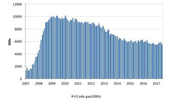
To compute these job gaps we have to set a ‘full employment’ benchmark. I have set this at 4 per cent, which is where the US labour market has been sitting for a few months (before the decline in April due to a fall in participation).
I explain in this blog post – US labour market – strengthened in February but still not at full employment (April 13, 2018) – is the best case scenario given that I actually think the cyclical losses are much worse than I provide here.
Using the estimated potential labour force (controlling for declining participation), we can compute a ‘necessary’ employment series which is defined as the level of employment that would ensure on 4 per cent of the simulated labour force remained unemployed.
This time series tells us by how much employment has to grow each month (in thousands) to match the underlying growth in the working age population with participation rates constant at their January 2008 peak – that is, to maintain the 4 per cent unemployment rate benchmark.
In the blog post cited above (US labour market – strengthened in February but still not at full employment), I provide more information and analysis on the method.
There are two separate effects:
- The actual loss of jobs between the employment peak in November 2007 and the trough (January 2010) was 8,582 thousand jobs. However, total employment is now above the January 2008 peak by 8,583 thousand jobs.
- The shortfall of jobs (the overall jobs gap) is the actual employment relative to the jobs that would have been generated had the demand-side of the labour market kept pace with the underlying population growth – that is, with the participation rate at its January 2008 value and the unemployment rate was constant at 4 per cent. This shortfall loss amounts to 5,469 thousand jobs.
The following graph shows the US Jobs Gap, which is the departure of current employment from the level of employment that would have generated a 4 per cent unemployment rate, given current population trends.
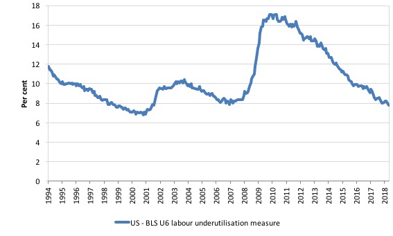
To put that into further perspective, the following graph shows the BLS measure U6, which is defined as:
Total unemployed, plus all marginally attached workers plus total employed part time for economic reasons, as a percent of all civilian labor force plus all marginally attached workers.
It is thus the broadest measure of labour underutilisation that the BLS publish.
In December 2006, before the affects of the slowdown started to impact upon the labour market, the measure was estimated to be 7.9 per cent.
It is now at 7.8 per cent and has declined in the early part of 2018..
The U-6 measure remains above the trough of the early 2000s, and is around the pre-GFC level.
The ridiculous NAIRU
I have written conceptual articles on the NAIRU several times in the past.
Among others:
1. The dreaded NAIRU is still about! (April 16, 2009).
2. NAIRU mantra prevents good macroeconomic policy (November 19, 2010).
3. Why we have to learn about the NAIRU (and reject it) (November 19, 2013).
Further, my 2008 book with Joan Muysken – Full Employment abandoned – presented a detailed critique of the concept combining logical, mathematical and empirical arguments – so fairly comprehensive.
The essential prediction of the New Keynesian approach that places the Non-Accelerating Inflation Rate of Unemployment (NAIRU) at a central theoretical concept is that inflation should fall during periods when the unemployment rate is above the estimated NAIRU and vice versa.
We can allow some dynamic lags in the prediction but even then it doesn’t stack up.
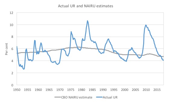
I just have to look at three graphs (apart from all the modelling I have done in the past) to know that the notion is not useful.
The US hasn’t had a an unemployment this low since around December 2000 and then a long time before that. Yet inflation is stable.
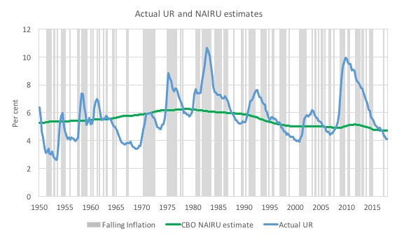
The first graph shows the actual US unemployment rate (using quarterly data) and the Congressional Budget Office’s estimates of the long-run NAIRU from the March-quarter 1950 to the March-quarter 2018.
There are periods where the actual UR has been well above the estimated NAIRU and vice versa.
It is clear that since the December-quarter 2016, the actual unemployment rate has been below the estimated NAIRU for the US, which should invoke strong inflationary pressures.
There is no sign of that happening.
The second graph shows the same graph with periods of falling inflation superimposed (grey bars). You will find no relationship between periods when the unemployment rate was above the green NAIRU line and the grey bars.
It is all over the place.
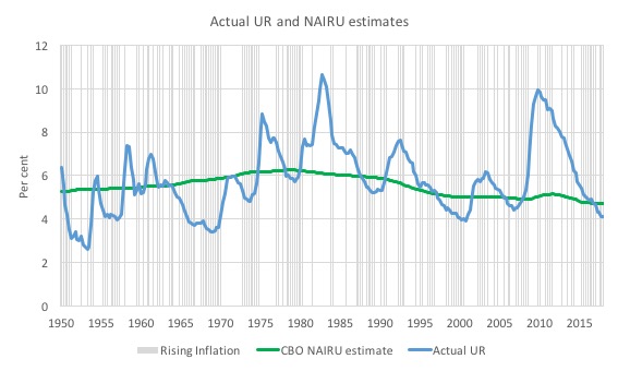
The last graph superimposes periods of rising inflation (grey bars).
Again, you will find no relationship between periods when the unemployment rate was above the green NAIRU line and the grey bars.
The problem is that the policy makers use the correspondence between the estimated NAIRU and the actual unemployment rate to formulate both fiscal and monetary policy.
It means that they err on the side of excessive fiscal austerity and/or higher than necessary interest rates when the actual rate is below the NAIRU, which leads to an upward bias in actual labour underutilisation.
Conclusion
The April BLS labour market data release for the US revealed fairly tepid labour market with significant slack still remaining.
Caution should always be exercised given the volatility of the monthly data.
The broader measure of labour underutilisation (U-6) was slightly lower as was the unemployment rate, the latter being down to the drop in participation.
The relatively weak employment growth was accompanied by an even larger decline in the labour force, which meant that unemployment fell – but that is a sign of weakness not strength.
I still do not think the US labour market is near to full employment. This assessment is reinforced by the fact that the participation rate is still well below where it was even after we adjust for the ageing effects (retirements), a bias towards low wage jobs continues, and the JOLTS dynamics suggest some slack.
Finally, despite the recent claims in the media that wages for US workers are in the process of ‘breaking out’, a closer look at the data shows that for 84 per cent of the private workforce (production and nonsupervisory) wages growth is steady and real wages growth close to zero if not negative.
That is enough for today!
(c) Copyright 2018 William Mitchell. All Rights Reserved.
Bill,
You are probably aware, but Bernie Sanders along with Democratic Senators Kirsten Gillibrand and Cory Booker have recently announced support (and soon-to-be-released policy proposals) for job guarantee policies.
Booker and Gillibrand’s is a pilot program while Bernie’s is a federal job guarantee. I’m sure Professor Kelton has a hand in this!
This is leading into the midterm elections where the Democrats are likely to regain ground in the House.
I am fascinated and quietly hopeful but interested in your thoughts?
Check this out:
Three Point Nine, Still No Boundary For Sanity
http://www.alhambrapartners.com/2018/05/04/three-point-nine-still-no-boundary-for-sanity/
Mosler v Keen Debate last night….
I can’t believe Steve Keen did not know that in a flexible exchange rate for a transaction to complete you need a buyer and a seller
£————–> Euro
£<————– Euro
So the amount at the central bank does not change just the name on the account. Not only did he not know the balance at the central bank stayed the same he actually thought more Euro's were created in that process and not cancelled out. He actually called that was a different way to create money !!!!!
He also Failed to grasp that "savings" are an export product and all trade is balanced with those and that if things do become problems capital controls could be put on FPI. China being a great example. He couldn't distinguish between Foreign Direct Investment (FDI) where a foreign investor provides funds to a productive enterprise in another nation, from Foreign Portfolio Investment (FPI), which represents foreign investments in a nation’s financial assets which bear no interest in an underlying productive activity in the real sector of the economy.
I think Trump is about teach Keen what can be done.
Trump and Abe is up to something they are never away from each other.
I think Trump is trying to Get Abe to fund some of his infrastructure for him.
Broader private activity bond use in Trump infrastructure plan – Rueters
Japan PM's adviser says BOJ should consider buying foreign bonds – Rueters
Japan have been saying this for a while now at least for 6 months and put the two together and what have you got ?
Is Japan going to be bullied into buying infrastructure bonds and pay for some of Trumps infrastructure ? China next ?
If Keen completes that world circuit model it is going to have to be checked and checked again before it gets put out there.
Dear Derek Henry (at 2018/05/07 7:18 pm)
Yes, I saw some of the Real Progressives discussion – one person was largely talking nonsense.
best wishes
bill
Mind blowing Bill
Truely mind blowing
I listened and eventually had to turn it off….Just had enough….and that is why I dislike the word “real” in certain instances..
Were I to tell Mr Keen that, Imports are a “TANGIBLE” benefit which carries a nominal cost, and Exports are a “TANGIBLE” loss which carries a nominal benefit, how is he going to disagree???
Mr. Keen is still working on his model. Patience.
I went back and listened to the rest of it…..
Warren has lost me on a point…..
We should zero rate bonds and we should also stop registered pension funds from buying stocks.
???????
Are all pensions then to be government funded?(delivered)
Derek,
There’s unlikely to be a change at the central bank because central bank functions are reactive. There always appears to be a misunderstanding of the MMT analysis – which may be to do with the wording of how things are explained.
The central bank is *not* required to clear commercial banks. Operationally they clear with each other peer-to-peer. At the end of every clearing period, in a pure system with no Treasury, the central bank is out of the interbank market.
The central bank is nothing more than a clearing house for that function – which reduces collateral requirements. However with the introduction of RTGS systems that collateral requirement returns and the central bank is doing little more than running the RTGS system – something that could possibly be done with a blockchain structure between the commercial banks.
The money creation, if there is any, occurs at the commercial bank level where a commercial bank will discount a foreign currency into the local currency using some sort of swap transaction. However that always shifts equity in the opposite direction which the multinational may not want and they may trade across corporate boundaries to restore their preferred international equity positions – which will move the exchange rate.
Steve Keen has some interesting ideas, but unfortunately they founder on the system dynamics techniques he chooses to use. Institutional design and interaction matter – and that requires a simulation, not a solver.
Keen’s objection, as I understood it, was that a persistent trade imbalance has consequences. It’s less clear to me what he supposes those consequences are.
Does anybody understand what he’s worried about, and more importantly why he is wrong?
I ask because I encounter objections to MMT among friends and could use counter arguments.
Never mind — I see where the very next post undertakes the question in considerable detail.