Today (April 18, 2024), the Australian Bureau of Statistics released the latest - Labour Force,…
Australian labour market remains stuck in a weak state
The Australian Bureau of Statistics released the latest – Labour Force, Australia, April 2018 – today which showed that the Australian labour market remains in a weak state even though full-time employment grew. Over the first four months of 2018, the labour market is decidedly weaker when compared to 2017. With relatively modest employment growth and rising participation, unemployment increased by 10,600 and the unemployment rate edged up to 5.6 per cent. The teenage labour market was the only bright spot although most of the employment gains were in part-time jobs. Further, underemployment fell marginally as did the broad labour underutilisation rate as a result of the bias towards full time work (also reflected in the monthly hours gain). Overall, my assessment is that the Australian labour market remains stuck in a weak state and is still a considerable distance from full employment. There is a lot of slack remaining and defies the foolish calls in recent months from those demanding reductions in the fiscal deficit.
The summary ABS Labour Force (seasonally adjusted) estimates for April 2018 are:
- Employment increased 22,600 (0.2 per cent) – Full-time employment increased 32,700 and part-time employment decreased 10,000.
- Unemployment increased 10,600 to 741,000.
- The official unemployment rate increased by 0.1 points to 5.6 per cent.
- The participation rate increased by 0.1 points to 65. per cent, which is still below its previous peak (December 2010) of 65.8 per cent.
- Aggregate monthly hours worked increased 19.4 million hours (1.11 per cent).
- The estimates for the April 2018 show that underemployment fell slightly to 8.3 per cent. The total labour underutilisation rate (unemployment plus underemployment) was slightly lower as a consequence at 13.9 per cent. There were 1,104.7 thousand persons underemployed and a total of 1,844.7 thousand workers either unemployed or underemployed.
Employment growth – positive but the weakness continues
Employment recorded another modest increase at 22,600 with full-time employment increasing by 32,700 and part-time employment decreasing by 10,000. This reversed the results from last month when full-time fell and vice versa.
We observed a zig-zag pattern in total employment growth up until the end of 2016 switching around the zero growth line. The oscillating pattern has continued into 2017 but the level has risen above the zero line.
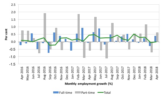
The following graph shows the month by month growth in full-time (blue columns), part-time (grey columns) and total employment (green line) for the 24 months to April 2018 using seasonally adjusted data.
It gives you a good impression of just how flat employment growth had been leading into 2017.
And the trend is decidedly down in the first months of 2018.
Overall: today’s result signals a sustained weaker labour market.
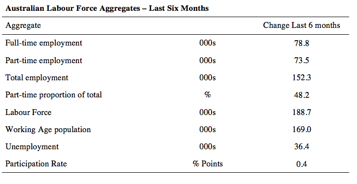
The following table provides an accounting summary of the labour market performance over the last six months. The monthly data is highly variable so this Table provides a longer view which allows for a better assessment of the trends.
Overall there have been only 152.3 thousand jobs (net) added in Australia over the last six months while the labour force has increased by 188.7 thousand. The result has been that unemployment has risen by 36.4 thousand.
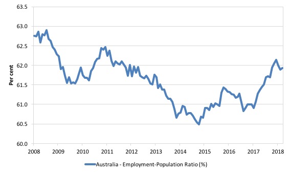
Given the variation in the labour force estimates, it is sometimes useful to examine the Employment-to-Population ratio (%) because the underlying population estimates (denominator) are less cyclical and subject to variation than the labour force estimates. This is an alternative measure of the robustness of activity to the unemployment rate, which is sensitive to those labour force swings.
The following graph shows the Employment-to-Population ratio, since February 2008 (the low-point unemployment rate of the last cycle).
It dived with the onset of the GFC, recovered under the boost provided by the fiscal stimulus packages but then went backwards again as the last Federal government imposed fiscal austerity in a hare-brained attempt at achieving a fiscal surplus.
The ratio began rising in December 2014 which suggested to some that the labour market had bottomed out and would improve slowly as long as there are no major policy contractions or cuts in private capital formation.
The series turned again as overall economic activity weakened.
The ratio was steady in April 2018 at 61.9 and remains well below pre-GFC peak in April 2008 of 62.9 per cent.
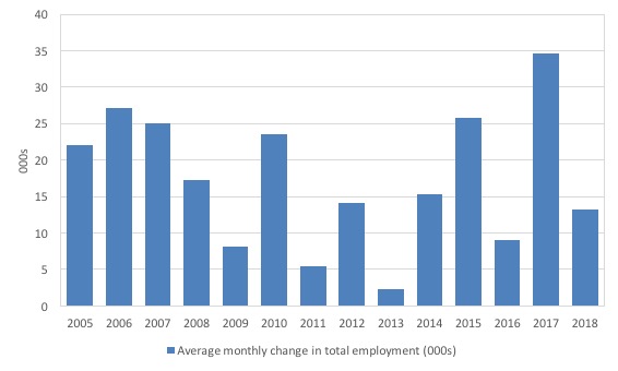
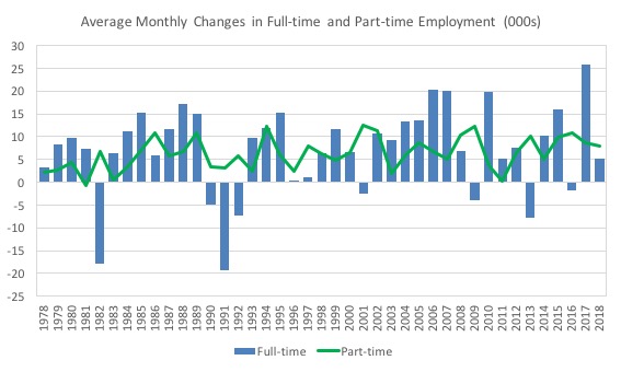
To put the current monthly performance into perspective, the following graph shows the average monthly employment change for the calendar years from 2005 to 2018 (the 2018 result is up to April only).
It is clear that after some lean years, 2017 was a much stronger year if total employment is the indicator.
It is also clear that the labour market has weakened considerably in the first three months of 2018.
To provide a longer perspective, the following graphs shows the average monthly changes in Total employment (upper panel), and Full-time and Part-time employment (lower panel) in thousands since 1978 (when the current dataset began).
The 2018 average is for January and February only so is not definitive.
The interesting result is that during recessions or slow-downs, it is full-time employment that takes the bulk of the adjustment. Even when full-time employment growth is negative, part-time employment continues to grow.

Teenage labour market – 15-19 year olds some improvement
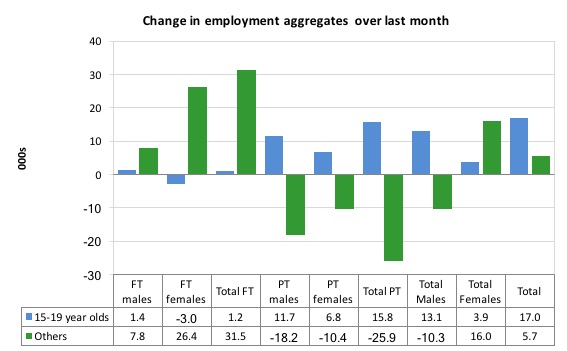
Total teenage employment rose by a fairly significant 17 thousand jobs in April, considering only 22,600 net jobs overall were created.
Full-time teenage employment rose by 1.2 thousand, while part-time employment rose by 15.8 thousand.
The following graph shows the distribution of net employment creation in the last month by full-time/part-time status and age/gender category (15-19 year olds and the rest)
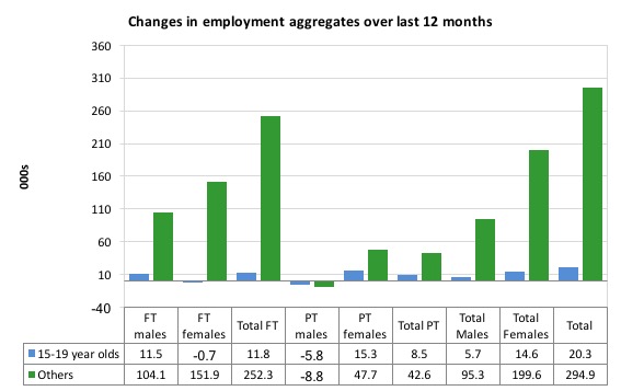
Over the last 12 months, teenagers have gained 20.3 thousand (net) jobs overall while the rest of the labour force have gained 294.9 thousand net jobs.
Teenagers are around 6.2 per cent of the total labour force and their share in employment growth over the last 12 months has been proportional, meaning their relative position has not changed.
The following graph shows the change in aggregates over the last 12 months.
In terms of the current cycle, which began after the last low-point unemployment rate month (February 2008), the following results are relevant:
1. Since February 2008, there have been only 1,853.6 thousand (net) jobs added to the Australian economy but teenagers have lost a 67.5 thousand over the same period.
2. Since February 2008, teenagers have lost 112.2 thousand full-time jobs (net).
3. Even in the traditionally, concentrated teenage segment – part-time employment, teenagers have gained only 44.7 thousand jobs (net) even though 951.2 thousand part-time jobs have been added overall.
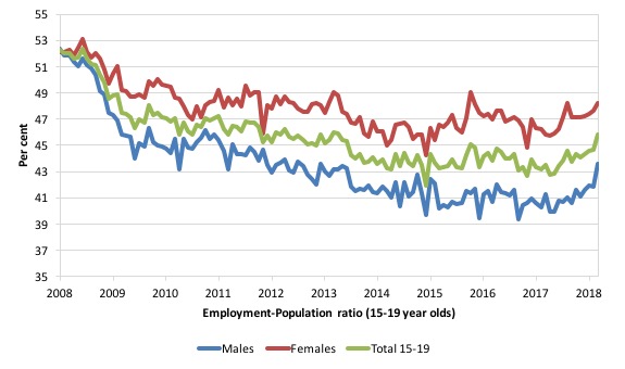
To put the teenage employment situation in a scale context (relative to their size in the population) the following graph shows the Employment-Population ratios for males, females and total 15-19 year olds since February 2008.
You can interpret this graph as depicting the loss of employment relative to the underlying population of each cohort. We would expect (at least) that this ratio should be constant if not rising somewhat (depending on school participation rates).
The facts are that the absolute loss of jobs reported above is depicting a very difficult situation for our teenagers. Males, in particular, have lost out severely as a result of the economy being deliberately stifled by austerity policy positions.
In the latter months of 2015, with the part-time employment situation improving, there was some reversal in the downward trends in these ratios.
The male ratio has fallen by 8.7 percentage points since February 2008, the female ratio has fallen by 3.9 percentage points and the overall teenage employment-population ratio has fallen by 6.4 percentage points.
The other staggering statistic relating to the teenage labour market is the decline in the participation rate since the beginning of 2008 when it peaked in February at 61.4 per cent.
In April 2018, the participation rate was 54.4 per cent (up 0.9 percentage points).
The difference between the 2008 level, amounts to an additional 78.9 thousand teenagers who have dropped out of the labour force as a result of the weak conditions since the crisis.
If we added them back into the labour force the teenage unemployment rate would be 24.6 per cent rather than the official estimate for April 2018 of 17.4 per cent.
Some may have decided to return to full-time education and abandoned their plans to work. But the data suggests the official unemployment rate is significantly understating the actual situation that teenagers face in the Australian labour market.
Overall, the performance of the teenage labour market remains fairly poor although clearly April 2018 was a good month.
This situation doesn’t rate much priority in the policy debate, which is surprising given that this is our future workforce in an ageing population. Future productivity growth will determine whether the ageing population enjoys a higher standard of living than now or goes backwards.
I continue to recommend that the Australian government immediately announce a major public sector job creation program aimed at employing all the unemployed 15-19 year olds, who are not in full-time education or a credible apprenticeship program.
Unemployment increased 10,600 to 741,000
The official unemployment rate increased by 0.1 points to 5.6 per cent in April 2018 on the back of the subdued employment growth and a rising participation rate.
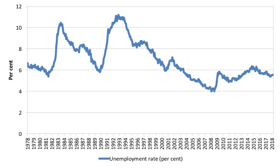
The following graph shows the national unemployment rate from February 1978 to April 2018. The longer time-series helps frame some perspective to what is happening at present.
After falling steadily as the fiscal stimulus pushed growth along, the unemployment rate slowly trended up for some months.
It is now still 0.7 points above the level it fell to as a result of the fiscal stimulus and 1.5 points above the level reached before the GFC began.
Conclusion: there is still considerable slack in the labour market that should be absorbed with fiscal stimulus.
Broad labour underutilisation slightly lower as a consequence at 13.9 per cent
The ABS publishes monthly and quarterly labour underutilisation data. The quarterly data for the February-quarter 2017 was published last month.
So for this month, we use the monthly data.
The results are:
1. Underemployment fell slightly by 8.9 thousand and was estimated to be 8.3 per cent of the labour force. The fall this month did not offset the rise last month.
2. The total labour underutilisation rate (unemployment plus underemployment) was slightly lower as a consequence at 13.9 per cent.
3. There were 1,104.7 thousand persons underemployed and a total of 1,844.7 thousand workers either unemployed or underemployed.
So even with steady employment growth, the Australian labour market has nearly 1.9 million workers available for work who cannot find sufficient hours.
In terms of the quarterly data, the following graph plots the seasonally-adjusted underemployment rate in Australia since February 1978 to the February-quarter 2018 (blue line) and the broad underutilisation rate over the same period (green line).
The difference between the two lines is the unemployment rate.
You can see the three cyclical peaks corresponding to the 1982, 1991 recessions and the more recent downturn.
The other difference between now and the two earlier cycles is that the recovery triggered by the fiscal stimulus in 2008-09 did not persist and as soon as the ‘fiscal surplus’ fetish kicked in in 2012, things went backwards very quickly.
The two earlier peaks were sharp but steadily declined. The last peak fell away on the back of the stimulus but turned again when the stimulus was withdrawn.

If hidden unemployment (given the depressed participation rate) is added to the broad ABS figure the best-case (conservative) scenario would see a underutilisation rate well above 15 per cent at present. Please read my blog – Australian labour underutilisation rate is at least 13.4 per cent – for more discussion on this point.
The next quarterly update will be for the May-quarter 2018 and will be published published in the June 2018 Labour Force release. In between those releases, the monthly estimates will guide our thinking.
Aggregate participation rate – rose by 0.1 points to 65.6 per cent
With the rise in participation and the weakness of employment growth, unemployment increased by 10,600.
There is considerable monthly fluctuation in the participation rate but the current rate of 65.6 per cent is still below its most recent peak in November 2010 of 65.8 per cent.
What would the unemployment rate be if the participation rate was at the last November 2010 peak level value?
The following graph tells us what would have happened if the participation rate had been constant over the period November 2010 to January 2018. The blue line is the official unemployment rate since its most recent low-point of 4 per cent in February 2008.
The red line starts at November 2010 (the peak participation month). It is computed by adding the workers that left the labour force as employment growth faltered (and the participation rate fell) back into the labour force and assuming they would have been unemployed. At present, this cohort is likely to comprise a component of the hidden unemployed (or discouraged workers).
With the rise in participation in recent months, the red line has fallen but is still above the actual unemployment rate.
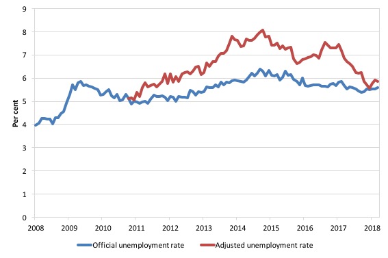
1. Total official unemployment in January 2018 was estimated to be 741 thousand.
2. Unemployment would be 779.6 thousand if participation rate was at its November 2010 peak.
3. The unemployment rate would now be 5.9 per cent rather than the official April 2018 estimate of 5.6 per cent.
The difference between the two numbers mostly reflects, the change in hidden unemployment (discouraged workers) since November 2010. These workers would take a job immediately if offered one but have given up looking because there are not enough jobs and as a consequence the ABS classifies them as being Not in the Labour Force.
There has been some change in the age composition of the labour force (older workers with low participation rates becoming a higher proportion) but this only accounts for less than 1/3 of the shift. The rest is undoubtedly accounted for by the rise in hidden unemployment.
Note, the gap between the blue and red lines doesn’t sum to total hidden unemployment unless November 2010 was a full employment peak, which it clearly was not. The interpretation of the gap is that it shows the extra hidden unemployed since that time.
This gap shrinks as participation rises relative to the November 2010 peak.
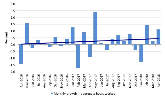
Hours worked – increased by 19.4 million hours (1.11 per cent).
The hours data was strong this month and reflected the dominance of full-time employment in the result.
The following graph shows the monthly growth (in per cent) over the last 24 months. The dark linear line is a simple regression trend of the monthly change – which depicts an modest upward trend – distorted somewhat by the outlier in May 2017 (the trend would have been more sharply downward without that positive spike).
You can see the pattern of the change in working hours is also portrayed in the employment graph – zig-zagging across the zero growth line although less so in 2017.
Conclusion
My standard monthly warning: we always have to be careful interpreting month to month movements given the way the Labour Force Survey is constructed and implemented.
Today’s figures show that the Australian labour market remains in a relatively weak state with only modest employment gains, albeit dominated by full-time employment.
Over the first four months of 2018, the labour market is decidedly weaker when compared to 2017.
With relatively modest employment growth and rising participation, unemployment increased by 10,600 and the unemployment rate edged up to 5.6 per cent.
The teenage labour market was the only bright spot although most of the employment gains were in part-time jobs.
Further, underemployment fell marginally as did the broad labour underutilisation rate as a result of the bias towards full time work (also reflected in the monthly hours gain).
Taken together, my overall assessment is:
1. The labour market remains stuck in a weak state.
2. It remains a considerable distance from full employment.
That is enough for today!
(c) Copyright 2018 William Mitchell. All Rights Reserved.
AUD/USD is on the verge of exploding upwards.
What with gold going to hit $1600 and the US $ going to fall like a stone. 3 More US rate hikes this year with more to come next year. Oil adding to those inflationary pressures.
The Aussie strength over the next 12 months is going to catch the Australian central bank by suprise. So how will the Australian central bank react to a stronger Aussie?
My guess is they will start cutting the interest rate as they believe cutting interest rates will weaken the Aussie when infact that will make the Aussie even stronger.
Which is sure to have an effect on exports then GDP with more job losses.
When the FED moves into a rate hike cycle on false assumptions.
They think increasing interest rates fights inflation and makes the $ stronger. When it actually does the opposite. Readers can fill in the gaps below.
December 2015, Dollar Index, 98.
Today, Dollar Index,
December 2015, Dollar/yen, 121.00
Today, dollar/yen,
December 2015, Gold, $1050
Today, Gold,
December 2015, Oil, $38
Today, Oil,
December 2015, 10-Yr Treas futures, 127.00
Today, 10-year Treas futures,
December 2015, CPI, 0.7% y-o-y.
Today, CPI,
The correct response from other central banks would be to raise interest rates also. To stop teir currencies getting stronger against the $.
This is important with those countries that export their way to growth. Like the EU and Japan as you can see with their fall in GDP in both areas this week.
Draghi is in big, big trouble. When you have an export to growth model and the Euro goes from
EUR/USD 1.06 – 1.2
EUR/GBP 0.70 – 0.88
Because both the UK and the US is now in rate hike mode.
As I’ve been saying for months now. Draghi knows this of course but because of his lies about QE and interest rates he can’t get out of the mess that he has put himself in. His lies have boxed him into a corner he can’t get out of.
He needs inflation to weaken the Euro and the only way he can do that is
1) Stop QE and start balance sheet reduction
2) Increase interest rates
But the Germans have this thing about inflation that they can’t shake off and Draghi knows this which is why he came out at the weekend asking for a fiscal lever. He was begging for one.
a) To hide his lies because of the corner he is in to try and hide the fact before he walks away trying to get away scott free. Kicking the can down the road so whoever follows him has to deal with the problem.
b) To get inflation he needs.
Ultimately it is down to the Germans get over their inflation vodoo or sit back and watch the Euro get stronger and stronger that will eat into German exports. Which of course was Trumps plan all along.
How it all plays out in Australia will depend on the Australian central bank and my money is on they will do the wrong thing.
All else equal
Over the next few years if the US stay in rate hike mode.
I can see the AUD/USD hitting parity with the US $.
Mainly because the Australian central bank will do the wrong thing and cut interest rates instead of increasing them.
The Aussies won’t be driving up the coast on holiday they’ll be flying all over the world 🙂