Today (April 18, 2024), the Australian Bureau of Statistics released the latest - Labour Force,…
Australian labour market weaker – no employment growth and participation down
Today, the Australian Bureau of Statistics released the latest data – Labour Force, Australia, September 2018 – which show that the Australian labour market has weakened, with employment growth virtually zero. Compounding that weakness was a sharp decline in the participation rate (0.3 points). Taken together, unemployment and the unemployment rate fell but this is a sign of weakness not improvement. The decline in unemployment is because workers gave up looking for jobs in a weak labour market. Monthly hours worked remained on a flat trend. Overall, my assessment is that the Australian labour market remains in a fairly weak state and, is still a considerable distance from full employment. There is clear room for some serious policy expansion at present.
The summary ABS Labour Force (seasonally adjusted) estimates for September 2018 are:
- Employment increased 5,600 (0.04 per cent) – full-time employment increased 20,300 and part-time employment decreased 14,700.
- Unemployment decreased 37,200 to 665,800 but only because participation fell.
- The official unemployment rate decreased by 0.3 points to 5.0 per cent.
- The participation rate decreased by 0.2 points to 65.4 per cent, and remains well below its previous peak (December 2010) of 65.8 per cent.
- Aggregate monthly hours worked increased 6.2 million hours (0.4 per cent).
- The monthly broad underutilisation estimates for September 2018 show that underemployment was steady at 8.7 per cent (1,103.2 thousand). The total labour underutilisation rate (unemployment plus underemployment) was 13.3 per cent. There were a total of 1,768.9 thousand workers either unemployed or underemployed.
Employment increased by only 5,600 in September 2018
Employment growth was virtually zero in September.
Total employment rose by 5,600 (0.04 per cent) – full-time employment increased 20,300 and part-time employment decreased 14,700.
It reverses last month’s stronger result, which were, in part, driven by the specific characteristics of the rotational samples that make up the eight sub-samples used to compute the survey estimates.
The September result is more characteristic of the weak state that the labour market has demonstrated for most of this year.
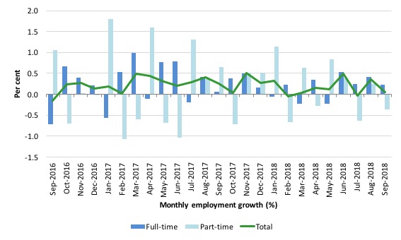
The following graph shows the month by month growth in full-time (blue columns), part-time (grey columns) and total employment (green line) for the 24 months to September 2018 using seasonally adjusted data.
The zig-zag pattern where employment growth has regularly been around zero is evident.
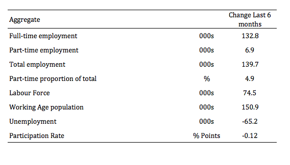
The following table provides an accounting summary of the labour market performance over the last six months. As the monthly data is highly variable, this Table provides a longer view which allows for a better assessment of the trends.
Overall there have been just 132.8 thousand jobs (net) added in Australia over the last six months while the labour force has increased by 74.5 thousand. The result has been that unemployment has fallen by 65.2 thousand.
These aggregate changes signify a fairly weak labour market performance given that the decline in unemployment is largely due to the drop in participation of 0.12 points.
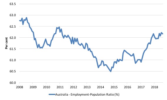
Given the variation in the labour force estimates, it is sometimes useful to examine the Employment-to-Population ratio (%) because the underlying population estimates (denominator) are less cyclical and subject to variation than the labour force estimates. This is an alternative measure of the robustness of activity to the unemployment rate, which is sensitive to those labour force swings.
The following graph shows the Employment-to-Population ratio, since February 2008 (the low-point unemployment rate of the last cycle).
It dived with the onset of the GFC, recovered under the boost provided by the fiscal stimulus packages but then went backwards again as the last Federal government imposed fiscal austerity in a hare-brained attempt at achieving a fiscal surplus.
The ratio began rising in December 2014 which suggested to some that the labour market had bottomed out and would improve slowly as long as there are no major policy contractions or cuts in private capital formation.
The series turned again as overall economic activity weakened.
The ratio was steady in September 2018 to 62.2 per cent (back to the June level) and remains well below pre-GFC peak in April 2008 of 62.9 per cent.
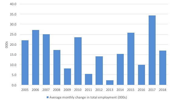
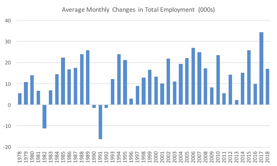
To put the current monthly performance into perspective, the following graph shows the average monthly employment change for the calendar years from 2005 to 2018 (the 2018 result is up to September 2018 only).
It is clear that after some lean years, 2017 was a much stronger year if total employment is the indicator.
It is also clear that the labour market has weakened considerably in the first 9 months of 2018.
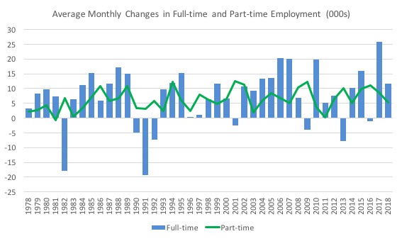
To provide a longer perspective, the following graphs shows the average monthly changes in Total employment (upper panel), and Full-time and Part-time employment (lower panel) in thousands since 1978 (when the current dataset began).
The interesting result is that during recessions or slow-downs, it is full-time employment that takes the bulk of the adjustment. Even when full-time employment growth is negative, part-time employment usually continues to grow.
Teenage labour market goes backwards in September 2018
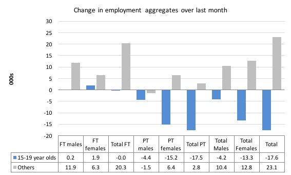
Total teenage employment fell by 17.6 thousand jobs in September 2018 with full-time teenage employment mostly unchanged and part-time employment falling by 17.5 thousand.
The following graph shows the distribution of net employment creation in the last month by full-time/part-time status and age/gender category (15-19 year olds and the rest)
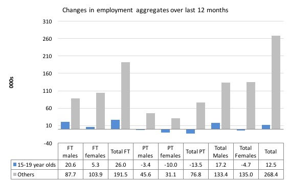
Over the last 12 months, teenagers have gained 12.5 thousand (net) jobs overall while the rest of the labour force have gained 268 thousand net jobs.
Teenagers have gained around 4.5 per cent of the total net employment growth over the last 12 months but represent around 6.2 per cent of the total labour force. So they are doing relatively worse when we take scale into account.
The following graph shows the change in aggregates over the last 12 months.
In terms of the current cycle, which began after the last low-point unemployment rate month (February 2008), the following results are relevant:
1. Since February 2008, there have been 1,988.8 thousand (net) jobs added to the Australian economy but teenagers have lost a 75.4 thousand over the same period.
2. Since February 2008, teenagers have lost 96.4 thousand full-time jobs (net).
3. Even in the traditionally, concentrated teenage segment – part-time employment, teenagers have gained only 21 thousand jobs (net) even though 875.9 thousand part-time jobs have been added overall.
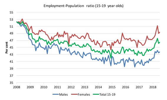
To put the teenage employment situation in a scale context (relative to their size in the population) the following graph shows the Employment-Population ratios for males, females and total 15-19 year olds since February 2008.
You can interpret this graph as depicting the loss of employment relative to the underlying population of each cohort. We would expect (at least) that this ratio should be constant if not rising somewhat (depending on school participation rates).
The absolute loss of jobs reported above has impacted more on males than females.
The male ratio has fallen by 9.2 percentage points since February 2008, the female ratio has fallen by 4.7 percentage point and the overall teenage employment-population ratio has fallen by 7.0 percentage points.
The other statistic relating to the teenage labour market that is worth highlighting is the decline in the participation rate since the beginning of 2008 when it peaked in February at 61.4 per cent.
In September 2018, the participation rate was 55 per cent (down by 0.6 percentage points).
However, the difference between the 2008 level, amounts to an additional 74.3 thousand teenagers who have dropped out of the labour force as a result of the weak conditions since the crisis.
If we added them back into the labour force the teenage unemployment rate would be 25.6 per cent rather than the official estimate for September 2018 of 17.7 per cent.
Some may have decided to return to full-time education and abandoned their plans to work. But the data suggests the official unemployment rate is significantly understating the actual situation that teenagers face in the Australian labour market.
Overall, the performance of the teenage labour market leaves a lot to be desired. The decline in full-time employment for teenagers was particularly worrying.
This situation doesn’t rate much priority in the policy debate, which is surprising given that this is our future workforce in an ageing population. Future productivity growth will determine whether the ageing population enjoys a higher standard of living than now or goes backwards.
I continue to recommend that the Australian government immediately announce a major public sector job creation program aimed at employing all the unemployed 15-19 year olds, who are not in full-time education or a credible apprenticeship program.
Unemployment decreased 37,200 to 665,800
The official unemployment rate fell by 0.3 points to 5 per cent in September 2018 and total unemployment decreased by 37,200 on the back of a sharp decline in the participation rate (see below).
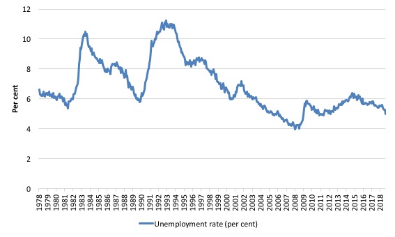
The following graph shows the national unemployment rate from February 1978 to September 2018. The longer time-series helps frame some perspective to what is happening at present.
After falling steadily as the fiscal stimulus pushed growth along, the unemployment rate slowly trended up for some months.
It is still 0.1 points above the level it fell to as a result of the fiscal stimulus and 1 point above the level reached before the GFC began.
Conclusion: the declining unemployment in September is not a good sign given the drop in participation. There is clearly still considerable slack in the labour market that should be absorbed with fiscal stimulus.
Broad labour underutilisation at 13.3 per cent
The results based on the Monthly data for September 2018 are (seasonally adjusted):
1. Underemployment fell by 1 thousand and was estimated to be steady at 8.7 per cent of the labour force.
2. The total labour underutilisation rate (unemployment plus underemployment) was 13.3 per cent (down from 13.5 per cent).
3. There were 1,103.2 thousand persons underemployed and a total of 1,768.9 thousand workers either unemployed or underemployed.
The following graph plots the seasonally-adjusted underemployment rate in Australia since February 1978 to the September 2018 (blue line) and the broad underutilisation rate over the same period (green line).
The difference between the two lines is the unemployment rate.
You can see the three cyclical peaks corresponding to the 1982, 1991 recessions and the more recent downturn.
The other difference between now and the two earlier cycles is that the recovery triggered by the fiscal stimulus in 2008-09 did not persist and as soon as the ‘fiscal surplus’ fetish kicked in in 2012, things went backwards very quickly.
The two earlier peaks were sharp but steadily declined. The last peak fell away on the back of the stimulus but turned again when the stimulus was withdrawn.
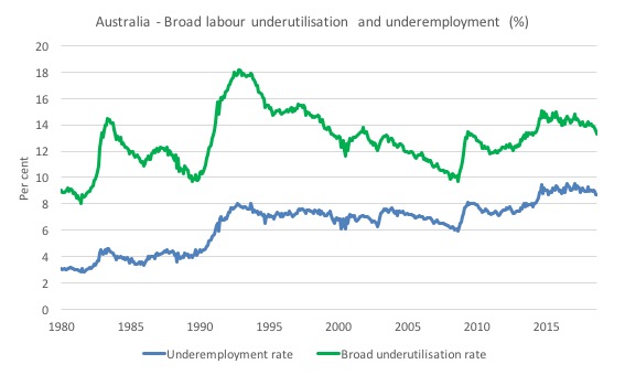
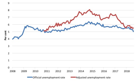
If hidden unemployment (given the depressed participation rate) is added to the broad ABS figure the best-case (conservative) scenario would see a underutilisation rate well above 15 per cent at present. Please read my blog post – Australian labour underutilisation rate is at least 13.4 per cent – for more discussion on this point.
Aggregate participation rate – fell by 0.2 points to 65.4 per cent
Unemployment fell this month despite the flat employment growth because the labour force fell more quickly as a result of decline in participation.
By how much would unemployment have risen if the participation rate had not fallen?
The labour force is a subset of the working-age population (those above 15 years old). The proportion of the working-age population that constitutes the labour force is called the labour force participation rate. Thus changes in the labour force can impact on the official unemployment rate, and, as a result, movements in the latter need to be interpreted carefully. A rising unemployment rate may not indicate a recessing economy.
The labour force can expand as a result of general population growth and/or increases in the labour force participation rates.
The following Table shows the breakdown in the changes to the main aggregates (Labour Force, Employment and Unemployment) and the impact of the rise in the participation rate.
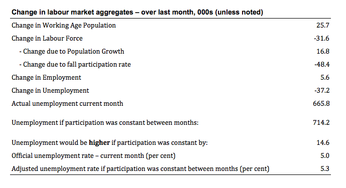
The change in the labour force in September 2018 was the outcome of two separate factors:
- The underlying population growth added 16.8 thousand persons to the labour force. The population growth impact on the labour force aggregate is relatively steady from month to month but has slowed in recent months; and
- The fall in the participation rate meant that there were 48.4 thousand workers dropping out of the labour force (relative to what would have occurred had the participation rate remained unchanged).
- The net result was that the labour force declined by 31.6 thousand (rounded).
If the participation rate had not have fallen, total unemployment, at the current employment level, would have been 714.2 thousand rather than the official count of 665.8 thousand as recorded by the ABS – a difference of 48.4 thousand workers (the ‘participation effect’).
Thus, without the fall in the participation rate in September 2018, the unemployment rate would have been 5.3 per cent (rounded) rather than its current value of 5.0 per cent (rounded).
In effect, all the decline in the unemployment rate is down to the decline in the participation rate.
The conclusion is that hidden unemployment rose slightly in September 2018 – a sign of a weakening situation.
There is considerable monthly fluctuation in the participation rate but the current rate of 65.4 per cent is still below its most recent peak in November 2010 of 65.8 per cent.
What would the unemployment rate be if the participation rate was at the last November 2010 peak level value?
The following graph tells us what would have happened if the participation rate had been constant over the period November 2010 to September 2018. The blue line is the official unemployment rate since its most recent low-point of 4 per cent in February 2008.
The red line starts at November 2010 (the peak participation month). It is computed by adding the workers that left the labour force as employment growth faltered (and the participation rate fell) back into the labour force and assuming they would have been unemployed. At present, this cohort is likely to comprise a component of the hidden unemployed (or discouraged workers).
1. Total official unemployment in September 2018 was estimated to be 665.8 thousand.
2. Unemployment would be 737 thousand if participation rate was at its November 2010 peak.
3. The unemployment rate would now be 5.5 per cent rather than the official September 2018 estimate of 5 per cent.
The difference between the two numbers mostly reflects, the change in hidden unemployment (discouraged workers) since November 2010. These workers would take a job immediately if offered one but have given up looking because there are not enough jobs and as a consequence the ABS classifies them as being Not in the Labour Force.
There has been some change in the age composition of the labour force (older workers with low participation rates becoming a higher proportion) but this only accounts for less than 1/3 of the shift. The rest is undoubtedly accounted for by the rise in hidden unemployment.
Note, the gap between the blue and red lines doesn’t sum to total hidden unemployment unless November 2010 was a full employment peak, which it clearly was not. The interpretation of the gap is that it shows the extra hidden unemployed since that time.
This gap shrinks as participation rises relative to the November 2010 peak.
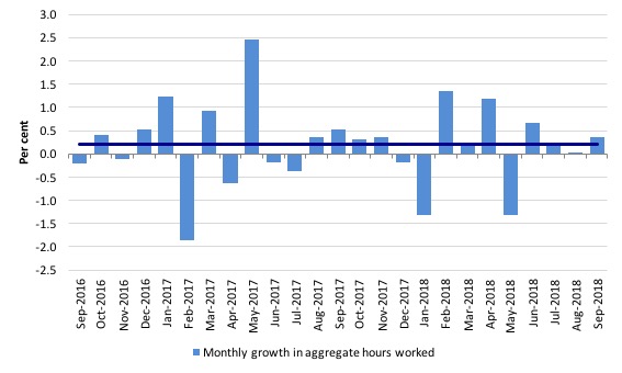
Hours worked – increased by just 6.2 million hours (0.4 per cent).
The following graph shows the monthly growth (in per cent) over the last 24 months.
The dark linear line is a simple regression trend of the monthly change – which depicts a very flat trend – distorted somewhat by the outlier in May 2017 (the trend would have been more downward without that positive spike).
You can see the pattern of the change in working hours is also portrayed in the employment graph – zig-zagging across the zero growth line although less so in 2017.
Conclusion
My standard monthly warning: we always have to be careful interpreting month to month movements given the way the Labour Force Survey is constructed and implemented.
The September data shows that employment growth was virtually zero.
Compounding that weakness was a sharp decline in the participation rate (0.2 points).
Taken together, unemployment and the unemployment rate fell but this is a sign of weakness not improvement.
The decline in unemployment is because workers gave up looking for jobs in a weak labour market.
Monthly hours worked remained on a flat trend.
My overall assessment is:
1. The labour market remains in a fairly weak state.
2. It remains a considerable distance from full employment.
That is enough for today!
(c) Copyright 2018 William Mitchell. All Rights Reserved.
I have been listening to question time today. Our government have taken these figures and made them into something to crow about and celebrate. And then they use these figures to say they can fund more spending because of these employment figures. What chance does MMT have to overcome the governments inaccurate statements? Who can the public believe? And sadly the economics reporters at the ABC parrot the same statements as the government.
Off topic.
I have found a short summary of how Bill explains the US inflation of the 60s & 70s.
It is —
The Nation —
Beyond Austerity, Deficit mania is built on a series of destructive neoliberal myths.
By William Mitchell, MARCH 16, 2011
.
cut off these wordshttps://www.thenation.com/article/beyond-austerity/cut off these words
.
He blames the inflation on Vietnam War spending and then the OPEC oil shock.
Steve_American, the proper link is: http://www.thenation.com/article/beyond-austerity/
The one you gave doesn’t seem to work.
Steve, your link does not work. Search for Beyond Austerity. It should come up near the top
Ah, I see what you did. Unfortunately, it doesn’t really work, especially for someone who reads fast.
Thanks Steve- that was a great article by Bill.
And wealth and power were just waiting, hoping, looking for inflation problems to attribute to Keynes type thinking. They didn’t want truth. They boot-strapped themselves back into control on lies. It wasn’t that hard to see. It shows how W & P looks only to advantage. Truth, justice, fair play mean nothing to them. They see the general population as adversaries, enemies.
By the way, Bill, I suggested you, Warren and Mark Weisbrot as guests on the 1A public radio program, as a way to achieve a balanced view. In my entire life, I haven’t seen your names or MMT in TV, radio, magazine, newspapers. You’re invisible. They get some money from the Kochs and Scaife-Mellon Foundation, and others… Let’s hope you guys sneak under the wire.
Sorry, I really need to vent for a second. I’m finally reading Reclaiming the State, and even after reading much of the account here, it still beggars belief what happened in Europe. I’m at page 92 and I just want someone to tell me it’s all lies so I can sleep later.
The right is correct about one thing, the left parties are insane.
Dear Paulo Marques (2018/10/19 at 9:50 am)
You have 202 pages to go. It gets worse.
I suggest you put on a pot of tea and try to chill out. Perhaps put on some Leonard Cohen.
On second thoughts, leave out the Leonard Cohen.
best wishes
bill
Paulo Marques,
“The right is correct about one thing, the left parties are insane.”
Yes they are. They refuse to understand their ignorance to economics or they are deliberately faux left to give an illusion of choice. The ALP comes to mind in the latter scenario.
Dear Bill
I accidentally posted this comment in the wrong thread.
I get a lot out of your excellent blog posts, journal articles, and books. Thank you for your contributions to informing the public about the the fiscal policy options available to our national government.
I was wondering if you have a ballmark estimate for what your preferred fiscal expansion would be for the Australian Government in 2019-2020. And approximately how much of that expansion would finance a Job Guarantee in 2019-2020.
I read that in May 2013 you stated your preference for a fiscal deficit of $70 billion or 4.5 percent of GDP for 2013-14. You advocated an increase of the deficit from $23.5 billion (1.6% of GDP) to $70 billion (a fiscal expansion of $46.5 billion). You estimated that $22 billion would be needed for the first year of a Job Guarantee.
In 2017-2018 the Australian Government’s final fiscal outcome was a fiscal deficit of $5.3 billion (0.3% of GDP).
How big should the fiscal deficit be in 2019-2020 to achieve full employment with price stability?
How much spending would be needed for a Job Guarantee in 2019-2020?
Best wishes
Nicholas