Today (April 18, 2024), the Australian Bureau of Statistics released the latest - Labour Force,…
US labour market moderated in November and considerable slack remains
Last week’s (December 7, 2018) release by the US Bureau of Labor Statistics (BLS) of their latest labour market data – Employment Situation Summary – November 2018 – showed that total non-farm payroll employment rose by 155,000 and the unemployment rate was essentially unchanged at 3.7 per cent. Participation was steady. While the US labour market is reaching unemployment rates not seen since the late 1960s, the participation rate is still well below the pre-GFC levels and a substantial jobs deficit remains. Other indicators suggest there is still considerable slack in the labour market, especially outside the labour force (marginal workers) and among the underemployed. Taken together, the US labour market moderated in November but remains some distance from full employment.
Overview for November 2018
- Payroll employment rose by 155,000.
- Total labour force survey employment rose by 233 thousand in net terms.
- The seasonally adjusted labour force rose by 133 thousand.
- Official unemployment fell by 100 thousand to 5,975 thousand.
- The official unemployment rate was slightly lower at 3.67 per cent (down from 3.74 per cent).
- The participation rate was steady at 62.9 per cent but remains well below the peak in December 2006 (66.4 per cent). Adjusting for age effects, the rise in those who have given up looking for work for one reason or another since December 2006 is around 3,804 thousand workers. The corresponding unemployment rate would be 5.8 per cent, far higher than the current official rate.
- The broad labour underutilisation measure (U6) rose by 0.2 points to 7.6 per cent.
For those who are confused about the difference between the payroll (establishment) data and the household survey data you should read this blog – US labour market is in a deplorable state – where I explain the differences in detail.
Payroll employment trends
The BLS noted that:
Total nonfarm payroll employment increased by 155,000 in November, compared with an average monthly gain of 209,000 over the prior 12 months. In November, job gains occurred in health care, in manufacturing, and in transportation and warehousing.
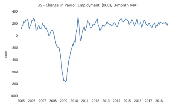
The first graph shows the monthly change in payroll employment (in thousands, expressed as a 3-month moving average to take out the monthly noise).
The monthly changes were stronger in 2014 and 2015, and then dipped in the first-half of 2016. By the end of 2016, job creation was stronger but then it tailed off again, somewhat.
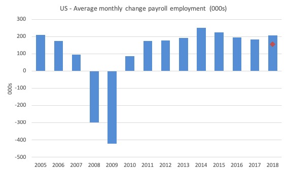
The next graph shows the same data in a different way – in this case the graph shows the average net monthly change in payroll employment (actual) for the calendar years from 2005 to 2018 (the current year is up to November).
The red diamond is the current month’s increase.
The slowdown that began in 2015 continued through 2017 and 2018 so far appears to have reversed that trend, with the current average for 2018 (213 thousand) higher than the 2017 average.
The average change in 2017 was 182 thousand, down from the 195 thousand average throughout 2016.
The average net change in 2014 was 250 thousand, in 2015 it was 226 thousand.
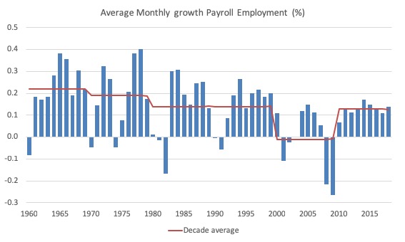
To put the current recovery into historical perspective the following graph shows the average annual growth in payroll employment since 1960 (blue columns) with the decade averages shown by the red line.
It reinforces the view that while payroll employment growth has been steady since the crisis ended, it is still well down on previous decades of growth.
Labour Force Survey – employment growth strong
In November 2018, employment as measured by the household survey rose by 233 thousand net (0.15 per cent) while the labour force rose by 133 thousand (0.08 per cent).
As a result, total unemployment fell by 100 thousand and the unemployment rate fell at the second decimal point to 3.67 per cent (from 3.74 per cent).
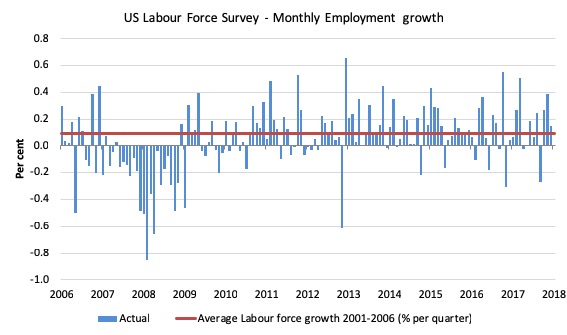
The next graph shows the monthly employment growth since the low-point unemployment rate month (December 2006). The red line is the average labour force growth over the period December 2001 to December 2006 (0.09 per cent per month).
Summary conclusions:
1. There is still no coherent positive and reinforcing trend in employment growth since the recovery began back in 2009. There are still many months where employment growth, while positive, remains relatively weak when compared to the average labour force growth prior to the crisis or is negative.
3. The November growth rate was down on the last two months.
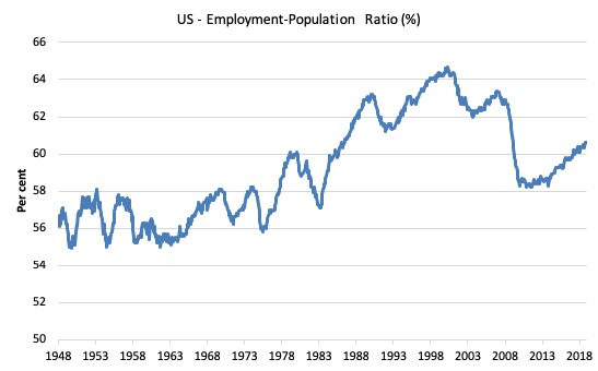
A good measure of the strength of the labour market is the Employment-Population ratio given that the movements are relatively unambiguous because the denominator population is not particularly sensitive to the cycle (unlike the labour force).
The following graph shows the US Employment-Population from January 1970 to November 2018. While the ratio fluctuates a little, the November 2018 ratio was steady at 60.6 per cent.
It has risen by 0.5 points since the beginning of 2018.
Over the longer period though, we see that the ratio remains well down on pre-GFC levels (peak 63.4 per cent in December 2006), which is a further indication of how weak the recovery has been so far and the distance that the US labour market is from being at full capacity (assuming that the December 2006 level was closer to that state).
Unemployment and underutilisation trends
The first graph shows the official unemployment rate since January 1950.
It is clear that the US labour market is reaching unemployment rates not seen since the late 1960s.
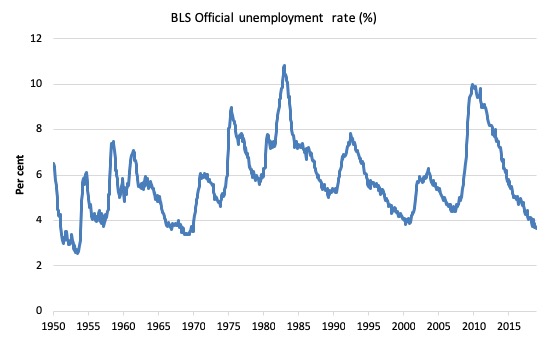
The official unemployment rate is a narrow measure of labour wastage, which means that a strict comparison with the 1960s, for example, in terms of how tight the labour market, has to take into account broader measures of labour underutilisation.
The next graph shows the BLS measure U6, which is defined as:
Total unemployed, plus all marginally attached workers plus total employed part time for economic reasons, as a percent of all civilian labor force plus all marginally attached workers.
It is thus the broadest measure of labour underutilisation that the BLS publish.
In December 2006, before the effects of the slowdown started to impact upon the labour market, the measure was estimated to be 7.9 per cent.
After a period of steady decline over the first part of 2018, it is now at 7.6 per cent (up from 7.4 per cent in October).
Perhaps, the US labour market is starting to turn down.
The U-6 measure is marginally below the pre-GFC level but remains above the trough of the early 2000s.
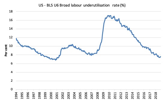
That provides a quite different perspective in the way we assess the US recovery and challenges the view that the US economy is close to full employment.
The US jobs deficit
The current participation rate of 62.9 per cent is a long way below the most recent peak in December 2006 of 66.4 per cent.
When times are bad, many workers opt to stop searching for work while there are not enough jobs to go around. As a result, national statistics offices classify these workers as not being in the labour force (they fail the activity test), which has the effect of attenuating the rise in official estimates of unemployment and unemployment rates.
These discouraged workers are considered to be in hidden unemployment and like the officially unemployed workers are available to work immediately and would take a job if one was offered.
In most advanced nations, the population is shifting towards older workers who have lower participation rates – so the US is not special in this regard.
Thus some of the decline in the total participation rate could simply being an averaging issue – more workers who have a lower participation rate as a proportion of the total workforce.
In this blog post (November 7, 2017) – Updating the impact of ageing labour force on US participation rates – I estimated that about 61 per cent of the decline in the participation rate since January 2008 has been due to non-cyclical shifts in the demographic weights (shifting age composition).
That still leaves a significant cyclical response.
Adjusting for the demographic effect would give an estimate of the participation rate in November 2018 of 64.3 per cent if there had been no cyclical effects (up from the current 62.9 per cent).
This would give an adjusted unemployment rate of 5.76 per cent rather than 3.7 per cent, if all the ‘hidden’ unemployed (since December 2006) were to be counted among the official unemployed.
To compute these job gaps we have to set a ‘full employment’ benchmark. I have set this at 3.7 per cent, which is where the US labour market is now sitting.
I explain in this blog post – US labour market – strengthened in February but still not at full employment (April 13, 2018) – is the best case scenario given that I actually think the cyclical losses are much worse than I provide here.
Using the estimated potential labour force (controlling for declining participation), we can compute a ‘necessary’ employment series which is defined as the level of employment that would ensure on 3.7 per cent of the simulated labour force remained unemployed.
This time series tells us by how much employment has to grow each month (in thousands) to match the underlying growth in the working age population with participation rates constant at their January 2008 peak – that is, to maintain the 3.6 per cent unemployment rate benchmark.
In the blog post cited above (US labour market – strengthened in February but still not at full employment), I provide more information and analysis on the method.
There are two separate effects:
- The actual loss of jobs between the employment peak in November 2007 and the trough (January 2010) was 8,582 thousand jobs. However, total employment is now above the January 2008 peak by 10,200 thousand jobs.
- The shortfall of jobs (the overall jobs gap) is the actual employment relative to the jobs that would have been generated had the demand-side of the labour market kept pace with the underlying population growth – that is, with the participation rate at its January 2008 value and the unemployment rate was constant at 3.7 per cent. This shortfall loss amounts to 5,339 thousand jobs.
The following graph shows the US Jobs Gap, which depicts the gap between current employment and the level of employment that would have generated a 3.7 per cent unemployment rate, given current population trends.
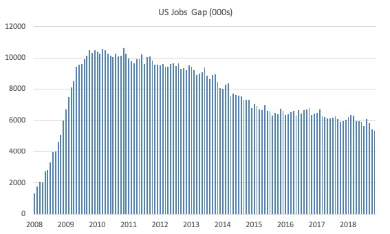
This reinforces the conclusion we reached above that the US labour market, while now enjoying a low official unemployment rate has not fully recovered from the GFC.
By this estimate, there are around 5,339 thousand jobs that could be filled by enticing workers who are outside the labour force to re-enter.
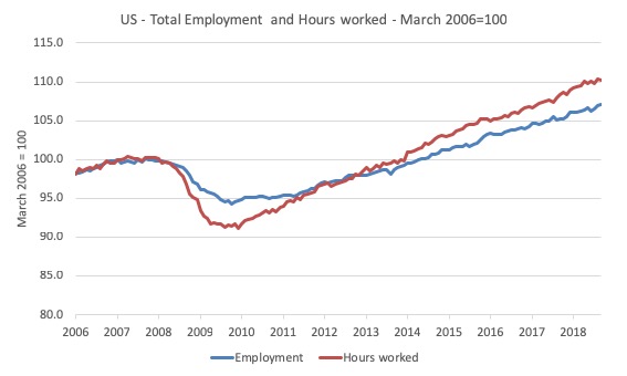
Employment and hours
The first graph shows the index of aggregate weekly hours worked by all employees from March 2006 to August 2015 (red line) and total civilian employment (blue line). The data is from the BLS. Both series are indexed to 100 at March 2007 (peak employment before last cycle ended).
Prior to the crisis, the two series moved more in line with each other as average weekly working hours remained fairly steady.
When the GFC hit, firms adjusted by sacking workers but also reducing hours available, the latter effect being greater because firms hoard skilled labour given the hiring and firing costs are high.
The last thing a firm wants to get is a reputation for being capricious when it comes to expensive labour. Such a firm will find it hard attracting skilled labour in the upturn.
As the recovery ensued, both employment in persons and total weekly hours worked rose, the latter more quickly as the hoarded labour was put back onto longer time.
That process does not seem to have exhausted itself yet – if anything the growing gap between the two time series indicates that there is still significant slack in the US labour market.
U-V curve analysis
How does this fit in with the hiring and firing data available from the – US JOLTS database – supplied by the BLS.
The JOLTS data allows us to distinguish whether ‘supply-side’ movements are driving the shifts in unemployment (that is, actions by workers) or whether ‘demand-side’ factors are more influential.
In general, the JOLTS database usually always shows that it is the number of jobs on offer and the growth of employment that is the dominant force.
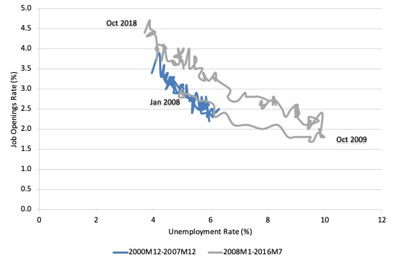
To start the discussion, it is useful to look at the US version of the Unemployment to Vacancies curve (where vacancies are the Total Non-Farm Job Openings as a percent of the Labour Force).
The following graph shows two periods – the first, December 2000 to December 2007, and the second, January 2008 to October 2018.
The two periods combined cover the entire span of the JOLTS data. The segments are pre-crisis and post-crisis (where December 2007 was the peak of the last GDP cycle).
Refer to the blog – Latest Australian vacancy data – its all down to deficient demand – for a conceptual discussion about how to interpret this framework in terms of movements along curves and shifts in relationships.
Basically, the UV (or Beveridge) curve shows the unemployment-vacancy (UV) relationship, which plots the unemployment rate on the horizontal axis and the vacancy rate on the vertical axis to investigate these sorts of questions.
Mainstream economists interpret movements along the curve as being cyclical events and shifts in the curve as structural events.
So, in that framework, a movement ‘down along the curve’ to the south-east suggests a decline in the number of jobs available due to an aggregate demand failure, while a movement ‘up along the curve’ indicates improved aggregate demand and lower unemployment.
If unemployment rises in an economy where there are movements along the UV curve it is referred to as “Keynesian” or “cyclical” unemployment – that is, arising from a deficiency in aggregate demand.
The mainstream economics literature claims that ‘shifts in the curve’ – (out/in) – indicate non-cyclical (structural) factors (more efficient/less efficient) are causing the rising (falling) unemployment.
Allegedly, the UV curve shifts out because the labour market was becoming less efficient in matching labour supply and labour demand and vice versa for shifts inwards.
The factors that allegedly ’cause’ increasing inefficiency are the usual neo-liberal targets – the provision of income assistance to the unemployed (dole); other welfare payments, trade unions, minimum wages, changing preferences of the workers (poor attitudes to work, laziness, preference for leisure, etc).
The problem is that this view is at odds with the evidence.
As is the case in most advanced countries, the shift in the US curve occurred during a major demand-side recession – that is, it has been driven by cyclical downturns (macroeconomic events) rather than any autonomous supply-side shifts.
Once the economy resumed growth the unemployment rate fell more or less in line with the new job openings rate – tracing the grey line up to the north-west of the graph.
The data tells us that the US labour market is tightening. The question is how much further can the movement up along the UV-curve go?
Flows analysis
One way to think about the extent of the supply-side capacity is to examine the flows data from the labour force survey.
I discuss the use of gross flows data in this blog post (among others) – ().
I don’t intend to do a full analysis here of the latest data.
But examining the flows from outside the labour force into employment and unemployment is a useful way of understanding how much spare capacity there might be on the supply-side of the US labour market.
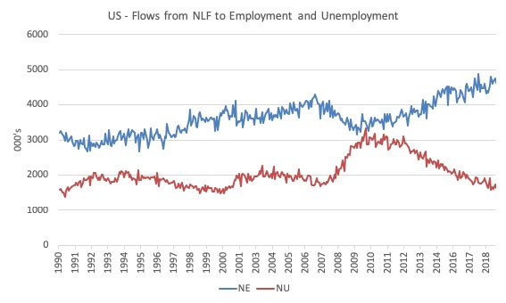
The following graph shows these flows from February 1990 to November 2018 (in thousands).
The data shows that the NE transition (not in labour force to employment) is at record highs (the data was first published in 1990) and the upward trend is not slowing.
Workers are being drawn back into employment from inactivity in record numbers as the expansion continues.
With the participation rate still well down on historic highs (even after adjusting for ageing), one has to conclude that there is still supply-side capacity to be absorbed within the US labour market.
This conclusion is consistent with the estimates of the Jobs Gap presented above.
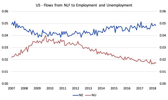
The next graph shows the flows in terms of transition probabilities (the likelihood that the flow will occur) from January 2007 to November 2018.
In November 2018, a worker who is currently outside the labour force has a 4.8 per cent chance of entering the labour force by gaining employment (depicted NE) compared to entering 1.7 per cent change of entering unemployed (depicted NU).
That is a dramatic shift from the situation that prevailed in April 2010 when the respective probabilities were NE 4.2 per cent, NU 4 per cent.
Unemployment dynamics
Another way of thinking about the extent of supply-side capacity (slack) in the US labour market is to consider the response of long-term unemployment to the cycle.
The BLS report that the average duration of unemployment is now 21.7 weeks. In December 2006 it was 16.1 weeks. So the temporal quality of the unemployment pool is still biased towards long-term unemployment
Of course, mainstream economists consider the problem in the US to be structural and conclude that the long-term unemployed are largely ‘unemployable’.
This perspective goes back to the start of the neo-liberal period.
The 1994 OECD Job Study became the bible for governments everywhere, which were intent on abandoning their commitment to full employment and, instead, concentrate labour market policy on supply-side initiatives.
This was the so-called start of the activism agenda – the pursuit of ’employability’ – rather than maintaining the responsibility for ensuring there were enough jobs available.
It was claimed that persistent unemployment was due to poor attitudes and lack of training.
The principle claim was that long term unemployment possessed strong ‘irreversibility’ properties.
Irreversibility is sometimes referred to as hysteresis and suggests that the long term unemployed constitute a bottleneck to economic growth which can only be ameliorated through supply-side (rather than demand-side) policy initiatives.
So the mainstream contention was that one cannot really count them among the ‘work read’ pool of available labour.
The OECD considered that only by “market-based” developments – privatising public employment services, harsh welfare-to-work changes, tightened activity tests, reductions in the real value of income support for the unemployed etc – that this alleged irreversibility would be alleviated.
The problem is that the facts never supported the ideologically-obsessed narrative that the neo-liberals pushed, which were used to justify the dismantling of the public sector and the privatisation of labour market programs.
First, unemployment only falls when there is strong enough growth in aggregate spending. Training and motivation schemes do not reduce unemployment.
The reason?
Please read my blog – What causes mass unemployment? (January 11, 2010) – for more discussion on this point.
Second, when there is an strong enough expansion in spending which stimulates labour demand, not only do the short-term unemployed gain work but also the long-term unemployed find work.
In earlier work that I have done studying the rise in long term unemployment I found no evidence that there had been any major structural shifts in the relationship between long-term unemployment and total unemployment in most nations.
The sharp rises in long-term unemployment occur as a consequence recessions.
The long-term unemployment rate typically rises with a slight lag with the official unemployment rate.
So during a prolonged downturn, the flows into short-term unemployment feed longer duration spells of unemployment which then cascades over into long-term unemployment.
All the dynamics of the long-term unemployment rate are demand-driven. I have never been able to construct them as steady structural shifts driven by behavioural supply side changes.
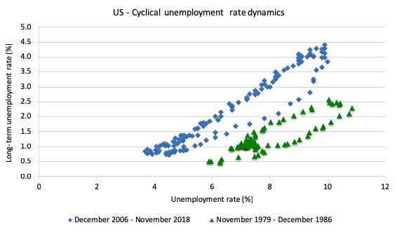
The next graph compares the relationship between the official US unemployment rate (horizontal axis) and the long term unemployment rate (vertical axis) for two cycles coinciding with the 1982 recession (green markers – low-point unemployment rate – November 1979 was 5.9 per cent) and the current downturn (blue markers – low-point unemployment rate – December 2006 was 4.4 per cent).
The data for the 1982 recession shows that the economy started with a higher unemployment rate which rose sharply and drove a rise in the long-term unemployment rate.
The cycle is depicted as a counter-clockwise movement in the data.
In the recovery phase, the long-term unemployment rate dropped (in a lagged pattern) with the improvements in the official unemployment rate.
In the GFC and aftermath period (blue markers), the US labour market started from a better position but the downturn was more severe and drawn out even though the unemployment rate only rose to 10 per cent rather than 10.8 per cent in November 1982.
However, it is the persistent of the slackness that accounts for the rise in the long-term unemployment rate.
But if you compare the actual slope of each of the recoveries (once the long-term unemployment rate peaks and starts to fall again) they are almost identical.
So just as the long-term unemployment rate fell to low levels as the 1982 recovery strengthened, the same thing has happened in the current period.
So the long-term unemployed do not appear to pose a major constraint on growth (and reducing the overall unemployment rate).
That is why the sustained 3.7 per cent unemployment rate in the US at present has confounded those who assume these structural constraints are real (outside their flawed economic modelling).
Further analysis of capacity available
I have previously discussed the drop in labour force participation in the US since 2000.
See the most recent blog post on this topic – Updating the impact of ageing labour force on US participation rates (November 7, 2017).
What that analysis (which is supported by the discussion above) tells me is that there is still considerable supply-side slack in the US labour market.
I use the term ‘supply-side slack’ to mean that there are plenty of workers who are idle in one way or another and who want to work some or more but cannot find the hours because labour demand is weaker than needed.
As note above, the BLS U-6 measure adds together total unemployment, all marginally attached workers, all employed part time for economic reasons and expresses this as a percent of all civilian labor force plus all marginally attached workers.
In November 2018 the components are (in thousands):
1. Total unemployment = 5,975 thousand.
2. Total marginally attached workers = 1,678 thousand.
3. Total part-time for economic reasons = 4,802 thousand.
4. Total comprising the U6 numerator = 12,455 thousand.
5. However, within the Not in the labour force category (total 96,043 thousand as at November 2018), there were 5,060 who want to work and for various reasons fail the activity test (didn’t search within the last 4 weeks).
So it is more realistic to consider these workers as being possible capacity rather than restrict our estimates to the marginally attached workers who are available for work now.
That would give a total number of 1 + 3 + 5 = 15,837 thousand.
That figure is an aggregate – that is, it doesn’t decompose spatially (where people live relative to jobs) and the sort of ascriptive characteristics the people bring (education, experiences, age, etc).
We also cannot convert that number into a full-time equivalent number because the BLS does not provide detailed hours breakdowns.
The BLS Labour Force survey doesn’t publish the extra hours this cohort would prefer but we do know the proportion that would usually work full-time.
For example, in November 2018, 26 per cent of those who were forced to work ‘part-time for economic reasons’ usually worked full-time.
As a result of the constraint, they were on average working just 23.6 hours per week instead of 35 hours.
So a considerable idle capacity.
The JOLTs data set noted above provides information on labour demand.
In October 2018, there were 7,079 thousand non-farm job openings.
To get a feel for the scale of the flows within the US labour market, there were 5,892 thousand non-farm hires in October 2018, and 5,556 thousand separations
So a very large percentage of those job openings turnover each months as workers are laid off (1,691 thousand) or quit (3,514 thousand).
The point is that while there has been continued growth in the job openings in the last few years there are still many more people available for work than there is new jobs opening up.
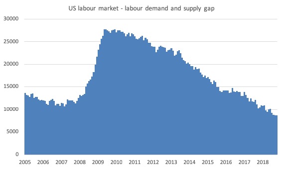
The following graph estimates the gap between labour supply (employment plus unemployment plus part-time for economic reasons plus not in the labour force but want to work) and labour demand (employment plus job openings) from January 2005 to October 2018.
This is an estimate and I am working on more complex ways of developing the measure.
The point is that as at October 2018, this measure of slack – the gap – stood at 8,665 thousand or 5.4 per cent of the labour force.
That is, there is a shortage of jobs and it is likely that while the unemployment rate might not have far lower to go, there is a large pool of workers either underemployed or outside the labour force that want to work more hours.
The Green New Deal proposal
The reason I have been interested in developing an understanding of the extent of the slack in the US labour market, is to help me appreciate the challenge ahead if the US was to pursue the current proposal for a – Green New Deal – doing the rounds in Democrat circles at the moment in the US.
In fact, the terminology dates back to 2007 when the New York Times journalist Thomas L. Friedman talked about it.
On July 17, 2008, Mark Lynas, attached to the Green New Deal Group, wrote an Op Ed – A Green New Deal.
He used terms such as the “war economy” (channelling Keynes) but “this time not towards fighting fascism, but towards heading off ecological crisis”.
The US Green Party was proposing such a plan in 2012.
But this sort of initiative is not confined to the US.
On May 1, 2009, the Green Political Foundation associated with the Heinrich Böll-Stiftung (which is allied to the German Green Party) published – Toward a Transatlantic Green New Deal.
There is now a – Global Marshall Plan Initiative – being advocated by a host of people around the world.
So the idea has currency all over the world.
The US proposal is rather sketchy at present and obviously needs a lot more detailed work before we can fully appreciate what it involves.
Suffice to say the idea will not be financially constrained as this article – We Can Pay For A Green New Deal (November 30, 2018) clearly points out.
I didn’t like the reference in that article to:
Sure, it’ll cost a lot of money.
How much ‘money’ is associated with the project is not the ‘cost’ of the project.
Modern Monetary Theory (MMT) clearly differentiates between a fiscal outlay (a $ entry into some document and account) and the real resources that the outlay brings into productive use or diverts from another use.
The real resource usage is the ‘cost’ not the fiscal outlay.
Language is extremely important even if one is playing a political game.
If we don’t make the distinction as above then we invite politicians to talk about fiscal policy all the time and ignore the real costs and benefits of policy choices.
There was also a statement in the article that said that the Green New Deal:
… won’t be a drag on the economy …
Here we have to be careful and this is what piqued my interest.
In the past, I have done detailed modelling of shifts to renewables within Australia.
For example, see A Just Transition to a Renewable Energy Economy in the Hunter Region, Australia (published June 2008).
We updated that work some years later but the Report that was completed remains confidential and has not yet been released by the client we worked with.
The point is that these substantial structural shifts in industrial production – carbon to green, in this case – create massive changes in labour markets, local communities, and the like.
While progressives should support these transitions (as long as they are Just), the reality is that there are winners and losers from these shifts – both in terms of persons and regions.
In the Australian case, closing down the entire coal export sector, while desirable and inevitable, would lead to substantial job losses in that sector, which would have to be offset elsewhere.
Other work I have done on saving rain forests tells me that the spatial concentration of these resources leads to massive job losses in certain regions and towns that are hard to offset.
In the work cited above and the unpublished work we outlined the concept of a Just Transition, which would help the losers adjust to the shifts.
Further, one cannot simply focus on one sector while ignoring the implications for other sectors.
My research on this sort of adjustment is on-going but here are some dimensions for a green new deal in the US.
The International Trade Union Confederation published an interesting study (April 2012) – Growing Green and Decent Jobs.
It is a very nice piece of analysis and though a little dated, given the technological improvements in renewable modes, it still contains valuable information.
The basic proposition that:
There is no choice but to transition to a greener economy, where social needs and environmental protection are at the heart of decision making.
I consider that to be an unimpeachable statement.
I also agree that:
Jobs-centred growth is essential to kick start economies in developed, developing and emerging countries.
And my own work over many years on this topic is consistent with their findings.
The ITUC Report (cited above) estimated that over a five-year period, a shift to a green economy would likely generate between 15.3 million (low job creation) to 20.7 million (high job creation) depending on assumptions made about the scale.
In 2012, these shifts amounted to 10.5 per cent of total employment (low job creation) to 14 per cent (high job creation).
As at November 2018, 14 per cent of total employment would be 21,951.3 thousand.
In other words, a huge shift in the employment structure and multiples of the available idle labour supply.
Which jobs are going to be lost? Which sectors are going to be significantly contracted and how will that happen?
I will write more about this in the future.
But for now the Green New Deal proposal will require major non-market interventions to make it a reality.
In the 1960s, governments introduced processes called manpower and occupational planning to guide policies relating to industry development, education and training to ensure major shortages in labour did not eventuate.
Departments of Labour had huge forecasting divisions which informed these processes.
It was the anathema of neoliberalism.
The Green New Deal will require that sort of capacity to be reintroduced.
In other words, it will require that the US make a massive shift in culture with much more government intervention and restrictions and penalties on ‘non-green’ activities.
That will be a challenge I think.
Conclusion
The November BLS labour market data release for the US tells me that the US labour market slowed a little.
Caution should always be exercised given the volatility of the monthly data.
The official unemployment rate is at levels not seen since the late 1960s but the U6 broad underutilisation rate is still at elevated levels (albeit dropping).
And there is still a lot of slack outside the labour force.
While the participation rate is still well below where it was even after we adjust for the ageing effects (retirements), the strong employment growth over the last few months has seen activity rising.
But there is still slack in the system.
That is enough for today!
(c) Copyright 2018 William Mitchell. All Rights Reserved.
‘Language is extremely important even if one is playing a political game.’
What is so valuable about MMT is that it awakens us (me in particular) to what Wittgenstein called ‘the bewitchment of our intelligence by means of language.’
The tail of language ends up wagging the dog of our thinking. Whenever the habitual hard wiring of my conditioning is challenged I can feel a jolt in my brain which tells me I fell into mechanical non-thinking and a ‘gestalt shift’ takes place. I often find a fall back into the habitual again and have to be re-jolted. Luckily and thankfully, we have Bill’s blog to do the daily ‘jolt.’
Perhaps we need a newspaper called the Daily Jolt?
MMT is a great tool for waking oneself up!
What concerns me, as I turn 70, is the difference in the quality of available jobs at the time I entered the labor market as a young man and those being counted in current employment analyses. I had numerous opportunities to invest myself in a wide variety of work opportunities, and virtually all of them were solid positions for decent pay and ample benefits, and, perhaps most importantly, an implied or explicit promise of job security. What I see today are massive numbers of temp workers doing gig jobs with meager pay and little to no benefits. So isn’t comparing and computing the jobs of today with the jobs of yesterday an apples-and-oranges thing, sort of like comparing President Trump to President Kennedy. Yes, they’re both presidents, but……………
Newton, Bill factors in underemployment and zero hours employment into his analyses. His reference point is always full employment with Job Guarantees backing up shifts in employment patters.