For years, those who want selective access to government spending benefits (like the military-industrial complex…
Britain’s austerity costs are larger than any predicted Brexit losses
On February 21, 2019, the British Office of National Statistics (ONS) released the latest fiscal data for the British government – Public sector finances, UK: January 2019. There was a lot of press reaction applauding the result and even progressive writers found it possible to misrepresent what the data actually is telling us has been happening. The fact that the British government recorded a fiscal surplus of £14.9 billion in January 2019 was touted in terms of creating a ‘war chest’ that the Government will be able to delve into when the next crisis arrives (which might be soon if the current Brexit mishaps continue). The reality, is, of course, totally different. There is no stored up spending capacity (stock) created when a government runs a surplus. What is actually happening is that the net flows out of the economy to the government squeeze an already over-indebted non-government sector for liquidity and destroy that much of its wealth portfolio. Moreover, while all and sundry, including the Euro-leaning Left are frothing at the mouth over Brexit, new data now allows us to compute the losses arising from the deliberate strategy of fiscal austerity that the Government has pursued. Guess what? They appear to dwarf all the Project Fear estimates of losses arising from Brexit (notwithstanding the flaky nature of those estimates). Where is the Guardian’s column Austerity Watch to match its hapless Brexit Watch column? Where is the relentless stream of articles from Guardian journalists and Op Writers about austerity? Sorry, that would take up space which is occupied by the relentless stream of articles about Brexit?
When the ONS published the data, various journalists were extolling the virtues of the fiscal surplus in a number of different ways – ‘creating savings’, ‘storing up future spending capacity’, ‘taking pressure of interest rates’, ‘reducing future tax liabilities’, and all the rest of the guff.
The commentary was generally disappointing from a Modern Monetary Theory (MMT) perspective.
Even the commentary by Larry Elliot in the Guardian (February 21, 2019) – Hammond will keep his powder dry over pre-Brexit windfall – was a bit disappointing.
Readers were told that:
The chancellor will adopt a wait-and-see approach to talks before allocating his surplus funds …
The size of the surplus recorded … means Hammond now has ample scope to do just that, should the need arise.
In any event, Hammond is now in a better position than he was when he made his budget speech in late October.
1. A Chancellor does not allocate fiscal surpluses. They are flows and are gone the moment they occur. The tax revenue will be a number in an account. But that is a meaningless construct when assessing whether the British government can spend.
2. The size of the surplus (or even its existence as an accounting construct) doesn’t increase (or decrease) the financial capacity of the British government to spend tomorrow or the day after that.
In political terms, by misleading the public on what surpluses actually mean, the government might lie and claim it has more scope to spend.
But the UK Guardian should not be helping them with that deception.
Using terms like “better position” reinforces the lie that deficits are bad and surpluses are good.
Effectively, the real story is that the fiscal surplus which the Office of National Statistics recorded as having risen to £14.9 billion in January 2019 destroyed that much non-government wealth in January 2019.
That, in turn, further squeezes non-government sector liquidity at a time when households are carrying massive and unsustainable debt burdens and business firms are reluctant to invest given a range of uncertainties.
That is what a progressive media outlet should have reported.
Which then leads to a report published by the New Economics Foundation (February 21, 2019) – Austerity is subduing UK economy by more than £3,600 per household this year.
The NEF analysis focuses on what impact the process of cutting net government sector spending has had on the prosperity of the British people.
I find this sort of analysis of what has actually been happening in Britain much more compelling than all the Project Fear analysis of what might be in the face of Brexit, especially given the ridiculous modelling assumptions that have been used to come up with those Brexit doom scenarios.
The NEF estimated, in relation to the Tory’s fiscal policy management since they were elected in May 2010, that:
1. “for nine years, the elephant in the room has largely been missed: the sheer scale of economic damage that these targets have contributed to in the first place”.
2. “The human impacts have always been clear. Whether rising homelessness, frozen benefit payments, overcrowded school classes or excessively long waits in hospital A&E services, the starved ambition and resources of our public realm have touched the lives of almost everyone.”
3. Derived from Office of Budget Responsibility analysis, the NEF estimates that “the effects of austerity on GDP over the decade so far … have suppressed the level of GDP by almost £100 billion in the 2018/ 19 alone”.
4. That is, discretionary policy decisions since 2009-10 have reduced real GDP growth by such an extent that in 2018/19, GDP is 4.7 per cent lower than it would otherwise have been without the austerity.
5. “To break this number down another way, it means that deliberate policy from government over the past nine years has had the standalone effect of suppressing incomes and expenditure in the economy by just under £1,500 per person and more than £3,600 per household, in this year alone.”
And think about that in the context of Project Fear and Brexit.
On February 26, 2019, the British Government’s Cabinet Office issued another Project Fear (PF) document – Implications for Business and Trade of a No Deal Exit on 29 March 2019 – which alleges that under a no-deal Brexit (aka Armageddon in PF-speak) would be:
… 6.3-9% smaller in the long term in a no deal scenario (after around 15 years) than it otherwise would have been when compared with today’s arrangements, assuming no action is taken
They note that “there is an inherent uncertainty around this type of economic analysis … The results … should be interpreted with caution.”
The document doesn’t tell us how the results were derived but we know that in similar ‘modelling’ efforts rather odd behaviour is assumed of the British government in the face of economic collapse.
For example, in November 2018, the British Government published its – EU Exit Long-term economic analysis – which produced similar estimates.
Importantly, in the “modelling” exercise, there were no “domestic policy responses” modelled.
We read:
The analysis has not sought to consider the potential impact of future domestic policy responses that the UK Government and devolved administrations may implement, including in a no deal scenario …
The analysis does not make judgements about future economic policy and no assumptions are made on the impacts of any future policy, including on seeking to realise any wider opportunities from exit beyond the illustrative new trade partnerships explicitly modelled with the rest of the world.
So in this story, as Britain burns, Nero fiddles.
The British government just watches the chaos unfold and does nothing!
Again, on November 28, 2018, the HM Treasury’s Project Fear partner, the so-called independent Bank of England published its own horror story – EU withdrawal scenarios and monetary and financial stability – which presented various “scenarios” relating to Brexit.
While they came up with similar ‘losses’ in GDP to the most recent Government report, they also assumed:
1. “no discretionary changes in spending or tax policy are assumed” – the ‘Government sits doing its knitting while the economy collapses around them’ assumption.
2. The central bank hikes interest rates “mechanically” and in some scenarios the interest rate rises to 5.5 per cent.
Just think about that sort of scenario: external trade is collapsing around them, credit availability tightens, macroeconomic uncertainty rises (which would affect household consumption spending and business investment) and GDP growth starts to nose-dive and while that is happening Treasury does nothing and the Bank of England hikes interest rates to 5.5 per cent.
If you believe that, then, as they say, you would believe anything.
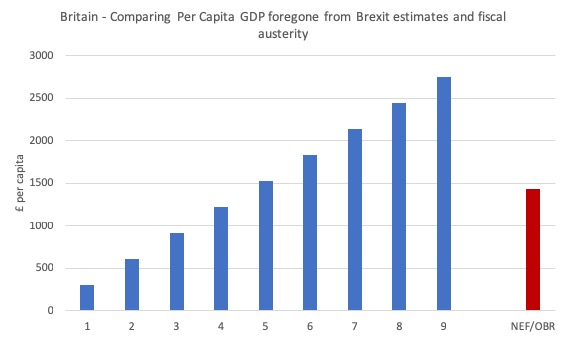
But the point is that all these Project Fear estimates of the worst case scenarios are suggesting per capita losses much lower than those that have arisen through deliberate austerity imposed by Britain’s Tory government.
The ONS publication (February 11, 2019) – GDP first quarterly estimate, UK: October to December 2018 – tells us that the British economy produced £2,033,623 million worth of goods and services in real terms in 2018.
The per capita result was £30,596 per person.
The following graph shows what the various predicted losses per capita would be from different Brexit impacts (in terms of per cent of GDP foregone, depicted by the blue columns), and the NEF/OBR estimates of the austerity over the last 9 years (depicted by the red column).
The horizontal axis numbers are the different percentage losses of current real GDP after 15 years.
And remember, the latest Brexit impact results are the total over 15 years whereas the NEF/OBR estimate is for a single year (2018/19).
If we expressed the estimated Brexit losses on an annualised basis, taking into account the compounding involved, the Brexit losses estimated would be very small on a per capita basis – like a hundred odd pounds instead of thousands – compared to the actual fiscal austerity cost that has been already endured due to the Government’s folly.
So why isn’t the Guardian and other media outlets running an Austerity Watch column, instead of ‘Brexit Watch’ articles?
Which then leads to the most recent data release from ONS (February 26, 2018) – The effects of taxes and benefits on household income, disposable income estimate: 2018 – which presents the most recent ONS analysis of “how taxes and benefits redistribute income between various groups of households in the UK”.
The analysis is divided into two separate publications:
1. Average household income, UK: Financial year ending 2018.
2. Household income inequality, UK: Financial year ending 2018.
What the data shows is that:
1. Income inequality has risen in the UK over 2018 but not by much.
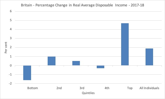
2. But the real average income for the lowest quintile of households went backwards in 2017-18 as the following graph shows.
3. The top 20 per cent of income recipients enjoyed a real growth of 4.7 per cent while the bottom 20 per cent went backwards in real terms by 1.6 per cent.
ONS indicated that:
The average income of the poorest fifth of the population – when ranked by equivalised household disposable income – contracted by 1.6%, mainly driven by fall in the average value of cash benefits their households receive. The average income of the richest fifth, on the other hand, increased by 4.7% due largely to increases in average household earnings from employment.
So fiscal austerity is squeezing real incomes for the poorest while the richest are extracting real income growth via their employment.
So, in addition to fiscal austerity leading to large overall losses of GDP (income), it has also led to a slight rise in income inequality.
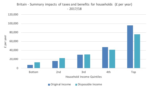
The next graph summarises the impact of the tax and transfer system in Britain on household disposable income.
The dark blue columns are the original income for each quintile and the jade columns (to the right for those who struggle with color differentiation) is the disposable income in 2017/18 after the redistribution system takes effect.
For the bottom quintile, the taxes and transfer system boosts their original income by 71.2 per cent (from a very low base).
Then the differences are 37.4 increase (2nd quintile), 1.37 per cent increase (3rd quintile), 11.6 per cent decline (4th quintile) and a 20.6 per cent decreases for the top quintile.
So there is some redistribution going on. I am doing some more analysis of this data to resolve some other queries I have which will also shed more light on this redistributive element.
My current conjecture is that the middle class is being hollowed out and some data is suggesting that. But I need more time to get the evidence.
Conclusion
This blog post really constituted notes I took when I was examining the latest data from the Office of National Statistics and doing some calculations.
The juxtaposition of the NEF report and my own subsequent calculations with the proposed losses into the distant future from an extreme (in their eyes) Brexit is, in my view, interesting and clearly not well perceived in the public debate.
I am not suggesting that progressive elements, who oppose Brexit in Britain and regularly tout their conjectures on the damage it might (or might not) cause, are indifferent to the damage that the fiscal austerity has actually caused.
Clearly, they are on the record as being hostile to the Tory austerity.
But their hostility to austerity seems more muted and less persistent than their hostility to Brexit, which I find odd.
And when you see the relative scales of the losses arising from what has happened (austerity) and what might happen (Brexit with a nonsensically passive Treasury and a destructive Bank of England response) then it reinforces the curiousness of the relative responses.
The Guardian, for example, loves pumping out anti-Brexit articles on a daily basis but the frequency of anti-austerity articles is much lower, despite the estimates now showing that the latter will leave a much larger loss in GDP (and human suffering) than Brexit is likely to cause.
That is enough for today!
(c) Copyright 2019 William Mitchell. All Rights Reserved.
Hi Bill,
I don’t know whether this strictly relevant But I am puzzled by the case of New Zealand where the Taxes are not directly paid to the Inland Revenue but into a private Westpac account held by the government. From there I understand it is distributed to the various govt. departments that also hold accounts at the same bank. The govt. seems to me to be going to great lengths not to spend using it’s own bank, the reserve bank, to spend money into the economy.I have read a lot in mmt about taxes being cancelled when they are paid to the taxation authority, so how does this fit?
Regards,
Richard Pennell
Trying to get my head around that chart showing per capita GDP change due to austerity versus that due to No Deal Brexit. I think I get the austerity bar – it is today’s per capita GDP minus what it would have been without 9 years of austerity (I think). But the No Deal bars? Is that per capita GDP in 15 years’ time at different negative % GDP impacts minus today’s GDP or minus what it would be in 15 years’ time if we Remain? If the latter then the official estimates indicate a comparable impact from No Deal (after 15 years) compared to Austerity (after 9 years). However, if the former then I think the No Deal impact is implicitly much worse than Austerity. I must be mis-interpreting the data! Hold on – I think I see it. The ‘No Deal’ variance is simply the sum change over 15 years. So ignoring compounding and time variance, we can roughly divide the impact by 15 to get an annual impact. Wow! Are they really that venal? Why not project out 100 years to get a REALLY scary number
Dear MattR (at 2019/03/04 at 5:47 pm)
The graph and the statements I made about it should not be see as an exact science in any way. I computed various losses that would occur at different GDP levels) – the 15 year horizon was the government’s horizon. The results were indicative only and the NEF came up with similar outcomes so there some validation.
Whatever the final outcomes of the Brexit process might turn out to be, the costs of austerity can be estimated in the way described using official government data and their own analysis.
It seems obvious, that even taking the worst case scenarios of Brexit (say the Bank of England estimates) we cannot get significantly worse outcomes than Britain has already endured under austerity.
Given that, the imbalance in the debate, seems odd, which was the point of the blog post.
best wishes
bill
Bill,
I didn’t see where you sad what the numbers 1 through 9 across the bottom refer to.
I went back and read it again and still don’t understand.
Steve
Well, after reading all this and attending a church session on poverty here in Sheffield, I must admit, as a Remainer, that we may need to take the bilharzia cure, i.e. Leave. When the bilharzia worms enter the blood stream and lay eggs they causing extreme irritation and deterioration of key organs. The only cure in my day was a heavy dose drastic medicine that made you as sick as a dog for 24 hours such as you cannot believe; but it cleans out the parasites and their eggs.
Sufferers emerge weak and listless, but recover quickly within a week and regain a healthy life . The parable is made more compelling in that the parasites enter the body mainly through the penis.
Richard Pennell
Are you sure that’s what really happens or is it what you are being told?
In the UK (since 2006) there is a similar system whereby tax revenue is received by two commercial banks and the same two banks make government payments. However, there is no sense that the revenue receipts are “distributed” to the paying accounts. You would need to investigate and understand how the NZ interbank settlement system works, but I guess it would be done by the RBNZ, the same as it is done by the BoE in the UK. Then you would see that the underlying reserves held in the settlement system are withdrawn when tax is received and added when payments are made. The government account, in the UK the Account of Her Majesty’s Exchequer, maintains a record of it all – keeps score in Mosler’s terminology. I would urge you to google “Interbank Settlement System New Zealand” and you’ll find there is a paper on Real Time Gross Settlement amongst many others.
Richard Pennell
PS. I just glanced through that paper and it contains some very useful flow diagrams that are better than the ones in the similar BoE paper. It even shows the flow of reserves when the government issues bonds. I’ve added it to my library.
When and how am I going to be able to purchase the new textbook? Sorry for the interruption.
@Nigel Hargreaves,
“In the UK (since 2006) there is a similar system whereby tax revenue is received by two commercial banks and the same two banks make government payments. However, there is no sense that the revenue receipts are “distributed” to the paying accounts.”
This for me has been a stumbling block in being able to conclusively “prove” in online debate that taxes don’t fund spending (I’m not an economist or banker, so it all seems quite esoteric), and I’ve met online resistance in the past from people who “appear” to know the arrangements and details of the Exchequer’s “bank account” (forget the name), and who have attempted to refute the idea that taxation effectively destroys money, by making reference to this very matter.
I would love to see a diagram or article (preferably official!) showing the precise movements within the Exchequer’s accounts, that can prove definitively to detractors the fact that money is indeed “destroyed” by taxation. Unfortunately, taken at face value, the retail banking arrangements of the Exchequer make it easy to believe, instead, that the payment of taxes does indeed fund govt spending.
I am familiar with the “reserve add must precede a reserve drain” argument – though this is very abstract for non-MMT initiates to understand, but do you (or Bill… or anyone else?) have any ideas for sources of clear evidential information regarding the exact movements in the Exchequer’s accounts that could prove the “destruction” of tax payments, and non-use for govt spending?
Thanks, Mr S.
@ Christopher Herbert
I am also eager to get my hands on this
Dear All
Click on the Menu Option above MMT Textbook for all the details of how to access the new book.
Thanks for your interest.
best wishes
bill
It’s not just planet Earth that spins round in circles so do most individual’s brains. There is a massive failure to understand the need to democratise the key commodity of money so that adequate demand can be sustained for all in every nation. Instead we get all the claptrap from the few about there being only a limited means of successfully optimising demand – the private sector Invisible Hand (with spinoffs thereof Efficient Market Hypothesis, Rational Expectations Theory, etc.) and automatic fiscal collars that ideally generate rainy day surpluses!
UK Guardian is a fraud. It’s designed to infiltrate and corrupt.
Thanks, Bill — ordered
@ Mr Shigemitsu
The ontological reality of modern money is that it exists in accurate bookkeeping, and after that, in our minds. Anybody who wants to see money received in taxes taken and shoveled into a fire, or something, is going to be disappointed. For sovereign activities, the national Central Bank is the ultimate bookkeeper, the ultimate arbiter of who has how much money, of who can claim to possess a credit against a CB debit. As far as the CB’s technical activities are concerned, as long as they post a balancing credit for every debit they can post whatever they want or need to. As long as in our minds we believe what they say about the money in the national market, the economy can go on.
(I think there’s a passage from Schopenhauer – which I haven’t been able to find, I think Raymond Smullyan cited it somewhere – where at the end of its allotted time, the soul dissolves back into the Great Mother – or something. We could say something similar about money that has been taken back from its life in the national market, and returned to its origin.)
“I am familiar with the “reserve add must precede a reserve drain” argument – though this is very abstract for non-MMT initiates to understand”
We might get a crude example of the money life-cycle, maybe too crude to be popular, from Parker Bros. board game Monopoly™. Notice how the Bank has to take a deficit position of $1500 (if I recall correctly) per player for the game to even start, and further deficit spending of $200 every time someone passes GO. There’s no requirement in the rules that the Bank ever should get this back. Imagine Austerity Monopoly, where at the end of the game, the Bank would have to have got back all the money it ever issued, plus a little more, and wind up in surplus. Depressing enough that the rich-get-richer feedback loop drives all players but one to ruination. Horrible if even that one couldn’t win.
So a 9% loss would be £180 a year. It would take 8.3 years for the worst-case scenario to cost me as much as the last year of austerity did.
I wonder what the total cost of austerity to date has been in that case. I wouldn’t be surprised if it turns out to be so high that it would take Brexit costs literally decades to catch up!
The government creates a ‘reserve’ asset on a commercial bank’s balance sheet much like a customer would when it signs a loan agreement.
The bank simultaneously creates a bank money deposit in the government payee’s account. For all the world it looks very similar to a traditional commercial bank loan operation.
However, this ignores the ‘forced’ nature of the transaction. The government is forcing the commercial bank to expand its balance sheet at a dictated interest rate. There is no choice involved like the choice it has to grant a loan or not to a high street customer. Government similarly forces the banks to contract their balance sheets when taxes are paid to HMRC.
In return the commercial bank gains a banking licence and access to the Bank of England payment system, lender of last resort and ability to clear its money at par.