Today (April 18, 2024), the Australian Bureau of Statistics released the latest - Labour Force,…
US labour market steadies in March 2019
Last week’s (April 5, 2019) release by the US Bureau of Labor Statistics (BLS) of their latest labour market data – Employment Situation Summary – March 2019 – is still being affected by the variability in the sampling and benchmarking changes made by the BLS. However, working through those impacts, one concludes that the US labour market is still adding jobs, albeit at a slower pace than last year. The unemployment rate remains low (at 3.81 per cent) and the participation rate has come off a bit, indicating a slowdown in underway, although month-to-month variability should not be taken as a trend. It is also clear that there is still a substantial jobs deficit remaining and considerable scope for increased participation.
Overview for March 2019
- Payroll employment rose by 196,000 – big shift from February.
- Total labour force survey employment fell by 201 thousand net (-0.12 per cent).
- The seasonally adjusted labour force fell by 224 thousand (-0.14 per cent).
- Official unemployment fell by 24 thousand to 6.211 million.
- The official unemployment rate was unchanged at 3.82 per cent.
- The participation rate was fell by 0.2 points to 63 per cent but remains well below the peak in December 2006 (66.4 per cent). Adjusting for age effects, the rise in those who have given up looking for work for one reason or another since December 2006 is around 3,693 thousand workers. The corresponding unemployment rate would be 5.8 per cent, far higher than the current official rate.
- The broad labour underutilisation measure (U6) was unchanged at 7.3 per cent.
Further, for those who are confused about the difference between the payroll (establishment) data and the household survey data you should read this blog – US labour market is in a deplorable state – where I explain the differences in detail.
Payroll employment trends
The BLS noted that:
Total nonfarm payroll employment increased by 196,000 in March … Notable job gains occurred in health care and in professional and technical services. Employment growth averaged 180,000 per month in the first quarter of 2019, compared with 223,000 per month in 2018.
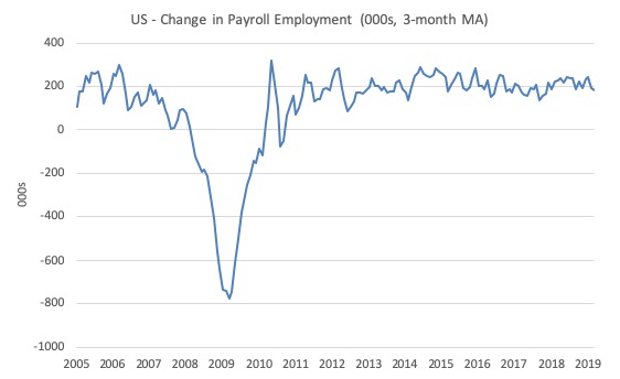
The first graph shows the monthly change in payroll employment (in thousands, expressed as a 3-month moving average to take out the monthly noise).
This month was much more robust than February but still under the average of the last several years.
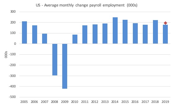
The next graph shows the same data in a different way – in this case the graph shows the average net monthly change in payroll employment (actual) for the calendar years from 2005 to 2019 (the 2019 average being for the first three months at this stage).
The red diamond is the current month’s increase.
The slowdown that began in 2015 continued through 2017 was reversed last year. The 2018 average was 223 thousand compared to 179 thousand in 2017.
So far the average for 2019 is 180 thousand. There is a slowdown rather than a crash going on at present.
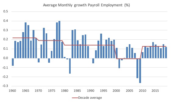
To put the current recovery into historical perspective the following graph shows the average annual growth in payroll employment since 1960 (blue columns) with the decade averages shown by the red line.
It reinforces the view that while payroll employment growth has been steady since the crisis ended, it is still well down on previous decades of growth.
Labour Force Survey – employment growth remains positive
The differences between the Payroll and Household surveys were large this month and the reader should make sure they understand how those differences may arise. Much of the variations this month arose from sampling variability and changes to population benchmarks, which, to some extent, corrected the variability in last months estimates. The BLS Technical Note is useful.
Employment as measured by the household survey fell by 201 thousand net (-0.12 per cent) while the labour force fell by 224 thousand (-0.14 per cent).
As a result (in accounting terms), total unemployment fell by 24 thousand and the unemployment rate was largely unchanged at 3.81 per cent.
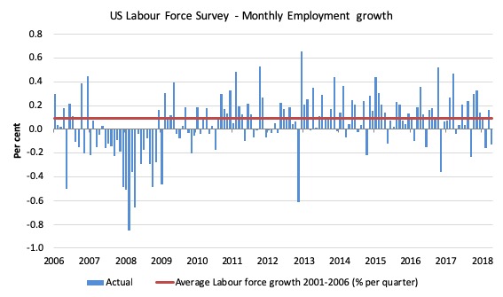
The next graph shows the monthly employment growth since the low-point unemployment rate month (December 2006). The red line is the average labour force growth over the period December 2001 to December 2006 (0.09 per cent per month).
Summary conclusion:
There is still no coherent positive and reinforcing trend in employment growth since the recovery began back in 2009. There are still many months where employment growth, while positive, remains relatively weak when compared to the average labour force growth prior to the crisis or is negative.
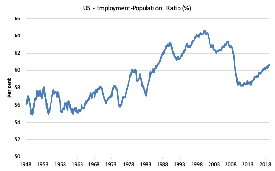
A good measure of the strength of the labour market is the Employment-Population ratio given that the movements are relatively unambiguous because the denominator population is not particularly sensitive to the cycle (unlike the labour force).
The following graph shows the US Employment-Population from January 1970 to March 2019. While the ratio fluctuates a little, the March 2019 ratio fell by 0.1 points to 60.6 per cent.
A slight weakening.
This time last year it was 60.4 per cent. So a larger proportion of the working age population are now in work of some kind.
Over the longer period though, we see that the ratio remains well down on pre-GFC levels (peak 63.4 per cent in December 2006), which is a further indication of how weak the recovery has been so far and the distance that the US labour market is from being at full capacity (assuming that the December 2006 level was closer to that state).
Unemployment and underutilisation trends
The first graph shows the official unemployment rate since January 1950.
It is clear that the US labour market is reaching unemployment rates not seen since the late 1960s (it is slightly lower than the most recent low-point in April 2000).
With inflation stable, the continued low unemployment rates make a mockery of official NAIRU estimates of full employment coinciding with an unemployment rate of 4.5 per cent.
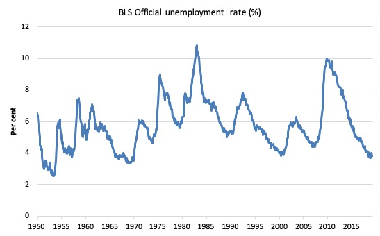
The official unemployment rate is a narrow measure of labour wastage, which means that a strict comparison with the 1960s, for example, in terms of how tight the labour market, has to take into account broader measures of labour underutilisation.
The next graph shows the BLS measure U6, which is defined as:
Total unemployed, plus all marginally attached workers plus total employed part time for economic reasons, as a percent of all civilian labor force plus all marginally attached workers.
It is thus the broadest measure of labour underutilisation that the BLS publish.
In December 2006, before the effects of the slowdown started to impact upon the labour market, the measure was estimated to be 7.9 per cent.
In March 2019 it was down to 7.3 per cent and steady.
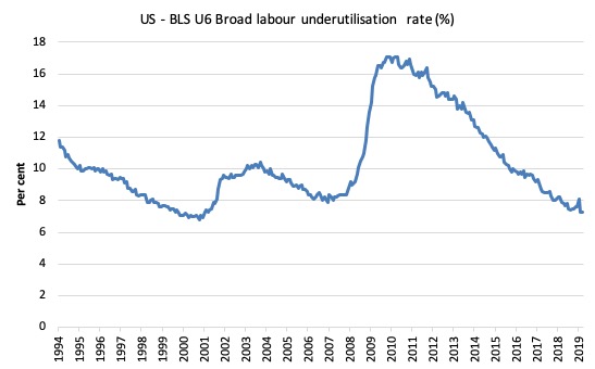
The U-6 measure is marginally below the pre-GFC level but remains above the trough of the early 2000s.
While it is signalling improvement, there is still some scope to go before full capacity is reached.
The US jobs deficit
The current participation rate of 63 per cent is a long way below the most recent peak in December 2006 of 66.4 per cent.
When times are bad, many workers opt to stop searching for work while there are not enough jobs to go around. As a result, national statistics offices classify these workers as not being in the labour force (they fail the activity test), which has the effect of attenuating the rise in official estimates of unemployment and unemployment rates.
These discouraged workers are considered to be in hidden unemployment and like the officially unemployed workers are available to work immediately and would take a job if one was offered.
In most advanced nations, the population is shifting towards older workers who have lower participation rates – so the US is not special in this regard.
Thus some of the decline in the total participation rate could simply being an averaging issue – more workers who have a lower participation rate as a proportion of the total workforce.
In this blog post (November 7, 2017) – Updating the impact of ageing labour force on US participation rates – I estimated that about 61 per cent of the decline in the participation rate since January 2008 has been due to non-cyclical shifts in the demographic weights (shifting age composition).
That still leaves a significant cyclical response.
Adjusting for the demographic effect would give an estimate of the participation rate in March 2019 of 64.3 per cent if there had been no cyclical effects (up from the current 63 per cent).
This would give an adjusted unemployment rate of 5.83 per cent rather than 3.81 per cent, if all the new ‘hidden’ unemployed (since December 2006) were to be counted among the official unemployed.
To compute the job gaps, a ‘full employment’ benchmark of 3.7 per cent is used – this is where the US labour market reached in November 2018.
I explain in this blog post – US labour market – strengthened in February but still not at full employment (April 13, 2018) – is the best case scenario given that I actually think the cyclical losses are much worse than I provide here.
Using the estimated potential labour force (controlling for declining participation), we can compute a ‘necessary’ employment series which is defined as the level of employment that would ensure on 3.7 per cent of the simulated labour force remained unemployed.
This time series tells us by how much employment has to grow each month (in thousands) to match the underlying growth in the working age population with participation rates constant at their January 2008 peak – that is, to maintain the 3.7 per cent unemployment rate benchmark.
In the blog post cited above (US labour market – strengthened in February but still not at full employment), I provide more information and analysis on the method.
There are two separate effects:
- The actual loss of jobs between the employment peak in November 2007 and the trough (January 2010) was 8,582 thousand jobs. However, total employment is now above the January 2008 peak by 10,153 thousand jobs.
- The shortfall of jobs (the overall jobs gap) is the actual employment relative to the jobs that would have been generated had the demand-side of the labour market kept pace with the underlying population growth – that is, with the participation rate at its January 2008 value and the unemployment rate was constant at 3.7 per cent. This shortfall loss amounts to 5,318 thousand jobs.
The following graph shows the US Jobs Gap, which depicts the gap between current employment and the level of employment that would have generated a 3.7 per cent unemployment rate, given current population trends.
The shortfall rose in March 2019 after consistently falling over the last year.
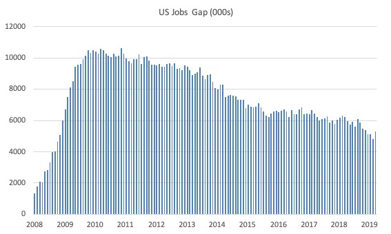
This reinforces the conclusion we reached above that the US labour market, while now enjoying a low official unemployment rate has not fully recovered from the GFC.
Focus on Manufacturing
When Donald Trump campaigned for President in 2016 one of his most important claims was that he would bring the jobs back to the industrial heartlands that had been hollowed out by years of structural decay and damaging recessions.
He made a Speeech on September 15, 2016 at the New York Economic Club where he said:
Over the next 10 years, our economic team estimates that under our plan the economy will average 3.5 percent growth and create a total of 25 million new jobs. You can visit our website, just look at the math, it works …
It will be amazing to watch … You watch, it’ll happen …
My economic plan rejects the cynicism that says our labor force will keep declining, that our jobs will keep leaving, and that our economy can never grow as it did once before …
He was particularly targetting his rhetoric at the disadvantaged communities in America’s manufacturing strongholds that were in decline, leaving few well-paid job opportunities.
This narrative has also driven his tariff policy approach.
Anecdotally, there have been various reports of major manufacturing plant closures in recent months, which would appear to cast doubt on Trump’s performance in this regard.
In late 2018, the Ford and GM car companies responded to poor sales and shifts in consumer preferences away from the vehicles these companies supply, by closing plants in the Mid-west and laying off thousands of workers.
So I thought I would take a look at the data.
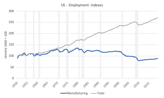
The first graph provides a long term trends in total US employment and Manufacturing employment in the US from January 1950 to March 2019. The index is set to 100 in January 1950. The gray bars at the NBER recession dates.
Total employment is now at 270 index points while Manufacturing is at 88.8 (a 11.2 point decline).
It is interesting that while the growth trend has been slightly downwards over the long period shown, the major declines occur during recessions.
Up until the mid-1980s the recessions were followed by stronger recoveries. Those recoveries are no much weaker and drawn out and insufficient to maintain the level of employment after each subsequent recession.
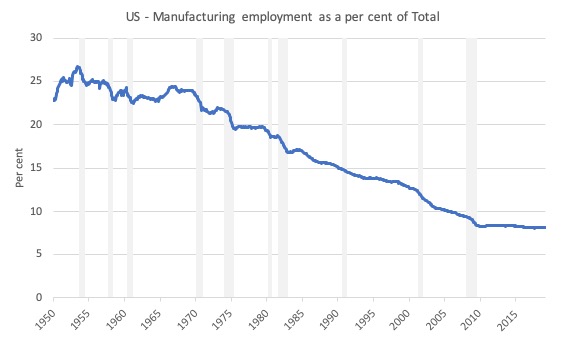
As a result, Manufacturing has declined as a proportion of total employment (see next graph). In 1950, Manufacturing provided 23.8 per cent of total US employment. By March 2019, that proportion had fallen to 8.2 per cent.
778 thousand jobs (net) have gone out of Manufacturing since April 2008 (when the GFC really started to impact on US employment).
But those losses were concentrated in the downturn period. Since Donald Trump took office (January 2017) 575 thousand new (net) jobs have been added to Manufacturing.
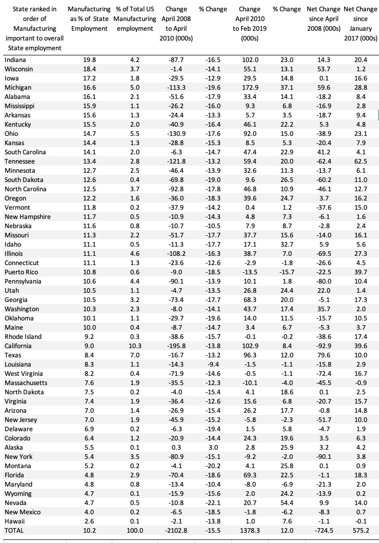
The following Table summarises a lot of data. It shows the downturn after April 2008 until April 2010 and then the recovery period from April 2010 to February 2019 (latest data). I excluded the Virgin Islands (sorry Warren) and District of Columbia due to data issues.
The States are ranked in terms of how important Manufacturing employment is to their total employment levels.
Overall, Manufacturing in the US lost 2,102.8 thousand (net) jobs in the 2-year downturn period, and since then, in recovery, have only added 1,378.3 thousand (net) jobs.
The GFC downturn was very harsh (a 15 per cent drop in employment in this sector).
Overall, the net change since the onset of the GFC has been 724.5 thousand (net) jobs but since Donald Trump was elected Manufacturing has added 575.2 thousand (net) jobs.
This overall impact is because, initially, the recovery was very slow and drawn out. In more recent years that recovery has gathered pace somewhat.
And it probably has nothing to do with Donald Trump’s policy interventions.
I am still running models to understand the data shifts in more detail. The evidence is mixed. Some of the stronghold States have fared better in the recovery than others.
The top 4 states (in terms of my sorting here) have all added more (net) jobs in the recovery than they lost in the downturn. They are mid-West locations.
By way of contrast, the southern strongholds of Alabama, Mississippi and Arkansas lost out significantly.
Conclusion
The March 2019 BLS labour market data release for the US tells me that the US labour market has probably weakened somewhat from where it was at the end of 2018.
Caution should always be exercised given the volatility of the monthly data especially this month, given the changes made to the population benchmarks last month.
It is clear that there is still a substantial jobs deficit remaining and considerable scope for increased participation.
Events
I have now added an Events Page which I will update when I am appearing at public events.
Please support the activists who organise these events. Often they do so from out of their own pocket. I typically do not take an appearance fee for my part.
Call for financial assistance to make the MMT University project a reality
I am in the process of setting up a 501(c)(3) organisation under US law, which will serve as a funding vehicle for the MMT Education project – MMT University – that we hope to launch later in 2019.
For equity reasons, we plan to offer all the tuition and material (bar the texts) for free to ensure everyone can participate irrespective of personal financial circumstance.
Even if I was to charge some fees the project would need additional financial support to ensure it will be sustainable.
So to make it work I am currently seeking sponsors for this venture.
The 501(c)(3) funding structure means you can contribute to the not-for-profit organisation (which will be at arm’s length to the not-for-profit educational venture) in the knowledge that your support will not be publicly known.
Alternatively, if you wish to have your support for the venture publicly acknowledged there will information presented on the Home Page of the MMT University to acknowledge that funding.
To ensure the project has longevity I am hoping to obtain some long-term support proposals.
At present, I estimate I will need about AUD 150k per year.
Note that most of these funds will support an administrative support staff (1 person fractional), data charges, and video editing and design staff (as needed).
The key Modern Monetary Theory (MMT) academics have agreed to help in the educational program without charge.
Please E-mail me if you can help. The Project cannot happen without support.
You will be contributing to a progressive venture.
That is enough for today!
(c) Copyright 2019 William Mitchell. All Rights Reserved.
Hi Bill. I’m glad it’s vacant. You see, I’m persistent. I believe my mind is open to being changed. “Trade and External Finances” posted May 8, 2018. First thing, did I miss it or have you forgotten your promise “Why might we care about foreign ownership?” Well you did acknowledge that every country is different, depending on its’ own particular endowments of human and material resources. And let’s not forget the country’s Wealth and Power. Using Australia appears to me like using an exception to prove the rule. Why not use the US or UK. Or better yet, El Salvador, or Honduras, or some weak country in Africa, rich in mineral resources but weak in wealth and human resources. Whether large, persistent trade deficit is harmful or not depends on the particular circumstances of the country. Let’s face it, western powers, especially Anglo nations, stick together.
You aren’t privy to all the communications and understandings at the highest levels of power and authority. I remember when an Arab country wanted to buy an american seaport – Congresssional opposition was strong enough for the public to hear. I believe that limitations are set, quietly, on what properties and resources a powerful nation will allow a foreign nation or corporation to buy, manage, or control. It’s not a marketplace. The only reason it doesn’t create a problem in countries like the US, UK, AU, is that foreigners understand just what is out of bounds. And if they forget, they are reminded. So if a small but advanced country like AU hasn’t run into problems, it’s because boundaries have been set. Backed up by the wealth and power not only of AU, but the UK and US.