Today (February 21, 2023), the Australian Bureau of Statistics released the latest - Wage Price…
Australia – wages growth continue at record low levels – further evidence of policy failure
Last Wednesday (November 13, 2019), the Australian Bureau of Statistics (ABS) released the latest- Wage Price Index, Australia – (September-quarter 2019). Both private and public sector wages growth was just 0.5 per cent in the September-quarter – keeping growth at record lows. Over the year to September 2019, overall wages growth was 2.2 per cent and in decline. With the annual inflation rate running at 1.7 per cent, workers were able to enjoy some real wages growth. However, over the longer period, real wages growth is still running well behind the growth in GDP per hour (productivity), which has allowed profits to secure a substantially increased share of national income. And, as the federal government continues to sabotage the economy as a consequence of its obsession with recording a fiscal surplus, the moderating wages growth will likely undermine it planning targets. In the last fiscal statement, the government was forecasting annual wages growth would be 2.75 per cent rising to 3.25 per cent. At the current rate, nominal wages will be lucky to top 2 per cent in 2019-20, which means the tax revenue estimates in the fiscal plans are likely to be over-stated. And, if the mainstream narrative was remotely correct, why is employment growth flatlining when wages growth is at record lows?
The summary results (seasonally adjusted) for the September-quarter 2019 were:
- The Wage Price Index grew by 0.5 per cent in the September-quarter 2019, and 2.2 per cent over the previous 12 months.
- The growth for the private sector was 0.5 per cent in the September-quarter and 2.2 per cent over the year.
- The growth for the public sector was 0.5 per cent in the September-quarter and 2.5 per cent over the year.
- “The largest contribution to wage growth over the quarter was jobs in the health care and social assistance industry”.
- The annual CPI inflation rate was 1.7 per cent in the 12 months to March 2019.
- Labour productivity growth (output per hour) grew by 0.3 per cent over that period.
Nominal wage and real wage trends in Australia
The ABS Media Release (November 13, 2019) said:
… The rate of annual wage growth eased slightly in September after being stable over the past year, continuing to grow at a slightly faster rate than consumer prices over the past year …
This result continues a sequence of quarters where wages growth has been just slightly above or slightly below the annual inflation, meaning real wages have been static at best.
The wage series used in this blog post is the quarterly ABS Wage Price Index. The Non-farm GDP per hour is derived from the quarterly National Accounts.
Productivity data available via the RBA Table H2 Labour Costs and Productivity.
The ABS Information Note: Gross Domestic Product Per Hour Worked – says that:
In Australian National Accounts: National Income, Expenditure and Product (cat. no. 5206.0) and Australian System of National Accounts (cat. no. 5204.0) the term ‘GDP per hour worked’ (and similar terminology for the industry statistics) is generally used in preference to ‘labour productivity’ because:
– the term is more self-explanatory; and
– the measure does not attribute change in GDP to specific factors of production.
Later in the week, I will write specifically about the various productivity measures as they have been leading to some misleading inferences among social media commentators.
On price inflation measures, please read my blog – Inflation benign in Australia with plenty of scope for fiscal expansion – for more discussion on the various measures of inflation that the RBA uses – CPI, weighted median and the trimmed mean The latter two aim to strip volatility out of the raw CPI series and give a better measure of underlying inflation.
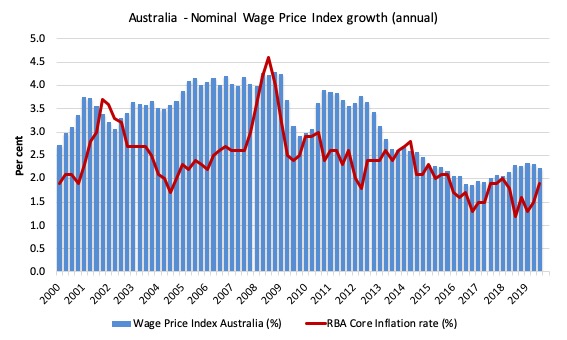
The first graph shows the overall annual growth in the Wage Price Index (public and private) since the September-quarter 2000 (the series was first published in the September-quarter 1997).
I also superimposed the annual inflation rate (red line). The blue bar area above the red line indicate real wages growth and below the opposite.
With the annual inflation rate falling to around 1.7 per cent, workers are now gaining some real wages growth.
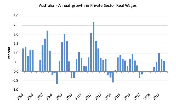
The following graph shows the annual growth in private sector real wages since the June-quarter 2005 to the September_quarter 2019.
After a few quarters of hard real wage cutting in 2013-14, the private sector returned to positive real wages growth but at very subdued rates.
Throughout 2017 and into 2018, real wages growth was negative. But over the last five quarters there has been evidence of real wages growth although the extent of that growth depends on the inflation measure we deploy. Further that incremental shift is now declining.
Overall, as wages growth moderates further, the government’s fiscal surplus obsession will come unstuck. In the last fiscal statement, the government was forecasting annual wages growth would be 2.75 per cent rising to 3.25 per cent.
At the current rate, nominal wages will be lucky to top 2 per cent in 2019-20, which means the tax revenue estimates in the fiscal plans are likely to be over-stated.
Austerity has a habit of rendering fiscal targets meaningless.
Workers not sharing in productivity growth
While real wages growth has been positive over the last three quarters – which means that the rate of growth in nominal wages has outstripped the inflation rate, another relationship that is important is the relative growth of real wages and productivity.
Historically (for periods which data is available), rising productivity growth was shared out to workers in the form of improvements in real living standards.
In effect, productivity growth provides the ‘space’ for nominal wages to growth without promoting cost-push inflationary pressures.
There is also an equity construct that is important – if real wages are keeping pace with productivity growth then the share of wages in national income remains constant.
Further, higher rates of spending driven by the real wages growth then spawned new activity and jobs, which absorbed the workers lost to the productivity growth elsewhere in the economy.
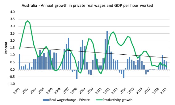
The next graph shows the annual hourly real wage change for the private sector (blue bars) and the annual Non-farm GDP per hour growth (green line) since the June-quarter 2001, expressed as a 6-quarter moving-average to filter out the volatility in the series. The black line is the trend productivity growth over the same time period.
Between 2012 and 2017, productivity growth has been mostly above trend and well above the growth in real wages. During this period there was a vigorous redistribution of national income towards profits going on.
During 2018, productivity growth started to lag and has been much lower since the December-quarter 2017.
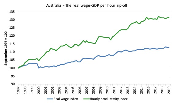
Taking a longer view, the following graph shows the total hourly rates of pay in the private sector in real terms (deflated with the CPI) (blue line) from the inception of the Wage Price Index (December-quarter 1997) and the real GDP per hour worked (from the national accounts) (green line) to the September_quarter 2019.
It doesn’t make much difference which deflator is used to adjust the nominal hourly WPI series. Nor does it matter much if we used the national accounts measure of wages – I will deal with these nuances in a later blog post.
But, over the time shown, the real hourly wage index has grown by 13.1 per cent, while the hourly productivity index has grown by 31.7 per cent.
If I started the index in the early 1980s, when the gap between the two really started to open up, the gap would be much greater. Data discontinuities however prevent a concise graph of this type being provided at this stage.
For more analysis of why the gap represents a shift in national income shares and why it matters, please read the blog post – Australia – stagnant wages growth continues (August 17, 2016).
So even though we should be happy to see real wages growth over the last three quarters, this does nothing much to redress the massive loss of income that workers might have otherwise enjoyed had real wages kept pace with productivity growth over the stretch.
Where does the real income that the workers lose by being unable to gain real wages growth in line with productivity growth go?
Answer: Mostly to profits.
One might then claim that investment will be stimulated.
At the onset of the GFC (December-quarter 2007), the Investment ratio (percentage of private investment in productive capital to GDP) was 23.8 per cent.
It peaked at 24.3 per cent in the December-quarter 2013. But in recent quarters it has fallen and in the June-quarter 2019 (most recent data) it stood at 18.2 per cent.
Some of the redistributed national income has gone into paying the massive and obscene executive salaries that we occasionally get wind of.
Some will be retained by firms and invested in financial markets fuelling the speculative bubbles around the world.
Now, if you think the analysis is skewed because I used GDP per hour worked (a very clean measure from the national accounts), which is not exactly the same measure as labour productivity, then consider the next graph.
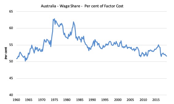
It shows the movements in the wage share in GDP (at factor cost) since the March-quarter 1960 to the June-quarter 2019.
As I will explain in a later blog post, the only way that the wage share can fall like this, systematically, over time, is if there has been a redistribution of national income away from labour.
And the only way that can occur is if the growth in real wages is lower than the growth in labour productivity.
That has clearly been the case since the late 1980s. In the March-quarter 1991, the wage share was 56.6 per cent and the profit share was 22.2 per cent.
By the June-quarter 2019, the wage share had fallen to 51.7 per cent and the profit share risen to 29.4 per cent.
The relationship between real wages and productivity growth also has bearing on the balance sheets of households.
One of the salient features of the neo-liberal era has been the on-going redistribution of national income to profits away from wages. This feature is present in many nations.
The suppression of real wages growth has been a deliberate strategy of business firms, exploiting the entrenched unemployment and rising underemployment over the last two or three decades.
The aspirations of capital have been aided and abetted by a sequence of ‘pro-business’ governments who have introduced harsh industrial relations legislation to reduce the trade unions’ ability to achieve wage gains for their members. The casualisation of the labour market has also contributed to the suppression.
The so-called ‘free trade’ agreements have also contributed to this trend.
I consider the implications of that dynamic in this blog post – The origins of the economic crisis (February 16, 2009). As you will see, I argue that without fundamental change in the way governments approach wage determination, the world economies will remain prone to crises.
In summary, the substantial redistribution of national income towards capital over the last 30 years has undermined the capacity of households to maintain consumption growth without recourse to debt.
One of the reasons that household debt levels are now at record levels is that real wages have lagged behind productivity growth and households have resorted to increased credit to maintain their consumption levels, a trend exacerbated by the financial deregulation and lax oversight of the financial sector.
Real wages growth and employment
The standard mainstream argument is that unemployment is a result of excessive real wages and moderating real wages should drive stronger employment growth.
As Keynes and many others have shown – wages have two aspects:
First, they add to unit costs, although by how much is moot, given that there is strong evidence that higher wages motivate higher productivity, which offsets the impact of the wage rises on unit costs.
Second, they add to income and consumption expenditure is directly related to the income that workers receive.
So it is not obvious that higher real wages undermine total spending in the economy. Employment growth is a direct function of spending and cutting real wages will only increase employment if you can argue (and show) that it increases spending and reduces the desire to save.
There is no evidence to suggest that would be the case.
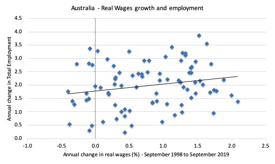
The following graph shows the annual growth in real wages (horizontal axis) and the quarterly change in total employment (vertical axis). The period is from the December-quarter 1998 to the September-quarter 2019. The solid line is a simple linear regression.
Conclusion: When real wages grow faster so does employment although from a two-dimensional graph causality is impossible to determine.
However, there is strong evidence that both employment growth and real wages growth respond positively to total spending growth and increasing economic activity. That evidence supports the positive relationship between real wages growth and employment growth.
Noting that we should not draw causality from two-dimensional cross plots.
Conclusion
Australia continues to endure very low rates of wages growth, which have provided for modest rates of growth in real wages – given that the inflation rate has also been low (currently at 1.7 per cent).
Overall, as wages growth moderates further, the government’s fiscal surplus obsession will come unstuck. In the last fiscal statement, the government was forecasting annual wages growth would be 2.75 per cent rising to 3.25 per cent.
At the current rate, nominal wages will be lucky to top 2 per cent in 2019-20, which means the tax revenue estimates in the fiscal plans are likely to be over-stated.
Austerity has a habit of rendering fiscal targets meaningless.
That is enough for today!
(c) Copyright 2019 William Mitchell. All Rights Reserved.
The question remains how long can the Australian government pretend it can maintain a surplus without going into a recession.
“The following graph shows the annual growth in real wages (horizontal axis) and the quarterly change in total employment”
The vertical axis label says annual change.
The graph of wages growth against employment growth shows no simple relationship. I saw somewhere else that wages growth and underemployment growth are clearly negatively correlated.