Today (April 18, 2024), the Australian Bureau of Statistics released the latest - Labour Force,…
US labour market – quantitative gains but qualitative losses
On Friday (December 6, 2019), the US Bureau of Labor Statistics (BLS) released their latest labour market data – Employment Situation Summary – November 2019 – which reveals a labour market that that is still adding jobs. The November performance was very strong in quantitative terms. The payroll employment change was well above the year’s average and the official unemployment rate remains at very low (relative) levels. The employment-population ratio is steady indicating that the labour market is producing jobs growth in line with population growth. The Broad labour underutilisation ratio (U-6) remains high (but fell in November by 0.1 points) even though the official unemployment is now hovering around levels not seen since the late 1960s. The worry is that the jobs being added represent a significant hollowing out of jobs in the median wage area (the so-called ‘middle-class’ jobs), which is reinforcing the polarisation in the income distribution and rising inequality. There is no hint, yet in the data, that a recession is coming any time soon.
Overview for November 2019
- Payroll employment rose by 266,000 – below the 2019 monthly average.
- Total labour force survey employment rose by 83 thousand net (0.05 per cent).
- The seasonally adjusted labour force rose by 40 thousand (0.02 per cent).
- Official unemployment fell by 44 thousand to 5,811 thousand.
- The official unemployment rate remained largely unchanged at 3.53 per cent (-0.1 points).
- The participation rate fell by 0.1 points to 63.2 per cent but remains well below the peak in December 2006 (66.4 per cent). Adjusting for age effects, the rise in those who have given up looking for work for one reason or another since December 2006 is around 2,189.3 thousand workers. The corresponding unemployment rate would be 4.8 per cent, far higher than the current official rate.
- The broad labour underutilisation measure (U6) fell by 0.1 points to 6.9 per cent largely because of a decline in the number in the part-time for economic reasons cohort (the US indicator of underemployment).
Further, for those who are confused about the difference between the payroll (establishment) data and the household survey data you should read this blog – US labour market is in a deplorable state – where I explain the differences in detail.
Payroll employment trends
The BLS noted that:
Total nonfarm payroll employment rose by 266,000 in November. Job growth has averaged 180,000 per month thus far in 2019, compared with an average monthly gain of 223,000 in 2018. In November, notable job gains occurred in health care and in professional and technical services. Employment also increased in manufacturing, reflecting the return of workers from a strike. Employment continued to trend up in leisure and hospitality, transportation and warehousing, and financial activities, while mining lost jobs.
The first graph shows the monthly change in payroll employment (in thousands, expressed as a 3-month moving average to take out the monthly noise). The gray lines are the annual averages.
This month saw the change in payroll employment rise well above the average monthly change for the year to date.

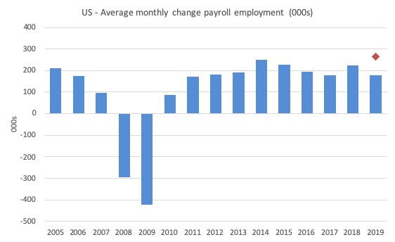
The next graph shows the same data in a different way – in this case the graph shows the average net monthly change in payroll employment (actual) for the calendar years from 2005 to 2019 (the 2019 average being for the first 11 months at this stage).
The red diamond is the current month’s increase.
The slowdown that began in 2015 continued through 2017 was reversed last year. The 2018 average was 223 thousand compared to 179 thousand in 2017.
So far the average for 2019 is 180 thousand.
The November result is thus very strong in relative terms.
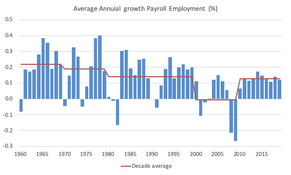
To put the current recovery into historical perspective the following graph shows the average annual growth in payroll employment since 1960 (blue columns) with the decade averages shown by the red line.
It reinforces the view that while payroll employment growth has been steady since the crisis ended, it is still well down on previous decades of growth.
Labour Force Survey – employment growth remains positive
Employment as measured by the household survey rose by 83 thousand net (0.05 per cent) while the labour force rose by only 40 thousand (0.02 per cent).
As a result (in accounting terms), total unemployment fell by 44 thousand and the unemployment rate remained largely unchanged at 3.53 per cent (-0.1 point). The last time the unemployment rate was this low was in August 1969.
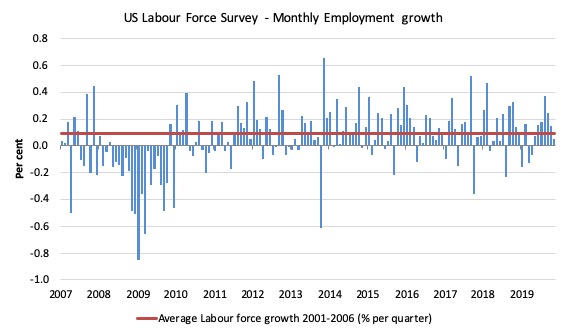
The next graph shows the monthly employment growth since January 2008. The red line is the average labour force growth over the period December 2001 to December 2006 (0.09 per cent per month).
Summary conclusion:
1. There is still no coherent positive and reinforcing trend in employment growth since the recovery began back in 2009. There are still many months where employment growth, while positive, remains relatively weak when compared to the average labour force growth prior to the crisis or is negative.
There are also months where employment growth is negative.
Contrary to the message from the payroll data, the labour force survey data is showing a weakening situation.
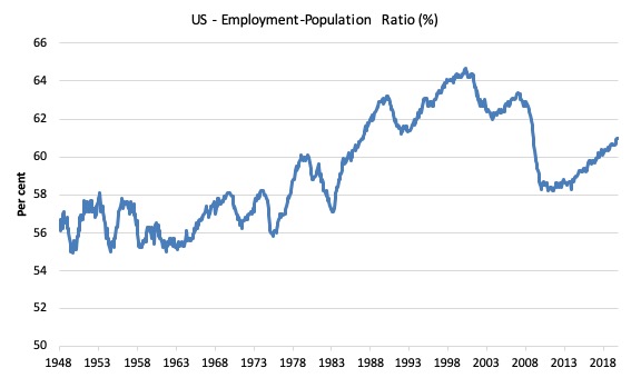
A good measure of the strength of the labour market is the Employment-Population ratio given that the movements are relatively unambiguous because the denominator population is not particularly sensitive to the cycle (unlike the labour force).
The following graph shows the US Employment-Population from January 1948 to November 2019. While the ratio fluctuates a little, the November 2019 ratio was unchanged at 61 per cent and held that level since September 2019.
Over the longer period though, we see that the ratio remains well down on pre-GFC levels (peak 63.4 per cent in December 2006), which is a further indication of how weak the recovery has been so far and the distance that the US labour market is from being at full capacity (assuming that the December 2006 level was closer to that state).
It is usually a positive sign though when total employment outstrips the underlying growth in the working age population.
Unemployment and underutilisation trends
The first graph shows the official unemployment rate since January 1950 which is currently at 3.53 per cent, slightly lower than the previous month.
It is clear that the US labour market is reaching unemployment rates not seen since the late 1960s.
With inflation stable, the continued low unemployment rates make a mockery of official NAIRU estimates of full employment coinciding with an unemployment rate of 4.6 per cent.
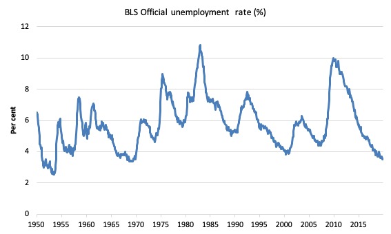
The official unemployment rate is a narrow measure of labour wastage, which means that a strict comparison with the 1960s, for example, in terms of how tight the labour market, has to take into account broader measures of labour underutilisation.
The next graph shows the BLS measure U6, which is defined as:
Total unemployed, plus all marginally attached workers plus total employed part time for economic reasons, as a percent of all civilian labor force plus all marginally attached workers.
It is thus the broadest quantitative measure of labour underutilisation that the BLS publish.
In December 2006, before the effects of the slowdown started to impact upon the labour market, the measure was estimated to be 7.9 per cent.
In November 2019 the U6 measure fell by 0.1 points to 6.9 per cent. This was the result of the category ‘Part-time for economic reasons’ falling by 116 thousand or 3 per cent.
U-6 was 8.1 per cent at the beginning of 2019.
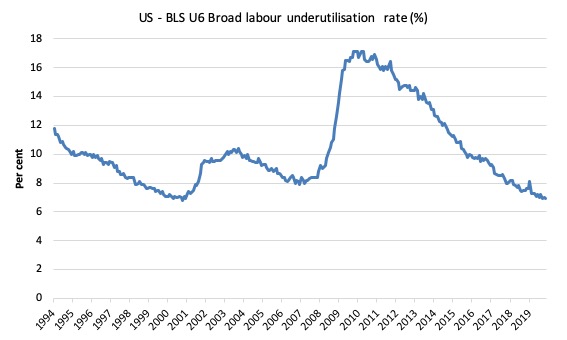
The U-6 measure is marginally below the pre-GFC level but remains above the trough of the early 2000s when it was 6.8 per cent.
While it is signalling improvement, there is still some scope to go before full capacity is reached.
Feature this month: Occupational wage bias intensifies through 2019
Recently, the CBS News Report (December 2, 2019) – Almost half of all Americans work in low-wage jobs – told us that while the quantitative US labour market data is showing strong employment growth and very low (relative) unemployment rates, other measures show that:
Almost half of U.S. workers between ages 18 to 64 are employed in low-wage jobs … 44% of U.S. workers are employed in low-wage jobs that pay median annual wages of $18,000 … Most of the 53 million Americans working in low-wage jobs are adults in their prime working years, or between about 25 to 54, they noted. Their median hourly wage is $10.22 per hour – that’s above the federal minimum wage of $7.25 an hour but well below what’s considered the living wage for many regions.
In other words, there is a job quality problem.
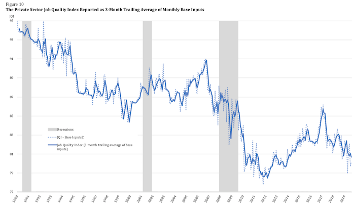
The – US Job Quality Index – is an innovative approach that “assesses job quality in the United States by measuring desirable higher-wage/higher-hour jobs versus lower-wage/lower-hour jobs” on a monthly basis.
I will comment more on the construction of that index in later blog posts.
Here is there latest graph (reproduced from the November report):
As regular readers will know I have been tracking the sectoral and occupational employment changes in the US in relation to earnings for some time now. I am working on a very disaggregated version of that approach.
But for now I just updated my research into the cyclical shifts in employment at the main occupational levels for the US today.
And the results are very interesting.
In the past, I have demonstrated that the proportion of jobs in the total employment in sectors that pay below-average pay has increased.
But at that level of aggregation, we are unable to say whether these jobs in question were high-pay or low-pay.
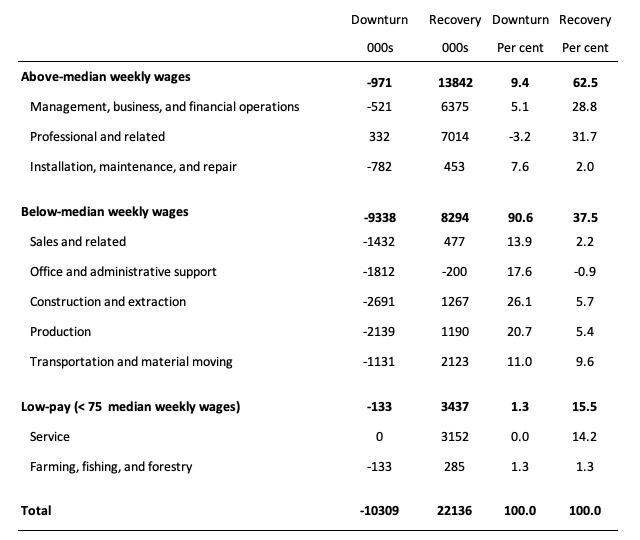
The next table helps to expand on that understanding.
It shows the net job losses (in the downturn) and net job gains (in the recovery to date) for the major occupations in the BLS classification.
I have sorted the occupations relative to median weekly earnings as at the third-quarter 2019.
Low-pay is 75 per cent of the median.
Summary results:
1. In the downturn 90.6 per cent of the jobs lost were in occupations that paid below median weekly earnings (1.3 per cent of those were in low-paid occupations). Very few jobs (relatively) were lost in the higher paying occupations.
2. Given 86.1 per cent of the total jobs lost in the downturn were in sectors paying above average pay. The inference is that the jobs lost were predominantly the lower paying jobs in those sectors (although we cannot strictly compare mean and median in a wage distribution given the skewness).
3. In the upturn to date, the net jobs added have not yet replaced those lost in the occupations with below median weekly earnings. 62.5 per cent of the net jobs added have been in occupations with above median weekly earnings.
4. While only a small number and proportion of jobs were lost in the low-pay occupations, the recovery has seen a much larger number of those jobs being added. Of the 37.5 per cent share of below median earning jobs added in the recovery, the proportion that are in low-pay occupations is currently 15.5 per cent.
5. This tells us that there is a polarisation going on in the occupational employment structure with a bias towards low-pay jobs in the below median weekly earnings occupations and towards jobs in the above median weekly earnings. This supports the evidence provided by the Job Quality Index data.
6. That is there has been a hollowing out around the overall median pay levels.
Conclusion
The November 2019 BLS labour market data release for the US tells me that the US labour market remains below the performance achieved in 2018 although there has been considerable month-to-month volatility.
The US labour market is still adding jobs albeit at a slower pace than in 2018, although the November performance is a sharp improvement in quantitative terms.
The Broad labour underutilisation ratio (U-6) remains high (but fell) and the official unemployment is now hovering around levels not seen since the late 1960s
The worry is that the jobs being added represent a significant hollowing out of jobs in the median wage area (the so-called ‘middle-class’ jobs), which is reinforcing the polarisation in the income distribution and rising inequality.
That is enough for today!
(c) Copyright 2019 William Mitchell. All Rights Reserved.
Bi, I think this sentence left out 2 letters,the 2 I put there in brackets.
“The US labour market is still adding jobs albeit at a slow[er] pace than in 2018, although the November performance is a sharp improvement in quantitative terms.”
And my post left out 2 letters in “Bi[ll]”.
Bill, What would be interesting to know is the USA industry sector/s where wages/salaries have not declined and by what % ? and also from what industries did more highly paid workers move from to industries that were were offering lower paid jobs. In addition has there been a decline in skills or skills lost by the workers who moved to the lower paid jobs? and what impact this skill loss/decline had on overall USA labour productivity? This has been an interesting and thought provoking blog for me. Thank you.
@ Steve_American
Pointing out typos is helpful but I had to laugh:
MUPHRY’S LAW: Muphry’s law is an adage that states: “If you write anything criticizing editing or proofreading, there will be a fault of some kind in what you have written.”[1] The name is a deliberate misspelling of “Murphy’s law”.
Does the data exist to sum up the salary of all the new jobs and graph that instead of employment numbers? That would, to my mind, be a real indication of how much the economy will improve or not, given the influx of spending by the new hires. And a dual graph with the employment numbers might show differences that would be indicative of problems in the types of jobs being offered.