Today (April 18, 2024), the Australian Bureau of Statistics released the latest - Labour Force,…
US labour market data – we have never been here before!
Last month’s analysis of the US labour force data – Tip of the iceberg – the US labour market catastrophe now playing out (April 6, 2020) – presaged what was to come. We now know more about the size of the iceberg. It is unimaginably large. Words fail really. This is one of those all-time historical events that make the severe crises of the past (early 1980s, 1990s, GFC – look like blips). On May 8, 2020, the US Bureau of Labor Statistics (BLS) released their latest labour market data – Employment Situation Summary – April 2020 – which shows that the US labour market has collapsed into territory never before recorded. And, given that the data released was drawn from samples that went up to April 12 (establishment survey) and April 18 (household survey), and so doesn’t fully capture the extent of the unfolding catastrophe. More recent data released by the US Department of Labor (unemployment insurance claimant data) shows the situation worsened in the last two weeks of April. In the last two weeks of April 2020, more than 9 million extra workers registered unemployment insurance claims. All the aggregates are demonstrating dramatic shifts to the point that graphs are becoming rather binary – the rest of history and now. The employment-population rate plunged 8.7 points to 51.3 per cent, which is the largest monthly fall since the sample began in January 1948. The U6 measure of broad labour underutilisation increased by 14 points to 22.8 per cent. This is the largest monthly rise in this measure since it was first published in January 1994. The situation will get worse. Its already catastrophic and it demonstrates a massive policy failure from the Federal government. Instead of directing trillions into the top-end-of-town, the US government should have guaranteed all incomes and introduced large-scale job creation programs and a Job Guarantee as an on-going safety net. Instead it is watching over people dying and people’s material prosperity being destroyed.
Overview for April 2020:
- Payroll employment fell by 20.5 million – no words capture that properly.
- Total labour force survey employment fell by 22,369 thousand net (-14.4 per cent).
- The seasonally adjusted labour force fell by 6,432 thousand (-3.95 per cent) (as participation fell).
- Official unemployment rose by 15,938 thousand to 23,078 thousand (but see below for commentary on latest data)
- The official unemployment rate rose by 10.3 points to 14.7 per cent.
- The participation rate plunged by 2.5 points to 60.2 per cent. Adjusting the unemployment rate for the change in hidden unemployment would generate an unemployment rate of 18.1 per cent rather than 14.7 per cent.
- The broad labour underutilisation measure (U6) rose sharply by 14 points to 22.8 per cent, in part, because of a rise in the number in the part-time for economic reasons cohort (the US indicator of underemployment) and a rise in other marginal categories. But the rise in joblessness drove the extreme shift this month in U6.
For those who are confused about the difference between the payroll (establishment) data and the household survey data you should read this blog post – US labour market is in a deplorable state – where I explain the differences in detail.
Payroll employment trends
The BLS noted that:
Total nonfarm payroll employment fell by 20.5 million in April, after declining by 870,000 in March. The April over-the-month decline is the largest in the history of the series and brought employment to its lowest level since February 2011 (the series dates back to 1939). Job losses in April were widespread, with the largest employment decline occurring in leisure and hospitality …
In April, employment in leisure and hospitality plummeted by 7.7 million, or 47 percent. Almost three-quarters of the
decrease occurred in food services and drinking places (-5.5 million). Employment also fell in the arts, entertainment,
and recreation industry (-1.3 million) and in the accommodation industry (-839,000).
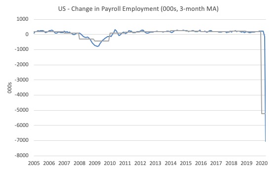
The first graph shows the monthly change in payroll employment (in thousands, expressed as a 3-month moving average to take out the monthly noise). The gray lines are the annual averages.
The data is now ‘off the chart’ and that says enough.
The next graph shows the same data in a different way – in this case the graph shows the average net monthly change in payroll employment (actual) for the calendar years from 1940 to 2020 (the 2020 average is for the months to date).
I usually only show this graph from 2005 but because history is being created at present I included the full sample available from 1940.
The final average for 2019 was 178 thousand.
The average so far for 2020 is -5,238 thousand.
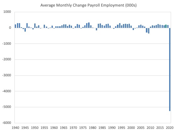
In a way, graphs like this lose definition and only present a binary world.
Labour Force Survey – employment growth collapses
The BLS report that:
In April, the unemployment rate increased by 10.3 percentage points to 14.7 percent. This is the highest rate and the largest over-the-month increase in the history of the series (seasonally adjusted data are available back to January 1948). The number of unemployed persons rose by 15.9 million to 23.1 million in April. The sharp increases in these measures reflect the effects of the coronavirus pandemic and efforts to contain it.
The data for April is staggering:
Employment as measured by the household survey fell by 22,369 thousand net (-14.4 per cent) while the labour force declined by 6,432 thousand (-3.95 per cent) as the participation rate fell by 4 points (a huge monthly contraction).
As a result (in accounting terms), total measured unemployment rose by 15,938 thousand and the unemployment rate rose by 10.3 points to 14.7 per cent.
It will take some time to absorb those workers back into employment once the economy starts moving again because a number of employers will have been wiped out by the scale of the contraction.
I am not publishing my usual graph which shows the monthly employment growth since January 2008 because the scale of the last two months (particularly April) flatten all the previous observations to the point of meaningless except in the binary sense noted above.
The Employment-Population ratio shift is also dramatic.
This is a good measure of the strength of the labour market because the movements are relatively unambiguous because the denominator population is not particularly sensitive to the cycle (unlike the labour force).
The following graph shows the US Employment-Population from January 1948 to April 2020.
While the ratio fluctuates a little, the April 2020 ratio fell by 8.7 points to 51.3 per cent, which is the largest monthly fall since the sample began in January 1948.
So only just over a half of the working age population in the US is working now.

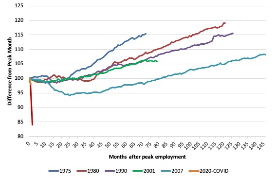
As a matter of history, the following graph shows employment indexes for the US (from US Bureau of Labor Statistics data) for the five NBER recessions since the mid-1970s and the current 2020-COVID crisis.
They are indexed at the employment peak in each case and we trace the data out for each episode until one month before the next peak.
So you get an idea of:
1. The amplitude (depth) of each cycle in employment terms.
2. The length of the cycle in months from peak-trough-peak.
The early 1980s recession was in two parts – a short downturn in 1981, which was followed by a second major downturn 12 months later in July 1982 which then endured.
Other facts:
1. Return to peak for the GFC was after 78 months.
2. The previous recessions have returned to the 100 index value after around 30 to 34 months.
3. Even at the ned of the GFC cycle (146 months), total employment in the US has still only risen by 8.3 per cent (since December 2007), which is a very moderate growth path as is shown in the graph.
The current collapse is something else.
Unemployment and underutilisation trends
The trends shown in the following graphs can only summarised by – we haven’t been there before!
The first graph shows the official unemployment rate since January 1950 which shifted from 4.4 per cent to 14.7 per cent (noting the caveats at the outset.
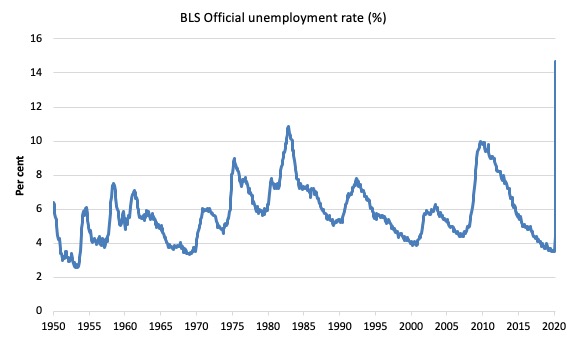
The official unemployment rate is a narrow measure of labour wastage, which means that a strict comparison with the 1960s, for example, in terms of how tight the labour market, has to take into account broader measures of labour underutilisation.
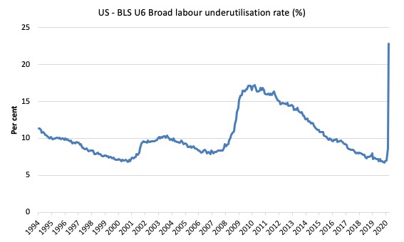
The next graph shows the BLS measure U6, which is defined as:
Total unemployed, plus all marginally attached workers plus total employed part time for economic reasons, as a percent of all civilian labor force plus all marginally attached workers.
It is thus the broadest quantitative measure of labour underutilisation that the BLS publish.
In December 2006, before the effects of the slowdown started to impact upon the labour market, the measure was estimated to be 7.9 per cent.
In April 2020 the U6 measure increased by 14.1 points to 22.8 per cent.
This is the largest monthly rise in this measure since it was first published in January 1994.
This was driven, in part, by the rise in the category ‘Part-time for economic reasons’ – a measure of underemployment in the US data context) – it rose by a huge 5,122 thousand or 47 per cent.
The BLS say that:
The number of persons at work part time for economic reasons nearly doubled over the month to 10.9 million. These individuals, who would have preferred full-time employment, were working part time because their hours had been reduced or they were unable to find full-time jobs. This group includes persons who usually work full time and persons who usually work part time …
The number of persons not in the labor force who currently want a job, at 9.9 million, nearly doubled in April. These individuals were not counted as unemployed because they were not actively looking for work during the last 4 weeks or were unavailable to take a job.
Persons marginally attached to the labor force – a subset of persons not in the labor force who currently want a job – numbered 2.3 million in April, up by 855,000 over the month. These individuals were not in the labor force, wanted and were available for work, and had looked for a job sometime in the prior 12 months but had not looked for work in the 4 weeks preceding the survey. Discouraged workers, a subset of the marginally attached who believed that no jobs were available for them, numbered 574,000 in April, little changed from the previous month.
So not only are there massive layoffs occurring but firms are also making hours adjustment – cutting full-time hours back to part-time or cutting part-time hours and workers are dropping out of the official labour force (not searching) and are thus moving into hidden unemployment (see below).
Aggregate participation rate – plunges by 2.5 points to 60.2 per cent
The fall in the labour force participation rate meant that the labour force contracted and workers who would have been counted among the unemployment were, instead, classified by the BLS as being not in the labour force.
This reduces the severity of the rise in official unemployment.
By how much would unemployment have risen if the participation rate had not fallen?
The labour force is a subset of the working-age population (those above 15 years old). The proportion of the working-age population that constitutes the labour force is called the labour force participation rate. Thus changes in the labour force can impact on the official unemployment rate, and, as a result, movements in the latter need to be interpreted carefully. A rising unemployment rate may not indicate a recessing economy.
The labour force can expand as a result of general population growth and/or increases in the labour force participation rates.
Here are the facts:
1. The labour force shrank by 6,432 thousand to 156,481 thousand.
2. If the participation rate had not fallen, given the current working age population, the labour force would have been 162,979 thousand.
3. So 6,498 thousand workers left the labour force in April and it is safe to say they would not have done so if employment opportunities had not collapsed
4. If we assume those workers are hidden unemployed – they want to work, are willing to work, but did not actively seek work – and add them back into the official unemployment, the adjusted unemployment rate in April would be 18.1 per cent rather than the official estimate of 14.7 per cent.
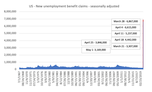
The claimants data horror story
Here is the latest update (as for the week ending May 2, 2020) from the US Department of Labor’s weekly data releases for the unemployment insurance claimants.
I first started tracking this data for this downturn in my last commentary on the monthly US labour market data release – Tip of the iceberg – the US labour market catastrophe now playing out (April 6, 2020).
The Department of Labor provides an archive of the weekly unemployment insurance claims data back to July 1, 1967 – HERE.
The weekly data can be found in the – UI Weekly Claims Report.
Bringing together the archived data and the most recent release (May 2, 2020), the following table tells the shocking story.
| Week ending | Initial Claims (SA) | Weekly Change | Cumulative sum since March 7, 2020 |
| March 7, 2020 | 211,000 | -6,000 | n/a |
| March 14, 2020 | 282,000 | +71,000 | 282,000 |
| March 21, 2020 | 3,307,000 | +3,025,000 | 3,589,000 |
| March 28, 2020 | 6,687,700 | +3,560,000 | 10,456,000 |
| April 4, 2020 | 6,615,000 | -252,000 | 17,071,000 |
| April 11, 2020 | 5,237,000 | -1,378,000 | 22,308,00 |
| April 18, 2020 | 4,442,000 | -795,000 | 26,750,000 |
| April 25, 2020 | 3,846,000 | -596,000 | 30,596,000 |
| May 2, 2020 | 3,169,000 | -677,000 | 33,765,000 |
The next graph shows the data from 1967 to May 2, 2020.
The spike at the end of the graph shows how drastic the situation is in the US.
This is a quite extraordinary graph. The small upward lumps along the way are deep recession in the early 1980s, 1990s and the GFC.
Relativity!
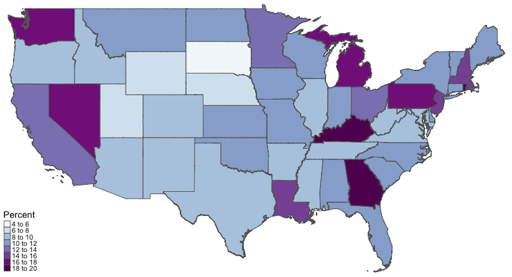
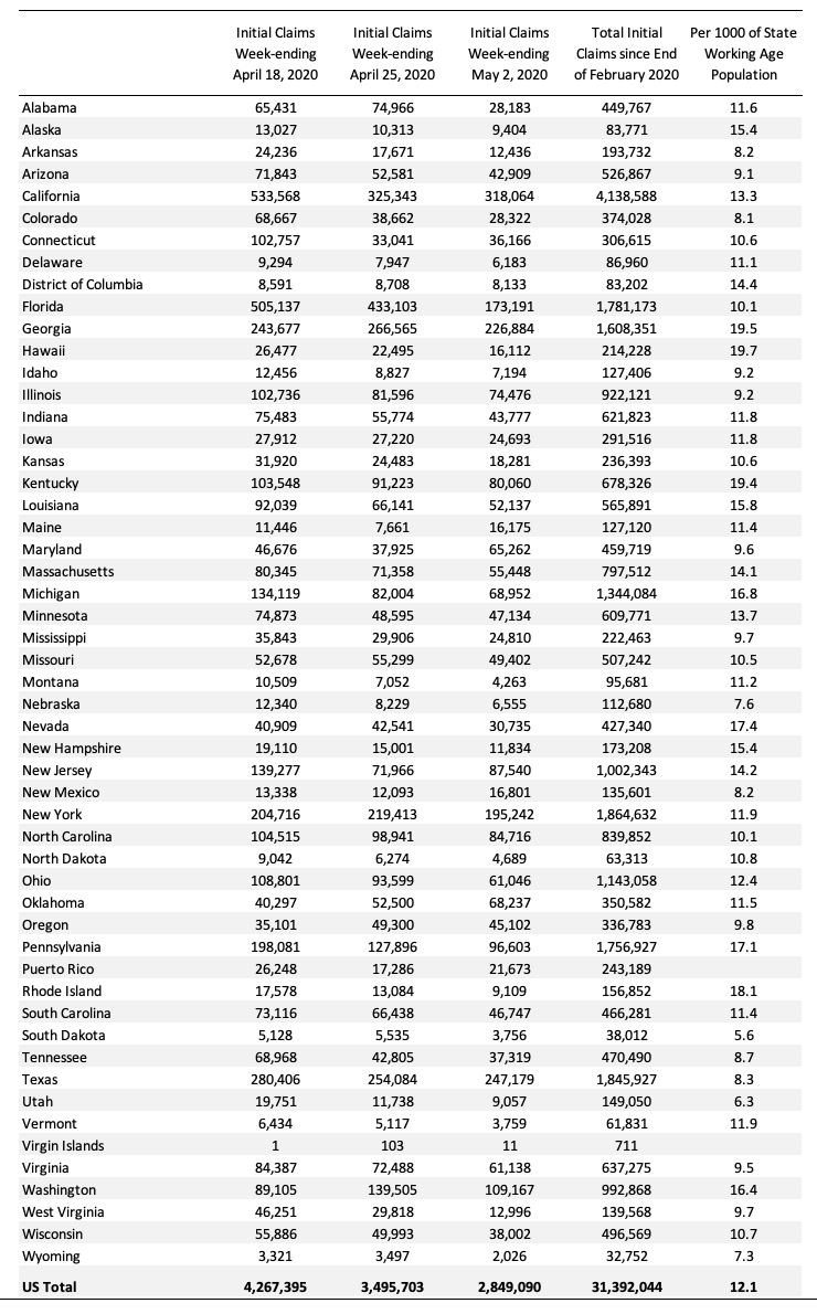
The next map shows the cumulative sum of unemployment insurance claimants since the end of February 2020, expressed as a percentage of the Working Age Population in each state (Alaska was 15.4 per cent and Hawaii was 19.65 per cent).
This graph more starkly demonstrates where the loss of jobs is impacting most significantly. You can compare this map with the map I produced last week to see where the virus job losses are having shifting impacts.
The following Table presents the same data for those who prefer numbers.
Conclusion
The April 2020 US BLS labour market data release reveals a catastrophic labour market.
All variables reported changed sharply.
I have never seen these sorts of monthly shifts.
No-one has.
The scale of the crisis requires dramatic interventions.
The current position of the US government has biased their stimulus spending towards the corporate sector and high income earners.
It disadvantages precarious workers and those losing jobs.
The US government should immediately announce an unconditional Job Guarantee and guarantee salaries for all workers made redundant.
That is enough for today!
(c) Copyright 2020 William Mitchell. All Rights Reserved
“So only just over a half of the working age population in the US is working now.” Yes. And we are extremely grateful for that half. Not to the point of actually paying them much more of course.
This all is of course intellectually fascinating but really sucks to live through. Not that you don’t realize that Professor.
That curse- may you live in interesting times becomes more relevant every day.
Bill, you wrote, “While the ratio fluctuates a little, the April 2020 ratio fell by 8.7 points to 51.3 per cent, which is the largest monthly fall since the sample began in January 1948.”
However, the graph this refers to shows the line going down to right at 60%, not going on down to 51.3%.
At least as I see it.
As you know I retired to Thailand. The news from here is —
1] Traffic is down about 25% at noon on a Fri. in the big city.
2] Most stores are open.
3] By law restaurants can only be take out places.
4] The Thai Gov. has or will pay all “workers” 5000 bhat/mo, which equals about $500/month in buying power. [My calculation is 5000/mo / 30 bhat/$$ X 3 (because it seems my dollars go 3 times further) = $500.]
. . . Th min. wage was 350 bhat/day so 5000/350 = 14.29 day’s pay at min. wage.
5] 95% I see when I go to the town are wearing masks.
6] There has been about a 20% to 30% rise in food prices. The local “Cosco” has trouble keeping all items in stock.
7] All schools are closed.
8] Large gatherings are banned. Like sporting events.
9] The Gov. has deferred most (or all) interest charges and many payments are also deferred.
10] Coronavirus data (by 5/11/20202) Cases: 3,015; Deaths: 56; & Recovered: 2,796. Total population is 66.56M.
Bill,
Has anyone ever done a paper you can point me to that looks at the economy if we slashed the pension age to 50 and as we became more productive 45.
Call it a pension or UBI for the over 50’s the treasury would just instruct the central bank to credit bank accounts with a decent amount for the over 50’s to live on and enjoy retirement.
16 – 50 year olds would provide the goods and services for all along side a job guarantee, ZIRP, no debt issued, free education, commercial banks put back in their box. Investment in public services, R&D, Infrastructure, balanced trade policy, all the tick boxes that MMT economists would suggest if the country was large enough.
Or do you think countries would run out of people and the inflationary pressures would be too great as the productive section of the economy shrinks – They don’t become productive enough ?
It would be great to read “any” paper that looks at the effects of cutting the pension age by an author that knows how the monetary system operates. Have you ever came across any ?
Thanks…
Niagara falls. Evey now and then, there is an adventurer who can’t resist the urge to go over it in a canoe, kayak or barrel. Now the politicians have done it, through sheer ineptitude.
Dear Bill
(off-topic, sorry!)
Living as I do in Finland I’m acutely aware of your own close (teaching) association with the Economics Department of Helsinki University.
I wonder if this press release has crossed your desk and if so how it strikes you, given your familiarity with the Finnish scene:-
“Major adjustment package needed for after business support phase and economic stimulus. Ministry of Economic Affairs and Employment and Ministry of Finance (8.5.2020)”
As you know, Finland is numbered among the infamous “frugal four” along with Germany, Holland and Austria and its domestic policy-setting appears impregnably dominated by entrenched mainstream, neoliberal, ideology. (It continues to baffle me how despite that your lectures attract an audience here, let alone a respectably-sized one).
This report describes itself as an assessment of “the measures (needed) to reduce the damage to the economy (from the coronavirus) and to restore Finland … to a path of sustainable growth, high employment and sustainable public finances”. Prominent are the weasel words “consolidating” and “sustainable” in conjunction with “public finances” which as you know is code for “unquestioning compliance with the Stability and Growth Pact’s ideological straitjacket” (in plainer words: “austerity for ever!”). The framing used is entirely in accord with standard gobbledegook such as “the long-term sustainability gap” (which is SGP-speak for “Catch 22”). This passage alone is enough to chill the blood:-
“… after the stimulus phase, it will be vital to adjust public finances to a level that the economy can sustain, and the adjustment will be considerably greater than was envisaged before the crisis. In practice, the adjustment will be in the form of reducing expenditure and/or raising taxes.
“The scale of the adjustment needed is unclear. The working group concludes that the minimum extent of this, assuming an unaltered economic structure, will be 3-4 per cent of gross domestic product (GDP)”.
You probably know some among the authors directly or by repute. Par for the course?
Can nothing at all be done to make inroads into this solid phalanx of orthodoxy and reaction? it might as well be the Bourbons all over again! Are there no bright sparks and rebels among your students and ex-students here? Do none of them ever publicly challenge this rubbish? (I should add that I don’t speak or read Finnish, so if they did I probably wouldn’t know about it).
Re the US situation. It appears the US government is supporting laid off workers fairly generously (UI + $600) for 4 (?) months plus some money to small business. However workers in the ”gig” economy (those with no job security and no benefits of any kind eg health, pension) have been kicked to the curb with $1,200 total each for the duration of the crisis. This is a lot of people. The states are only getting assistance for direct covid-related things, no assistance for decreases in tax revenues or increases in other costs. Unless this changes it is a catastrophe in the making. I find it difficult to believe nothing else will be done but so far nothing has.
In the best of times 34.6% of US-ians have no access to health care. So what will happen now?
People by the tens of millions will lose everything. I repeat I find it hard to believe more won’t be done, but so far nothing.
Of course big business and especially big finance are getting massive assistance, in the trillions.
It’s 2008-10 all over again, but much worse. Hard to believe. Unfortunately US-Ians are completely unorganised: the political parties are corrupt to the core and the one glimmer of hope, Bernie Sanders, has been easily swept aside, the unions are on their knees and organised religion is uninterested.
Keith- I think that is a fairly realistic assessment of what is happening in the US. I might argue a bit and say that it is more like 20% who have inadequate access to health care. But it is a whole lot of people either way. I am lucky that my brother is a doctor- that has saved me several times already. Not sure how realistic a plan of having a brother be a doctor works out for everyone…
“the US government should have guaranteed all incomes and introduced large-scale job creation programs and a Job Guarantee as an on-going safety net.”
Bill, I wholeheartedly agree with you! We just blew a golden opportunity.
The economic decline was induced by the federal government to curtail the spread of the virus. To compare the induced decline to historic business cycle declines is somewhat misleading. We are already seeing a recovering economy as some states “reopen” their economies. The tradeoff of collapsing the economy to the impact of the virus became unacceptable. As the stock market rallies there might be the forecast for better times ahead. I can understand your desire to implement MMT economic policies across the board but the record spending by the federal government and the safety net implemented by the Federal Reserve dwarfs any support programs that have ever been undertaken. Fortunately it appears that the decisionmakers are implementing some MMT ideas and, relative to the Keynesian or monetarists that are still in control, that is a good thing.
Can we “compare” the current induced economic data that has been forced upon us by the lockdown with the traditional business cycle analysis data? A response to the corona virus is the culprit, not to mention the oil price collapse. While an MMT solution might be better than the solutions that have been implemented, credit should be given to the expansive monetary and fiscal policies that have dwarfed any historical response to a calamity.
Thomas wrote, “… that have dwarfed any historical response to a calamity.”
Except the calamity we call WWII.
And I say it actually took spending on the level of WWII to end the Great Depression.
. . . The deficit spending for the New Deal was simply put, *not* enough.