It's Wednesday and we have discussion on a few topics today. The first relates to…
Australia national accounts – early stages of the virus recession now clear
Australia has endured a sequence of unplanned disasters over the last 12 months. The lingering effects of a long drought. Massive bushfires. Floods. And, then, if that wasn’t enough, along comes the worst of them all – the coronavirus. The latest release by the Australian Bureau of Statistics of the – March-quarter 2020 National Accounts data (June 3, 2020) – is now recording the early impacts on our national economy from the Pandemic. It will be worse when the June-quarter figures are released in September. Today’s data confirms what we have been tracing for several quarters – the Australian economy has now crossed the line into negative growth with sustained negative contributions from all private sources of expenditure. Household Consumption expenditure fell sharply as households increased their saving ratio. The overall contraction is less than has been recorded to date in other nations. But we should wait until the June-quarter before we get too optimistic. The obvious conclusion is that the Federal government has not supported an ailing economy enough to avoid the damage that negative growth brings. An urgent and major shift in fiscal policy towards further expansion is definitely required.
The main features of the National Accounts release for the March-quarter 2020 were (seasonally adjusted):
- Real GDP decreased by 0.3 per cent for the quarter. The annual growth rate was 1.4 per cent, well below historical trend of between 3.25 and 3.5 per cent.
- Real GDP per capita declined by 0.7 per cent.
- The main negative contributor was household consumption expenditure (minus 0.6 points).
- Australia’s Terms of Trade (seasonally adjusted) rose by 2.9 per cent in the quarter but was down by 0.9 per cent over the 12 month period.
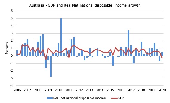
- Real net national disposable income, which is a broader measure of change in national economic well-being rose by 0.5 per cent for the quarter and 2.4 per cent for the 12 months, which means that Australians are better off (on average) than they were at that point 12 months ago. These swings are being driven by the fluctuating terms of trade – the usual story for Australia.
- The Household saving ratio (from disposable income) rose sharply from 3.5 per cent to 5.5 per cent as the uncertainty over employment and health rose. The saving ratio is still well below the levels that were observed following the GFC.
Overall growth picture – heading into recession
The ABS – Press Release – said that:
The Australian Gross Domestic Product fell 0.3 per cent in seasonally adjusted, chain volume terms in the March quarter 2020 and growth slowed to 1.4 per cent through the year …
… This was the slowest through-the-year growth since September 2009 when Australia was in the midst of the Global Financial Crisis and captures just the beginning of the expected economic effects of COVID-19 …
Private demand detracted 0.8 percentage points from GDP, driven primarily by a 1.1 per cent fall in household final consumption expenditure. Spending on services fell significantly, particularly where restrictions impacted most severely, such as air transport services, hotels, cafes and restaurants, recreation and culture. Spending on goods rose, most notably in food and pharmaceuticals, as households prepared for the introduction of restrictions. …
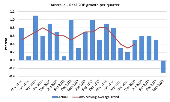
The first graph shows the quarterly growth over the last five years (with the red line being the ABS moving average trend). The ABS has now stopped publishing the trend for the time being given the large swings in performance that will be experienced over the next several quarters.
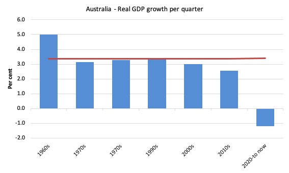
To put this into historical context, the next graph shows the decade average annual real GDP growth rate since the 1960s (the horizontal red line is the average for the entire period (3.4 per cent) from the March-quarter 1960 to the March-quarter 2020).
The 2020-to-now average is obviously just the March-quarter 2020 result.
It is easy to see how far below historical trends the growth performance of the last 2 decades have been as the fiscal surplus obsession has intensified on both sides of politics.
Even with a massive household credit binge and a one-in-a-hundred-years mining boom that was pushed by stratospheric movements in our terms of trade, our real GDP growth has declined substantially below the long-term performance.
And it is not that we are eschewing material aspirations in favour of climate action.
Analysis of Expenditure Components
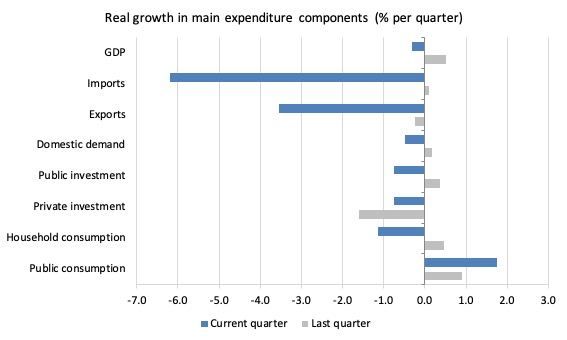
The following graph shows the quarterly percentage growth for the major expenditure components in real terms for the December-quarter 2019 (grey bars) and the March-quarter 2020 (blue bars).
Points to note:
1. The pre-Pandemic growth performance was already weak, a point that the Government should recognise when calibrating the appropriate size of the stimulus to deal with the health crisis.
2. Household Consumption expenditure fell by 1.1 per cent in the March-quarter and by 0.2 per cent over the 12 months.
3. General goverment consumption expenditure rose by 1.8 pre cent in the March-quarter and by 6.2 per cent over the 12 months.
4. Export expenditure fell by 3.5 per cent in the March-quarter and by 2 per cent over the 12 months. However, the decline in import expenditure for the quarter was 6.2 per cent and 7.7 per cent over the year.
5. Private investment expenditure growth declined by 0.8 per cent for the quarter. It has declined every quarter since the March-quarter 2018. It declined by 3.6 per cent over the 12 months.
6. Public investment declined by 0.75 per cent for the quarter as the big public infrastructure projects (State government – large transport projects mainly) start to taper. Over the 12 months public investment spending rose by 2.1 per cent.
Contributions to growth
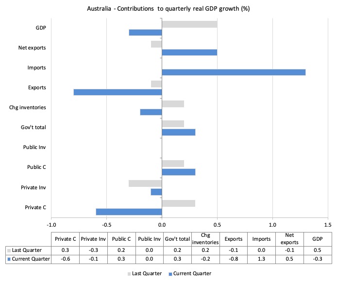
What components of expenditure added to and subtracted from the 0.3 per cent real GDP growth in the March-quarter 2020?
The following bar graph shows the contributions to real GDP growth (in percentage points) for the main expenditure categories. It compares the March-quarter 2020 contributions (blue bars) with the December-quarter 2019 (gray bars).
In order of contribution:
1. Household consumption expenditure contributed minus 0.6 points to the overall growth result as households withdrew and tried to save more.
2. Growth in inventories contributed minus 0.2 points. This is related to firms stockpiling.
3. Net exports added 0.5 percentage points – you may wonder how given that exports contributed minus 0.8 points. The answer is that falling imports added 1.3 points (remember imports are a drain on expenditure).
4. Public consumption contributed 0.3 points. Overall, the government sector contributed 0.3 points (given the zero contribution from public capital formation).
5. Private investment expenditure undermined growth by 0.1 points.
Material living standards rose in March-quarter 2020
The ABS tell us that:
A broader measure of change in national economic well-being is Real net national disposable income. This measure adjusts the volume measure of GDP for the Terms of trade effect, Real net incomes from overseas and Consumption of fixed capital.
While real GDP growth (that is, total output produced in volume terms) contracted by 0.3 per cent in the March-quarter 2020, real net national disposable income growth grew by 0.5 per cent.
How do we explain that?
There was a rise in disposable income (3.8 per cent) that was driven by a substantial increase (6.2 per cent) “increase in social assistance benefits due to both an increase in the number of recipients and the introduction of new government support packages in response to COVID-19 and bushfires” and some adjustments to the tax scales.
But wages growth remained low.
In other words, government assistance does increase material prosperity!
Over the 12 months to the March-quarter 2019, Real net national disposable income grew by 2.4 per cent, which means that Australians were better off (on average) in real income terms than they were twelve months prior.
The following graph shows the evolution of the quarterly growth rates for the two series since the March-quarter 2006.
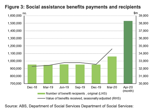
The rise in social assistance payments
To provide more insight into the government support for real disposable income this graph (produced by the ABS) is rather emphatic.
It is useful because it adds a single month’s observation for April 2020 (so outside of the quarterly span of the national accounts data) to give us an impression of what will happen in the June-quarter data.
Household saving ratio rises – as households refrain from consumption
The two elements – rising disposable income and a sharp contraction in household consumption expenditure – led to a sharp rise in the household saving ratio to 5.5 per cent.
Ultimately, the credit-fuelled and draw down on saving cannot be sustained. The impacts of the coronavirus (lost income) have exacerbated the tension households have been facing with flat income growth for several years and massive debt levels.
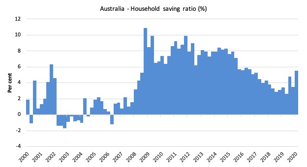
The following graph shows the household saving ratio (% of disposable income) from the March-quarter 2000 to the current period. It shows the period leading up to the GFC, where the credit binge was in full swing and the saving ratio was negative to the rise during the GFC and then the most recent rise.
To put the more recent period into an historical context, the next graph shows the household saving ratio (% of disposable income) from the March-quarter 1960 to the current period.
In the March-quarter 2008, the ratio was 10.9 per cent having risen sharply in the early days of the GFC as households tried to stabilise the record debt situation.
Once the GFC threat was contained by the massive fiscal stimulus, the saving ratio began to fall again, especially as the squeeze on wages has intensified.
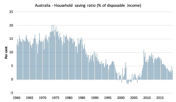
The following table shows the impact of the neoliberal era on household saving. These patterns are replicated around the world and expose our economies to the threat of financial crises much more than in pre-neoliberal decades.
The result for the current decade (2020-) is the single March-quarter observation.
| Decade | Average Household Saving Ratio (% of disposable income) |
| 1960s | 14.3 |
| 1970s | 16.1 |
| 1980s | 12.0 |
| 1990s | 5.4 |
| 2000s | 2.2 |
| 2010s | 6.42 |
| 2020- | 5.5 |
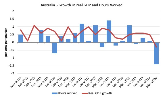
Real GDP growth and hours worked
The following graph presents quarterly growth rates in real GDP and hours worked using the National Accounts data for the last five years to the March-quarter 2020.
The March-quarter data shows the rather dramatic plunge in total hours worked lagged with GDP growth following – which means that productivity growth rose quite strongly (1.4 per cent).
You can see the dislocation between the two measures over the period to mid-2016 (it actually began in 2011). In other words, GDP was growing while hours worked growth was variable but often zero or negative.
From then until the March-quarter 2018, the two series moved more or less together, despite the blip in the March-quarter 2018.
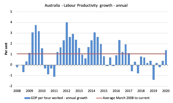
To see the above graph from a different perspective, the next graph shows the annual growth in GDP per hour worked (labour productivity) from the March-quarter 2008 quarter to the March-quarter 2019. The horizontal red line is the average annual growth since March-quarter 2008 (1.1 per cent), which itself is an understated measure of the long-term trend growth of around 1.5 per cent per annum.
The relatively strong growth in labour productivity in 2012 and the mostly above average growth in 2013 and 2014 helps explain why employment growth was lagging given the real GDP growth. Growth in labour productivity means that for each output level less labour is required.
In the March-quarter 2020, annual labour productivity growth rose by 1.4 per cent.
Conclusion
Remember that the National Accounts data is three months old – a rear-vision view – of what has passed and to use it to predict future trends is not straightforward.
The decline in real GDP growth in the March-quarter is modest considering the events of the last few months.
But the full impact of the lockdown will emerge in the June-quarter data, as the graph on social assistance payments (above) signalled.
We know the labour market has collapsed in April.
The Australian economy is being hit with cumulative effects of drought, bush fires, floods and now the virus.
The problem now is that while businesses are recovering and reopening, many will have disappeared.
The government support will have to be substantially larger than it currently is and for longer than they have proposed if the impending recession is to be attenuated.
Overall, the Australian growth outlook remains poor.
A major shift in fiscal policy towards further expansion is definitely required – now and big.
That is enough for today!
(c) Copyright 2020 William Mitchell. All Rights Reserved.
This Post Has 0 Comments