It's Wednesday and we have discussion on a few topics today. The first relates to…
US Labour Market – cheering but it is too early to break out the champagne
On June 5, 2020, the US Bureau of Labor Statistics (BLS) released their latest labour market data – Employment Situation Summary – May 2020 – which shows that the US labour market has responded to the relaxation of lockdown controls in a modest way. I cannot believe that in Donald Trump’s words the US is “largely through” the Pandemic and it remains to be seen whether lockdown rules will have to be reintroduced when the infections rise again. But, for the time being, the payroll numbers improved as you would expect when shops reopened and people went back to work. But I stress this was a modest improvement. The numbers filing for unemployment insurance continue to rise and now top 43.2 million since March 7, 2020. A further 1.9 million filed in the week ending May 30, 2020. There were also some discrepancies noted by the BLS in the survey responses this month which adds to the uncertainty. Overall, the US labour market is in crisis and it remains to be seen how many jobs have disappeared and how many will emerge once the lockdowns are ended. Some 2.6 points of ‘unemployment’ lie outside the labour force (workers giving up looking), and as employment growth increases, those workers will come back into the recorded labour force and be classified as unemployed rather than not in the labour force. So how deep this catastrophe is remains a but uncertain. But I do not see appropriate policy responses in place. The US government should have guaranteed all incomes and introduced large-scale job creation programs and a Job Guarantee as an on-going safety net.
Overview for May 2020:
- Payroll employment rose by 2,509 thousand.
- Total labour force survey employment rose by 3,839 thousand net (2.9 per cent).
- The seasonally adjusted labour force rose by 1,746 thousand (1.12 per cent).
- Official unemployment fell by 2,093 thousand to 20,985 thousand (but see below for commentary on latest data)
- The official unemployment rate fell by 1.4 points to 13.3 per cent.
- The participation rate rose by 0.6 points to 60.8 per cent. Adjusting the unemployment rate for the change in hidden unemployment would generate an unemployment rate of 15.9 per cent rather than 13.3 per cent.
- The broad labour underutilisation measure (U6) fell by 1.6 points to 21.2 per cent, in part, because of a fall in the number in the part-time for economic reasons cohort (the US indicator of underemployment) and a fall in other marginal categories.
For those who are confused about the difference between the payroll (establishment) data and the household survey data you should read this blog post – US labour market is in a deplorable state – where I explain the differences in detail.
BLS explanation
The BLS provided a special note to help us understand the results this month.
We learn:
1. The payroll survey response was “slightly lower than collection rates prior to the pandemic”.
2. “The household survey response rate, at 67 percent, was about 15 percentage points lower than in months prior to the pandemic.”
3. Both results reduce the accuracy of the surveys.
4. In the payroll survey:
… workers who are paid by their employer for all or any part of the pay period including the 12th of the month are counted as employed, even if they were not actually at their jobs. Workers who are temporarily or permanently absent from their jobs and are not being paid are not counted as employed, even if they are continuing to receive benefits.
5. In the Labour Force survey:
Workers who indicate they were not working during the entire survey reference week and expect to be recalled to their jobs should be classified as unemployed on temporary layoff. In May, a large number of persons were classified as unemployed on temporary layoff.
However, there was also a large number of workers who were classified as employed but absent from work.
The BLS wanted the latter group classified as unemployed for consistency but the survey staff didn’t always comply, which means that the employment estimates are probably overstated.
What impact might this have had?
The BLS say:
If the workers who were recorded as employed but absent from work due to “other reasons” (over and above the number absent for other reasons in a typical May) had been classified as unemployed on temporary layoff, the overall unemployment rate would have been about 3 percentage points higher than reported (on a not seasonally adjusted basis).
So we are still operating in an environment of uncertainty.
It is far to early to conclude that the US labour market is ‘bouncing back’ quickly.
Once these classification issues are resolved, the participation response becomes more normal (workers coming back into the labour force), and the number of jobs lost forever becomes apparent, the true residual impact of the pandemic on the US labour market will become clearer.
Payroll employment trends
The BLS noted that:
Total nonfarm payroll employment increased by 2.5 million in May, reflecting a limited resumption of economic activity that had been curtailed due to the coronavirus pandemic and efforts to contain it. Employment fell by 1.4 million and 20.7 million, respectively, in March and April. Despite the over-the-month increase, nonfarm employment in May was 13 percent below its February level. Large employment increases occurred in May in leisure and hospitality, construction, education and health services, and retail trade. Government employment continued to decline sharply.
A question that you should ask: Why is Government employment declining sharply in a major economic disaster?
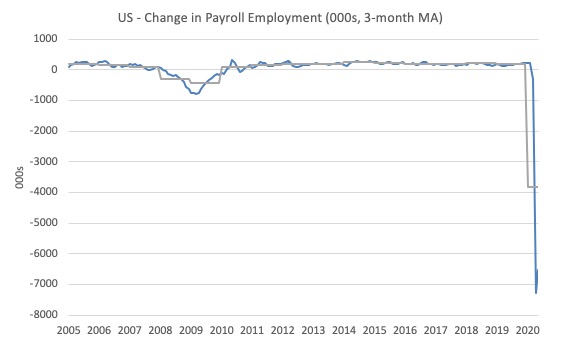
The first graph shows the monthly change in payroll employment (in thousands, expressed as a 3-month moving average to take out the monthly noise). The gray lines are the annual averages.
The data is now ‘off the chart’ and that says enough.
The next graph shows the same data in a different way – in this case the graph shows the average net monthly change in payroll employment (actual) for the calendar years from 1940 to 2020 (the 2020 average is for the months to date).
I usually only show this graph from 2005 but because history is being created at present I included the full sample available from 1940.
The final average for 2019 was 178 thousand.
The average so far for 2020 is -3,817 thousand.
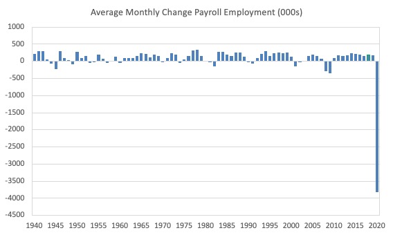
In a way, graphs like this lose definition and only present a binary world.
Labour Force Survey – employment growth shows modest comeback
The data for May shows some improvement along the lines revealed by the payroll data.
1. Employment as measured by the household survey fell by 3,839 thousand net (2.9 per cent).
2. The labour force rose by 1,746 (-1.1 per cent).
3. The participation rate fell by 0.6 points.
4. As a result (in accounting terms), total measured unemployment fell by 2,093 thousand and the unemployment rate fell by 1.4 points to 13.3 per cent.
So some improvement.
But remember, last month, employment fell by 22.4 million, so the 3.8 million improvement this month is, indeed, modest. But a good sign if we ignore the risk of people going back to work with the virus still raging.
It will take some time to absorb those workers back into employment once the economy starts moving again because a number of employers will have been wiped out by the scale of the contraction.
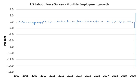
The following graph shows the monthly employment growth since January 2008, which shows the massive disruption this sickness has caused.
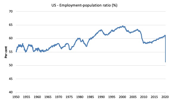
The Employment-Population ratio is a good measure of the strength of the labour market because the movements are relatively unambiguous because the denominator population is not particularly sensitive to the cycle (unlike the labour force).
The following graph shows the US Employment-Population from January 1950US_EPOP_1970_May_2020.jpg to May 2020.
While the ratio fluctuates a little, the April 2020 ratio fell by 8.7 points to 51.3 per cent, which is the largest monthly fall since the sample began in January 1948.
In May 2020, it rose by 1.5 points to 52.8 per cent.
But still just over a half of the working age population in the US is working now.
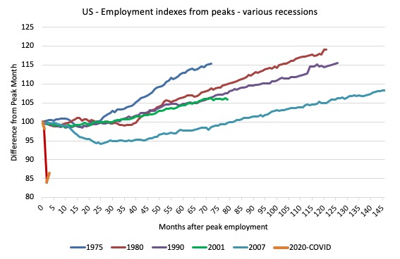
As a matter of history, the following graph shows employment indexes for the US (from US Bureau of Labor Statistics data) for the five NBER recessions since the mid-1970s and the current 2020-COVID crisis.
They are indexed at the employment peak in each case and we trace the data out for each episode until one month before the next peak.
So you get an idea of:
1. The amplitude (depth) of each cycle in employment terms.
2. The length of the cycle in months from peak-trough-peak.
The early 1980s recession was in two parts – a short downturn in 1981, which was followed by a second major downturn 12 months later in July 1982 which then endured.
Other facts:
1. Return to peak for the GFC was after 78 months.
2. The previous recessions have returned to the 100 index value after around 30 to 34 months.
3. Even at the ned of the GFC cycle (146 months), total employment in the US has still only risen by 8.3 per cent (since December 2007), which is a very moderate growth path as is shown in the graph.
The current collapse is something else.
Unemployment and underutilisation trends
The BLS report that:
The unemployment rate declined by 1.4 percentage points to 13.3 percent in May, and the number of unemployed persons fell by 2.1 million to 21.0 million. Reflecting the effects of the coronavirus pandemic and efforts to contain it, the unemployment rate and the number of unemployed persons are up by 9.8 percentage points and 15.2 million, respectively, since February
The modest return to employment saw the official unemployment rate decline slightly in May 2020.
The first graph shows the official unemployment rate since January 1950.
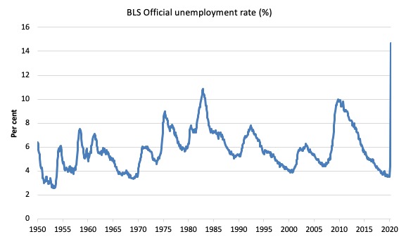
The official unemployment rate is a narrow measure of labour wastage, which means that a strict comparison with the 1960s, for example, in terms of how tight the labour market, has to take into account broader measures of labour underutilisation.
The next graph shows the BLS measure U6, which is defined as:
Total unemployed, plus all marginally attached workers plus total employed part time for economic reasons, as a percent of all civilian labor force plus all marginally attached workers.
It is thus the broadest quantitative measure of labour underutilisation that the BLS publish.
In December 2006, before the effects of the slowdown started to impact upon the labour market, the measure was estimated to be 7.9 per cent.
In May 2020 the U6 measure decreased by 1.6 points to 21.2 per cent.
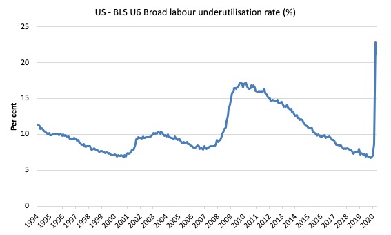
What drove this slight improvement?
This was driven, in part, by a slight fall (254 thousand) in the category ‘Part-time for economic reasons’ – a measure of underemployment in the US data context).
But this was offset by a small return to those wanting to work but not actively looking, who are excluded from the official unemployment count.
The BLS say that:
The number of persons employed part time for economic reasons, at 10.6 million, changed little in May, but is up by 6.3 million since February. These individuals, who would have preferred full-time employment, were working part time because their hours had been reduced or they were unable to find full-time jobs. This group includes persons who usually work full time and persons who usually work part time …
The number of persons not in the labor force who currently want a job, at 9.0 million, declined by 954,000 in May, after increasing by 4.4 million in April. These individuals were not counted as unemployed because they were not actively looking for work during the last 4 weeks or were unavailable to take a job …
Persons marginally attached to the labor force–a subset of persons not in the labor force who currently want a job–numbered 2.4 million in May, little different from the prior month. These individuals were not in the labor force, wanted and were available for work, and had looked for a job sometime in the prior 12 months but had not looked for work in the 4 weeks preceding the survey. Discouraged workers, a subset of the marginally attached who believed that no jobs were available for them, numbered 662,000 in May, also little changed from the previous month.
So not only are there massive layoffs occurring but firms are also making hours adjustment – cutting full-time hours back to part-time or cutting part-time hours and workers are dropping out of the official labour force (not searching) and are thus moving into hidden unemployment (see below).
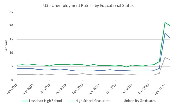
The next graph shows the evolution of unemployment rates for three cohorts based on educational attainment: (a) those with less than high school completion; (b) high school graduates; and (c) university graduates.
As usual, when there is a crisis, the least educated suffer disproportionately.
In the US context, especially in the current time, the trends in trends in unemployment by ethnicity are interesting.
Two questions arise:
1. How have the Black and African American and White unemployment rate fared in the post-GFC period?
2. How has the relationship between the Black and African American unemployment rate and the White unemployment rate changed since the GFC?
Summary:
1. All the series move together as economic activity cycles. The data also moves around a lot on a monthly basis.
2. The Black and African American unemployment rate was 6.7 per cent in March 2020, rose to 16.7 per cent in April and rose again to 16.8 per cent in May 2020.
3. The Hispanic or Latino unemployment rate was 6 per cent in March 2020, rose to 18.9 per cent in April and fell to 17.6 per cent in May 2020.
4. The White unemployment rate was 4 per cent in March 2020, rose to 14.2 per cent in April and fell to 12.4 per cent in May 2020.
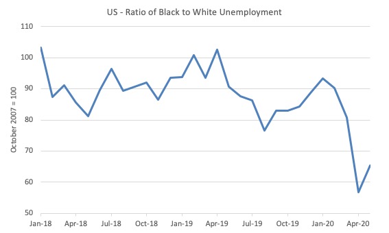
The next graph shows the Black and African American unemployment rate to White unemployment rate (ratio) from January 2018 (index = 100), when the White unemployment rate was at 3.5 per cent and the Black or African American rate was at 7.5 per cent.
This graph allows us to see whether the relative position of the two cohorts has changed since the crisis.
While there is month-to-month variability, the data shows that, in fact, leading up to the Pandemic, the position of Black and African Americans had improved in relative terms (to Whites), although that just that the White unemployment was so low that employers were forced to take on other ‘less preferred’ workers if they wanted to maintain growth.
However, it is also clear that since March 2020, the relative position of the Black and African American workers has deteriorated.
Aggregate participation rate – rose by 0.6 points to 60.8 per cent
This represented a modest return to participation after the 2.5 points plunge last month.
The April fall in the labour force participation rate meant that the labour force contracted and workers who would have been counted among the unemployment were, instead, classified by the BLS as being not in the labour force.
This reduces the severity of the rise in official unemployment.
So this modest rise in participation meant that the unemployment rate did not fall by as much as it would have if the participation rate had ahve remained at the April level.
The question though is how much hidden unemployment remains after the April decline.
The labour force is a subset of the working-age population (those above 15 years old). The proportion of the working-age population that constitutes the labour force is called the labour force participation rate. Thus changes in the labour force can impact on the official unemployment rate, and, as a result, movements in the latter need to be interpreted carefully. A rising unemployment rate may not indicate a recessing economy.
The labour force can expand as a result of general population growth and/or increases in the labour force participation rates.
Here are the facts:
1. The labour force in May 2020 was 158,227 thousand.
2. It would have been 163,172 thousand had the participation rate been at the March 2020 level.
3. This means that there are still 4,686 thousand workers who are still outside the labour force as a result of the collapse in employment opportunities. It is safe to say they would not have been outside the labour force if employment opportunities had not collapsed
4. If we assume those workers are hidden unemployed – they want to work, are willing to work, but did not actively seek work – and add them back into the official unemployment, the adjusted unemployment rate in May 2020 would be 15.9 per cent rather than the official estimate of 13.3 per cent.
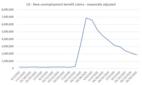
The claimants data horror story – still horrible but moderating a bit
Here is the latest update (as for the week ending May 30, 2020) from the US Department of Labor’s weekly data releases for the unemployment insurance claimants.
The Department of Labor provides an archive of the weekly unemployment insurance claims data back to July 1, 1967 – HERE.
The weekly data can be found in the – UI Weekly Claims Report.
Bringing together the archived data and the most recent release (June 4, 2020), the following table tells the shocking story.
| Week ending | Initial Claims (SA) | Weekly Change | Cumulative sum since March 7, 2020 |
| March 7, 2020 | 211,000 | -6,000 | n/a |
| March 14, 2020 | 282,000 | +71,000 | 282,000 |
| March 21, 2020 | 3,307,000 | +3,025,000 | 3,589,000 |
| March 28, 2020 | 6,687,700 | +3,560,000 | 10,456,000 |
| April 4, 2020 | 6,615,000 | -252,000 | 17,071,000 |
| April 11, 2020 | 5,237,000 | -1,378,000 | 22,308,00 |
| April 18, 2020 | 4,442,000 | -795,000 | 26,750,000 |
| April 25, 2020 | 3,867,000 | -575,000 | 30,617,000 |
| May 2, 2020 | 3,846,000 | -596,000 | 30,596,000 |
| May 9, 2020 | 3,176,000 | -691,000 | 33,793,000 |
| May 16, 2020 | 2,446,000 | -535,000 | 39,220,000 |
| May 23, 2020 | 2,126,000 | -320,000 | 41,346,000 |
| May 30, 2020 | 1,877,000 | -249,000 | 43,223,000 |
So the figure is 43.2 million!
The next graph shows the data from January 1, 2020 to May 30, 2020.
I had previously posted the full sample, which showed how insignificant the previous deep recessions of the early 1980s, 1990s and the GFC were by comparison with the current event.
But we get little information from seeing a huge vertical line dwarfing all previous observations. We know the scale.
So I decided to start the sample at the beginning of 2020 to see how the claimant numbers evolve since the outset of the Pandemic.
This gives us a good indication of the dynamics.
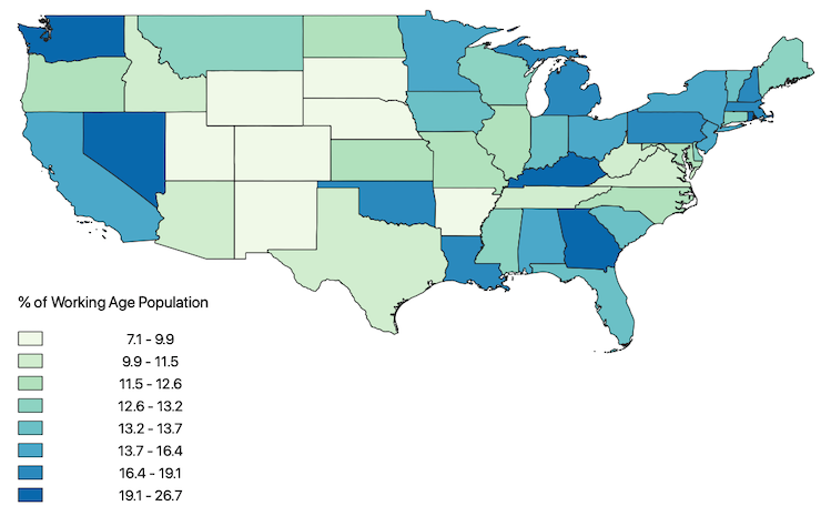
The next map shows the cumulative sum of unemployment insurance claimants since the end of February 2020 (as at May 30, 2020, expressed as a percentage of the Working Age Population in each state (Alaska was 19.6 per cent and Hawaii was 22.6 per cent).
This map demonstrates where the loss of jobs is impacting most significantly.
The next map shows the Insured Unemployment Rate for the States as at May 30, 2020.
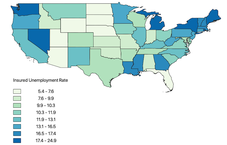
There are some spatial variations in the proportion of new claimants and those unemployed receiving insurance. I am investigating those variations in more detail and will report back if I find anything interesting.
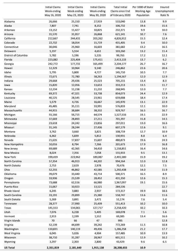
The following Table presents the same data mapped in the first map for those who prefer numbers.
Conclusion
The May 2020 US BLS labour market data release reveals an on-going catastrophic labour market with some signs of improvement as the lockdown eases.
I am guessing a lot of employment will have disappeared forever and when the dust settles and we find out how many, the medium-term outlook will be rather grim.
I would urge the US government not to wait for that time but to anticipate that substantial job creation policy initiatives will be required.
The current position of the US government has biased their stimulus spending towards the corporate sector and high income earners.
It disadvantages precarious workers and those losing jobs.
The US government should immediately announce an unconditional Job Guarantee and guarantee salaries for all workers made redundant.
That is enough for today!
(c) Copyright 2020 William Mitchell. All Rights Reserved
“There are some spatial variations in the proportion of new claimants and those unemployed receiving insurance.”
It may be because unemployment compensation eligibility and benefit amounts are determined by each state. And all the programs are administered at the state level. But the federal government passed what I think is called the CARES Act that proposed to expand coverage to many who were previously not eligible (such as self-employed people) and pay up to $600 a week for them (and add $600 a week to the generally meager regular state compensation for those who would usually qualify anyways). But you still have to apply through each state’s labor department.
And they have been a bit overwhelmed to say the least and hopefully trying to catch up.
“And they have been a bit overwhelmed to say the least and hopefully trying to catch up.”
Another reason to get rid of a system that has people in the way.
Everybody (who wants to!) on a default Federal payroll that pays automatically anybody paid by another payroll in the previous 12 months but who currently isn’t receiving anything.
The money is then automatic and instant, with the ‘labor people’ doing the contacting over time to see what you are going to do in the public sphere for your money.
We have the entire system backwards.
Using traditional analysis to evaluate the current situation should be questioned on the grounds that the crisis was caused by the government shutdown, it wasn’t a traditional business cycle event.