Today (April 18, 2024), the Australian Bureau of Statistics released the latest - Labour Force,…
Australian labour force data – labour underutilisation rate rises to 25.1 per cent
Whatever way you want to interpret it, the Australian labour market continued to deteriorate in May 2020. The latest data from the Australian Bureau of Statistics – Labour Force, Australia, May 2020 – released today (June 18, 2020) continues to tell a shocking tale. All the main aggregates moved in an adverse direction. Employment fell by 1.8 per cent (227,700). Unemployment rose by 86,700 thousand. But that is a gross understatement of the problem given that the participation rate fell by 0.7 points, which meant the labour force fell by 142 thousand. Without the fall in the participation rate in May 2020, the unemployment rate would have been 8.1 per cent rather than its current value of 7.1 per cent). But relative to August 2019 (peak participation), the unemployment rate would have been 11.7 per cent. The broad labour underutilisation rate is now at 20.2 per cent. There are now 2,639.1 thousand workers either unemployed or underemployed. That number swells to 3,286.5 (or 25.1 per cent) if we add the rise in hidden unemployment back into the ‘jobless’. Any government that oversees that sort of disaster has failed in their basic responsibilities to society. Its fiscal stimulus is totally inadequate.
The summary ABS Labour Force (seasonally adjusted) estimates for May 2020 are:
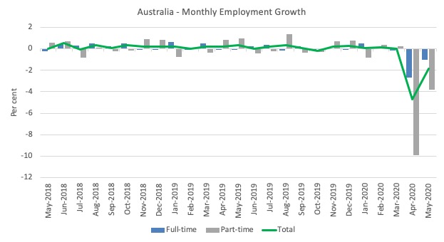
- Employment decreased 227,700 (-1.8 per cent) – Full-time employment decreased 89,100 and part-time employment decreased 138,600.
- Unemployment increased 86,700 to 927,600 persons.
- The official unemployment rate increased 0.7 points to 7.1 per cent.
- The participation rate decreased by 0.7 points to 62.9 per cent.
- Aggregate monthly hours worked decreased 12.1 million hours (-0.75 per cent).
- Underemployment fell 109.5 thousand or 0.7 points to 13.1 per cent. Overall there are 1,711.5 thousand underemployed workers. The total labour underutilisation rate (unemployment plus underemployment) increased by 0.1 points to 20.2 per cent. There were a total of 2,6391 thousand workers either unemployed or underemployed.
Employment decreased 227,700 or -1.8 per cent in May 2020
1. Employment decreased a further 227,700 ( per cent), which means since March it has fallen by 835.1 thousand (-6.4 per cent).
2. Full-time employment decreased 89,100 and part-time employment decreased 138,600
The following graph shows the month by month growth in full-time (blue columns), part-time (grey columns) and total employment (green line) for the 24 months to May 2020 using seasonally adjusted data.
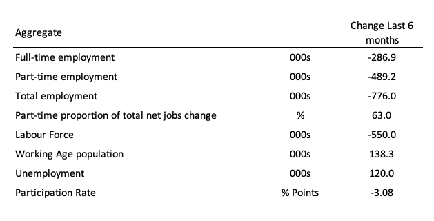
The following table provides an accounting summary of the labour market performance over the last six months.
As the monthly data is highly variable, this Table provides a longer view which allows for a better assessment of the trends.
Assessment:
1. Every bad thing that can happen has happened – employment collapse, participation rate collapse, labour force collapse, which reduces the collapse in official unemployment.
2. As a consequence while official unemployment has risen by 120 thousand, hidden unemployment has risen substantially given the labour force has shrunk by 550 thousand on the back of a 3.1 points drop in participation (see below for quantification).
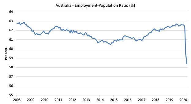
Given the variation in the labour force estimates, it is sometimes useful to examine the Employment-to-Population ratio (%) because the underlying population estimates (denominator) are less cyclical and subject to variation than the labour force estimates. This is an alternative measure of the robustness of activity to the unemployment rate, which is sensitive to those labour force swings.
The following graph shows the Employment-to-Population ratio, since May 2008 (the low-point unemployment rate of the last cycle).
It fell with the onset of the GFC, recovered under the boost provided by the fiscal stimulus packages but then went backwards again as the Federal government imposed fiscal austerity in a hare-brained attempt at achieving a fiscal surplus in 2012.
The ratio fell a further 0.9 points in May 2020 and is at 58.4 per cent. The ratio is now 4.5 points below pre-GFC peak in May 2008 of 62.9 per cent.
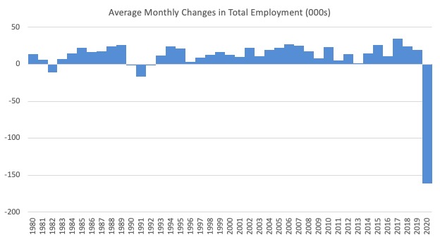
To put the current monthly performance into perspective, the following graph shows the average monthly employment change for the calendar years from 1980 to 2020 (to date).
1. It is clear that after some lean years, 2017 was a much stronger year if total employment is the indicator.
2. It is also clear that the labour market weakened considerably over 2018 and that situation worsened in 2019.
3. 2020 is off the scale (average employment change so far of -161.5 thousand).
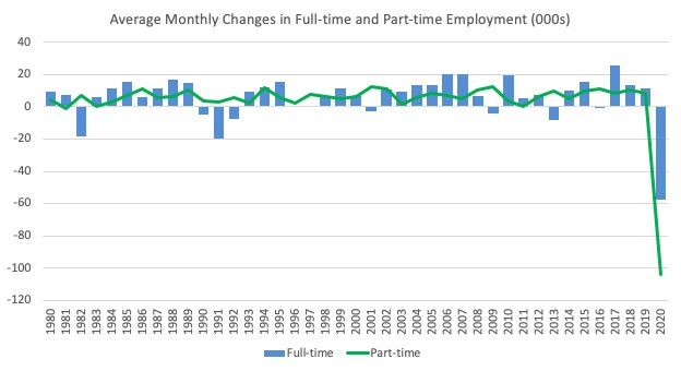
The following graph shows the average monthly changes in Full-time and Part-time employment (lower panel) in thousands since 1980.
The interesting result is that during recessions or slow-downs, it is full-time employment that takes the bulk of the adjustment. Even when full-time employment growth is negative, part-time employment usually continues to grow.
However, this crisis is different because much of the employment losses are the result of lockdowns and enforced business closures in sectors where part-time employment dominates.
But the collapse in full-time employment signals that the demand-side impacts are spreading more widely.
Unemployment increased 85,700 to 927,600 or 7.1 per cent
The official unemployment rate increased by 0.7 points to 7.1 per cent but the actual unemployment arising from the crisis is much higher given the sharp fall in the participation rate.
Most of the fall in the Labour Force (-142 thousand) will be hidden unemployed who have not satisfied activity tests in the survey (that is, they probably said they had given up looking).
Further on I will quantify what that means for the underlying unemployment rate.
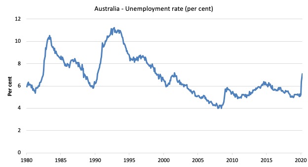
The following graph shows the national unemployment rate from January 1980 to May 2020. The longer time-series helps frame some perspective to what is happening at present.
Assessment:
1. Any time the unemployment rate rises like this you know one other thing – the extent of fiscal policy support is inadequate.
2. There is clearly still considerable slack in the labour market that could be absorbed with further fiscal stimulus.
3. The government is choosing to allow this rise in joblessness.
Broad labour underutilisation rose by 0.1 points to 20.2 per cent
The results for May 2020 are (seasonally adjusted):
1. Underemployment fell by 109.5 thousand as the lockdown eased a little.
2. The underemployment rate fell by 0.7 points to 13.1 per cent.
2. Overall there are 1.711.5 thousand underemployed workers.
3. The total labour underutilisation rate (unemployment plus underemployment) increased by 0.1 points to 20.2 per cent.
4. There were a total of 2,639.1 thousand workers either unemployed or underemployed.
5. The shift has been driven by the rise in unemployment, which suggests a longer-lasting crisis – jobs are being shed rather than workers being put on shorter time.
The following graph plots the seasonally-adjusted underemployment rate in Australia from January 1980 to the May 2020 (blue line) and the broad underutilisation rate over the same period (green line).
The difference between the two lines is the unemployment rate.
The three cyclical peaks correspond to the 1982, 1991 recessions and the more recent downturn.
The other difference between now and the two earlier cycles is that the recovery triggered by the fiscal stimulus in 2008-09 did not persist and as soon as the ‘fiscal surplus’ fetish kicked in in 2012, things went backwards very quickly.
The two earlier peaks were sharp but steadily declined. The last peak fell away on the back of the stimulus but turned again when the stimulus was withdrawn.
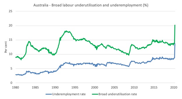
If hidden unemployment (given the depressed participation rate) is added to the broad ABS figure the best-case (conservative) scenario would see a underutilisation rate around 24.8 per cent at present. Please read my blog post – Australian labour underutilisation rate is at least 13.4 per cent – for more discussion on this point.
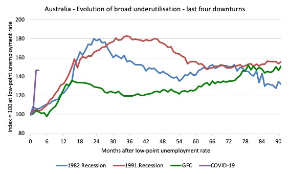
Unemployment and broad labour underutilisation indexes – last four downturns
The following graph captures the evolution of the unemployment rates for the 1982, 1991, GFC and COVID-19 downturns.
For each episode, the graph begins at 100 – which is the index value of the unemployment rate at the low-point of each cycle (June 1981; December 1989; February 2008, and January 2020, respectively).
We then plot each episode out for 90 months.
For 1991, the peak unemployment which was achieved some 38 months after the downturn began and the resulting recovery was painfully slow. While the 1982 recession was severe the economy and the labour market was recovering by the 26th month. The pace of recovery for the 1982 once it began was faster than the recovery in the current period.
During the GFC crisis, the unemployment rate peaked after 16 months (thanks to a substantial fiscal stimulus) but then started rising again once the stimulus was prematurely withdrawn and a new peak occurred at the 80th month.
The COVID-19 downturn, while in its early months, is obviously worse than any of the previous recessions shown.
The graph provides a graphical depiction of the speed at which each recession unfolded (which tells you something about each episode) and the length of time that the labour market deteriorated (expressed in terms of the unemployment rate).
After three months, the unemployment had risen from 100 to:
1. 108.8 index points in 1982.
2. 109.2 index points in 1991.
3. 107.1 index points in the GFC.
4. 139.4 index points currently (and note the point below about participation rate declining)
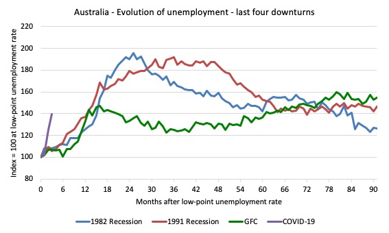
Note that these are index numbers and only tell us about the speed of decay rather than levels of unemployment.
The next graph performs the same operation for the broad labour underutilisation rate (sum of official unemployment and underemployment).
Aggregate participation rate decreased by 0.7 points to 62.9 per cent
The fall in the labour force participation rate meant that the labour force fell by 142 thousand. It has fallen by 623.6 thousand since March 2020.
That contraction would have been added to official unemployment had the workers (in all probability) not given up looking for work.
In other words, the fact that the ABS estiamtes the official unemployment rate to have only risen by 0.7 points in May 2020 is a gross underestimate of what is actually going on with respect to job loss.
By how much would unemployment have risen if the participation rate had not fallen?
We can make two calculations:
1. Just the monthly implication.
2. The implication of the participation rate being below its most recent peak of 66.2 per cent in August 2019.
The labour force is a subset of the working-age population (those above 15 years old). The proportion of the working-age population that constitutes the labour force is called the labour force participation rate. Thus changes in the labour force can impact on the official unemployment rate, and, as a result, movements in the latter need to be interpreted carefully. A rising unemployment rate may not indicate a recessing economy.
The labour force can expand as a result of general population growth and/or increases in the labour force participation rates.
The following Table shows the breakdown in the changes to the main aggregates (Labour Force, Employment and Unemployment) and the impact of the rise in the participation rate.
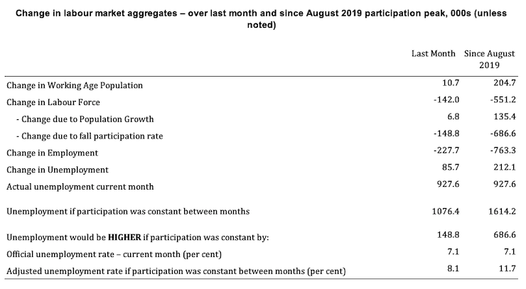
The change in the labour force in May 2020 was the outcome of two separate factors:
- The underlying population growth added 6.8 thousand persons to the labour force. The population growth impact on the labour force aggregate is relatively steady from month to month but has slowed in recent months; and
- The fall in the participation rate meant that there were 148.8 thousand workers dropping out of the labour force (relative to what would have occurred had the participation rate remained unchanged).
- The net result was that the labour force fell by 142 thousand.
Assessment:
1. If the participation rate had not have fallen in May, total unemployment, at the current employment level, would have been 1,076.4 thousand rather than the official count of 927.6 thousand as recorded by the ABS – a difference of 148.8 thousand workers (the ‘participation effect’).
2. Without the fall in the participation rate in May 2020, the unemployment rate would have been 8.1 per cent (rounded) rather than its current value of 7.1 per cent).
3. Hidden unemployment thus rose by 148.8 thousand.
4. The situation is worse if we consider the collapse since August 2019. The labour force has shrunk by 551.2 thousand and the unemployment rate would be 11.7 per cent rather than 7.1 per cent had those workers not dropped out of the labour force as a result of inadequate job opportunities.
5. If we add the change in hidden unemployment back into the broad labour underutilisation rate currently estimated to be 20.2 per cent, we would get a total wastage rate of 24.8 per cent. Hideous. Policy. Failure.
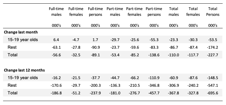
Teenage labour market continues to decline sharply in May 2020
1. Total teenage net employment fell by 53.5 thousand in May 2020 (-9.1 per cent) after falling 14.8 per cent in April. This is the result of the closures in hospitality, recreation and arts etc. But I was surprised the losses continued as strongly in May, given some of the easing of the lockdowns.
It suggests that some businesses have gone broke in the interim.
2. Full-time teenage employment rose (surprisingly) by 1.7 thousand (1.4 per cent) and part-time employment fell by 55.3 thousand (-11.9 per cent).
3. The teenage unemployment rate a further 1.3 points to 19.9 per cent.
The following Table shows the distribution of net employment creation in the last month and the last 12 months by full-time/part-time status and age/gender category (15-19 year olds and the rest).
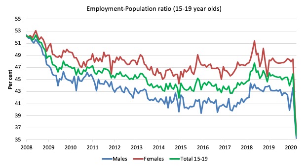
To put the teenage employment situation in a scale context (relative to their size in the population) the following graph shows the Employment-Population ratios for males, females and total 15-19 year olds since May 2008.
You can interpret this graph as depicting the loss of employment relative to the underlying population of each cohort. We would expect (at least) that this ratio should be constant if not rising somewhat (depending on school participation rates).
The absolute loss of jobs reported above has impacted more on males than females.
1. The male ratio has fallen by 17.1 percentage points since February 2008 and 7.5 points since March 2020.
2. The female ratio has fallen by 16.1 percentage points and 11.7 points since March 2020.
3. The overall teenage employment-population ratio has fallen by 16.6 percentage points and 10.4 points since March 2020.
4. In proportional terms, this is a devastating result for teenagers.
The other statistic relating to the teenage labour market that is worth highlighting is the decline in the participation rate since the March 2020 – when it was 55.1 per cent.
In May 2020, the ratio had falled to 44.5 per cent. A staggering exit from the labour force.
It was already well below the level that was recorded at the onset of the GFC.
The difference between the 2008 level and now, amounts to an additional 244.6 thousand teenagers who have dropped out of the labour force as a result of the weak conditions since the crisis.
1. If we added them back into the labour force the teenage unemployment rate would be 41.4 per cent rather than the official estimate for May 2020 of 19.9 per cent.
2. Even the collapse in participation since March 2020, would imply the adjusted youth unemployment rate had risen by 17.1 percentage points
Some may have decided to return to full-time education and abandoned their plans to work. But the data suggests the official unemployment rate is significantly understating the actual situation that teenagers face in the Australian labour market.
Overall, the performance of the teenage labour market is disastrous and will undermine future productivity and prosperity as our society ages.
I continue to recommend that the Australian government immediately announce a major public sector job creation program aimed at employing all the unemployed 15-19 year olds, who are not in full-time education or a credible apprenticeship program.
This is desperately required now.
The Government has been silent on this crisis. A nation cannot stand idly by and allow 41.4 per cent of teenagers who desire to work to be idle.
That is a catastrophe for the present and a time-bomb for the future.
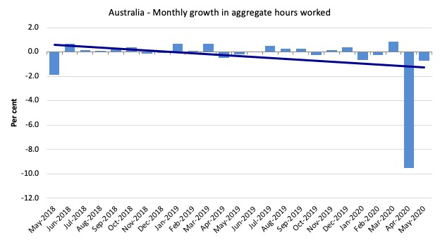
Hours worked decreased 12.1 million hours (-0.75 per cent) in May 2020
A slowing down of hours worked lost this month after the massive 9.5 per cent contraction in April.
The following graph shows the monthly growth (in per cent) over the last 24 months.
The dark linear line is a simple regression trend of the monthly change – which depicts a sharp decreasing trend. Even before the coronavirus crisis struck, the trend was downwards.
Conclusion
My standard monthly warning: we always have to be careful interpreting month to month movements given the way the Labour Force Survey is constructed and implemented.
The May 2020 data reveals that the Australian economy is in dire straits now.
All the main aggregates moved in extremely adverse directions.
Since March 2020:
1. Employment has fallen by 835.1 thousand (6.4 per cent).
2. The Labour Force has fallen by 623.6 thousand (4.6 per cent).
3. Unemployment has risen by 212.1 thousand
4. Participation has drop by 4.6 percentage points.
5. Hidden unemployment has risen by 623.6 thousand.
6. The overall labour underutilisation rate (official unemployment, underemployment and hidden unemployment) is now around 25.1 per cent.
My overall assessment is:
1. The current situation can best be described as catastrophic.
2. The Australian labour market needs massive fiscal policy intervention targetted at direct job creation.
3. The prior need for a fiscal stimulus of around 2 per cent has changed to a fiscal stimulus requirement of several times that.
4. There is clear room for some serious fiscal policy expansion at present and the Federal government’s attempts to date have been seriously under-whelming.
5. Any government that oversees that sort of disaster has failed in their basic responsibilities to society. Its fiscal stimulus is totally inadequate.
That is enough for today!
(c) Copyright 2020 William Mitchell. All Rights Reserved.
“The government is choosing to allow this rise in joblessness.”
In effect yes, but only because it thinks the issuance of debt-free money to fund a JG will cause inflation, even in the present circumstances.
Aided and abetted by the geniuses in the treasury and reserve bank, who should know better.
Reading it very closely this time, many thanks to Bill for the thorough unemployment analysis and the excellent conclusions put forward what should be done.
I think this method of analysis should be adopted by all countries so that a specific set of solutions could be derived.
This method will work whether you are in the normal time, the Covid19 led time, or any economic crises induced time.
I also like the way his analysis explains how long it will take for the unemployment to peak, which demographic variables it will affect, and by how much.
This is very good, as it gives a clear direction of how much, how long, and where the fiscal stimulus should be targeted.
The Australian government should be thankful for this analysis, and act upon it quickly and accordingly.
Nothing could be easier than this to solve the unemployment crisis situation in the land of down under!
Now, looking back to my own country (Thailand), we have no such clear scientific analysis yet, as far as I know (not in the mainstream discussions any way).
Well perhaps maybe, one day, soon.
Vorapot
To me as a mere bystander, Bill’s compelling analysis of the Australian government’s performance comes across as an unconditionally-damning indictment. Nor can it reasonably be argued in mitigation that few other governments have done much if any better.
I would have thought it would strike any Australian with an ounce of impartiality who reads it in exactly the same way.
So the question becomes:- Why then isn’t the Australian population as a whole in a state of revolt (and I’m not talking about violence) against their politicians’ patent failure to fullfil their duty to the nation?
I imagine that whatever the explanation is in Australia’s case it’s unlikely to be any different *in essence* than it would be if the same question were to be posed, say, in regard to (most) EU member-governments. If so, that leads to a profoundly depressing conclusion.
There is indeed a very long way to go yet before enlightenment can be expected to dawn on our politics taken as a whole – regardless of party-political orientation.
Note that mutual obligation for jobseeker was suspended until early June. This probably explains the drop in participation rate. That is, the increase in number of people on jobseeker/newstart from Feb-April was ~500,000 and decrease in labour force in between Feb-April was also ~500,000. Similarly I would expect to see another ~150,000 people on jobseeker by May (data not available yet), as the labour force dropped by 142,000.
It also wouldn’t surprise me if we see the participation rate jump back up in June and then again in July. Because these ~650,000 people will likely be re-entering the labour force now. Perhaps not in time for June numbers, but definitely for July.
“Why then isn’t the Australian population as a whole in a state of revolt ”
Most of them already have jobs, and they see little value in providing job loss insurance.
Which is why we need to push the other side of the Job Guarantee auto stabiliser – that it replaces the Internet Rate Targeting policy and ensures that national interest rates remain Zero forever.
The pitch needs to be that the MMT Job Guarantee ensures your mortgage rate will remain low forever, that you’ll be able to retire earlier (since we no longer need fluff jobs to maintain monetary circulation), and you’ll always have a job to go to throughout your working life wherever in the country you choose to live.
Direct personal benefit first; looking after your neighbours brownie points second.
If that isn’t enough then we cancel income tax too (and make employers pay an employment tax instead). Then whatever you earn you get to keep, All of it.
With the Job Guarantee your working day is your contribution to society. No need for tax.
That’s the sort of pitch we need to develop, One that answers the “what’s in it for me” question.
Excellent suggestions, Mr Wilson.
If Income Tax were to be cancelled they would not be put through the onerous task of filling out a Tax Return every year.
I’m reminded that “the income tax” made its first appearance (in modern times anyway) during the Napoleonic wars, as a temporary measure to pay for same, and was strongly resisted. I seem to recall dimly that the war was otherwise financed by loans (from Nathan Mayer Rothschild mainly), issuing govt paper and by suspending the convertibility of BoE notes into gold – which looks like a trial run for Lincoln’s “greenbacks”.
Ever since, that “temporary” tax has come to be regarded as a law of nature, which is strange when you come to think of it.
@ Neil
“….it replaces the Inter(est) Rate Targeting policy and ensures that national interest rates remain Zero forever”.
Would that mean that monetary policy as a macro-economic tool (open-market operations, govt debt-issue, QE/direct monetary financing, etc) would fall into permanent disuse? Leaving only control over the private banks’ operation of the payments/clearing system as the task for the CB? (No mean task BTW).
Would Treasury (then as now) control the flow of fiat currency-issuance/withdrawal such that supply of it was kept sufficient to meet demand, after allowing for the volume of private-bank credit-creation? (I presume you’re not proposing to rein-back, let alone stifle altogether, the latter)?
“Any government that oversees that sort of disaster has failed in their basic responsibilities to society. …Every bad thing that can happen has happened – employment collapse, participation rate collapse, labour force collapse, which reduces the collapse in official unemployment. …Hideous. Policy. Failure.” We who follow Bill’s blog and read his other work easily recognize the hideousness of governmental decisions to bail out only the rich and powerful when society itself is unraveling. We know in advance what is coming, a Second Great Post-Covid Depression dwarfing the one our grandparents knew, a systemic global crash that will immiserate billions of average citizens, who will soon join the ranks of the many millions already marginalized and rendered disposable by neoliberalism. The hope is that it will not be long before the immiserated billions come to see what we see, begin to burn with the same passionate indignation over horrible and totally unnecessary policy failures. I’ve mentioned before the sign I had made for my front yard in a typical American subdivision: “WE’RE IN THIS TOGETHER/BAIL OUT EVERYONE.” Thanks to MMT, we know how to go about this bailing out of everyone, beginning with a federal JG that allows all who can work to do so productively, for decent pay and benefits, and also allows workers to be paid in the same manner, seamlessly, when they must shelter in place to protect public health. And those guaranteed jobs can be focused on doing all the necessary things that the private sector cannot “afford” to do, all those essential things to improve the welfare of people and planet, to address the carnage, social and environmental, that the sole pursuit of private profit leaves in its wake. It’s all so goddamn clear to us, as plain as the noses on our faces, yet only a small minority sees it. Will it take mass immiseration on an almost unimaginable scale to finally make the majority acknowledge the truth of what Bill and his MMT colleagues have been saying?–that the human race does not need to suffer in this hideous fashion, that there are concrete steps our governments could take right now to alleviate much of this impending misery, steps involving no more than the responsible and compassionate investment of fiat money, which is called into existence merely by the taking of these steps. God knows why it seems we must pay such a hideous price to see the obvious. I surely don’t.
“Would that mean that monetary policy as a macro-economic tool (open-market operations, govt debt-issue, QE/direct monetary financing, etc) would fall into permanent disuse?”
Yes. Like alchemy before it. And for the same reasons.
“Leaving only control over the private banks’ operation of the payments/clearing system as the task for the CB?”
And clearing the government cheques. And resolving banks that fail – which of course they can be allowed to now that deposits are fully protected and we have no need of bank lending to stabilise economies. No more “too big to fail”.
And, most importantly, paying the wages of people on the Job Guarantee sourced from the new “Domestic Stabilisation Fund” account
The Central Bank would transfer from the Domestic Stabilisation Fund to the Treasury payment account (in the UK to the Consolidated Fund) on demand. And that’s how Job Guarantee is ‘funded’.
Beyond that Treasury then pays out of the Payment Account whatever the legislature authorises and collects whatever taxes it sees fit to collect. It can even continue issuing bonds if it wants to.
All that ends is Interest on Reserves and the employment of the overpaid unelected wonks deciding rates. The person running the central bank becomes as anonymous as any other government department head.
Yesterday I saw a debate from Hudson vs some Harvard prof.
He said that “the free market is all about efficiency.”
I remember thinking about 15 percent broad under utilization in Australia all these years. Now its 25 percent. What a joke economics is.
@Newton Finn at 23:38
A beautiful piece! I think the answer is everywhere in the news these days – when people ask: why the Wall street keeps going up while the main streets keep hitting the food handout hotspots?
Because there is a ‘disconnect’ between them, this is the conclusion most came up with.
In a way, this reminds me of the French revolution, only the players have different entities and titles.
But it all boils down to the same things – the separated worlds – the elite and the ordinaries.
The only problem is the elites are elected by us.
vorapot
@vorapot,
In the US, the people are already in the streets.
MMTers need to join them there. Join them for their issue and try to educate them that BLM should also ask for a new CCC New Deal program, MMT’s JG program**. It is paid for with magic tree money, just like the $33T that the Repuds in Congress gave to Amazon 2 months ago. If Amazon can get $33T from the magic money tree, then the American people can get $6T/yr form that tree too. Right?
** The JGP is for everyone of every race, incl. Blacks, this time.
PS, I also live in Thailand, in the north.
@ Neil Wilson
“…now that deposits are fully protected…”
How?
As I understand it, under current law bank-customers’ deposits are the legal property of the bank and depositors are some – but only some – among those with financial claims on its assets if it goes bust. Deposits in that event are insured, but only up to the amount of the cap applying at any given time (£85K currently?).
How could deposits be “fully protected” without banks having first been prohibited – by statute – from taking customers’ deposits *in their entirety* onto their balance-sheets? ie becoming money-warehouses where people can store *their own* money without ceasing to own it?
Forgive me but I simply don’t understand what you’re proposing.
“Deposits in that event are insured”
You insure them 100%. There is no operational difference between insured individual deposits on the face of a bank’s balance sheet, and changing that deposit to a BoE owned deposit with individual deposits on the face of the central banks balance sheet. One is an insured model, the other is an in specie model.
When a bank goes busts – which is when their loan assets shrink beyond their capital buffer – the central bank steps in and resolves the bank by injecting bank reserves sufficient to restore the equity buffer – a buffer now owned by the resolution department of the central bank. Once stabilised that equity buffer is sold back to the market – which recovered the injected bank reserves from elsewhere in the system.
Those taking a cold bath are the equity and bond holders in the failed bank. As it should be.
@ Neil Wilson
OK, I get it now (the gist of it, anyway).
Thanks!