Today (April 18, 2024), the Australian Bureau of Statistics released the latest - Labour Force,…
US labour market reverses direction but for how long?
On July 2, 2020, the US Bureau of Labor Statistics (BLS) released their latest labour market data – Employment Situation Summary – June 2020 – which shows that the US labour market response to the relaxation of lockdown controls gained pace in due, although the question that remains is how long can the governors of the states allow the relaxation to continue given the alarming spread of disease. Already, nations such as Spain are returning to lockdown as their hospital systems become overwhelmed by the ‘second wave’ following easing. And US states such as Texas, Arizona and Florida are approaching the time when they will have to return to some form of lockdown given the health crisis that premature easing has created. The problem is that the lack of economic support from the Federal government makes those decisions difficult to take and extremely damaging for the unemployed. It is almost unbelievable that the Republican politicians are endorsing cutting unemployment support. But, in June, as the economy reopened, the payroll numbers improved as you would expect with a 4.8 million increase in jobs net) and the official unemployment rate rate falling to 11.1 per cent. The numbers filing for unemployment insurance are now falling but now top 49.2 million since March 7, 2020. A further 1.4 million filed in the week ending June 27, 2020. How far the recovery can go depends on two factors, both of which are biased negatively: (a) How many firms have gone broke in the lockdown? (b) Whether the US states will have to reverse their lockdown easing in the face of a rapid escalation of the virus in some of the more populace states. But I do not see appropriate policy responses in place. The US government should have guaranteed all incomes and introduced large-scale job creation programs and a Job Guarantee as an on-going safety net.
Overview for June 2020:
- Payroll employment rose by 4.8 million.
- Total labour force survey employment rose by 4,940 thousand net (3.6 per cent).
- The seasonally adjusted labour force rose by 1,705 thousand (1.1 per cent).
- Official unemployment fell by 3,235 thousand to 17,750 thousand (but see below for commentary on latest data)
- The official unemployment rate fell by 2.2 points to 11.1 per cent.
- The participation rate rose by 0.7 points to 61.5 per cent. Adjusting the unemployment rate for the change in hidden unemployment would generate an unemployment rate of 12.8 per cent rather than 11.1 per cent.
- The broad labour underutilisation measure (U6) fell by 3.2 points to 18 per cent, in part, because of a fall in the number in the part-time for economic reasons cohort (the US indicator of underemployment).
For those who are confused about the difference between the payroll (establishment) data and the household survey data you should read this blog post – US labour market is in a deplorable state – where I explain the differences in detail.
BLS explanation
The BLS provided a special note to help us understand the results this month.
We learn:
1. “The collection rate for the establishment survey in June was 63 percent, lower than collection rates prior to the pandemic.”
2. “The household survey response rate, at 65 percent, was about 18 percentage points lower than in months prior to the pandemic.”
3. Both results reduce the accuracy of the surveys.
4. In the payroll survey:
… workers who are paid by their employer for all or any part of the pay period including the 12th of the month are counted as employed, even if they were not actually at their jobs. Workers who are temporarily or permanently absent from their jobs and are not being paid are not counted as employed, even if they are continuing to receive benefits.
5. In the Labour Force survey:
Workers who indicate they were not working during the entire survey reference week and expect to be recalled to their jobs should be classified as unemployed on temporary layoff. In June, a large number of persons were classified as unemployed on temporary layoff.
However, there was also a large number of workers who were classified as employed but absent from work.
The BLS wanted the latter group classified as unemployed for consistency but the survey staff didn’t always comply, which means that the employment estimates are probably overstated.
What impact might this have had?
The BLS say:
If the workers who were recorded as employed but absent from work due to “other reasons” (over and above the number absent for other reasons in a typical June) had been classified as unemployed on temporary layoff, the overall unemployment rate would have been about 1 percentage point higher than reported (on a not seasonally adjusted basis).
So we are still operating in an environment of uncertainty.
Once these classification issues are resolved, the participation response becomes more normal (workers coming back into the labour force), and the number of jobs lost forever becomes apparent, the true residual impact of the pandemic on the US labour market will become clearer.
Payroll employment trends
The BLS noted that:
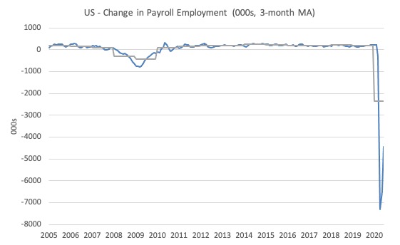
Total nonfarm payroll employment increased by 4.8 million in June, following an increase of 2.7 million in May. These gains reflect a partial resumption of economic activity that had been curtailed due to the coronavirus pandemic in April and March, when employment fell by a total of 22.2 million in the 2 months combined. In June, nonfarm employment was 14.7 million, or 9.6 percent, lower than its February level. Employment in leisure and hospitality rose sharply in June. Notable job gains also occurred in retail trade, education and health services, other services, manufacturing, and professional and business services. Employment continued to decline in mining.
The first graph shows the monthly change in payroll employment (in thousands, expressed as a 3-month moving average to take out the monthly noise). The gray lines are the annual averages.
The data is now ‘off the chart’ and that says enough.
The next graph shows the same data in a different way – in this case the graph shows the average net monthly change in payroll employment (actual) for the calendar years from 1940 to 2020 (the 2020 average is for the months to date).
I usually only show this graph from 2005 but because history is being created at present I included the full sample available from 1940.
The final average for 2019 was 178 thousand.
The average so far for 2020 is -2,366 thousand.
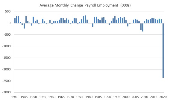
In a way, graphs like this lose definition and only present a binary world.
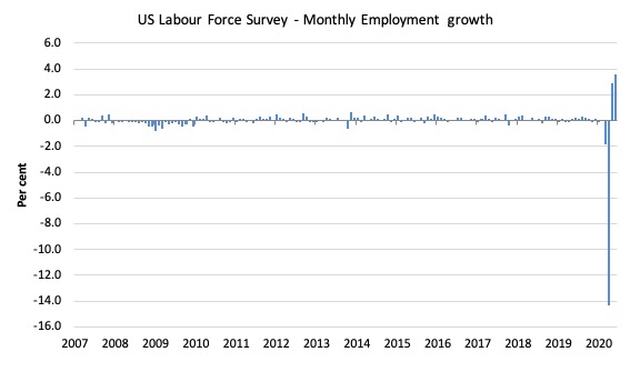
Labour Force Survey – employment growth shows strengthening comeback
The data for June shows some improvement along the lines revealed by the payroll data.
1. Employment as measured by the household survey rose by 4,940 thousand net (3.6 per cent).
2. The labour force rose by 1,705 (1.08 per cent).
3. The participation rate fell by 1.15 points as job opportunities increased.
4. As a result (in accounting terms), total measured unemployment fell by 3,235 thousand and the unemployment rate fell by 2.2 points to 11.1 per cent.
So some improvement.
It will take some time to absorb the workers shed in March and April back into employment once the economy starts moving again because a number of employers will have been wiped out by the scale of the contraction.
The following graph shows the monthly employment growth since January 2008, which shows the massive disruption this sickness has caused.
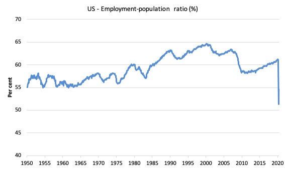
The Employment-Population ratio is a good measure of the strength of the labour market because the movements are relatively unambiguous because the denominator population is not particularly sensitive to the cycle (unlike the labour force).
The following graph shows the US Employment-Population from January 1950 to June 2020.
While the ratio fluctuates a little, the April 2020 ratio fell by 8.7 points to 51.3 per cent, which is the largest monthly fall since the sample began in January 1948.
In June 2020, it rose by 1.8 points to 54.6 per cent.
But still just over a half of the working age population in the US is working now.
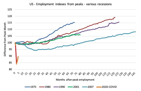
As a matter of history, the following graph shows employment indexes for the US (from US Bureau of Labor Statistics data) for the five NBER recessions since the mid-1970s and the current 2020-COVID crisis.
They are indexed at the employment peak in each case and we trace the data out for each episode until one month before the next peak.
So you get an idea of:
1. The amplitude (depth) of each cycle in employment terms.
2. The length of the cycle in months from peak-trough-peak.
The early 1980s recession was in two parts – a short downturn in 1981, which was followed by a second major downturn 12 months later in July 1982 which then endured.
Other facts:
1. Return to peak for the GFC was after 78 months.
2. The previous recessions have returned to the 100 index value after around 30 to 34 months.
3. Even at the end of the GFC cycle (146 months), total employment in the US had still only risen by 8.3 per cent (since December 2007), which is a very moderate growth path as is shown in the graph.
The current collapse is something else.
Unemployment and underutilisation trends
The BLS report that:
The unemployment rate declined by 2.2 percentage points to 11.1 percent in June, and the number of unemployed persons fell by 3.2 million to 17.8 million. Although unemployment fell in May and June, the jobless rate and the number of unemployed are up by 7.6 percentage points and 12.0 million, respectively, since February.
The strengthening of employment saw the official unemployment rate decline slightly in June 2020.
The first graph shows the official unemployment rate since January 1950.
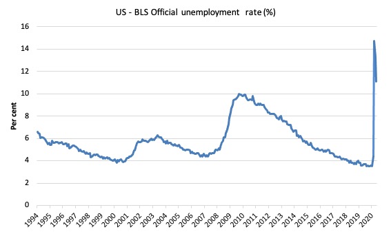
The official unemployment rate is a narrow measure of labour wastage, which means that a strict comparison with the 1960s, for example, in terms of how tight the labour market, has to take into account broader measures of labour underutilisation.
The next graph shows the BLS measure U6, which is defined as:
Total unemployed, plus all marginally attached workers plus total employed part time for economic reasons, as a percent of all civilian labor force plus all marginally attached workers.
It is thus the broadest quantitative measure of labour underutilisation that the BLS publish.
In December 2006, before the effects of the slowdown started to impact upon the labour market, the measure was estimated to be 7.9 per cent.
In June 2020 the U6 measure decreased by 3.2 points to 18 per cent.
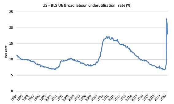
What drove this slight improvement?
This was driven, in part, by a 1,571 thousand decline in the category ‘Part-time for economic reasons’ – a measure of underemployment in the US data context.
But this was offset by a small return to those wanting to work but not actively looking, who are excluded from the official unemployment count.
The BLS say that:
The number of persons employed part time for economic reasons declined by 1.6 million to 9.1 million in June but is still more than double its February level. These individuals, who would have preferred full-time employment, were working part time because their hours had been reduced or they were unable to find full-time jobs. This group includes persons who usually work full time and persons who usually work part time ….
Persons marginally attached to the labor force–a subset of persons not in the labor force who currently want a job–numbered 2.5 million in June, little different from the prior month. These individuals were not in the labor force, wanted and were available for work, and had looked for a job sometime in the prior 12 months but had not looked for work in the 4 weeks preceding the survey. Discouraged workers, a subset of the marginally attached who believed that no jobs were available for them, numbered 681,000 in June, essentially unchanged from the previous month.
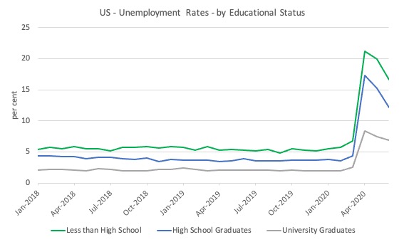
The next graph shows the evolution of unemployment rates for three cohorts based on educational attainment: (a) those with less than high school completion; (b) high school graduates; and (c) university graduates.
As usual, when there is a crisis, the least educated suffer disproportionately.
In the collapse in employment, the unemployment rates rose by:
1. 14.4 points for those with less than high-school diploma.
2. 12.9 points for high school, no college graduates.
3. 5.9 points for those with university degrees.
The bounce back has seen the unemployment rate fall by:
1. 3.3 points for those with less than high-school diploma.
2. 3.2 points for high school, no college graduates.
3. 0.5 points for those with university degrees.
In the US context, especially in the current time, the trends in trends in unemployment by ethnicity are interesting.
Two questions arise:
1. How have the Black and African American and White unemployment rate fared in the post-GFC period?
2. How has the relationship between the Black and African American unemployment rate and the White unemployment rate changed since the GFC?
Summary:
1. All the series move together as economic activity cycles. The data also moves around a lot on a monthly basis.
2. The Black and African American unemployment rate was 6.7 per cent in March 2020, rose to 16.8 per cent in May and is now down to 15.4 in June.
3. The Hispanic or Latino unemployment rate was 6 per cent in March 2020, rose to 18.9 per cent in April and fell to 16.6 per cent in June 2020.
4. The White unemployment rate was 4 per cent in March 2020, rose to 14.2 per cent in April and fell to 10.1 per cent in June 2020.
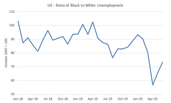
The next graph shows the Black and African American unemployment rate to White unemployment rate (ratio) from January 2018 (index = 100), when the White unemployment rate was at 3.5 per cent and the Black or African American rate was at 7.5 per cent.
This graph allows us to see whether the relative position of the two cohorts has changed since the crisis.
While there is month-to-month variability, the data shows that, in fact, leading up to the Pandemic, the position of Black and African Americans had improved in relative terms (to Whites), although that just reflected the fact that the White unemployment was so low that employers were forced to take on other ‘less preferred’ workers if they wanted to maintain growth.
However, it is also clear that since March 2020, the relative position of the Black and African American workers has deteriorated.
Aggregate participation rate – rose by 0.7 points to 61.5 per cent
This represented a modest return to participation.
The April fall in the labour force participation rate (-2.5 points) meant that the labour force contracted and workers who would have been counted among the unemployment were, instead, classified by the BLS as being not in the labour force.
This reduced the severity of the rise in official unemployment.
So two months of rising participation has meant that the unemployment rate has not fallen by as much as it would have if the participation rate had have remained at the April level.
The question though is how much hidden unemployment remains after the April decline.
The labour force is a subset of the working-age population (those above 15 years old). The proportion of the working-age population that constitutes the labour force is called the labour force participation rate. Thus changes in the labour force can impact on the official unemployment rate, and, as a result, movements in the latter need to be interpreted carefully. A rising unemployment rate may not indicate a recessing economy.
The labour force can expand as a result of general population growth and/or increases in the labour force participation rates.
Here are the facts:
1. The labour force in June 2020 was 159,932 thousand.
2. It would have been 163,053 thousand had the participation rate been at the March 2020 level.
3. This means that there are still 3,121 thousand workers who are still outside the labour force as a result of the collapse in employment opportunities. It is safe to say they would not have been outside the labour force if employment opportunities had not collapsed
4. If we assume those workers are hidden unemployed – they want to work, are willing to work, but did not actively seek work – and add them back into the official unemployment, the adjusted unemployment rate in June 2020 would be 12.8 per cent rather than the official estimate of 11.1 per cent.
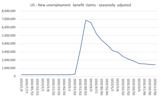
The claimants data horror story – still horrible but moderating a bit
Here is the latest update (as for the week ending June 20, 2020) from the US Department of Labor’s weekly data releases for the unemployment insurance claimants.
The Department of Labor provides an archive of the weekly unemployment insurance claims data back to July 1, 1967 – HERE.
The weekly data can be found in the – UI Weekly Claims Report.
Bringing together the archived data and the most recent release (June 20, 2020), the following table tells the story.
| Week ending | Initial Claims (SA) | Weekly Change | Cumulative sum since March 7, 2020 |
| March 7, 2020 | 211,000 | -6,000 | n/a |
| March 14, 2020 | 282,000 | +71,000 | 282,000 |
| March 21, 2020 | 3,307,000 | +3,025,000 | 3,589,000 |
| March 28, 2020 | 6,687,700 | +3,560,000 | 10,456,000 |
| April 4, 2020 | 6,615,000 | -252,000 | 17,071,000 |
| April 11, 2020 | 5,237,000 | -1,378,000 | 22,308,00 |
| April 18, 2020 | 4,442,000 | -795,000 | 26,750,000 |
| April 25, 2020 | 3,867,000 | -575,000 | 30,617,000 |
| May 2, 2020 | 3,846,000 | -596,000 | 30,596,000 |
| May 9, 2020 | 3,176,000 | -691,000 | 33,793,000 |
| May 16, 2020 | 2,446,000 | -535,000 | 39,220,000 |
| May 23, 2020 | 2,126,000 | -320,000 | 41,346,000 |
| May 30, 2020 | 1,877,000 | -249,000 | 43,223,000 |
| June 6, 2020 | 1,561,267 | -315,733 | 44,784,267 |
| June 13, 2020 | 1,540,000 | -21,267 | 46,324,267 |
| June 20, 2020 | 1,482,000 | -58,000 | 47,806,267 |
| June 27, 2020 | 1,427,000 | -55,000 | 49,223,267 |
So the figure is 49.2 million!
The next graph shows the data from January 1, 2020 to June 30, 2020.
I had previously posted the full sample, which showed how insignificant the previous deep recessions of the early 1980s, 1990s and the GFC were by comparison with the current event.
But we get little information from seeing a huge vertical line dwarfing all previous observations. We know the scale.
So I decided to start the sample at the beginning of 2020 to see how the claimant numbers evolve since the outset of the Pandemic.
This gives us a good indication of the dynamics.
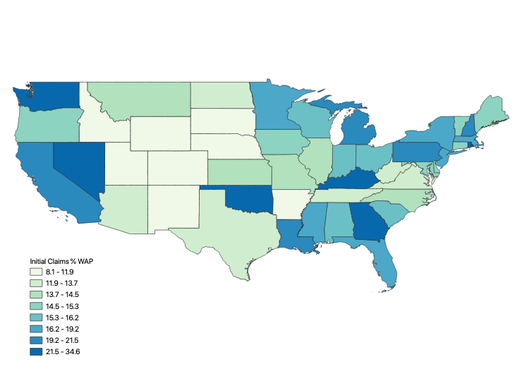
The first map shows the cumulative sum of unemployment insurance claimants since the end of February 2020 (as at June 30, 2020, expressed as a percentage of the Working Age Population in each state (Alaska was 25.9 per cent and Hawaii was 26.0 per cent).
This map demonstrates where the loss of jobs up to June 20, 2020 is impacting most significantly.
The next map shows the Insured Unemployment Rate for the States as at June 20, 2020.

There are some spatial variations in the proportion of new claimants and those unemployed receiving insurance.
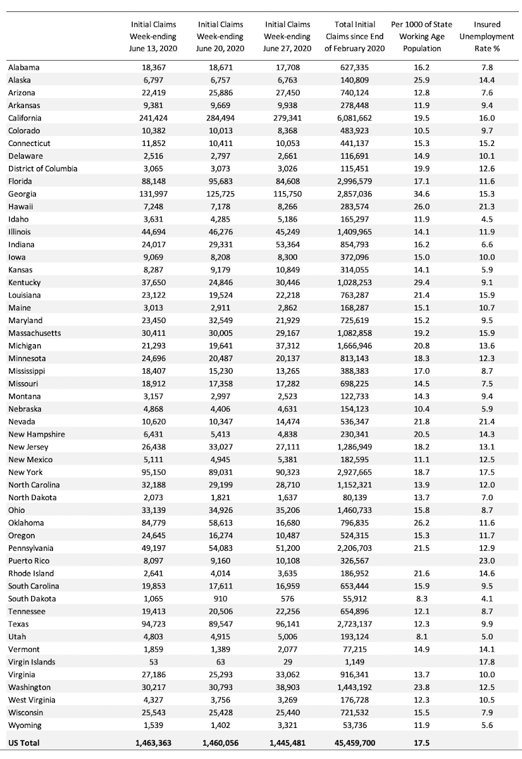
The following Table presents the same data mapped in the first map for those who prefer numbers.
Conclusion
The June 2020 US BLS labour market data release reveals an accelerating recovery from the catastrophic labour market collapse in March and April.
How far the recovery can go and reduce unemployment depends on two factors, both of which are biased negatively:
1. How many firms have gone broke in the lockdown? When the dust settles and we find out how many, the medium-term outlook will be rather grim.
2. Whether the US states will have to reverse their lockdown easing in the face of a rapid escalation of the virus in some of the more populace states. I suspect the death toll and the strain on hospitals, especially in the south will require the states to reimpose lockdown restrictions, which will slow down the virus spread but also the capacity to reduce unemployment.
On both fronts, the US government should introduce substantial job creation policy initiatives.
The current position of the US government has biased their stimulus spending towards the corporate sector and high income earners.
That is enough for today!
(c) Copyright 2020 William Mitchell. All Rights Reserved
Bill,
Wolf St blog contrasts BLS figures with US Labor dept. Suggesting 13+ millions mismatch!.
Regards
“It is almost unbelievable that the Republican politicians are endorsing cutting unemployment support. …The US government should have guaranteed all incomes and introduced large-scale job creation programs and a Job Guarantee as an on-going safety net. …(S)till just over a half of the working age population in the US is working now.” As Bill again demonstrates with this post, he is a master at cutting through the phony employment statistics constantly fed to citizens by corrupt federal governments through the equally corrupt mainstream media. The lens of MMT revealed how we might navigate the Covid Crisis and come out of it with stronger, more humane, more environmentally-sensitive economies. These MMT lessons have yet to be understood and implemented, but the time of reckoning will come and come soon, especially, as Bill notes, if the pandemic comes roaring back with the spikes to be anticipated and already being seen. Obvious at this point to nearly all, the neoliberal system has proven itself too brittle and precarious, too oppressive and ecocidal, to bring anything but continuing catastrophe. So Bill, more than ever we need that ten-point MMT plan or something like it to keep our economies afloat and reoriented. We need the whole package, of which the JG and other job creation initiatives are key pieces but only that. MMT’s moment is now, and it is called upon to set forth concrete steps, visible through its lens, by which we can survive and even thrive at this perilous time when neoliberal economics flounders in obvious failure. No thinking person believes any more in that system. Instead, we look to MMT to give us a new and better one to believe in, to instill in the minds and hearts of our fellow citizens, and to work with all that’s in us to put into place before this whole thing blows. I hate the word “deliverables,” but they are precisely what is demanded of MMT by this hour: the individual pieces of a comprehensive plan, tailorable to each currency-sovereign nation–even to the EU if the bureaucrats get onboard–and thereby capable of seeing us through this perfect storm.
Hi Professor Mitchell!
Mike Norman has been reporting that US Treasury tax withholding data has been decelerating, indicating net-layoffs, not hiring growth. Could you look into that?
Thanks!
This is what a serious epidemic, in a world run according to neo liberal principles looks like.
The lock down measures put in place, in most regions, do not seem to have been drastic enough to do the job. The contagiousness, severity and difficulty of managing the disease severely underestimated by those in power, almost everywhere.
The effects of decades of privatization and spending cuts in public systems are laid out before us, for all to see.
Would a very broad, stringently enforced lock down, were everyone shelters in place , and all transactions were frozen for about 3wks, do the job, that the drawn out half measures being employed seem to be failing to accomplish?
Newton,
My reply to you about calling the dollar an IUO was deleted.
I’ll repeat it.
I think that calling the dollar an IOU that has what is owed being the cancelling of the tax you owe when you pay your taxes with dollars — is useful.
Obviously, US bonds are IOUs.
If digital or cash dollars are also IOUs, then it makes no sense for economists to ask the Gov. to tax one kind of IOU (dollars) from Americans to pay those dollars to bond holders who would rather have a bond and not the dollars. It is all smoke and mirrors. It is all lies.
That, if we want to end the national debt the only way is to create new digital dollars and pay off all the bonds with them.
We can’t tax $24T away from the poor or middle classes (because they don’t have $24T) and the rich will not let us tax $24T from them. Also, many bonds are held by the 1% Americans or the comps. they own. They certainly aren’t going to think taxing them(selves) to pay them(selves) is going to be a good idea. Not even the US Gov. can pay off its total debt with borrowed money. And, it is either politically or economically impossible to pay off the US national debt with tax revenues.
So why do it? So, why talk about doing it? So, why say that it has to be done someday?
Smoke and mirrors.
.
Dear Steve_American (at 2020/07/07 at 11:33 pm)
It was deleted because it was irrelevant to the post. You knew that but still wanted to wax lyrical. Comments here are not the place for a free-for-all soapbox. I suggest you create your own blog if you want a unrestricted editorial space to talk about whatever you want.
And, in deleting it, I made no judgement about the quality of the input.
best wishes
bill
Bill,
I was NOT complaining that you deleted my post. It may seem that way, but I understood why you did it.
I reposted just part of the exchange, leaving out the part I thought was the main reason the original was deleted.
This is your site and you can delete anything I write if you want to.
Creating my own site will not work because nobody will see it.
Thank you for not deleting my last post.
I’m very heartened that MMT is making some progress with the top politicians of Australia.
It is a noble fight.
Best wishes.