Today (April 18, 2024), the Australian Bureau of Statistics released the latest - Labour Force,…
Australian labour market improvement moderates before the Stage 4 Victorian storm is about to hit
The Australian economy continued to recover somewhat as the government eased the strict lockdown on businesses. However, the pace of improvement moderated significantly. The latest data from the Australian Bureau of Statistics – Labour Force, Australia, July 2020 – released today (August 13, 2020) shows that employment rose by 0.9 per cent, well down on the rate of improvement last month. The participation rate also rose as job opportunities increased, and the labour force change outstripped the employment increase, which meant that unemployment rose by a further 15,700 thousand. More than a million Australian workers are now unemployed, which does not include the 235 thousand that have dropped out of the labour force since March 2020. That means the official unemployment rate of 7.5 per cent continues to underestimate the actual impact given that the labour force is still 235.2 thousand lower than it was in March 2020. Adding those ‘hidden unemployed’ workers back to the underutilisation rate suggests that 21.3 per cent of the available labour supply is not working in one way or another (unemployment, hidden unemployment, and underemployment). Any government that oversees that sort of disaster has failed in their basic responsibilities to society. It must increase its fiscal stimulus and target it towards large-scale job creation. The problem now is that with the Stage 4 lockdowns in Victoria now in place as it deals with the second virus wave, it is almost certain that the August figures will reveal a deterioration. My overall assessment is: (a) The current situation can best still be described as catastrophic; (b) The Australian labour market needs massive fiscal policy intervention targetted at direct job creation; (c) The prior need for a fiscal stimulus of around 2 per cent has changed to a fiscal stimulus requirement of several times that; (d) There is clear room for some serious fiscal policy expansion at present and the Federal government’s attempts to date have been seriously under-whelming; and (e) Any government that oversees that sort of disaster has failed in their basic responsibilities to society.
The summary ABS Labour Force (seasonally adjusted) estimates for July 2020 are:
- Employment increased 114,700 (0.9 per cent) – Full-time employment increased 43,500 and part-time employment increased 71,200.
- Unemployment increased 15,700 to 1,009,400 persons.
- The official unemployment rate increased 0.1 points to 7.5 per cent.
- The participation rate increased by 0.6 points to 64.7 per cent.
- Aggregate monthly hours worked increased 21.7 million hours (1.31 per cent).
- Underemployment fell 46.3 thousand or 0.5 points to 11.2 per cent. Overall there are 1,511.8 thousand underemployed workers. The total labour underutilisation rate (unemployment plus underemployment) decreased by 0.4 points to 18.7 per cent. There were a total of 2,521.2 thousand workers either unemployed or underemployed.
Employment increased 114,700 in July 2020 – the rebound is moderating
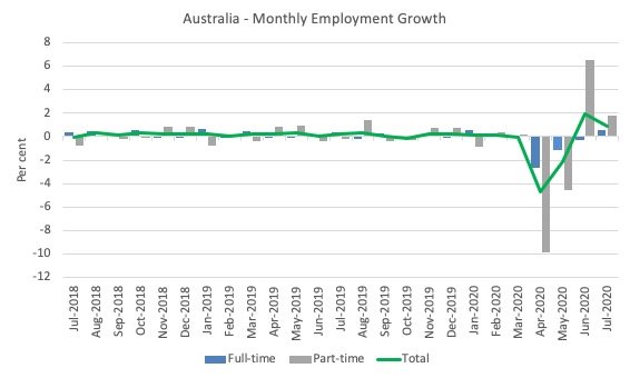
1. Employment growth was positive – 114,700 (0.9 per cent) but almost half of what it was in the first rebound in June.
Since March it has now fallen by -528.4 thousand (-4.1 per cent).
2. Full-time employment increased 43,500 and part-time employment increased 71,200.
This was a reversal for full-time jobs. In the June rebound, full-time employment fell.
With Stage 4 lockdowns in Victoria though, I expect this month will be a ‘false dawn’.
The following graph shows the month by month growth in full-time (blue columns), part-time (grey columns) and total employment (green line) for the 24 months to July 2020 using seasonally adjusted data.
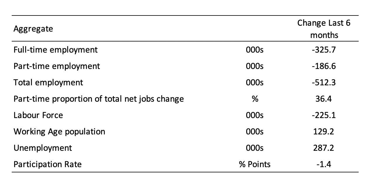
The following table provides an accounting summary of the labour market performance over the last six months.
As the monthly data is highly variable, this Table provides a longer view which allows for a better assessment of the trends.
Assessment:
1. Both the demand- and supply-side have contracted for the same reason – a collapse of employment opportunities. The labour force reduction is less severe than the employment fall, which is why official unemployment has risen.
2. While official unemployment has risen by 287.2 thousand, hidden unemployment has risen substantially given the labour force has shrunk by 225.1 thousand on the back of a 1.4 points drop in participation (see below for quantification).
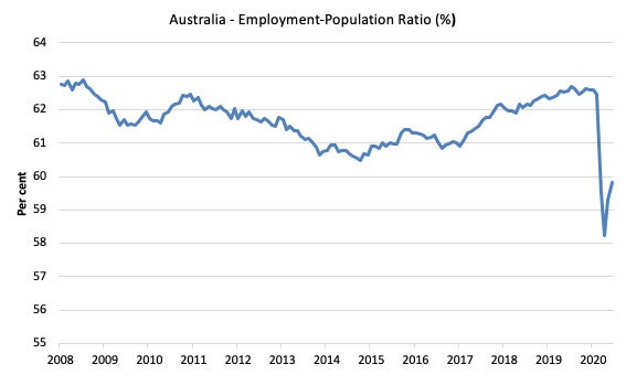
Given the variation in the labour force estimates, it is sometimes useful to examine the Employment-to-Population ratio (%) because the underlying population estimates (denominator) are less cyclical and subject to variation than the labour force estimates. This is an alternative measure of the robustness of activity to the unemployment rate, which is sensitive to those labour force swings.
The following graph shows the Employment-to-Population ratio, since June 2008 (the low-point unemployment rate of the last cycle).
It fell with the onset of the GFC, recovered under the boost provided by the fiscal stimulus packages but then went backwards again as the Federal government imposed fiscal austerity in a hare-brained attempt at achieving a fiscal surplus in 2012.
The ratio rise by 0.5 points in July 2020 to 59.8 per cent. The ratio is now 3 points below pre-GFC peak in April 2008 of 62.9 per cent.
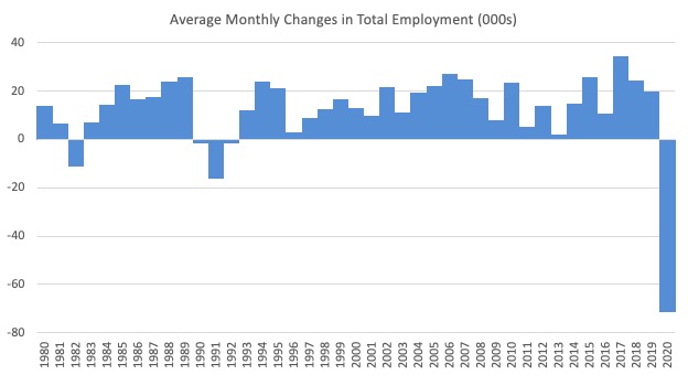
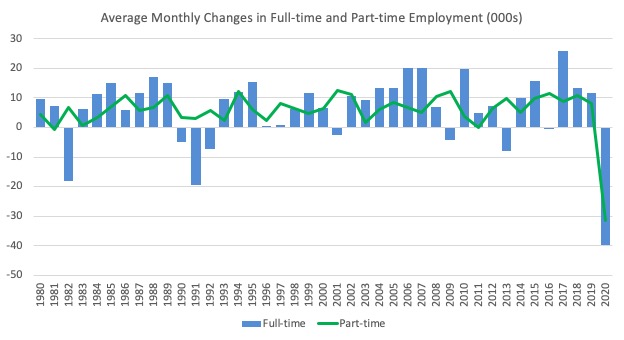
To put the current monthly performance into perspective, the following graph shows the average monthly employment change for the calendar years from 1980 to 2020 (to date).
1. The labour market weakened considerably over 2018 and that situation worsened in 2019.
2. 2020 is off the scale (average employment change so far of -71.5 thousand).
The following graph shows the average monthly changes in Full-time and Part-time employment (lower panel) in thousands since 1980.
The interesting result is that during recessions or slow-downs, it is full-time employment that takes the bulk of the adjustment. Even when full-time employment growth is negative, part-time employment usually continues to grow.
However, this crisis is different because much of the employment losses are the result of lockdowns and enforced business closures in sectors where part-time employment dominates.
But the continuing worsening of the full-time employment situation signals that the demand-side impacts are spreading more widely.
Unemployment increased 15,700 to 1,009,400 persons or 7.5 per cent
The official unemployment rate increased by 0.1 points to 7.5 per cent but the actual unemployment arising from the crisis is much higher given the sharp fall in the participation rate since March.
In June, unemployment continued to rise despite the employment growth, because workers, previously classified as being outside the labour force re-entered as they considered their was a slightly better change of gaining employment.
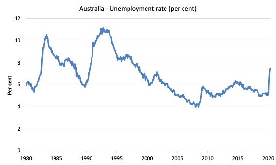
The following graph shows the national unemployment rate from January 1980 to July 2020. The longer time-series helps frame some perspective to what is happening at present.
Assessment:
1. Any time the unemployment rate rises like this you know one other thing – the extent of fiscal policy support is inadequate.
2. There is clearly still considerable slack in the labour market that could be absorbed with further fiscal stimulus.
3. The government is choosing to allow this rise in joblessness.
Broad labour underutilisation decreased by 1.1 points to 19.1 per cent in July 2020
The results for July 2020 are (seasonally adjusted):
1. Underemployment fell 46.3 thousand as the lockdown eased a little.
2. The underemployment rate fell by 0.5 points to 11.2 per cent.
2. Overall there are 1,511.8 thousand underemployed workers.
3. The total labour underutilisation rate (unemployment plus underemployment) decreased by 0.4 points to 18.7 per cent.
4. There were a total of 2,521.2 thousand workers either unemployed or underemployed.
5. The rise in the broad underutilisation rate has been driven by the rise in unemployment, which suggests a longer-lasting crisis – jobs are being shed rather than workers being put on shorter time.
The following graph plots the seasonally-adjusted underemployment rate in Australia from January 1980 to the July 2020 (blue line) and the broad underutilisation rate over the same period (green line).
The difference between the two lines is the unemployment rate.
The three cyclical peaks correspond to the 1982, 1991 recessions and the more recent downturn.
The other difference between now and the two earlier cycles is that the recovery triggered by the fiscal stimulus in 2008-09 did not persist and as soon as the ‘fiscal surplus’ fetish kicked in in 2012, things went backwards very quickly.
The two earlier peaks were sharp but steadily declined. The last peak fell away on the back of the stimulus but turned again when the stimulus was withdrawn.

If hidden unemployment (given the depressed participation rate) is added to the broad ABS figure the best-case (conservative) scenario would see a underutilisation rate around 21.3 per cent at present. Please read my blog post – Australian labour underutilisation rate is at least 13.4 per cent – for more discussion on this point.
Unemployment and broad labour underutilisation indexes – last four downturns
The following graph captures the evolution of the unemployment rates for the 1982, 1991, GFC and COVID-19 downturns.
For each episode, the graph begins at 100 – which is the index value of the unemployment rate at the low-point of each cycle (June 1981; December 1989; February 2008, and January 2020, respectively).
We then plot each episode out for 90 months.
For 1991, the peak unemployment which was achieved some 38 months after the downturn began and the resulting recovery was painfully slow. While the 1982 recession was severe the economy and the labour market was recovering by the 26th month. The pace of recovery for the 1982 once it began was faster than the recovery in the current period.
During the GFC crisis, the unemployment rate peaked after 16 months (thanks to a substantial fiscal stimulus) but then started rising again once the stimulus was prematurely withdrawn and a new peak occurred at the 80th month.
The COVID-19 downturn, while in its early months, is obviously worse than any of the previous recessions shown.
The graph provides a graphical depiction of the speed at which each recession unfolded (which tells you something about each episode) and the length of time that the labour market deteriorated (expressed in terms of the unemployment rate).
After five months, the unemployment had risen from 100 to:
1. 111.6 index points in 1982.
2. 111.2 index points in 1991.
3. 106.7 index points in the GFC.
4. 147.3 index points currently (and note the point below about participation rate declining)
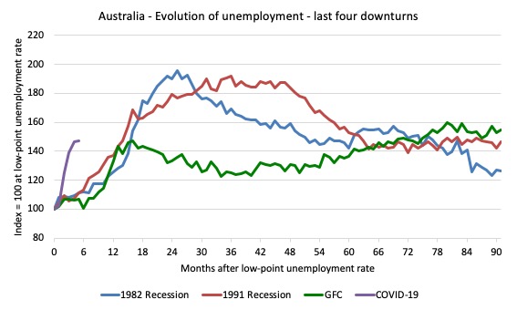
Note that these are index numbers and only tell us about the speed of decay rather than levels of unemployment.
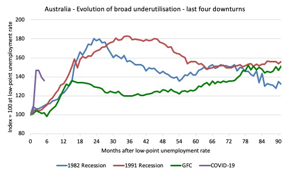
The next graph performs the same operation for the broad labour underutilisation rate (sum of official unemployment and underemployment).
Aggregate participation rate increased by 0.6 points to 64.7 per cent
The rise in the labour force participation rate means that that the labour force grew by 130 thousand. Given employment only rose by 114,7000, the return of workers into the labour force also pushed up the unemployment pool by 15,700.
This always happens in the early stages of a recovery as the supply-side adjusts to the increased employment opportunities.
The labour force is still below the March 2020 level by 235.2 thousand and those workers will return as employment rises, which will place a further strain on official unemployment.
By how much would unemployment have changed had the participation rate had not risen?
We can make two calculations:
1. Just the monthly implication.
2. The implication of the participation rate being below its most recent peak of 66.2 per cent in August 2019.
The labour force is a subset of the working-age population (those above 15 years old). The proportion of the working-age population that constitutes the labour force is called the labour force participation rate. Thus changes in the labour force can impact on the official unemployment rate, and, as a result, movements in the latter need to be interpreted carefully. A rising unemployment rate may not indicate a recessing economy.
The labour force can expand as a result of general population growth and/or increases in the labour force participation rates.
The following Table shows the breakdown in the changes to the main aggregates (Labour Force, Employment and Unemployment) and the impact of the rise in the participation rate.
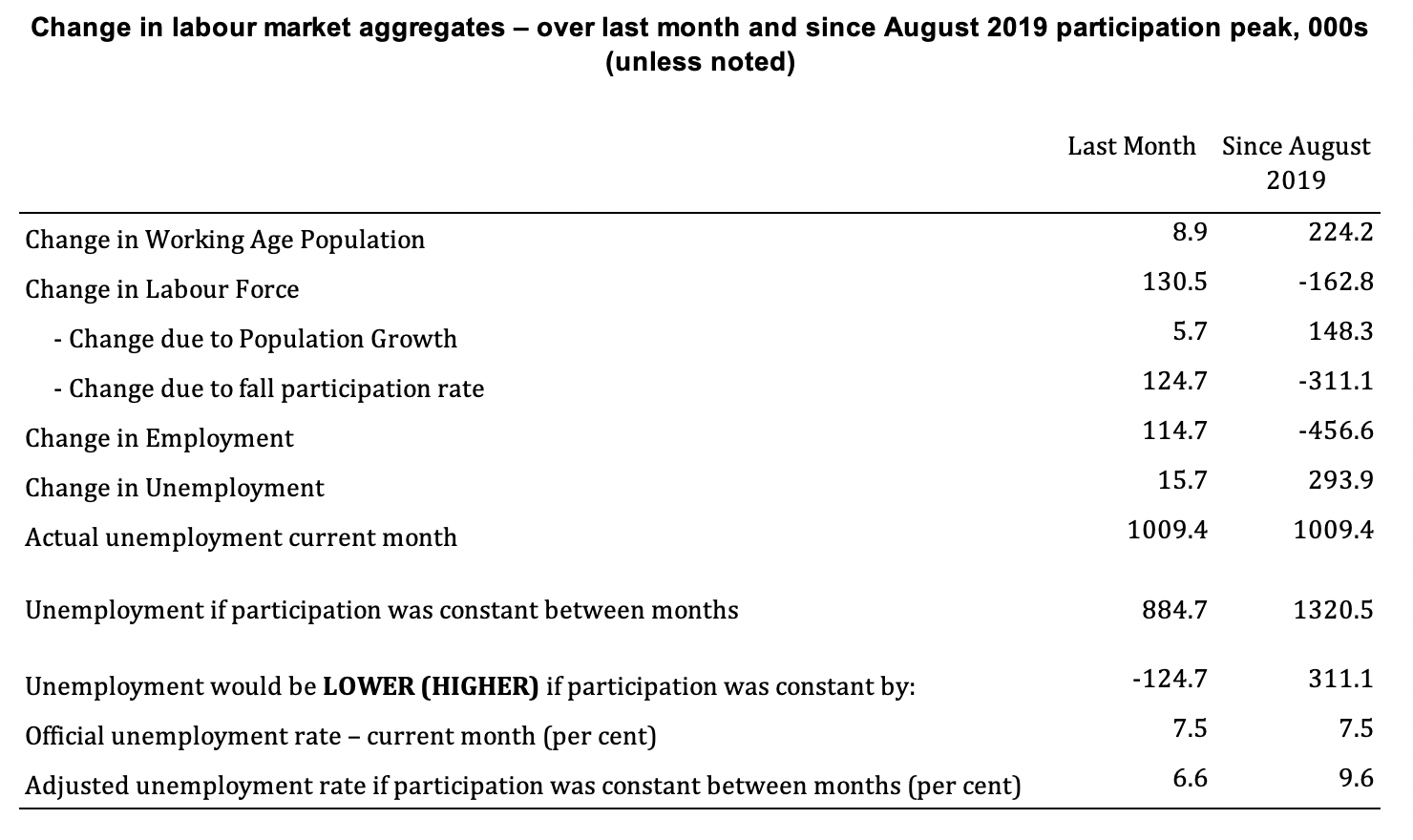
The change in the labour force in July 2020 was the outcome of two separate factors:
- The underlying population growth added 5.7 thousand persons to the labour force. The population growth impact on the labour force aggregate is relatively steady from month to month but has slowed in recent months; and
- The rise in the participation rate meant that there were 124.7 thousand workers re-entering the labour force (relative to what would have occurred had the participation rate remained unchanged).
- The net result was that the labour force rose by 130.5 thousand.
Assessment:
1. If the participation rate had not have risen in July, total unemployment, at the current employment level, would have been 884.7 thousand rather than the official count of 1009.4 thousand as recorded by the ABS – a difference of 124.7 thousand workers (the ‘participation effect’).
2. Without the rise in the participation rate in July 2020, the official unemployment rate would have been 6.6 per cent (rounded) rather than its current value of 7.5 per cent).
3. Hidden unemployment thus fell by 124.75 thousand.
4. The situation is worse if we consider the collapse since August 2019. The labour force has shrunk by 162.8 thousand and the unemployment rate would be 9.6 per cent rather than 7.5 per cent had those workers not dropped out of the labour force as a result of inadequate job opportunities.
5. If we add the change in hidden unemployment back into the broad labour underutilisation rate currently estimated to be 18.7 per cent, we would get a total wastage rate of 20.3 per cent.
And, as I concluded last month that spells Policy. Failure.
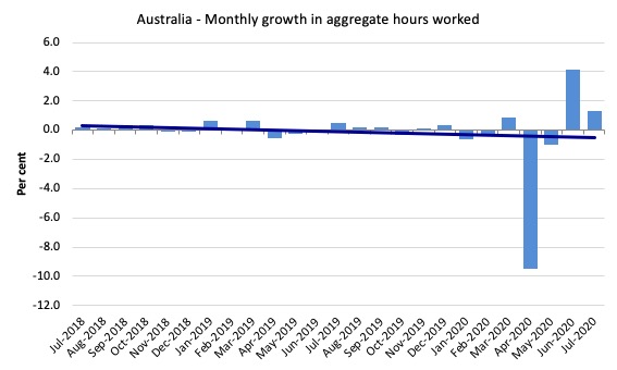
Hours worked increased 21.7 million hours (1.31 per cent) in July 2020
As the lockdown eases, hours are returning.
The following graph shows the monthly growth (in per cent) over the last 24 months.
The dark linear line is a simple regression trend of the monthly change – which depicts a decreasing trend. Even before the coronavirus crisis struck, the trend was downwards.
Teenage labour market improves as lockdown eases in July 2020
1. Total teenage net employment rose by 28 thousand in July 2020 (4.8 per cent) as the low-wage service sector continued to reopen.
2. Full-time teenage employment rose by just 0.4 thousand (0.3 per cent) and part-time employment rose by 27.6 thousand (6.1 per cent).
3. The teenage unemployment rate rose 2.9 points to 22.4 per cent on the back of a sharp rise in participation.
4. The moderation in the rebound was seen in the teenage labour market as well as the broader labour market.
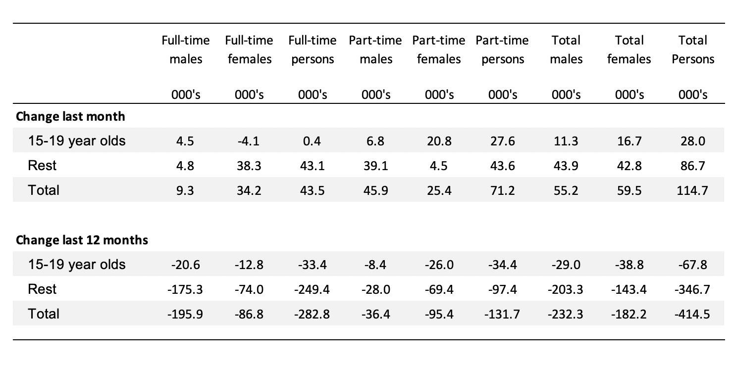
The following Table shows the distribution of net employment creation in the last month and the last 12 months by full-time/part-time status and age/gender category (15-19 year olds and the rest).
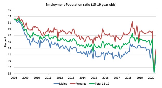
To put the teenage employment situation in a scale context (relative to their size in the population) the following graph shows the Employment-Population ratios for males, females and total 15-19 year olds since June 2008.
You can interpret this graph as depicting the loss of employment relative to the underlying population of each cohort. We would expect (at least) that this ratio should be constant if not rising somewhat (depending on school participation rates).
The absolute loss of jobs reported above has impacted more on females than males.
1. The male ratio has fallen by 12.9 percentage points since February 2008 and 4.2 points since March 2020.
2. The female ratio has fallen by 9.6 percentage points and 5.8 points since March 2020.
3. The overall teenage employment-population ratio has fallen by 11.3 percentage points and 5 points since March 2020.
4. In proportional terms, despite the improvement in June, this remains a devastating result for teenagers.
Conclusion
My standard monthly warning: we always have to be careful interpreting month to month movements given the way the Labour Force Survey is constructed and implemented.
The July 2020 data reveals that the Australian economy continued to recover somewhat as the government eased the strict lockdown on businesses.
However, the pace of improvement moderated significantly.
And, the scale of the collapse was so large that it will take years to reverse given the on-going closure of businesses that have ‘not made it through to the other side’.
The problem now is that with the Stage 4 lockdowns in Victoria now in place as it deals with the second virus wave, it is almost certain that the August figures will reveal a deterioration.
My overall assessment is:
1. The current situation can best still be described as catastrophic.
2. The Australian labour market needs massive fiscal policy intervention targetted at direct job creation.
3. The prior need for a fiscal stimulus of around 2 per cent has changed to a fiscal stimulus requirement of several times that.
4. There is clear room for some serious fiscal policy expansion at present and the Federal government’s attempts to date have been seriously under-whelming.
5. Any government that oversees that sort of disaster has failed in their basic responsibilities to society.
That is enough for today!
(c) Copyright 2020 William Mitchell. All Rights Reserved.
Based on Bill’s excellent analyses as always on this issue (which I really feel grateful to read), they have made me gain insights as follows:
1. We know almost exactly where the fiscal supports should be focused on, and how much.
For example, in the recreational and service sectors, follows by what are shown on the ‘sector by sector’ graphs, from Bill’s previous analyses/statistical numbers.
2. Looking at the length of the unemployment graphs presented, the economic recover will be more like ‘L’ shape rather than anything else.
3. And Based on my related observations of the pandemic itself, I notice that it takes a ‘normal curve’, something that look like a ‘Bell shape’ (of various heights depending on the country).
This means if the global pandemic peaks today, it will take around 8 months roughly for the pandemic situation to be under control.
Something like, the pandemic just has to run it course, and that course is a Bell shape.
4. This means that the economic situation will be as Bill predicted, that the fiscal supports will have to be many times of that 2% of the GDP (in this case for Australia).
5. I also feel that it will have to be symmetrical at least. One on the way up, and another one on the way down from the curve.
5. In conclusion, if the global pandemic peak today (as uncle Donald Trump keeps wishing/saying), the real economic recovery will, or can really begin, around ‘early summer’ next year (vaccine or not, or second wave, or not).
6. Further, taking ‘L’ shape recovery into account based on my deductive reasoning of Bill’s graphs, we need at least another 24 months or 2 year from that point on, or a bit longer (say middle of 2023).
Hopefully, we last until then as civilised nations or in a positive thinking terms, emerge on the other side of the tunnel as happy as before, at least.
Take good care everyone. We are in for a bit longer ride if based on my analysis above!
vorapot
Bill,
I don’t dispute your figures or the need for immediate fiscal support for people affected by the lock-downs to ensure they can meet their unavoidable commitments to pay for housing, food, heating etc. but how is any government supposed to create significant numbers of new jobs under these circumstances? Whilst you have convinced me of the merit of a job guarantee in principle, I find it hard to believe that any amount of money can be mobilised into creating actual jobs in the numbers required at present, but much of your writing recently suggests you believe this is possible if only the government were willing to make it happen.
In WA, tasmania and the other states currently not so seriously affected by lock-downs and other restrictions something can begin to be organised but it’s difficult to imagine how you mobilise thousands of people into new jobs, train them, provide equipment, management etc. etc. in Victoria at the moment. There may well be a need for people to begin work in new jobs helping to deal with the pandemic but the failure of the hotel quarantine with it’s use of insufficiently trained security staff says caution is needed here.
The current unemployment figures are a function of the pandemic, surely it is the figures we begin to see months into the future that are the ones that matter when deciding how we judge the government’s response and whether they have actually learned anything useful from the experience of suddenly having to issue large quantities of money for the common good.
More important statistics this month, next month and in the very short term are figures such as the number of people made homeless by inadequate emergency support, regardless of whether they are counted as ’employed’ or not.
Kitwn,
Our local council & Our state government has huge numbers of analysed, approved, planned & prioritised jobs scheduled for the next few years which could be brought forward if federally funded. Obviously ones suitable for JG need to be chosen but each local area can do that right away. You are right that we can’t switch to a full JG overnight & it might start slow, but given this disruption is likely to last years, the Feds could immediately cancel the job-active network & redirect funds to pilot works to set up JG structures linked to local governments & state bureaucracy. Once it is piloted, it can expand. Better to be heading in the right direction from now in my view.
Also in my area, there already exist community organisations dedicated to creating new industries and businesses, plus training courses much better than Job Active associated companies are providing. In places where work for the dole which maintained the town was present then cancelled e.g. aboriginal settlements, these could recommence relatively quickly. So the first thing is to pivot, then pilot and refine, then scale up. Doing nothing means the unemployed suffer without hope while Job Active scams the money that could be used to pilot JG.