Today (April 18, 2024), the Australian Bureau of Statistics released the latest - Labour Force,…
US labour market improvement continues but there is still a long way to go
On September 4, 2020, the US Bureau of Labor Statistics (BLS) released their latest labour market data – Employment Situation Summary – August 2020 – which shows that while employment continued to grow, the rebound has moderated. All the major aggregates are heading in the right direction. Employment is up, participation is up, the labour force is recovering and the unemployment rate and broader measures of labour underutilisation are falling. The problem facing the US is that the lack of economic support from the Federal government means that the huge pool of unemployment will take years to reduce and the damage will accumulate. How far the recovery can go depends on two factors, both of which are biased negatively: (a) How many firms have gone broke in the lockdown? (b) Whether the US states will have to reverse their lockdown easing in the face of a rapid escalation of the virus in some of the more populace states. I do not see appropriate policy responses in place at present. From abroad, it looks like the US government is stepping back when it should be engaging in supporting all incomes and introducing large-scale job creation programs.
Overview for August 2020:
- Payroll employment rose by 1.4 million (slowing).
- Total labour force survey employment rose by 3,756 thousand net (2.6 per cent).
- The seasonally adjusted labour force rose by 968 thousand (0.61 per cent).
- Official unemployment fell by 2,788 thousand to 13,550 thousand (but see below for commentary on latest data)
- The official unemployment rate fell by 1.8 points to 8.4 per cent.
- The participation rate rose 0.3 points to 61.7 per cent. Adjusting the unemployment rate for the change in hidden unemployment would generate an unemployment rate of 9.9 per cent rather than 8.4 per cent.
- The broad labour underutilisation measure (U6) fell by 2.3 points to 14.2 per cent, in part, because of a fall in the number in the part-time for economic reasons cohort (the US indicator of underemployment).
For those who are confused about the difference between the payroll (establishment) data and the household survey data you should read this blog post – US labour market is in a deplorable state – where I explain the differences in detail.
BLS explanation
The BLS provided a special note to help us understand the results this month.
We learn:
1. “The collection rate for the establishment survey was 77 percent in August, higher than the average for the 12 months ending in February 2020.”
2. “The household survey response rate was 70 percent in August, up from the low, up from the rate of 65 percent in June but well below the average rate of 83 percent for the 12 months prior to the pandemic.
3. Both results reduce the accuracy of the surveys.
4. In the payroll survey:
… workers who are paid by their employer for all or any part of the pay period including the 12th of the month are counted as employed, even if they were not actually at their jobs. Workers who are temporarily or permanently absent from their jobs and are not being paid are not counted as employed, even if they are continuing to receive benefits.
5. In the Labour Force survey:
… In the household survey, individuals are classified as employed, unemployed, or not in the labor force based on their answers to a series of questions about their activities during the survey reference week (August 9th through August 15th). Workers who indicate they were no working during the entire survey reference week and expect to be recalled to their jobs should be classified as unemployed on temporary layoff. As in recent months, a large number of persons were classified as unemployed on temporary layoff in August.
The BLS wanted the latter group classified as unemployed for consistency but the survey staff didn’t always comply, which means that the employment estimates are probably overstated.
What impact might this have had?
The BLS say:
The share of responses that may have been misclassified was much smaller in July and August than in prior months …
For March through July, BLS published an estimate of what the unemployment rate would have been had misclassified workers been included. Repeating this same approach, the overall August unemployment rate would have been about 0.7 percentage point higher than reported. However, this represents the upper bound of our estimate of misclassification and probably overstates the size of the misclassification error.
So we are still operating in an environment of uncertainty but the data accuracy has increased.
Once these classification issues are resolved, the participation response becomes more normal (workers coming back into the labour force), and the number of jobs lost forever becomes apparent, the true residual impact of the pandemic on the US labour market will become clearer.
Payroll employment trends
The BLS noted that:
Total nonfarm payroll employment rose by 1.4 million in August, and the unemployment rate fell to 8.4 percent … These improvements in the labor
market reflect the continued resumption of economic activity that had been curtailed due to the coronavirus (COVID-19) pandemic and efforts to contain it. In August, an increase in government employment largely reflected temporary hiring for the 2020 Census. Notable job gains also occurred in retail trade, in professional and business services, in leisure and hospitality, and in education and health services.
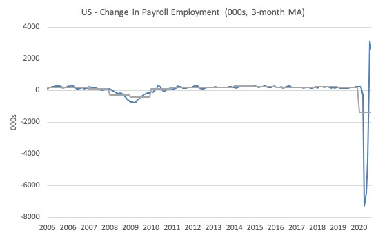
The first graph shows the monthly change in payroll employment (in thousands, expressed as a 3-month moving average to take out the monthly noise). The gray lines are the annual averages.
The data swings are still large and dwarf the past history.
The next graph shows the same data in a different way – in this case the graph shows the average net monthly change in payroll employment (actual) for the calendar years from 1940 to 2020 (the 2020 average is for the months to date).
I usually only show this graph from 2005 but because history is being created at present I included the full sample available from 1940.
The final average for 2019 was 178 thousand.
The average so far for 2020 is -1,386 thousand.
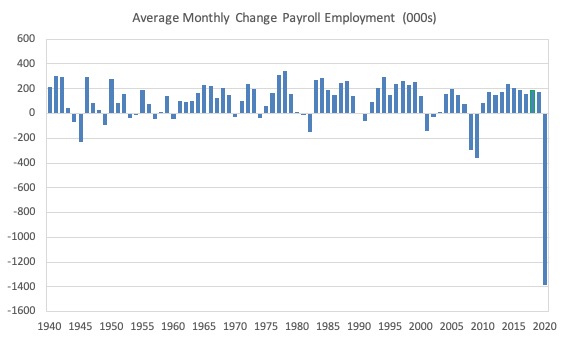
In a way, graphs like this lose definition and only present a binary world.
Labour Force Survey – employment growth continues albeit at a slower pace
The data for August shows some improvement on the previous months.
1. Employment as measured by the household survey rose by 3,756 thousand net (2.6 per cent).
2. The labour force rose by 968 thousand (0.61 per cent).
3. The participation rate rose by 0.3 points.
4. As a result (in accounting terms), total measured unemployment fell by 2,788 thousand and the unemployment rate fell by 1.8 points to 8.4 per cent.
So some improvement and better than the increments recorded in July.
It will take some time to absorb the workers shed in March and April back into employment once the economy starts moving again because a number of employers will have been wiped out by the scale of the contraction.
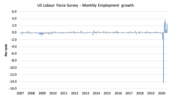
The following graph shows the monthly employment growth since January 2008, which shows the massive disruption this sickness has caused.
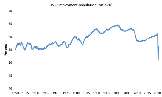
The Employment-Population ratio is a good measure of the strength of the labour market because the movements are relatively unambiguous because the denominator population is not particularly sensitive to the cycle (unlike the labour force).
The following graph shows the US Employment-Population from January 1950 to August 2020.
While the ratio fluctuates a little, the April 2020 ratio fell by 8.7 points to 51.3 per cent, which is the largest monthly fall since the sample began in January 1948.
In August 2020, it rose by 1.4 points to 56.5 per cent.
It is still well down on the level in January 2020 (61.2 per cent).
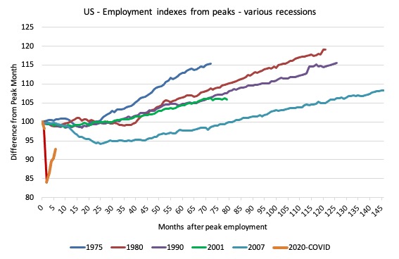
As a matter of history, the following graph shows employment indexes for the US (from US Bureau of Labor Statistics data) for the five NBER recessions since the mid-1970s and the current 2020-COVID crisis.
They are indexed at the employment peak in each case and we trace the data out for each episode until one month before the next peak.
So you get an idea of:
1. The amplitude (depth) of each cycle in employment terms.
2. The length of the cycle in months from peak-trough-peak.
The early 1980s recession was in two parts – a short downturn in 1981, which was followed by a second major downturn 12 months later in July 1982 which then endured.
Other facts:
1. Return to peak for the GFC was after 78 months.
2. The previous recessions have returned to the 100 index value after around 30 to 34 months.
3. Even at the end of the GFC cycle (146 months), total employment in the US had still only risen by 8.3 per cent (since December 2007), which is a very moderate growth path as is shown in the graph.
The current collapse is something else.
Unemployment and underutilisation trends
The BLS report that:
In August, the unemployment rate declined by 1.8 percentage points to 8.4 percent, and the number of unemployed persons fell by 2.8 million to 13.6 million. Both measures have declined for 4 consecutive months but are higher than in February, by 4.9 percentage points and 7.8 million, respectively.
The strengthening of employment saw the official unemployment rate decline in August 2020.
The first graph shows the official unemployment rate since January 1950.
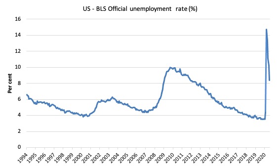
The official unemployment rate is a narrow measure of labour wastage, which means that a strict comparison with the 1960s, for example, in terms of how tight the labour market, has to take into account broader measures of labour underutilisation.
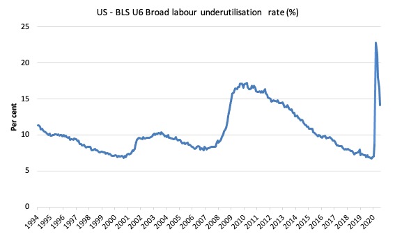
The next graph shows the BLS measure U6, which is defined as:
Total unemployed, plus all marginally attached workers plus total employed part time for economic reasons, as a percent of all civilian labor force plus all marginally attached workers.
It is thus the broadest quantitative measure of labour underutilisation that the BLS publish.
In December 2006, before the effects of the slowdown started to impact upon the labour market, the measure was estimated to be 7.9 per cent.
In August 2020 the U6 measure decreased by 2.3 points to 14.2 per cent. It is now below the level recorded during the GFC.
What drove this slight improvement?
This was driven, in part, by a 871 thousand decline in the category ‘Part-time for economic reasons’ – a measure of underemployment in the US data context.
The BLS say that:
The number of persons employed part time for economic reasons (sometimes referred to as involuntary part-time workers) declined by 871,000 to 7.6 million in August, reflecting a decline in the number of people whose hours were cut due to slack work or business conditions (-1.1 million). The number of involuntary part-time workers is 3.3 million higher than in February. These individuals, who would have preferred full-time employment, were working part time because their hours had been reduced or they were unable to find full-time jobs. This group includes persons who usually work full time and persons who usually work part time …
In August, the number of persons not in the labor force who currently want a job declined by 747,000 to 7 million; this measure is 2 million higher than in February. These individuals were not counted as unemployed because they were not actively looking for work during the last 4 weeks or were unavailable to take a job …
Among those not in the labor force who currently want a job, persons marginally attached to the labor force fell at 2.1 million, changed little in August. These individuals were not in the labor force, wanted and were available for work, and had looked for a job sometime in the prior 12 months but had not looked for work in the 4 weeks preceding the survey. Discouraged workers, a subset of the marginally attached who believed that no jobs were available for them, decreased by 130,000 in August to 535,000.
Ethnicity and Education
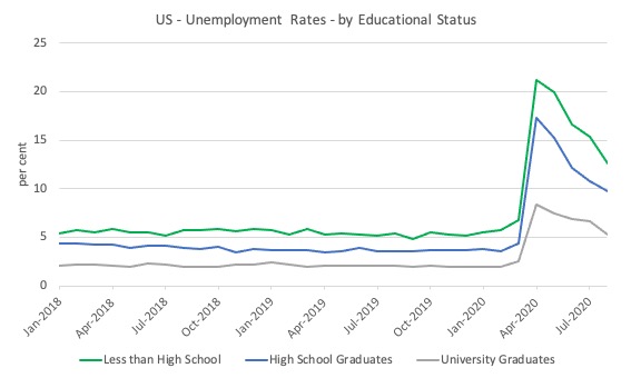
The next graph shows the evolution of unemployment rates for three cohorts based on educational attainment: (a) those with less than high school completion; (b) high school graduates; and (c) university graduates.
As usual, when there is a crisis, the least educated suffer disproportionately.
In the collapse in employment, the unemployment rates rose by:
- 14.4 points for those with less than high-school diploma.
- 12.9 points for high school, no college graduates.
- 5.9 points for those with university degrees.
The bounce back since April 2020 has seen the unemployment rate fall by:
- 8.6 points for those with less than high-school diploma.
- 7.5 points for high school, no college graduates.
- 3.1 points for those with university degrees.
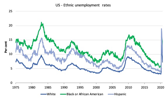
In the US context, especially in the current time, the trends in trends in unemployment by ethnicity are interesting.
Two questions arise:
1. How have the Black and African American and White unemployment rate fared in the post-GFC period?
2. How has the relationship between the Black and African American unemployment rate and the White unemployment rate changed since the GFC?
Summary:
1. All the series move together as economic activity cycles. The data also moves around a lot on a monthly basis.
2. The Black and African American unemployment rate was 6.7 per cent in March 2020, rose to 16.8 per cent in May and is now down to 13 per cent in August 2020.
3. The Hispanic or Latino unemployment rate was 6 per cent in March 2020, rose to 18.9 per cent in April and fell to 10.5 per cent in August 2020.
4. The White unemployment rate was 4 per cent in March 2020, rose to 14.2 per cent in April and fell to 7.3 per cent in August 2020.
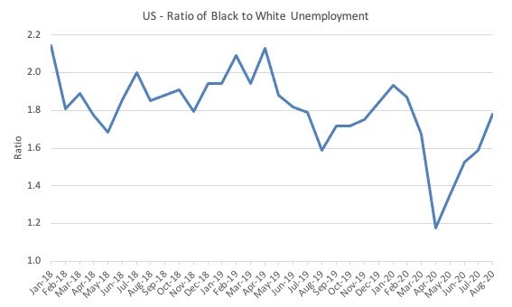
The next graph shows the Black and African American unemployment rate to White unemployment rate (ratio) from January 2018, when the White unemployment rate was at 3.5 per cent and the Black or African American rate was at 7.5 per cent.
This graph allows us to see whether the relative position of the two cohorts has changed since the crisis.
While there is month-to-month variability, the data shows that, in fact, through to mid-2019, the position of Black and African Americans had improved in relative terms (to Whites), although that just reflected the fact that the White unemployment was so low that employers were forced to take on other ‘less preferred’ workers if they wanted to maintain growth.
In April 2019, the ratio was 2.1 (meaning the Black and African American unemployment rate was more than 2 times the White rate).
The ratio fell to 1.6 in August 2019, reflecting the improved relative Black and African American position.
As the pandemic hit, the ratio fell to 1.2 in April from 1.7 in March, reflecting an improvement in the relative position of the Black and African American workers.
More recently, the relative position has deteriorated and the ratio is at 1.8.
Aggregate participation rate – rose 0.3 points to 61.7 per cent
The April fall in the labour force participation rate (-2.5 points) meant that the labour force contracted and workers who would have been counted among the unemployment were, instead, classified by the BLS as being not in the labour force.
This reduced the severity of the rise in official unemployment.
The question though is how much hidden unemployment remains after the April decline.
The labour force is a subset of the working-age population (those above 15 years old). The proportion of the working-age population that constitutes the labour force is called the labour force participation rate. Thus changes in the labour force can impact on the official unemployment rate, and, as a result, movements in the latter need to be interpreted carefully. A rising unemployment rate may not indicate a recessing economy.
The labour force can expand as a result of general population growth and/or increases in the labour force participation rates.
Here are the facts:
1. The labour force in August 2020 was 160,838 thousand.
2. It would have been 163,445 thousand had the participation rate been at the March 2020 level.
3. This means that there are still 2,607 thousand workers who are still outside the labour force as a result of the collapse in employment opportunities. It is safe to say they would not have been outside the labour force if employment opportunities had not collapsed
4. If we assume those workers are hidden unemployed – they want to work, are willing to work, but did not actively seek work – and add them back into the official unemployment, the adjusted unemployment rate in August 2020 would be 9.9 per cent rather than the official estimate of 8.4 per cent.
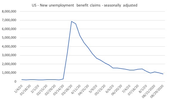
The claimants data horror story – moderating
Here is the latest update (as for the week ending August 29, 2020) from the US Department of Labor’s weekly data releases for the unemployment insurance claimants.
The Department of Labor provides an archive of the weekly unemployment insurance claims data back to July 1, 1967 – HERE.
The weekly data can be found in the – UI Weekly Claims Report.
Bringing together the archived data and the most recent release (September 3, 2020), the following table tells the story.
| Week ending | Initial Claims (SA) | Weekly Change | Cumulative sum since March 7, 2020 |
| March 7, 2020 | 211,000 | -6,000 | n/a |
| March 14, 2020 | 282,000 | +71,000 | 282,000 |
| March 21, 2020 | 3,307,000 | +3,025,000 | 3,589,000 |
| March 28, 2020 | 6,687,700 | +3,560,000 | 10,456,000 |
| April 4, 2020 | 6,615,000 | -252,000 | 17,071,000 |
| April 11, 2020 | 5,237,000 | -1,378,000 | 22,308,00 |
| April 18, 2020 | 4,442,000 | -795,000 | 26,750,000 |
| April 25, 2020 | 3,867,000 | -575,000 | 30,617,000 |
| May 2, 2020 | 3,176,000 | -691,000 | 33,793,000 |
| May 9, 2020 | 2,687,000 | -489,000 | 36,480,000 |
| May 16, 2020 | 2,446,000 | -241,000 | 38,926,000 |
| May 23, 2020 | 2,123,000 | -323,000 | 41,049,000 |
| May 30, 2020 | 1,897,000 | -226,000 | 42,946,000 |
| June 6, 2020 | 1,566,000 | -331,000 | 44,512,000 |
| June 13, 2020 | 1,540,000 | -26,000 | 46,052,000 |
| June 20, 2020 | 1,482,000 | -58,000 | 47,534,000 |
| June 27, 2020 | 1,408,000 | -74,000 | 48,942,000 |
| July 4, 2020 | 1,310,000 | -98,000 | 50,252,000 |
| July 11, 2020 | 1,308,000 | -2,000 | 51,560,000 |
| July 18, 2020 | 1,422,000 | 114,000 | 52,982,000 |
| July 25, 2020 | 1,435,000 | 13,000 | 54,417,000 |
| August 1, 2020 | 1,191,000 | -244,000 | 55,608,000 |
| August 8, 2020 | 971,000 | -220,000 | 56,579,000 |
| August 15, 2020 | 1,104,000 | 133,000 | 57,683,000 |
| August 22, 2020 | 1,011,000 | -93,000 | 58,694,000 |
| August 29, 2020 | 881,000 | -130,000 | 59,575,000 |
So the figure is 59.3 million!
The next graph shows the data from January 1, 2020 to August 1, 2020.
I had previously posted the full sample, which showed how insignificant the previous deep recessions of the early 1980s, 1990s and the GFC were by comparison with the current event.
But we get little information from seeing a huge vertical line dwarfing all previous observations. We know the scale.
So I decided to start the sample at the beginning of 2020 to see how the claimant numbers evolve since the outset of the Pandemic.
This gives us a good indication of the dynamics.
Conclusion
The August 2020 US BLS labour market data release reveals an on-going rebound from the catastrophic labour market collapse in March and April but the pace of recovery has moderated.
How far the recovery can go and reduce unemployment depends on two factors, both of which are biased negatively:
1. How many firms have gone broke in the lockdown? When the dust settles and we find out how many, the medium-term outlook will be rather grim.
2. Whether the US states will have to reverse their lockdown easing in the face of a rapid escalation of the virus in some of the more populace states. I suspect the death toll and the strain on hospitals, especially in the south will require the states to reimpose lockdown restrictions, which will slow down the virus spread but also the capacity to reduce unemployment.
On both fronts, the US government should introduce substantial job creation policy initiatives.
The current position of the US government has biased their stimulus spending towards the corporate sector and high income earners.
That is enough for today!
(c) Copyright 2020 William Mitchell. All Rights Reserve
As far as I know, the actual current position of the US government on fiscal stimulus is next to nothing. Most of the previous stimulus provisions were either one and done or limited to several months and expired already. Congress has not extended them as yet and it is not apparent they will agree on anything anytime soon. It is a mess.
One theory I heard over the weekend while listening to a podcast. Was that the US cut deals with Japan the EU (after all they had a lot to do with how the EU was set up) and China.
The deal was the US said yes we will allow you to export your way to growth and in fact we encourage it. We will provide you with the consumers and also the US treasuries that you can use to park your savings. We will take the hit on domestic jobs to allow you to do this. Then after you have become wealthy you can then start buying our goods and services in return.
Japan is fully on board and is trying to stick to their side of the bargain. As they move from trade surpluses to deficits.
China make noises of wanting to move to trade deficits but are dragging their heels about it.
The EU have ignored the deal completely. Their fiscal rules are set up explicitly to dampen down consumer demand for imports. They get countries tied in fiscally and then instruct them to export their way to growth.
Hence all the attention on trade recently. You could easily use your imagination and say the UK was part of this deal along with the US albeit in a smaller way. Reagan could easily of got Thatcher on board at the time to run trade deficits also to allow Japan, the EU and China to grow. Considering Russia was and still is the enemy.
This is what Trumps narrative is about Trade. If this deal was struck back in the 80’s it is time for Japan the EU and China to come through On their side of the bargain. So everyone can run a more balanced trade policy.
I’m not saying this theory is true. However, I can see some truths in it.
If this theory is true.
This could be the only possible way the EU change their rules. The US says enough is enough.
But the big bear to the North will play a major role in how that actually plays out. The liberal left and liberal right want to keep it in a cage. Trump not so much.
“From abroad, it looks like the US government is stepping back when it should be engaging in supporting all incomes and introducing large-scale job creation programs.” From over here, it looks much the same. I’m unimpressed by employment statistics these days, however well-crunched, because they usually fail to take into consideration the mass substitution of BS jobs for decent jobs, a substitution which had been occurring since the 1970s and was taken to the max following the 2008 GFC, which bailed out the rich and powerful and left the rest of us hanging in the wind. Whether you’re working some sort of gig or temp job or not, no solid foundation is provided to live a viable life or look forward to a viable future, and that’s precisely the precarious and dispiriting position into which we’ve pushed so many of the young. Small wonder we have so much civil unrest these days, easily triggered by a single outrageous incident. Yet the answer, at least initially, seems so obvious to me; namely, the implementation of MMT’s JG proposal, which would not only provide those viable lives and futures now lacking, but would also put people to work taking desperately-needed care of each other in this cold neoliberal world, and, even more importantly, put them to work to begin to restore the endangered health of our natural environment, already lingering on life support. Indeed, these two new focuses of human endeavor would likely become the principal ones once the JG foot was inside the door. It wouldn’t be long, I suspect, before the JG was supplemented with an intensely reinvigorated public sector pursuing both essential tasks. Please note that we’re talking about fiat money here, new money created by the mere decision to invest it, so we could let the rich alone to stew in the soul-damaging consequences of having an insane amount of money in a world where many suffer from obscene want. Let me again refer to the sign in my front yard: “WE’RE IN THIS TOGETHER. BAIL OUT EVERYONE.” Our essential post-Covid political challenge, now that fiat money has been revealed by MMT and demonstrated by two massive and instantaneous bail-outs of the rich and powerful (in 2008 and now), is to redirect that awesomely ample financial stream, limited only by available or readily obtainable resources, to average people, to what the good book calls “the least of these,” and to all living things. Is it possible to conceive of a more simple and elegant path toward the solution of a civilizational and planetary problem of life and death, as concrete and doable a first step toward that solution from which the rest would flow, than can be found in two little letters: JG?
On the 10th of May, the ‘Market Monetarist’ Lars Christensen said this: “When Americans vote in November unemployment will be below 6%”