It's Wednesday and we have discussion on a few topics today. The first relates to…
More analysis from the coronavirus dataset
Today is Wednesday and after several meetings and preparing for a workshop tonight I am powering away on some writing deadlines for academic-type articles etc. But, on Monday, I didn’t have time to finish the discussion on the pandemic trade-off between saving lives and protecting our material prosperity, particularly the future prosperity of the younger generations. And, just as it always is the case, the unfinished parts of the story I provided was picked up by a rather harsh critic. I chose not to make the comment public because while one of the points made was valid in part (as above), the general tenor was not a view I choose to publicise or give credence to. So today I will elaborate a little more because it also provides a lesson in data analysis, which many people would not really cotton onto straight away. And after we have mashed our brains on outliers etc, we can get funky with some music. Such is life on a Wednesday.
Outliers and statistical relationships
If you need to refresh then the blog post I am extending is here – There is no inevitable trade-off between saving the lives of the aged and economic prosperity (September 21, 2020).
The statistical analysis provided was really tangential to the theme of the blog post, which was to intrude on the ‘save the old cats that are going to die soon anyone and damage the kids’ prospects for ever’ type reasoning.
This sort of reasoning is based on a false premise, which is that the currency-issuing government does not have the fiscal capacity to minimise the economic damage while we go about preserving the lives of the older members of our societies through various lockdown/distancing policies.
I do not buy the conspiracy theory argument that the virus is a beat up to take our attention away from how we are being ripped off by one corporation or another.
The corollary that it is a conspiracy to impose authoritarian governments that will further the needs of the financial capital also does not rub with me.
I also do not think the virus is just another influenza.
The science seems to be uncertain as to what the virus impacts – short-run and long-term are – and how they affect different demographic cohorts.
It is clear that it is a very unfair virus, impacting both in health and economic terms on the lowest paid workers in our societies.
But until we have more data I think it is reasonable for governments to promote caution.
And it is clear that the death rates are conditioned by many variables and as more data comes in, researchers will be able to provide much better understandings of what drives the disparities in death rates, independent of lockdown intensity.
My analysis was not multivariate and I stressed in the blog post that I always caution against drawing too much from simple data analysis of the type presented.
I mentioned that I was pursuing more complicated statistical work, which I am doing at present and will report back if I find anything interesting.
So the reader was warned against reading too much into the data analysis, which was somewhat tangential to the purpose of the blog post anyway (as noted above).
Now a regular reader wrote in and said:
In the case of the first graph, there are many problems with inter-county comparisons. The most glaring issue here is that the trend/regression line shown is dramatically distorted by the outlier China …
Which is absolutely correct and if I had more time on Monday I would have followed it up with this further analysis – and at the time, I knew I would be able to provide it today by way of a shorter blog post (which is sort of what I see Wednesday’s being for these days).
And if I was going to do more substantive time series analysis, I would take into account the lags in the system with country-specific effects as well as temporal effects. But this was a blog post not a scientific paper.
He also said that there were problems with aligning the data in temporal terms because China was coming out of the first wave well before other countries were going into it.
Again absolutely correct.
So here is the first graph that the commentator was referring to:
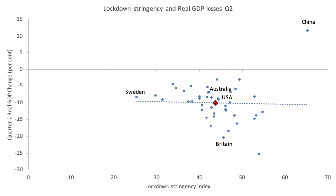
I mentioned that “Countries like Australia had a similar economic contraction to Sweden, for example, with significantly tighter lockdowns.”
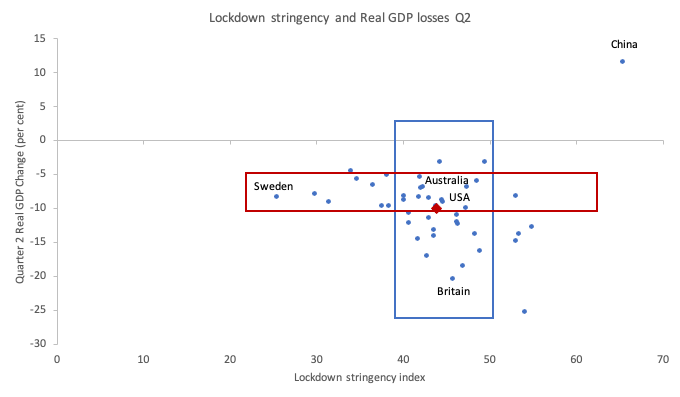
Now, here is another version of the same graph with two rectangles added.
The data shows – blue rectangle – that nations with broadly similar stringency index values experienced quite different real GDP declines in the second-quarter. That observation is not skewed by the Chinese outlier.
The red rectangle shows that nations with broadly similar real GDP declines had vastly different stringency policies in place in the second-quarter 2020. Again, the Chinese outlier has nothing to do with that.
Which is more or less the point I wanted to make in Monday’s blog post.
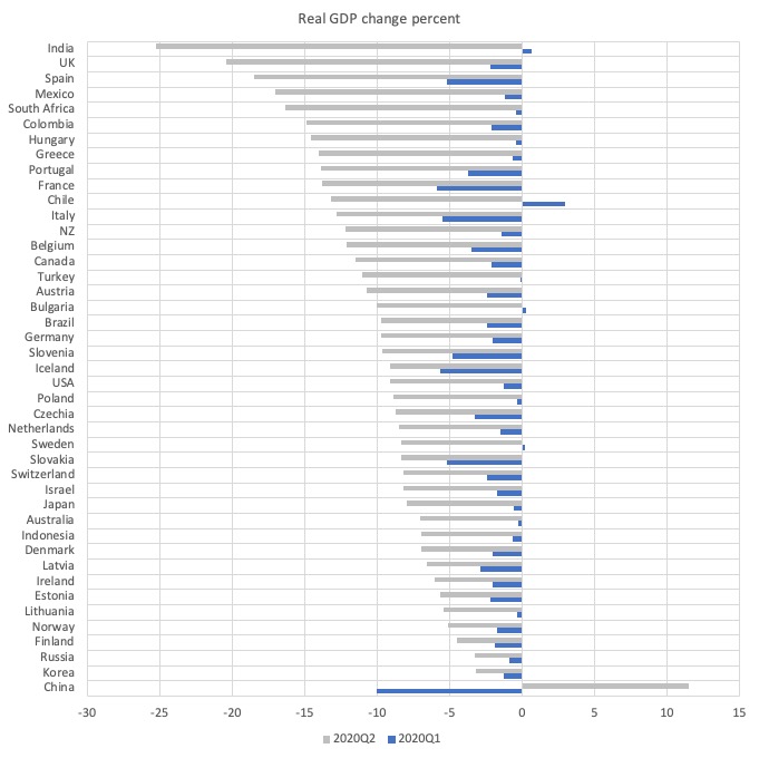
Here is a graph that shows the real GDP change (per cent) for the sample of countries (for which OECD provide the data) in the first- and second-quarters 2020.
The Chinese difference is clear, although the recession set in for almost all these countries by the first-quarter 2020.
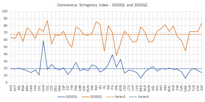
And here is a graph that shows the stringency index value by nation for the first- and second-quarters 2020 with the dotted lines being the overall sample averages for each period.
It gives us an idea of the considerable variation in lockdown severity deployed by different nations. You can draw your own inferences from that.
In econometric modelling, we would test whether China was an outlier using various exclusion techniques and test how that alters the inherent relationship.
If I exclude China, then the mean stringency index result falls from 43.77 to 43.27 (hardly any change), whereas the Real GDP decline is 10.45 points rather than 9.95 points (because China had already been growing in quarter 2).
And if I exclude it from the sample altogether and re-plot the cross-country relationship for quarter 2, I would find that the harsher the stringency, the greater average real GDP loss.
Which, of course makes sense.
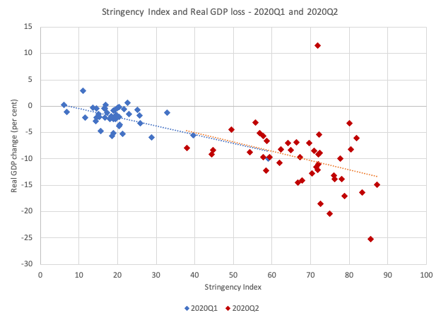
But we can also deal with the differential temporal effects of the virus (approximately) by plotting the stringency-real GDP relationship for 2020Q1 and 2020Q2 separately, which aligns the observations better.
This is what you get then – the dotted lines being the simple linear regression for the each quarter. And remember, this regression is simple (that is, could be mis-specified because of omitted variables) and is subject to endogeneity in that the right-hand side probably also affects the left-hand side. There would be other issues too.
But as a rough pictorial statement they are interesting and would guide further, deeper, more precise statistical analysis.
I would be fairly confident that better statistical modelling would find a negative relationship between the two – which means that tougher lockdowns lead to greater real GDP loss, with considerable country-specific variation around the average relationship.
But that again is the point.
The statistical association shown by the cross-plots hides the accompanying government policy responses to deal with the economic damage.
Which was the point of the blog post.
Governments could have attenuated the economic losses significantly – by diverting labour into other areas and paying wages where diversion into alternative, safe production was impracticable.
But the commentator was correct in pointing out how outliers distort our analysis and I thank him for his efforts.
Music – John Schofield
This is what I have been listening to while working this afternoon. I put this on as I was travelling between meetings today and had forgotten just how much I like the playing of American guitarist – John Schofield – who sort of spans the world of funk, jazz, bepop and rock.
His collaborations are with giants of all these genres and extend out to blues and soul as well.
Quite extraordinary – the diversity demonstrated.
I first encountered him when he started out in the early 1970s playing with Chet Baker and Gerry Mulligan before moving on to play with Charles Mingus in the mid-1970s.
I have followed his path ever since.
This song is off his 1998 album – A Go Go (distributed by Verve) – and has the same title.
This was the first time, he had recorded with the avant-garde jazz funk organ-based trio – Medeski, Martin and Wood – which formed in Brooklyn in 1991.
It consisted of:
1. John Medeski (keyboards)
2. Chris Wood (bass)
3. Billy Martin (drums)
These guys are not all that well-known internationally, but can play like there is no tomorrow.
I also often wondered how John Schofield was able to get that biting but warm tone.
One day, while I was experimenting with a Gibson 335 (my only non-Fender guitar) – John Schofield plays a custom Ibanez similar to the 335 – I turned the tone knob down to take the treble off (about 2/3 of the full range) on the bridge pickup and put the signal through a gain box with just a touch of distortion at higher volumes.
And, as they say, voila! there was the sound. Fairly clean at low volumes and a bit dirty at higher levels.
A great track from a pretty fine album.
I especially like the Hammond organ sound on this album, but then regular readers will know how much I crave that sound.
Perfect for my mood today. Pretty funky without being ebullient.
That is enough for today!
(c) Copyright 2020 William Mitchell. All Rights Reserved.
Kudos to Prof. Mitchell for this update.
The new bottom graph (with both Q1 and Q2) looks very plausible.
Hopefully the Prof. will also clarify how the severe economic losses can be avoided.
Billy Martin is such an underrated drummer. Saw the MMW trio with Scofield a few years back. Scofield and Medeski, in particular, throw all kinds of syncopated notes in, but the rhythm section didn’t miss!
@ Kingsley Lewis (quite a name!)
Re your query “Hopefully the Prof. will also clarify how the severe economic losses can be avoided.”
Bill said that “Governments could have attenuated the economic losses significantly – by diverting labour into other areas and paying wages where diversion into alternative, safe production was impracticable.”
Attenuated is different to avoided but I think you mean the same thing.
I take it you are asking for specific policy proposals? More detail could be given but if you read more of this blog you will get a better sense of what he means, particularly articles re the job guarantee. Also there was this blog https://billmitchell.org/blog/?p=44844
Beautiful guitar and Hammond organ track! (personally, although the drummer is great, I’d have him turned down just a shade)