Today (April 18, 2024), the Australian Bureau of Statistics released the latest - Labour Force,…
US labour market – floundering now despite modest gains
On October 2, 2020, the US Bureau of Labor Statistics (BLS) released their latest labour market data – Employment Situation Summary – September 2020 – which shows that while employment continued to grow, the rebound has moderated significantly. Further, the unemployment rate fell by 0.5 points to 7.9 per cent but only because the participation rate fell by 0.3 points, which saw less workers in the labour force. If the participation rate had not fallen, then there would have been only a marginal improvement in the unemployment situation. The sources of that participation decline are not disclosed. The problem facing the US is that the lack of economic support from the Federal government means that the huge pool of unemployment will take years to reduce and the damage will accumulate. How far the recovery can go depends on two factors, both of which are biased negatively: (a) How many firms have gone broke in the lockdown? (b) Whether the US states will have to reverse their lockdown easing in the face of a rapid escalation of the virus in some of the more populace states. I do not see appropriate policy responses in place at present. From abroad, it looks like the US government is stepping back when it should be engaging in supporting all incomes and introducing large-scale job creation programs.
Overview for September 2020:
- Payroll employment rose by 661,000 (slowing).
- Total labour force survey employment rose by 275 thousand net (0.19 per cent).
- The seasonally adjusted labour force fell by 695 thousand (-0.4 per cent).
- Official unemployment fell by 970 thousand to 12,580 thousand (but see below for commentary on participation rate fall)
- The official unemployment rate fell by 0.5 points to 7.9 per cent.
- The participation rate fell 0.3 points to 61.4 per cent. Adjusting the unemployment rate for the change in hidden unemployment would generate an unemployment rate of 8.3 per cent rather than 7.9 per cent.
- The broad labour underutilisation measure (U6) fell by 1.4 points to 12.8 per cent, in part, because of a fall in the number in the part-time for economic reasons cohort (the US indicator of underemployment).
For those who are confused about the difference between the payroll (establishment) data and the household survey data you should read this blog post – US labour market is in a deplorable state – where I explain the differences in detail.
BLS explanation
The BLS provided a special note to help us understand the results this month.
We learn:
1. “The collection rate for the establishment survey was 77 percent in August, higher than the average for the 12 months ending in February 2020.”
2. “The household survey response rate was 70 percent in August, up from the low, up from the rate of 65 percent in June but well below the average rate of 83 percent for the 12 months prior to the pandemic.
3. Both results reduce the accuracy of the surveys.
4. In the payroll survey:
… workers who are paid by their employer for all or any part of the pay period including the 12th of the month are counted as employed, even if they were not actually at their jobs. Workers who are temporarily or permanently absent from their jobs and are not being paid are not counted as employed, even if they are continuing to receive benefits.
5. In the Labour Force survey:
… In the household survey, individuals are classified as employed, unemployed, or not in the labor force based on their answers to a series of questions about their activities during the survey reference week (September 6th through September 12th). Workers who indicate they were no working during the entire survey reference week and expect to be recalled to their jobs should be classified as unemployed on temporary layoff. As in recent months, a large number of persons were classified as unemployed on temporary layoff in September.
The BLS wanted the latter group classified as unemployed for consistency but the survey staff didn’t always comply, which means that the employment estimates are probably overstated.
What impact might this have had?
The BLS say:
… the share of responses that may have been misclassified was much smaller in July, August, and September than in prior months.
For March through August, BLS published an estimate of what the unemployment rate would have been had misclassified workers been included. Repeating this same approach, the overall September unemployment rate would have been 0.4 percentage point higher than reported. However, this represents the upper bound of our estimate of misclassification and probably overstates the size of the misclassification error.
So we are still operating in an environment of uncertainty but the data accuracy has increased.
Once these classification issues are resolved, the participation response becomes more normal (workers coming back into the labour force), and the number of jobs lost forever becomes apparent, the true residual impact of the pandemic on the US labour market will become clearer.
Payroll employment trends
The BLS noted that:
Total nonfarm payroll employment rose by 661,000 in September, following larger gains in the prior 4 months. In September, nonfarm employment was below its February level by 10.7 million, or 7.0 percent. Notable job gains occurred in leisure and hospitality, in retail trade, in health care and social assistance and in professional and business services. Employment declined in government, mainly in state and local government education.
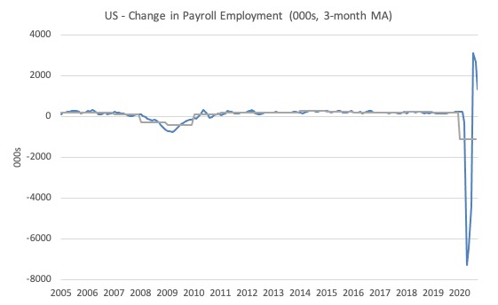
The first graph shows the monthly change in payroll employment (in thousands, expressed as a 3-month moving average to take out the monthly noise). The gray lines are the annual averages.
The data swings are still large and dwarf the past history.
Clearly, the 20.7 million job loss in April has not yet been reversed. Given the loss of payroll jobs in March and April, the US labour market is still 10.7 million jobs short from where it was at the end of February.
The next graph shows the same data in a different way – in this case the graph shows the average net monthly change in payroll employment (actual) for the calendar years from 1940 to 2020 (the 2020 average is for the months to date).
I usually only show this graph from 2005 but because history is being created at present I included the full sample available from 1940.
The final average for 2019 was 178 thousand.
The average so far for 2020 is -1,142 thousand.
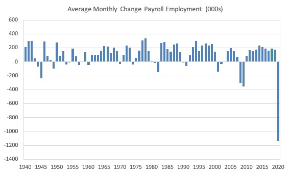
In a way, graphs like this lose definition and only present a binary world.
Labour Force Survey – employment growth continues albeit at a sharply slower pace
The data for September continues the improvement although the pace of recovery has slowed dramatically.
1. Employment as measured by the household survey rose by 275 thousand net (0.19 per cent down from 2.6 per cent in August).
2. The labour force fell by 695 thousand (-0.43 per cent).
3. The participation rate fell by 0.49 points.
4. As a result (in accounting terms), total measured unemployment fell by 970 thousand and the unemployment rate fell by 0.5 points to 7.9 per cent but all because the labour supply contracted sharply (see below).
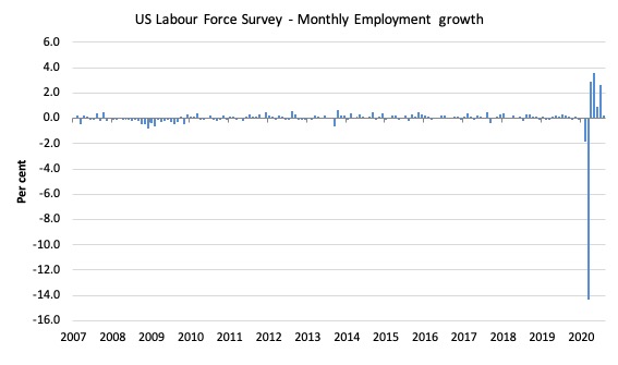
The following graph shows the monthly employment growth since January 2008, which shows the massive disruption this sickness has caused.
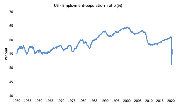
The Employment-Population ratio is a good measure of the strength of the labour market because the movements are relatively unambiguous because the denominator population is not particularly sensitive to the cycle (unlike the labour force).
The following graph shows the US Employment-Population from January 1950 to September 2020.
While the ratio fluctuates a little, the April 2020 ratio fell by 8.7 points to 51.3 per cent, which is the largest monthly fall since the sample began in January 1948.
In September 2020, it rose by 0.1 points to 56.6 per cent.
It is still well down on the level in January 2020 (61.2 per cent).
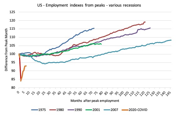
As a matter of history, the following graph shows employment indexes for the US (from US Bureau of Labor Statistics data) for the five NBER recessions since the mid-1970s and the current 2020-COVID crisis.
They are indexed at the employment peak in each case and we trace the data out for each episode until one month before the next peak.
So you get an idea of:
1. The amplitude (depth) of each cycle in employment terms.
2. The length of the cycle in months from peak-trough-peak.
The early 1980s recession was in two parts – a short downturn in 1981, which was followed by a second major downturn 12 months later in July 1982 which then endured.
Other facts:
1. Return to peak for the GFC was after 78 months.
2. The previous recessions have returned to the 100 index value after around 30 to 34 months.
3. Even at the end of the GFC cycle (146 months), total employment in the US had still only risen by 8.3 per cent (since December 2007), which is a very moderate growth path as is shown in the graph.
The current collapse is something else.
Unemployment and underutilisation trends
The BLS report that:
In September, the unemployment rate declined by 0.5 percentage point to 7.9 percent, and the number of unemployed persons fell by 1.0 million to 12.6 million. Both measures have declined for 5 consecutive months but are higher than in February, by 4.4 percentage points and 6.8 million, respectively.
The official unemployment rate declined in September 2020 largely because of a contraction in the supply of workers seeking work. That needs further investigation but on the face of it is not a good sign.
The first graph shows the official unemployment rate since January 1950.
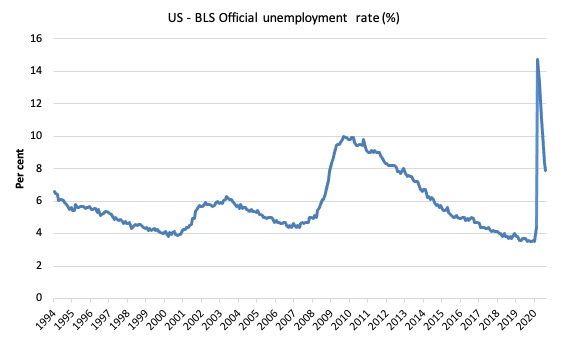
The official unemployment rate is a narrow measure of labour wastage, which means that a strict comparison with the 1960s, for example, in terms of how tight the labour market, has to take into account broader measures of labour underutilisation.
The next graph shows the BLS measure U6, which is defined as:
Total unemployed, plus all marginally attached workers plus total employed part time for economic reasons, as a percent of all civilian labor force plus all marginally attached workers.
It is thus the broadest quantitative measure of labour underutilisation that the BLS publish.
In December 2006, before the effects of the slowdown started to impact upon the labour market, the measure was estimated to be 7.9 per cent.
In September 2020 the U6 measure decreased by 1.4 points to 12.8 per cent.
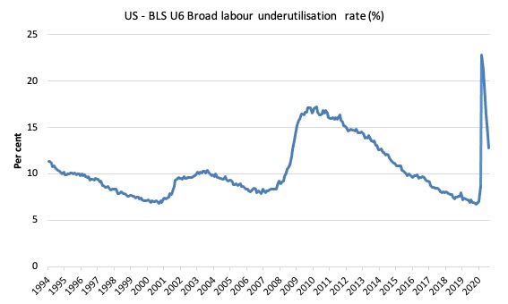
What drove this slight improvement?
This was driven, in part, by a 1,272 thousand decline in the category ‘Part-time for economic reasons’ – a measure of underemployment in the US data context.
The BLS say that:
In September, the number of persons employed part time for economic reasons (sometimes referred to as involuntary part-time workers) declined by 1.3 million to 6.3 million, reflecting a decrease in the number of persons whose hours were cut due to slack work or business conditions. The number of involuntary part-time workers is 2.0 million higher than in February. These individuals, who would have preferred full-time employment, were working part time because their hours had been reduced or they were unable to find full-time jobs …
The number of persons not in the labor force who currently want a job, at 7.2 million, changed little in September; this measure is 2.3 million higher than in February. These individuals were not counted as unemployed because they were not actively looking for work during the last 4 weeks or were unavailable to take a job …
Among those not in the labor force who currently want a job, the number of persons marginally attached to the labor force, at 1.9 million, changed little in September. These individuals were not in the labor force, wanted and were available for work, and had looked for a job sometime in the prior 12 months but had not looked for work in the 4 weeks preceding the survey. The number of discouraged workers, a subset of the marginally attached who believed that no jobs were available for them, was 581,000 in September, also little changed from the previous month …
Ethnicity and Education
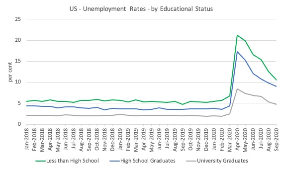
The next graph shows the evolution of unemployment rates for three cohorts based on educational attainment: (a) those with less than high school completion; (b) high school graduates; and (c) university graduates.
As usual, when there is a crisis, the least educated suffer disproportionately.
In the collapse in employment, the unemployment rates rose by:
- 14.4 points for those with less than high-school diploma.
- 12.9 points for high school, no college graduates.
- 5.9 points for those with university degrees.
The bounce back since April 2020 has seen the unemployment rate fall by:
- 10.6 points for those with less than high-school diploma meaning the unemployment rate is now 3.8 points above the March level.
- 8.3 points for high school, no college graduates meaning the unemployment rate is now 4.6 points above the March level.
- 3.6 points for those with university degrees meaning the unemployment rate is now 2.3 points above the March level.
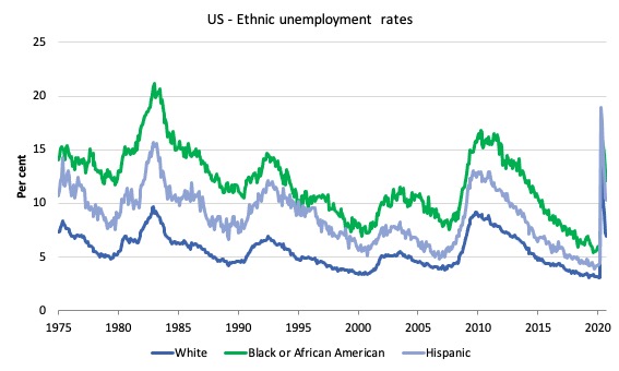
In the US context, especially in the current time, the trends in trends in unemployment by ethnicity are interesting.
Two questions arise:
1. How have the Black and African American and White unemployment rate fared in the post-GFC period?
2. How has the relationship between the Black and African American unemployment rate and the White unemployment rate changed since the GFC?
Summary:
1. All the series move together as economic activity cycles. The data also moves around a lot on a monthly basis.
2. The Black and African American unemployment rate was 6.7 per cent in March 2020, rose to 16.8 per cent in May and is now down to 12.1 per cent in September 2020.
3. The Hispanic or Latino unemployment rate was 6 per cent in March 2020, rose to 18.9 per cent in April and fell to 10.3 per cent in September 2020.
4. The White unemployment rate was 4 per cent in March 2020, rose to 14.2 per cent in April and fell to 7 per cent in September 2020.
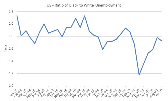
The next graph shows the Black and African American unemployment rate to White unemployment rate (ratio) from January 2018, when the White unemployment rate was at 3.5 per cent and the Black or African American rate was at 7.5 per cent.
This graph allows us to see whether the relative position of the two cohorts has changed since the crisis. If it is rising, then the unemployment rate of the Black and African American cohort is either rising faster than the white unemployment rate or falling more slowly (or a combination of that relativity).
While there is month-to-month variability, the data shows that, in fact, through to mid-2019, the position of Black and African Americans had improved in relative terms (to Whites), although that just reflected the fact that the White unemployment was so low that employers were forced to take on other ‘less preferred’ workers if they wanted to maintain growth.
In April 2019, the ratio was 2.1 (meaning the Black and African American unemployment rate was more than 2 times the White rate).
By April 2020, the ratio had fallen to its lowest level of 1.2, reflecting the improved relative Black and African American position.
As the pandemic hit, the ratio rose and peaked at 1.8 in August 2020, but fell to 1.7 in September, reflecting an improvement in the relative position of the Black and African American workers.
Aggregate participation rate – fell by 0.3 points to 61.4 per cent
What is the impact of that decline for the actual unemployment situation?
We can make two comparisons:
1. Compare the September 2020 with the March 2020 state.
2. Compare the changes in the last month.
The labour force is a subset of the working-age population (those above 15 years old). The proportion of the working-age population that constitutes the labour force is called the labour force participation rate. Thus changes in the labour force can impact on the official unemployment rate, and, as a result, movements in the latter need to be interpreted carefully. A rising unemployment rate may not indicate a recessing economy.
The labour force can expand as a result of general population growth and/or increases in the labour force participation rates.
The following Table decomposes these effects and summarises the relevant aggregates:
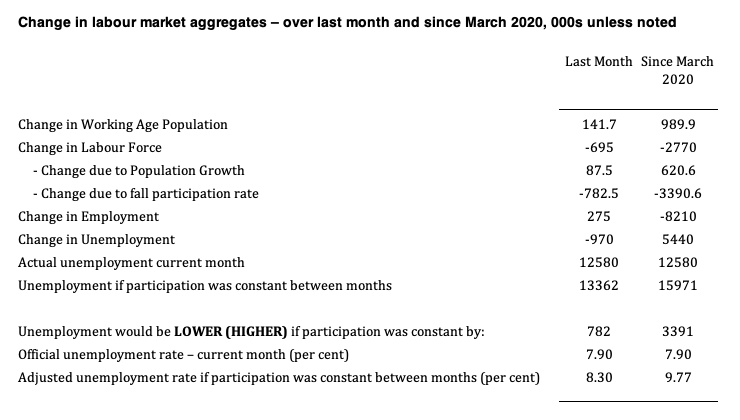
1. The labour force in September 2020 was 160,143 thousand.
2. The labour force has shrunk by 782 thousand in the last month as a result of the 0.3 points fall in the labour force participation over that period.
3. If we assume those workers are hidden unemployed – they want to work, are willing to work, but did not actively seek work – and add them back into the official unemployment, the adjusted unemployment rate in September 2020 would be 8.3 per cent rather than the official estimate of 7.9 per cent.
4. Since March 2020, the labour force has contracted by 3,390 thousand as a result of the 1.3 points fall in the labour force participation over that period.
5. If we assume those workers are hidden unemployed – they want to work, are willing to work, but did not actively seek work – and add them back into the official unemployment, the adjusted unemployment rate in September 2020 would be 9.8 per cent rather than the official estimate of 7.9 per cent.
That gives a very different picture of how well the US labour market is recovering from the crisis and with the virus numbers still very high and with winter approaching, the immediate future does not look good.
The Occupational Impacts to date – low wage workers bearing the brunt
As regular readers will know I have been tracking the sectoral and occupational employment changes in the US in relation to earnings for some time now.
I am exploring now is how is the US labour market collapse impacting on workers across the wage distribution.
The burning question is whether low-paid workers bear the brunt of downturns and how well the respective earnings groups fare in the recovery?
In the past, I have demonstrated that the proportion of jobs in the total employment in sectors that pay below-average pay has increased.
But at that level of aggregation, we are unable to say whether these jobs in question were high-pay or low-pay.
The next table helps to expand on that understanding.
It shows the net job losses (in the downturn) and net job gains (in the recovery to date) for the major occupations in the BLS classification.
I have sorted the occupations relative to median weekly earnings as at the June-quarter 2020 (most recent data).
Low-pay is 75 per cent of the median and in terms of the most recent earnings data includes the Service occupations, Farming, Fishing and Forestry occupations, and the Transportation and material moving occupations.
GFC downturn
1. In the downturn, 90.6 per cent of the jobs lost were in occupations that paid below median weekly earnings (12.3 per cent of those were in low-paid occupations). Very few jobs (relatively) were lost in the higher paying occupations.
2. Given 86.1 per cent of the total jobs lost in the downturn were in sectors paying above average pay. The inference is that the jobs lost were predominantly the lower paying jobs in those sectors (although we cannot strictly compare mean and median in a wage distribution given the skewness).
GFC recovery to February 2020
1. In the upturn to February 2020, the net jobs added had not yet replaced those lost in the occupations with below median weekly earnings. 67 per cent of the net jobs added were in occupations with above median weekly earnings. That proportion rose in the last three months to February 2020.
2. In the recovery, a much larger number of low-paid jobs were added. Of the 33 per cent share of below median earning jobs added in the recovery, almost all of them were in low-pay occupations (31.3 per cent of the total jobs added).
3. This tells us that there is a polarisation going on in the occupational employment structure with a bias towards low-pay jobs in the below median weekly earnings occupations and towards jobs in the above median weekly earnings with a hollowing out in the middle of the distribution.
4. That is, over the recovery period a hollowing out around the overall median pay levels was going on.
The Covid downturn – February 2020 to April 2020
The current crisis is very different to the GFC recession, given that a host of activities were forced to stop altogether ad authorities (slowly) enforced shutdowns and isolation.
The areas that are most affected include hospitality, sports, entertainment, restaurants and cafes, travel, and similar, which are major employers of low-paid, precarious workers.
So I expect the patterns of job loss to be somewhat different as a result.
The summary results are that:
1. Low-paid work slumped by 29.9 per cent between February and April 2020.
2. In just two months, the low-paid service sector occupations shed 160 per cent of the total jobs that were added in the period between January 2010 and February 2020. Think about that!
2. Below-median pay jobs slumped by 21.9 per cent.
3. Above-median pay jobs fell by 7.9 per cent.
4. In terms of total numbers of jobs lost:
(a) 22.9 per cent (5,646 thousand) were in above-median pay occupations.
(b) 77.1 per cent (19,045 thousand) in below-median pay occupations.
(c) 43.2 per cent of the total (10,671 thousand) have been in low-pay occupations.
The Covid recovery – from April 2020
The summary results are that:
1. Low-paid work has grown by 25.3 per cent and gained 60.3 per cent of the jobs lost between February and April 2020.
2. Below-median pay jobs have grown by 18.3 per cent and gained 65.4 per cent of the jobs lost between February and April 2020.
3. Above-median pay jobs have grown by 3.1 per cent and gained 35.6 per cent of the jobs lost between February and April 2020.
4. In terms of total numbers of jobs gained:
(a) 13.9 per cent (2,017 thousand) were in above-median pay occupations.
(b) 86.1 per cent (12,451 thousand) in below-median pay occupations.
(c) 44.5 per cent of the total (6,439 thousand) have been in low-pay occupations.
| Occupational Group | Jobs change – Feb-Apr 2020 (000s) | Proportion change (%) | Jobs change – Apr-Sep 2020 (000s) | Proportion change (%) |
| Above-median pay | -5,646 | 22.9 | 2,017 | 13.9 |
| Management, business, and financial operations occupations | 1,471 | 6.0 | 292 | 2.0 |
| Professional and related | -3,452 | 14.0 | 1,245 | 8.6 |
| Installation, maintenance, and repair | -723 | 2.9 | 480 | 3.3 |
| Below-median pay but not low pay | -19,045 | 77.1 | 12,451 | 86.1 |
| Sales and related | -2,846 | 11.5 | 1,934 | 13.4 |
| Office and administrative support | -1,937 | 7.8 | 1,251 | 8.6 |
| Construction and extraction | -1,605 | 6.5 | -1,489 | 10.3 |
| Production | -1,986 | 8.0 | 1,338 | 9.26 |
| Low pay | -10,671 | 43.2 | 6,439 | 44.5 |
| Service | -8,189 | 33.2 | 5,394 | 37.3 |
| Farming, fishing, and forestry | -64 | 0.3 | -114 | n/a |
| Transportation and material moving | -2,418 | 9.8 | 1,159 | 8.0 |
| Total | 24,691 | 100.0 | 14,470 | 100.0 |
Conclusion
The September 2020 US BLS labour market data release reveals an on-going rebound from the catastrophic labour market collapse in March and April but the pace of recovery has moderated significantly.
How far the recovery can go and reduce unemployment depends on two factors, both of which are biased negatively:
1. How many firms have gone broke in the lockdown? When the dust settles and we find out how many, the medium-term outlook will be rather grim.
2. Whether the US states will have to reverse their lockdown easing in the face of a rapid escalation of the virus in some of the more populace states.
On both fronts, the US government should introduce substantial job creation policy initiatives.
The current position of the US government has biased their stimulus spending towards the corporate sector and high income earners.
That is enough for today!
(c) Copyright 2020 William Mitchell. All Rights Reserved
“(1) How many firms have gone broke in the lockdown? When the dust settles and we find out how many, the medium-term outlook will be rather grim. (2) Whether the US states will have to reverse their lockdown easing in the face of a rapid escalation of the virus in some of the more populace states.” I would add a couple more considerations. If enough gerbil wheel jobs do not survive to substantially reemploy the masses, what will the gerbils do? Will they curl up in a corner of the cage and die, or turn on their gerbil masters and try to tear the cage apart, break out of it, begin to build a better one? There’s a folk saying to the effect that even a small worm turns when trod upon. We may well find out whether there’s still truth in that old saying, or whether decades of neoliberalist decadence have managed to sap the spirit of the small (human) worm.
Making statistical comparisons with past business cycles may be misleading as this period is characterized by a government shutdown of the economy. As such conclusions about past comparisons should be made cautiously.
There is a major transition going on in the economy due to the virus. While there are many suffering because of both the government’s actions and the effects of the virus, there are also sectors of the economy that are flourishing. For example, IPO shares are up in price a surprising 60% this year with further big new issues coming. The majority of these successes are related to the new economy and the funds raised by these companies will be used to expand, hire people and contribute to our continuing growth in productivity.
@Thomas Nugent, I agree with you that there is shift in the economic paradigm, may be it is like the time of the invention of locomotives, or the ford motors production era. Thus, the comparison of data from two different economic paradigms might not be applicable. We have to invent a ‘new theory’ for prediction, or explain and describe first.
That new theory, in my opinion, will be a ‘digital globalisation’ one, this will replace the locomotive, or, the automotive era.
I think we will need to be more innovative as well as adaptive, as a country and society, when needed.
But it has to be ‘fast’, in order to survive, or succeed in the new normal.
Further, in my opinion, the economic recovery will be known when the pandemic peaks, because it will the same amount of time to come down from that (which is a symmetrical shape, based on my observation).
However, one thing is sure, we will come down to a completely different world than the one we went in.
With the MMT lens provided by Bill and others, through their relentless dissemination of knowledge, we will see ‘two paradigm shifts’ taking place at the same time.
Which is quite a shift!
Countries that can handle both well will succeed more, and the lesser able ones will be behind just like what we see in the past and present.
This coping phenomenon will look very much like a normal distribution. Some will do very well. some will do poorly. The remaining will get by.
The question is, which group will we will be…