Today (April 18, 2024), the Australian Bureau of Statistics released the latest - Labour Force,…
Australian labour market improving as Victoria eases its strict lockdown
The latest data from the Australian Bureau of Statistics – Labour Force, Australia, October 2020 – released today (November 19, 2020) shows that the labour market has improved largely due to the recent easing of the lockdowns in Victoria as that state overcomes the second virus wave. All states and territories experienced employment gains in October 2020. Even though employment increased by 1.4 per cent in the month (which is a very strong result), unemployment rose marginally (0.1 points) as a result of the very strong growth in participation (up 0.9 points). Underemployment also fell by 1 point and the broad labour underutilisation rate (sum of unemployment and underemployment) fell by 0.9 points. But the recovery is still too slow and more government support by way of large-scale job creation is required given total employment is still 233 thousand below the level in March 2020 and unemployment is 245 thousand higher.
The summary ABS Labour Force (seasonally adjusted) estimates for October 2020 are:
- Employment increased 178,800 (1.4 per cent) – Full-time employment increased by 97,000 and part-time employment increased 81,800.
- Unemployment increased 25,500 to 960,900 persons.
- The official unemployment rate increased 0.1 points to 7 per cent.
- The participation rate increased by 0.9 points to 65.8 per cent.
- Aggregate monthly hours worked increased 21 million hours (1.2 per cent).
- Underemployment decreased by 1 point to 10.4 per cent (decline of 114.8 thousand). Overall there are 1,424.8 thousand underemployed workers. The total labour underutilisation rate (unemployment plus underemployment) decreased by 0.9 points to 17.4 per cent. There were a total of 2,385.7 thousand workers either unemployed or underemployed.
Employment increased strongly in October 2020
1. Employment growth was 1.4 cent.
Since March it has now fallen by 223.1 thousand (-1.7 per cent).
2. Full-time employment increased by 97,000 and part-time employment increased 81,800.
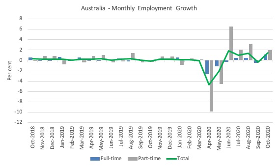
The following graph shows the month by month growth in full-time (blue columns), part-time (grey columns) and total employment (green line) for the 24 months to October 2020 using seasonally adjusted data.
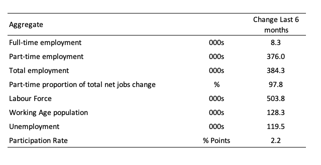
The following table provides an accounting summary of the labour market performance over the last six months. That is, since April, clearly if we take a 7 month view we get a less favourable impression given the pandemic started in March.
As the monthly data is highly variable, this Table provides a longer view which allows for a better assessment of the trends.
Assessment:
1. Total employment has risen by 384.3 thousand but 87.8 per cent of that increase has been in part-time work. This is quite a significant result.
2. The major casualties of the lockdowns were areas of the labour market where part-time work dominated. Full time work was somewhat insulated from the lockdowns as employees could work from home more easily.
3. The fact that there has been hardly any full-time employment gains in the last 6 months is a major worry. If we take the change since March 2020, the high point before the pandemic struck, then 227.7 full-time positions (net) have been lost to date.
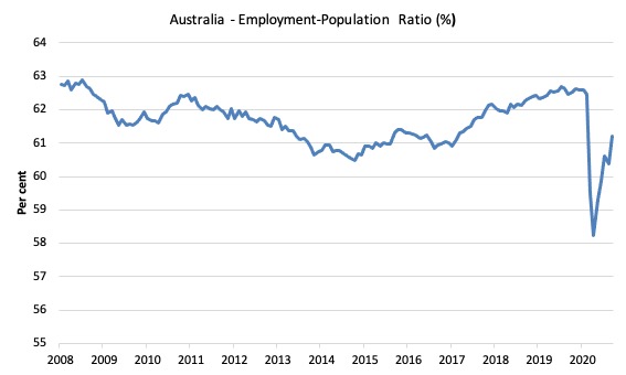
Given the variation in the labour force estimates, it is sometimes useful to examine the Employment-to-Population ratio (%) because the underlying population estimates (denominator) are less cyclical and subject to variation than the labour force estimates. This is an alternative measure of the robustness of activity to the unemployment rate, which is sensitive to those labour force swings.
The following graph shows the Employment-to-Population ratio, since June 2008 (the low-point unemployment rate of the last cycle).
It fell with the onset of the GFC, recovered under the boost provided by the fiscal stimulus packages but then went backwards again as the Federal government imposed fiscal austerity in a hare-brained attempt at achieving a fiscal surplus in 2012.
The ratio rose by 0.8 points in October 2020 to 61.2 per cent on the back of strong employment growth. The ratio is now 1.7 points below pre-GFC peak in April 2008 of 62.9 per cent.
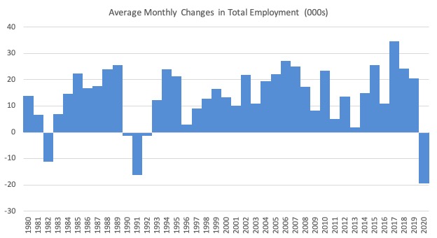
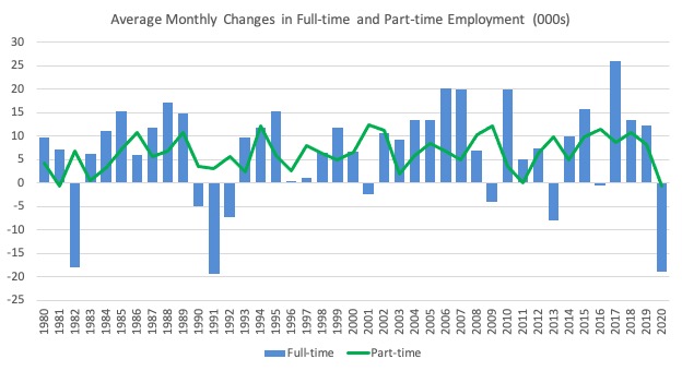
To put the current monthly performance into perspective, the following graph shows the average monthly employment change for the calendar years from 1980 to 2020 (to date).
1. The labour market weakened considerably over 2018 and that situation worsened in 2019.
2. The average employment change so far in 2020 is -16.9 thousand.
3. What I noticed when compiling the data today was how the scales are returning to the data. The early pandemic results made the past history look flat. But now some perspective is returning.
The following graph shows the average monthly changes in Full-time and Part-time employment (lower panel) in thousands since 1980.
The interesting result is that during recessions or slow-downs, it is full-time employment that takes the bulk of the adjustment. Even when full-time employment growth is negative, part-time employment usually continues to grow.
However, this crisis is different because much of the employment losses are the result of lockdowns and enforced business closures in sectors where part-time employment dominates.
But the continuing worsening of the full-time employment situation signals that the demand-side impacts are spreading more widely.
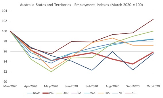
Impact of Stage 4 lockdown in Victoria
The following graph shows the impact on employment in Victoria as the State 4 restrictions took hold.
Clearly the lockdown has been damaging to employment in Victoria, which is no surprise.
With infection numbers now zero for 20 consecutive days and restrictions easing, Victoria’s employment grew by a strong 2.4 per cent in October and the situation will now continue to improve.
Unemployment increased 25,500 to 960,900 persons or 7 per cent
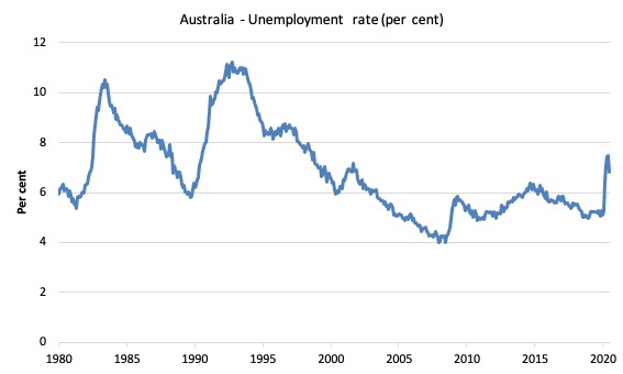
The official unemployment rate rose by 0.1 points to 7 per cent as the strong growth in employment (1.4 per cent) could not keep up with the strong growth in the labour force (1.5 per cent) as participation rose by 0.9 points.
The following graph shows the national unemployment rate from January 1980 to October 2020. The longer time-series helps frame some perspective to what is happening at present.
Assessment:
1. There is clearly still considerable slack in the labour market that could be absorbed with further fiscal stimulus.
Broad labour underutilisation decreased by 0.9 points to 17.4 per cent in October 2020
The results for October 2020 are (seasonally adjusted):
1. Underemployment fell by 114.8 thousand.
2. The underemployment rate fell by 1 point to 10.4 per cent.
2. Overall there are 1,424.8 thousand underemployed workers.
3. The total labour underutilisation rate (unemployment plus underemployment) decreased by 0.9 points to 17.4 per cent.
4. There were a total of 2,385.7 thousand workers either unemployed or underemployed.
The following graph plots the seasonally-adjusted underemployment rate in Australia from January 1980 to the October 2020 (blue line) and the broad underutilisation rate over the same period (green line).
The difference between the two lines is the unemployment rate.
The three cyclical peaks correspond to the 1982, 1991 recessions and the more recent downturn.
The other difference between now and the two earlier cycles is that the recovery triggered by the fiscal stimulus in 2008-09 did not persist and as soon as the ‘fiscal surplus’ fetish kicked in in 2012, things went backwards very quickly.
The two earlier peaks were sharp but steadily declined. The last peak fell away on the back of the stimulus but turned again when the stimulus was withdrawn.
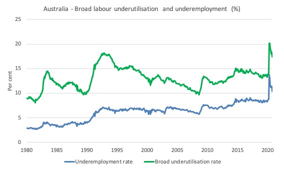
We need to add in the rise in hidden unemployment (given that the participation rate is still lower than its past peak) then we would add about 1.5 per cent to this broad rate to get a true underutilisation rate around 19 per cent. Please read my blog post – Australian labour underutilisation rate is at least 13.4 per cent – for more discussion on this point.
Unemployment and broad labour underutilisation indexes – last four downturns
The following graph captures the evolution of the unemployment rates for the 1982, 1991, GFC and COVID-19 downturns.
For each episode, the graph begins at 100 – which is the index value of the unemployment rate at the low-point of each cycle (June 1981; December 1989; February 2008, and January 2020, respectively).
We then plot each episode out for 90 months.
For 1991, the peak unemployment which was achieved some 38 months after the downturn began and the resulting recovery was painfully slow. While the 1982 recession was severe the economy and the labour market was recovering by the 26th month. The pace of recovery for the 1982 once it began was faster than the recovery in the current period.
During the GFC crisis, the unemployment rate peaked after 16 months (thanks to a substantial fiscal stimulus) but then started rising again once the stimulus was prematurely withdrawn and a new peak occurred at the 80th month.
The COVID-19 downturn, while in its early months, is obviously worse than any of the previous recessions shown.
The graph provides a graphical depiction of the speed at which each recession unfolded (which tells you something about each episode) and the length of time that the labour market deteriorated (expressed in terms of the unemployment rate).
After five months, the unemployment had risen from 100 to:
1. 111.6 index points in 1982.
2. 111.2 index points in 1991.
3. 106.7 index points in the GFC.
4. 137.7 index points currently.
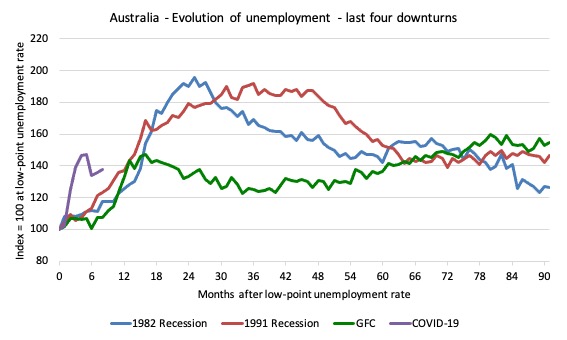
Note that these are index numbers and only tell us about the speed of decay rather than levels of unemployment.
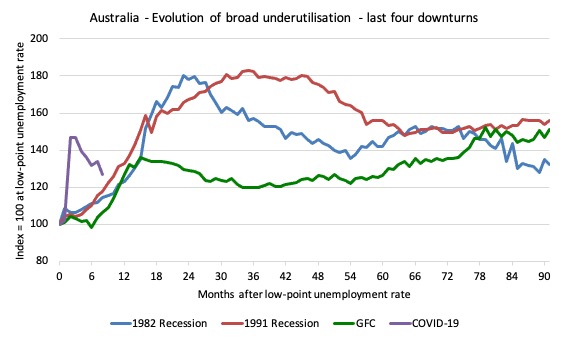
The next graph performs the same operation for the broad labour underutilisation rate (sum of official unemployment and underemployment).
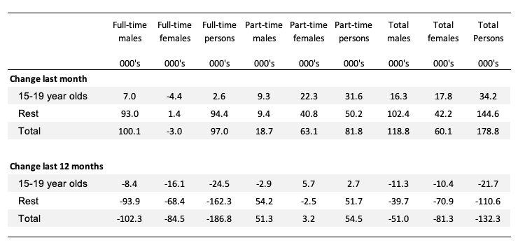
Teenage labour market improves in October 2020
1. Total teenage net employment rose by 34.2 thousand in October 2020 (5.5 per cent).
2. Full-time teenage employment rose by 2.6 thousand (2 per cent) and part-time employment rose by 31.6 thousand (6.5 per cent). The sharp rise in part-time work is the result of the low-wage service sector now being open in most states.
3. The teenage unemployment rate was static at 19.5 per cent because the employment growth was swampled by the increase in participation (2.9 points). These aggregates are volatile.
The following Table shows the distribution of net employment creation in the last month and the last 12 months by full-time/part-time status and age/gender category (15-19 year olds and the rest).
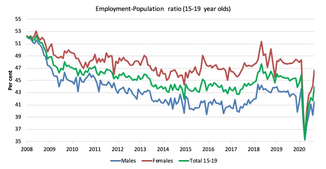
To put the teenage employment situation in a scale context (relative to their size in the population) the following graph shows the Employment-Population ratios for males, females and total 15-19 year olds since June 2008.
You can interpret this graph as depicting the loss of employment relative to the underlying population of each cohort. We would expect (at least) that this ratio should be constant if not rising somewhat (depending on school participation rates).
The absolute loss of jobs reported above has impacted more on females than males.
1. The male ratio has fallen by 10.8 percentage points since February 2008 and 2.1 points since March 2020.
2. The female ratio has fallen by 5.5 percentage points and 1.7 points since March 2020.
3. The overall teenage employment-population ratio has fallen by 8.2 percentage points and 1.9 points since March 2020.
4. In proportional terms, despite the improvement in June, this remains a devastating result for teenagers.
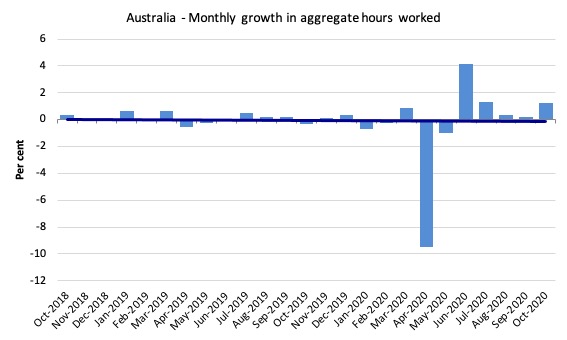
Hours worked increased 21 million hours (1.2 per cent) in October 2020
As the lockdown eases, hours worked are returning – albeit very slowly
The following graph shows the monthly growth (in per cent) over the last 24 months.
The dark linear line is a simple regression trend of the monthly change – which depicts a decreasing trend. Even before the coronavirus crisis struck, the trend was downwards.
Aggregate participation rate increased by 0.9 points to 65.8 per cent
The rise in the labour force participation rate means that the labour force rose by 204.3 thousand in October 2020.
With employment rising by 178.8 thousand, unemployment rose 25.5 thousand.
By how much would unemployment have changed had the participation rate had not risen?
We can make two calculations:
1. Just the monthly implication.
2. The implication of the participation rate being below its most recent peak of 66.2 per cent in August 2019.
The labour force is a subset of the working-age population (those above 15 years old). The proportion of the working-age population that constitutes the labour force is called the labour force participation rate. Thus changes in the labour force can impact on the official unemployment rate, and, as a result, movements in the latter need to be interpreted carefully. A rising unemployment rate may not indicate a recessing economy.
The labour force can expand as a result of general population growth and/or increases in the labour force participation rates.
The following Table shows the breakdown in the changes to the main aggregates (Labour Force, Employment and Unemployment) and the impact of the rise in the participation rate.
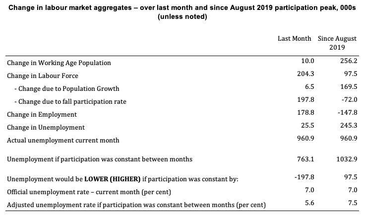
The change in the labour force in October 2020 was the outcome of two separate factors:
- The underlying population growth added 6.5 thousand persons to the labour force. The population growth impact on the labour force aggregate is relatively steady from month to month but has slowed in recent months due to the border restrictions and the impact they have had on migration rates; and
- The rise in the participation rate meant that there were 197.8 thousand workers re-entering the labour force (relative to what would have occurred had the participation rate remained unchanged).
- The net result was that the labour force rose by 204.3 thousand.
Assessment:
1. If the participation rate had not have risen in October 2020, total unemployment, given the current employment level, would have been 763.1 thousand rather than the official count of 960.9 thousand as recorded by the ABS – a difference of 197.8 thousand workers (the ‘participation effect’).
2. Without the rise in the participation rate in October 2020, the official unemployment rate would have been 5.6 per cent (rounded) rather than its current value of 7 per cent).
3. The situation is worse if we consider the collapse since August 2019. The labour force has risen by only 97.5 thousand while employment has fallen (net) by 147.8 thousand. That is why unemployment is 245.3 thousand higher than it would have been and the unemployment rate would be 7.5 per cent rather than 7 per cent had those workers not dropped out of the labour force as a result of inadequate job opportunities.
Conclusion
My standard monthly warning: we always have to be careful interpreting month to month movements given the way the Labour Force Survey is constructed and implemented.
The October 2020 data reveals that the recovery in the Australian economy has improved somewhat as the Stage 4 restrictions in Victoria were eased substantially.
My overall assessment is:
1. All states and territories experienced employment gains in October 2020.
2. Even though employment increased by 1.4 per cent in the month (which is a very strong result), unemployment rose marginally (0.1 points) as a result of the very strong growth in participation (up 0.9 points).
3. Underemployment also fell by 1 point and the broad labour underutilisation rate (sum of unemployment and underemployment) fell by 0.9 points.
4. But the recovery is still too slow and more government support by way of large-scale job creation is required given total employment is still 233 thousand below the level in March 2020 and unemployment is 245 thousand higher.
That is enough for today!
(c) Copyright 2020 William Mitchell. All Rights Reserved
Do the ABS data reveal how many hidden unemployed people there are in Australia today? People who are out of the labour force – not employed and not actively looking for work – but they would accept a suitable job if it were offered to them?
Nicholas, your questions could be supplemented by others, in light of the presumably large number of people who need and want a decent fulltime job to support themselves and/or their families. To add to your concern about how many of these people have given up on finding any work at all, one might also ask how many are working part-time jobs, temp jobs, gig jobs, independent contractor jobs, on-call jobs, etc., along with how many are working more than one such job or are compelled to work well past retirement age, all in a desperate effort to make ends meet. Without answers to these questions front and center in any analysis of employment data, we learn little about what’s going on with the struggle of average people to make a living, and things can easily be spun in a far more positive direction than they warrant. Bill, of course, does provide this crucial info and doesn’t even attempt to sugarcoat his number-crunching.