Today (April 18, 2024), the Australian Bureau of Statistics released the latest - Labour Force,…
US labour market deteriorating – health and economic policy failures
Last month, I noted that with the virus infections in the US increasing rapidly and renewed lockdowns almost inevitable combined with the lack of fiscal support from government, labour market conditions would probably deteriorate in November. I thought the US faced an uncertain and pessimistic future. The latest data reveals that assessment was accurate. On December 4, 2020, the US Bureau of Labor Statistics (BLS) released their latest labour market data – Employment Situation Summary – November 2020 – which reveals a deteriorating situation. Employment growth has slowed dramatically and participation fell by 0.2 points, which is the only reason that the unemployment rate fell by 0.2 points. Once we take into account the decline in the labour force, we realise that the fall in unemployment is illusory – it just means that workers who would normally be considered unemployed are now being classified as outside the labour force (that is, as hidden unemployed). The impasse at Congress on the the size and design of the next tranche of fiscal support is not helping. And then the data shows the lax health policy is allowing the virus to run out of control and how that plays out is anyone’s guess. I suspect a nation has to get the health problem sorted before they can really sort out the economic problem. The US appears to be going in the opposite direction to that. I doubt it will turn out well.
Overview for November 2020:
- Payroll employment rose by 245,000 (slowing dramatically).
- Total labour force survey employment rose by 2,243 thousand net (0.05 per cent).
- The seasonally adjusted labour force fell by 400 thousand (0.25 per cent).
- Official unemployment fell by 326 thousand to 10,735 thousand
- The official unemployment rate fell by 0.2 points to 6.7 per cent.
- The participation rate fell by 0.2 points to 61.5 per cent.
- The broad labour underutilisation measure (U6) fell by 0.1 points to 12 per cent, as the part-time for economic reasons cohort (the US indicator of underemployment) fell by 23 thousand (0.3 per cent).
For those who are confused about the difference between the payroll (establishment) data and the household survey data you should read this blog post – US labour market is in a deplorable state – where I explain the differences in detail.
BLS explanation
The BLS provided a special note to help us understand the results this month.
We learn:
1. “The collection rate for the establishment survey was 74 percent in November, about the same as the average for the 12 months ending in February 2020.”
2. “The household survey response rate was 79 percent in November, considerably higher than the low of 65 percent in June but below the average of 83 percent for the 12 months ending in February 2020”
3. Both results reduce the accuracy of the surveys.
4. In the payroll survey:
… workers who are paid by their employer for all or any part of the pay period including the 12th of the month are counted as employed, even if they were not actually at their jobs. Workers who are temporarily or permanently absent from their jobs and are not being paid are not counted as employed, even if they continue to receive benefits.
5. In the Labour Force survey:
… individuals are classified as employed, unemployed, or not in the labor force based on their answers to a series of questions about their activities during the survey reference week (November 8th through November 14th). Workers who indicate they were not working during the entire survey reference week and expect to be recalled to their jobs should be classified as unemployed on temporary layoff. As in recent months, a large number of persons were classified as unemployed on temporary layoff in November.
The BLS wanted the latter group classified as unemployed for consistency but the survey staff didn’t always comply, which means that the employment estimates are probably overstated.
What impact might this have had?
The BLS say:
… the share of responses that may have been misclassified was highest in the early months of the pandemic and has been considerably lower in recent months.
For March through October, BLS published an estimate of what the unemployment rate would have been had misclassified workers been included among the unemployed. Repeating this same approach, the overall November unemployment rate would have been 0.4 percentage point higher than reported. However, this represents the upper bound of our estimate of misclassification and probably overstates the size of the misclassification error.
So we are still operating in an environment of uncertainty but the data accuracy has increased.
Once these classification issues are resolved, the participation response becomes more normal (workers coming back into the labour force), and the number of jobs lost forever becomes apparent, the true residual impact of the pandemic on the US labour market will become clearer.
Payroll employment trends
The BLS noted that:
Total nonfarm payroll employment rose by 245,000, following gains of larger magnitude in the prior 6 months. In November, nonfarm employment was below its February level by 9.8 million, or 6.5 percent. Notable job gains occurred over the month in transportation and warehousing, professional and business services, and health care. Employment declined in government and retail trade.
It is clear that the US cannot continue with a no lockdown approach with the virus spiralling out of control, hospitals becoming overcrowded and the death rate rising to unimaginable levels.
Several states are now starting to reimpose lockdowns and the labour market will deteriorate as a consequence.
That is evident by the loss of 35 thousand jobs in the retail trade sector as the previous seasonal hiring dries up.
The other worry is that:
Government employment declined for the third consecutive month, decreasing by 99,000 in November. A decline of 86,000 in federal government employment reflected the loss of 93,000 temporary workers who had been hired for the 2020 Census. Employment in local government education continued to trend down (-21,000).
That signals a failure of the policy response.
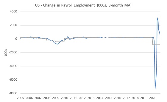
The first graph shows the monthly change in payroll employment (in thousands, expressed as a 3-month moving average to take out the monthly noise). The gray lines are the annual averages.
The data swings are still large and dwarf the past history.
Clearly, the 20.7 million job loss in April has not yet been reversed. Given the loss of payroll jobs in March and April, the US labour market is still 10.1 million jobs short from where it was at the end of February.
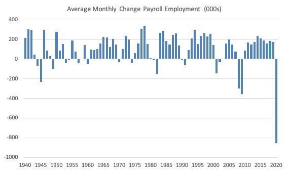
The next graph shows the same data in a different way – in this case the graph shows the average net monthly change in payroll employment (actual) for the calendar years from 1940 to 2020 (the 2020 average is for the months to date).
I usually only show this graph from 2005 but because history is being created at present I included the full sample available from 1940.
The final average for 2019 was 178 thousand.
The average so far for 2020 is -852 thousand.
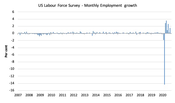
Labour Force Survey – employment growth negative
The data for September reveals that the labour market is now going backwards in the US.
1. Employment as measured by the household survey fell by 74 thousand net (0.05 per cent).
2. The labour force fell by 400 thousand (0.25 per cent).
3. The participation rate fell by 0.2 points.
4. As a result (in accounting terms), total measured unemployment fell by 326 thousand and the unemployment rate fell by 0.2 points to 6.7 per cent.
Taken together this is a poor outcome, even though unemployment fell.
It fell because more people dropped out of the active labour force as employment opportunities declined.
The following graph shows the monthly employment growth since January 2008, which shows the massive disruption this sickness has caused.
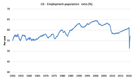
The Employment-Population ratio is a good measure of the strength of the labour market because the movements are relatively unambiguous because the denominator population is not particularly sensitive to the cycle (unlike the labour force).
The following graph shows the US Employment-Population from January 1950 to November 2020.
While the ratio fluctuates a little, the April 2020 ratio fell by 8.7 points to 51.3 per cent, which is the largest monthly fall since the sample began in January 1948.
In November 2020, it fell by 0.1 points to 57.3 per cent.
It is still well down on the level in January 2020 (61.2 per cent).
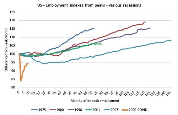
As a matter of history, the following graph shows employment indexes for the US (from US Bureau of Labor Statistics data) for the five NBER recessions since the mid-1970s and the current 2020-COVID crisis.
They are indexed at the employment peak in each case and we trace the data out for each episode until one month before the next peak.
So you get an idea of:
1. The amplitude (depth) of each cycle in employment terms.
2. The length of the cycle in months from peak-trough-peak.
The early 1980s recession was in two parts – a short downturn in 1981, which was followed by a second major downturn 12 months later in July 1982 which then endured.
Other facts:
1. Return to peak for the GFC was after 78 months.
2. The previous recessions have returned to the 100 index value after around 30 to 34 months.
3. Even at the end of the GFC cycle (146 months), total employment in the US had still only risen by 8.3 per cent (since December 2007), which is a very moderate growth path as is shown in the graph.
The current collapse is something else and progress has now gone into reverse.
Unemployment and underutilisation trends
The BLS report that:
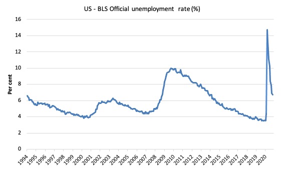
In November, the unemployment rate edged down to 6.7 percent. The rate is down by 8.0 percentage points from its recent high in April but is 3.2 percentage points higher than it was in February. The number of unemployed persons, at 10.7 million, continued to trend down in November but is 4.9 million higher than in February.
The official unemployment rate declined in November 2020 largely because the labour force shrunk by a greater amount than the contraction in employment – a bad coincidence.
The first graph shows the official unemployment rate since January 1994.
The official unemployment rate is a narrow measure of labour wastage, which means that a strict comparison with the 1960s, for example, in terms of how tight the labour market, has to take into account broader measures of labour underutilisation.
The next graph shows the BLS measure U6, which is defined as:
Total unemployed, plus all marginally attached workers plus total employed part time for economic reasons, as a percent of all civilian labor force plus all marginally attached workers.
It is thus the broadest quantitative measure of labour underutilisation that the BLS publish.
In December 2006, before the effects of the slowdown started to impact upon the labour market, the measure was estimated to be 7.9 per cent.
In November 2020 the U6 measure decreased by 0.1 points to 12 per cent.
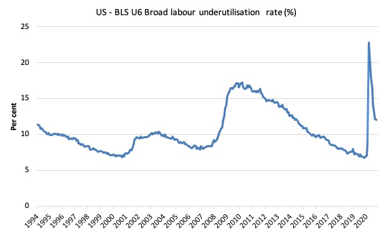
What drove this decline in U6?
The BLS say that:
The number of persons employed part time for economic reasons was about unchanged over the month at 6.7 million but remains 2.3 million higher than the February level …
In November, the number of persons not in the labor force who currently want a job increased by 448,000 to 7.1 million; this measure is 2.2 million higher than in February. These individuals were not counted as unemployed because they were not actively looking for work during the last 4 weeks or were unavailable to take a job …
Among those not in the labor force who currently want a job, the number of persons marginally attached to the labor force, at 2.1 million, changed little in November. These individuals wanted and were available for work and had looked for a job sometime in the prior 12 months but had not looked for work in the 4 weeks preceding the survey. The number of discouraged workers, a subset of the marginally attached who believed that no jobs were available for them, was 657,000 in November, little changed from the previous month.
Ethnicity and Education
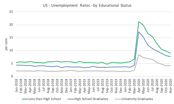
The next graph shows the evolution of unemployment rates for three cohorts based on educational attainment: (a) those with less than high school completion; (b) high school graduates; and (c) university graduates.
As usual, when there is a crisis, the least educated suffer disproportionately.
In the collapse in employment, the unemployment rates rose by:
- 14.4 points for those with less than high-school diploma.
- 12.9 points for high school, no college graduates.
- 5.9 points for those with university degrees.
The bounce back since April 2020 has seen the unemployment rate fall by:
- 12.2 points for those with less than high-school diploma meaning the unemployment rate is now 3.8 points above the March level.
- 9.6 points for high school, no college graduates meaning the unemployment rate is now 4.6 points above the March level.
- 4.2 points for those with university degrees meaning the unemployment rate is now 2.3 points above the March level.
In the last month, the change in the unemployment rate has been:
- -0.8 points points for those with less than high-school diploma.
- -0.4 points for high school, no college graduates meaning the unemployment rate.
- 0 points for those with university degrees meaning the unemployment rate.
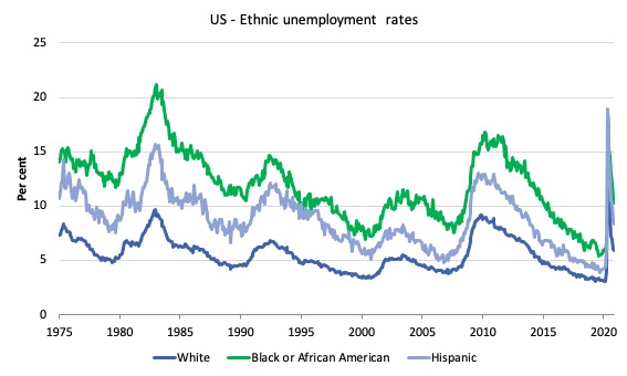
In the US context, especially in the current time, the trends in trends in unemployment by ethnicity are interesting.
Two questions arise:
1. How have the Black and African American and White unemployment rate fared in the post-GFC period?
2. How has the relationship between the Black and African American unemployment rate and the White unemployment rate changed since the GFC?
Summary:
1. All the series move together as economic activity cycles. The data also moves around a lot on a monthly basis.
2. The Black and African American unemployment rate was 6.7 per cent in March 2020, rose to 16.8 per cent in May and is now down to 10.3 per cent in November 2020.
3. The Hispanic or Latino unemployment rate was 6 per cent in March 2020, rose to 18.9 per cent in April and fell to 8.4 per cent in November 2020.
4. The White unemployment rate was 4 per cent in March 2020, rose to 14.2 per cent in April and fell to 5.9 per cent in November 2020.
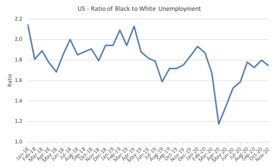
The next graph shows the Black and African American unemployment rate to White unemployment rate (ratio) from January 2018, when the White unemployment rate was at 3.5 per cent and the Black or African American rate was at 7.5 per cent.
This graph allows us to see whether the relative position of the two cohorts has changed since the crisis. If it is rising, then the unemployment rate of the Black and African American cohort is either rising faster than the white unemployment rate or falling more slowly (or a combination of that relativity).
While there is month-to-month variability, the data shows that, in fact, through to mid-2019, the position of Black and African Americans had improved in relative terms (to Whites), although that just reflected the fact that the White unemployment was so low that employers were forced to take on other ‘less preferred’ workers if they wanted to maintain growth.
In April 2019, the ratio was 2.1 (meaning the Black and African American unemployment rate was more than 2 times the White rate).
By April 2020, the ratio had fallen to its lowest level of 1.2, reflecting the improved relative Black and African American position.
As the pandemic hit, the ratio rose and peaked at 1.8 in August 2020, but fell to 1.7 in September, reflecting an improvement in the relative position of the Black and African American workers.
In November, the ratio was 1.7.
Aggregate participation rate – fell by 0.2 points to 61.5 per cent
What is the impact of that decline for the actual unemployment situation?
We can make two comparisons:
1. Compare the November 2020 with the March 2020 state.
2. Compare the changes in the last month.
The labour force is a subset of the working-age population (those above 15 years old). The proportion of the working-age population that constitutes the labour force is called the labour force participation rate. Thus changes in the labour force can impact on the official unemployment rate, and, as a result, movements in the latter need to be interpreted carefully. A rising unemployment rate may not indicate a recessing economy.
The labour force can expand as a result of general population growth and/or increases in the labour force participation rates.
The following Table decomposes these effects and summarises the relevant aggregates:
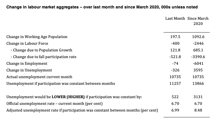
1. The labour force in November 2020 was 160,467 thousand.
2. The labour force has shrunk by 400 thousand in the last month as a result of the 0.2 points fall in the labour force participation over that period.
3. If we assume those workers are hidden unemployed – they want to work, are willing to work, but did not actively seek work – and add them back into the official unemployment, the adjusted unemployment rate in November 2020 would be 6.99 per cent rather than the official estimate of 6.7 per cent.
4. Since March 2020, the labour force has contracted by 2,446 thousand as a result of the 1.2 points fall in the labour force participation over that period.
5. If we assume those workers are hidden unemployed – they want to work, are willing to work, but did not actively seek work – and add them back into the official unemployment, the adjusted unemployment rate in November 2020 would be 8.5 per cent rather than the official estimate of 6.7 per cent.
That gives a very different picture of how well the US labour market is recovering from the crisis and with the virus numbers still very high and with winter approaching, the immediate future does not look good.
Conclusion
The November 2020 US BLS labour market data release reveals that the improvement that the US has seen since the catastrophic labour market collapse in March and April has gone into reverse.
The payroll data suggests the pace of recovery is slowing, whereas the labour force data has recorded a reversal.
It is clear that the US cannot continue with a no lockdown approach with the virus spiralling out of control, hospitals becoming overcrowded and the death rate rising to unimaginable levels.
Several states are now starting to reimpose lockdowns and the labour market will deteriorate as a consequence.
That is evident by the loss of 35 thousand jobs in the retail trade sector as the previous seasonal hiring dries up.
Total (net) jobs lost in the government sector was 99 thousand in November.
It doesn’t make sense in a massive crisis for government employment to be falling.
The delays in extra US government assistance are not helpful and perhaps with the political situation less uncertain (for most) the Congress will resolve the impasse.
That is enough for today!
(c) Copyright 2020 William Mitchell. All Rights Reserved.
Thank you for the detailed analysis of the US labor market. I wish you were wrong about the implications, but I think you are right, unfortunately for many in this country.
As far as the word ‘lockdown’ that everybody uses to describe restrictions about which businesses can be open during the pandemic – I think it is the wrong word to use. You have written a number of times about how the language used can ‘frame’ the discussion going forward. ‘Lockdown’ is a term describing a prison situation where inmates are locked up in their cells for the duration of the lockdown. As far as I know, even in Australia where you had effective public health policies implemented by the government, the comparison between your situation and that of actual prisoners is very weak.
In the US, even the worst early hit states (I am in one) have not imposed restrictions to the extent that Australia did. Alternatively, you could say none of them implemented the most effective public health policies. And we have the death tolls to back that statement up unfortunately.
I guess I have a problem with calling an effective public health policy the same word that is used to describe a situation in a prison for convicted criminals. It’s that framing thing.