Today (April 18, 2024), the Australian Bureau of Statistics released the latest - Labour Force,…
Australian labour market – stronger as working age population flattens out
Today (June 17, 2021), the Australian Bureau of Statistics put out the latest – Labour Force, Australia – for May 2021. The data shows that employment increased by 115,200 (which is strong), monthly hours worked increased by 1.4 per cent, unemployment fell by 53,000 (which is excellent), the unemployment rate fell 0.4 points to 5.1 per cent, the participation rate rose 0.3 points (good) and underemployment fell by 0.4 points to 7.4 per cent (excellent). It is hard not to see all these results in a positive light. More jobs are being created, more people are coming back into the labour force and fewer people are being underutilised relative to their desired work intentions. This reverses to some extent the backward step the labour market took last month. The labour market is still 237.1 thousand jobs of where it would have been if employment had continued to grow according to the average growth rate between 2015 and February 2020.
The summary ABS Labour Force (seasonally adjusted) estimates for May 2021 are:
- Employment increased 115,200 (0.9 per cent) – Full-time employment increased by 97,500 and part-time employment increased by 17,700.
- Unemployment decreased by 53,000 to 701,100 persons.
- The official unemployment rate decreased 0.4 points to 5.1 per cent.
- The participation rate increased by 0.3 points to 66.2 per cent.
- Aggregate monthly hours worked increased 25 million hours (1.4 per cent).
- Underemployment decreased by 0.3 points to 7.4 per cent (a fall of 41.6 thousand). Overall there are 1,028 thousand underemployed workers. The total labour underutilisation rate (unemployment plus underemployment) decreased by 0.7 points to 12.5 per cent. There were a total of 1,729.2 thousand workers either unemployed or underemployed.
Employment increased 115,200 in May 2021
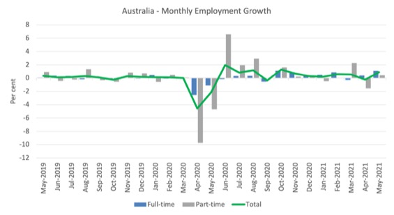
1. Employment growth was 0.9 per cent with 115,200 (net) jobs being added.
2. Full-time employment increased by 97,500 and part-time employment increased by 17,700.
3. Employment in Australia is now above the February 2020 level by 130.2 thousand (1.0 per cent). However, some sectors are still languishing while others are rebounding strongly.
The following graph shows the month by month growth in full-time (blue columns), part-time (grey columns) and total employment (green line) for the 24 months to May 2021 using seasonally adjusted data.
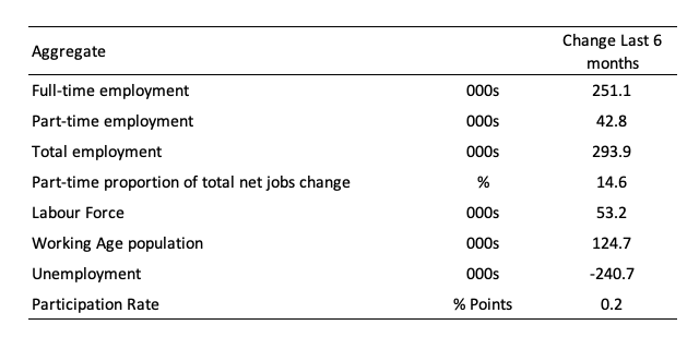
The following table provides an accounting summary of the labour market performance over the last six months to provide a longer perspective that cuts through the monthly variability and provides a better assessment of the trends.
Assessment:
1. Total employment has risen by 251.1 thousand and 14.6 per cent of that increase has been in part-time work.
2. Full-time employment has dominated.
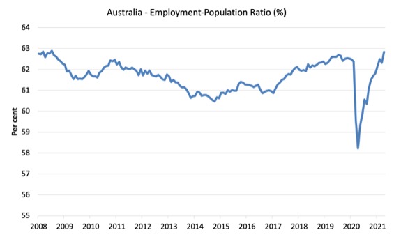
Given the variation in the labour force estimates, it is sometimes useful to examine the Employment-to-Population ratio (%) because the underlying population estimates (denominator) are less cyclical and subject to variation than the labour force estimates. This is an alternative measure of the robustness of activity to the unemployment rate, which is sensitive to those labour force swings.
The following graph shows the Employment-to-Population ratio, since February 2008 (the low-point unemployment rate of the last cycle).
It fell with the onset of the GFC, recovered under the boost provided by the fiscal stimulus packages but then went backwards again as the Federal government imposed fiscal austerity in a hare-brained attempt at achieving a fiscal surplus in 2012.
The ratio rose by 0.5 points in May 2021 to 62.8 per cent. The ratio is now at the pre-GFC peak in April 2008 of 62.9 per cent.
This is partly due to the slower population growth as a result of the lack of immigration due to the on-going external border closures.
This is forcing employers to search harder for workers already in Australia rather than discriminate against the unemployed.
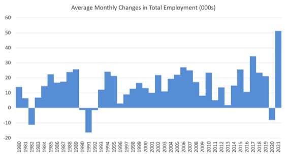
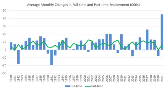
To put the current monthly performance into perspective, the following graph shows the average monthly employment change for the calendar years from 1980 to 2020 (to date).
1. The labour market weakened considerably over 2018 and that situation worsened in 2019.
2. The average employment change over 2020 was -7.5 thousand.
3. So far in 2021, the average monthly change is 51.2 thousand and you can see that from the graph that this is exceptional, although it has only been for 5 months so far as businesses return to more normal levels of operation.
The following graph shows the average monthly changes in Full-time and Part-time employment (lower panel) in thousands since 1980.
The interesting result is that during recessions or slow-downs, it is full-time employment that takes the bulk of the adjustment. Even when full-time employment growth is negative, part-time employment usually continues to grow.
However, this crisis is different because much of the employment losses are the result of lockdown and enforced business closures in sectors where part-time employment dominates.
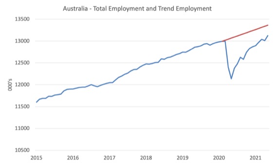
Actual and Trend Employment
While the current month’s employment figures are encouraging, the labour market is still some way from catching up on the jobs that were lost during the pandemic.
The following graph shows total employment (blue line) and what employment would have been if it had continued to grow according to the average growth rate between 2015 and February 2020.
The gap as at May 2021 is 237.1 thousand jobs.
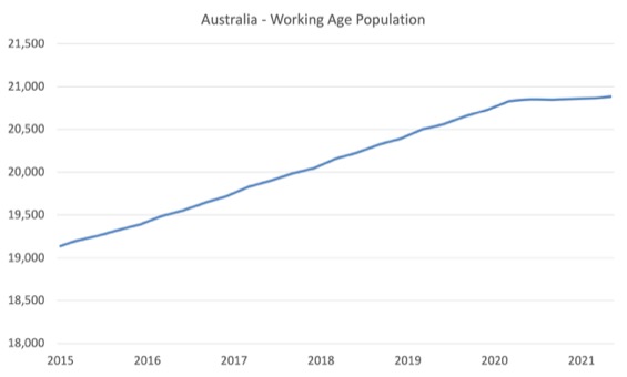
The Population Slowdown
The following graph shows Australia’s working age population (Over 15 year olds) from January 2015 to May 2021.
With the external border closed, immigration has shrunk to virtually zero and the impact is very clear.
This flattening out has forced employers to work harder to get workers and is one of the reasons unemployment is falling quite quickly, given the circumstances.
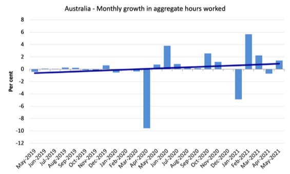
Hours worked increased 25 million hours (1.4 per cent) in May 2021
The following graph shows the monthly growth (in per cent) over the last 24 months.
The dark linear line is a simple regression trend of the monthly change – which depicts slightly positive trend.
Unemployment decreased by 53,000 to 701,100 persons
The official unemployment rate fell 0.4 points to 5.1 per cent as both employment and the participation rate increased.
That is a virtuous double.
The following graph shows the national unemployment rate from February 1980 to May 2021. The longer time-series helps frame some perspective to what is happening at present.
Assessment:
1. Unemployment is now back to the pre-pandemic February 2020 level – but we shouldn’t use that as the aspirational benchmark.
2. There is still considerable slack in the labour market that could be absorbed with further fiscal stimulus.

Broad labour underutilisation decreased by 0.7 points to 12.5 per cent in May 2021
The results for May 2021 are (seasonally adjusted):
1. Underemployment decreased by 41.6 thousand.
2. The underemployment rate fell by 0.3 points to 7.4 per cent.
2. Overall there are 1,028 thousand underemployed workers.
3. The total labour underutilisation rate (unemployment plus underemployment) decreased by 0.7 points to 12.5 per cent.
4. There were a total of 1,729.2 thousand workers either unemployed or underemployed.
5. This is lowest rate since February 2013 and once again illustrates what happens when immigration is reduced dramatically and employers have to rely on the locally-available workers.
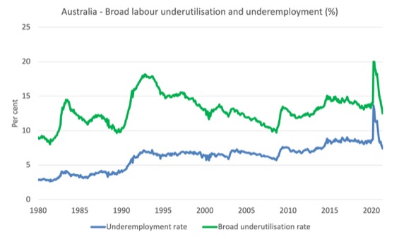
The following graph plots the seasonally-adjusted underemployment rate in Australia from February 1980 to the May 2021 (blue line) and the broad underutilisation rate over the same period (green line).
The difference between the two lines is the unemployment rate.
The three cyclical peaks correspond to the 1982, 1991 recessions and the more recent downturn.
The other difference between now and the two earlier cycles is that the recovery triggered by the fiscal stimulus in 2008-09 did not persist and as soon as the ‘fiscal surplus’ fetish kicked in in 2012, things went backwards very quickly.
The two earlier peaks were sharp but steadily declined. The last peak fell away on the back of the stimulus but turned again when the stimulus was withdrawn.
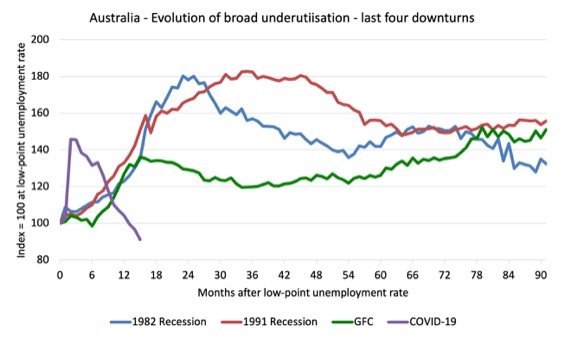
Unemployment and broad labour underutilisation indexes – last four downturns
The following graph captures the evolution of the unemployment rates for the 1982, 1991, GFC and COVID-19 downturns.
For each episode, the graph begins at 100 – which is the index value of the unemployment rate at the low-point of each cycle (June 1981; December 1989; February 2008, and February 2020, respectively).
We then plot each episode out for 90 months.
For 1991, the peak unemployment which was achieved some 38 months after the downturn began and the resulting recovery was painfully slow. While the 1982 recession was severe the economy and the labour market was recovering by the 26th month. The pace of recovery for the 1982 once it began was faster than the recovery in the current period.
During the GFC crisis, the unemployment rate peaked after 16 months (thanks to a substantial fiscal stimulus) but then started rising again once the stimulus was prematurely withdrawn and a new peak occurred at the 80th month.
The COVID-19 downturn was obviously worse than any of the previous recessions shown but because of its unique nature – the job losses being largely driven by lockdowns etc.
And the recovery is evident.
The graph provides a graphical depiction of the speed at which each recession unfolded (which tells you something about each episode) and the length of time that the labour market deteriorated (expressed in terms of the unemployment rate).
After 15 months, the unemployment had risen from 100 to:
1. 138.2 index points in 1982 and rising.
2. 157.1 index points in 1991 and rising.
3. 146 index points in the GFC and rising.
4. 98.8 index points currently and falling.

Note that these are index numbers and only tell us about the speed of decay rather than levels of unemployment.
The next graph performs the same operation for the broad labour underutilisation rate (sum of official unemployment and underemployment).
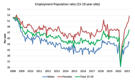
Teenage labour market improves in May 2021
The following Table shows the distribution of net employment creation in the last month and the last 12 months by full-time/part-time status and age/gender category (15-19 year olds and the rest).

To put the teenage employment situation in a scale context (relative to their size in the population) the following graph shows the Employment-Population ratios for males, females and total 15-19 year olds since June 2008.
You can interpret this graph as depicting the loss of employment relative to the underlying population of each cohort. We would expect (at least) that this ratio should be constant if not rising somewhat (depending on school participation rates).
1. The male ratio has fallen by 8.8 percentage points since February 2008, but is now 0.1 points above its level in March 2020. It fell by 0.38 points over the month.
2. The female ratio has risen by 0.6 percentage points since February 2008, is now 4.8 points above its level in March 2020. It rose by 1.55 points over the month.
3. The overall teenage employment-population ratio has fallen by 4.2 percentage points since February 2008, is now 2.4 points above its level in March 2020. It rose by 0.56 points over the month.
Conclusion
My standard monthly warning: we always have to be careful interpreting month to month movements given the way the Labour Force Survey is constructed and implemented.
The May 2021 data reveals that the Australian labour market has regained its growth momentum with strong employment growth, increased working hours and participation and falling unemployment and underemployment.
Overall, one of the better monthly results.
My overall assessment is:
1. Total employment is now above where it was in February 2020 but there are major sectoral differences – some sectors are still in deep recession while others are booming.
2. The results suggest that with lower population growth due to the external border closures, employers are now having to absorb the unemployed more quickly to mainstain their operations.
3. There is still plenty of scope for further fiscal support without triggering any inflationary pressures.
That is enough for today!
(c) Copyright 2021 William Mitchell. All Rights Reserved.
Who would ever have thought that when you suddenly stop giving employers access to hundreds of thousands of imported workers which have enabled them to dispense with training local workers and in some cases to avoid employing them altogether – that more Australians might be able to secure some employment.
Makes a mockery of the widely-touted argument that business needs access to a giant global pool of labour because Australians are too lazy to get jobs.
For years that we have been looking the other way, as corporations (speccially the agro-business) has been “importing” labour from the “third world” to the “first world” (and “second” world too).
They work in a semi-slavery system and “slave-owners” are happy because they got what they need, when they need it, for next to nothing, with no strings attached.
Well, but that only happens while we keep silent about it.
We should demand equal rights to migrant workers. It’s in our own interest.
Reserve Bank Governor Phil Lowe stated yesterday….
“The main effect of the closure of the borders on the labour market is that we can no longer tap the overseas labour market for areas where workers are in short supply.
“So, what used to happen before the pandemic is if there was a shortage in the labour market for a particular skill, firms could go overseas and tap the global labour market. And that meant that if there was very strong demand for workers of a particular skill, the price – the wage – didn’t really move very much because you could go and get workers from overseas.
“You can’t do that at the moment. Or at least it is very hard to bring in workers with skills. It’s not necessarily the level of immigration that’s the main factor here. It’s the ability to tap global labour markets for areas where there is a shortage.
“And we’re starting to hear reports of wages moving for some of those jobs. But other firms are saying ‘look, we don’t want to bid up the cost base now’. Because perhaps late in the year there will be some way to get workers to come back in with skills that we really need and that will alleviate some of the pressures.
“I think if that doesn’t happen, and we’re still in this position in a year’s time where we can’t get workers and skills are in short supply, then we will see more upward pressure on wages and inflation”.
Even the RBA admits it.