Today (April 18, 2024), the Australian Bureau of Statistics released the latest - Labour Force,…
Still a lot of slack remaining in the US labour market
The US Bureau of Labor Statistics published the latest JOLTs data yesterday (July 7, 2021) – Job Openings and Labor Turnover Summary – May 2021 – which provides some interesting insights into labour market dynamics that run against the mainstream narrative. It allows me to calculate broader measures of labour demand and supply to achieve a more accurate indication of how tight or otherwise the US labour market is. Currently there is still considerable slack in the US labour market, some of it, outside the official labour force, and some of it in underemployment, as well as the official unemployment number. My estimates of the gap between labour supply (employment plus unemployment plus part-time for economic reasons plus not in the labour force but want to work) and labour demand (employment plus job openings) comes to 12,465 thousand or 7.75 per cent of the labour force. In February 2020, this gap stood at 8,076 thousand or 4.9 per cent of the labour force. So there has been improvement but there is still a lot of slack in the US labour market.
Data summary for May 2021
- “The number of job openings was little changed at 9.2 million on the last business day of May.”
- “Hires were little changed at 5.9 million.”
- “Total separations decreased to 5.3 million. Within separations, the quits rate decreased to 2.5 percent.”
- “The layoffs and discharges rate, while little changed over the month, hit a series low of 0.9 percent.”
How do we interpret those figures?
It suggests that the labour market has reached a state of possible rest – labour demand is stable and workers are quitting their jobs at reduced rates, which is a sign of both easing jobs growth and more uncertainty about the future.
Quit rates are strongly pro-cyclical, which means they rise when times are good and fall at other times when jobs are hard to find and the fear of unemployment is rising.
U-V curve analysis
How does this fit in with the hiring and firing data available from the – US JOLTS database – supplied by the BLS.
The BLS published the latest JOLTs data last Friday (May 15, 2020) – Job Openings and Labor Turnover Summary – which reveals data up to March 2020.
So in a sense it is the calm before the storm.
The JOLTS data allows us to distinguish whether ‘supply-side’ movements are driving the shifts in unemployment (that is, actions by workers) or whether ‘demand-side’ factors are more influential.
In general, the JOLTS database usually always shows that it is the number of jobs on offer and the growth of employment that is the dominant force.
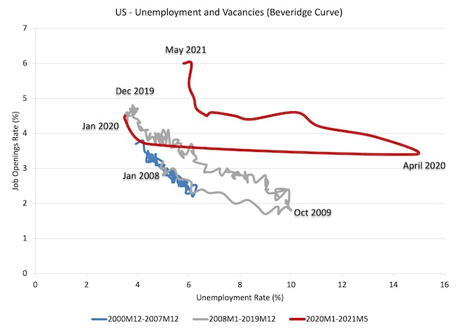
To start the discussion, it is useful to look at the US version of the Unemployment to Vacancies curve (where vacancies are the Total Non-Farm Job Openings as a percent of the Labour Force).
The following graph shows three distinct periods:
1. December 2000 to December 2007 (the JOLTS database started in December 2000).
2. January 2008 to December 2019 – so the GFC downturn and drawn out recovery (of sorts).
3. January 2020 to May 2021 – the COVID-19 cycle.
The three periods graphed cover the entire span of the JOLTS data.
Refer to the blog – Latest Australian vacancy data – its all down to deficient demand (July 2, 2013)- for a conceptual discussion about how to interpret this framework in terms of movements along curves and shifts in relationships.
Basically, the UV (or Beveridge) curve shows the unemployment-vacancy (UV) relationship, which plots the unemployment rate on the horizontal axis and the vacancy rate on the vertical axis to investigate these sorts of questions.
Mainstream economists interpret movements along the curve as being cyclical events and shifts in the curve as structural events.
So, in that framework, a movement ‘down along the curve’ to the south-east suggests a decline in the number of jobs available due to an aggregate demand failure, while a movement ‘up along the curve’ indicates improved aggregate demand and lower unemployment.
If unemployment rises in an economy where there are movements along the UV curve it is referred to as “Keynesian” or “cyclical” unemployment – that is, arising from a deficiency in aggregate demand.
The mainstream economics literature claims that ‘shifts in the curve’ – (out/in) – indicate non-cyclical (structural) factors (more efficient/less efficient) are causing the rising (falling) unemployment.
Allegedly, the UV curve shifts out because the labour market was becoming less efficient in matching labour supply and labour demand and vice versa for shifts inwards.
The factors that allegedly ’cause’ increasing inefficiency are the usual neo-liberal targets – the provision of income assistance to the unemployed (dole); other welfare payments, trade unions, minimum wages, changing preferences of the workers (poor attitudes to work, laziness, preference for leisure, etc).
Using this logic in the 1970s, when the shifts were first noticed, mainstream economists argued that the Non-Accelerating-Inflation-Rate-of-Unemployment (NAIRU) had risen and that ‘Keynesian’ attempts at reducing unemployment through the use of expansionary fiscal policy would only cause inflation.
They argued that structural policies were needed, which marked the beginning of the neoliberal activation program and the attacks on trade unions etc.
Micro policies like cutting unemployment benefits and/or making it harder to get and remain on benefits became the norm.
The pernicious work test mentality entered the fray.
Industrial relations legislation in many nations made it hard for trade unions to prosecute successful wage claims and minimum wage adjustments stalled or were weak.
The problem was that the evidence used to justify all this was wrongly interpreted.
The shifts in the U-V curve had nothing to do with microeconomic or structural factors.
As is the case in most advanced countries, the shift in the US curve occurred during a major demand-side recession – that is, it has been driven by cyclical downturns (macroeconomic events) rather than any autonomous supply-side shifts.
Once the economy resumed growth the unemployment rate fell more or less in line with the new job openings rate – tracing the grey line up to the north-west of the graph.
We can see that through 2019, as the labour market was tightening and unemployment was reaching levels not seen since the late 1960s, that the UV curve was starting to shift south again.
However, the emergence of the current crisis in March and pushed the curve out – there has never been such a sudden shift in a U-V curve anywhere like this.
And, when things start settling down again, we will see that curve start shifting in again.
All due to cyclical factors that fiscal policy changes can influence.
If you want to see the NAIRU idiocy in all its starkness, here is a graph that shows the old Australian Treasury TRYM estimates of the NAIRU (red) and the actual unemployment rate (blue).
TRYM was Treasury’s former macroeconomic forecasting and analysis structural econometric model of the Australian economy.
This graph highlights the stupidity of mainstream economics.
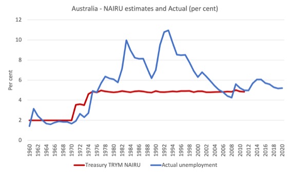
You can see the problem clearly without having to understand anything much.
Proponents of the NAIRU as a useful policy construct have never explained the sudden jump from 1974 which coincided at the time with the rise in the actual unemployment rate.
The latter occurred as a result of the recession that followed the OPEC oil price hikes and was clearly understood in terms of a negative spending shock exacerbated by contractionary policy.
But mainstream economists claim that shifts in the NAIRU reflect shifts in microeconomic factors – the so-called structural factors, which are invariant to the economic cycle.
Why is that important?
Because if the structural factors (attitudes towards work, regulations such as minimum wages, income support levels, taxes, etc) fully determine the NAIRU and they are invariant to the economic cycle, which is driven by spending, then it would be difficult for the government to use expansionary fiscal policy to reduce the unemployment rate without incurring accelerating inflation.
That is exactly the notion that defined the entry of Monetarism and the Natural Rate Hypothesis (NRH) into their literature.
It is the causality that underpins their argument that there is only one unique unemployment rate consistent with stable inflation and fiscal policy adjustments (classic Keynesian policies) are unable to influence that rate and only cause inflation if the government tries to influence the level of unemployment.
The game is thus to accept that for given structural parameters, the unemployment rate where inflation stabilises is the ‘natural rate’ and if the government feels it is too high then they have to engage in structural changes which include reducing (scrapping minimum wages), reducing trade union bargaining power, cutting corporate taxation, increase the strength of activity tests for unemployment benefit recipients and even scrapping the benefit altogether.
You can see how the NAIRU has been such a powerful pillar of the neoliberal deregulation agenda.
But, even if structural factors are determinant of the NAIRU, it remains the fact that if they are influenced in any way by the economic (spending) cycle, then the NAIRU becomes sensitive to government spending shifts and the whole Monetarist-NRH story crumbles.
That is what the concept of hysteresis was about. That was one of the things my PhD contributed – I was one of the first to develop that concept in the literature in the 1980s.
The idea is that structural shifts accompany cyclical shifts and so there is no determinant NAIRU and estimates of it will just follow the actual unemployment rate up and down in some lagged fashion depending on the econometric technique used to estimate it.
And, when one examines the alleged structural factors (proposed by proponents of the NAIRU concept) using all sorts of statistical and econometric tools – from simple linear regressions to advanced techniques (non-linear, filters, etc) the overwhelming result is that the structural variables, are, themselves, highly sensitive to the economic cycle.
Which means if the actual unemployment rate falls, the estimated NAIRU falls (and vice versa).
Which means that if governments stimulate the economy using fiscal policy and reduce the actual unemployment rate, the estimated NAIRU (which is unobservable) also falls.
The mainstream conception is ridiculous.
QED.
Please read this blog post and the links within it for more analysis of this issue – Never trust a NAIRU estimate (May 13, 2020).
Further labour demand and supply analysis
I have previously discussed the drop in labour force participation in the US since 2000.
See the most recent blog post on this topic – Updating the impact of ageing labour force on US participation rates (November 7, 2017).
What that analysis (which is supported by the discussion above) tells me is that there is still considerable supply-side slack in the US labour market.
I use the term ‘supply-side slack’ to mean that there are plenty of workers who are idle in one way or another and who want to work some or more but cannot find the hours because labour demand is weaker than needed.
As note above, the BLS U-6 measure adds together total unemployment, all marginally attached workers, all employed part time for economic reasons and expresses this as a percent of all civilian labor force plus all marginally attached workers.
In May 2021, the components are (in thousands):
1. Total unemployment = 9,316 thousand.
2. Total marginally attached workers = 1,856 thousand.
3. Total part-time for economic reasons = 4,627 thousand.
4. Total comprising the U6 numerator (available labour force underutilised) = 15,799 thousand.
5. However, within the Not in the labour force category (total 99,172 thousand as at May 2021), there were 7,087 who want to work and for various reasons fail the activity test (didn’t search within the last 4 weeks).
So it is more realistic to consider these workers as being possible capacity rather than restrict our estimates to the marginally attached workers who are available for work now.
That would give a total number of 1 + 3 + 5 = 21,674 thousand – that’s 21.6 million folks!.
That figure is an aggregate – that is, it doesn’t decompose spatially (where people live relative to jobs) and the sort of ascriptive characteristics the people bring (education, experiences, age, etc).
We also cannot convert that number into a full-time equivalent number because the BLS does not provide detailed hours breakdowns.
The BLS Labour Force survey doesn’t publish the extra hours this cohort would prefer but we do know the proportion that would usually work full-time.
But we know that in June 2021, 4,837 thousand workers in the “part-time for economic reasons” category, 1,661 thousand usually work full-time but could not find the work (Table A-25).
That is, 34 per cent of those who were forced to work ‘part-time for economic reasons’ usually worked full-time.
As a result of the constraint, they were on average working just 23.1 hours per week instead of 35 hours.
So that represents a considerable idle capacity.
The JOLTs data set noted above also provides information on labour demand.
In May 2021, there were 9,209 thousand non-farm job openings, slightly up on the April 2021 figure of 9,193 thousand, and considerably better than the 4,630 thousand in April 2020.
To get a feel for the scale of the flows within the US labour market, there were 5,927 thousand non-farm hires in May 2021, and 5,318 thousand separations
A very large percentage of those job openings turnover each month as workers are laid off (1,368 thousand) or quit (3,604 thousand).
The following graph estimates the gap between labour supply (employment plus unemployment plus part-time for economic reasons plus not in the labour force but want to work) and labour demand (employment plus job openings) from January 2005 to May 2021.
As at May 2021, this measure of slack – the gap – stood at 12,465 thousand or 7.75 per cent of the labour force. In February 2020, this gap stood at 8,076 thousand or 4.9 per cent of the labour force.
So there has been improvement but there is still a lot of slack in the US labour market.

Conclusion
I ran out of time today and have still to analyse the quits and hires data in more detail.
I will do that next week.
This is all part of my investigation into inflation ceilings and the likelihood of any wage breakouts.
The JOLTS data is very useful because it addresses some of the most simple claims made by the mainstream approach to unemployment. And the evidence is clear.
There is no validity in the supply-side case that mass unemployment is somehow something to do with the unemployed being lured into leisure by excessive unemployment benefits or some other reason.
The evidence is consistent and strong – the mass unemployment in the US is the result of a systemic failure in that economy to produce enough jobs or when governments close down whole sectors.
The point is that it is always a political choice of government.
The government can always eliminate unemployment if it chooses.
Currently there is still considerable slack in the US labour market, some of it, outside the official labour force, and some of it in underemployment, as well as the official unemployment number.
That is enough for today!
(c) Copyright 2021 William Mitchell. All Rights Reserved.
I just want to thank you for this post. When I saw the title I thought it was going to be the typical rundown of the US labor market- not that I don’t appreciate those because I do. But they are a bit heavy on stats and less so on theory and while that is important, it isn’t always the most entertaining kind of thing to read. Kind of like work in other words. Important but often not fun.
But here you explain how the data can be understood and some of the ways to do that. And, of course, issues that “highlights the stupidity of mainstream economics”. Which might be a better title for this post seeing that not everyone cares so much about slack in the US labor force. Even if I do. Thanks.
Peter Martin on ABC’s The Economists last night said “full employment may be MUCH lower” than we have been led to believe during the last 3 decades …duh; and his side-kick the “award-winning” Gigi Foster wonders if the reason why young women are no longer taking up economics study is because inequality and insecure work is increasing during the same period….. duh: neither of them sees their flat-earth economics is the reason for the the above negative outcomes.
And Foster is still claiming governments should not lock-down during a pandemic, because it “damages the economy and peoples’ mental health.” What a half-wit, and she wins awards!
Of course she can’t begin to consider that currency-issuing governments COULD support unemployed (non-essential) workers during a lock-down, by simply changing the digits in the bank accounts of these workers….meanwhile she is wondering why young people are looking to socialism….”which has proven to be a failure”…
“full employment may be MUCH lower”” …or rather, un/under-employment associated with “full employment”, may be much lower (than we have been led to believe by neoliberal NAIRU nut-jobs.
Full employment is when everybody that wants a job has one.
We can test that by having local authorities offer a living wage job to anybody that wants one. If we’re at full employment, nobody will turn up and the process will be costless.
So let’s put that test in place so we know capitalism is working properly…