Today (March 6, 2024), the Australian Bureau of Statistics released the latest - Australian National…
Australian national accounts – growth 3 months ago but no guide to current situation
Time series data is somewhat difficult to use at present because of the dramatic impact the pandemic (and the lockdowns) has had on behaviour. It is difficult to conduct precise statistical work that spans this period and in the future, econometricians like me will have to use special techniques to isolate these observations if we are to get anything meaningful from the data over longer horizons into the future. National accounts data is also fraught at the best of times because of the lags in collection and publication. It tells us where we were three months ago and three months before that. So while today’s data release from the Australian Bureau of Statistics of the – Australian National Accounts: National Income, Expenditure and Product, June 2021 (released September 1, 2021) – shows that the Australian economy grew by 0.7 per cent in the March-quarter after growing by 1.9 per cent in the March-quarter 2021. The annual growth rate of 9.6 per cent is relatively meaningless given the base effect noted above. Household consumption growth is positive but subdued. Business investment while positive has tapered somewhat. The external sector undermined growth as exports fell sharply. The public sector contributed 0.7 points to growth, which means that without that fiscal support (at both federal and state level), there would have been zero growth. With the NSW and Victorian economies now enduring a long lockdowns the next quarter will record negative growth and there is clearly a need for increased fiscal support.
The main features of the National Accounts release for the June-quarter 2021 were (seasonally adjusted):
- Real GDP increased by 0.7 per cent for the quarter. The annual growth rate was 1.1 per cent
- Australia’s Terms of Trade (seasonally adjusted) rose by 7.4 per cent in the quarter and was up by a very strong 15.4 per cent over the 12 month period. This is due to higher export prices for our primary commodities (iron ore).
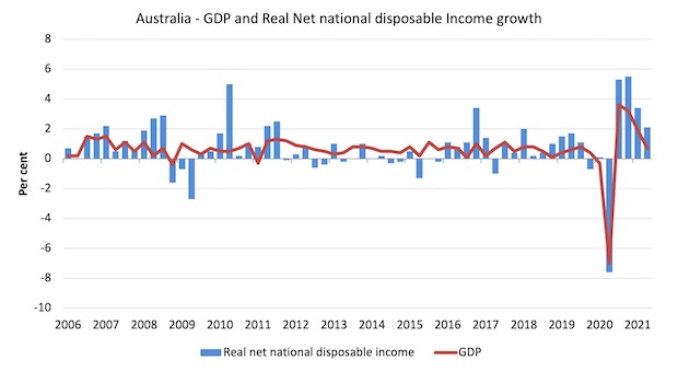
- Real net national disposable income, which is a broader measure of change in national economic well-being rose by 2.1 per cent for the quarter and was 17.3 per cent higher over the 12 months, which means that Australians are better off (on average) than they were at that point 12 months ago. A lot of that is due to the terms of trade effect (iron ore prices).
- The Household saving ratio (from disposable income) fell from 11.6 per cent to 9.7 per cent as gross disposable income fell with the withdrawal of government benefits and household spending resumed. It remains above recent trends.
Overall growth picture – growth before the current lockdowns
The data released today covers a time when Covid was under control in Australia and the economies were increasingly returning to pre-pandemic operations.
By June, towards the end of the period covered, the NSW government’s lax quarantine policy led to a new outbreak and their reaction was inadequate.
That state is now in crisis – somewhat locked down and the virus has now spread to Victoria, which has imposed an even tighter lockdown.
These ‘suspensions’ of usual economic activity are ongoing and will show up in the September-quarter national accounts data, when the economy will certainly record negative growth.
I also warned readers the other day in this blog post – Brexit is delivering better pay for British workers (on average) (August 30, 2021 – about drawing inferences on annual growth figures when the base observation used in the calculation was, for example, an historically high or low value.
The ABS – Press Release – said that:
Domestic demand drove growth of 0.7 per cent this quarter which saw continued growth across household spending, private investment and public sector expenditure. Lockdowns had minimal impact on domestic demand, with fewer lockdown days and the prolonged stay at home orders in NSW only commencing later in the quarter …
Private demand contributed 1.0 percentage points to growth …
Public demand contributed 0.7 percentage points to growth, driven by continued investment in state and local infrastructure projects …
Net trade detracted from growth driven by falls in exports …
The household saving to income ratio fell slightly …
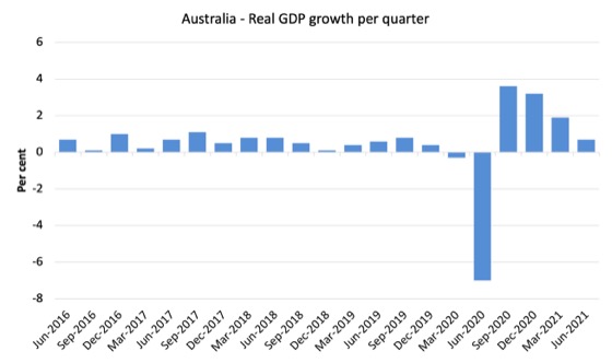
The first graph shows the quarterly growth over the last five years.
The massive 2020 outlier renders graphs like this rather binary and suppress the variations in the growth performance in prior quarters.
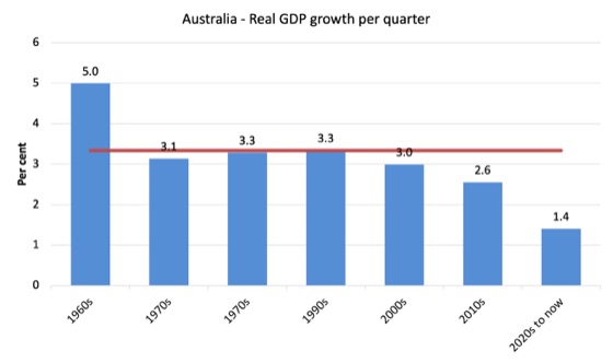
To put this into historical context, the next graph shows the decade average annual real GDP growth rate since the 1960s (the horizontal red line is the average for the entire period (3.3 per cent) from the March-quarter 1960 to the March-quarter 2020).
The 2020-to-now average is obviously is the average for the first 6 quarters of this decade and has been dominated by the pandemic.
It is obvious then how far below historical trends the growth performance of the last 2 decades have been as the fiscal surplus obsession has intensified on both sides of politics.
Even with a massive household credit binge and a once-in-a-hundred-years mining boom that was pushed by stratospheric movements in our terms of trade, our real GDP growth has declined substantially below the long-term performance.
Analysis of Expenditure Components
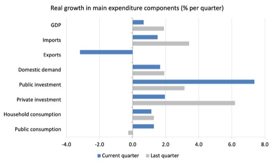
The following graph shows the quarterly percentage growth for the major expenditure components in real terms for the March-quarter 2021 (grey bars) and the June-quarter 2021 (blue bars).
Points to note:
1. Household Consumption expenditure rose by 1.1 per cent in the June-quarter (lower than previous quarter). It remains below the level recorded in the December-quarter 2019 (pre-pandemic).
2. General government consumption expenditure rose by 1.3 per cent in the June-quarter and by 4.8 per cent over the 12 months. The economy is still being significantly supported by fiscal policy but that support is now tapering. It will have to remain at these elevated levels for some period yet.
3. Private investment expenditure growth rose by 1.9 per cent for the quarter and by 13.2 per cent over the year. It is highly likely that the nascent recovery in business investment will stall given the extended lockdowns the nation is now enduring.
4. Public investment rose by 7.4 per cent for the quarter and by 14.2 per cent for the year, as a result of some very large state-level infrastructure projects.
5. Export expenditure fell by 3.2 per cent for the quarter and fell by 2.6 per cent over the 12 months. Imports rose by 1.5 per cent for the quarter and were 16.8 per cent higher over the year.
Contributions to growth
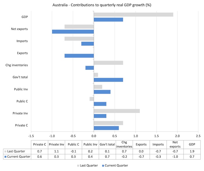
What components of expenditure added to and subtracted from the 7 per cent decline in real GDP growth in the June-quarter 2021?
The following bar graph shows the contributions to real GDP growth (in percentage points) for the main expenditure categories. It compares the June-quarter 2021 contributions (blue bars) with the March-quarter 2021 (gray bars).
In no order:
1. Household consumption expenditure contributed 0.6 points to the overall growth which is subdued relative to pre-pandemic levels.
2. Private investment expenditure contributed 0.3 points to growth. A major slowdown.
3. Growth in inventories reduced growth by 0.2 points as stocks ran down.
4. Public consumption contributed 0.3 points probably as fiscal support had to increase again in May and June to deal with the renewed infection rate. Public investment contributed positive 0.4 points. Overall, the government sector contributed 0.7 points, which means that growth would be zero if the government was running a neutral position.
5. Net exports reduced growth by 1 points – because the contribution of exports (-0.7 points) added to the import effect (-0.3 points) (remember imports are a drain on expenditure).
Material living standards rose in June-quarter 2021
The ABS tell us that:
A broader measure of change in national economic well-being is Real net national disposable income. This measure adjusts the volume measure of GDP for the Terms of trade effect, Real net incomes from overseas and Consumption of fixed capital.
While real GDP growth (that is, total output produced in volume terms) rose by 0.7 per cent in the June-quarter 2021, real net national disposable income growth rose by 2.1 per cent.
How do we explain that?
There was a rise in employee compensation (of 1.2 per cent), which helped boost household disposable income.
Further the terms of trade improved quite sharply, rising 7 per cent for the quarter, 24.1 per cent for the year. Australia once again floats on the back of the primary commodity wealth.
The following graph shows the evolution of the quarterly growth rates for the two series since the March-quarter 2006.
Household saving ratio fell from 11.6 per cent to 9.7 per cent
Gross disposable income fell by 0.3 per cent as “Social assistance benefit payments declined with reduced numbers of benefit recipients and as COVID-19 support payments were wound back.”
There was some offset by the “1.2% rise in compensation of employees which reflected increased employment and hours worked as economic activity continued to recover.”
The following graph shows the household saving ratio (% of disposable income) from the March-quarter 2000 to the current period. It shows the period leading up to the GFC, where the credit binge was in full swing and the saving ratio was negative to the rise during the GFC and then the most recent rise.
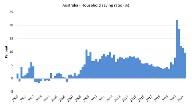
While the saving ratio might appear to be still very high, if we take a longer term view of it, the behaviour is less ‘historic’ than we might think. Back in the full employment days, when governments supported the economy and jobs with continuous fiscal deficits (mostly), households saved significant proportions of their income.
In the neoliberal period, as credit has been rammed down their throats, the saving rate dropped (to negative levels in the lead-up to the GFC).
Hopefully, households are paying off the record levels of debt they are now carrying and improving their financial viability.
To put the more recent period into an historical context, the next graph shows the household saving ratio (% of disposable income) from the March-quarter 1960 to the current period.
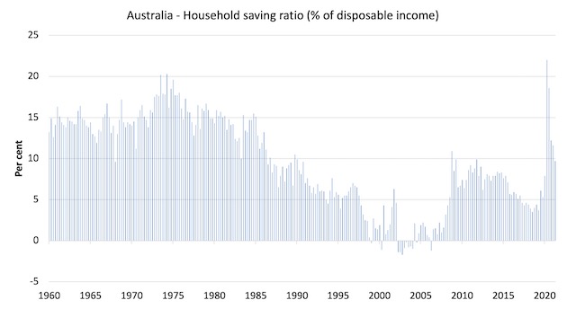
The following table shows the impact of the neoliberal era on household saving. These patterns are replicated around the world and expose our economies to the threat of financial crises much more than in pre-neoliberal decades.
The result for the current decade (2020-) is the average from March 2020 (5 quarters to date).
| Decade | Average Household Saving Ratio (% of disposable income) |
| 1960s | 14.3 |
| 1970s | 16.1 |
| 1980s | 12.0 |
| 1990s | 5.4 |
| 2000s | 2.2 |
| 2010s | 6.6 |
| 2020- | 13.7 |
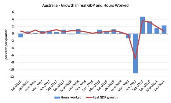
Real GDP growth and hours worked
The following graph presents quarterly growth rates in real GDP and hours worked using the National Accounts data for the last five years to the March-quarter 2021.
The March-quarter data shows that both output and hours worked is tapering downwards towards pre-pandemic levels.
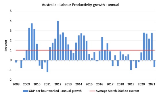
To see the above graph from a different perspective, the next graph shows the annual growth in GDP per hour worked (labour productivity) from the March-quarter 2008 quarter to the June-quarter 2021. The horizontal red line is the average annual growth since March-quarter 2008 (1.1 per cent), which itself is an understated measure of the long-term trend growth of around 1.5 per cent per annum.
The relatively strong growth in labour productivity in 2012 and the mostly above average growth in 2013 and 2014 helps explain why employment growth was lagging given the real GDP growth. Growth in labour productivity means that for each output level less labour is required.
The current negative growth reflects increased hours of work as workplaces returned to more normal patterns in the June-quarter without a commensurate increase in output.
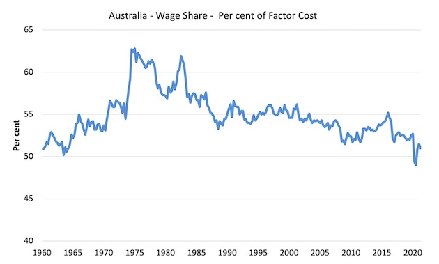
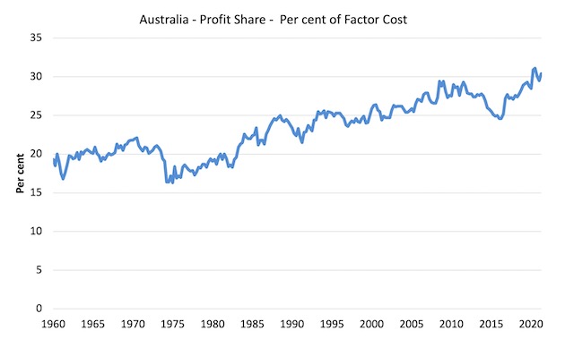
The distribution of national income – wage share falls
The wage share in national income fell by 0.5 points to 51 per cent.
The first graph shows the wage share in national income while the second shows the profit share.
The declining share of wages historically is a product of neoliberalism and will ultimately have to be reversed if Australia is to enjoy sustainable rises in standards of living without record levels of household debt being relied on for consumption growth.
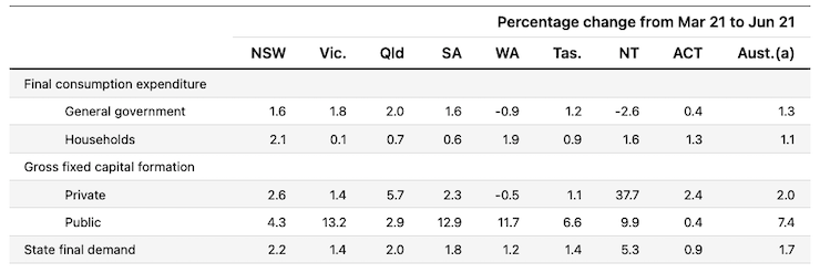
The change in final demand at the State/Territory level
The following table (taken from the ABS – thanks) shows the states/territories final demand trends for the June-quarter 2021.
The data is this table will look much worse next quarter for NSW and Victoria as a result of the current lockdowns.
Conclusion
Remember that the National Accounts data is three months old – a rear-vision view – of what has passed and to use it to predict future trends is not straightforward.
The data tells us that the economy was returning to some sense of pre-pandemic normality in the June-quarter but as a guide to where we are now, the result is misleading.
With the NSW and Victorian economies now enduring a long lockdowns the next quarter will record negative growth and there is clearly a need for increased fiscal support
That is enough for today!
(c) Copyright 2021 William Mitchell. All Rights Reserved.
Call me skeptical, but I don’t believe that an economy that is partially shutdown is doing better than Keatings recession where unemployment was in double figures.
Economic data has been bastardized over the years to make the govt look acceptable to the masses.
Bill, by you’re reckoning, how much did the change in Govt Inventories contribute to positive growth in this quarter?
Westpac attrbutes this change to the huge stocks of unwanted AstraZenaca Vaccine on Governement accounts, only the Coalition would be able to worm their way out of a technical recession off the back of a failed vaccination program and get away with it.
Eulogy
Today Mikis Theodorakis Greece’s greatest music composer, devoted Marxist activist and humanist passed away peacefully at the age of 96. Now the heavenly Angels will have a brilliant conductor in singing their devine psalms.
May God rest his soul.
Bill, you wrote:
” shows that the Australian economy grew by 0.7 per cent in the March [June?]-quarter after growing by 1.9 per cent in the March-quarter 2021. ”
I have suggested on other sites, that economists should not compare inflation over the year since a month in 2020, now in 2021. In between there was deflation. It would be better to compare the inflation over the 2 years since 2019, and point out that that is for 2 years not one. Or, divide it by 2 to get a number that is comparable to all previous ‘inflation over the last year’ numbers. These are at least better, if not good.