Today (April 18, 2024), the Australian Bureau of Statistics released the latest - Labour Force,…
Australian labour market continues to contract
The Australian Bureau of Statistics released the latest labour force data today (October 14, 2021) – Labour Force, Australia – for September 2021. The background is that the entire East Coast is in or has been in lockdown over the last few months and for the two largest labour markets (NSW and Victoria) that lockdown has been very tight. Both states are in the process of easing restrictions as vaccination rates rise. The September 2021 data reveals that the longer NSW lockdown is now impacting heavily on employment growth which is now 4.7 points below the March 2020 level. Similarly, Victoria’s employment level has fallen and is 2.1 points below the pre-pandemic level. Overall for the nation, employment fell for the second consecutive month as did the participation, the latter cushioning the rise in official unemployment. But if we take into account the participation decline, the actual unemployment rate would be 5.7 per cent rather than the official rate of 4.6 per cent. Quite a difference. The turbulence caused by the pandemic has really masked the steady decline before that and my estimates are that the true unemployment rate, taking into account the rise in hidden unemployment since August 2019, is close to 7 per cent. Again, quite a difference. The more stable ratio – the Employment-to-Population ratio plunged again in September – two months of massive declines. Last month, I predicted the situation will would worse in September – and it did. So while the unemployment rate might be relatively low by recent historical standards, the situation is dire. The lack of any significant stimulus from the federal government is telling. There is now definite evidence that further and rather massive fiscal support is required.
The summary ABS Labour Force (seasonally adjusted) estimates for September 2021 are:
- Employment decreased by 138,000 (-1.1 per cent) – Full-time employment increased by 26,700 and part-time employment decreased by 164,700.
- Unemployment increased by 8,900 to 626,000 persons.
- The official unemployment rate increased 0.1 points to 4.6 per cent.
- The participation rate fell 0.7 points to 64.5 per cent.
- The employment-population ratio fell by 0.7 points to 61.5 per cent.
- Aggregate monthly hours worked increased 15 million hours (0.9 per cent).
- Underemployment decreased by 1 points to 9.2 per cent (a rise of 119.3 thousand). Overall there are 1,247 thousand underemployed workers. The total labour underutilisation rate (unemployment plus underemployment) increased by 0.1 points to 13.9 per cent. There were a total of 1,873,4 thousand workers either unemployed or underemployed.
Employment decreased by 138,000 in September 2021
Employment fell for the second consecutive month as did the employment-population ratio.
1. Employment growth was -1.1 per cent with 138,000 (net) jobs being scrapped.
2. Full-time employment increased by 26,700 and part-time employment decreased by 164,700.
3. Employment in Australia is 110.8 thousand (net) jobs (0.9 per cent) below the pre-pandemic level in February 2020.
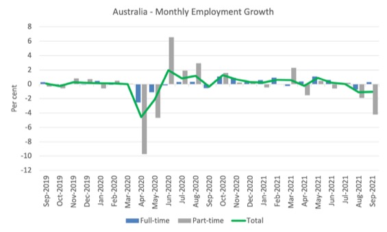
The following graph shows the month by month growth in full-time (blue columns), part-time (grey columns) and total employment (green line) for the 24 months to September 2021 using seasonally adjusted data.
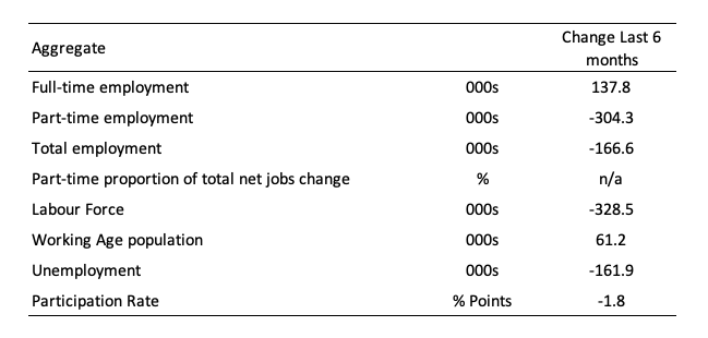
The following table provides an accounting summary of the labour market performance over the last six months to provide a longer perspective that cuts through the monthly variability and provides a better assessment of the trends.
However, with the situation in free fall at present, even a longer view of the data is likely to be misleading.
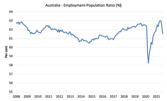
Given the variation in the labour force estimates, it is sometimes useful to examine the Employment-to-Population ratio (%) because the underlying population estimates (denominator) are less cyclical and subject to variation than the labour force estimates. This is an alternative measure of the robustness of activity to the unemployment rate, which is sensitive to those labour force swings.
The following graph shows the Employment-to-Population ratio, since February 2008 (the low-point unemployment rate of the last cycle).
It fell with the onset of the GFC, recovered under the boost provided by the fiscal stimulus packages but then went backwards again as the Federal government imposed fiscal austerity in a hare-brained attempt at achieving a fiscal surplus in 2012.
The ratio fell by 0.7 points in September 2021 to 61.5 per cent.
The last two months have seen this ratio fall sharply by 1.5 points. Quite a fall.
There are two forces working here – the denominator (population) is clearly providing favourable pressures due to the slower population growth as a result of the lack of immigration due to the on-going external border closures.
This is forcing employers to search harder for workers already in Australia rather than discriminate against the unemployed.
The numerator (employment) is clearly weaker as a result of the current lockdowns.
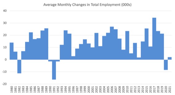
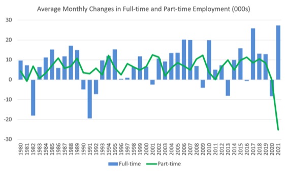
To put the current monthly performance into perspective, the following graph shows the average monthly employment change for the calendar years from 1980 to 2021 (to date).
1. The labour market weakened considerably over 2018 and that situation worsened in 2019.
2. The average employment change over 2020 was -8.4 thousand.
3. So far in 2021, the average monthly change is just 2.1 thousand (and falling rapidly).
The following graph shows the average monthly changes in Full-time and Part-time employment (lower panel) in thousands since 1980.
The interesting result is that during recessions or slow-downs, it is full-time employment that takes the bulk of the adjustment. Even when full-time employment growth is negative, part-time employment usually continues to grow.
However, this crisis is different because much of the employment losses are the result of lockdown and enforced business closures in sectors where part-time employment dominates.
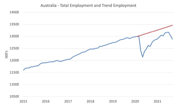
Actual and Trend Employment
The Australian labour market is still some way from catching up on the jobs that were lost during the pandemic. And the situation worsened in September 2021.
The following graph shows total employment (blue line) and what employment would have been if it had continued to grow according to the average growth rate between 2015 and February 2020.
The gap as at September 2021 rose by 163 thousand to 577.9 thousand jobs.
This is a good indicator of the extent of damage caused by the pandemic.
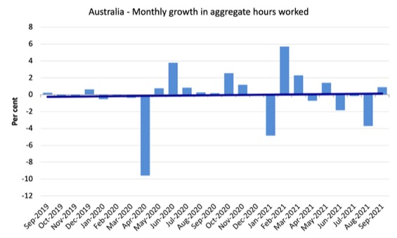
Hours worked increased 15 million hours (0.88 per cent) in September 2021
The following graph shows the monthly growth (in per cent) over the last 24 months.
The dark linear line is a simple regression trend of the monthly change – which depicts slightly positive trend.
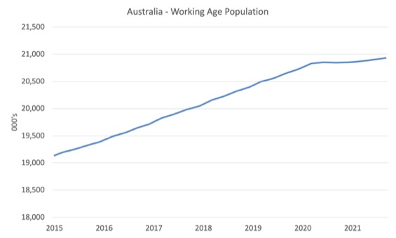
The Population Slowdown
The following graph shows Australia’s working age population (Over 15 year olds) from January 2015 to September 2021.
With the external border closed, immigration has shrunk to virtually zero and the impact is very clear.
This flattening out has forced employers to work harder to get workers and is one of the reasons unemployment is falling quite quickly, given the circumstances.
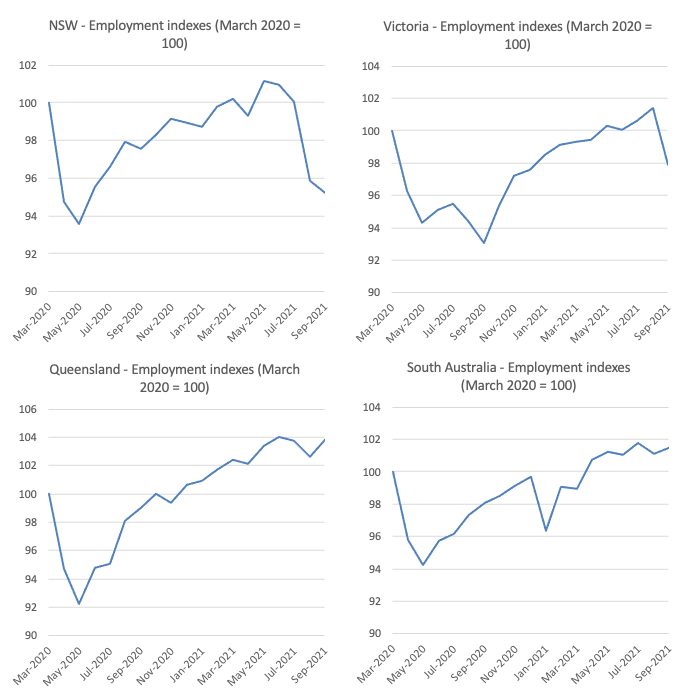
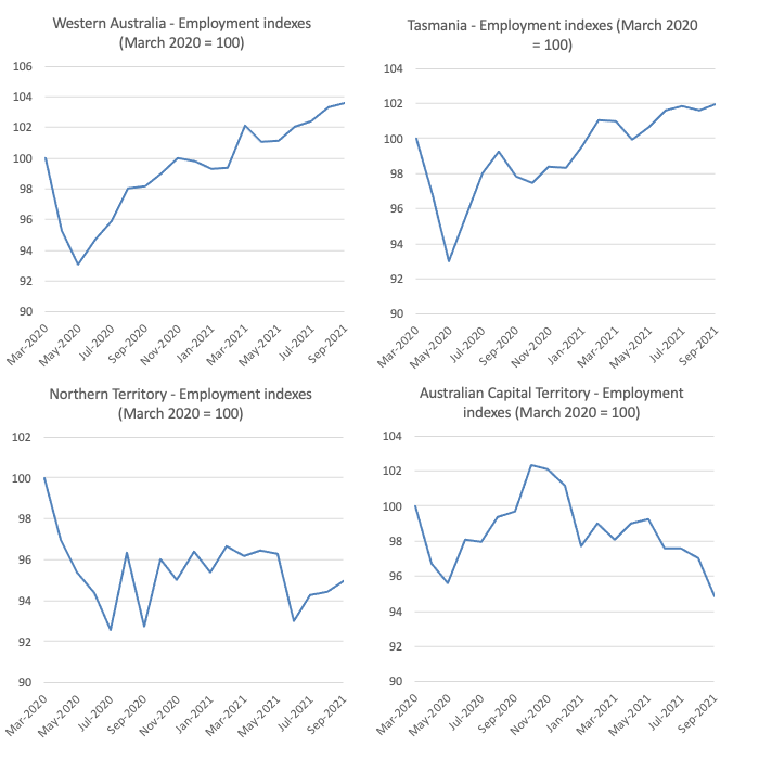
State by State Employment Trends
With renewed lockdowns imposed by Sydney and Melbourne (and to a lesser extent Canberra), the expectation was that employment would fall sharply given the extent of the restrictions.
The following graphs show the employment evolution since March 2020 by state and territory.
The impact of the, now lengthy lockdown in NSW are showing and employment is now 4.7 points below the March 2020 (pre-pandemic level) again.
The current lockdown in Victoria (shorter than NSW) has pushed employment 2.1 points below the March 2020 level.
These are the two largest states.
The states with the tightest border controls and the least COVID outbreaks (Queensland, Tasmania and Western Australia) are clearly performing the best. A lesson is in that data.
Unemployment decreased by 21,900 to 617,100 persons
The official unemployment rate rose by only 0.1 points to 4.6 per cent all despite the fall in employment by 138 thousand.
This is because the participation rate plunged and so the labour force shrunk with employment.
A terrible situation.
The unemployment rate would have been 5.6 per cent rather than 4.6 per cent if the participation rate had not fallen (see analysis below).
So not only is the slowdown in the working age population due to the restrictions on the external border taking pressure of unemployment, but, over the last two months, some of those who would normally be either employed or unemployed have given up looking for work due to the slowdown in opportunities for work.
They are considered the hidden unemployed.
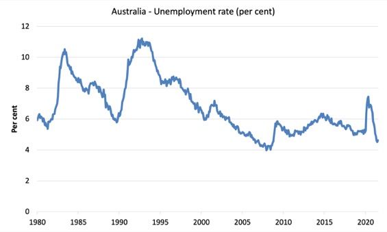
The following graph shows the national unemployment rate from February 1980 to September 2021. The longer time-series helps frame some perspective to what is happening at present.
Assessment:
1. Official unemployment is now lower than the pre-pandemic February 2020 level – but we shouldn’t use that as the aspirational benchmark given that the economy was already in bad shape at that point.
2. Further, once we factor in those who have been forced out of the labour force by the dearth of employment opportunities, the situation is much worse.
2. The usual cyclical asymmetry where unemployment rises quickly and falls very slowly is not being observed this cycle because of the population growth slowdown.
2. There is still considerable slack in the labour market that could be absorbed with further fiscal stimulus.
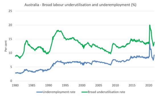
Broad labour underutilisation increased by 0.1 points to 13.9 per cent in September 2021
The results for September 2021 are (seasonally adjusted):
Underemployment decreased by 1 points to 9.2 per cent (a rise of 119.3 thousand). Overall there are 1,247 thousand underemployed workers. The total labour underutilisation rate (unemployment plus underemployment) increased by 0.1 points to 13.9 per cent. There were a total of 1,873,4 thousand workers either unemployed or underemployed
1. Underemployment decreased by 20.6 thousand.
2. The underemployment rate fell by 1 points to 9.2 per cent.
2. Overall there are 1,247 thousand underemployed workers.
3. The total labour underutilisation rate (unemployment plus underemployment) increased by 0.1 points to 13.9 per cent as unemployment rose.
4. There were a total of 1,873.4 thousand workers either unemployed or underemployed.
The following graph plots the seasonally-adjusted underemployment rate in Australia from February 1980 to the September 2021 (blue line) and the broad underutilisation rate over the same period (green line).
The difference between the two lines is the unemployment rate.
The three cyclical peaks correspond to the 1982, 1991 recessions and the more recent downturn.
The other difference between now and the two earlier cycles is that the recovery triggered by the fiscal stimulus in 2008-09 did not persist and as soon as the ‘fiscal surplus’ fetish kicked in in 2012, things went backwards very quickly.
The two earlier peaks were sharp but steadily declined. The last peak fell away on the back of the stimulus but turned again when the stimulus was withdrawn.
Aggregate participation rate decreased by 0.7 points to 64.5 per cent
As noted above, the decline in official unemployment was driven by the fall in participation – that is, unemployed workers seeking jobs.
The participation rate is now 1.6 points below the recent peak recorded in August 2019.
The labour force contracted by 129.1 thousand persons in August – the second consecutive month of two large contractions as workers became inactive due to a lack of job opportunities.
So even though employment contracted by 138 thousand (net), the labour force also fell, which meant that official unemployment only rose by 8,900 (the difference).
In other words, the official unemployed have become hidden unemployed – which means the official unemployment figures mask how bad the situation has become.
What would have been the case if the participation rate had not fallen?
We can make two calculations:
1. Just the monthly implication.
2. The implication of the participation rate being below its most recent peak of 66.2 per cent in August 2019.
The labour force is a subset of the working-age population (those above 15 years old). The proportion of the working-age population that constitutes the labour force is called the labour force participation rate. Thus changes in the labour force can impact on the official unemployment rate, and, as a result, movements in the latter need to be interpreted carefully. A rising unemployment rate may not indicate a recessing economy.
The labour force can expand as a result of general population growth and/or increases in the labour force participation rates.
The following Table shows the breakdown in the changes to the main aggregates (Labour Force, Employment and Unemployment) and the impact of the rise in the participation rate.
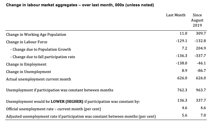
The change in the labour force in September 2021 was the outcome of two separate factors:
- The underlying population growth added 7.2 thousand persons to the labour force. The population growth impact on the labour force aggregate is relatively steady from month to month but has slowed over the last year due to the external border restrictions which have drastically reduced migration rates; and
- The fall in the participation rate meant that there were 136.3 thousand workers exiting the labour force (relative to what would have occurred had the participation rate remained unchanged).
- The net result was that the labour force fell by 129.1 thousand.
Assessment:
1. If the participation rate had not have fallen in September 2021, total unemployment, given the current employment level, would have been 762.3 thousand rather than the official count of 626 thousand as recorded by the ABS – a difference of 129.1 thousand workers (the ‘participation effect’).
2. Without the fall in the participation rate in September 2021, the official unemployment rate would have been 5.6 per cent (rounded) rather than its current value of 4.6 per cent).
3. In other words, the labour underutilisation is being hidden outside the official labour force.
4. Relative to the August 2019 peak participation rate, the unemployment rate would be 7 per cent had the participation rate in September 2021 not fallen.
Unemployment and broad labour underutilisation indexes – last four downturns
The following graph captures the evolution of the unemployment rates for the 1982, 1991, GFC and COVID-19 downturns.
For each episode, the graph begins at 100 – which is the index value of the unemployment rate at the low-point of each cycle (June 1981; December 1989; February 2008, and February 2020, respectively).
We then plot each episode out for 90 months.
For 1991, the peak unemployment which was achieved some 38 months after the downturn began and the resulting recovery was painfully slow. While the 1982 recession was severe the economy and the labour market was recovering by the 26th month. The pace of recovery for the 1982 once it began was faster than the recovery in the current period.
During the GFC crisis, the unemployment rate peaked after 16 months (thanks to a substantial fiscal stimulus) but then started rising again once the stimulus was prematurely withdrawn and a new peak occurred at the 80th month.
The COVID-19 downturn was obviously worse than any of the previous recessions shown but because of its unique nature – the job losses being largely driven by lockdowns etc.
The graph provides a graphical depiction of the speed at which each recession unfolded (which tells you something about each episode) and the length of time that the labour market deteriorated (expressed in terms of the unemployment rate).
After 19 months, the unemployment had risen from 100 to:
1. 173.1 index points in 1982 and falling (before a further rise).
2. 165.5 index points in 1991 and rising.
3. 142.2 index points in the GFC and falling.
4. 90.3 index points currently and rising (but note the participation rate analysis).
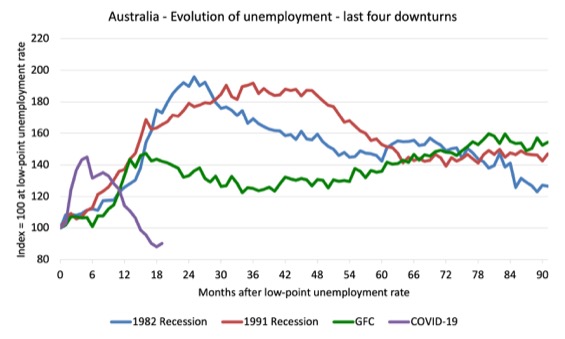
Note that these are index numbers and only tell us about the speed of decay rather than levels of unemployment.
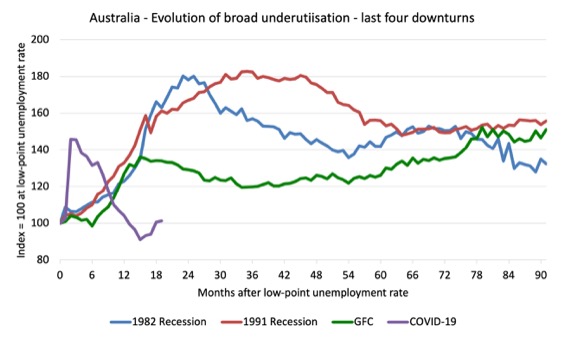
The next graph performs the same operation for the broad labour underutilisation rate (sum of official unemployment and underemployment).
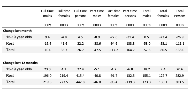
Teenage labour market continues to deteriorate in September 2021 – females endure the burden disproportionately
The following Table shows the distribution of net employment creation in the last month and the last 12 months by full-time/part-time status and age/gender category (15-19 year olds and the rest).
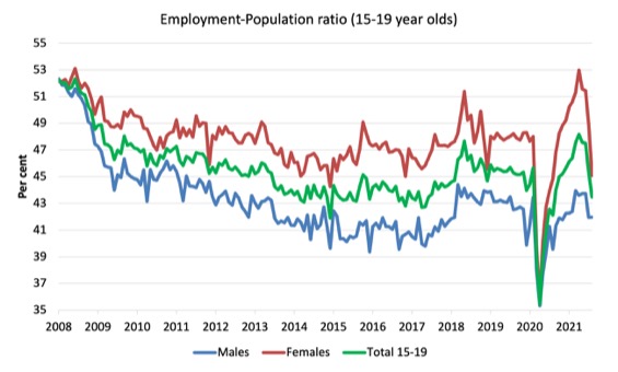
To put the teenage employment situation in a scale context (relative to their size in the population) the following graph shows the Employment-Population ratios for males, females and total 15-19 year olds since June 2008.
You can interpret this graph as depicting the loss of employment relative to the underlying population of each cohort. We would expect (at least) that this ratio should be constant if not rising somewhat (depending on school participation rates).
1. The male ratio has fallen by 10.4 percentage points since February 2008, and in August it was stable. It is now 1.5 points below its level in March 2020.
2. The female ratio has fallen by 7.1 percentage points since February 2008, and in August it fell by 3.9 points. It is now 2.9 points below its level in March 2020.
3. The overall teenage employment-population ratio has fallen by 8.8 percentage points since February 2008, is now 2.2 points above its level in March 2020. It fell by 1.9points over the month.
4. The contraction due to the recent lockdowns has impacted badly on teenage females relative to the negative impact on males.
Conclusion
My standard monthly warning: we always have to be careful interpreting month to month movements given the way the Labour Force Survey is constructed and implemented.
My overall assessment is:
1. The on-going impacts of the pandemic are once again killing job prospects and the lack of employment opportunities is pushing people out of the official labour force in substantial numbers.
2. Without that participation response, unemployment would have been much higher.
3. What is preventing a worse outcome is the fact that the lower population growth due to the external border closures, means that employers are now having to absorb the unemployed more quickly to maintain their operations.
3. There is now definite evidence that further fiscal support is required and the silence from the Federal government reveals their disdain for the plight of the workers.
That is enough for today!
(c) Copyright 2021 William Mitchell. All Rights Reserved.
Just discovered you’re post ‘ABC Bias: What might have been’. I really enjoyed watching that. 😉
“… It issues the currency at its discretion. What meaning is there to saving up something you can issue at will. None at all.”
One can only imagine their silence and their faces at that point. Haha
@FT
Very interesting and enlightening conversation! Many thanks for pointing it out. I can only find the transcription posted on this blog (not the video version).
I love the words, Prof. Bill used – “thinking economists”, I guess the other side of the term would be regurgitating economist.
As I get older, I don’t blame people for this as much any more because human operates very much based on bounded reality and intuition, not rational decision making process, all the time.
On top of this, they will have to have the will and courage to overcome the basic human nature and the psychological barriers like confirmation bias, herd mentality, selective perception, availability bias, randomness attribution error and so on.
Rational judgement/decision making or evidences based DM via observations or conducting researches, or reading about it in journals are mainly things for people in the academia and surrounding circles who have the access or can afford the privilege.
Another problem I see is that MMT is a lens whereas our discussions often move between lens (understanding) to the ideology and values (preferred public policy choices).
This adds to the complications in our discourse and learning process.
To overcome this, I would be clear when we talk about the lens and when we talk about policy making and its derivatives or choices.
They are intertwined, but at least we should start with the same assumptions or correct assumptions when discoursing.
Otherwise, we might be talking about two different things all the time, and I feel that is where we and the public are today.