Today (March 6, 2024), the Australian Bureau of Statistics released the latest - Australian National…
Australian economy contracts and workers national income share declines further
Today (December 1, 2021), the Australian Bureau of Statistics released the latest – Australian National Accounts: National Income, Expenditure and Product, September 2021 – which shows that the Australian economy contracted 1.9 per cent in the September-quarter. The annual growth rate of 3.9 per cent is relatively meaningless given the base was severely affected by the lockdowns last year. The decline in economic activity was driven by private demand, which contracted by 2.4 percentage points – mostly due to a decline in household final consumption expenditure. Public spending contributed 0.7 points to the GDP figure thus attenuating, to some extent, the fall in private demand. The increase in spending on health by both Federal and State governments was not large enough to avoid the contraction though. Real net national disposable income fell by 3.8 per cent, but rose by 7.8 per cent over the year. GDP per capita fell by 2 per cent in the September-quarter. There was a massive boost in the household saving ratio (from 11.8 per cent to 19.8 per cent) as a result of the tight lockdowns in Victoria and NSW during this period as a result of the renewed fiscal support. We will have to see how the rebound is next quarter now that the restrictions have been significantly eased. The most worrying thing about the data today is that the wage share in national income slumped further while the profit share in a smaller pie rose. Something needs to be done about that.
The main features of the National Accounts release for the September-quarter 2021 were (seasonally adjusted):
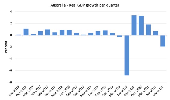
- Real GDP decreased by 1.9 per cent for the quarter. The annual growth rate was 3.9 per cent
- Australia’s Terms of Trade (seasonally adjusted) rose by 0.4 per cent in the quarter (a significant drop on previous results) but was up by a very strong 23.1 per cent over the 12 month period. This is due to higher export prices for our primary commodities (iron ore).
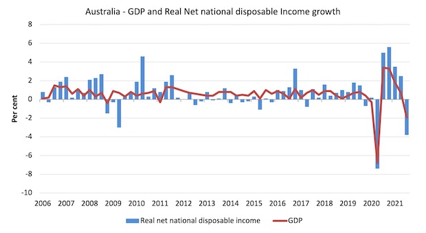
- Real net national disposable income, which is a broader measure of change in national economic well-being fell by 3.8 per cent for the quarter but was 7.8 per cent higher over the 12 months, which means that Australians are better off (on average) than they were at that point 12 months ago but poorer than their status in the June-quarter. A lot of that is due to the terms of trade effect (iron ore prices).
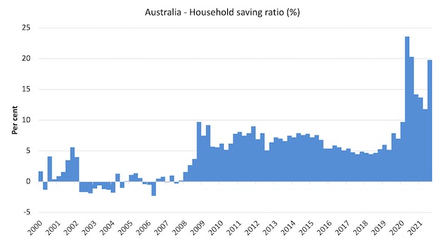
- The Household saving ratio (from disposable income) rose from 11.7 to 19.8 per cent as gross disposable income was supported by government income payments and spending declined.
Overall growth picture – the Winter lockdown lead to contraction as expected
The national contraction was driven largely by the lockdown effects in Victoria, NSW and the ACT. Economic activity actually grew modestly in the other states.
The ABS – Press Release – said that:
Domestic demand drove the fall, with prolonged lockdowns across NSW, Victoria and the ACT resulting in a substantial decline in household spending. The fall in domestic demand was only partly offset by growth in net trade and public sector expenditure. GDP in the September quarter 2021 was 0.2 per cent below the December quarter 2019 pre-pandemic level …
Private demand detracted 2.4 percentage points from GDP, with a 4.8 per cent fall in household final consumption expenditure. Household spending on services fell 5.8 per cent, with falls in hotels, cafes and restaurants, recreation and culture and transport services.
Public demand contributed 0.7 percentage points to GDP growth …
Net trade also contributed to growth … Imports of goods fell, reflecting continued global supply constraints and a fall in domestic demand.
The first graph shows the quarterly growth over the last five years.
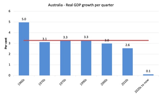
To put this into historical context, the next graph shows the decade average annual real GDP growth rate since the 1960s (the horizontal red line is the average for the entire period (3.3 per cent) from the March-quarter 1960 to the September-quarter 2021).
The 2020-to-now average is obviously is the average for the first 7 quarters of this decade and has been dominated by the pandemic.
It is obvious then how far below historical trends the growth performance of the last 2 decades have been as the fiscal surplus obsession has intensified on both sides of politics.
Even with a massive household credit binge and a once-in-a-hundred-years mining boom that was pushed by stratospheric movements in our terms of trade, our real GDP growth has declined substantially below the long-term performance.
Analysis of Expenditure Components
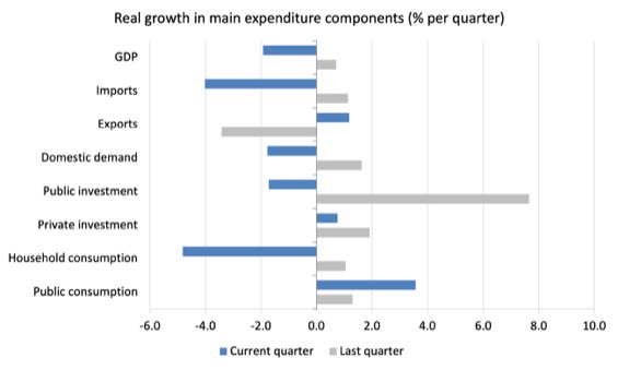
The following graph shows the quarterly percentage growth for the major expenditure components in real terms for the March-quarter 2021 (grey bars) and the September-quarter 2021 (blue bars).
Points to note:
1. Household Consumption expenditure fell by 4.8 per cent in the September-quarter. It remains well below the level recorded in the March-quarter 2020 (pre-pandemic).
2. General government consumption expenditure rose by 3.6 per cent in the September-quarter and by 5.8 per cent over the 12 months. The economy is still being significantly supported by fiscal policy. It will have to remain at these elevated levels for some period yet.
3. Private investment expenditure growth rose by 0.7 per cent for the quarter and by 12.9 per cent over the year.
4. Public investment fell 1.7 per cent for the quarter but was up by 11.7 per cent for the year, as a result of some very large state-level infrastructure projects.
5. Export expenditure rose by 1.2 per cent for the quarter and 3.3 per cent over the 12 months. Imports felll sharply by 4 per cent for the quarter and were 5.8 per cent higher over the year.
Contributions to growth
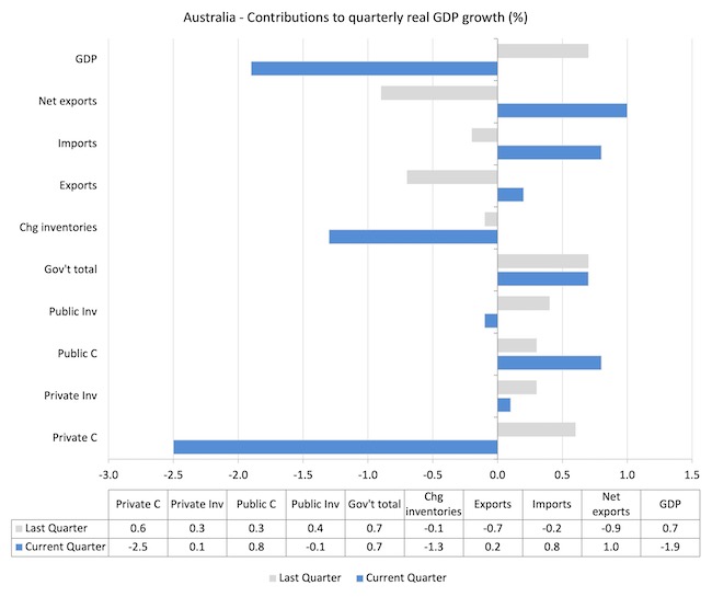
What components of expenditure added to and subtracted from the 1.9 per cent decline in real GDP growth in the September-quarter 2021?
The following bar graph shows the contributions to real GDP growth (in percentage points) for the main expenditure categories. It compares the September-quarter 2021 contributions (blue bars) with the March-quarter 2021 (gray bars).
In no order:
1. Household consumption expenditure detracted from the overall growth by 2.5 points.
2. Public Investment reduced growth by 0.1 points.
3. Growth in inventories reduced growth by 1.3 points as sales fell.
4. Private investment expenditure contributed 0.1 points to growth. A major slowdown.
5. Public consumption contributed 0.8 points as fiscal support had to increase again in May and June to deal with the renewed infection rates along the East Coast. Public investment reduced growth by 0.1 points. Overall, the government sector contributed 0.7 points.
5. Net exports contributed to growth by 1 point – because the contribution of exports (0.2 points) added to the import effect (0.8 points) (remember imports are a drain on expenditure).
Material living standards fell in September-quarter 2021
The ABS tell us that:
A broader measure of change in national economic well-being is Real net national disposable income. This measure adjusts the volume measure of GDP for the Terms of trade effect, Real net incomes from overseas and Consumption of fixed capital.
While real GDP growth (that is, total output produced in volume terms) fell by 1.9 per cent in the September-quarter 2021, real net national disposable income growth fell by 3.8 per cent.
How do we explain that?
Mostly because there was a rise in household gross disposable income (of 4.6 per cent) as a result of public fiscal support payments.
The following graph shows the evolution of the quarterly growth rates for the two series since the March-quarter 2006.
Household saving ratio rose from 11.8 per cent to 19.8 per cent
The combination of the rise in Gross disposable income as government support payments increased due to the renewed infection rate and a lack of spending opportunities as a result of the extensive lockdowns in NSW, ACT and Victoria meant that the saving ratio soared to 19.8 per cent.
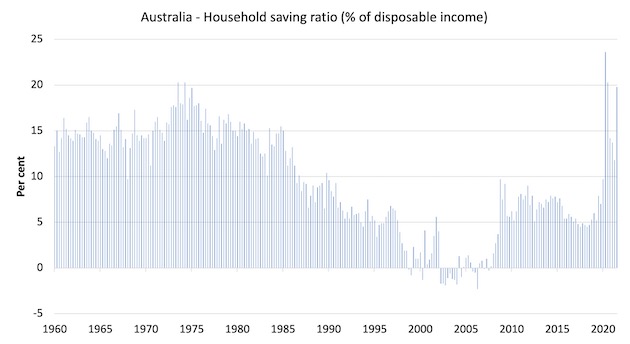
The following graph shows the household saving ratio (% of disposable income) from the March-quarter 2000 to the current period. It shows the period leading up to the GFC, where the credit binge was in full swing and the saving ratio was negative to the rise during the GFC and then the most recent rise.
While the saving ratio might appear to be still very high, if we take a longer term view of it, the behaviour is less ‘historic’ than we might think. Back in the full employment days, when governments supported the economy and jobs with continuous fiscal deficits (mostly), households saved significant proportions of their income.
In the neoliberal period, as credit has been rammed down their throats, the saving rate dropped (to negative levels in the lead-up to the GFC).
Hopefully, households are paying off the record levels of debt they are now carrying and improving their financial viability.
To put the more recent period into an historical context, the next graph shows the household saving ratio (% of disposable income) from the March-quarter 1960 to the current period.
The following table shows the impact of the neoliberal era on household saving. These patterns are replicated around the world and expose our economies to the threat of financial crises much more than in pre-neoliberal decades.
The result for the current decade (2020-) is the average from March 2020 (5 quarters to date).
| Decade | Average Household Saving Ratio (% of disposable income) |
| 1960s | 14.4 |
| 1970s | 16.2 |
| 1980s | 12.0 |
| 1990s | 5.1 |
| 2000s | 1.4 |
| 2010s | 6.4 |
| 2020- | 16.2 |
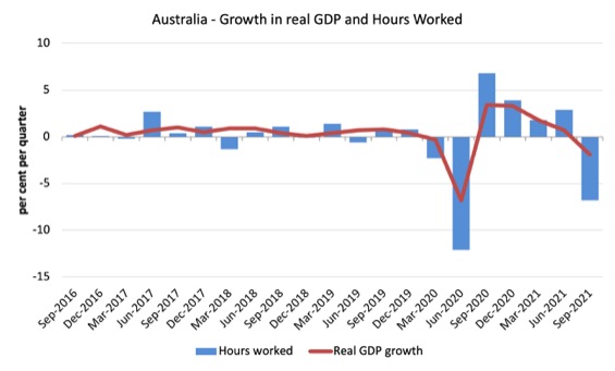
Real GDP growth and hours worked
The following graph presents quarterly growth rates in real GDP and hours worked using the National Accounts data for the last five years to the September-quarter 2021.
The data shows that both output and hours worked fell as expected.
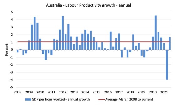
To see the above graph from a different perspective, the next graph shows the annual growth in GDP per hour worked (labour productivity) from the March-quarter 2008 quarter to the September-quarter 2021. The horizontal red line is the average annual growth since March-quarter 2008 (1.1 per cent), which itself is an understated measure of the long-term trend growth of around 1.5 per cent per annum.
The relatively strong growth in labour productivity in 2012 and the mostly above average growth in 2013 and 2014 helps explain why employment growth was lagging given the real GDP growth. Growth in labour productivity means that for each output level less labour is required.
As a result of output falling less than hours worked fell, productivity rose.
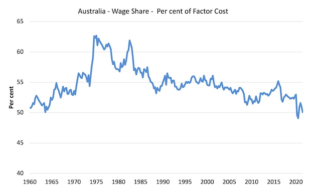
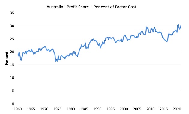
The distribution of national income – wage share continues to fall
The wage share in national income fell by 0.9 points to 50.1 per cent while the profit share rose by 0.6 points (in a declining overall result).
The first graph shows the wage share in national income while the second shows the profit share.
The declining share of wages historically is a product of neoliberalism and will ultimately have to be reversed if Australia is to enjoy sustainable rises in standards of living without record levels of household debt being relied on for consumption growth.
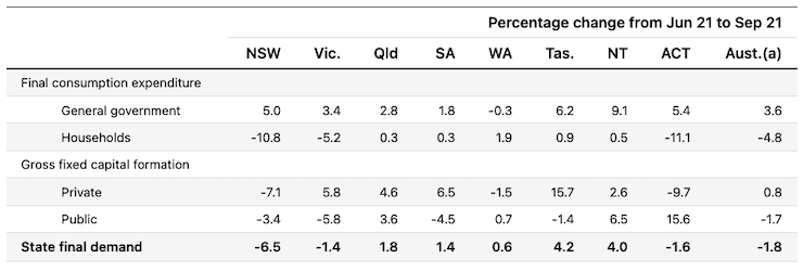
The change in final demand at the State/Territory level
The following table (taken from the ABS – thanks) shows the states/territories final demand trends for the September-quarter 2021.
The three lockdown states/territories – NSW, Victoria and ACT – all went backwards as a consequence.
Conclusion
Remember that the National Accounts data is three months old – a rear-vision view – of what has passed and to use it to predict future trends is not straightforward.
The data tells us that the economy took a hit as a result of the lockdowns.
I expect that there will be a relatively strong result in the December-quarter (data to be published in March 2022) given that the lockdown restrictions have been significantly reduced now.
That is enough for today!
(c) Copyright 2021 William Mitchell. All Rights Reserved.
This Post Has 0 Comments