Today (April 18, 2024), the Australian Bureau of Statistics released the latest - Labour Force,…
US labour market – job shortfall continues with government sector undermining job creation
Last Friday (December 3, 2021), the US Bureau of Labor Statistics (BLS) released their latest labour market data – Employment Situation Summary – November 2021 – which reported a total payroll employment rise of only 210,000 jobs in August and a 0.4 points decline in the official unemployment rate to 4.2 per cent, while participation rose by 0.2 points. This is one of those crazy months when the payroll figure suggests a slowing down while the labour force survey paints a fairly rosy outlook with strong jobs growth stimulating rising participation and a declining labour underutilisation rate. We will have to wait until next month to see how it all works out. But the undeniable facts are that the economy is still creating work – in an unequal pattern across the sectors and the government sector is undermining the benefits of that creation. The US labour market is still 3,912 thousand jobs short from where it was at the end of February 2020, which helps to explain why there are no fundamental wage pressures emerging. Any analyst who is claiming the US economy is close to full employment hasn’t looked at the data.
Overview for November 2021:
- Payroll employment increased by 210,000.
- Total labour force survey employment rose by 1,136 thousand net (0.74 per cent).
- The seasonally adjusted labour force 594 thousand net (0.37 per cent).
- The employment-population ratio rose 0.4 points to 59.2 per cent (down from February 2020 peak of 61.1 per cent).
- Official unemployment fell by 542 thousand to 6,877 thousand.
- The official unemployment rate fell by 0.4 points to 4.2 per cent.
- The participation rate rose by 0.2 points to 61.8 per cent.
- The broad labour underutilisation measure (U6) fell by 0.5 points to 7.8 per cent.
For those who are confused about the difference between the payroll (establishment) data and the household survey data you should read this blog post – US labour market is in a deplorable state – where I explain the differences in detail.
Some months the difference is small, while other months, such as in November is larger.
Payroll employment trends
The BLS noted that:
Total nonfarm payroll employment rose by 210,000 in November. Thus far this year, monthly job growth has averaged 555,000. Nonfarm employment has increased by 18.5 million since April 2020 but is down by 3.9 million, or 2.6 percent, from its pre-pandemic level in February 2020.
Professional and business services added 90,000 jobs in November … is 69,000 below its level in February 2020 …
Employment in transportation and warehousing increased by 50,000 in November and is 210,000 above its February 2020 level …
Construction employment rose by 31,000 in November … is 115,000 below its February 2020 level …
Manufacturing added 31,000 jobs in November … is down by 253,000 since February 2020 …
Employment in financial activities continued to trend up in November (+13,000) and is 30,000 above its February 2020 level …
Employment in retail trade declined by 20,000 in November … is 176,000 lower than in February 2020 …
Employment in leisure and hospitality changed little in November (+23,000) … is down by 1.3 million, or 7.9 percent, since
February 2020 …Health care employment was about unchanged in November (+2,000) … is down by 450,000 since February 2020 …
In November, employment showed little change in other major industries, including mining, wholesale trade, information, other services, and public and private education.
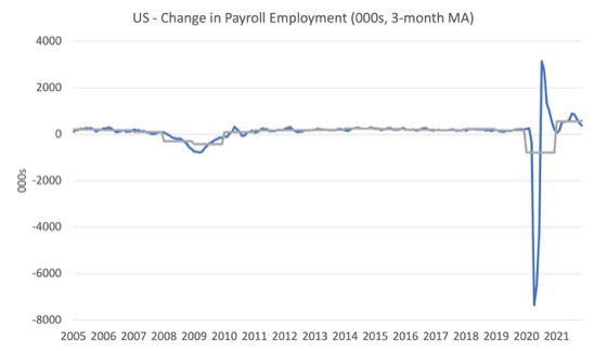
The first graph shows the monthly change in payroll employment (in thousands, expressed as a 3-month moving average to take out the monthly noise). The gray lines are the annual averages.
The data swings are still large and dwarf the past history.
The US labour market is still 3,912 thousand jobs short from where it was at the end of February 2020 and the commentary from the BLS above tells us how this shortfall is distributed across the sectors.
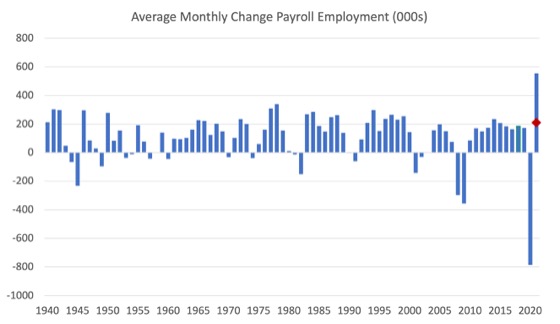
The next graph shows the same data in a different way – in this case the graph shows the average net monthly change in payroll employment (actual) for the calendar years from 2005 to 2021.
The red marker on the column is the current month’s result.
The final average for 2019 was 168 thousand.
The final average for 2020 was -785 thousand.
The average for 2021 (so far) is 555 thousand.
Labour Force Survey – employment growth continues
The data for November 2021 reveals:
1. Employment as measured by the household survey rose by 1,1366 thousand net (0.74 per cent).
2. The labour force rose by 594 thousand net (0.37 per cent).
3. The participation rate rose by 0.2 points to 61.8 per cent.
4. As a result (in accounting terms), total measured unemployment fell by 542 thousand to 6.877 thousand and the unemployment rate fell by 0.4 points to 4.2 per cent.
The following graph shows the evolution of the unemployment rate
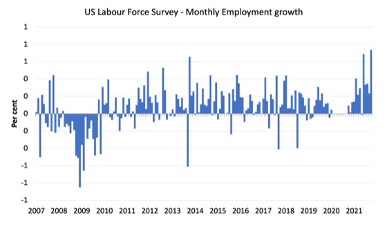
The following graph shows the monthly employment growth since January 2008 and excludes the extreme observations (outliers) between March 2020 and October 2020, which distort the current period relative to the pre-pandemic period.
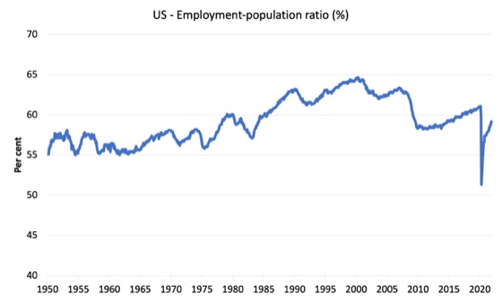
The Employment-Population ratio is a good measure of the strength of the labour market because the movements are relatively unambiguous because the denominator population is not particularly sensitive to the cycle (unlike the labour force).
The following graph shows the US Employment-Population from January 1950 to November 2021.
While the ratio fluctuates a little, the April 2020 ratio fell by 8.6 points to 51.3 per cent, which is the largest monthly fall since the sample began in January 1948.
In November 2021, the ratio rose by 0.4 points to 59.2 per cent.
It is still well down on the level in February 2020 (61.1 per cent).
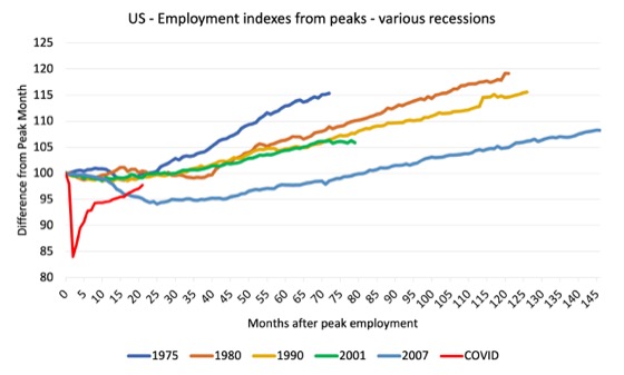
As a matter of history, the following graph shows employment indexes for the US (from US Bureau of Labor Statistics data) for the five NBER recessions since the mid-1970s and the current 2020-COVID crisis.
They are indexed at the employment peak in each case and we trace the data out for each episode until one month before the next peak.
So you get an idea of:
1. The amplitude (depth) of each cycle in employment terms.
2. The length of the cycle in months from peak-trough-peak.
The early 1980s recession was in two parts – a short downturn in 1981, which was followed by a second major downturn 12 months later in July 1982 which then endured.
Other facts:
1. Return to peak for the GFC was after 78 months.
2. The previous recessions have returned to the 100 index value after around 30 to 34 months.
3. Even at the end of the GFC cycle (146 months), total employment in the US had still only risen by 8.3 per cent (since December 2007), which is a very moderate growth path as is shown in the graph.
The COVID collapse was something else but the recent gains are evident, although the gains have been slowing relative to early in the recovery.
After 21 months, total employment is still 2.2 points below the February 2020 level.
Unemployment and underutilisation trends
The BLS note that:
The unemployment rate fell by 0.4 percentage point to 4.2 percent in November. The number of unemployed persons fell by 542,000 to 6.9 million. Both measures are down considerably from their highs at the end of the February-April 2020 recession. However, they remain above their levels prior to the coronavirus (COVID-19) pandemic (3.5 percent and 5.7 million, respectively, in February 2020) …
The number of long-term unemployed (those jobless for 27 weeks or more), at 2.2 million, changed little in November but is 1.1 million higher than in February 2020. The long-term unemployed accounted for 32.1 percent of the total unemployed in November.
The first graph shows the official unemployment rate since January 1994.
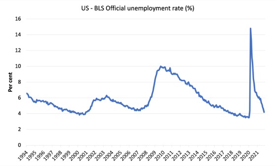
The official unemployment rate is a narrow measure of labour wastage, which means that a strict comparison with the 1960s, for example, in terms of how tight the labour market, has to take into account broader measures of labour underutilisation.
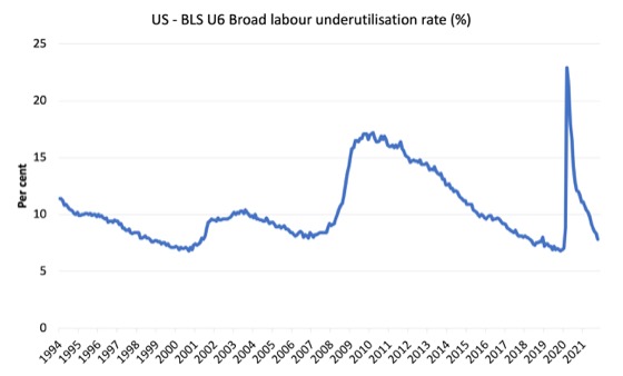
The next graph shows the BLS measure U6, which is defined as:
Total unemployed, plus all marginally attached workers plus total employed part time for economic reasons, as a percent of all civilian labor force plus all marginally attached workers.
It is thus the broadest quantitative measure of labour underutilisation that the BLS publish.
Pre-COVID, U6 was at 6.8 per cent (December 2019).
In November 2021 the U6 measure was 7.8 per cent, a decline of 0.5 points on the previous month.
Some of this fall was due to the decline in official unemployment and the further decline in the workers in the part-time for economic reasons cohort (the US indicator of underemployment).
These influences were offset by the rise in the participation rate, which added more workers to the labour force looking for work.
Ethnicity and Education
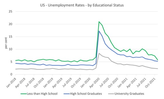
The next graph shows the evolution of unemployment rates for three cohorts based on educational attainment: (a) those with less than high school completion; (b) high school graduates; and (c) university graduates.
As usual, when there is a crisis, the least educated suffer disproportionately.
In the collapse in employment, the unemployment rates rose by:
- 14.1 points for those with less than high-school diploma.
- 13.0 points for high school, no college graduates.
- 5.9 points for those with university degrees.
The period since April 2020 has seen the unemployment rate fall by:
- 15.3 points for those with less than high-school diploma meaning the unemployment rate is now 1.2 points below the March 2020 level.
- 12.1 points for high school, no college graduates meaning the unemployment rate is now 0.9 points above the March 2020 level.
- 6.1 points for those with university degrees meaning the unemployment rate is now 0.2 points below the March 2020 level.
In the last month, the change in the unemployment rate has been:
- a fall of 1.7 points for those with less than high-school diploma.
- a fall of 0.2 points for high school, no college graduates.
- a fall of 0.1 points for those with university degrees.
So the fall in official unemployment in November 2021 was driven mostly by the decline in those with less than high-school diploma.
In the US context, the trends in trends in unemployment by ethnicity are interesting.
Two questions arise:
1. How have the Black and African American and White unemployment rate fared in the post-GFC period?
2. How has the relationship between the Black and African American unemployment rate and the White unemployment rate changed since the GFC?
Summary:
1. All the series move together as economic activity cycles. The data also moves around a lot on a monthly basis.
2. The Black and African American unemployment rate was 6.8 per cent in March 2020, rose to 16.7 per cent in May and is at 6.5 per cent in November 2021. In the last month, it was fell rather sharply by 0.8 points.
3. The Hispanic or Latino unemployment rate was 6 per cent in March 2020, rose to 18.9 per cent in April and is at 5.2 per cent in November 2021. In the last month, it fell by 0.7 points.
4. The White unemployment rate was 3.9 per cent in March 2020, rose to 14.1 per cent in April and fell to 3.7 per cent in November 2021. In the last month, it fell by 0.3 points.
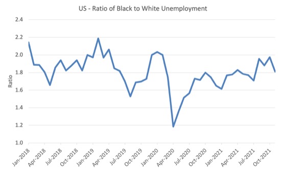
The next graph shows the Black and African American unemployment rate to White unemployment rate (ratio) from January 2018, when the White unemployment rate was at 3.5 per cent and the Black or African American rate was at 7.5 per cent.
This graph allows us to see whether the relative position of the two cohorts has changed since the crisis.
If it is rising, then the unemployment rate of the Black and African American cohort is either rising faster than the white unemployment rate or falling more slowly (or a combination of that relativity).
While there is month-to-month variability, the data shows that, in fact, through to mid-2019, the position of Black and African Americans had improved in relative terms (to Whites), although that just reflected the fact that the White unemployment was so low that employers were forced to take on other ‘less preferred’ workers if they wanted to maintain growth.
In April 2019, the ratio was 2.1 (meaning the Black and African American unemployment rate was more than 2 times the White rate).
By April 2020, the ratio had fallen to its lowest level of 1.2, reflecting the improved relative Black and African American position.
As the pandemic hit, the ratio rose and peaked at 1.8 in October 2020.
In November 2021, the ratio was 1.81, a fall of 0.17 points from the previous month, which indicates that the relative position of the Black and African American cohort has improved quite significantly.
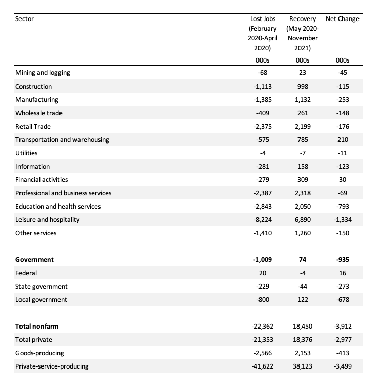
Special analysis this month – Sectoral employment trends
A closer look at the data this month shows some quite stark differences in employment fortunes across the industrial divide.
The following table summarises the situation.
It shows the lost jobs (thousands) between February 2020 and the trough in April 2020, then the net jobs gained since May 2020 up to November 2021, and the net change since February 2020.
This table shows how the overall job loss of 3,912 thousand jobs are distributed across the sectors.
So 34.1 per cent of the job shortfall is found in the Leisure and Hospitality sector (net change -1,334 thousand jobs).
20.3 per cent of the shortfall is in Education and health Services (net change of -793 thousand jobs).
Only two sectors have added jobs since February 2020 – Federal Government (net change of 16 thousand jobs) and Financial Activities (net change of 30 thousand jobs).
And a focus on government is revealing.
At a time when the private sector has lost 2,977 thousand jobs since February 2020 (net), the government sector has shed 935 thousand jobs (net).
Those jobs have been lost in State government (273 thousand) and Local government (678 thousand).
Exactly the opposite dynamic would have been responsible policy.
Conclusion
The November 2021 US BLS labour market data release suggests that the labour market is improving but still not close to full employment.
The actual payroll figure is well down on expectations but the household survey shows stronger performance.
The US labour market is still 3,912 thousand jobs short from where it was at the end of February 2020.
The employment-population ratio is still well down on the February 2020 peak.
Taken together, there are no fundamental wage pressures emerging at present despite the spikes in inflation arising from supply chain constraints.
Significantly, the government sector is undermining job creation (935 thousand below the February 2020 peak) – exactly the opposite to what is required.
That is enough for today!
(c) Copyright 2021 William Mitchell. All Rights Reserved.
I’m not sure how to react to this kind of data. Should I be happy that more jobs are being created, albeit too slowly? Or should I be sad that these new jobs, like the old jobs, fall largely into the category of wage-slavery? And then, there’s the overriding question concerning the ecocide involved in any rebooting of neoliberal capitalism. Is the glass half full, half empty, or laying in shards at our feet?
@Newton, wage-slavery is probably not the right term, but I think I know what you mean.
Bill,
Any increase in self employment in the USA to account for differences in job surveys?
Morning,
The cost to the US economy is what could those people and real resources be doing in the economy instead. Government never seems to realise that the only way it can fire people is if they are hired and retained by the private sector. If that doesn’t happen then government just goes from paying people to do something, to paying people to do nothing.
When government lays people off, there is never a list of private sector employers sat there with cheque books at the ready. Even outsourcing’s open secret is that it is really a way for government to fire people without getting their hands dirty.
They implicitly rely upon the magic of the tooth fairy – free markets to provide the jobs while food banks continue to increase. The tooth fairy assumes that people are mutable between professions at the snap of a finger and can be moved around like ingots of steel.
This 2 part interview with former Ohio Congressman Dennis Kucinich dives deep into what some of the issues are with job creation.
Part 1
https://www.rt.com/shows/on-contact/531359-american-coup-detat-kucinich/
Part 2
https://www.rt.com/shows/on-contact/531779-dennis-kucinich-on-contact-part-two/
In this 2 part interview with Dennis Kucinich describes in detail what he was up against and the death threats and how he was shot at with a high powered rifle. What is happening on American soil is the blue print of American foreign policy.
As mayor he took on the entrenched power of the big banks and business interests, along with the mob, which controlled City Hall. His anti-corruption campaign included battling back against the efforts to privatise the city’s municipal electric utility, a scheme that would have jacked up utility rates for the city’s residents and netted millions in profits for the banks and the privately owned Cleveland Electric Illuminating Company. His fearless confrontation with these entrenched centers of power, largely hidden in the shadows, swiftly saw these monied interests mount a vicious assault against him, which included a relentless smear campaign, amplified by a press that obsequiously catered to the interests of its big advertisers, and led to a recall vote, forcing the city into default and even assassination attempts. He was defeated in the next election. In December 2020, Kucinich filed paperwork to run in the 2021 Cleveland mayoral election.
The creeping homegrown Christianised far right is steadily gaining power in the United States is most evident not in Washington but in state-level politics. Some 150 million Americans live in fully or mainly “red states,” where state politics and policy are completely or largely in the hands of a far right wing Republican party. There are 22 states where Republicans control the governorship and legislatives bodies. There are 15 states where the Democratic party controls the governorship and legislative bodies. And there are 13 states with divided governments. In the “red” states such as Texas and Florida, laws are being passed to suppress voting, outlaw abortion, forbid honest discussion of white systemic racism in public education, ban local governments and school districts from enforcing minimum wage ordinances, prohibit local vaccine and mask mandates, cut pandemic-related unemployment benefits, reject federal Medicaid dollars to help the poor receive health care, and persecute undocumented workers and their families. All in the name of God.
The nation’s most retrograde corporate political funders and operatives – the Koch-backed “fifth column” culprits in historian Nancy MacLean’s book Democracy in Chains – have long focused heavily on politics and policy at the state level. State politics, with the collapse of the local press and its consolidation by a handful of corporations, is an easy mark. It is rarely covered and almost never in-depth. Corporations, for relatively small costs, can buy the loyalty of state officials and banish those who do not do their bidding. What is happening, as the historian Paul Street writes, is that in the white-nationalist “flyover” states, Republican far right are hard-wiring these jurisdictions to orchestrate this creeping coup with Leninist discipline.
Paul Street is the author of 10 books including his latest Hollow Resistance: Obama, Trump, and the Politics of Appeasement. He also writes regularly for Counterpunch where he published a recent column headlined “What really Happens in the Red States.”
The 2 part interview is a real eye opener and shows the task ahead for any progressive trying to make a difference. America is changing and changing rapidly and not in a very dangerous way. What a momentous challenge it would be to introduce a job guarentee.
Esp: Back in the late 1970s, when my wife (with only a B.A.) went to work for a major pharma company, the goal was a secure and mutually beneficial relationship. Accordingly, the company trained her to be a competent data coordinator, then advanced her into a data manager position before disability unexpectedly cut short her active employment. Yet there was still a modest pension, along with continuing group health insurance, to help our family adjust and weather the storm. Today, that same company hires virtually no employees, every new worker being only a temp or independent contractor, and pensions and group health insurance for retirees are distant dreams. Young employees, like my wife once was, now struggle to live on greatly reduced wages without benefits, and are expected to switch, every few years, from company to company, often from crappy job to crappy job, during their entire working lives. How they will be able to survive when they can no longer work because of age or disability is anyone’s guess. If wage-slavery is not the right word for this near-universal plight of the non-elite, at least here in The States, then what term would you suggest?
Did the Wall Street Journal get the data wrong? In Saturday’s edition one lead article entitled: “Workers’ Wages Extend Brisk Rise,” the author stated that “U.S. wages continue to rise at a brisk pace in November, particularly in sectors with the most acute labor shortages, Friday’s jobs report showed. Average hourly earnings in November were 4.8% higher from a year ago for all private industries, the Labor Department said. But wages were 13.7% higher for leisure and hospitality and 8.9% higher for transportation and warehousing.” Later in the article the author states, “From January to May, wages in leisure and hospitality industries were growing at a higher 23% annualized rate.” Where is the wage slavery?
Tom,
“Where is the wage slavery?”
Check the numbers for the last forty years and you will very easily find it.
On a barely related note, this on collapsing German industrial orders this fall.
German industrial orders collapse in October
https://www.hellenicshippingnews.com/german-industrial-orders-collapse-in-october/